FLEXBOX
What is a Flexbox?
- Flexible box
- A container (Flex Container)
- A 1-dimension list of items (Flex Items)
- The container takes care of making the content fit inside automatically (according to some css properties)
FLEXBOX
Concepts
1
2

main size

cross size


main start
main end
cross start
cross end
main axis
cross axis
CSS PROPERTIES
Flex Container
- display
.container {
  display: flex; /* or inline-flex */
}
flex
inline-flex


CSS PROPERTIES
Flex Container
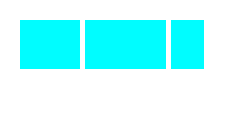
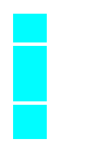
- flex-direction
.container {
  flex-direction: row | row-reverse | column | column-reverse;
}
row*
row-reverse

column
column-reverse


* default
CSS PROPERTIES
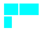
Flex Container
- flex-wrap
.container{
  flex-wrap: nowrap | wrap | wrap-reverse;
}
nowrap*
wrap
wrap-reverse
* default
CSS PROPERTIES
Flex Container
- flex-flow
.container{
   flex-flow: <‘flex-direction’> || <‘flex-wrap’>
}
Combination of flex-direction and flex-wrap.
.container{
   flex-flow: row nowrap;
}
By default:
CSS PROPERTIES
Flex Container
- justify-content
.container {
  justify-content: flex-start | flex-end | center | space-between | space-around;
}
flex-start*
flex-end

center


space-between

space-around
* default
CSS PROPERTIES
Flex Container
- align-items
.container {
  align-items: flex-start | flex-end | center | baseline | stretch;
}
flex-start
flex-end
center
baseline
stretch*
* default
CSS PROPERTIES
Flex Container
- align-content
.container {
  align-content: flex-start | flex-end | center | space-between | space-around | stretch;
}
flex-start
flex-end
center
space-between
space-around
stretch*
* default
CSS PROPERTIES
Flex ITEM
- order
.item {
  order: <integer>;
}
CSS PROPERTIES
Flex ITEM
- flex-grow
.item {
  flex-grow: <number>; /* default 0 */
}
* Negative values are invalid
Growing index if space available
CSS PROPERTIES
Flex ITEM
- flex-shrink
.item {
  flex-shrink: <number>; /* default 1 */
}
* Negative values are invalid

Shrinking index if lack of space
CSS PROPERTIES
Flex ITEM
- flex-basis
- This defines the default size of an element before the remaining space is distributed.
- flex-basis vs width???
- I can see no difference when you define a size in px, em, ...
- If set to auto additional space is added based on flex-grow.
- If set to 0 no additional space is added to the item.
- I only see usage with special values (0, auto)
Example ...
.item {
  flex-basis: <length> | auto; /* default auto */
}
CSS PROPERTIES
Flex ITEM
- flex-basis Example:

    <div class="flex-container">
      <div class="flex-item basis-auto">auto</div>
      <div class="flex-item basis-0">0</div>
      <div class="flex-item basis-auto">auto</div>
    </div>
HTML:
CSS:
.flex-container {
    display: inline-flex;
    width: 300px;
}
.flex-item {
    width: 50px;
    flex-grow: 1;
    flex-shrink: 1;
}
.basis-auto {
    flex-basis: auto;
}
.basis-0 {
    flex-basis: 0;
}
Result:
CSS PROPERTIES
Flex ITEM
- flex
.item {
  flex: none | [ <'flex-grow'> <'flex-shrink'>? || <'flex-basis'> ]
}
Combination of flex-grow, flex-shrink and flex-basis.
.item{
   flex: 0 1 auto;
}
By default:
CSS PROPERTIES
Flex ITEM
- align-self
.item {
  align-self: flex-start | flex-end | center | baseline | stretch;
}
flex-start
stretch
center
flex-end
baseline
Browser Support
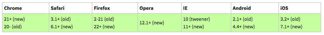
Since the specification has suffered from several modifications over the time, this had as a result the creation of several versions:
- new: the recent syntax from the specification (e.g. display: flex;)
- tweener: an odd unofficial syntax from 2011 (e.g. display: flexbox;)
- old: the old syntax from 2009 (e.g. display: box;)
This problem can be solved somehow by the use of Autoprefixer or creating dedicated mixins.
PROS & CONS
- Pros
- easy to use
- no need for a grid
- fit well for small modules (tickets maybe???)
- Cons
- specification is work-in-progess yet
- different versions (old, tweener, new)
- support for older browsers
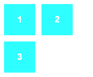
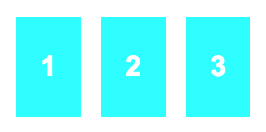
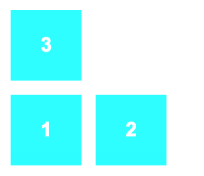
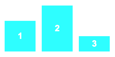
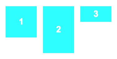
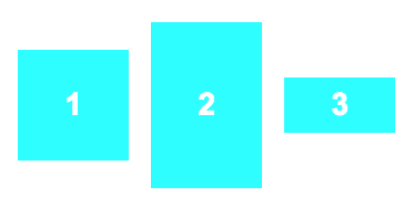
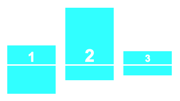
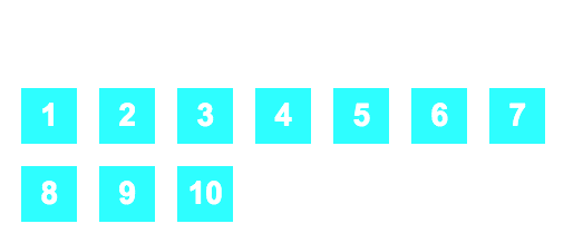
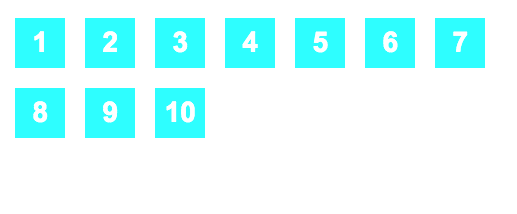
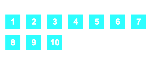
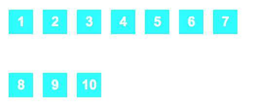
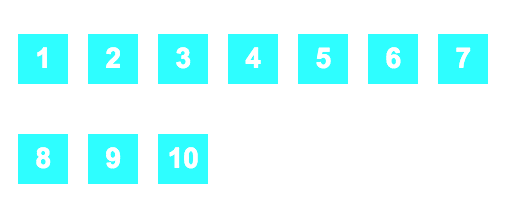
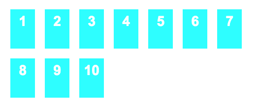
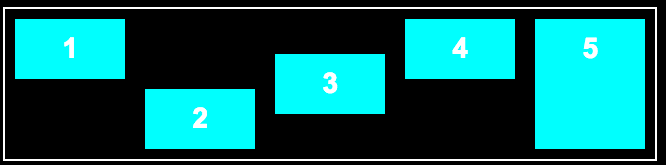
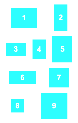
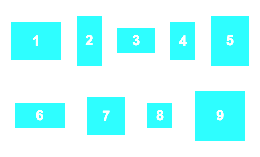
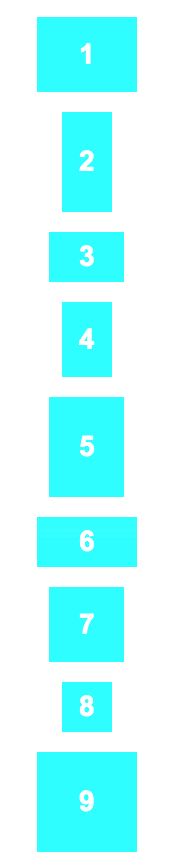
Exercise
Flex Container
Exercise:
Convert the following JsFiddle:
http://jsfiddle.net/asilvadelpozo/b48s577h/
in a Flexbox with this behavior:
Flexbox
By asilvadelpozo
Flexbox
Presentation about flexboxes for Fabs-HH