What the Flexbox?
aka «CSS Flexible Box Layout Module»
Herausforderungen
des 21. Jahrhunderts
Kontext
Uneinigkeit über das Provokations- bzw. Depressions-Potenzial verschiedener Frisuren
Vertikale Zentrierung mit CSS

Vertikale Zentrierung
(mit dynamischen Inhalten)
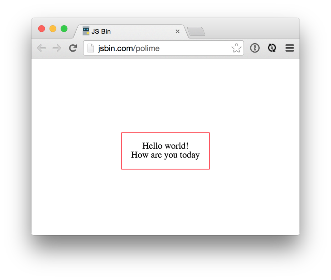
<div class="wrapper">
  <div class="content">
    Hello world!<br>
    How are you today?
  </div>
</div>
Ausgangslage
Ansatz 1
Absolute Positionierung / negative Translation
.wrapper {
  position: relative;
}
.content {
  position: absolute;
  left: 50%;
  top: 50%;
  transform: translate(-50%, -50%);
}Ansatz 2
CSS-Tabellen
.wrapper {
  display: table;
}
.wrapper-inner {
  display: table-cell;
  text-align: center;
  vertical-align: middle;
}
.content {
  display: inline-block;
}Ansatz 3
«Ghost element»
.wrapper:before {
  content: "";
  display: inline-block;
  height: 100%;
  vertical-align: middle;
  margin-right: -0.25em;
}
.content {
  display: inline-block;
  vertical-align: middle;
}Ansatz ♛
Flexbox
.wrapper {
  display: flex;
  justify-content: center;
  align-items: center;
}Was kann Flexbox?
Lösung für
Standard-Layout-Probleme
- Vertikale Zentrierung
- Grid-Systeme
- Input Add-Ons
- Sticky footer
- …
Syntax
Beispiel: Grid
.wrapper {
  display: flex;
}

.column {
  flex: 1;
  /* Shorthand für flex-grow: 1 */
}
http://jsbin.com/yoxag/edit?html,css,output
<div class="wrapper">
  <div class="column">
    Column 1
  </div>
  <div class="column">
    Column 2
  </div>
  <div class="column">
    Column 3
  </div>
  <div class="column">
    Column 4
  </div>
</div>
Erweiterung
3 Spalten, mittlere Spalte breiter
.wrapper {
  display: flex;
}

.column {
  flex: 1;
}
.column.var-wide {
  flex: 2;
}<div class="wrapper">
<div class="column">
Column 1
</div>
<div class="column var-wide">
Column 2
</div>
<div class="column">
Column 3
</div>
</div>Responsiveness
Linear auf kleinen Screens
.wrapper {
  display: flex;
}
.column {
  flex: 1;
}

@media (max-width: 30em) {
  .wrapper {
    display: block;
    /* Alternative: flex-direction: column; */
  }
}Responsiveness
Andere Reihenfolge
.wrapper {
  display: flex;
}
.column {
  flex: 1;
}

@media (max-width: 30em) {
  .wrapper {
    flex-direction: column;
  }
  .column:last-child {
    order: -1;
  }
}«Input Add-On»
form {
  display: flex;
}

input {
  flex: 1;
}<form>
<input type="text">
<button type="submit">
Submit
</button>
</form>
Technische Details
- CSS Flexible Box Layout Module Level 1
- W3C Last Call Working Draft
Browser-Support
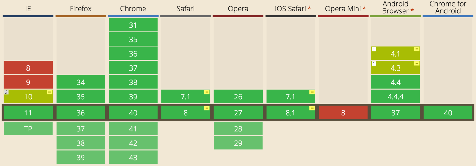
Fallback
bspw. für IE <= 9, mit Modernizr
/* Floats */
.no-flexbox.no-flexboxlegacy .wrapper:after {
  clear: both;
  content: "";
  display: table;
}
.no-flexbox.no-flexboxlegacy .column {
  float: left;
  width: 25%;
}
/* Tables */
.no-flexbox.no-flexboxlegacy .wrapper {
display: table;
table-layout: fixed;
width: 100%;
}
.no-flexbox.no-flexboxlegacy .column {
display: table-cell;
width: 50%; /* arbitrary width */
}What could possibly go wrong?
Vendor-Prefixes
.wrapper {
  display: -webkit-box;
  display: -webkit-flex;
  display: -ms-flexbox;
  display: flex;
}
.column {
  -webkit-box-flex: 1;
  -webkit-flex: 1;
      -ms-flex: 1;
          flex: 1;
}
.column:last-child {
  -webkit-box-ordinal-group: 0;
  -webkit-order: -1;
      -ms-flex-order: -1;
          order: -1;
}
.wrapper {
display: flex;
}
.column {
flex: 1;
}
.column:last-child {
order: -1;
}Theorie
Praxis
Autoprefixer
to the rescue

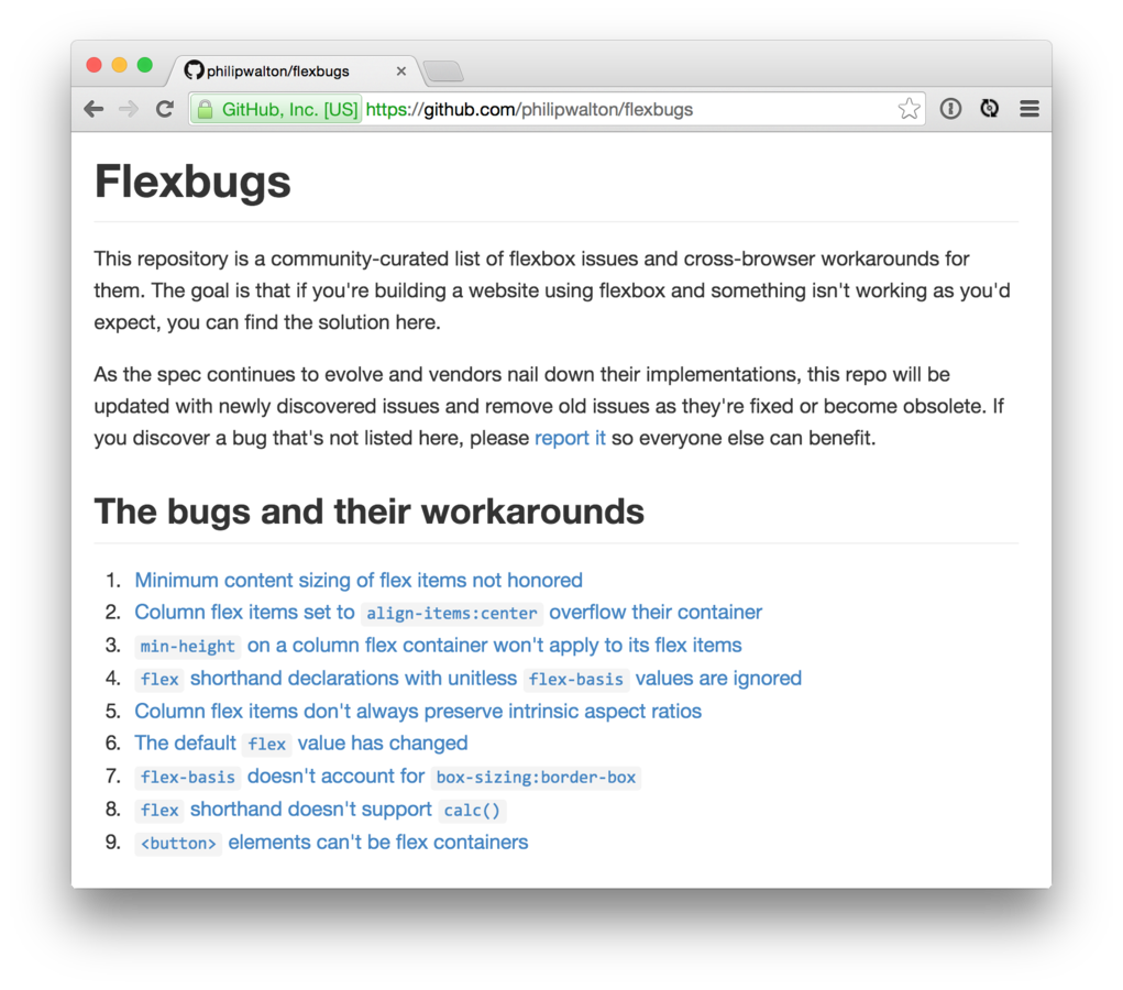
Bugs
Lesebefehl
-
«A complete Guide to Flexbox»
https://css-tricks.com/snippets/css/a-guide-to-flexbox/
-
«Harnessing Flexbox For Today’s Web Apps»
http://www.smashingmagazine.com/2015/03/02/
harnessing-flexbox-for-todays-web-apps/
-
«Solved by Flexbox»
http://philipwalton.github.io/solved-by-flexbox/
-
Spezifikation
http://www.w3.org/TR/css3-flexbox/
Besten Dank!
Thomas Jaggi
@backflip
thomas.jaggi@unic.com
What the Flexbox?
By Thomas Jaggi
What the Flexbox?
Einführung Flexbox – Lightning Talk Webnesday St. Gallen