Data Viz
Considerations and Practical Tips
Branden DuPont
Medical College of Wisconsin
Datashare @ MCW IHE = Local IDS

Building A Visualization Project
- Back end
- Getting Data
- Clean/reshape/join
- Generate Variables
- Run modeling, etc
- Automate this process (ETL)
- Front End
- Build web page
- Design visualizations
- User interaction
Front End
- Overview of general concepts and considerations
- type of viz project
- where it lives
- visualization design
- thoughts on color
- Reference examples throughout
- Avoid technical overview or in-depth overview of tools
Which Type of Data Visualization Project Do I Have?
- Exploratory
- provide multiple analyses
- filters for various perspectives
- question is open ended
- more interactivity
- Explanatory
- explore and understand an analysis
- similar to a policy brief
- question is discrete
- less interactivity
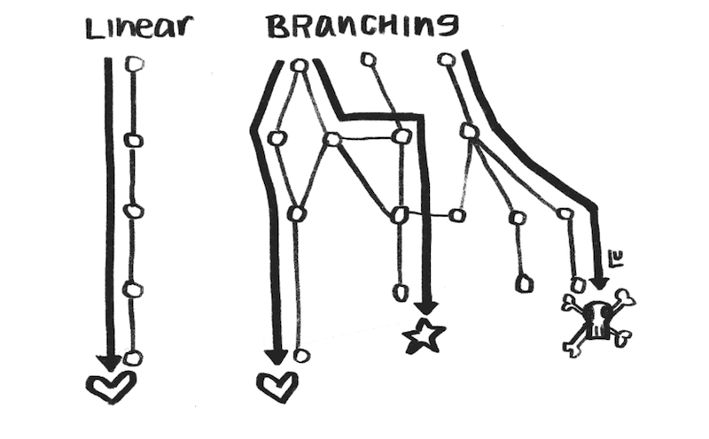
Susie Lu:
Explanatory vs Exploratory
Where Does The Visualization Live?
- Existing website vs. spinning up your own
- Web development can get complex
- Databases, HTML, CSS, Javascript, or Framework (Django, Ruby on Rails)
- SEO
- Google Analytics/Tracking
- Not a web developer?
- Wordpress (no-code)
- Wix/Wordpress (no-code)
- Static Site Generators
Why Static Sites Over Free Alternatives
- Easy to learn and deploy
- basic command line
- markdown to generate content (instead of html/css)
- free templates to build on
- can be learned
- Cheap and easy to maintain
- no database
- small domain name cost
- Versioning
- Allow easily embedding of interactive (and responsive) visualizations
Themes/Examples
- Example: themes, minimal
- Who else: NYC Housing Data Coalition, Philadelphia DAO
- Think tank/government agency with embedded visualization:
How Do I Choose the Right Data Viz?
- Good visualization is difficult, complex, and takes practice
- Good place to start: FT Visual Vocabulary
- Most of these can be made in standard viz tools
- Collect examples you like (Washington Post, ProPublica, Urban Institute, Flowing Data)
How to Improve Chart Design?
Elijah Meeks
- Don't use the chart defaults, be intentional about design
- Use annotations whenever possible -- even more than interactivity
- Chart's meaning should be clear at a glance. Highlight or add narrative to key insights.
- When appropriate add elements like
- data source
- contextual notes about the data,
- last chart update
- who made the chart
How to Use Color Effectively?
Lisa Charlotte Ross
- Color in data visualization is difficult
- Stick to a brand theme
- Best advice is to read several blog posts by Lisa Charlotte Ross
- Explain what your colors encode
- Grey is the most important color
- Use the same color for the same variables when appropriate
- Light colors for low values
- No more than 7 colors: 2 to 3 is ideal
- Use a color palette generator
Questions?
Build a Data Viz Project
By Branden DuPont


