Road to
Chakra-UI
From semantic to functional css
This talk is heavily inspired (stolen) from Adam Wathan's post
'CSS Utility Classes and "Separation of Concerns"'
Awakening: level 1
Semantic CSS

<p class="text-center">
    Hello there!
</p>
<style>
.greeting {
text-align: center;
}
</style>
<p class="greeting">
Hello there!
</p><div class="container">
<div class="author-bio">
<img src="https://cdn-images..." alt="">
<div>
<h2>Adam Wathan</h2>
<p>
Adam is a rad dude who likes TDD...
</p>
</div>
</div>
</div>.author-bio {
background-color: white;
border: 1px solid hsl(0,0%,85%);
border-radius: 4px;
box-shadow: 0 2px 4px rgba(0,0,0,0.1);
overflow: hidden;
> img {
display: block;
width: 100%;
height: auto;
}
> div {
padding: 1rem;
> h2 {
font-size: 1.25rem;
color: rgba(0,0,0,0.8);
}
> p {
font-size: 1rem;
color: rgba(0,0,0,0.75);
line-height: 1.5;
}
}
}Awakening: level 2
Decoupling styles from structure

CSS with modular architecture
CSS with modular architecture
CSS with modular architecture
<div class="author-bio">
  <img class="author-bio__image" src="https://cd..." alt="">
  <div class="author-bio__content">
    <h2 class="author-bio__name">Adam Wathan</h2>
    <p class="author-bio__body">
      Adam is a rad dude who likes TDD...
    </p>
  </div>
</div>
.author-bio {
background-color: white;
border: 1px solid hsl(0,0%,85%);
border-radius: 4px;
box-shadow: 0 2px 4px rgba(0,0,0,0.1);
overflow: hidden;
}
.author-bio__image {
display: block;
width: 100%;
height: auto;
}
.author-bio__content {
padding: 1rem;
}
.author-bio__name {
font-size: 1.25rem;
color: rgba(0,0,0,0.8);
}
.author-bio__body {
font-size: 1rem;
color: rgba(0,0,0,0.75);
line-height: 1.5;
}.author-bio {
background-color: white;
border: 1px solid hsl(0,0%,85%);
border-radius: 4px;
box-shadow: 0 2px 4px rgba(0,0,0,0.1);
overflow: hidden;
&__image {
display: block;
width: 100%;
height: auto;
}
&__content {
padding: 1rem;
}
&____name {
font-size: 1.25rem;
color: rgba(0,0,0,0.8);
}
&___body {
font-size: 1rem;
color: rgba(0,0,0,0.75);
line-height: 1.5;
}
}
Awakening: level 3
Dealing with similar components

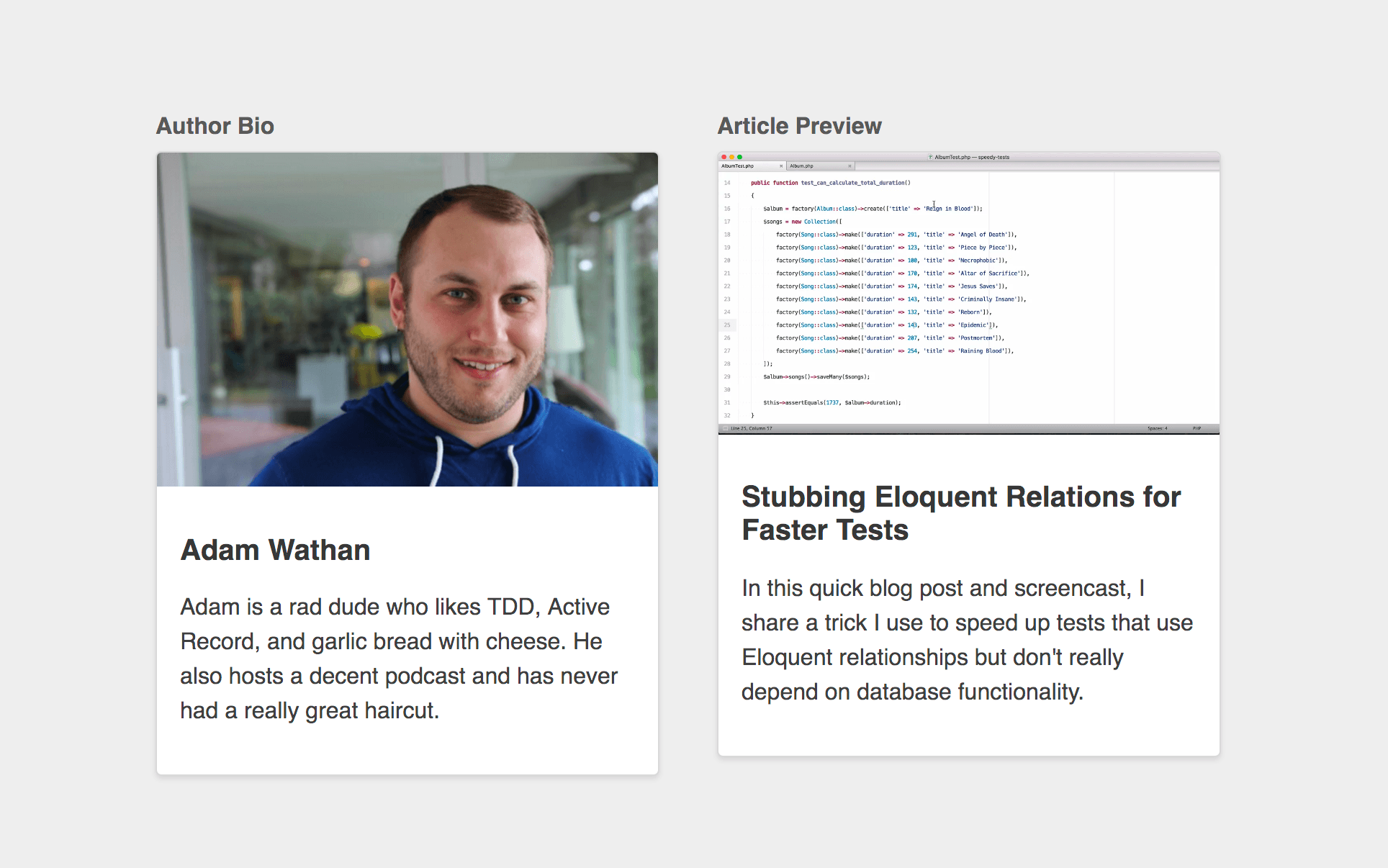
<div class="article-preview">
  <img class="article-preview__image" src="https..." alt="">
  <div class="article-preview__content">
    <h2 class="article-preview__title">Stubbing...</h2>
    <p class="article-preview__body">
      In this quick blog post...
    </p>
  </div>
</div>
How do we handle the CSS ?
Option 1: Duplicate the style
Option 2: @extend the author bio component
Option 3: Create a content-agnostic component
<div class="media-card">
  <img class="media-card__image" src="https:...." alt="">
  <div class="media-card__content">
    <h2 class="media-card__title">Adam Wathan</h2>
    <p class="media-card__body">
      Adam is a rad dude who likes TDD...
    </p>
  </div>
</div>
.media-card {
background-color: white;
border: 1px solid hsl(0,0%,85%);
border-radius: 4px;
box-shadow: 0 2px 4px rgba(0,0,0,0.1);
overflow: hidden;
}
.media-card__image {
display: block;
width: 100%;
height: auto;
}
.media-card__content {
padding: 1rem;
}
.media-card__title {
font-size: 1.25rem;
color: rgba(0,0,0,0.8);
}
.media-card__body {
font-size: 1rem;
color: rgba(0,0,0,0.75);
line-height: 1.5;
}- CSS that depends on HTML
- HTML that depends on CSS
There are two ways of writing CSS
Awakening: level 4
Content-agnostic CSS components

- .card
- .btn, .btn--primary, .btn--secondary
- .badge
- .card-list, .card-list-item
- .img--round
- .modal-form, .modal-form-section
"Trying to come up with these component names all of the time is exhausting."
"When you make modifiers like .actions-list--left, you're creating a whole new component modifier just to assign a single CSS property. It's already got left in the name, so you're not going to fool anyone that it's "semantic" in any way either."
Awakening: level 5
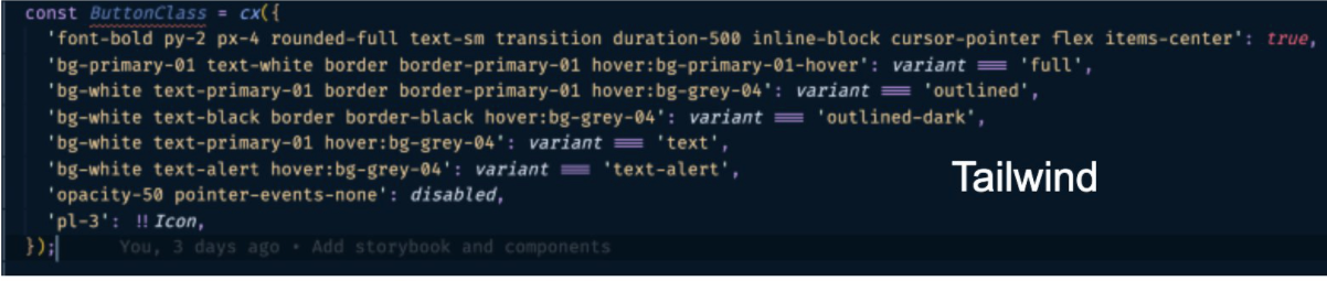
Utility-first Classes (it's about to be ugly)

.author-button

.submit-button

.button .button--submit

.btn .btn--primary .margin-right

...?
Utility classes for things like:
- Text sizes, colors, and weights
- Border colors, widths, and positions
- Background colors
- Flexbox utilities
- Padding and margin helpers
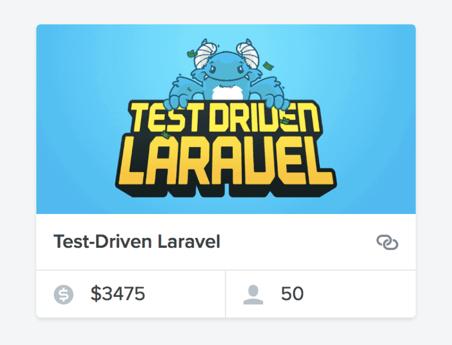
<div class="card rounded shadow">
    <a href="..." class="block">
        <img class="block fit" src="...">
    </a>
    <div class="py-3 px-4 border-b border-dark-soft flex-spaced flex-y-center">
        <div class="text-ellipsis mr-4">
            <a href="..." class="text-lg text-medium">
                Test-Driven Laravel
            </a>
        </div>
        <a href="..." class="link-softer">
            @icon('link')
        </a>
    </div>
    <div class="flex text-lg text-dark">
        <div class="py-2 px-4 border-r border-dark-soft">
            @icon('currency-dollar', 'icon-sm text-dark-softest mr-4')
            <span>$3,475</span>
        </div>
        <div class="py-2 px-4">
            @icon('user', 'icon-sm text-dark-softest mr-4')
            <span>25</span>
        </div>
    </div>
</div>
"You could try and enforce consistency through variables or mixins, but every line of new CSS is still an opportunity for new complexity; adding more CSS will never make your CSS simpler."
"If instead, the solution to styling something is to apply existing classes, all of a sudden that blank canvas problem goes away."
Introducing Tailwind css
-
It's atomic
-
It's super ugly.
-
Favor composition over inheritance
-
Themable
-
Immutability, predictability, avoidance of side-effects
-
Easier to maintain and to scale
-
Limiting choices can be a good thing
-
Not another bootstrap or material-ui
-
Automated purge
In the react / react-native world


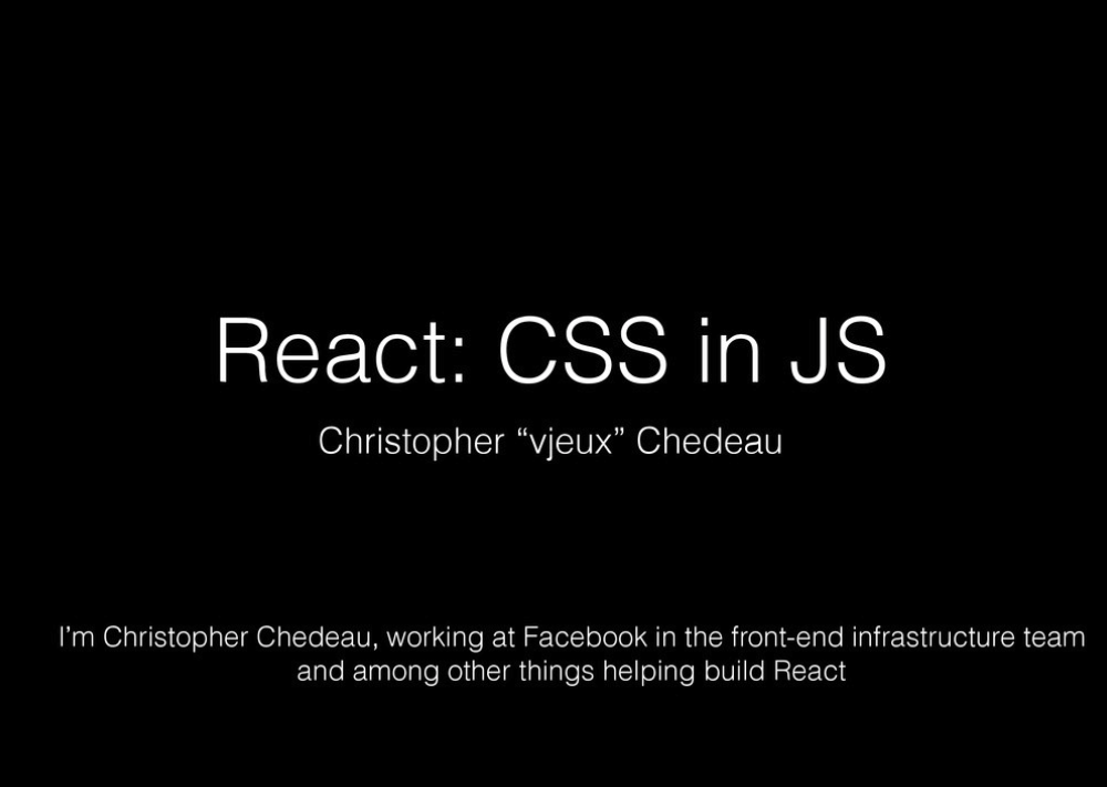

Radium, Fela, JSS
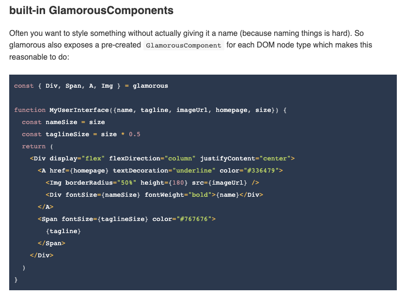
Glamorous
Styled-System
import styled from 'styled-components'
import { space, layout, color } from 'styled-system'

const Box = styled.div`
  ${space}
  ${layout}
  ${color}
`

export default Box
Awakening: level 6
Chakra-UI

Resources:
-
http://nicolasgallagher.com/about-html-semantics-front-end-architecture/
-
https://nick-basile.com/blog/post/5-takeaways-from-using-tailwind-css-in-real-projects
-
https://adamwathan.me/css-utility-classes-and-separation-of-concerns/
-
https://dev.to/lauragift21/love-at-second-sight-with-tailwindcss-23dc
-
https://blog.logrocket.com/tailwind-css-is-it-tomorrows-bootstrap-ebe560f9d00b/
-
https://dev.to/lauragift21/love-at-second-sight-with-tailwindcss-23dc
-
https://blog.algolia.com/redesigning-our-docs-part-4-building-a-scalable-css-architecture/
Road to Chakra-UI
By Stéphane Montlouis-Calixte