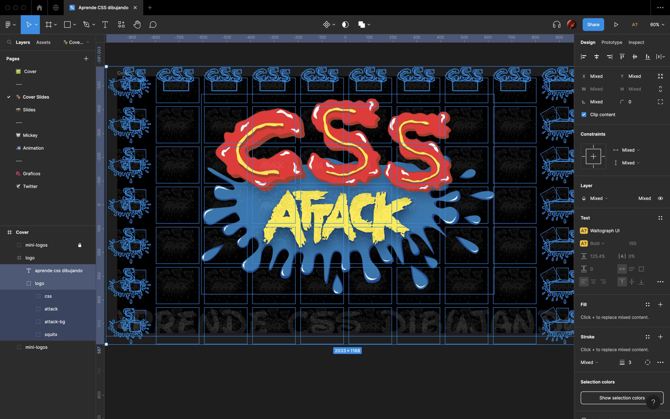


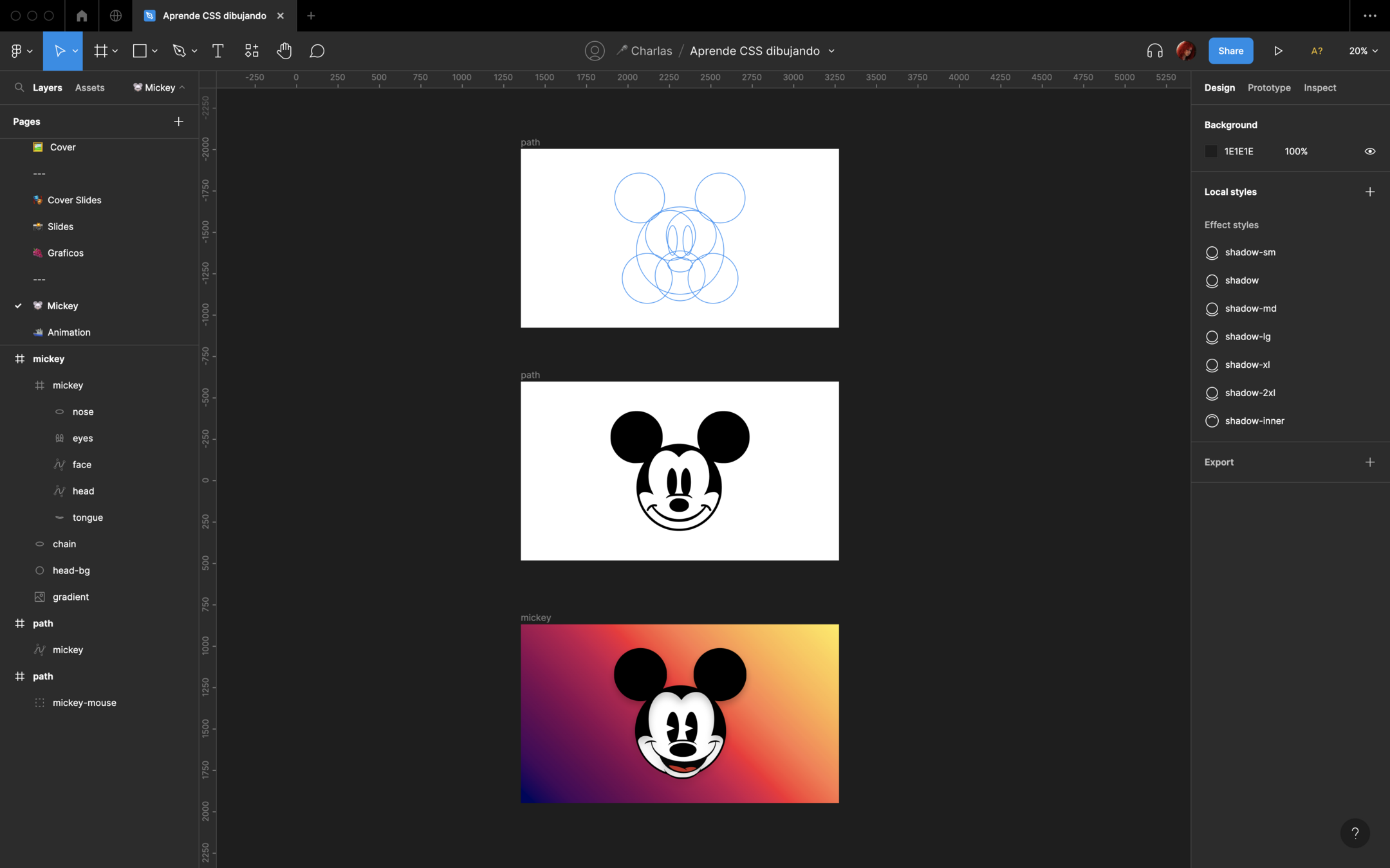


Carmen Ansio
Design Systems at Stripe
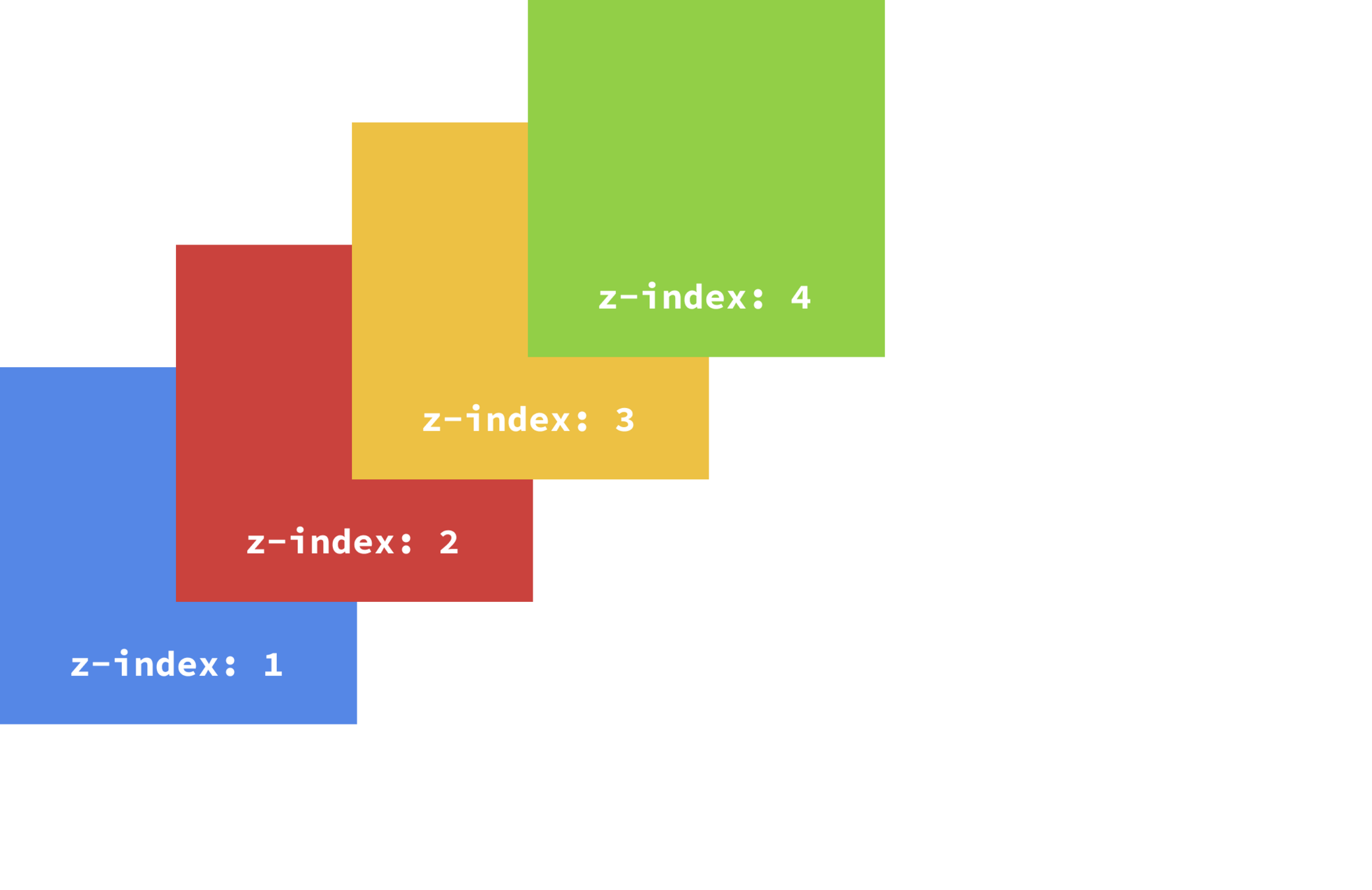
$zindex-dropdown:                   1000;
$zindex-sticky:                     1020;
$zindex-fixed:                      1030;
$zindex-modal-backdrop:             1040;
$zindex-offcanvas:                  1050;
$zindex-modal:                      1060;
$zindex-popover:                    1070;
$zindex-tooltip: 1080;<div class="mickey">
<div class="head">
<div class="face-skin">
<div class="skin skin-left"></div>
<div class="skin skin-right"></div>
</div>
<div class="eyes"></div>
<div class="nose">
<div class="nose-line"></div>
</div>
<div class="smile">
<div class="smile-left"></div>
<div class="smile-right"></div>
</div>
</div>
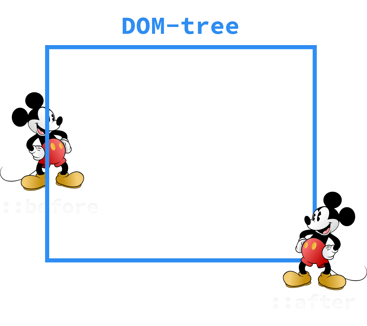
</div>*,
*::before,
*::after {
margin: 0;
padding: 0;
box-sizing: border-box;
}
body {
height: 100vh;
width: 100vw;
display: flex;
justify-content: center;
align-items: center;
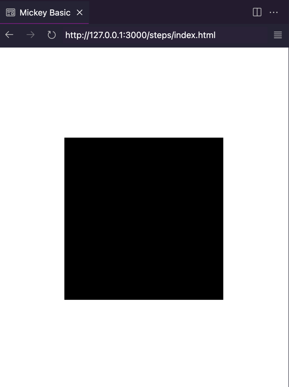
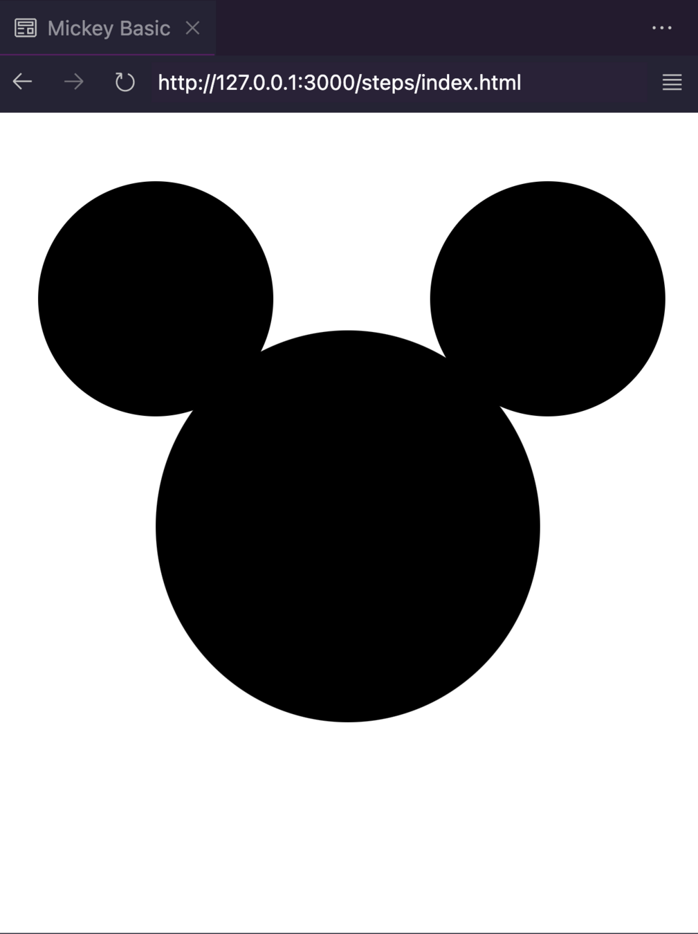
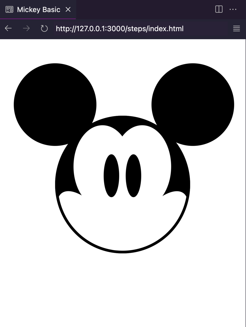
}.head {
height: 250px;
width: 245px;
background-color: #000;
position: relative;
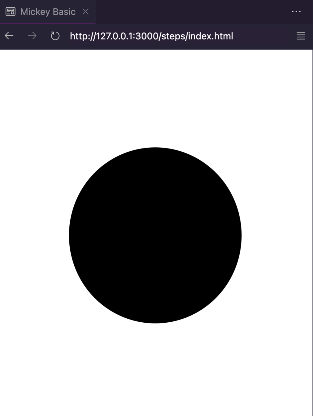
}.head {
height: 250px;
width: 245px;
background-color: #000;
position: relative;
border-radius: 50%;
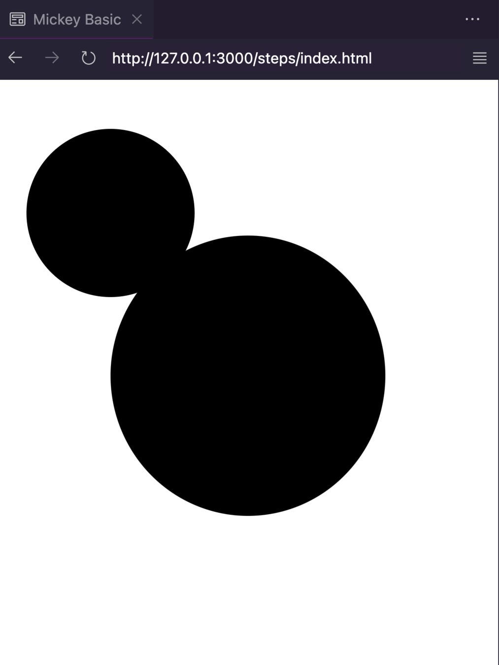
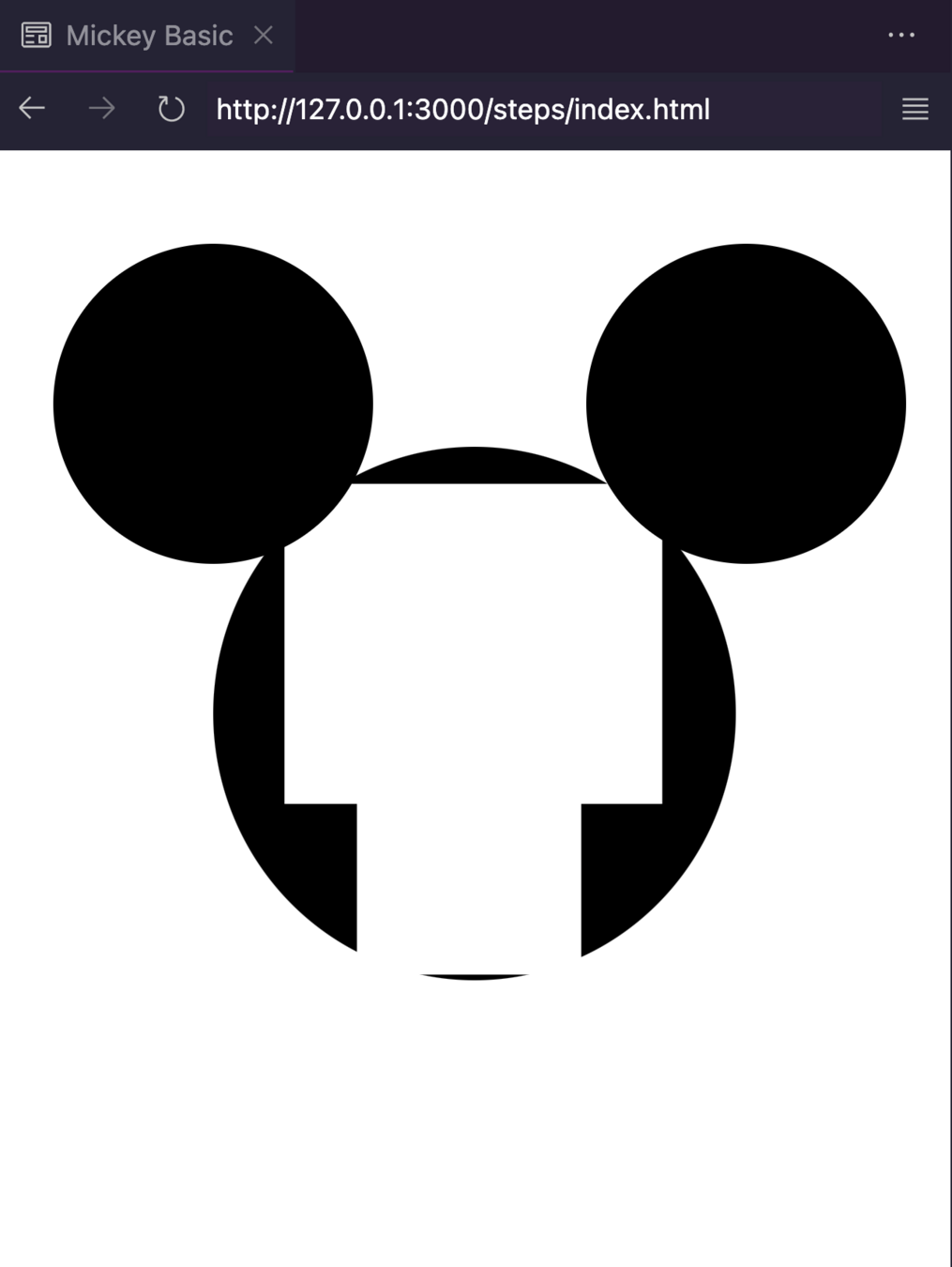
}.head::after {
--size: 150px;
content: "";
position: var(--vodka);
height: var(--size);
width: var(--size);
top: -95px;
left: calc(var(--size) / 2 * -1);
background-color: #000;
border-radius: 50%;
}.head::after {
--size: 150px;
content: "";
position: var(--vodka);
height: var(--size);
width: var(--size);
top: -95px;
left: calc(var(--size) / 2 * -1);
background-color: #000;
border-radius: 50%;
box-shadow: 250px 0 #000;
}.head::before {
content: "";
position: var(--vodka);
height: 150px;
width: 105px;
top: 7%;
left: -50%;
background-color: transparent;
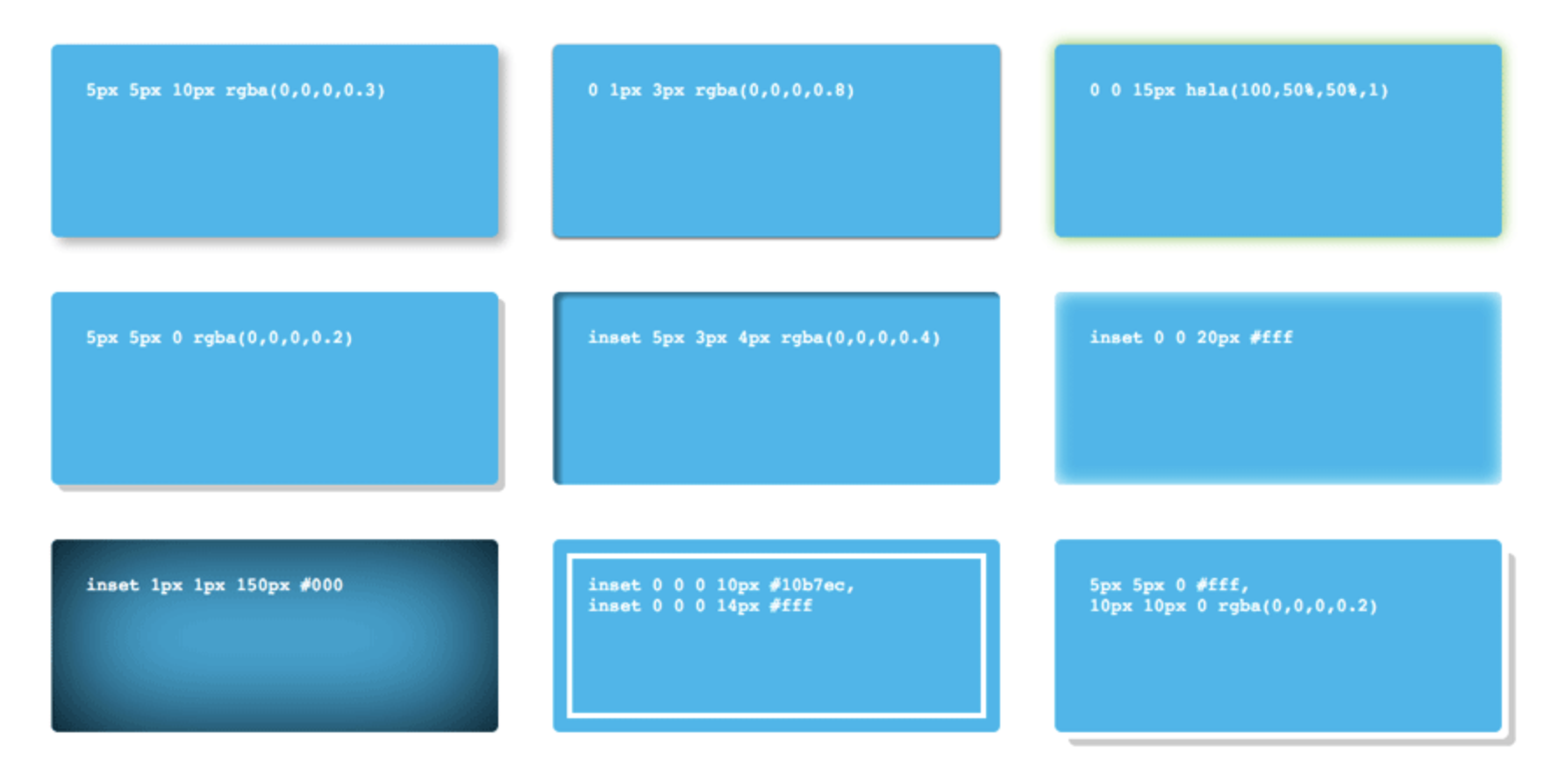
box-shadow: 156px 0 #fff, 228px 0 #fff, 190px 80px #fff;
}.head::before {
content: "";
position: var(--vodka);
height: 150px;
width: 105px;
top: 7%;
left: -50%;
background-color: transparent;
box-shadow: 156px 0 #fff, 228px 0 #fff, 190px 80px #fff;
border-radius: 50%;
}.skin {
--rotate: 38deg;
--position: 18px;
height: 150px;
width: 70px;
background-color: #fff;
border-radius: 50%;
position: var(--vodka);
top: 50%;
}
.skin-left {
transform: rotate(calc(var(--rotate) * -1));
left: var(--position);
}
.skin-right {
transform: rotate(var(--rotate));
right: var(--position);
}
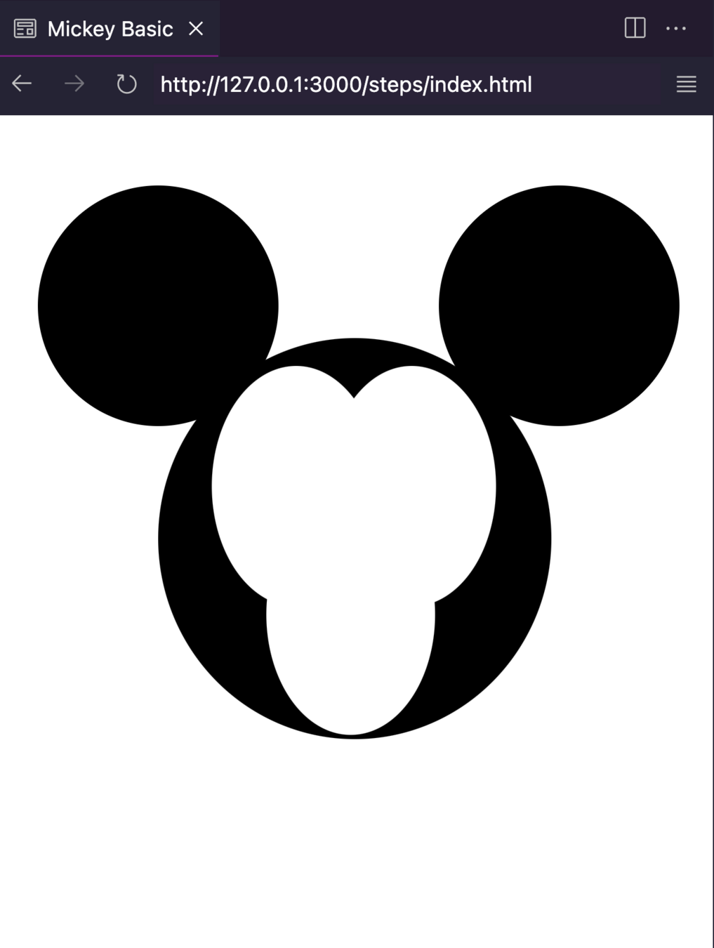
.eyes {
height: 78px;
width: 28px;
background-color: #000;
border-radius: 50%;
box-shadow: 40px 0 #000;
position: var(--vodka);
top: 28%;
left: 36%;
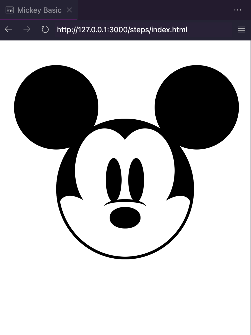
}.nose-line {
height: 28px;
width: 75px;
border-top: 5px solid #000;
border-radius: 50%;
position: var(--vodka);
top: -14px;
left: -10px;
}
.nose {
height: 38px;
width: 55px;
background-color: #000;
border-radius: 48%;
position: var(--vodka);
top: 62.8%;
left: 38.8%;
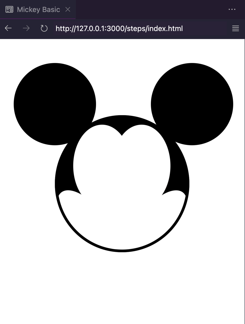
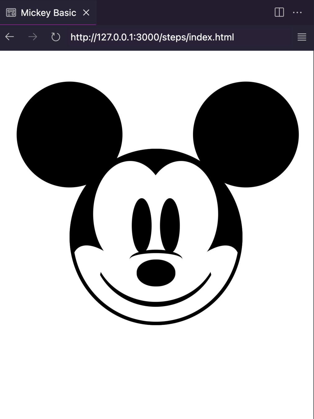
}.smile {
height: 175px;
width: 180px;
border: 2px solid transparent;
border-bottom: 7px solid #000;
border-radius: 50%;
z-index: 3;
position: var(--vodka);
bottom: 26px;
left: 32px;
}.smile-left,
.smile-right {
--distance: -6px;
--size: 46px;
height: var(--size);
width: var(--size);
border: 4px solid transparent;
border-top: 5px solid #000;
border-radius: 50%;
position: var(--vodka);
top: 74%;
}
.smile-left {
transform: rotate(-28deg);
left: var(--distance);
}
.smile-right {
transform: rotate(28deg);
right: var(--distance);
}By Carmen Ansio
Slides para #commitconf 2023


