Contents
- What is flex basic concepts
- Common values for the win
- Resolved by flex layout examples
- Caveats how to avoid flex traps
- Performance browser ❤️ flex
- Animations could be really slow and hard
- Tips and trick tricks and tips
What is flex
- Block layout for documents
- Inline layout for text
- Table layout for tabular data
- Positioned layout for explicit positioning
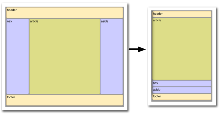
- Flex layout for applications and webpages
What is flex
Powerful tool for distributing space and aligning content in ways that web apps and complex web pages often need.
Basic concepts
- Lay out items container level
- Expand/shrink items item level
Basic concepts

container

flex-direction


justify-content
align-items

wrap
align-content
item

flex-grow
flex-shrink
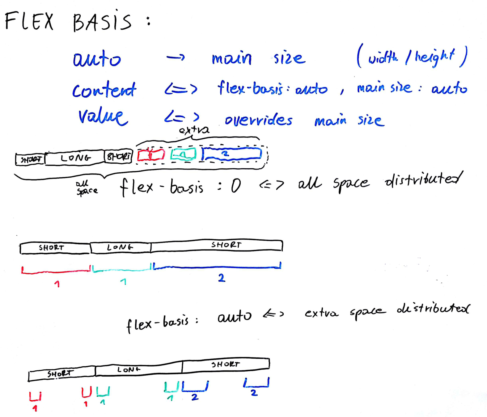
flex-basis


align-self
order
flex
Common values
flex: initial;
flex: none;
flex: auto;
flex: <positive-number>;
flex: <grow> <shrink> <basis>;flex: 0 1 auto;
flex: 0 0 auto;
flex: 1 1 auto;
flex: <positive-number> 1 0;Example 1
Horizontal and vertical centering
body {
  display: flex;
  justify-content: center;
  align-items: center;
}
body
figure
Example 2
Sticky footer
body {
  display: flex;
  flex-direction: column;
  height: 100vh;
}

header {
  flex: none;
}

footer {
  flex: none;
}

main {
  flex: auto;
}
header
body
footer
main
Example 3
Media object
.media
figure
main
.media {
  display: flex;
  align-items: flex-start;
}

figure {
  margin-right: 1em;
}

main {
  flex: 1;
}
Example 4
Scoreboards
body {
  display: flex;
  flex-direction: row;
}

.item-1, .item-3 {
  flex: 1;
}

.item-2 {
  flex: 2;
}
body
1
3
2
Example 5
Content grouping (floating behaviour)
body {
  display: flex;
  flex-direction: row;
}

.item-1 {
  margin-right: auto;
}
body
1
3
2
Example 6
Content grouping (floating behaviour)
body {
  display: flex;
  flex-direction: row;
}

.item-2 {
  margin-left: auto;
}
body
1
3
2
Example 7
Content grouping (floating behaviour)
body {
  display: flex;
  flex-direction: row;
}

.item-1 {
  margin-right: auto;
}

.item-3 {
  margin-left: auto;
}
body
1
3
2
Caveats
- Ignore min-height of parent IE 10-11
- Fail to honor minimum content sizing Chrome, Opera, Safari
- Unitless flex-basis IE 10-11
- Remember about overflow of container All
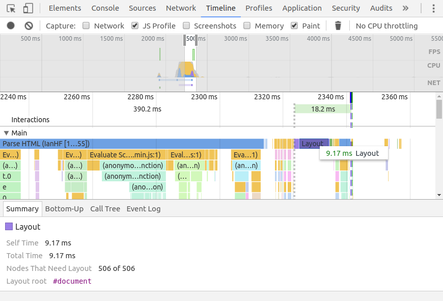
Performance
Tips and tricks
figure {
  margin: auto;
}
body
figure
Tips and tricks
figure {
  align-self: flex-end;
  margin-left: auto;
}
body
figure
1
2
Tips and tricks
body {
  display: flex;
}
.center, .left, .right {
  display: flex;
  justify-content: center;
}
.center {
  flex: 3;
}
.left {
  flex: 1;
  justify-content: flex-start;
}
.right {
  flex: 1;
  justify-content: flex-end;
}
body
center
left
item
item
right
item
Sexi Flexi
By coderitual


