Web Components
The Modular for frontend
What
did you
feeling?

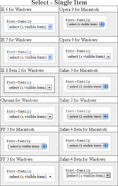
Too many tags needed.
Rendering as your browser

Managed Elements?
FXCK YEAH!

You will need
THIS.
You will need
THIS.

How to use
WEB COMPONENTS?
<template>

    <div class="slide">
        <ul>
            <content select="li"></content>
        </ul>
    </div>
</template>
1. Template
<decorator id="details-open">
    <template>
        <a id="summary">
          ▾
          <content select="summary"></content>
        </a>
        <content></content>
    </template>
</decorator>
2. Decorator
details[open] {
    decorator: url(#details-open);
}
<details open>
<summary>Timepieces</summary>
<ul>
<li>Sundial
<li>Cuckoo clock
<li>Wristwatch
</ul>
</details><element name="x-slide" extends="ul" constructor="SlideControl">
<template>
<div class="slide">
<ul>
<content select="li"></content>
</ul>
</div>
</template>
<script>
SlideControl.prototype = {
currentNum : function(){},
lastNum : function(){}
}
this.lifecycle({
created: function(root) {}
});
</script>
</element> 3. Custom Elements
<x-slide is="x-slide">
    <li><img src="http://helloworld.naver.com/img/1.jpeg" alt="1.jpeg" width="500px" height="333px" style=""></li>
    <li><img src="http://helloworld.naver.com/img/2.jpeg" alt="2.jpeg" width="500px" height="333px" style=""></li>
    <li><img src="http://helloworld.naver.com/img/3.jpeg" alt="3.jpeg" width="500px" height="333px" style=""></li>
    <li><img src="http://helloworld.naver.com/img/4.jpeg" alt="4.jpeg" width="500px" height="333px" style=""></li>
</x-slide> 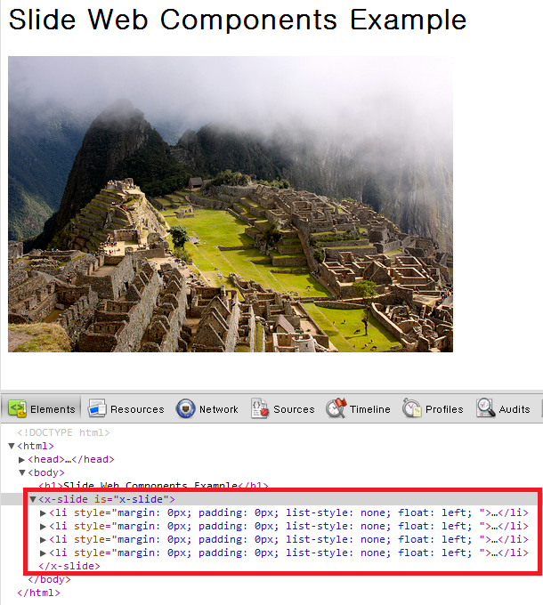
Hell yeah!
Shadow DOM
Shadow DOM
Shadow DOM
Before shadow coming...


After shadow coming...
Shadow in shadow...
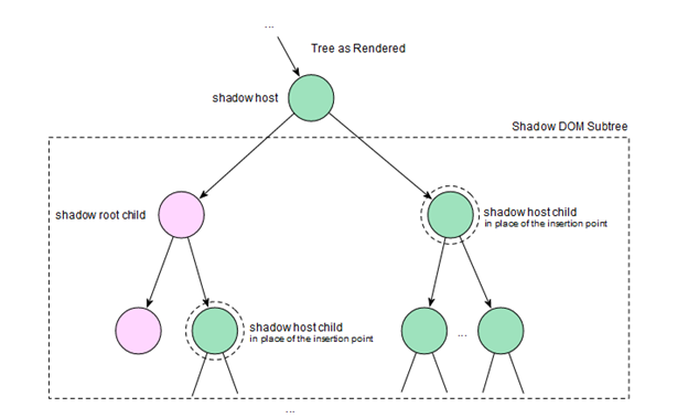
Shadow DOM
Usage
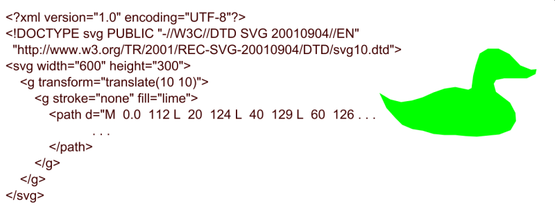
SVG

Web App Modulization
"SI" SUXKS
Web components
make easier your life.
Polymer

X-tag

xtag.register('x-clock', {
lifecycle: {
created: function(){
this.start();
}
},
methods: {
start: function(){
this.update();
this.xtag.interval = setInterval(this.update.bind(this), 1000);
},
stop: function(){
this.xtag.interval = clearInterval(this.xtag.interval);
},
update: function(){
this.textContent = new Date().toLocaleTimeString();
}
},
events: {
tap: function(){
if (this.xtag.interval) this.stop();
else this.start();
}
}
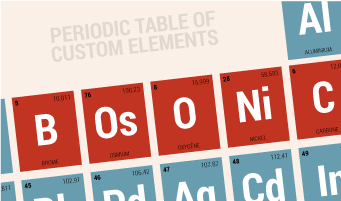
});Bosonic
<style>
b-dropdown.modern {
    border: 1px solid #ccc;
}
b-dropdown.modern > button {
    background-color: #ccc;
}
</style>

<b-dropdown class="modern">
    <button>Dropdown</button>
    <ul>
        <li>plain text</li>
        <li><a href="#">link item</a></li>
        <hr />
        <li><a href="#">separated link</a></li>
    </ul>
</b-dropdown>
Any Questions?
NO?
TANK YOU
COMPOSITE
Ukjin Yang
HTML5 Freelancer.
Dazare Manager


Did you forget something, speaker?
Don't forget imports!
<link rel="import" href="goodies.html">
True Story
데단한 기능!
Amazing Function!
Web Component
By Ukjin Yang