What have you learnt from your audience feedback?
Main Task
In order to get an initial feel of my audiences feelings towards the genre of documentaries I got a member of my target audience to watch my favorite example of a documentary about a similar topic. This was at the research stage which meant that any feedback that I received I could take into consideration and try and be mindful of it when I would be in the construction stage of my coursework, making it an extremely useful piece of research and no doubt helped improve my final product.
“I thought that this documentary was done very well, I like the metaphoric meaning behind the bear contrasting it with the war subjects areas. The documentary has a nostalgic feel towards it, which really connected with me on a emotional level, I think that this will appeal a younger audience as it picks up on aspects that you don’t see very often.
Negatives:
One thing that they could improve on is the lack of dynamic shots used within the documentary, however I like the photographic side of the documentary as you don’t often see this very often’
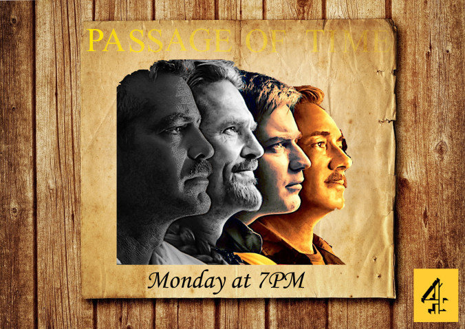
First Cut.
We screened our first cut of Passage of Time to several non media students in order to get a understanding of how non media literate persons would respond to our documentary. Furthermore they said that - “The beginning shot is highly effective, it grips my attention as it is very engaging as the colours work alongside the transitions. There are some very smooth transitions between each shot that work well alongside the non-diegetic sound”
But “In order to improve you need to add more some shots so the audience can get a better idea of what the documentary is about before going into the speech”
Overall the comments were generally very positive however, when consulting some other media students they found that for a Channel 4 product it was quite conventional and suffered slightly for sometimes having "talking heads". This was slightly problematic as Channel 4 are known for making high quality, non conventional documentaries and ours was looking like a conventional one.
Final Cut
After collecting audience feedback I found that the two biggest issues were that sometimes there were talking heads as well as the intro being slightly unclear in terms of displaying what the documentary is about.
Moreover to fix these issues I went to Haywards Heath and filmed some extra cutaways in order to make the documentary more dynamic and suffer less from "talking heads", I feel this was very effective as before the majority of the shots I used were filmed at the subjects house which although helped the audience connect with the subject as they were getting a glimpse into Brenda's life; it also made the documentary visually mundane as they were seeing similar shots throughout whereas with the added cutaways of scenery filmed while driving and shots of a train it livens up the documentary as not only are we adding more interesting visuals but we're also mixing up the shot types.
As well as adding cutaways I also added some old pictures of the subjects family throughout the documentary in order to resolve the issue of an unclear narrative.
Finished Product
Unfortunately, despite a valiant attempt at responding to every criticism given to us by our target audience; there were some aspects that we couldn't fix.
Arnold found that the documentary would've benefited from having the subject in a tighter frame as well as being at eye level opposed to the slightly high angle shots we used. He said that having the camera at eye level would've given the documentary a warmer mode of address as the audience would be closer to Brenda and get more emotive pleasures from the documentary. This is something that obviously slipped my mind as I had completed set up test shots early on in the documentary making process which meant that I completed it and never went back to potentially reevaluate whether on not they were the correct shots to use.
Conclusion
Overall I have learnt from my audience feedback that despite my skepticism regarding whether or not my target audience would respond positively to my documentary, as I found it quite conventional which can sometimes be considered boring; they enjoyed it having very few issues with it e.g. certain camera angles used. However I feel the biggest issue with Passage of Time is that it doesn't really subvert the genre in any way questioning the authenticity of an attempted Channel 4 product even though it is of a high standard. However, it could be argued that because it is scheduled at 3pm hammocked between Come dine with me and A place in the sun it benefits from being quite conventional as an older audience might get audience pleasures such as relatable characters creating nostalgia while my target audience will also see relateable characters in their grandparents.
Ancillary 1 and 2
Unlike my main task in which I had a vast number of ideas my ancillaries were far more concise as from the very beginning I had a very clear vision of what I wanted to do. However, I was also limited in my creativity as I had to conform to Channel 4's codes and conventions which meant that regardless of what my audience felt I couldn't change anything regarding Channel 4's codes and conventions and therefore had to hone in on the criticisms that weren't about the compulsory Channel 4 codes and conventions.
Radio Advert
Idea 1- A murmur of teenagers each saying a materialistic item e.g. Xbox, IPhone, PS4 etc. followed by TV static, followed by sound bites of my documentary.
Rahul Marteinez “The idea of having murmuring teenagers is quite eerie and intriguing as well as having a really strong tone for Channel 4 as they are known for making quite subversive adverts for their products.”
Alfie Baker “I think, given that the documentary focuses on Brenda and her life/insight into general sociological topics; by having teenagers speak about materialistic things and clearly presenting them in a bad light compared to the wise elderly woman, you would be presenting the two collective identities in a very stereotypical way which contradicts the aim of the documentary. Also by separating the two groups you are also creating an 'us and them scenario' which creates a rather confrontational tone which is again very misguided as this isn’t what the documentary is about.”
The following slides are a timeline of my radio advert from initial concepts to final product.
Initial Concepts.
Radio Advert
While I agree with Rahul that my first concept would be very enticing for my target audience. I also completely agree with Alfie that if I made this advert then I would be completely undermining the good intentions that I tried to make this documentary with. It would also be incredibly inconsistent with my other products as both my documentary and newspaper advertisement have a very warm mode of address and although Brenda does make some negative remarks about the youth of today e.g. "we didn't have pocket money!" it is a very minute topic of conversation. Therefore to produce such an advert would be deceitful.
Radio Advert
Idea 2- Sound bites of celebrities comments separated by changing tv channel sound effect. Followed by sound bites of my documentary.
Leeroy Davies “I really like this idea as unlike the first concept it doesn’t alienate any of the already underrepresented groups as well as being very channel 4 esque by being different by including celebrities in their adverts but in a more controversial way. ” The only issue I think there will be is that by having each sound bite follow one after the other it might become quite boring. I think it would be better to integrate them that way the listener isn’t bored and it might be quite humorous with the right sound bites.
After evaluating my first concept I felt that Leeroy is correct in choosing my second idea however, I wasn't sure about his comment regarding the order of the sound bites as I felt the advert should end with the listener thinking about the advert rather than whichever celebrity has just spoken. Moreover I decided to produce a mock up in which I followed up with how I was originally going to do it and then see if it worked.
Radio Advert
Mock ups: https://www.youtube.com/watch?v=PU-uKiAcTbM
https://www.youtube.com/watch?v=WhP_n1OE-4Q&t=1s
Tyrone Davies-"The voiceover at the end – that is well and truly random"
The use of a mysterious voice at the end of my advert was a creative experiment as I thought to use a regular voice would be quite boring and would kill the momentum that the sound bites build. However after consulting my target audience of the 40 I asked only 4 understood the meaning behind the voice. This was a clear indication for me that I would have to replace it. Initially I was going to record an elderly woman saying it however, once again my target audience thought it would be better to "use a normal voice as the last thing that Brenda says is so powerful, you wouldn't want to ruin that last strong message."
Radio Advert
Mock ups: https://www.youtube.com/watch?v=PU-uKiAcTbM
https://www.youtube.com/watch?v=WhP_n1OE-4Q&t=1s
Gertrude Smith-"The documentary opening and the advert indicate that this is a lovely tender documentary about a loving old couple, however, your radio advert gives a completely different impression particularly because of the aggressive swearing." This was a fantastic and really insightful criticism from Gertrude as it perfectly sums up the effect something small can have on an audience. For example as a young male I found the use of swearing rather humorous however an older audience will potentially find it extremely offensive. On reflection it also doesn't fit in with the air time of 3pm as this is before the watershed making it very inappropriate as well as the documentary not featuring this "dark side" that is in the advert making it false advertisement. Therefore I had to listen to my audience and change it.
Radio Advert
Final Product. https://www.youtube.com/watch?v=1r2XLskgucA
After analyzing the criticisms from my target audience and applying their suggestions to my advert the differences are listed below:
Advert went from 1 minute and 2 seconds to 52 seconds as it was deemed too long although adverts I researched ranged from 25 seconds to 1 minute.
I removed the swearing and aggressive sound bites and replaced them with warmer sound bites that fit the codes and conventions of my documentary and newspaper advertisement.
Lastly, I removed the deep voice at the end and replaced it with a normal voice to say the necessary pieces of information.
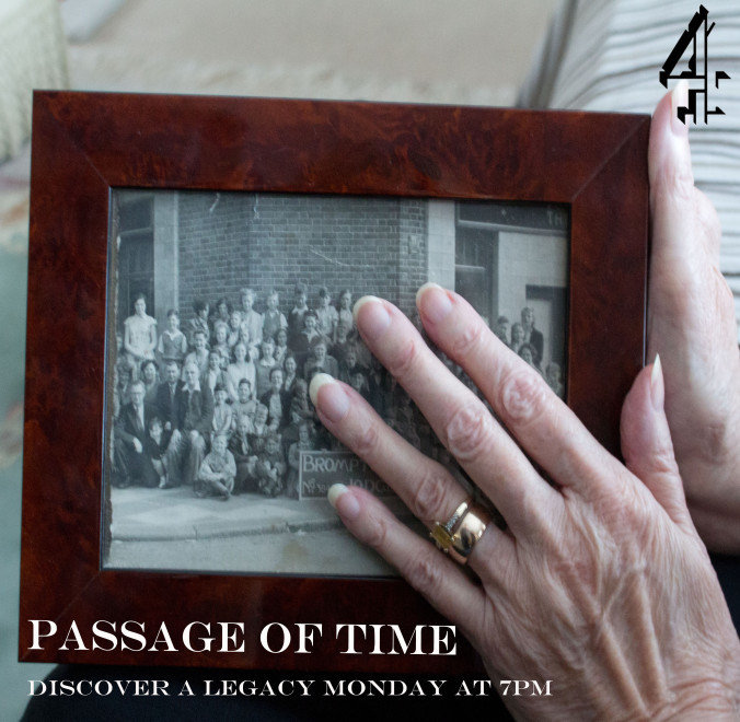
Newspaper Advertisement.
"There's something not quite right about these mock ups. I think it has something to do with the layout."
The following slides are a timeline of my newspaper advert from mock ups to the final product as well as recurring comments that I received during audience feedback which helped me change and improve my newspaper advertisement.
Mock ups.
Newspaper Advertisement.
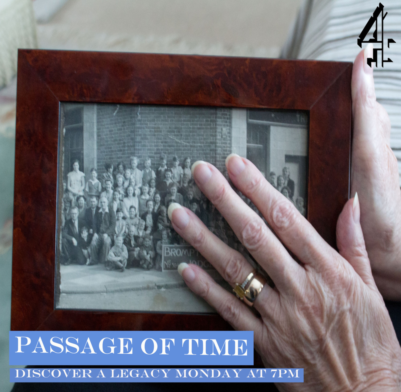
As we can see by comparing my first mock up with a real Channel 4 newspaper advertisement there are several issues regarding the layout that would need to change in order for my advert to resemble that of a real life media product. Firstly the Channel 4 logo is conventionally positioned either on the top right corner or in between the top and bottom right corner. Secondly every Channel 4 documentary advert features some form of tagline, which mine doesn't. Thirdly the title "passage of time is rather difficult to read both because of the colour like my feedback suggested but also because I used a fade effect on the text to match the image which is although conceptually good it doesn't work with the applied colour scheme with someone from my audience feedback saying that "it looks like a western" suggesting that my product is unclear which is problematic when trying to advertise a documentary as my audience needs to know what it is and when and where it is on just by looking at it; if they can't tell me those pieces of information then it is a bad advert and requires editing.
Newspaper Advertisement.
"I don't like the golden colour for the title, although it does remind me of old photo album fonts and that was apart of your concept, I feel the titles would look much better in white." As stated above my original idea was to use a golden font in order to replicate the appearance of a photo album however, after asking for feedback many disliked the font and found it to look quite sickly but at the same time mundane obviously receiving this feedback from several sources it was logical that I change the font to what appealed to my audience as at the end of the day it is marketed at them, making their opinions fundamental. Upon changing my titles to white Luke found that "the white is loads better for the titles!". After fixing the issue of font colour a convention of real Channel 4 products I realised that Channel 4 newspaper advertisements also have is having any text in boxes; usually in a pale colour. This provided me with my next task which would improve my product.
Newspaper Advertisement.
"I think the picture frame looks slightly discolored in places, I'm not sure if that was deliberate or not. Other than that though it looks like a real Channel 4 newspaper advertisement. After remedying the issue with my font and adding the blocks around my text my target audience has responded very positively towards it having only one potential flaw as some like the discoloration whereas others find it slightly off putting.
Those who liked it such as Beth found that the discoloration made the photo look older and therefore more authentic by showing the ageing photo opposed to a pristine one. In contrast Keith found that the discoloration, although slight; was "a little distracting" and would be more visually pleasing if it wasn't there. Moreover I considered both viewpoints and found that I agreed more with Beth as by leaving in the aged photo it implies that firstly that there is nothing wrong with ageing (a key theme in our documentary) as well as that we're not trying to cover anything up from our audience; a common aspect of Channel 4 documentaries.
Overall I have learnt from my audience feedback that both ancillaries fit in perfectly with the Channel 4 brand. My newspaper advert couldn't be any more conventional and my radio advert is conceptually good it is just that I'm not entirely happy with how my advert ends however, i'm not quite sure what it is that is bothering me but I feel that the end could be better.
I have also learn't that audience feedback is fundamental when producing anything as on several occasions my target audience put me back on the correct path when I would have otherwise gone astray. One example of this is when I was going to have sound bites which had swearing in them; I was blinded by my own creative ambitions that I couldn't see that not only did it not fit the ambiance of my other products but it also wouldn't be allowed before the watershed. Therefore without my audience feedback I would be making good products but for the wrong people and institutions.
Conclusion.
deck
By courj021