


Dénes Csala PRO
Assistant Professor| Blogger | Datactivist
Dr. Csala Dénes
SGPE, Crieff
11th January 2024
Assistant Professor
University of Bristol
Lancaster University
Data Visualization Expert
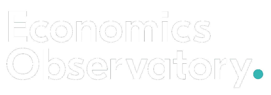
Economics Observatory
Northeastern, 2016
Sabine Kastner et al., Princeton, 2018
based on the UW CSE442 course and PARC UIR
Portrait of Herbert Simon - Richard Rappaport CC BY 3.0
Mitchell Kapor, freely quotedbased on UW CSE442
Hal Varian - Joi Ito CC BY 2.0
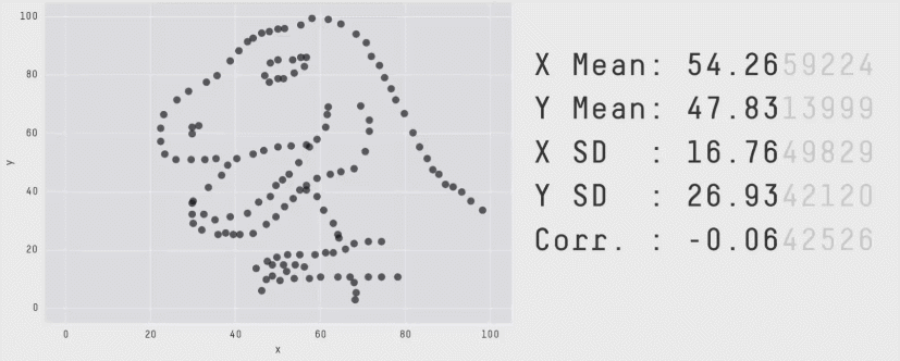
Datasaurus, Alberto Cairo, Autodesk, 2016
Allan Paivio, 1971
based on David McCandless, Information is Beautiful, 2012
based on Jacques Bertin, Sémiologie Graphique, 1967
Stanley Smith Stevens, 1957
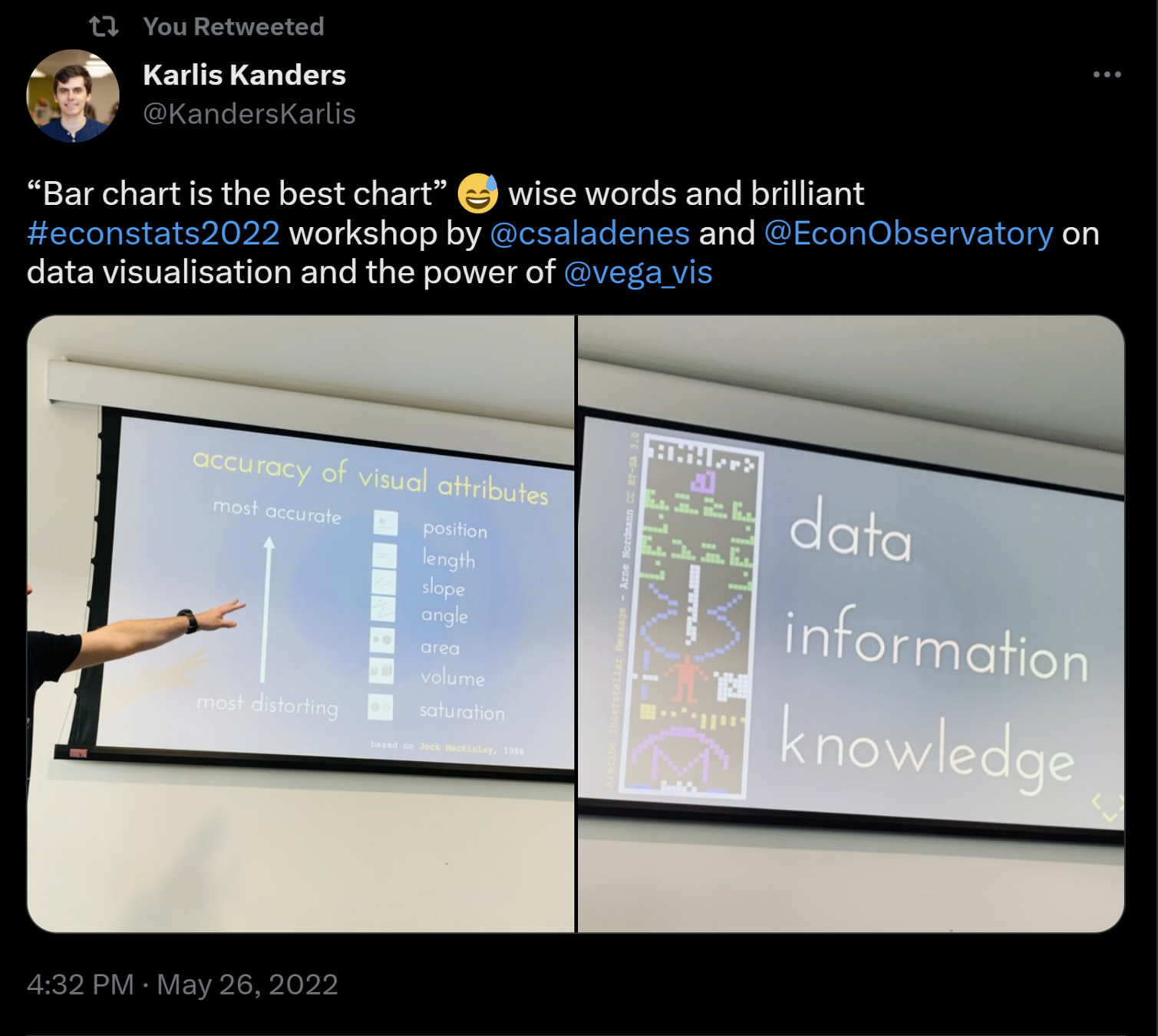
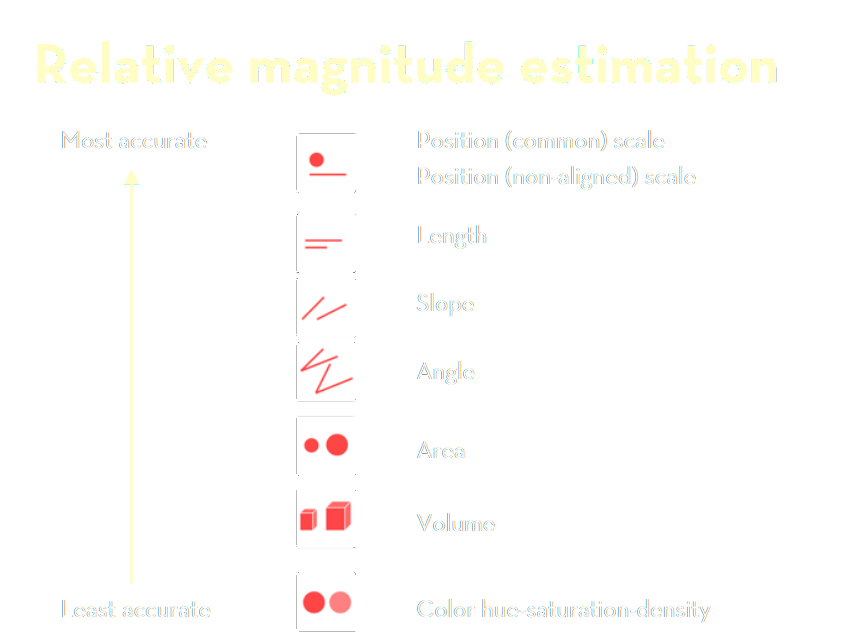
based on Jock MacKinlay, 1986
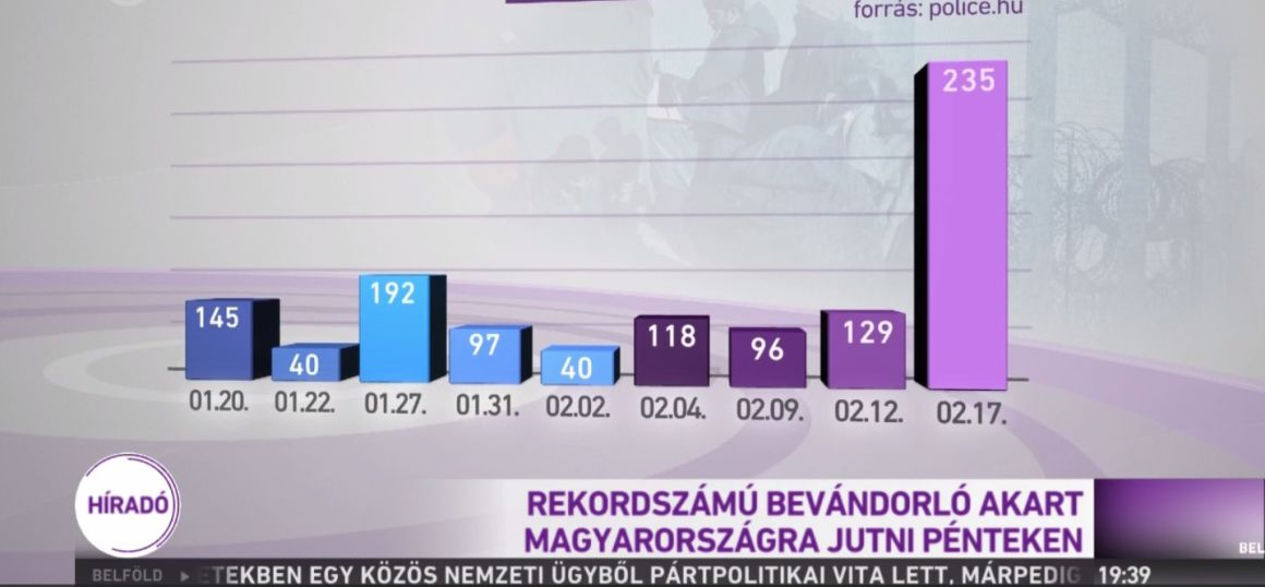
A record number of refugees attempted to to enter the country on Friday
Arecibo Interstellar Message - Arne Nordmann CC BY-SA 3.0
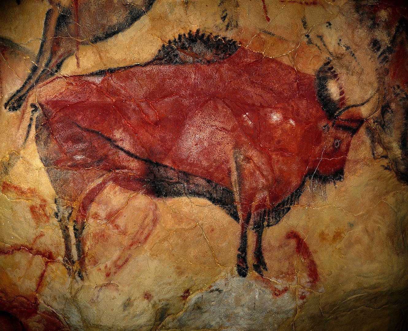
Altamira cave painting, i.e. 36 000
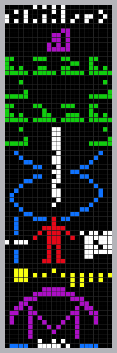
Ted Chiang, Eric Heisserer, Martine Bertrand, Stephen & Christopher Wolfram "Louise", in the alien language designed for movie Arrival, 2016 CC A-NC 4.0
Dr. Csala Dénes
SGPE, Crieff
11th January 2024
Assistant Professor
University of Bristol
Lancaster University
Data Visualization Expert
Economics Observatory
By Dénes Csala
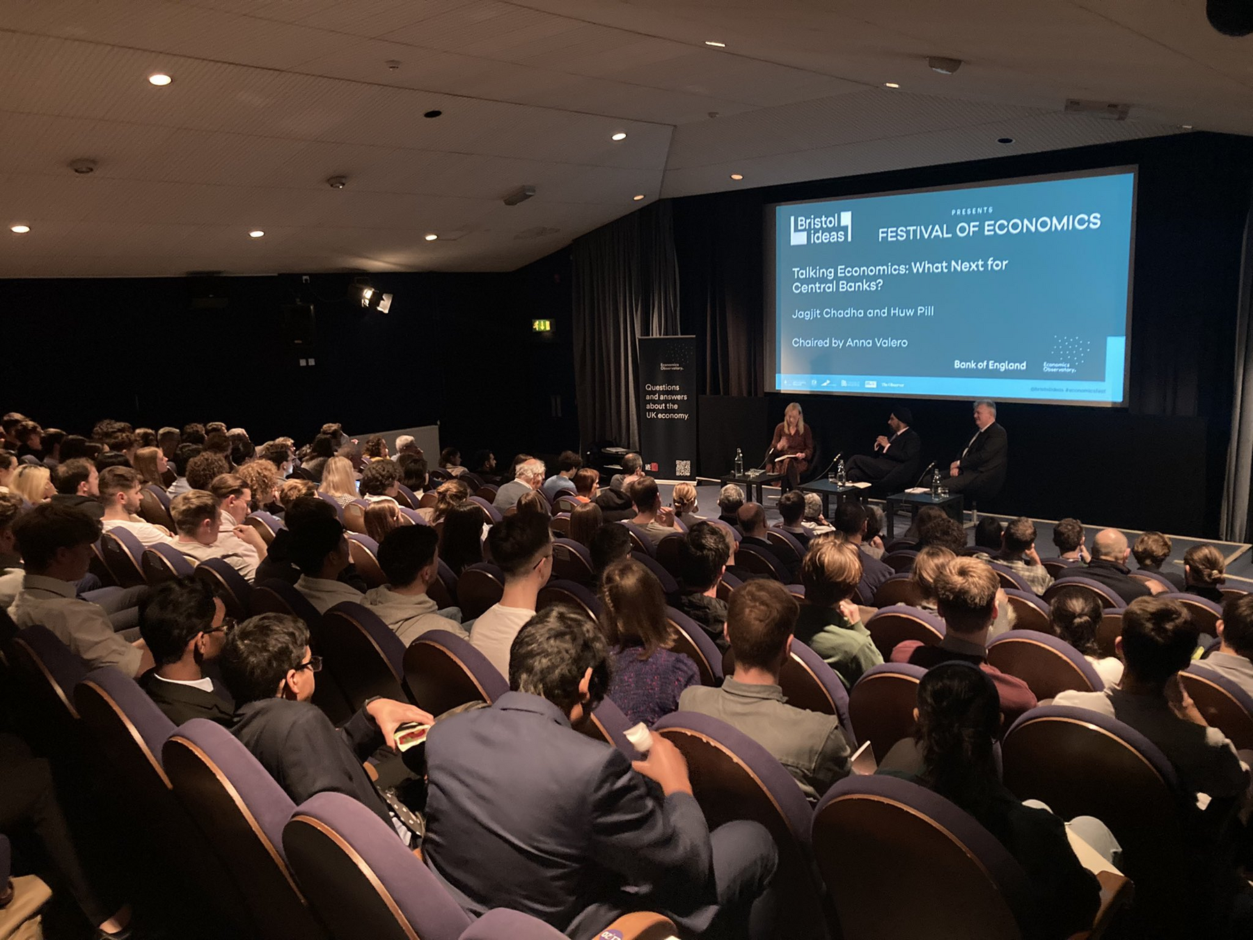
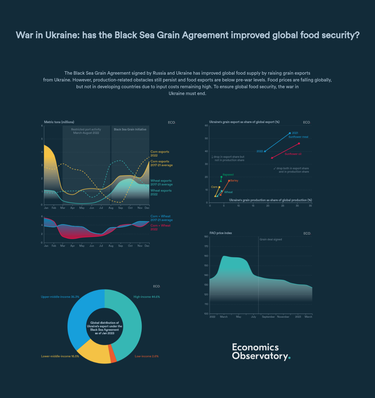
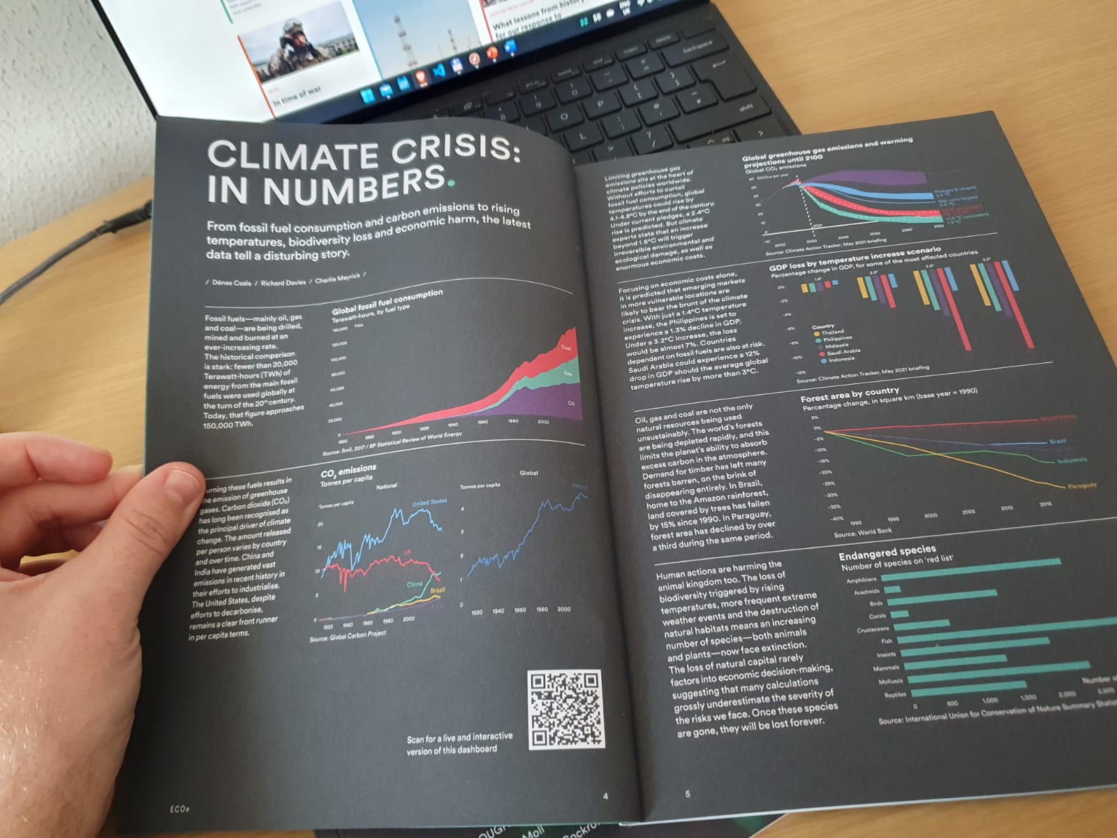
This talk presents Dénes team's experiences from the Economics Observatory, a collaborative research project in science communication that draws on the expertise of economists from a wide range of universities and research institutions across the UK and globally. It gathers and evaluates the best possible data and evidence on the challenges facing the economy and uses these as the basis for daily articles, visualizations briefings on the ECO website, social media channels, and via public facing events. They find that a blend of data and text is the best way for establishing this interface between experts and the public, rather than chart-heavy or text-only articles.


