Effective
ecommerce
design
Clear logo
Users should not be hunting for what site they are on
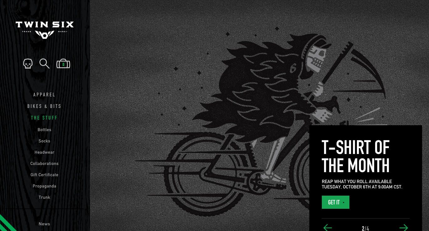
Good: Twin Six
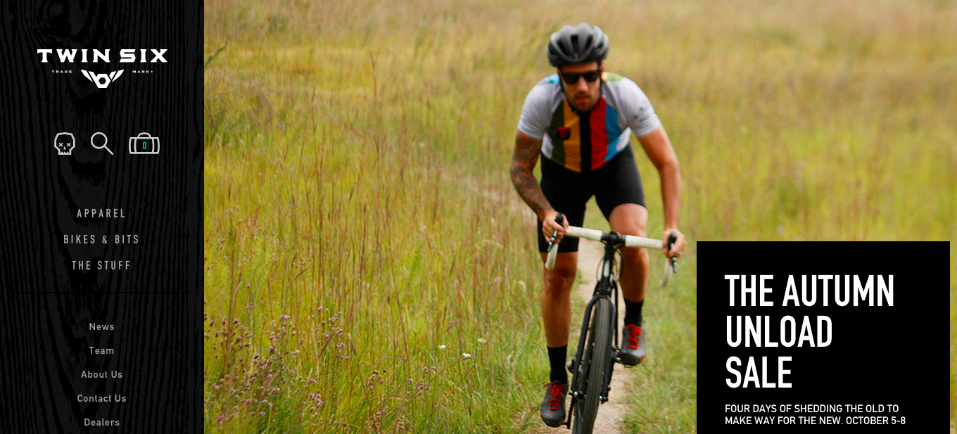
- only one logo but it does blend a bit
Bad: ThemeForest
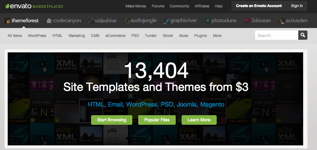
- Are we on Envato or Themeforest?
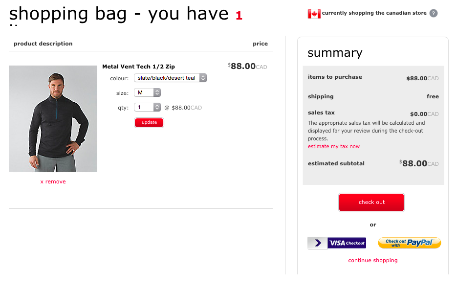
Clear Purchase Buttons
It's about clients purchasing things so don't make people hunt for the purchase button.
Make it clear and the 'highlight' colour for your site
Good: Garmin

Nice highlight colour that contrasts the rest of the design
Bad: Road Runner
Small text and blends in with header colours
Have to choose a colour to even get it
Search
If users aren't familiar with your store they need a quick way to find things
Even users that are familiar with your store may know exactly what they are looking for
Provide an obvious clear product search
Good: LuluLemon
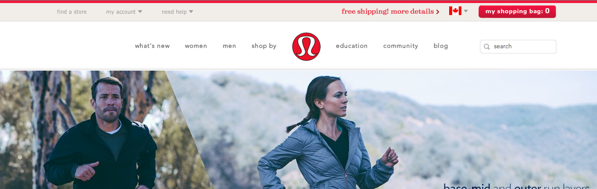
Search is right in the main navigation
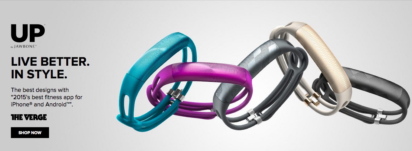
Bad: Jawbone
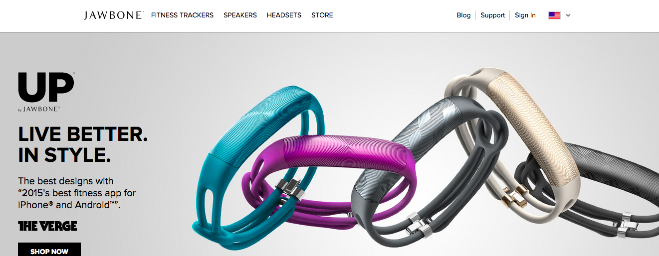
I have never found a way to search on the site
Contact Information
Provide a form, and email, and write the email out and a phone number
The point is to make it as easy as possible for your customer to contact you
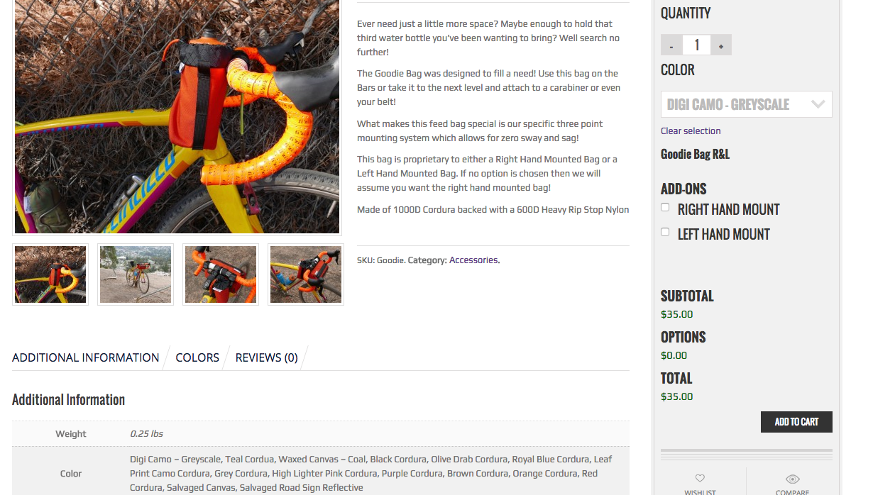
Good: Jacks Cycle
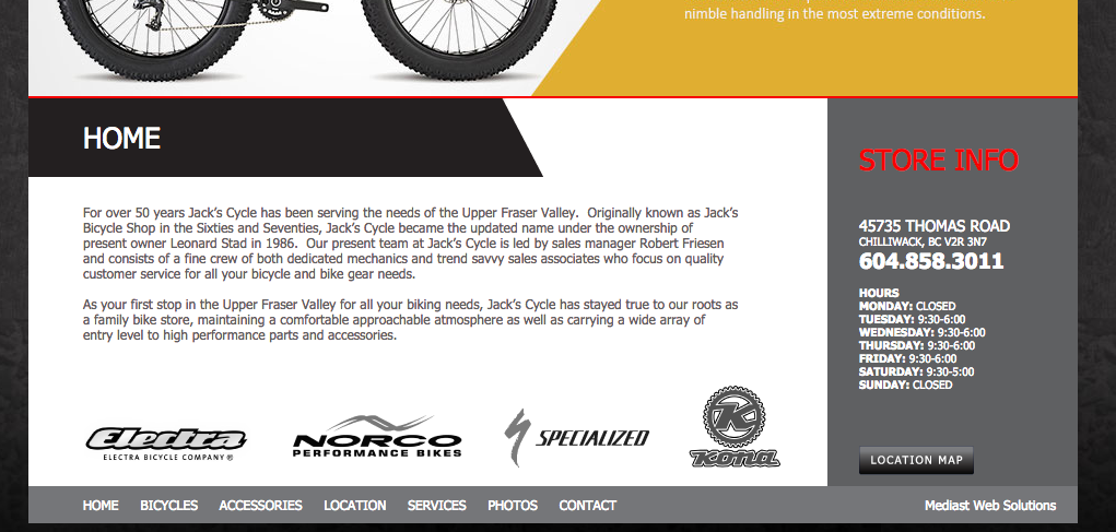
You don't ever have to go to the contact page to get all the information you could need
Bad: All Things Being Eco
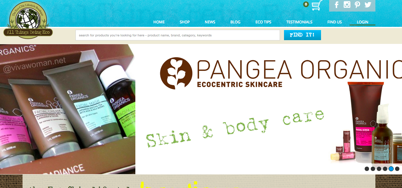
At least if you go to their contact page all the information is there
My Account/Sign in
Make it easy for returning customers to find their account
Make reordering easy
Make any account actions easy
Good: Tiger Direct
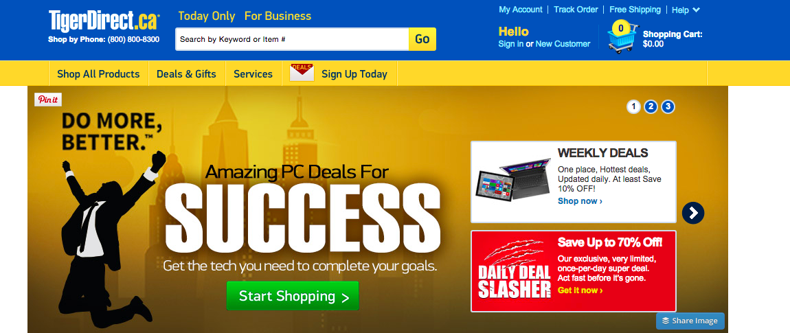
2 fairly obvious spots on the homepage to get to your account
Bad: Twin Six
No obvious way on the homepage but it used to be worse
Current Promotions
Make it easy to find current promotions
Feature one item and 2 - 4 other items
If everything is special then nothing is special
Good: JawBone
One main item and 4 sub-items lower down
Terrible: Nashbar
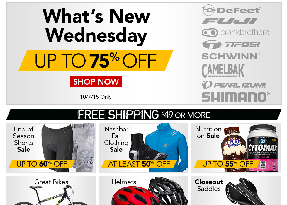
One big item
6 sub-items
and a few more things
Accepted Payment Methods
Make it easy for users to find the payment methods for your store
Show them in your footer and not microscopic
Good: Tiger Direct
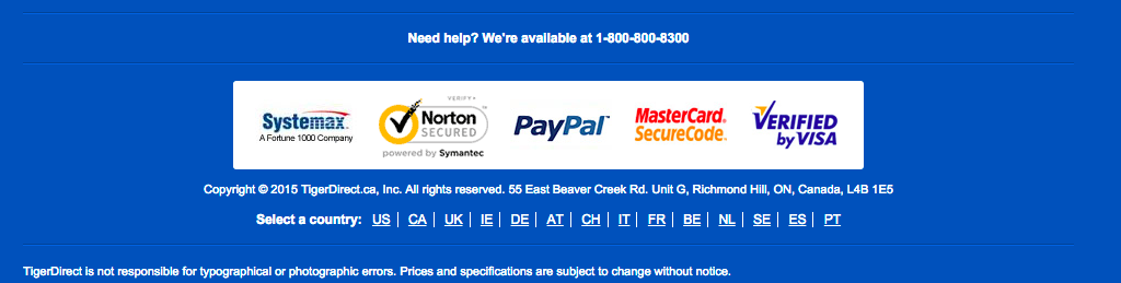
Right there we see PayPal, MasterCard and Visa accepted
bad: Lululemon
Only see it once you've got something in your cart
And do they accept major credit cards?
What about Social Media Buttons
Because we want people to share our product...right?
Of course making it easy is the goal
Everyone else has them ... right?!
Site Speed
Tracking
Social media buttons help social site track you around the web
People are very attuned to getting tracked now
Social Proof Right???
We have awesome content because people are sharing it right?
On most sites they are a vast wasteland of no clicks
Articles have 22,000 views and not a single social vote
Part of a social strategy right?
Nope but they're a good way to fool yourself
A strategy is:
- excellent content
- serious networking
- constant engagement
What about Mobile
All that speed stuff we talked about 10x
Often takes 2 clicks to activate
And they're small
And you have to enter passwords for the Web site
Increased Sharing
A number of sites have reported increased sharing when they removed social buttons
- Why I'm done with social media buttons
- Smashing Mag found increased traffic
- because people put it on their timeline
- Talon removed and saw more shares
- the lack of clicks was NEGATIVE proof
More Reading
- Why I'm done with social media buttons
- Sweep the sleaze
- Sweep the sleaze follow up
- The curious case of social buttons in eCommerce
But of course you need to A/B test
Effective eCommerce Design
By curtismchale
Effective eCommerce Design
What makes a good eCommerce site? It's more than just something pretty, it's something that converts.


