Slides for Developers
We strive to make Slides a great and flexible tool for developers. Presentations created on Slides are HTML documents under the hood, so generally anything that HTML can do, Slides can do. We make it easy to access and edit the underlying HTML and CSS through the Developer Mode.
There's also an API for creating new presentations with preset content, called the Define API.
For external REST and MCP API docs, see API Documentation.
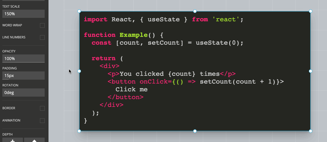
Syntax Highlighted Code
Slides is the best presentation tool out there when it comes to presenting and showing code. Highlighting is provided for all common languages and you can pick from multiple different highlight themes.
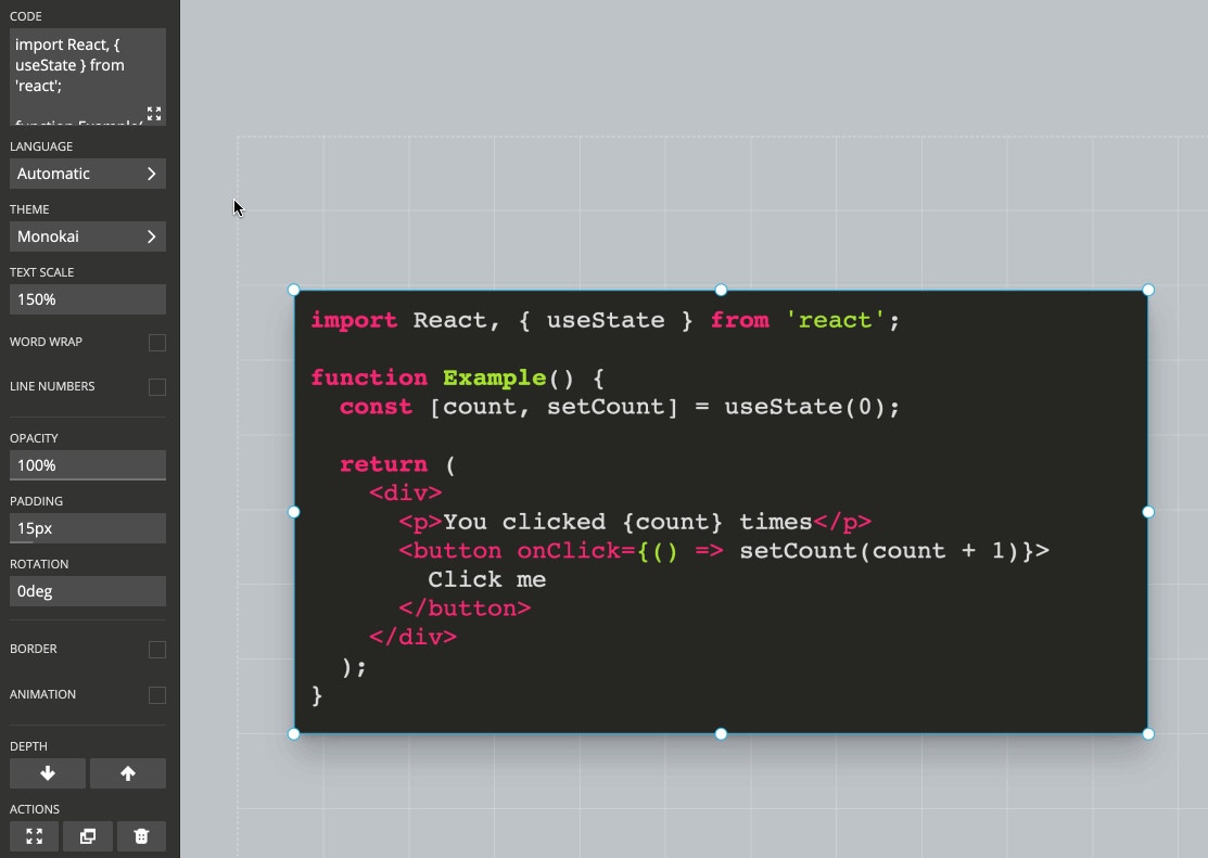
Line Highlights
You can emphasize specific lines of code to direct the audience's attention. Multiple code highlight steps can be added and stepped through for the same code block. An empty highlight step means that no code is highlighted.
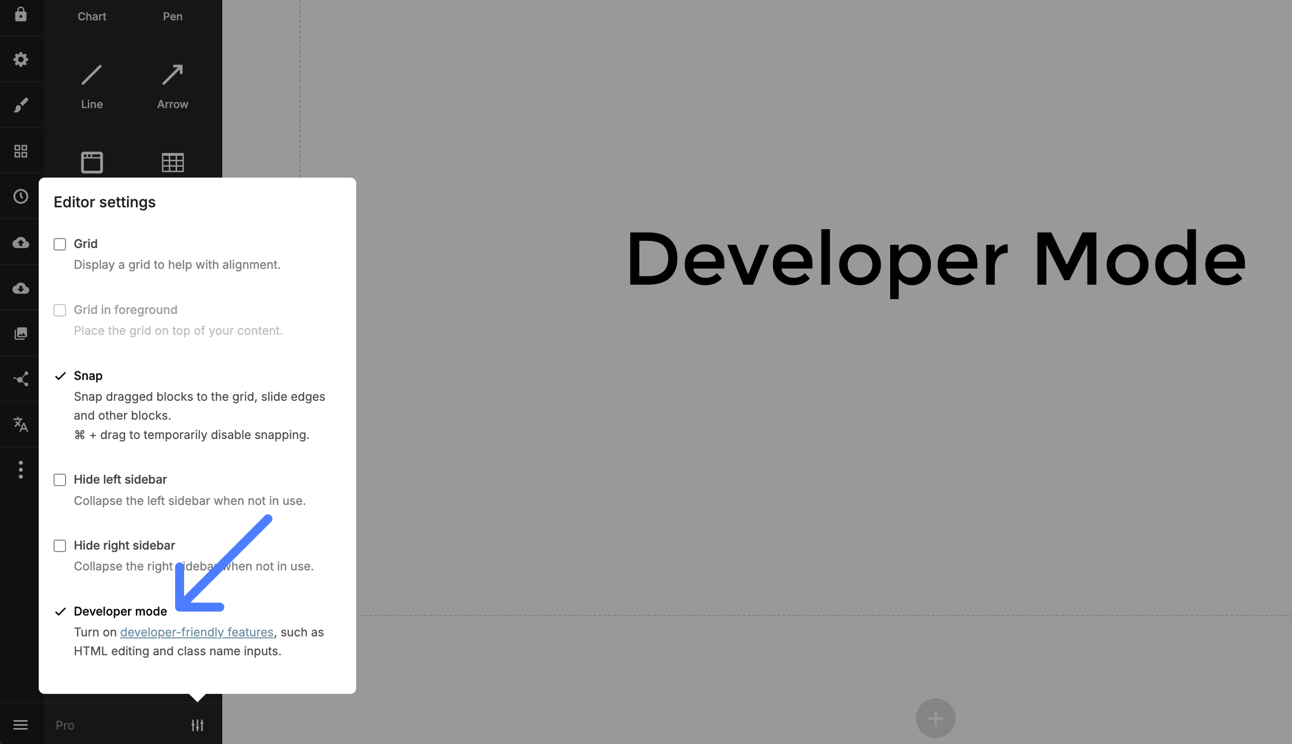
Developer Mode
The Slides editor has a developer mode which is useful if you know a bit of HTML and CSS. With this mode active you will be able to modify the underlying HTML of your deck, allowing you to make adjustments that the Slides editor does not provide interface options for.
To enable the developer mode open the editor settings in the bottom left corner:
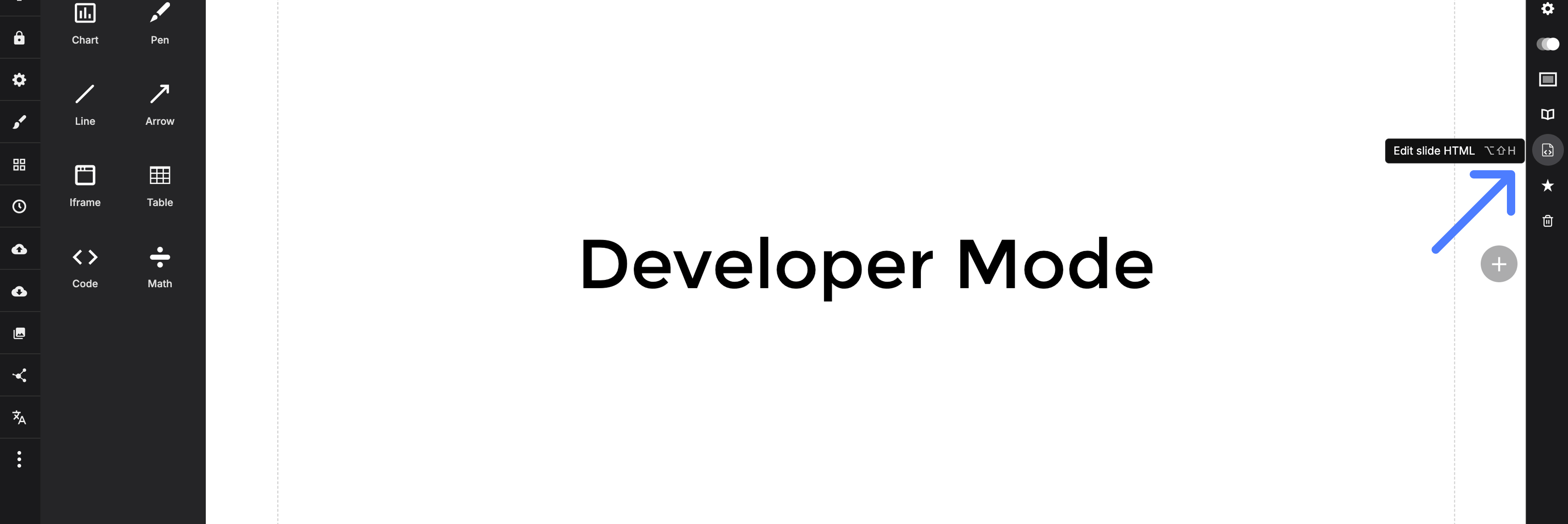
Editing HTML
The per-slide HTML editor can be accessed from the slide options area. It gives you raw access to the current slide's HTML, allowing you to change anything you like. Note that some elements, such as <script> and <link>, are not allowed for security reasons.
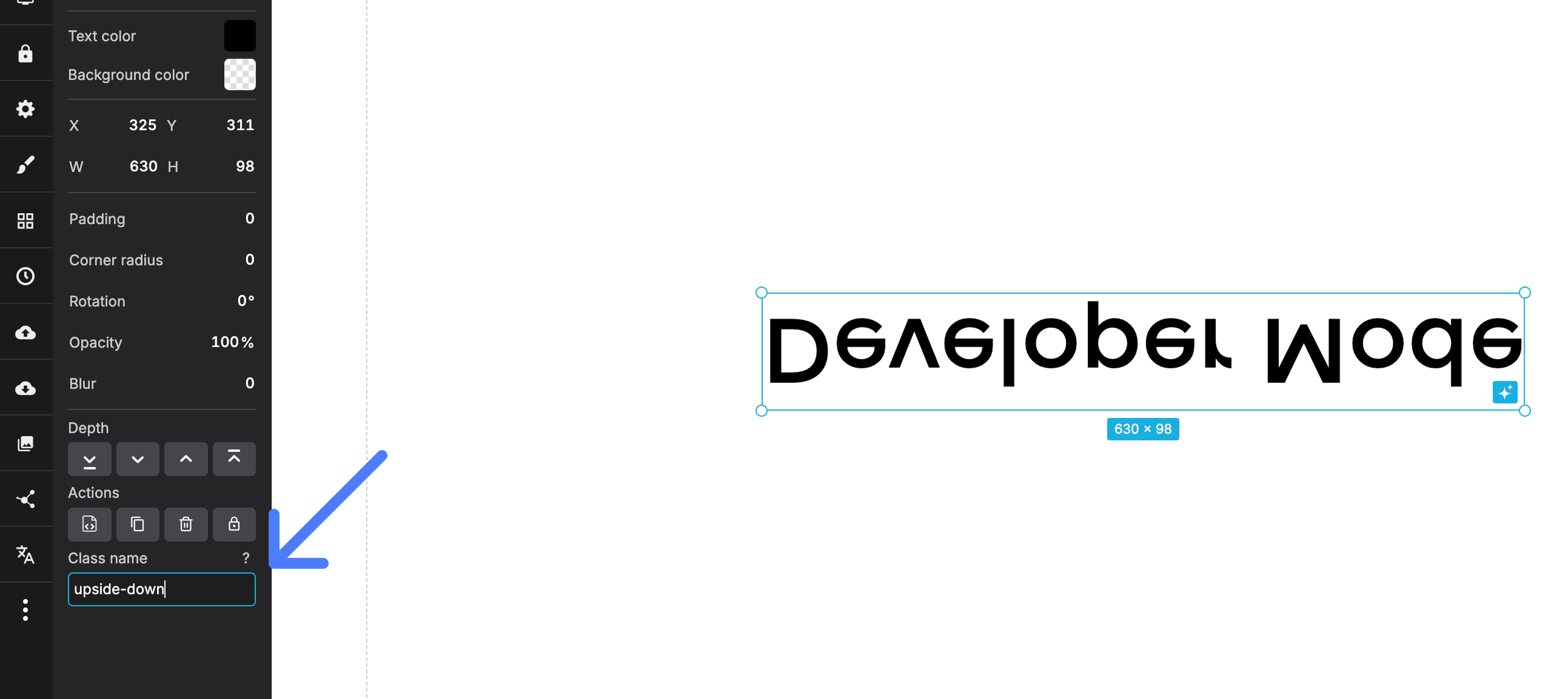
Element Classes
Requires ProAs a paying Slides customer you have access to the CSS editor which allows you to add custom styles to your deck. By turning on the developer mode a new "class name" field will appear for any block that you focus. This allows you to easily target a specific element with your CSS.
Here's an example that defines an "upside-down" class using custom CSS and applies it to a text block.
.upside-down {
    transform: scale( 1, -1 );
}
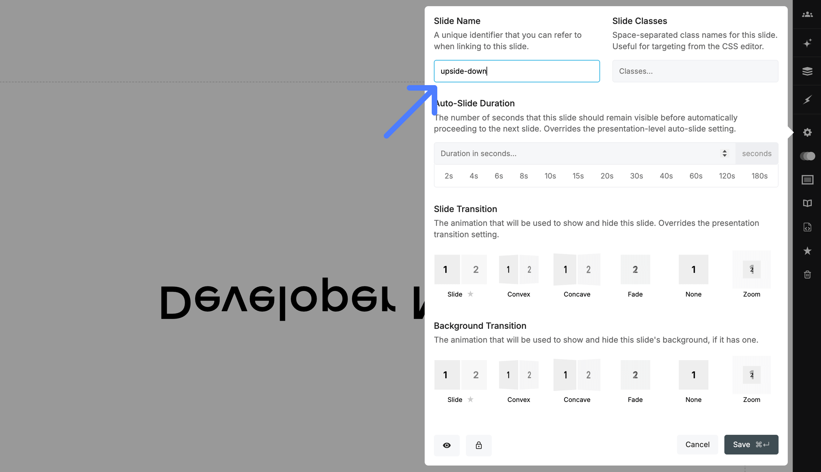
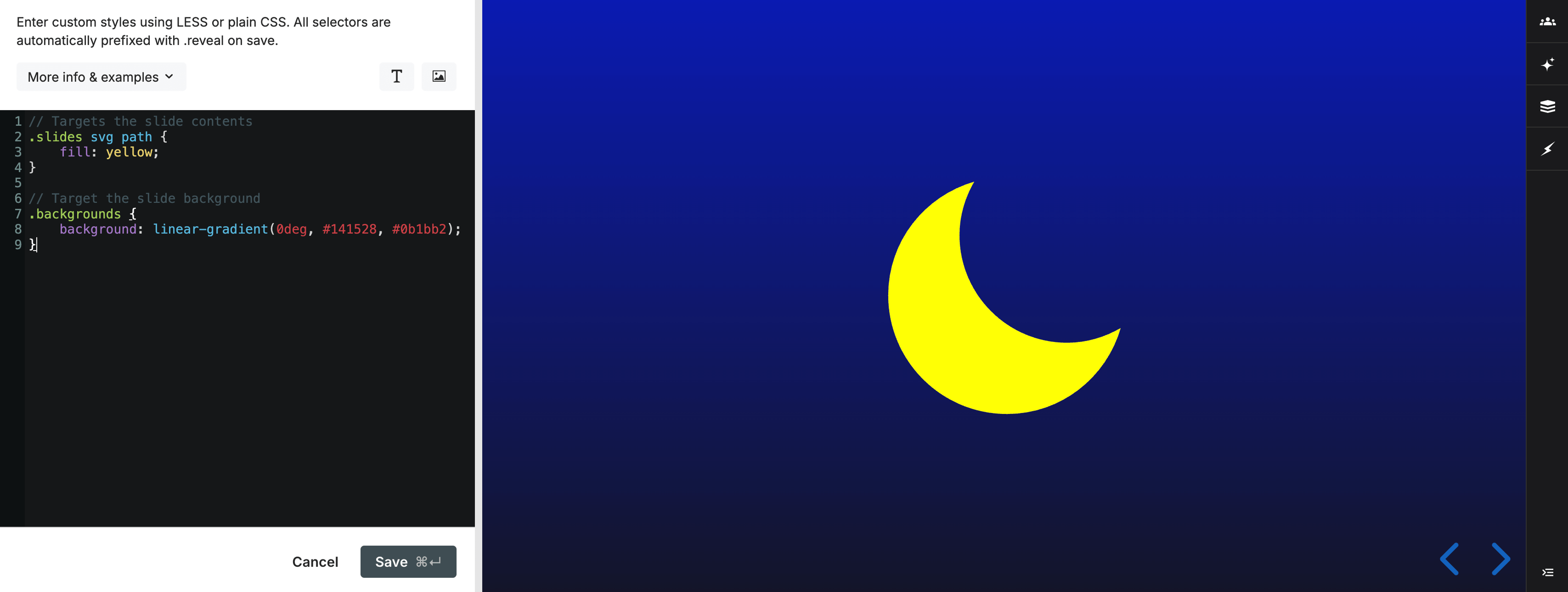
Slide Classes
Requires ProJust like you can add custom classes to individual elements it's also possible to add custom classes at the slide level. This can used to apply broader changes to the whole slide like inverting text and icon colors or changing the slide transition.
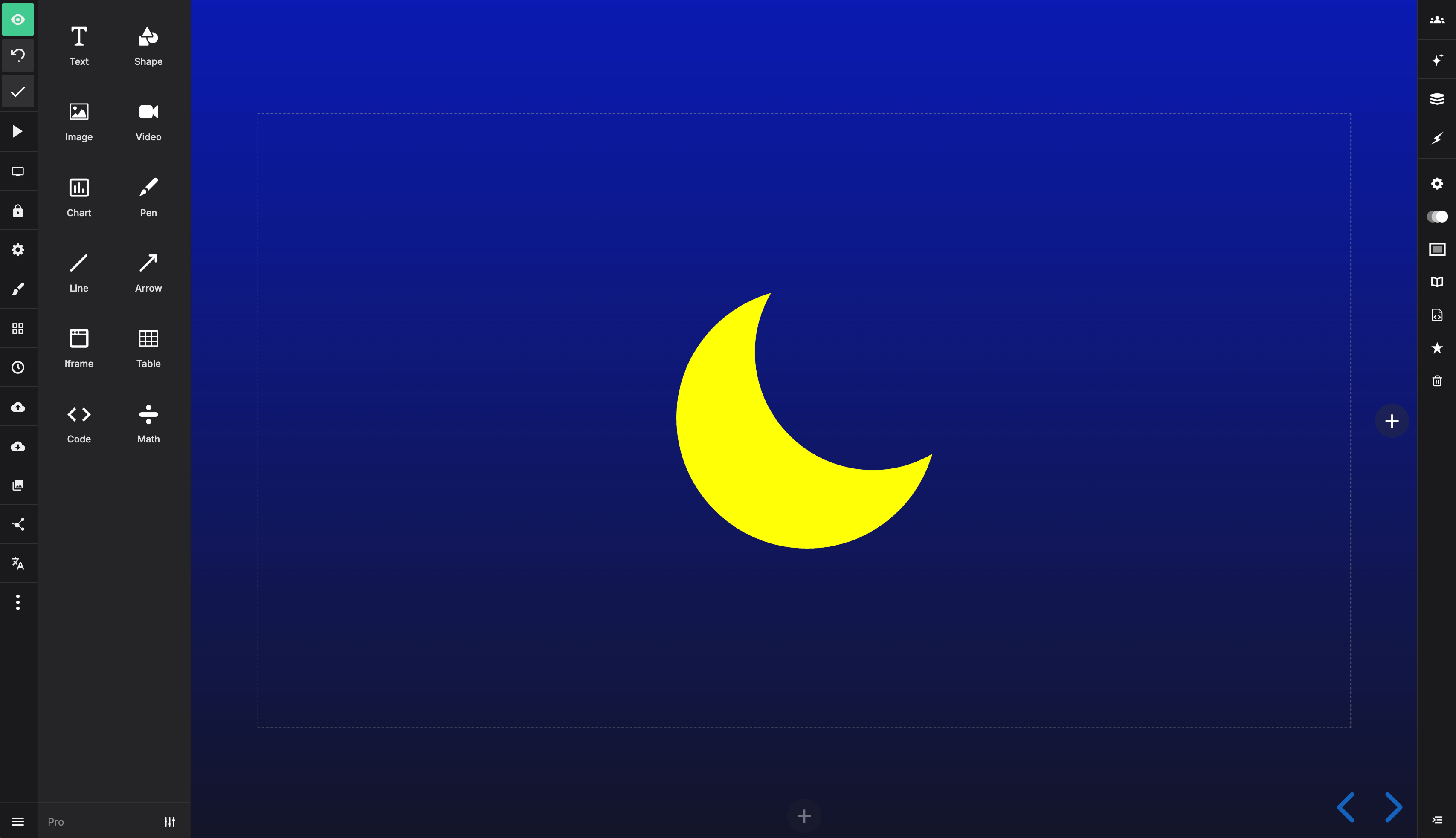
Under the hood the slide background element is separate from the slide itself. Here are two examples showing how you'd target the slide contents or slide background using a custom class called "night-sky":
// Targets the slide contents
.slides .night-sky svg path {
    fill: yellow;
}

// Target the slide background
.backgrounds .night-sky {
    background: linear-gradient(0deg, #141528, #0b1bb2);
}
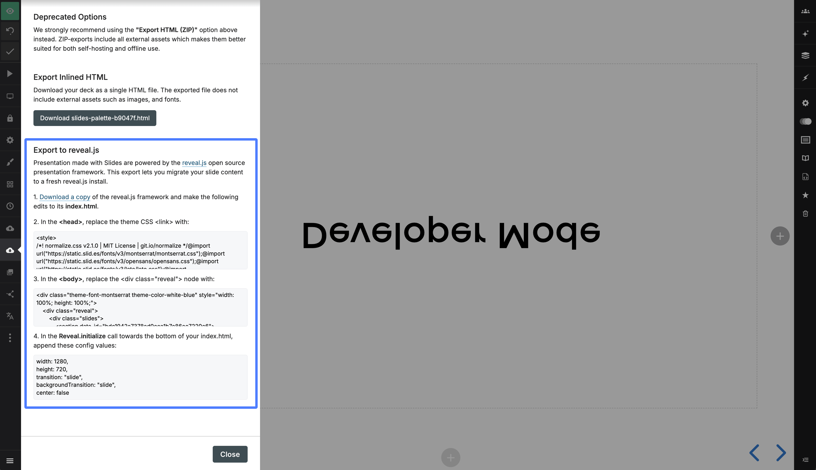
Export HTML
You can access the complete HTML for all slides in your deck inside of the export panel, under "Export to reveal.js". This provides a way of exporting your deck markup and the core Slides styles to reveal.js. There are a few limitations with exporting this way but it should provide a good starting point.
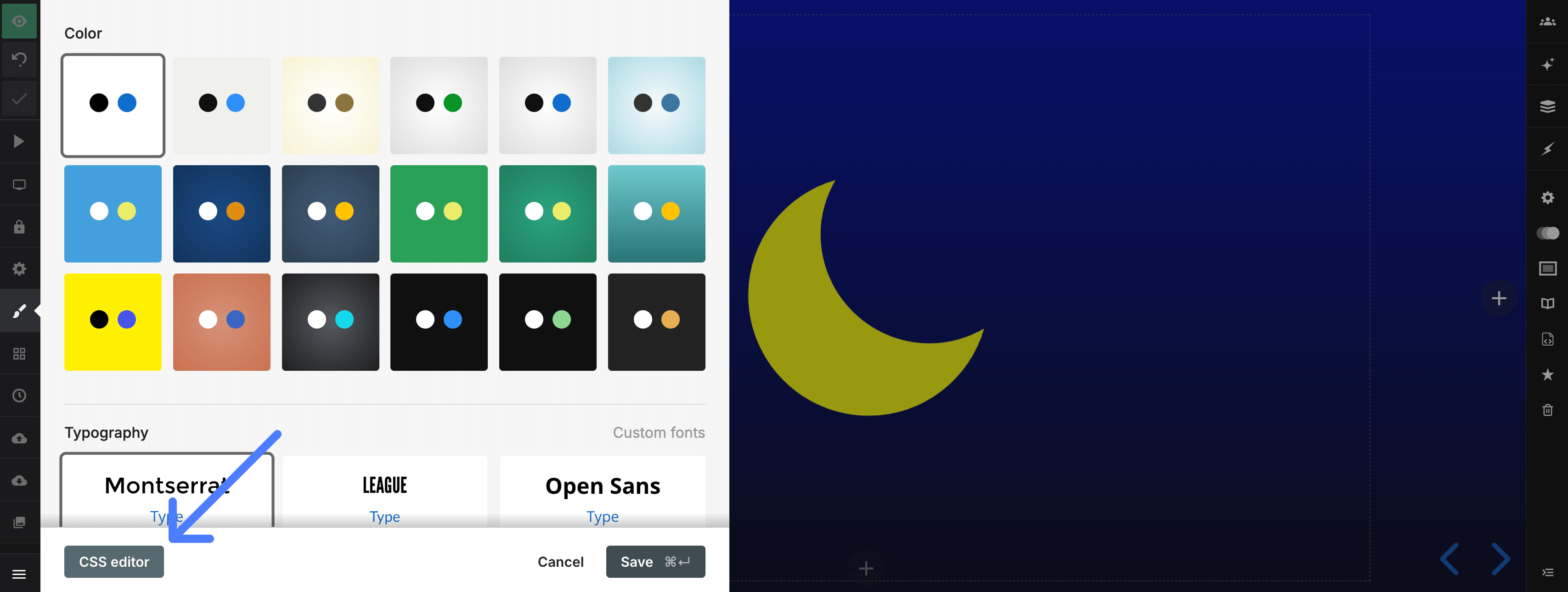
CSS Editor
Requires ProThe CSS editor lets you author custom styles for your presentation with a real-time preview of the result. It's available as an option inside of the Style panel of the presentation editor.
The editor preprocesses styles using LESS, though you're free to write plain CSS as well. We apply the styles in real-time as you type so there's no need to leave the editor or even press a refresh button to see what you're getting. Note that when your styles are saved they will be automatically wrapped in a ".reveal {}" selector to avoid conflicts with other page styles.
Custom Fonts
You can load custom fonts from Typekit and Google fonts and apply them using custom CSS. Find out more.
Developer Mode
If you turn on the developer mode you can also add custom classes to any focused element. This is a convenient way to easily apply your CSS to specific elements.
Examples
// Change presentation progress bar color
.progress span {
  background: #ff0000;
}

// Change control arrow color
.controls button {
  color: #ff0000;
}

// Change presentation background
& {
  background: #a83239;
}

// Change color of body text
.slides {
  color: #009999;
}

// Turn text white if the slide has a dark background
.has-dark-background {
  color: #ffffff;
}

// Larger slide numbers (if slide numbers are enabled for the deck)
.slide-number {
  font-size: 20px;
}

// Add a blue border to all slides (each slide is a <section>)
.slides section {
  outline: 1px solid blue;
}

// Add a red border to all vertical stacks of slides
.slides section.stack {
  outline: 1px solid red;
}

// Include a custom font
@font-face {
  font-family: "Cabin Sketch";
  src: url("https://static.slid.es/fonts/cabinsketch/cabinsketch-regular.woff") format("woff")
}

.slides h1, .slides h2, .slides h3 {
  font-family: "Cabin Sketch";
}
Here's where you can access the CSS editor from inside of the Style panel:
A screenshot of the editor:
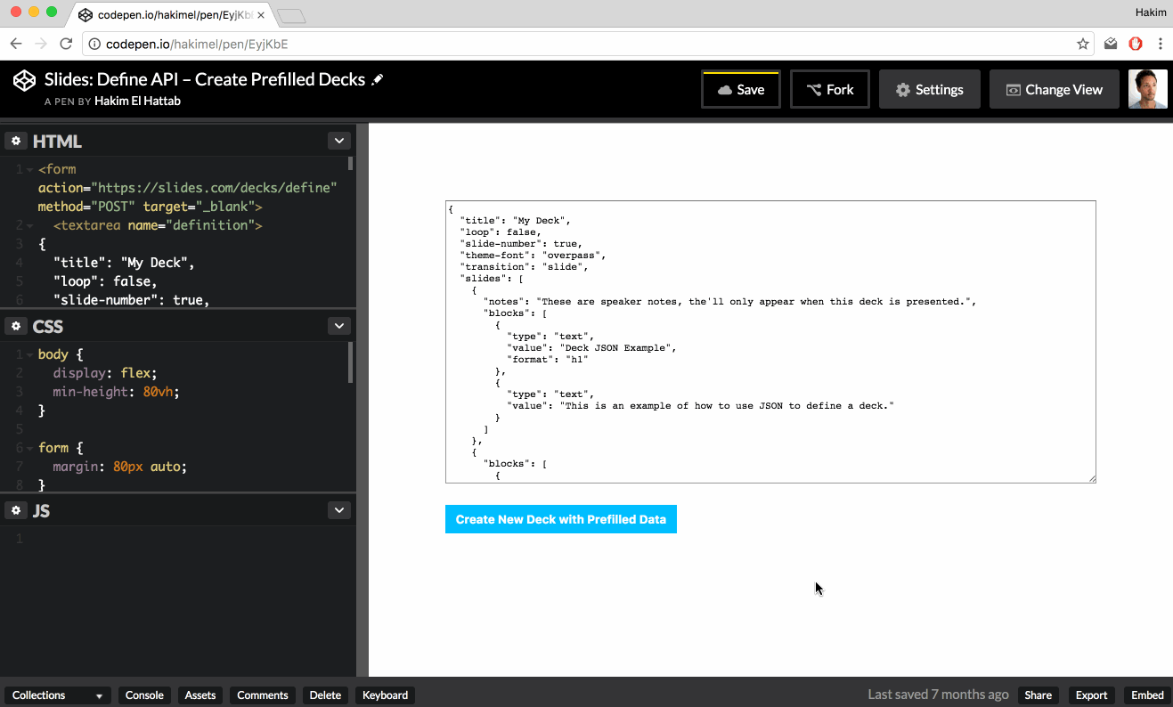
Define API: Create Prefilled Decks
BetaThe define API lets you create a presentation programatically and add it to the current user's Slides account. Presentations you create can include any of the content types that the Slides editor supports. You can even include live data from other sites via iframes.
For example, if you operate a web-based charting service, you can let your users create a presentation containing their fully interactive charts at the click of a button.
If the user isn't already signed in to Slides, they will automatically be prompted to authenticate or sign up. Once signed in, they are able to review the deck and confirm that they want to save it to their account. Here's what that process looks like:
The Request
To start the process you'll need to have the user submit an HTML form towards the http://slides.com/decks/define endpoint. The form needs to contain an input field with the name definition and the value of this input should be the JSON representation of a deck. Once the form is submitted, we'll automatically redirect the user to the appropriate page.
| Request Method | POST |
| Request URL | https://slides.com/decks/define |
| Request Payload | definition: DECK_JSON_HERE |
Here's a fully working example:
JSON Examples
Here's the bare minimum JSON you'll need to describe a deck.
{
  "title": "My Deck",
  "slides": [
    { "html": "<h1>Slide 1</h1>" },
    { "html": "<h1>Slide 2</h1>" }
  ]
}
If you want to group multiple slides into one vertical stack you can nest them in an array:
{
  "title": "My Deck",
  "slides": [
    { "markdown": "# Slide 1" },
    [
        { "markdown": "# Vertical Slide 2.1" },
        { "markdown": "# Vertical Slide 2.2" }
    ],
    { "markdown": "# Slide 3" }
  ]
}
The following JSON demonstrates most of the available options.
Note that there are three different ways to define slide content, blocks, HTML and Markdown. The benefit of using content blocks is that the elements you define are separately editable inside of the Slides editor. If you specify content as a string of HTML or Markdown, it will all be grouped into one element and edited as a text box.
{
  "title": "My Deck",
  "description": "Description of My Deck.",
  "width": 1024,
  "height": 576,
  "auto-slide-interval": 0,
  "slide-number": false,
  "loop": false,
  "theme-color": "white",
  "theme-font": "overpass",
  "transition": "slide",
  "slides": [
    {
      "id": "an-optional-slide-id",
      "background-color": "#cccccc",
      "background-image": "https://static.slid.es/images/screenshots/v1/slides-homepage-1440x900.png",
      "background-size": "cover",
      "notes": "My speaker notes",
      "blocks": [
        {
          "type": "text",
          "value": "Hello world!",
          "format": "h2"
        },
        {
          "type": "image",
          "value": "https://static.slid.es/images/screenshots/v1/slides-homepage-1440x900.png"
        },
        {
          "type": "iframe",
          "value": "https://slides.com/news/make-better-presentations/embed"
        },
        {
          "type": "table",
          "data": [
              ["A","B","C"],
              [ 1,  2,  3 ]
          ]
        }
      ]
    },
    {
      "background-image": "https://static.slid.es/images/screenshots/v1/slides-homepage-1440x900.png"
    },
    {
      "html": "<h1>HTML Slide</h1>"
    },
    {
      "markdown": "**Markdown** slide! <https://daringfireball.net/projects/markdown/syntax>"
    }
  ]
}
JSON Spec
Deck Properties
| Deck property | Description | ||||||||||||||||||||||||||
|---|---|---|---|---|---|---|---|---|---|---|---|---|---|---|---|---|---|---|---|---|---|---|---|---|---|---|---|
| title | The title of the presentation. Appears anywhere the deck is listed on slides.com. | ||||||||||||||||||||||||||
| description | A short description of the presentation. Appears anywhere the deck is listed on slides.com. | ||||||||||||||||||||||||||
| width | The presentation width in pixels. Defaults to 960. We automatically scale content up or down to fit any display. | ||||||||||||||||||||||||||
| height | The presentation height in pixels. Defaults to 700. We automatically scale content up or down to fit any display. | ||||||||||||||||||||||||||
| visibility |
Determines who this deck is visible to.
|
||||||||||||||||||||||||||
| auto-slide-interval | Optionally make the presentation auto-slide. This value is defined in milliseconds and defaults to 0 (no autosliding). | ||||||||||||||||||||||||||
| slide-number | Flags if a slide number should show the current slide number when viewing the presentations. False by default. | ||||||||||||||||||||||||||
| loop | Flags if the last slide of the presentation should loop back to the first. False by default. | ||||||||||||||||||||||||||
| css | Additional CSS to include in the presentation. Learn more about custom CSS. | ||||||||||||||||||||||||||
| theme-id | The ID of a theme to apply to the presentation. This theme must be owned by the team the signed in user are a member of. If this value is not provided, the default theme is used. | ||||||||||||||||||||||||||
| theme-color |
Presentation color. Available options:
|
||||||||||||||||||||||||||
| theme-font |
Presentation fonts. Open the Slides editor "Style" panel for previews. Available options:
|
||||||||||||||||||||||||||
| transition |
The transition to use when moving between slides.
|
||||||||||||||||||||||||||
| slides |
Each record in this array represents a slide. You can group multiple slides in a nested array to create vertical stacks, like this:
|
Slide Properties
| Slide property | Description | ||||||
|---|---|---|---|---|---|---|---|
| id | A unique identifier for the slide. This id can be used used for internal links. Should only contain alphanumerics, dashes, and underscores. | ||||||
| background-color |
Slide background color. Supports all CSS color formats, like red or #ff0000.
|
||||||
| background-image | URL to a background image. Supported formats: JPG, PNG, GIF and SVG. | ||||||
| background-size |
Controls the sizing of a background image. Options:
|
||||||
| notes | Plain text speaker notes that will appear when presenting this deck. Maximum length is 10000 characters. | ||||||
| html | Custom HTML that should be added to the slide. The HTML will be placed into a content block and centered on the slide. Note that we strip out all scripts, style tags and external stylesheets. | ||||||
| markdown | Markdown content that should be added to the slide. The HTML output will be placed in a content block and centered on the slide. | ||||||
| blocks | An array of content blocks. Blocks are automatically placed in a column at the center of the page. | ||||||
| auto-animate | Enables automatic animations between this slide and adjacent slides with the same property set. Elements are automatically matched and animated based on their content and position. See reveal.js Auto-Animate documentation for more details. | ||||||
| auto-animate-easing |
CSS easing function for auto-animate transitions on this slide (e.g., ease, ease-in-out, cubic-bezier()).
|
||||||
| auto-animate-duration | Duration of auto-animate transitions in seconds. | ||||||
| auto-animate-unmatched |
Determines whether elements with no matching auto-animate target should fade in. Set to false to make them appear instantly. Defaults to true.
|
||||||
| auto-animate-restart |
When set to true, prevents auto-animation between the previous slide and this one, effectively starting a new auto-animate sequence.
|
Block Properties
Properties available for all content blocks.
| Block property | Description | ||||||||||||||||||||||
|---|---|---|---|---|---|---|---|---|---|---|---|---|---|---|---|---|---|---|---|---|---|---|---|
| type |
The type of content you want to insert.
|
||||||||||||||||||||||
| x | The horizontal position of the block in pixels. If this value is not defined, we will automatically place it at the center of the slide. | ||||||||||||||||||||||
| y | The vertical position of the block in pixels. If this value is not defined, we will automatically place it at the center of the slide. | ||||||||||||||||||||||
| z | The z-index (layer depth) of the block. Higher values appear on top of lower values. | ||||||||||||||||||||||
| width | The width of the content block in pixels. | ||||||||||||||||||||||
| height | The height of the content block in pixels. Note that some blocks, like text, ignore this value since height is based on how tall the content is. | ||||||||||||||||||||||
| class | A class name to apply to the underlying HTML element for targeting with custom styles. Must be a valid CSS class name. | ||||||||||||||||||||||
| data |
An object of key-value pairs to add as data attributes to the underlying HTML element. For example:
data-foo="bar" to the underlying HTML element.
|
||||||||||||||||||||||
| animation-type |
Adds an animation to the content block.
|
||||||||||||||||||||||
| animation-trigger |
Determines which interaction that will trigger the animation. Has no effect unless animation-type is set.
|
||||||||||||||||||||||
| animation-duration | The number of seconds that the animation should run for. | ||||||||||||||||||||||
| animation-delay | The number of seconds to wait before running the animation. | ||||||||||||||||||||||
| rotation | The rotation angle of the block in degrees. | ||||||||||||||||||||||
| align-content | CSS align-content property for controlling content alignment within the block. | ||||||||||||||||||||||
| border-color |
Border color. Supports all CSS color formats, like red or #ff0000.
|
||||||||||||||||||||||
| border-width | Border width in pixels. | ||||||||||||||||||||||
| border-style |
Border style: solid, dashed, dotted, etc.
|
||||||||||||||||||||||
| border-radius | Border radius in pixels for rounded corners. | ||||||||||||||||||||||
| auto-animate-delay | Delay in seconds before auto-animate transitions for this block. | ||||||||||||||||||||||
| auto-animate-duration | Duration in seconds of auto-animate transitions for this block. | ||||||||||||||||||||||
| auto-animate-easing |
CSS easing function for auto-animate transitions (e.g., ease, linear, ease-in-out).
|
||||||||||||||||||||||
| mix-blend-mode |
CSS mix-blend-mode property for controlling how the block blends with content below it (e.g., multiply, screen, overlay).
|
||||||||||||||||||||||
| locked | Whether the block is locked from editing. | ||||||||||||||||||||||
| flip-x | Whether to flip the block horizontally. | ||||||||||||||||||||||
| flip-y | Whether to flip the block vertically. | ||||||||||||||||||||||
| blur-radius | Blur filter radius in pixels. | ||||||||||||||||||||||
| drop-shadow-x | Horizontal offset of drop shadow in pixels. | ||||||||||||||||||||||
| drop-shadow-y | Vertical offset of drop shadow in pixels. | ||||||||||||||||||||||
| drop-shadow-radius | Blur radius of drop shadow in pixels. | ||||||||||||||||||||||
| drop-shadow-color |
Color of drop shadow. Supports all CSS color formats, like red or #ff0000.
|
||||||||||||||||||||||
| link | URL to link the block to. When clicked, the block will navigate to this URL. |
Text block
Properties available for the text content block.
| Text block property | Description | ||||||||||||
|---|---|---|---|---|---|---|---|---|---|---|---|---|---|
| value | The string of text to insert. | ||||||||||||
| format |
The text format, defined as one of the following HTML tags:
If no format is specified, we pick a good default based on what other blocks there are on the slide. For example, if you have two text blocks we'll use an h1 for the first block and h2 for the second. |
||||||||||||
| align | Left, center, right or justify. | ||||||||||||
| padding | The number of pixels to leave empty around the text. | ||||||||||||
| color |
The color of table text. Supports all CSS color formats, like red or #ff0000.
|
||||||||||||
| font-size |
The size of text as a percentage of the default size. For example, 150%.
|
||||||||||||
| text-layout |
Controls text layout behavior.
|
||||||||||||
| auto-fit-text | Whether to automatically scale text to fit within the block. | ||||||||||||
| align-content | Controls the vertical alignment of text within a text block with a fixed text layout: start (top), center, or end (bottom). |
Image block
Properties available for the image content block.
| Image block property | Description |
|---|---|
| value | The URL of the image to insert. We support JPG, PNG, GIF and SVG. |
| alt | Alternative text for the image for accessibility purposes. |
Iframe block
Properties available for the iframe content block.
| Iframe block property | Description |
|---|---|
| value | The HTTPS URL of the web page to embed. |
Code block
Properties available for the code content block.
| Code block property | Description | ||||||||||||||||||||||||||||||||||||
|---|---|---|---|---|---|---|---|---|---|---|---|---|---|---|---|---|---|---|---|---|---|---|---|---|---|---|---|---|---|---|---|---|---|---|---|---|---|
| value | Code to syntax highlight. | ||||||||||||||||||||||||||||||||||||
| language |
The language of the code. We use highlight.js for syntax highlighting, you can see which languages they support at highlightjs.org/static/demo. If no language is specified, highlight.js will automatically try to determine what language it is. |
||||||||||||||||||||||||||||||||||||
| word-wrap | Flags if a code should wrap to new lines. False by default. | ||||||||||||||||||||||||||||||||||||
| line-numbers |
Controls line number visibility and code highlights.
|
||||||||||||||||||||||||||||||||||||
| theme |
The theme to use for syntax highlighting. We support the following themes:
|
||||||||||||||||||||||||||||||||||||
| font-size | The size of code text in pixels. | ||||||||||||||||||||||||||||||||||||
| frame |
Frame style for the code block.
|
||||||||||||||||||||||||||||||||||||
| autoheight | Whether the code block should automatically adjust its height to fit the content. |
Table block
Properties available for the table content block.
| Table block property | Description |
|---|---|
| data |
Table data in a multidimensional array. Here's an example data set:
|
| padding | Controls the empty spacing around each table cell. |
| text-color |
The text color. Supports all CSS color formats, like red or #ff0000.
|
| border-width | The size of the table border in pixels. |
| border-color |
Color of the table border. Supports all CSS color formats, like red or #ff0000.
|
Video block
Properties available for the video content block.
| Video block property | Description |
|---|---|
| value | The URL of the video file to embed. |
| controls | Whether to display video playback controls. Default is true. |
| autoplay | Whether the video should automatically start playing. |
| muted | Whether the video should be muted by default. |
| loop | Whether the video should loop when it reaches the end. |
Math block
Properties available for the math content block.
| Math block property | Description |
|---|---|
| value | Mathematical equation to render in LaTeX format. |
| font-size | The scale of the equation text as a percentage. |
Chart block
Properties available for the chart content block.
| Chart block property | Description |
|---|---|
| value | Chart data in CSV format. |
| chart-type | The type of chart: column, bar, line, pie, doughnut, polarArea, or radar. |
| chart-scales | Whether to show chart axis scales. |
| chart-legend | Whether to show the chart legend. |
| chart-legend-position | Position of the legend: top, bottom, left, or right. |
| chart-begin-at-zero | Specifies whether the the chart scale should always start from 0. |
| chart-theme | Color theme for the chart: vibrant, mono-dark, mono-light, warm, cool, pastel, contrast, earth, neon, or neutral. |
| chart-text-color | Color of chart text labels. Supports all CSS color formats. |
| chart-grid-color | Color of chart grid lines. Supports all CSS color formats. |
Shape block
Properties available for the shape content block.
| Shape block property | Description |
|---|---|
| shape-type | Type of shape: rect, circle, diamond, octagon, triangle-up, triangle-down, triangle-left, triangle-right, arrow-up, arrow-down, arrow-left, or arrow-right. Defaults to rect. |
| fill | Fill color of the shape. Supports all CSS color formats. |
| stroke-color | Stroke color of the shape. Supports all CSS color formats. |
| stroke-width | Width of the shape's stroke in pixels. |
| corner-radius | Corner radius for rounded rectangles in pixels. |
Line block
Properties available for the line content block.
| Line block property | Description |
|---|---|
| line-color | Color of the line. Supports all CSS color formats. |
| line-width | Width of the line in pixels. |
| line-start-type | Type of line ending at the start point: none, line-arrow, arrow, circle, square, or cross. |
| line-end-type | Type of line ending at the end point: none, line-arrow, arrow, circle, square, or cross. |
| line-x1 | X coordinate of the line's start point. |
| line-y1 | Y coordinate of the line's start point. |
| line-x2 | X coordinate of the line's end point. |
| line-y2 | Y coordinate of the line's end point. |
| line-c | Controls the curvature of the line. This is an offset from the middle of the line to the outer edge of the arc along the line's perpendicular. |