Building Responsive Web Apps
Preamble
I'm @danieljohngrant
Work at Lost My Name
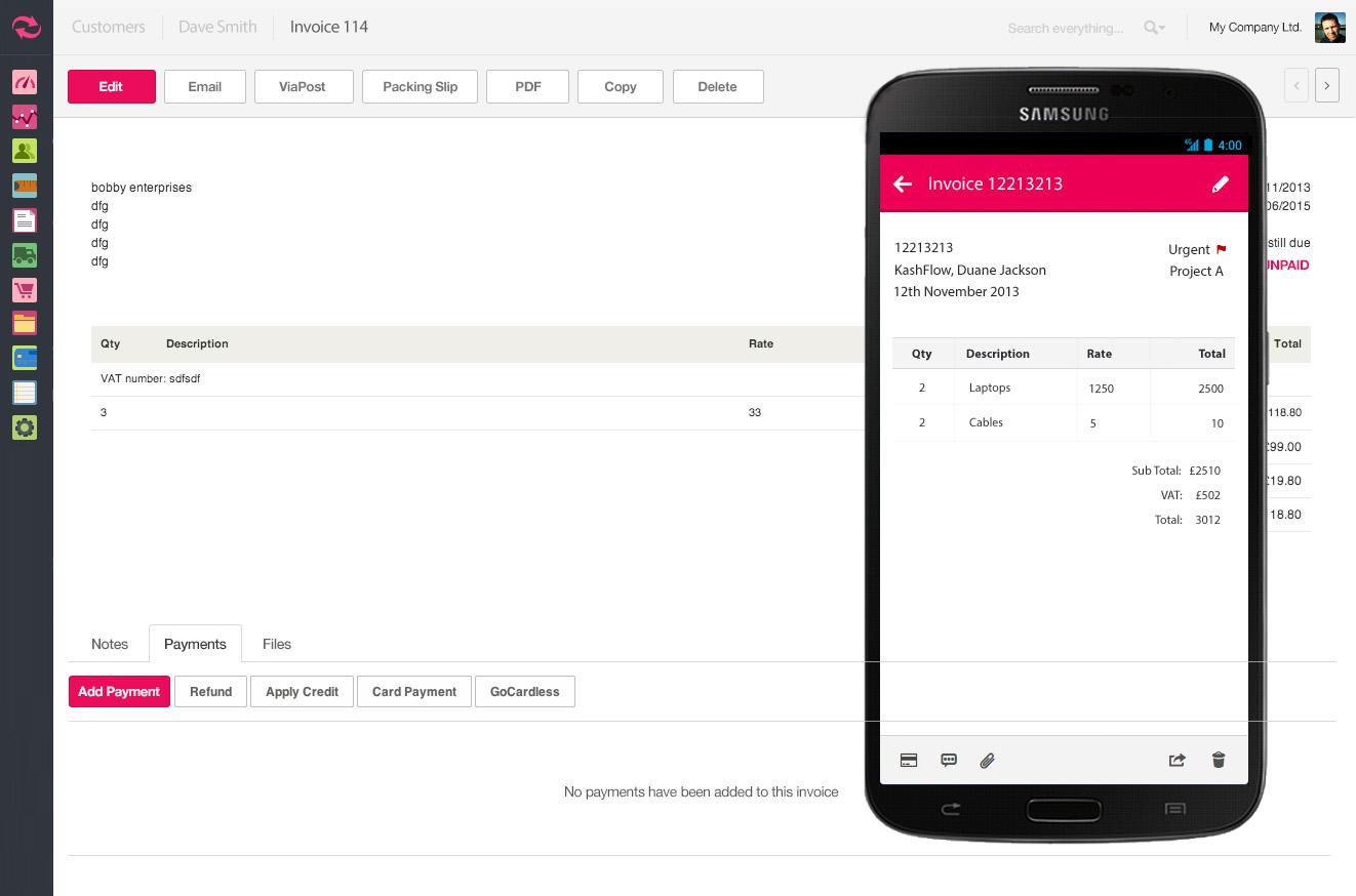
Designed and built KashFlow
Love CSS, hate mobile browsers
Session 1.1
Introduction: where does responsive design fit into the application landscape?
Sites vs. Apps
What's the difference?
Native vs. Web
What's wrong with building 5 different apps?
Areas of reconciliation
What can web apps learn from native and RWD?
Limitations
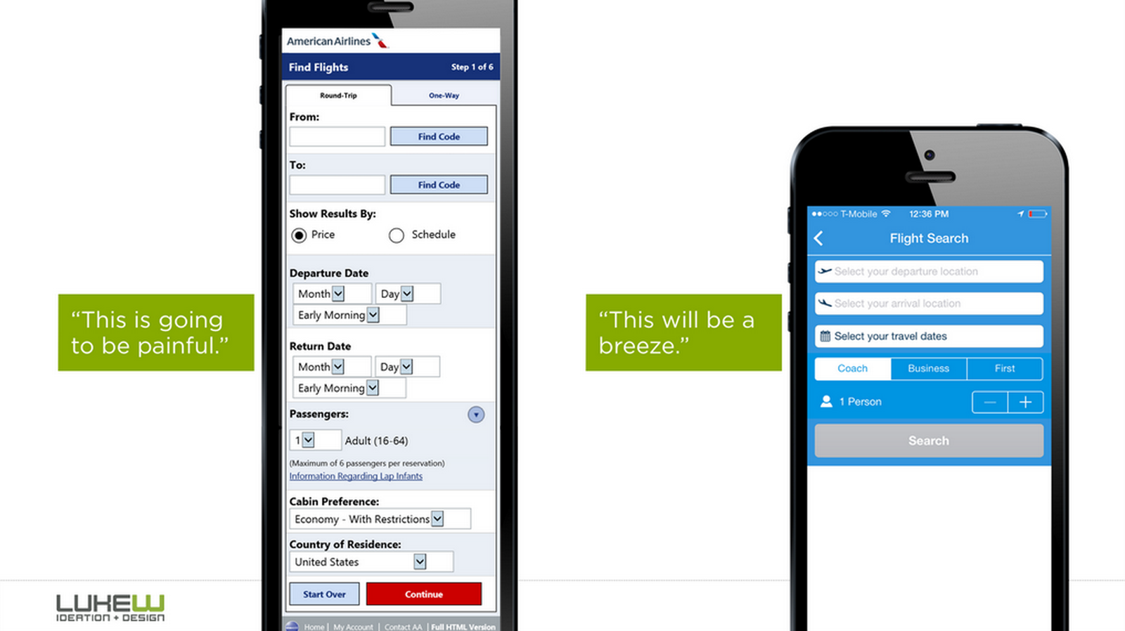
Don't try to make your app something it's not
Session 1.2
Delivering consistent experiences with RWD
Limitations are great
Bureaucracy is bad
Take the user on the same journey
Not matter what the device
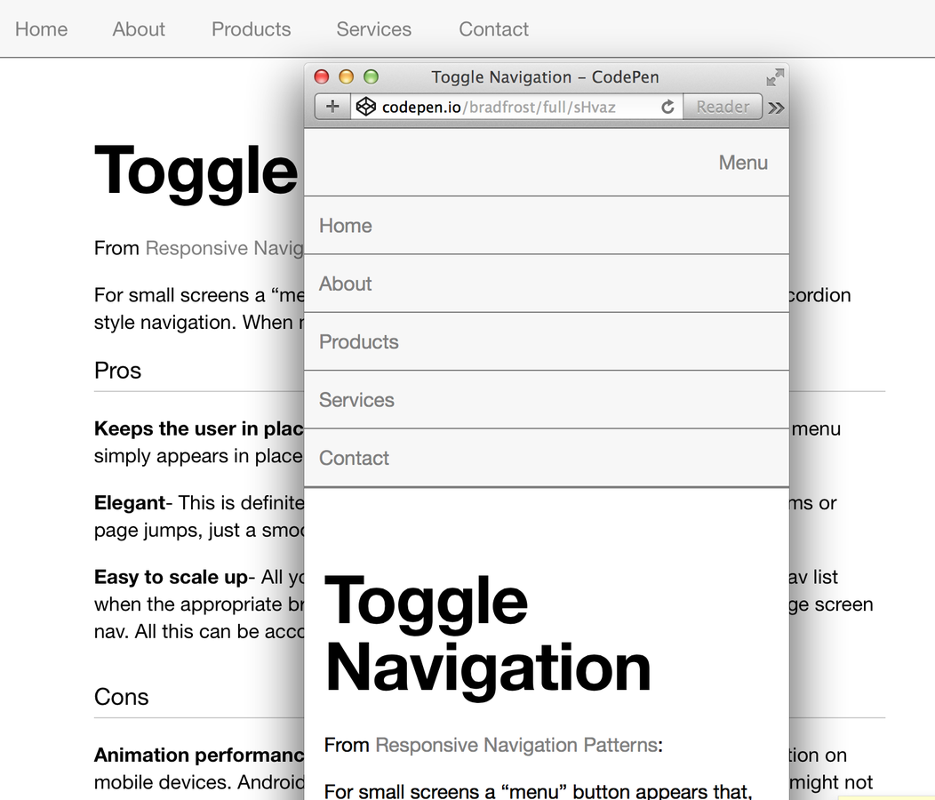
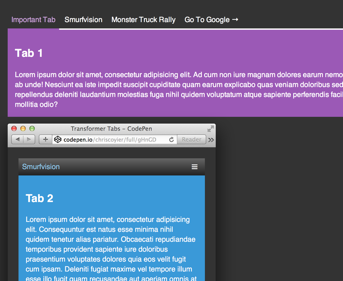
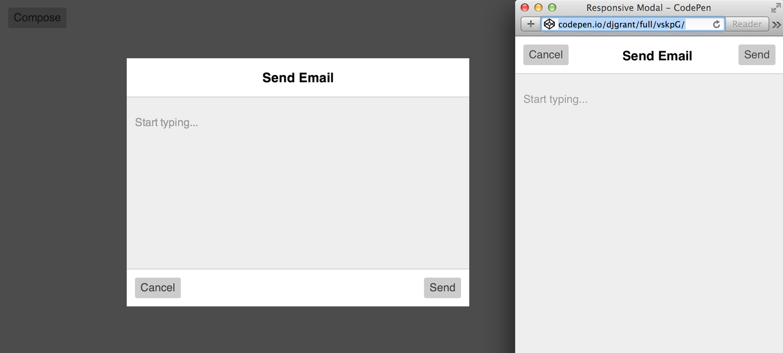
The long page syndrome
You don't need to show it all at once
De-prioritise some content blocks
Display on interaction events
Patterns for responsive apps
Learning to identify and reuse them
Exercise
Compare a the mobile and desktop versions of a well known web app.
Identify similarities and differences in:
a) the content structure
b) the user journey
Session 2.1
Structuring projects to scale
Session 2.2
Meaningful media queries
@media screen and (min-width: 780px) and (max-width: 1049px)
???
Media query mixins
@include mq(from: $fablet, to: $tablet)
Device breakpoints
tablet: (min-width: 780px) and (max-width: 1049px),
tablet-up: (min-width: 780px)
tablet-down: (max-width: 1049px)
@extend
@include on(mobile) {
  .selector {
    @extend .another-selector
  }
}
Warning! You may only @extend selectors within the same directive.
@include on(mobile) {
.selector {
@extend .another-selector
}
}
Warning! You may only @extend selectors within the same directive.
%placeholders
%placeholder {}
@include on(mobile) {
  %placeholder-on-mobile {}
}
@include on(mobile) {
  .selector {
    @extend %placeholder-on-mobile
  }
}
%placeholder {}
@include on(mobile) {
%placeholder-on-mobile {}
}@include on(mobile) {
.selector {
@extend %placeholder-on-mobile
}
}
Mobile first
.selector { padding: 12px; } @include on(tablet-up) { .selector { padding: 18px; } } @include on(desktop-up) { .selector {padding: 24px; } }
Silos
@include on(mobile) {
  .selector {
    padding: 18px;
  }
}

@include on(tablet) {
  .selector {
    padding: 18px;
  }
}

@include on(desktop) {
  .selector {
    padding: 24px;
  }
}
Cake and eat it
// base style.selector { color: green; }@include on(mobile-tablet) { .selector { padding: 18px; } } @include on(desktop-up) { .selector { padding: 18px; } }
Rule of thumb
Don't overwrite rules
Don't repeat rules
Exercise
Using media queries, conceal secondary content behind a link for smaller devices
Session 2.3
Exploring CSS space
Unpacking the syntax
.thing-to-transform {
  transform: function(value) function2(value);
}
Exercise
Make something move. Have fun!
Session 2.4
Developing responsive interaction
JavaScript

State
$('.handle').on('click', function() {
  $('.thing').addClass('is-active');
});
Responding to state changes
.thing {
  display: none;
}

.thing.is-active {
  display: block;
}
Transitioning between state changes
.thing {
  transform: translateX(-100%);
  transition: transform 0.3s;
}

.thing.is-active {
  transform: translateX(0);
}
Exercise
Create a responsive interaction
Responsive Web Apps 1.1
By djgrant

