
www.ikn.it
Milano, 9 Novembre
2017
FROM A BI APPROACH TO A DATAVIZ APPROACH
Alejandro Vidal
Data Scientist & Designer. BBVA Data Analytics
@doblepensador
Super motivational
Zero practical information
Boring & Technical Talk
This talk
(I hope)
Good to sell phones
A lot of stuff to remember
Not good for humans
Step by step
data visualization is a practice but also a cultural change
How to do it?
organizational structures
Insiders
Specialized (& small?) team inside a bigger one
- Typical in big companies and data-intensive products
- Most evident approach
- Achieve best data visualizations
- Echo chamber effect
- "Red button" problems
- We're in the middle: conflict of interest with other areas (developers, designers)
- What's the optimal size?
organizational structures
Diaspora
Smallers teams inside each area or department
- Less chamber effect
- Better integration
- More expensive
- Client-supplier relationship
organizational structures
freelancing
One-time and focused changes
- Easiest way for first data visualization uses
- Cheaper
- There isn't cultural change
- Hard to create long-term effects
organizational structures
Teacher & evangelist
Long-term and docent approach
- Scale better in huge companies
- Focused on cultural change
- More time
- Open-minded & prepared employees
How to do it badly
If you have enought money and time you can...
- Start a data visualization project without experts
- Don't pay attention to collaboration model with other areas
- Use data visualization at any cost
- Do it only because other companies do it
- Do it because it's cool
- Do it because it's trendy
- Do it because it's beatiful
How to do it badly
Well, if you insists... Typical outcomes
Non-sense & chaos
The same but with a graph
"Number decoration"
Data visualization
≠
nice charts
Don't forget the principles
What do you see here?
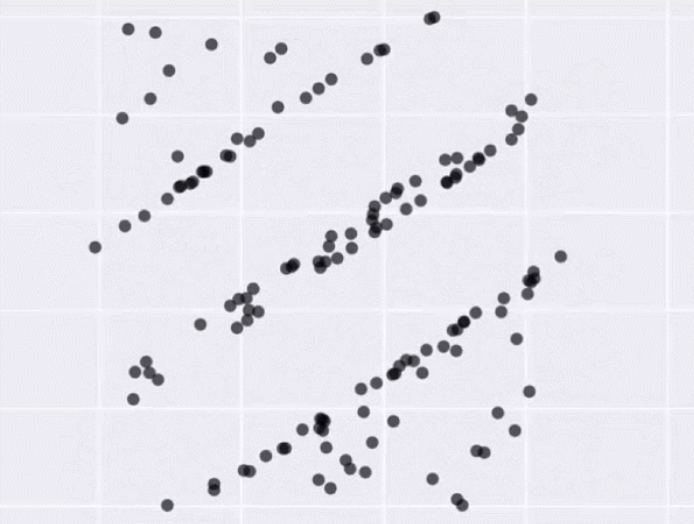
Same Stats, Different Graphs by Autodesk Research
What do you see here?

Your brain...
Saw a T-Rex
Saw a elliptic pattern
Saw vertical lines
It's pretty amazing finding patterns
USE it ;)
Disclaimer: I studied psychology
You don't need be an expert to make good data visualizations
Every data visualization in the world is...
A function
f(x)
that maps data into images
Data
f(x)
Perception
Insight
Decoding phase
"Data world"
"Visual world"
Encoding phase
COhort
group of clients whicH first purchase was in one specific month
January cohort: clients who purchases its first product in January
February: client who purchases its first product in February
...


Data
f(x)
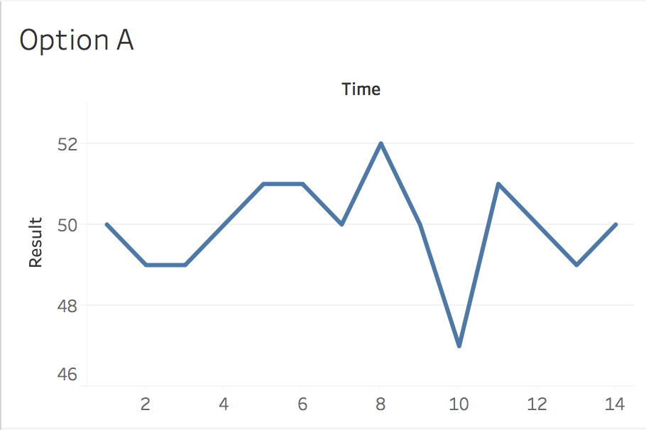
Agressive campaings are not as great as they seem

auto experimentation
Use your own business questions to detect which design is better
My question is:
When this KPI gets its lowest value?
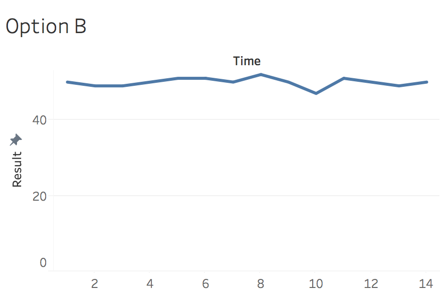
auto experimentation
Business question:
What product is my best-seller?
find the human in the loop
End users
send invoices

mailbox
Accountant
process the invoices

writes
reports

gives advice
checks
notifies
errors
Auditor

Try to find the human in the loop
There could be an oportunity for data visualization!
Identifying the user is 50% of knowing his needs
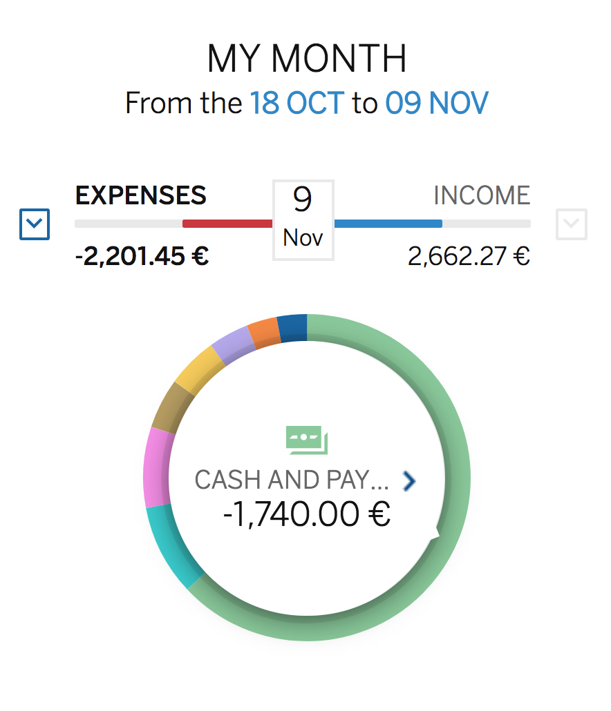
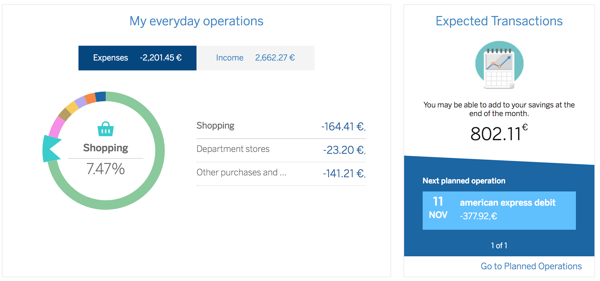
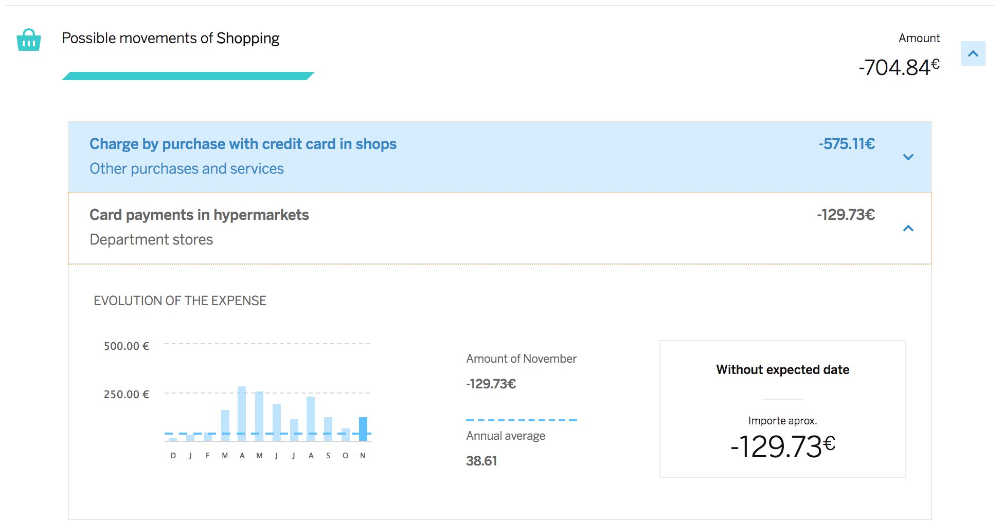
BBVA Personal FINANCIAL MANAGEMENT
BBVA users
BBVA

Personal Advisor
BBVA
How can we improve the experience for users without personal advisor?
Data visualization ;)
(& artificial intelligence)
Typical Questions when i explain this
My data is too simple to use data visualization
There is no dataviz application in my loops
If it's simple KEEP IT SIMPLE

Airbnb's search interface
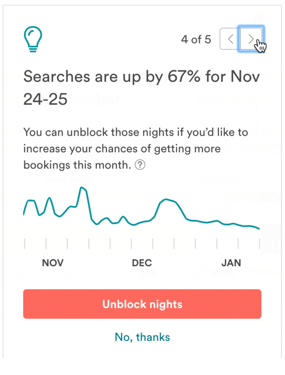
Airbnb's host insights system
IF THere isn't Create new loops

contracts
Point of Sale
pay with


Retailer
Think outside the box
communication, ART & Science
Communication
(The human in the loop is general public)
Art
SCIENCE
Artificial intelligence has "Black box models"
SCIENCE
EMBEDING PROJECTOR
by Google
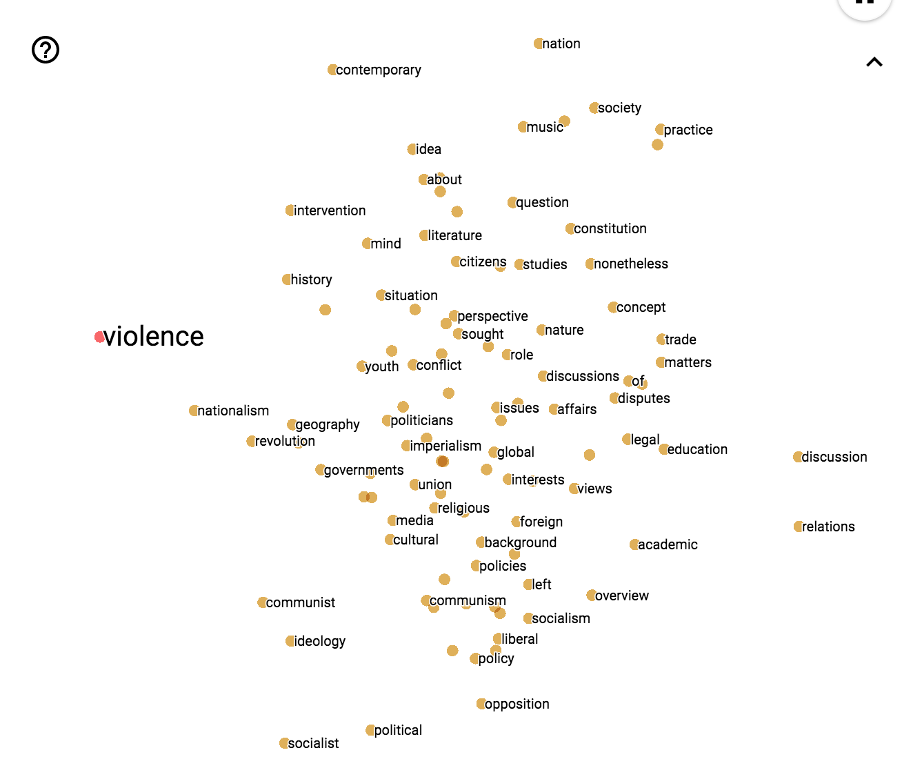
You're seeing the 100 most similar words to "politics" based on a Natural Language Processing Algorithm
"Bad"
"Good"
SCIENCE
EMBEDING PROJECTOR
by Google
SCIENCE
Tensorflow Playground
by Google
Step by step
Don't forget the principles
the human in the loop
Prepare your organization for this change
These are core. Forget them and you'll get bad products
Design with your user in mind
www.ikn.it
Milano, 9 Novembre
2017
GRAZIE PER L ’ATTENZIONE
Alejandro Vidal
Data Scientist & Designer. BBVA Data Analytics
@doblepensador
alejandro.vidal@bbvadata.com
deck
By Doble Pensador


