Data Visualization
From getting started to upping your game
@KaraDapena, @Eli_Mur, @Nat_Lash
Who we are
- Kara Dapena – Data visualization editor @ Miami Herald
- Nathaniel Lash – Data reporter @ Tampa Bay Times
- Eli Murray – News apps developer @ Tampa Bay Times
Getting started with data visualization
What is a data visualization?
Why do we need data visualizations?
A good data visualization provides insights that are not immediately obvious from the data alone.
A good data visualization asks and answers a question or tells a story.
A good data visualization provides appropriate context for an audience.
Tools of the trade
Charting
Chartbuilder
https://quartz.github.io/Chartbuilder/
Fusion Tables
https://fusiontables.google.com
Tableau
https://tableau.com
D3
https://d3js.org/
Mapping
Google Maps
https://google.com/mymaps
QGIS
http://www.qgis.org/en/site/
Map Box
https://www.mapbox.com/
Leaflet
http://leafletjs.com/
How to make a good data visualization
Kara Dapena
Visual story-telling tool
A good data visualization is a story-telling tool to deliver accurate information in a format that requires the least effort possible from the audience to gain insight
Creation process
- Be curious
- Define the punchline
- Sketch
- Test and revamp
- Publish
Principles of design
- Variety
- Unity
- Heirarchy

Variety
Unity
Hierarchy
Principles of design
Data-ink ratio
Be mindful of what to show and not to show
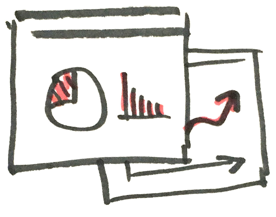
Parts that make the whole
Descriptive headline
Introduction
Graphic component
Byline
Note (if needed)
Source
Create a style guide
- Streamline your workflow
- Give your graphics a consistent look and feel, to create a sense of familiarity for your audience
- Pick one or two typefaces and establish typography for common elements
- Make a baseline color pallet
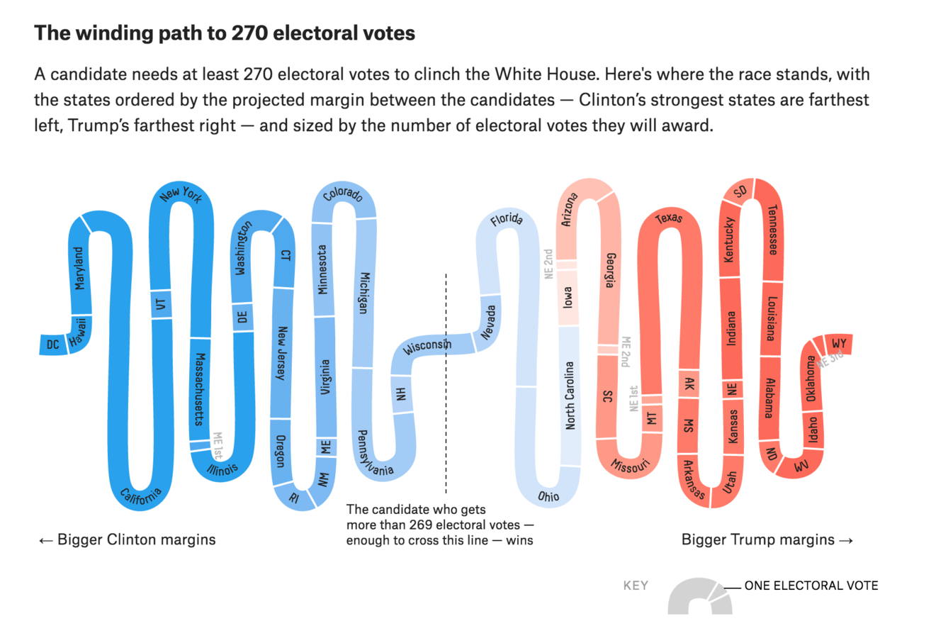
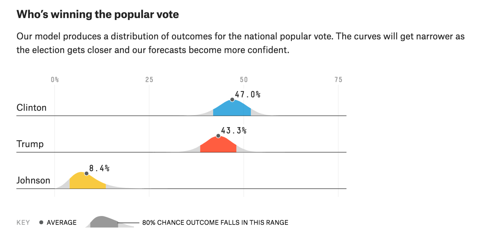
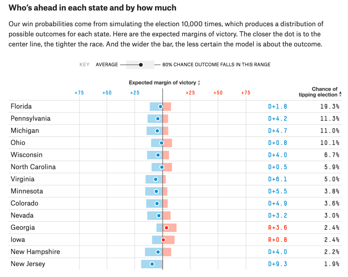
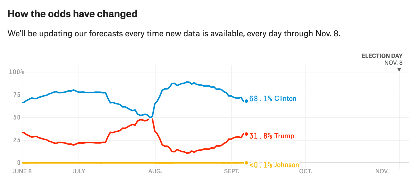
FiveThirtyEight
http://projects.fivethirtyeight.com/2016-election-forecast/
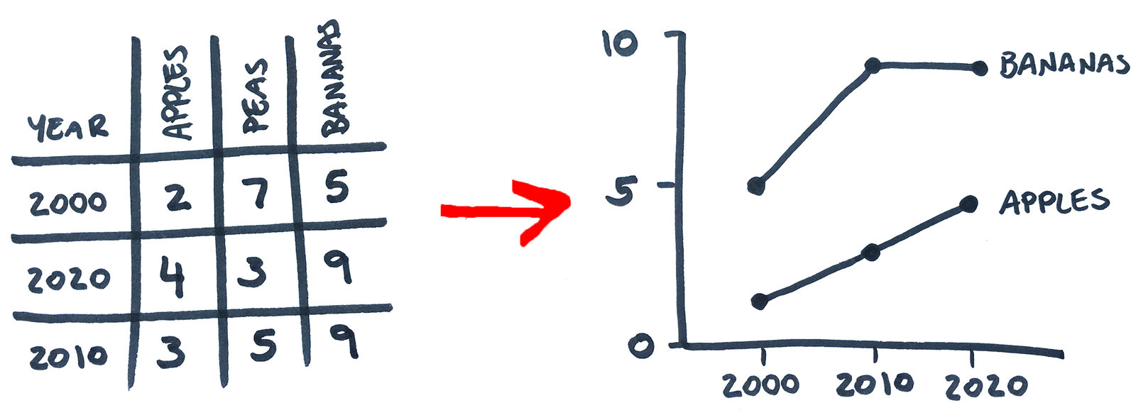
Decide on your format
- What platform are you using and what constraints or possibilities does it have?
- What structure is best suited to tell the story? Should it be a database, a map, a chart, a table, a timeline, etc...
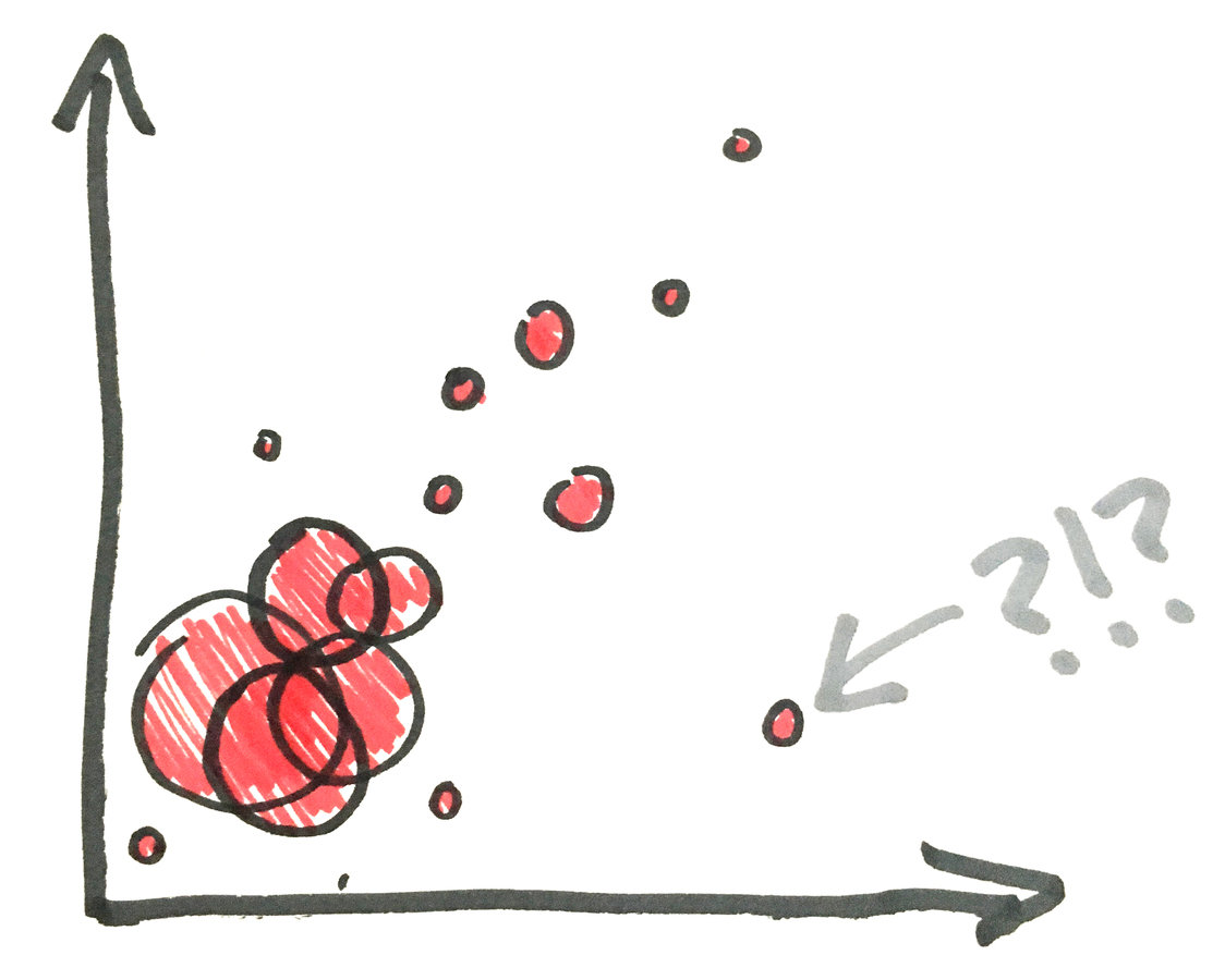
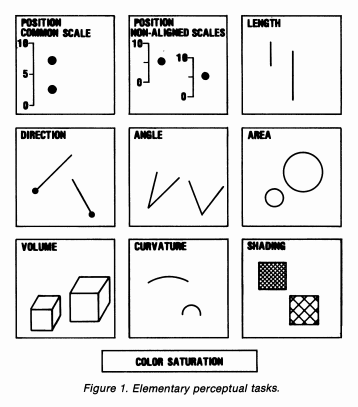
Comparison precision scale
Most to least precise:
- Position along a common scale
- Positions along nonaligned scales
- Length, direction, angle
- Area
- Volume, curvature
- Shading, color saturation
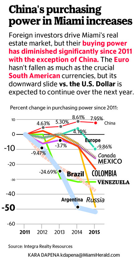
Do's and dont's

3D charts
Do not distort your charts by making them look 3D
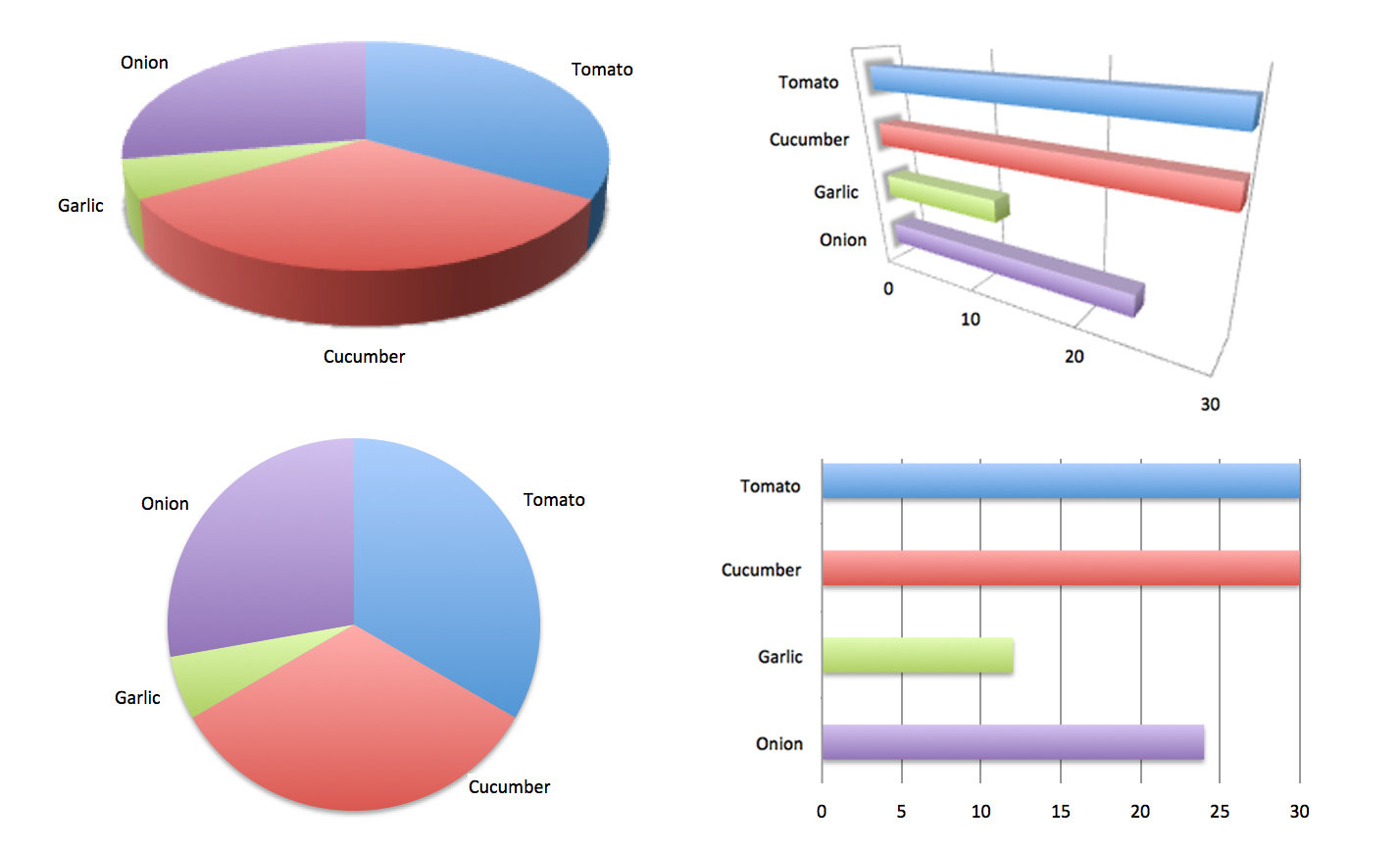
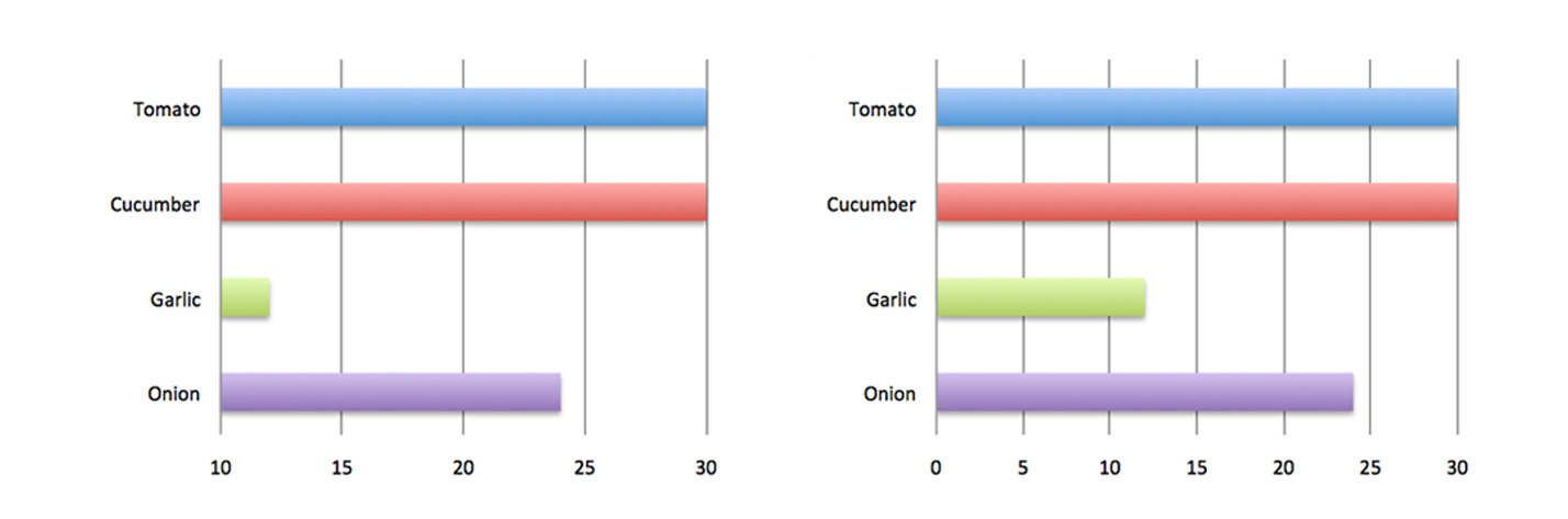
Start at zero
In a bar chart, the length of the bar indicates the value, so (almost) always start at 0
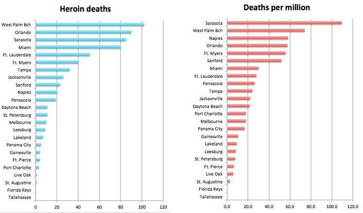
Apples to apples
Be sure that in addition to being accurate, your data is painting a fair picture
Don't fight your audience
Use the cultural conventions of your audience to make your visualization easier to read
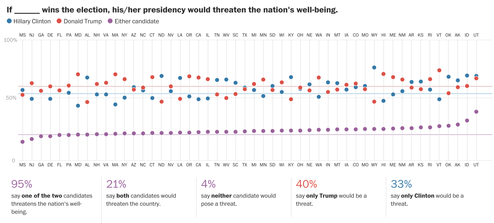
Annotate
Annotate to give your audience clues and insights
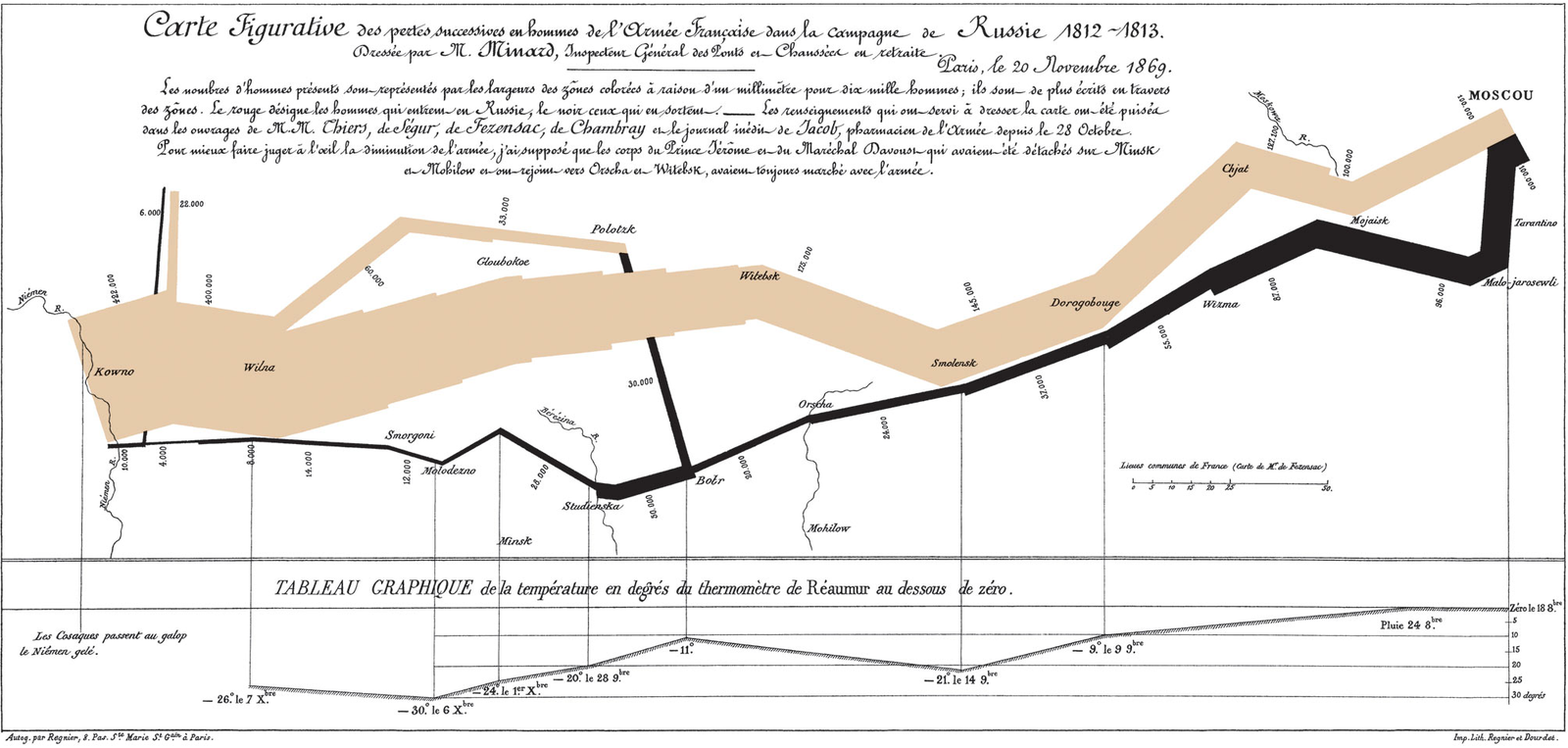
It's also OK to break the "rules"
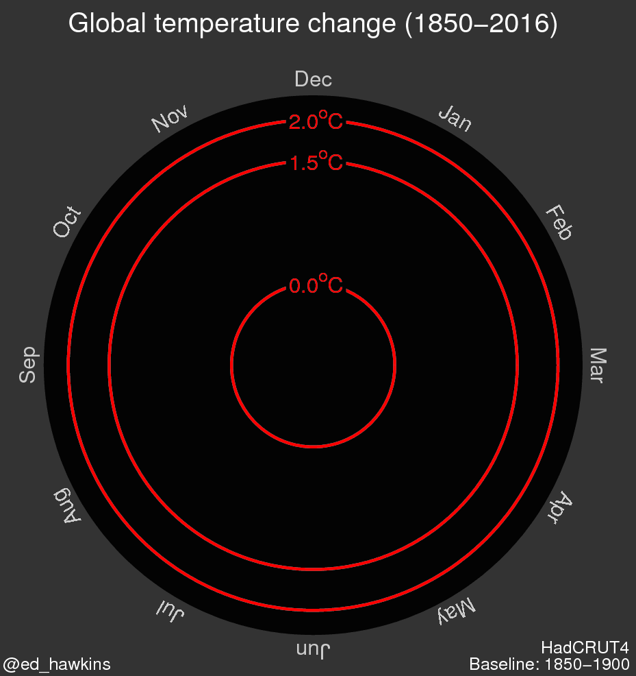
The BIG question.
How do we build
something like this?
2 ways
1. Hire
2. Train
1. Hire.
Abundance of
cheap labor
Good programs
College newspapers
Look for what
sets it apart
More than just a pretty portfolio site
All about clips
"Why did you choose to
do that in particular?"
Screening
Easy to fake to an
editor
Hard to fake to a programmer
2 data points
Day 1
Day 100
Okay...
Find them work on the best reporters
Shorter is better
Start with the
reporting problems
Data visualization
one of many steps
Data gathering
Data gathering
Scraping
Data gathering
FOIA
Data gathering
FOIA
Know how to request electronic records
Data cleaning
Data cleaning

Data analysis
Data analysis
2. Train.
Anyone can code
Anyone can code
Code takes time
ITERATIVE
Start simple
Give them
time to be ambitious.
Give them support.
Give them support.
But edit relentlessly.
Choose the
big stuff carefully
Culture of
innovation
Time
Trust
High expectations
This is all
about one thing:
Finding the nugget that makes the reader go,
"Whoa."
Combined with
diligent editing...
... Great things will come.
Questions?
Data Visualization
By ejmurra