Exploring Predix UI seed
GE China Predix Bootcamp - Day 5
Shanghai foundry front-end team

Required Environment
- Devbox
- CloudFoundry CLI
- NodeJS
- Git
- Sublime Text (or any code editor)
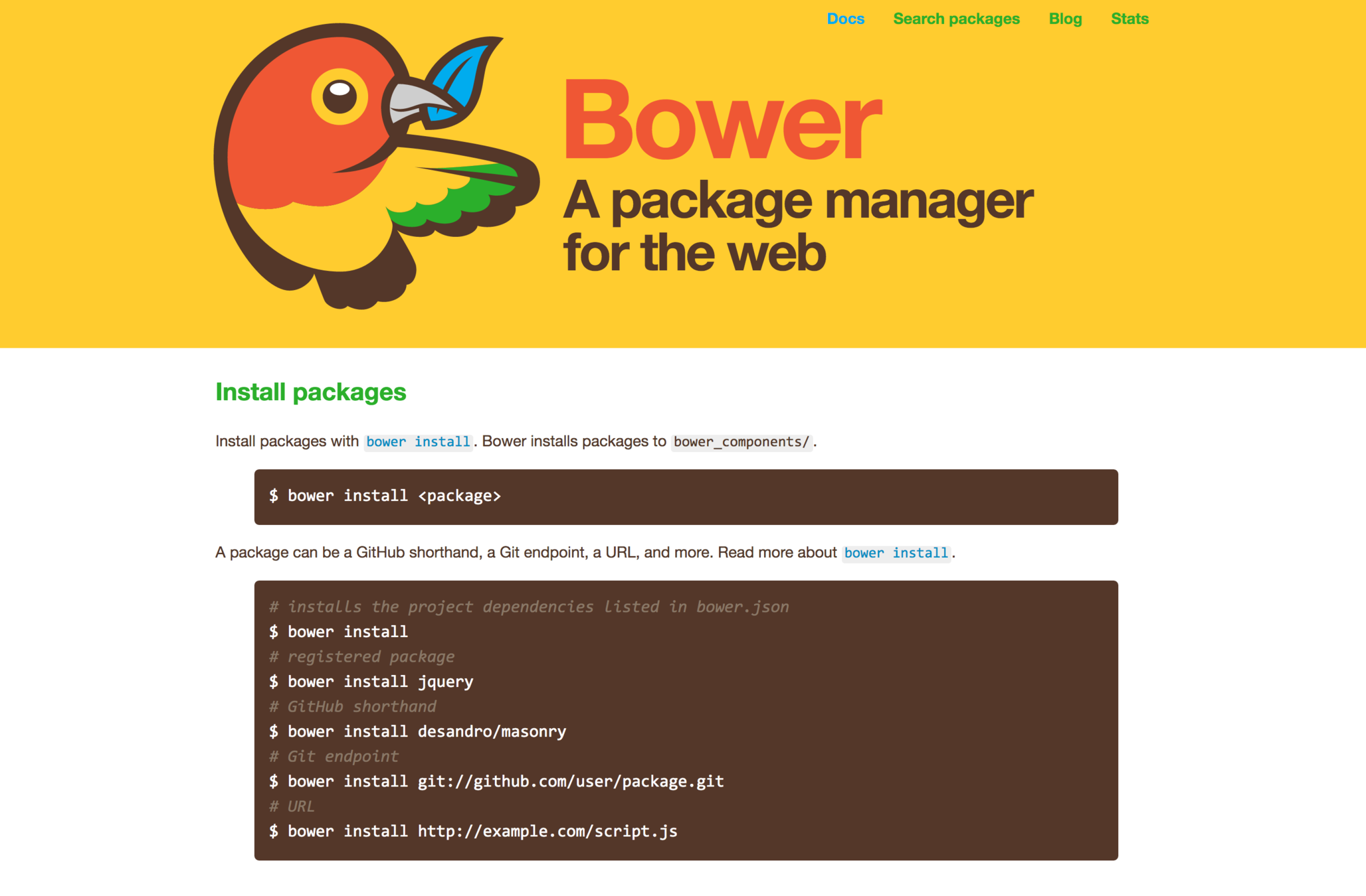
what does seed app offer
- Polymer web app-shell scaffold
- Example Predix UI Components usages
- Express web server connect to Predix services and APIs
- Built-in support of Predix UAA
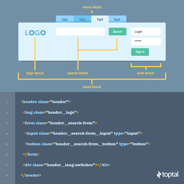
seed-app overview

BFF - Backend for front-end
- NodeJS
- bower/npm
- Express Web Server

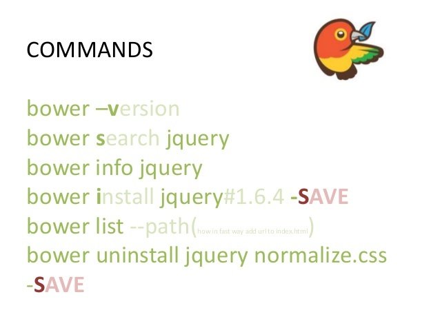
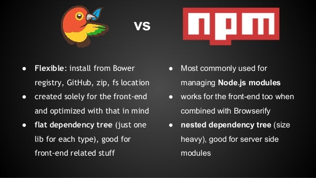
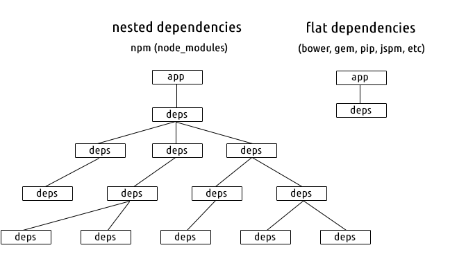
bower vs npm
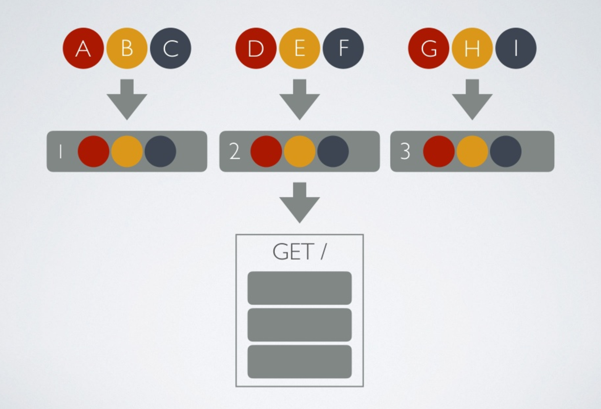
- non-blocking I/O
- Express middleware
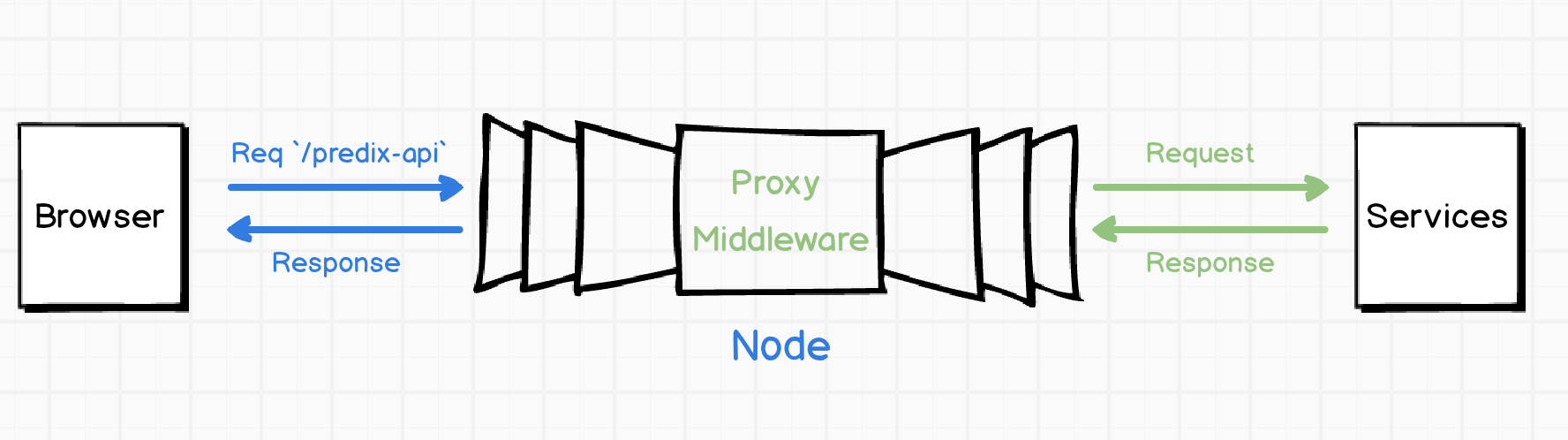
- http-proxy middleware
Express Server
(request) blocking I/O

(request) non-blocking I/O

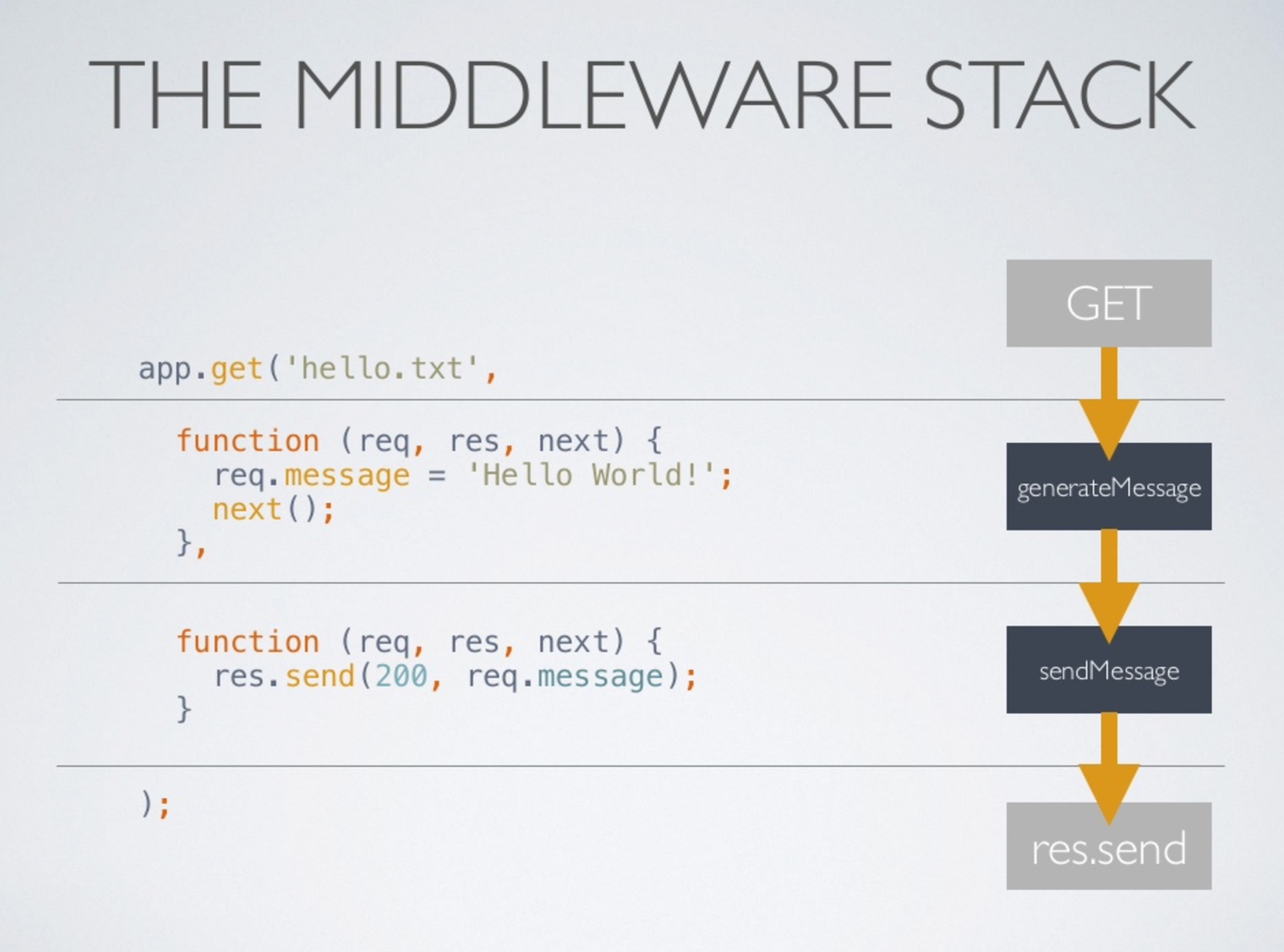
Middleware functions
- Execute any code
- Make changes to request/response
- End the request-response cycle
- Call the next middleware in stack
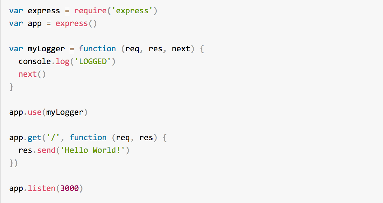
Express "hello world"
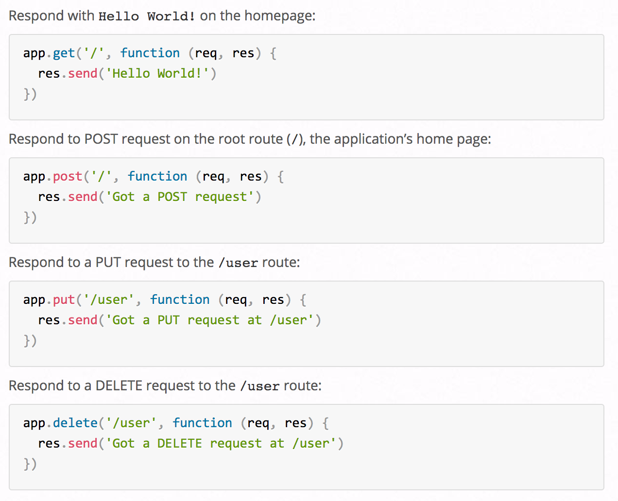
Express routes
HTTP Proxy Middleware
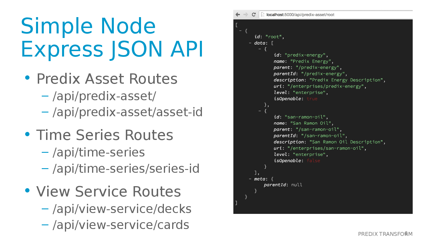
JSON-Server Middleware
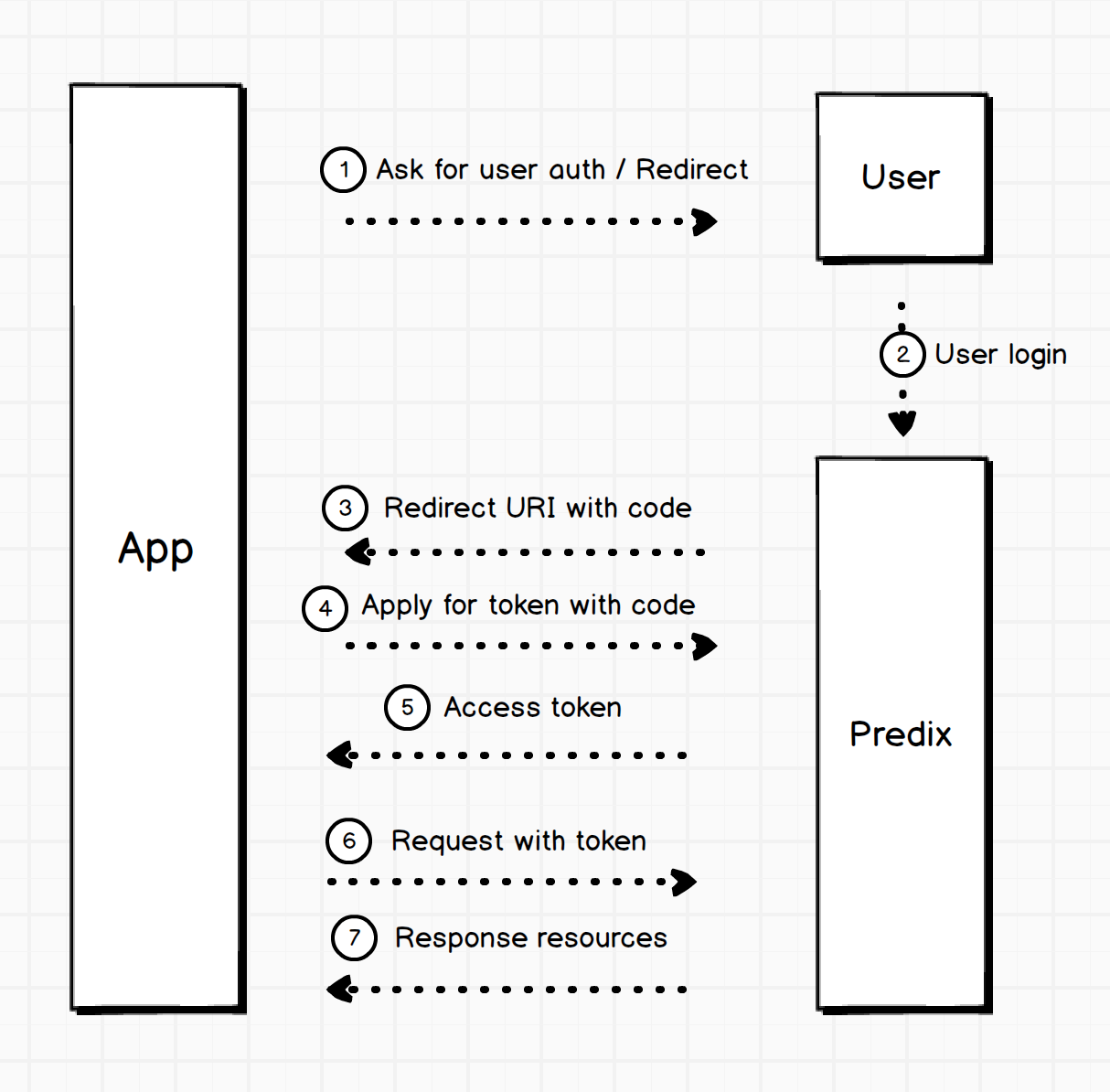
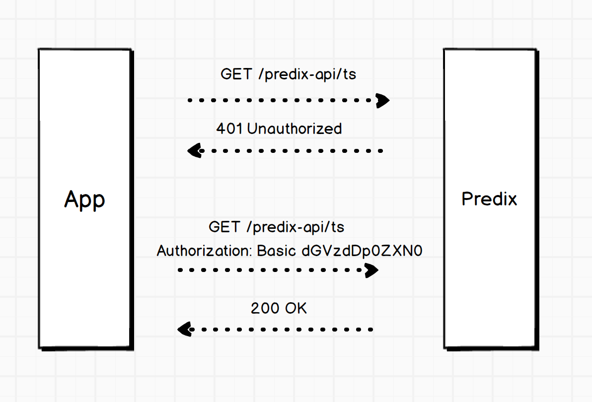
Enable UAA in seed app
- Config UAA for authentication
- Secure Express routes
- Credentials in manifest file for Deploy
  app.use('/login', {...});
  app.use('/api', {...});

  //Use this route to make the entire app secure.  This forces login for any path in the entire app.
  app.use('/', passport.authenticate('main', {
      noredirect: false //Don't redirect a user to the authentication page, just show an error
    }),
    // other middleware
  );
Authenticating All Routes

---
applications:
  - name: predix-ui-seed
    memory: 64M
    buildpack: nodejs_buildpack
    command: node server/app.js
    path: dist
#services:
 # - <your-name>-secure-uaa-instance
 # - <your-name>-timeseries-instance
 # - <your-name>-asset-instance
env:
    node_env: cloud
    uaa_service_label: predix-uaa
    # Add these values for authentication in the cloud
    #clientId: {Enter client ID, e.g. app-client-id, and place it here}
    #base64ClientCredential: {Get clientID:clientSecret then base64 encode and place it here}
    #windServiceURL: "{URL of the microservice <your-name>-winddata-timeseries-service}, e.g.  https://your-name-winddata-timeseries-service.run.asw-usw02-pr.predix.io"
Config manifest
Px UI components
(used in seed app)
- px-app-nav
- px-context-browser
- px-simple-line-chart
- px-simple-horizontal-bar-chart
- px-vis-timeseries
- px-data-table


Time-series chart
- px-rangepicker
- px-vis-data-convertor
- chart features

time-series chart
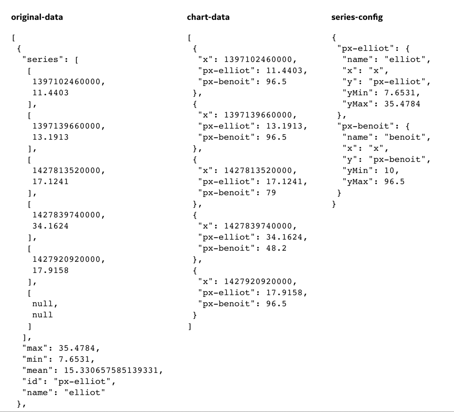
two time-series format
UI dashboard
- view service hierarchy
- context-browser
- deck-selector

dashboard view hierarchy
dashboard elements
- View – Visual summary of the information displayed in a web application. It consists of one or more decks.
- Deck – Component that supplies simple one-dimensional layout control for cards and components arranged in a specified order.
- Card – Smallest functional unit of the page. You can create interactions between components within an individual card, as well as interactions with other cards based on user context.
- Component – User-interface element that allows you to add concrete features or access services.

dashboard & assets
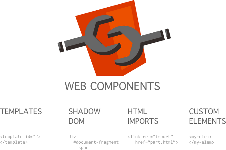
Application Shell
- Web components
- HTML Import
- Polymer
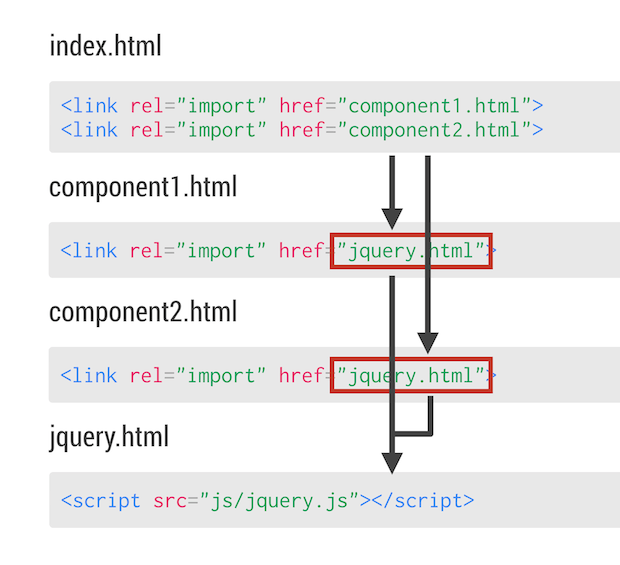
HTML Import - linking

App Shell - structure

App Shell - bundling

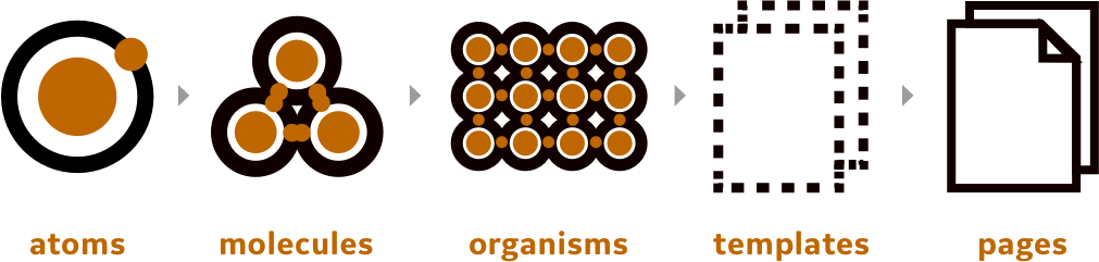
layers of Polymer application
Polymer Web Component
<dom-module id="element-name">
<template>
<style>
/* CSS rules for your element */
</style>
<!-- local DOM for your element -->
<div>{{greeting}}</div> <!-- data bindings in local DOM -->
</template>
<script>
// element registration
Polymer({
is: "element-name",
// add properties and methods on the element's prototype
properties: {
// declare properties for the element's public API
greeting: {
type: String,
value: "Hello!"
}
}
});
</script>
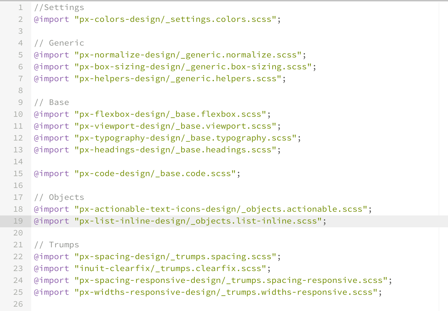
</dom-module>Predix CSS Framework
- Sass Lang
- Predix Design
- InuitCSS - BEM/ITCSS
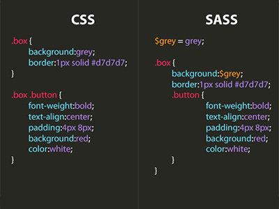
SASS - Preprocessing CSS

Predix Design system
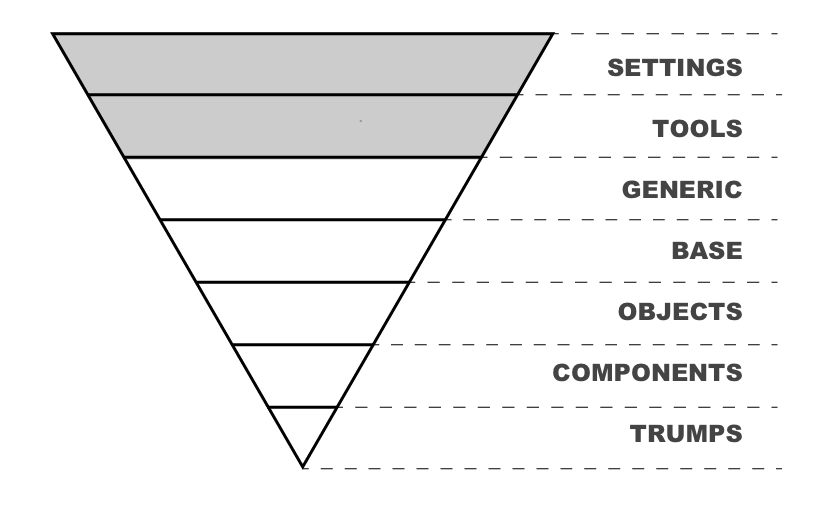
ITCSS - Inverted Triangle Cascading Style Sheet
- Objects – class-based selectors which define undecorated design patterns, for example media object known from OOCSS
- Components – specific UI components. This is where majority of our work takes place and our UI components are often composed of Objects and Components
- Trumps – utilities and helper classes with ability to override anything which goes before in the triangle, eg. hide helper class
- Settings – used with preprocessors and contain font, colors definitions, etc.
- Tools – globally used mixins and functions. It’s important not to output any CSS in the first 2 layers.
- Generic – reset and/or normalize styles, box-sizing definition, etc. This is the first layer which generates actual CSS.
- Elements – styling for bare HTML elements (like H1, A, etc.). These come with default styling from the browser so we can redefine them here.
Law of ITCSS
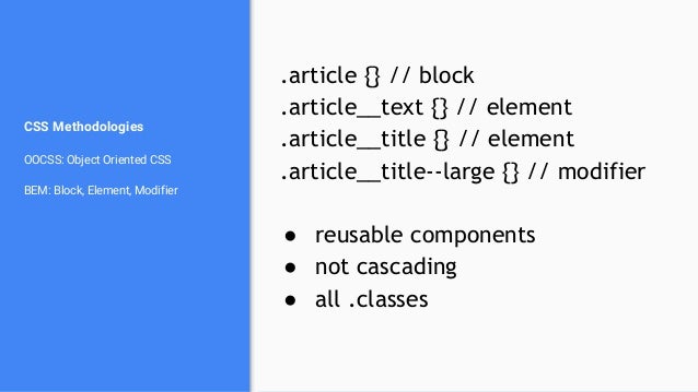
BEM style convention

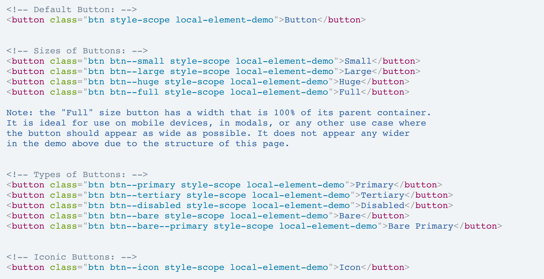
example: starter-kit-design-demo
example: predix-button-design
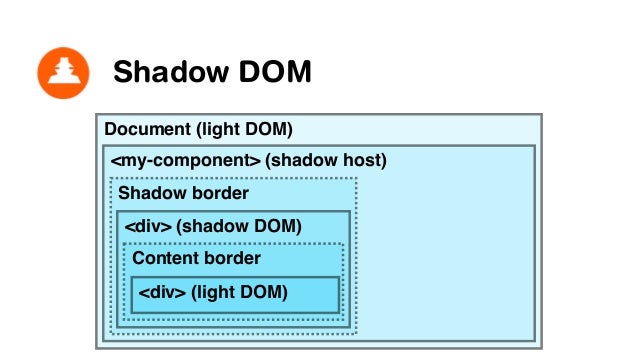
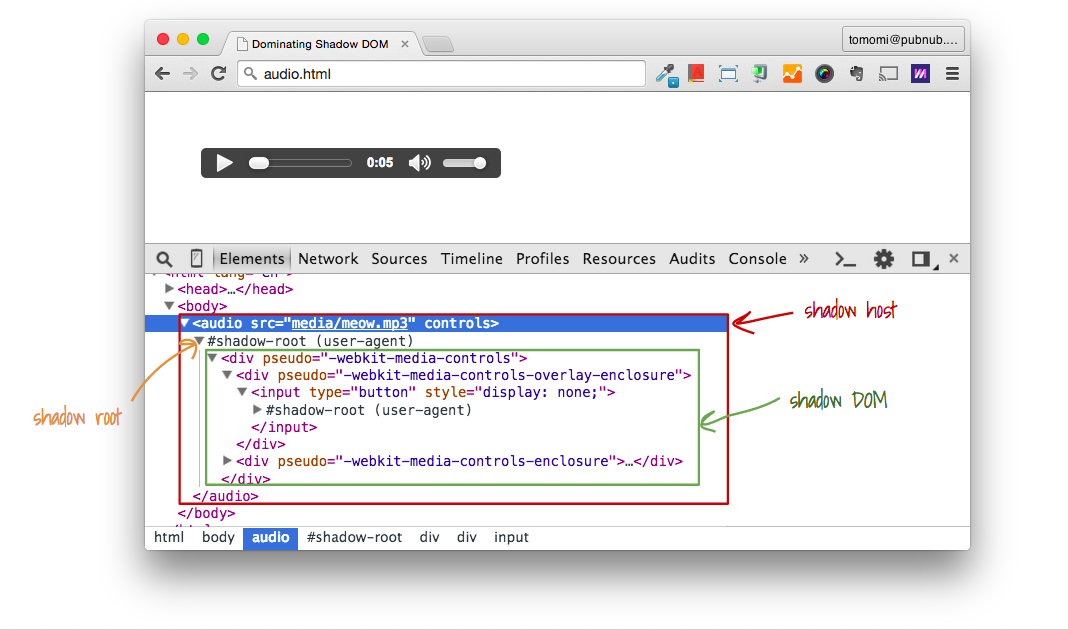
Scoped Styling
- Shadow DOM & Scoped Styling
- Shared styles module
- Custom CSS Variables & Mix-ins
- Document-wide Styling
<dom-module id="my-element">

  <template>

    <style>
      :host {
        display: block;
        border: 1px solid red;
      }
      #child-element {
        background: yellow;
      }
      /* styling elements distributed to content (via ::content) requires */
      /* selecting the parent of the <content> element for compatibility with */
      /* shady DOM . This can be :host or a wrapper element. */
      .content-wrapper ::content > .special {
        background: orange;
      }
    </style>

    <div id="child-element">In local DOM!</div>
    <div class="content-wrapper"><content></content></div>

  </template>

  <script>

      Polymer({
          is: 'my-element'
      });

  </script>

</dom-module>
component isolated local styles
<dom-module id="my-toolbar">

  <template>

    <style>
      :host {
        padding: 4px;
        background-color: gray;
      }
      .title {
        color: var(--my-toolbar-title-color);
      }
    </style>

    <span class="title">{{title}}</span>

  </template>

  <script>
    Polymer({
      is: 'my-toolbar',
      properties: {
        title: String
      }
    });
  </script>

</dom-module>
cross-scope styling - variables
<!-- usage -->
<style>
my-toolbar {
  --my-toolbar-theme: {
    /* rules */
  };
  --my-toolbar-title-theme: {
    /* rules */
  };
}
</style>


<dom-module id="my-toolbar">
  <template>
    <style>
      :host {
        padding: 4px;
        background-color: gray;
        /* apply a mixin */
        @apply(--my-toolbar-theme);
      }
      .title {
        @apply(--my-toolbar-title-theme);
      }
    </style>
    <span class="title">{{title}}</span>
  </template>
</dom-module>
cross-scope styling - mixins
<!-- shared-styles.html -->
<dom-module id="shared-styles">
  <template>
    <style>
      .red { color: red; }
    </style>
  </template>
</dom-module>


<!-- import the module  -->
<link rel="import" href="../shared-styles/shared-styles.html">
<dom-module id="x-foo">
  <template>
    <!-- include the style module by name -->
    <style include="shared-styles"></style>
    <style>:host { display: block; }</style>
    Hi
  </template>
  <script>Polymer({is: 'x-foo'});</script>
</dom-module>
shared style module
Data binding (MVVM)
- Declarative data-binding
- Observers v.s. Computed Property
- Control flow in data-binding
<dom-module id="user-view">
  <template>
    <div>[[name]]</div>
  </template>

  <script>
    Polymer({
      is: 'user-view',
      properties: {
        name: String
      }
    });
  </script>
</dom-module>

<!-- usage -->
<user-view name="Samuel"></user-view>
<dom-module id="main-view">
<template>
<user-view first="{{user.first}}"
last="{{user.last}}"></user-view>
</template>
<script>
Polymer({
is: 'main-view',
properties: {
user: Object
}
});
</script>
</dom-module>
text-binding v.s. property binding
Polymer({

  is: 'x-custom',

  properties: {
    disabled: {
      type: Boolean,
      observer: '_disabledChanged'
    },
    highlight: {
      observer: '_highlightChanged'
    }
  },

  _disabledChanged: function(newValue, oldValue) {
    this.toggleClass('disabled', newValue);
    this.highlight = true;
  },

  _highlightChanged: function() {
    this.classList.add('highlight');
    this.async(function() {
      this.classList.remove('highlight');
    }, 300);
  }

});
Simple Property Observer
Polymer({

  is: 'x-custom',

  properties: {
    preload: Boolean,
    src: String,
    size: String
  },

  observers: [
    'updateImage(preload, src, size)'
  ],

  updateImage: function(preload, src, size) {
    // ... do work using dependent values
  }

});
Complex Property Observer
<dom-module id="x-deep-observer">
  <template>
    <input value="{{user.name.first::input}}"
           placeholder="First Name">
    <input value="{{user.name.last::input}}"
           placeholder="Last Name">
  </template>
  <script>
    Polymer({
      is: 'x-deep-observer',
      properties: {
        user: {
          type: Object,
          value: function() {
            return {'name':{}};
          }
        }
      },
      observers: [
        'userNameChanged(user.name.*)'
      ],
      userNameChanged: function(changeRecord) {
        console.log('path: ' + changeRecord.path);
        console.log('value: ' + changeRecord.value);
      },
    });
  </script>
</dom-module>
Deep Property Observer
<dom-module id="name-card">
  <template>
    <div>[[name.first]] [[name.last]]</div>
  </template>
  <script>Polymer({ is: 'name-card' });</script>
</dom-module>
Data flow within element itself

<dom-module id="user-profile">
  <template>
    …
    <address-card
        address="{{primaryAddress}}"></address-card>
  </template>
  …
</dom-module>
Data flow between elements

If <address-card> change it's "address", property "primaryAddress" is changed on <user-profile> as well.
routing & page-flow
- app-location & app-route
- px-view
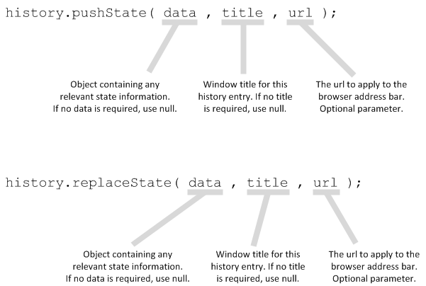
- HTML5 history API
URL and View Routing
<!-- proxy to window.location -->
<app-location
  route="{{_route}}">
</app-location>

<!-- match URL segment and convert to data -->
<app-route
  route="[[_route]]"
  pattern="/:page"
  data="{{routeData}}">
</app-route>

<!-- select the view that matches route to display -->
<template is="dom-repeat" items="[[_routePages]]">
  <px-view
    active="[[_equals(routeData.page, item.page)]]"
    element-href="[[item.elementHref]]">
  </px-view>
</template>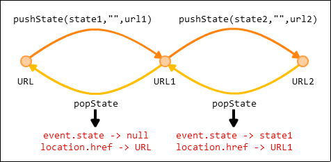
Build the seed app
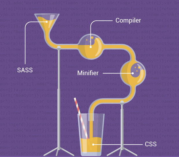
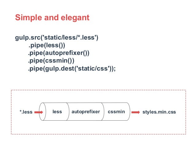
- build system
- gulp-sass
- gulp-vulcanizer

build system

gulp-sass task
gulp-vulcanizer

gulp.task('vulcanize', function() {
  return gulp.src('app/elements/elements.html')
    .pipe(vulcanize({
      stripComments: true,
      inlineScripts: true,
      inlineCss: true
    }))
    .pipe(gulp.dest('dist/elements'));
});
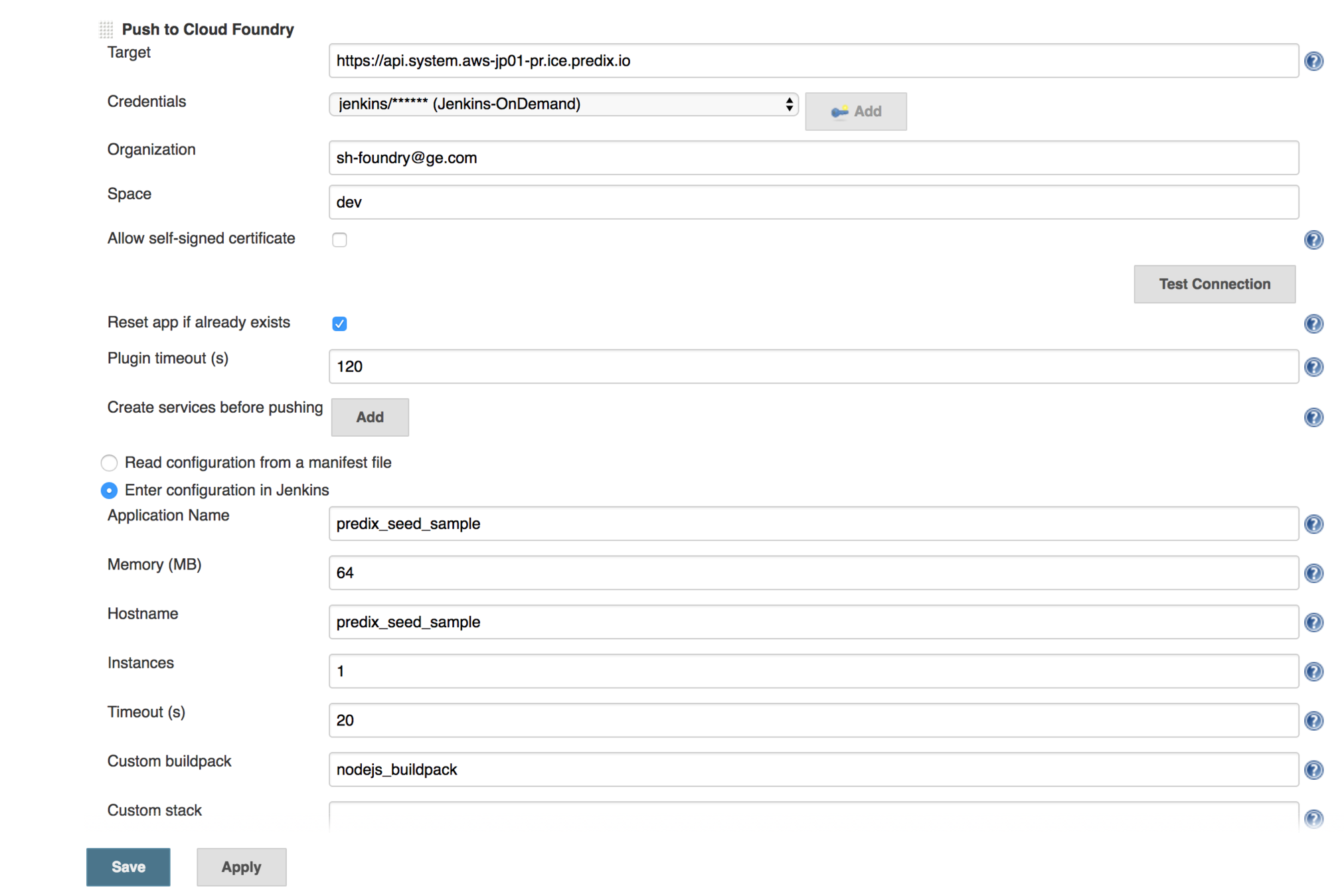
Deploy the seed app
- CF Deploy
- Jenkins CI integration
---
applications:
  - name: predix-ui-app
    memory: 64M
    buildpack: nodejs_buildpack
    command: node server/app.js

#services:
 # - <your-name>-secure-uaa-instance
 # - <your-name>-timeseries-instance
 # - <your-name>-asset-instance
env:
    node_env: cloud
    uaa_service_label : predix-uaa
    # Add these values for authentication in the cloud
    #clientId: {Enter client ID, e.g. app-client-id, and place it here}
    #base64ClientCredential: dWFhLWNsaWVudC1pZDp1YWEtY2xpZW50LWlkLXNlY3JldA==
    #windServiceURL: "{URL of the microservice <your-name>-winddata-timeseries-service}, e.g.  https://your-name-winddata-timeseries-service.run.asw-usw02-pr.predix.io"
Nodejs buildpack
Jenkins CI build
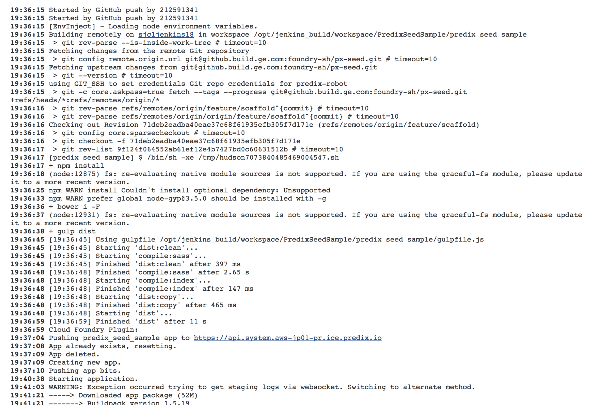
Jenkins CI build log

Q & A

Exploring Predix Seed App
By Garry Yao
Exploring Predix Seed App
UI seed app structure and features explained


