
Gian Faye Paguirigan
Web Artisan. Maker of Things. Geek of all Trades.
Text
Prepared by:
Inggo Espinosa
Daryll Delfin
Gian Paguirigan
JP Villafuerte
3
We are following this key point effectively. All of the elements in our pages are significant and communicates something. However, there are some that communicate poorly. Our menu, for example, while it communicates it’s there, can be improved by showing the most relevant action points like logging in. Homepage is also not communicative enough.
Our product's visual appearance relies heavily on content. We should improve the quality of our content. Our product gives a very pleasing emotion to the viewers [citation needed]. We can improve the quality of images, some are squeezed, grainy, blurry.
We agree -- but, they must be "professional". We also should not let our personal opinions on design affect the professional's opinions.
On the other hand, we're also wondering if this is too late for this.
If ever we're going to hire, we must trust their decisions.
Our layout appears to be simple and orderly.
Similar to my comment regarding the menu, I think some of our components needs improvement in this area.
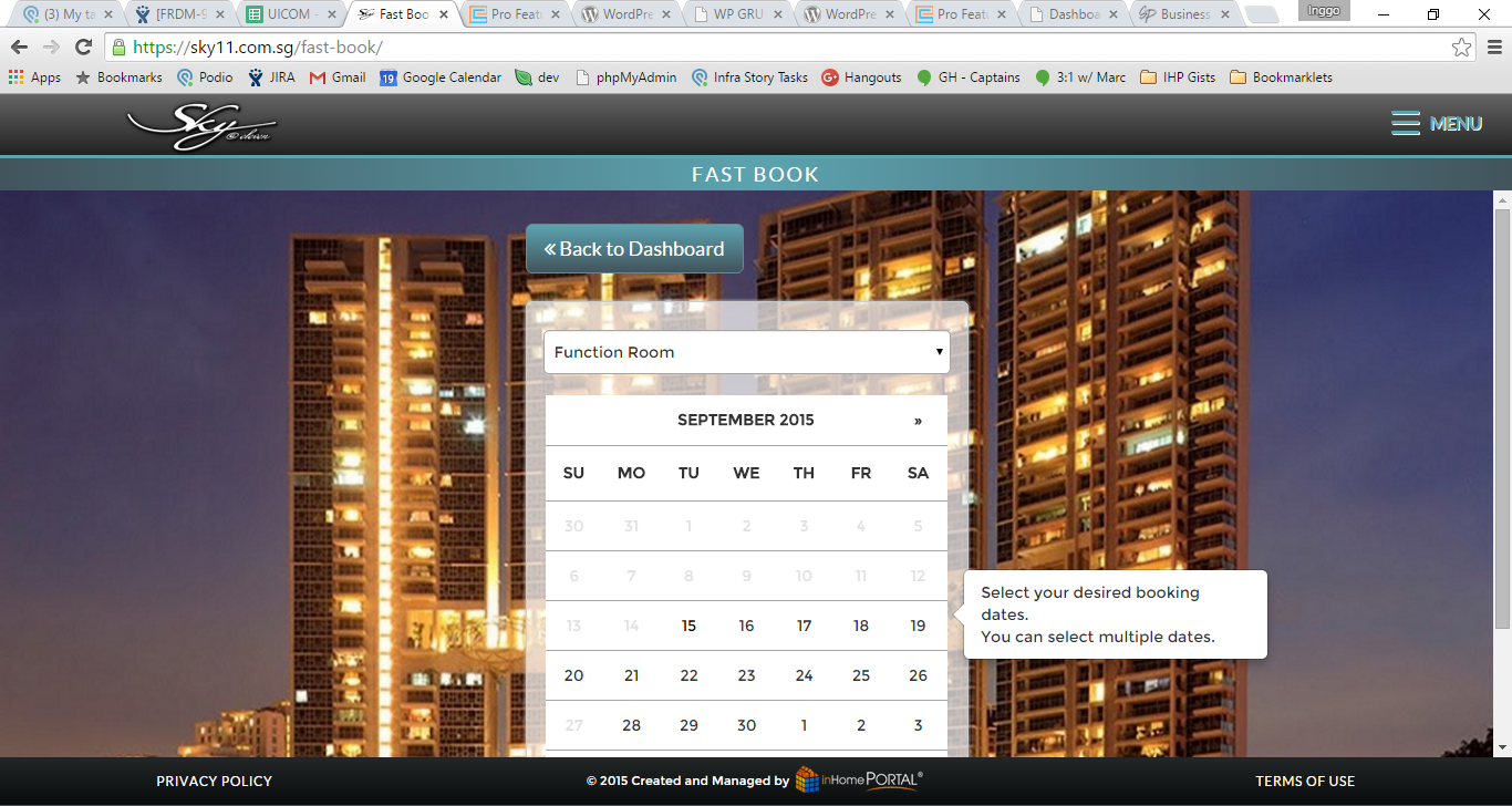
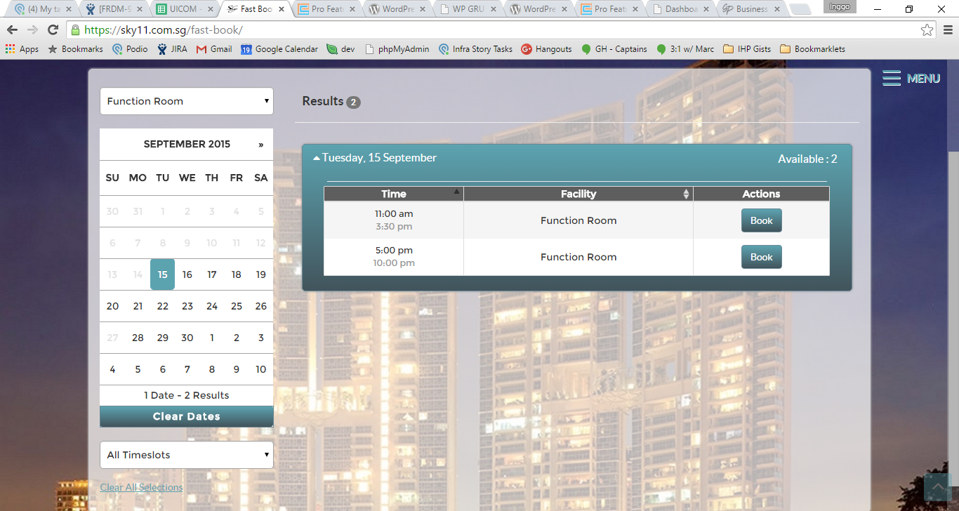
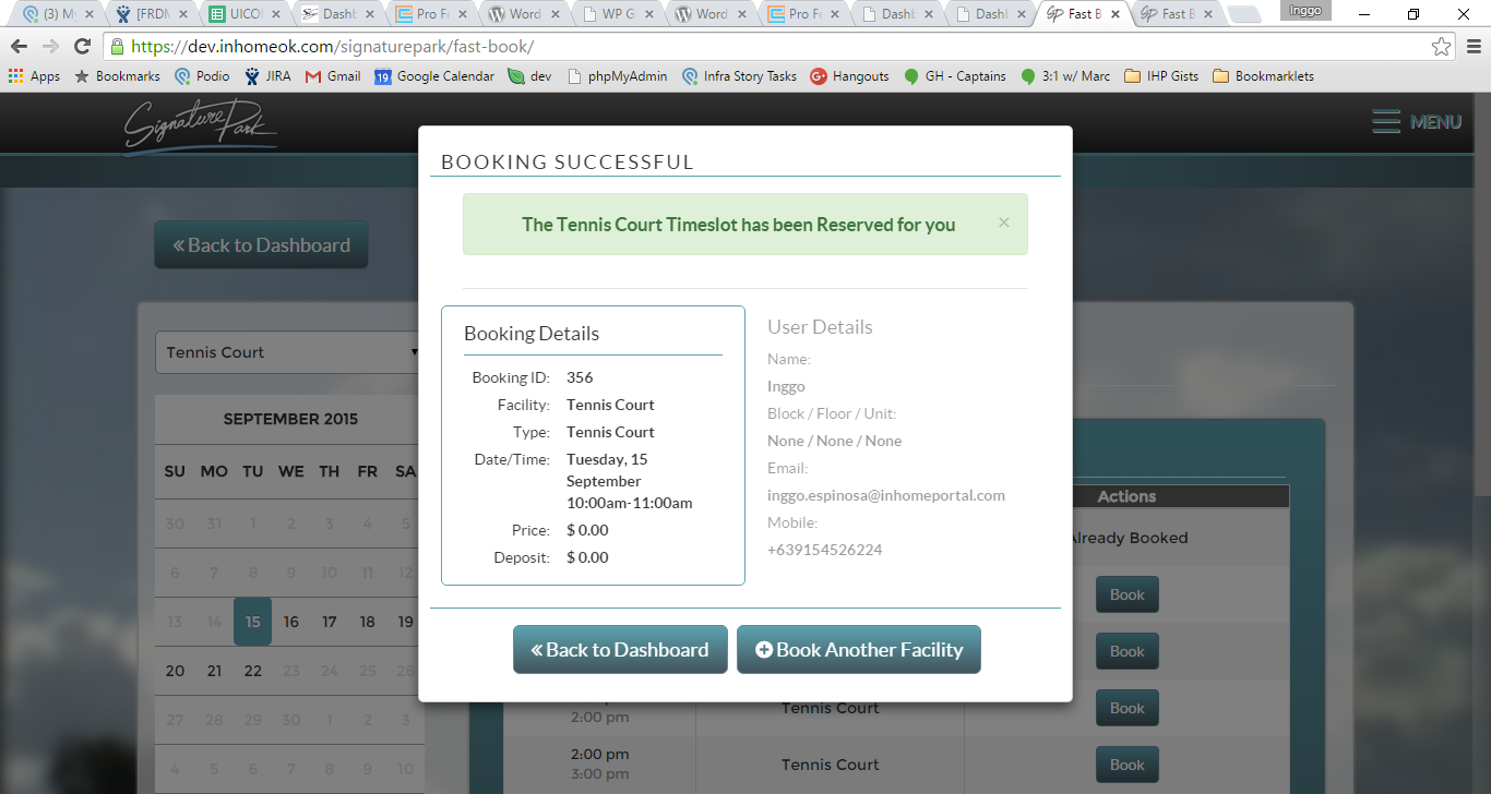
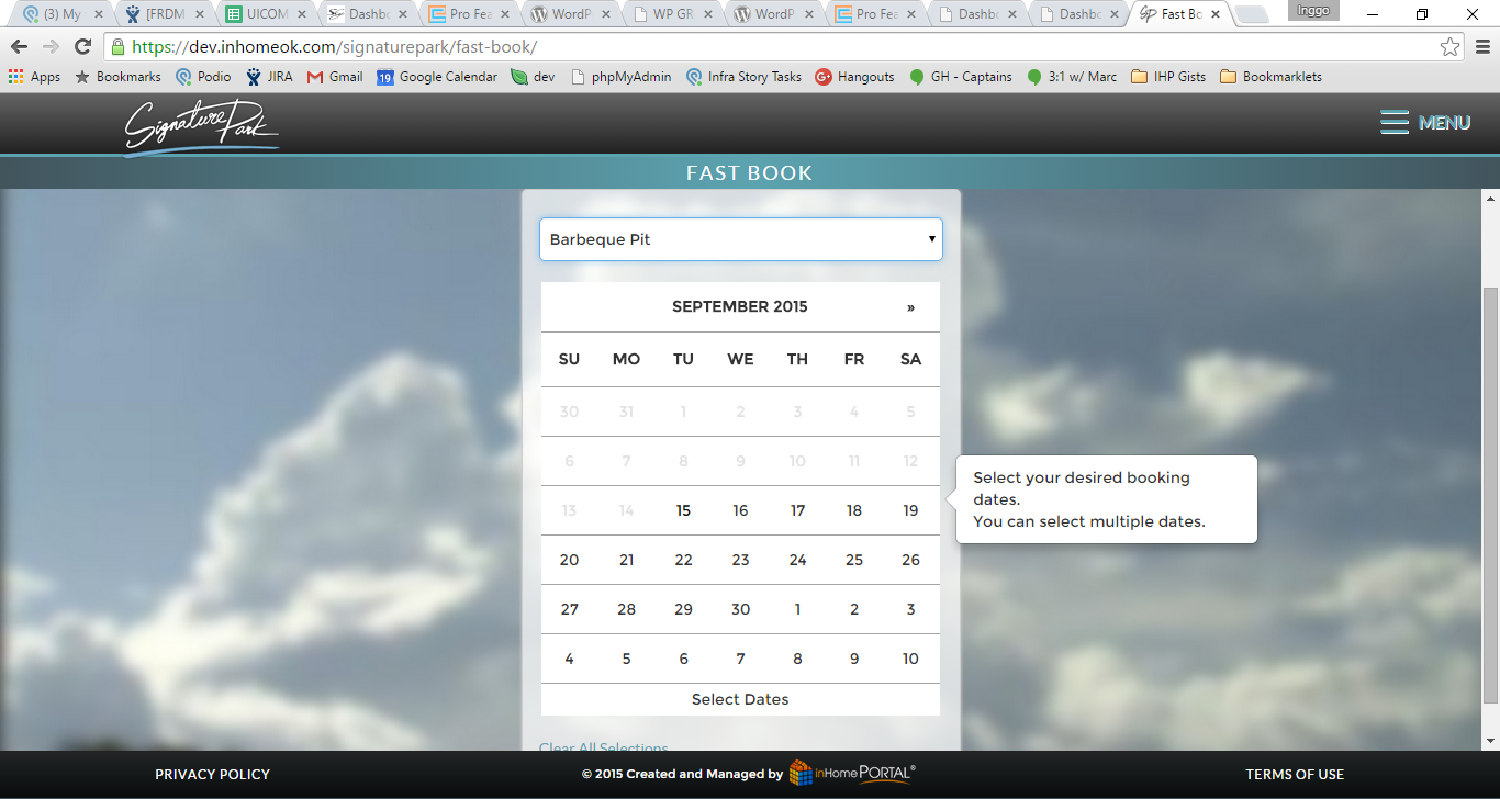
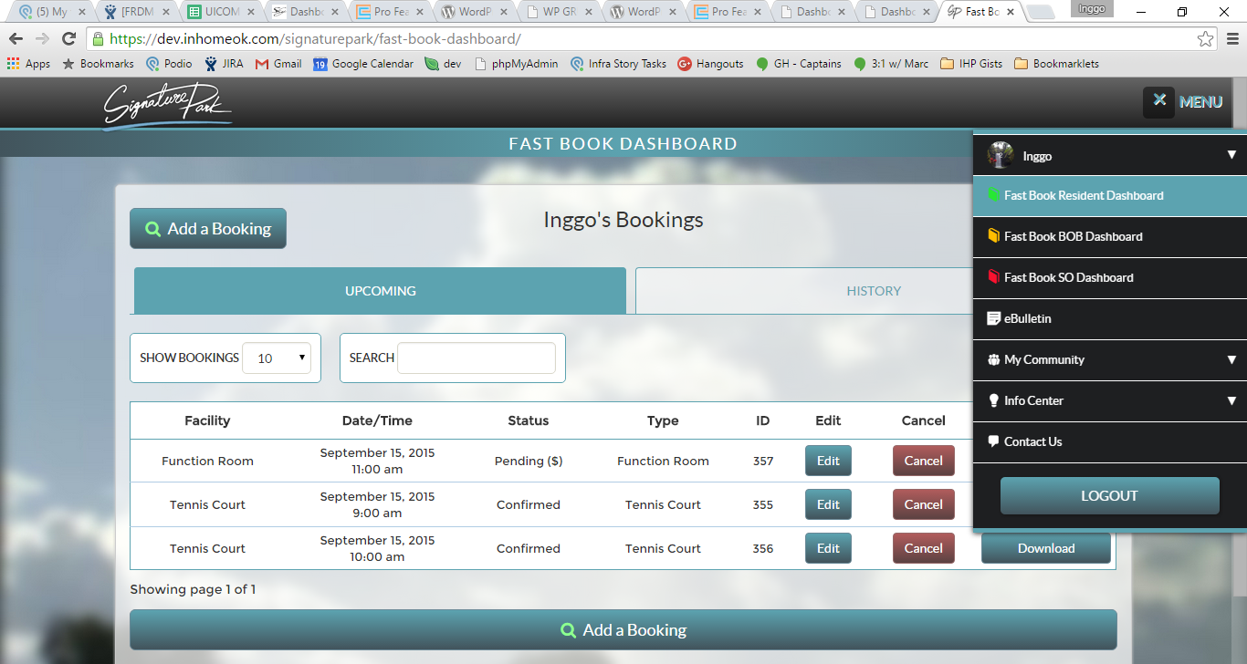
Flow on FBI add a booking does this well.
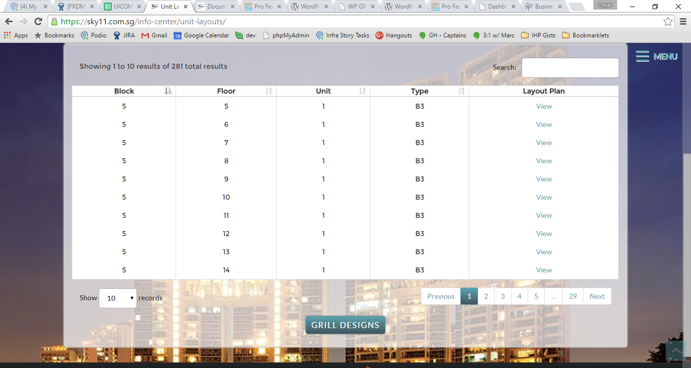
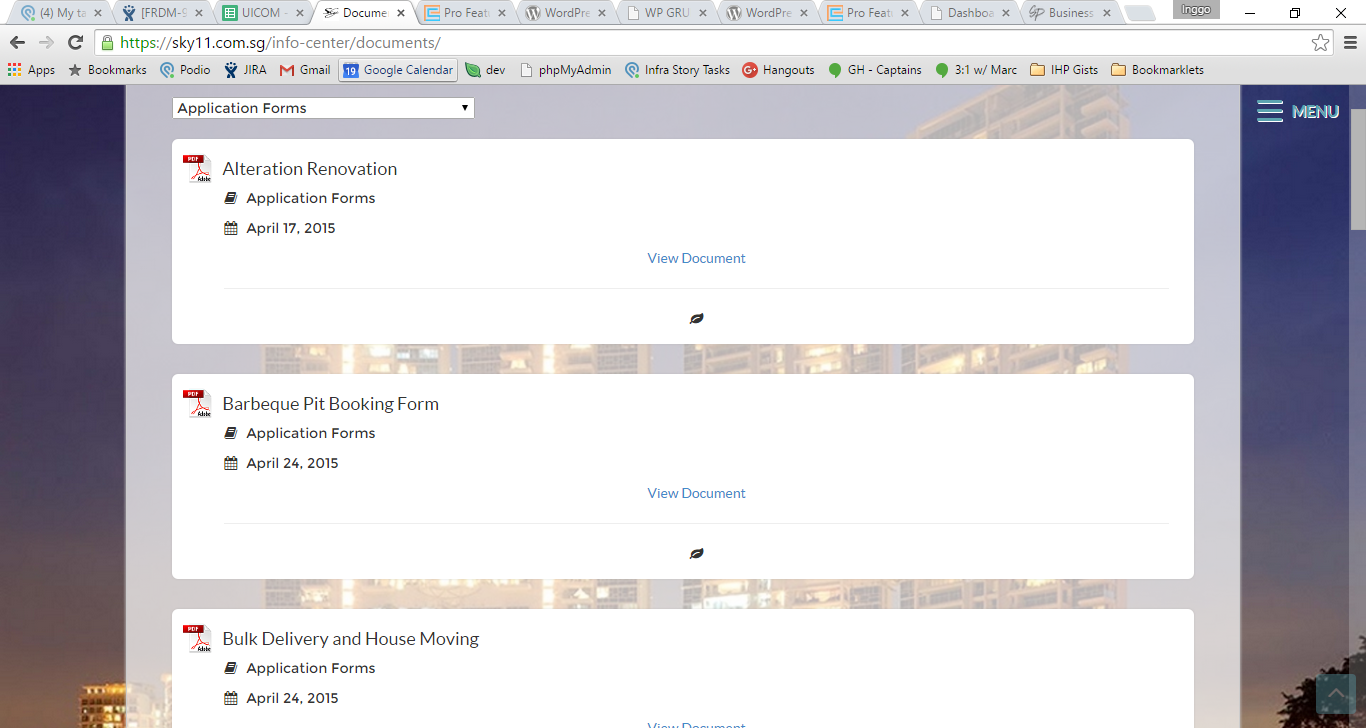
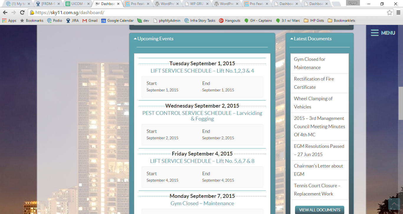
Flow can be improved on documents, unit layouts.
Our pages shows its functions by themselves.
We also think our wordings are good enough. None of them sound monologue-like.
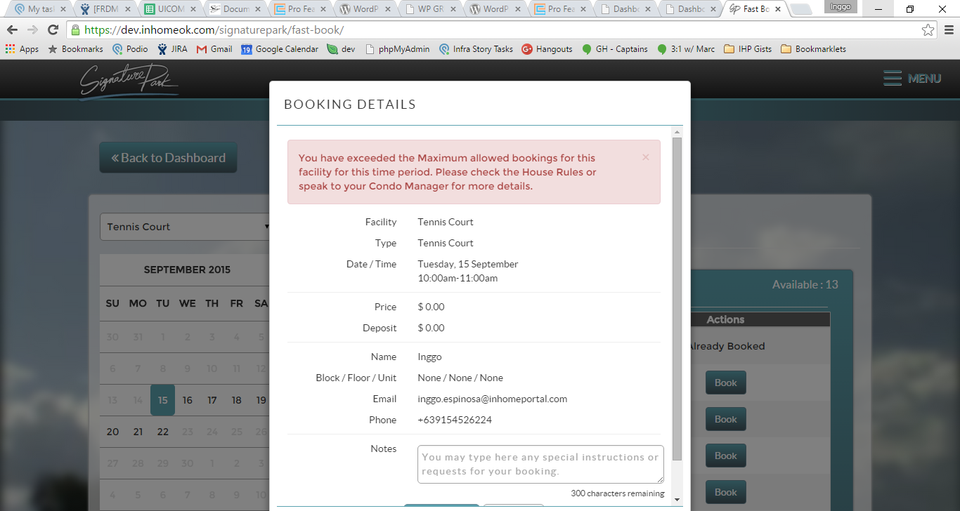
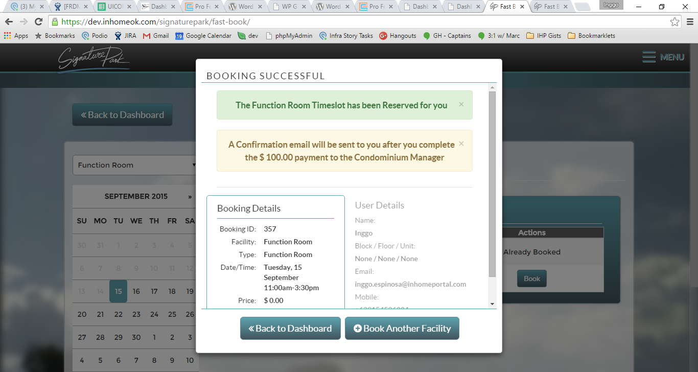
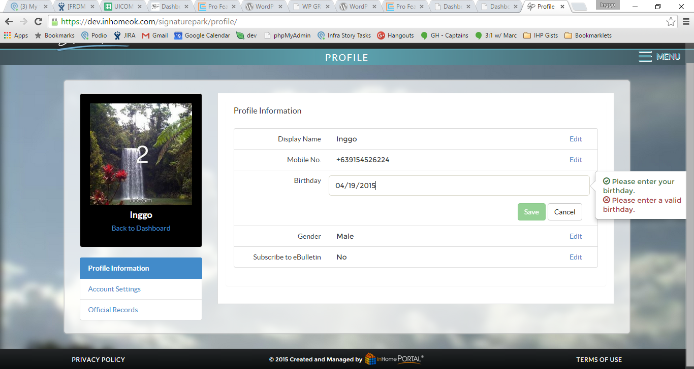
Important to not that we should put the restrictions initially, not at the end of workflow like the errors on FBI.
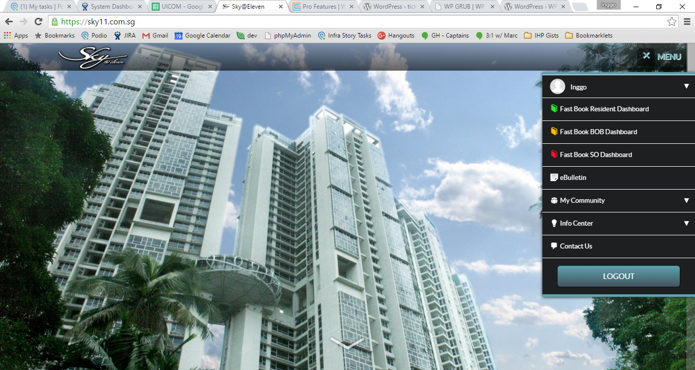
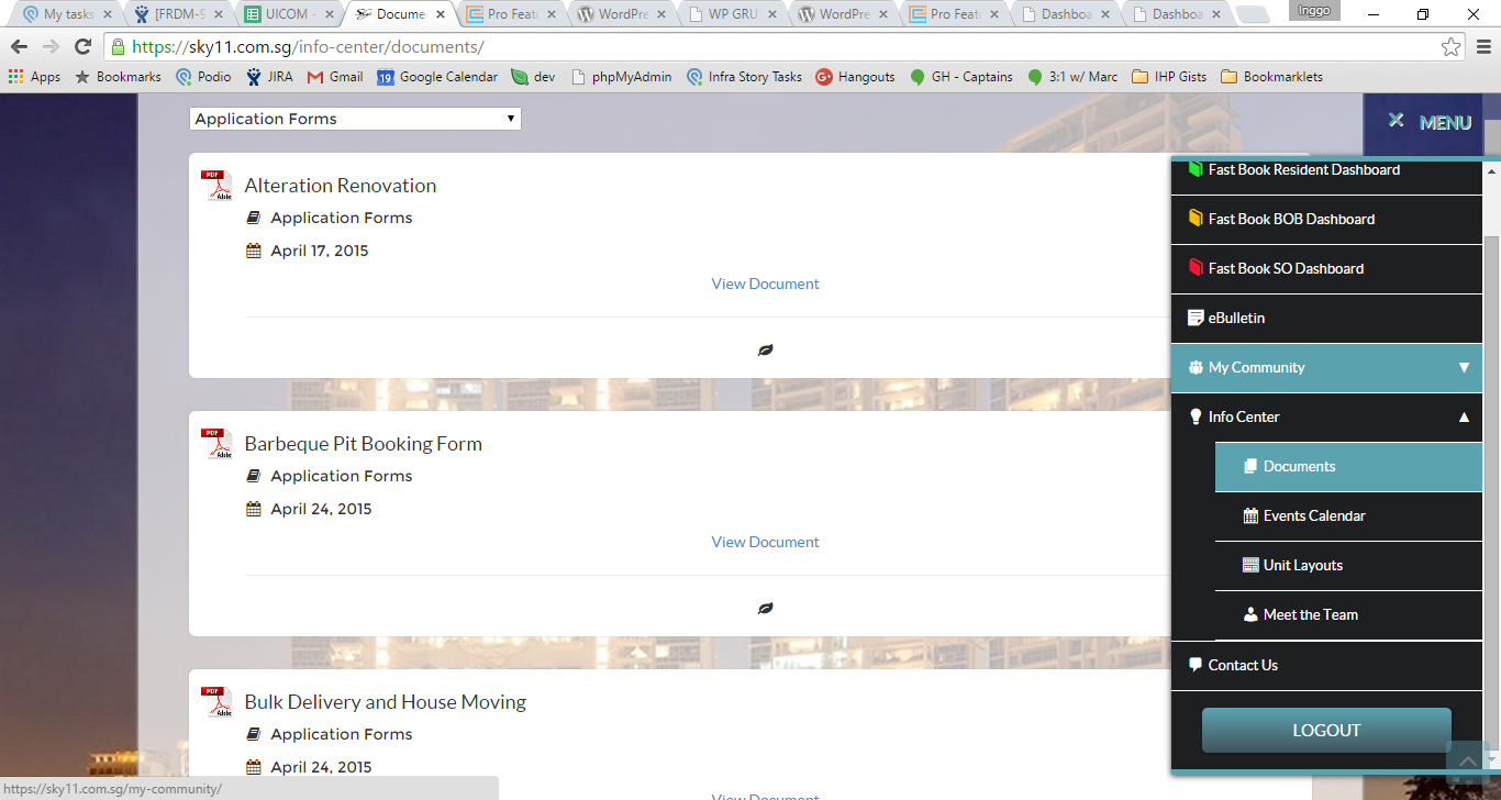
We are hiding one very important element on every page : The menu
Again, our menu hides some non-secondary elements that the user won’t discover until they click the menu itself.
We tend to hide elements, like the menu, accordions, modals.
Secondary level on menu is important, we should think about how to present it better.
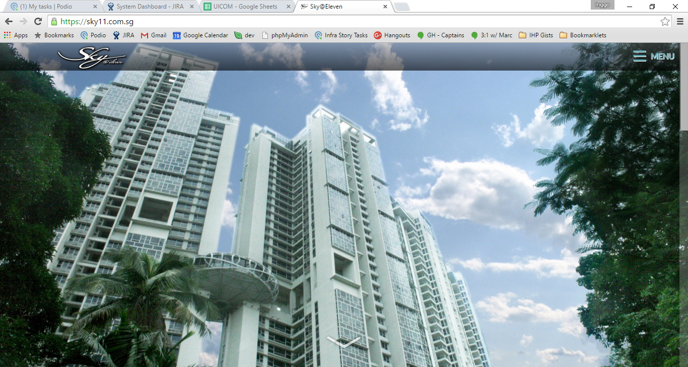
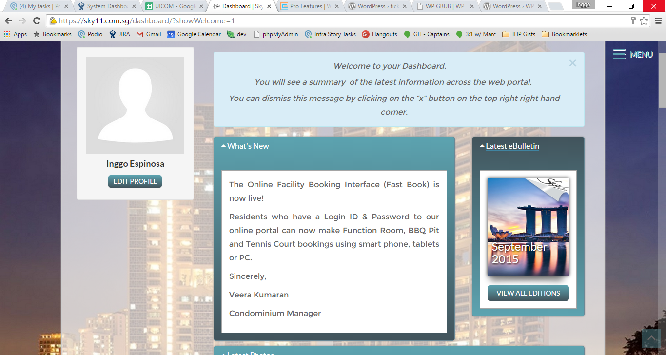
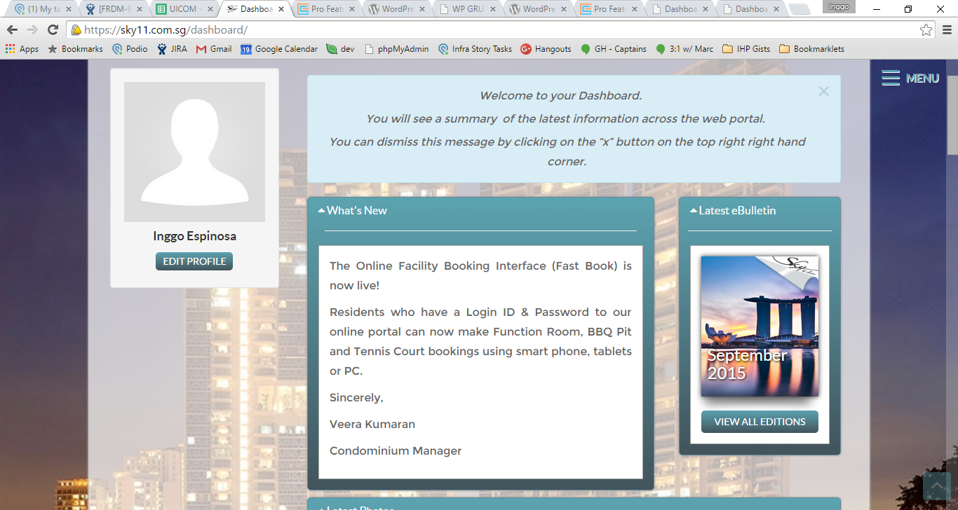
The initial outstanding view of the homepage is the big background image. It's not obvious that it's scrollable.
Our typography is visually easy to read. But sometimes, we overuse text shadows. Although we have a general font size for our body elements, some pages are not consistent. Font sizes are inconsistent -- some are justified, some are left aligned. (e.g. Freedom Dashboard welcome message)
Our colors are chosen well, like what we specify on the buttons: if negative, should be red; if positive, should be blue.
We can make use of this in our alert boxes as we are already doing so in some areas.
We can also make use of this to highlight (or de-highlight) certain call to actions.
We use some affordances in the form of tooltips and popovers.
This is also related to the ‘Click here’ text. we only need to put those in case the UI is not intuitive enough. But if a UI is intuitive, then it should be improved.
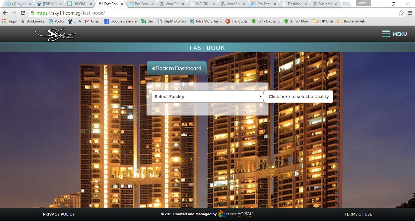
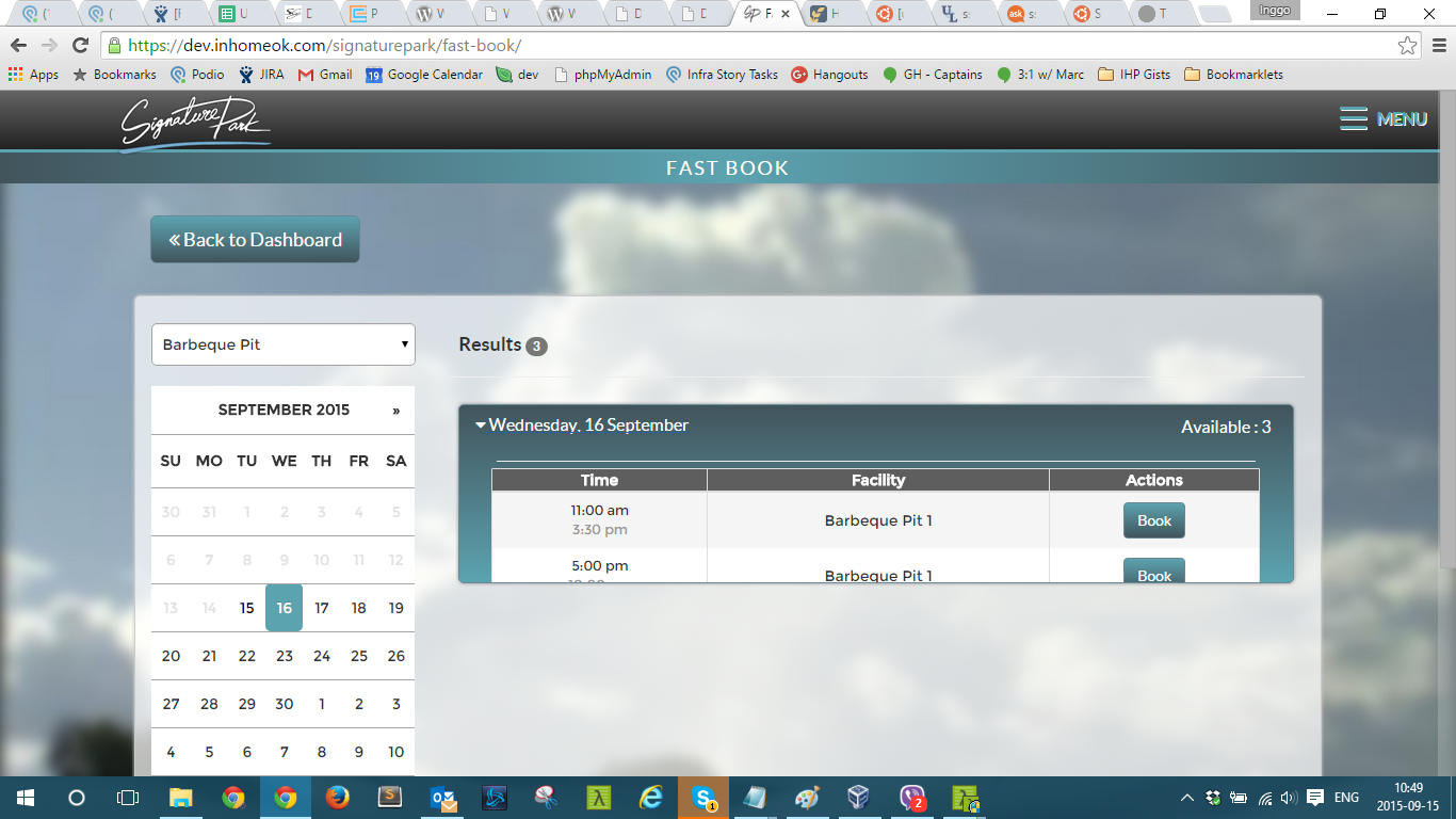
We can consider having our secondary controls, like filters in FBI, as a modal/show/hide instead.
We use a standard library for our icons (font-awesome).
The icons we use on the responsive menu represents what the page is.
I believe icons are a good way to communicate in small spaces. Maybe we should opt to remove the text and have icons instead on our mobile views.
We are using dashicons, elusive also (menu). Maybe we should only use one standard library
We use animations everywhere.
if 1 date selected on Add a Booking, the accordion automatically expands
Although animations are nice, we must consider the performance hits they can cause.
Page changing, such as on our unit layouts page, doesn’t animate. A better transition might be in order here.
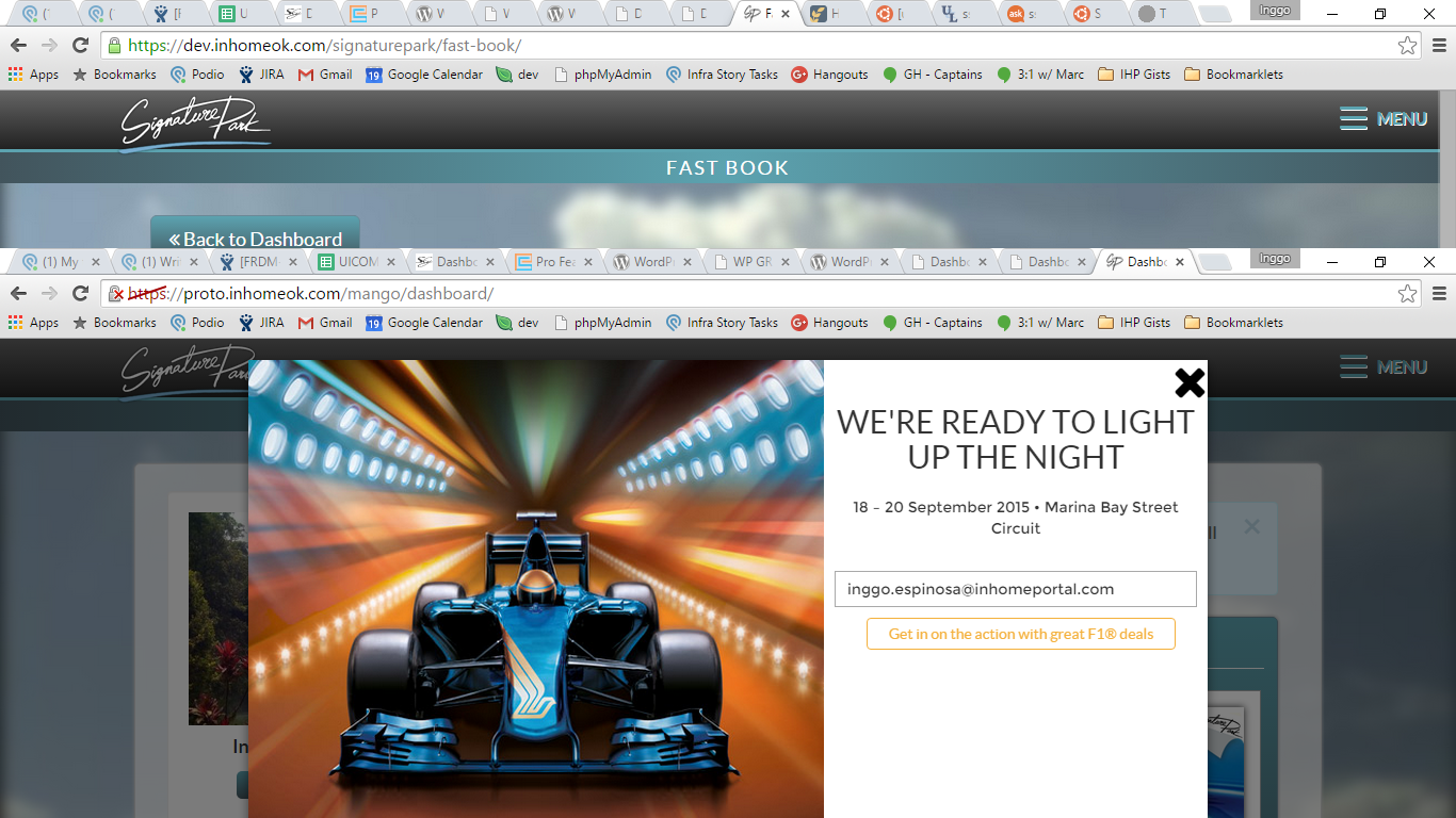
We use persistent modals, and planned user-interruptions in the form of ads.
We have been applying this on modals.
By Gian Faye Paguirigan
Visual Design


