Gian Faye Paguirigan
Web Artisan. Maker of Things. Geek of all Trades.
Prepared by:
Inggo Espinosa
Daryll Delfin
Gian Paguirigan
JP Villafuerte
4
We already assume that the users of our product are humans. We even do role-plays.
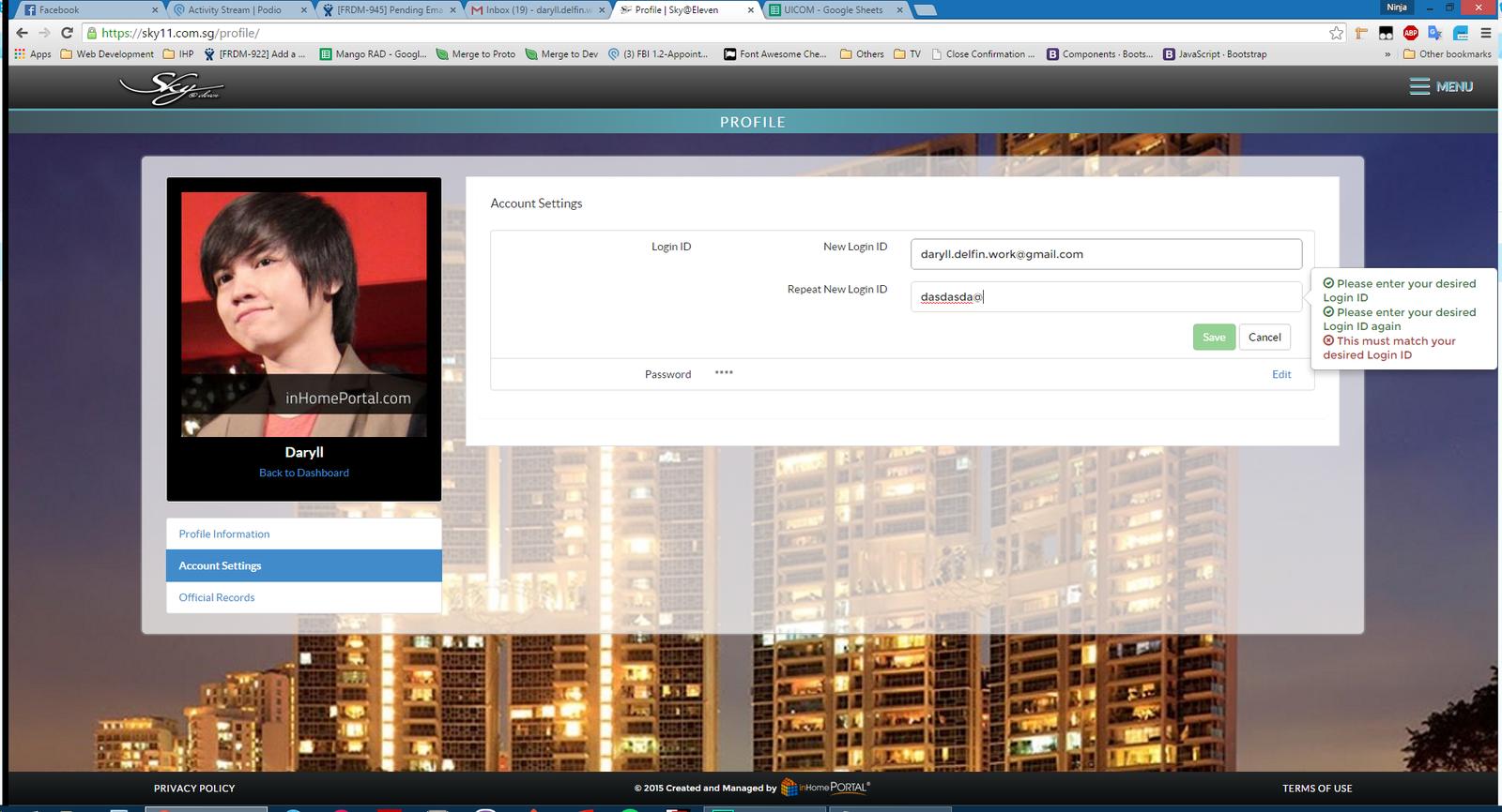
We shouldn’t use negative words when a user inputs something wrong, such as on our profile page.
Terms of Use checkboxes on update credentials
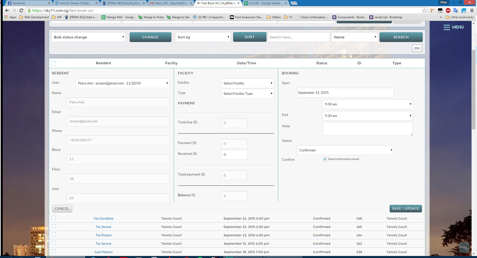
auto populating fields when selecting a user on admin SO dashboard (auto check, etc.)
We should expect our users to make mistakes.
We do not have a personality on our product yet. All messages are still a bit general.
We should give our product an identity. We should be more consistent in our components. Our cards, for example, should all look similar. As per our data tables, accordions, etc.
Fix our messages, tone, capitalization, grammar, periods. Be consistent.
We do this by providing useful info to our users.
We can do this by creating more useful modules for our users, like the forums and ticket system.
Regularly updating content.
Form validation, smart filters. Although everything is not perfect, we already take these into account.
Every workflow should have an exit point, even modals. (re-introduce close button)
Understandable, but we must also balance security with ease-of-use.
We can only do this by minimizing bugs, browser behavior differentiation, errors.
We should make the user’s goals our primary concerns. This basically means that we should ensure that the user is always able to use our product correctly, such as in FBI.
Smart filters, and not allowing users to do what they shouldn't do.
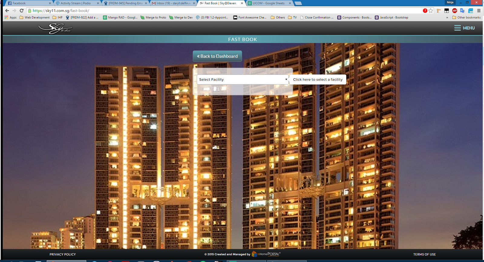
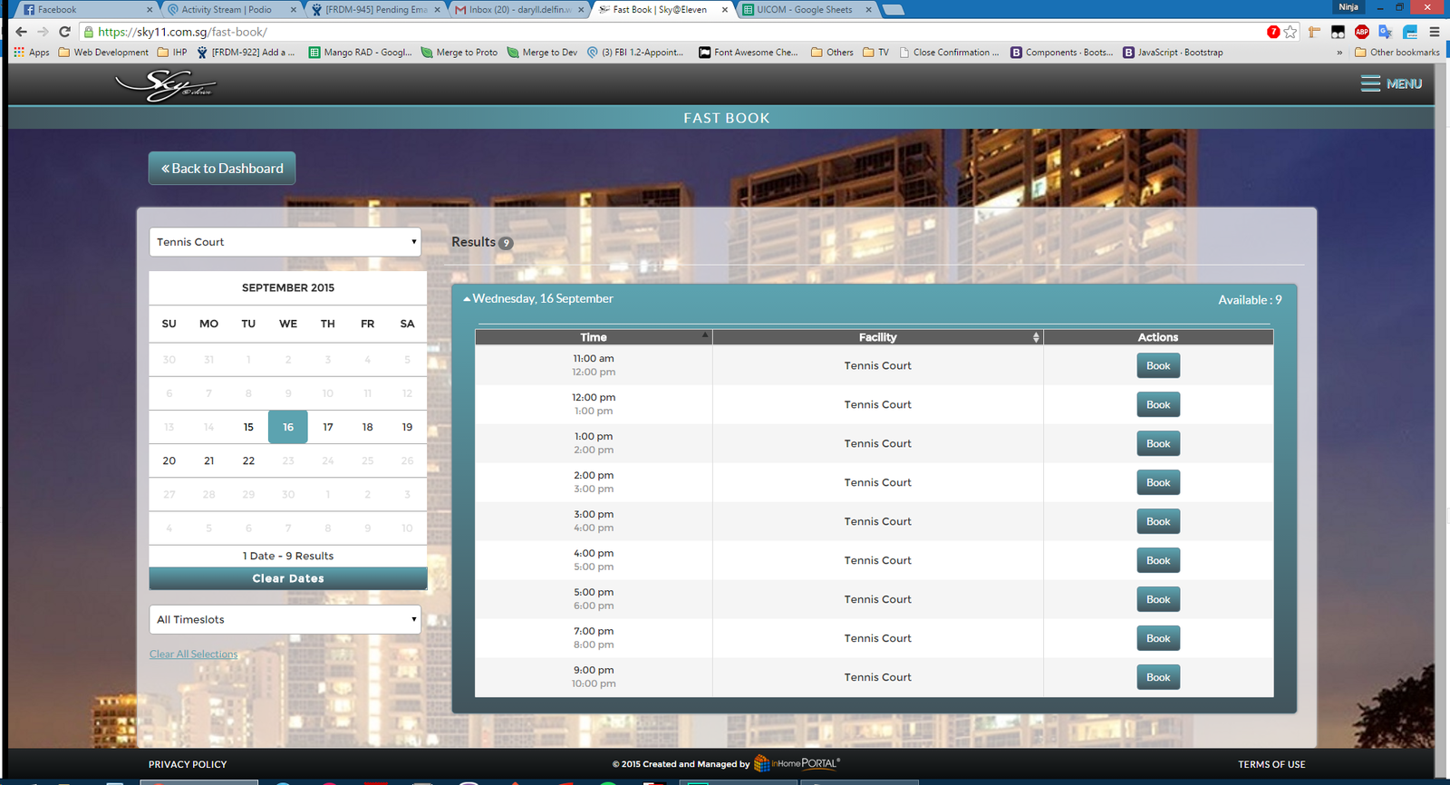
This is easier for us because we know our target audience. We can take advantage of this by understanding what they want in our
product and improve upon it. For now, it seems the most popular feature is the facilities booking and the most popular venue, for
Sky@11 at least, is the tennis court. Knowing this, maybe we should prioritize tennis courts in the dropdown instead of the other choices?
In line with that, eventually, maybe we should make the choice dynamic. We can have FBI learn what the most popular facility is
and have it automatically sort based on that.
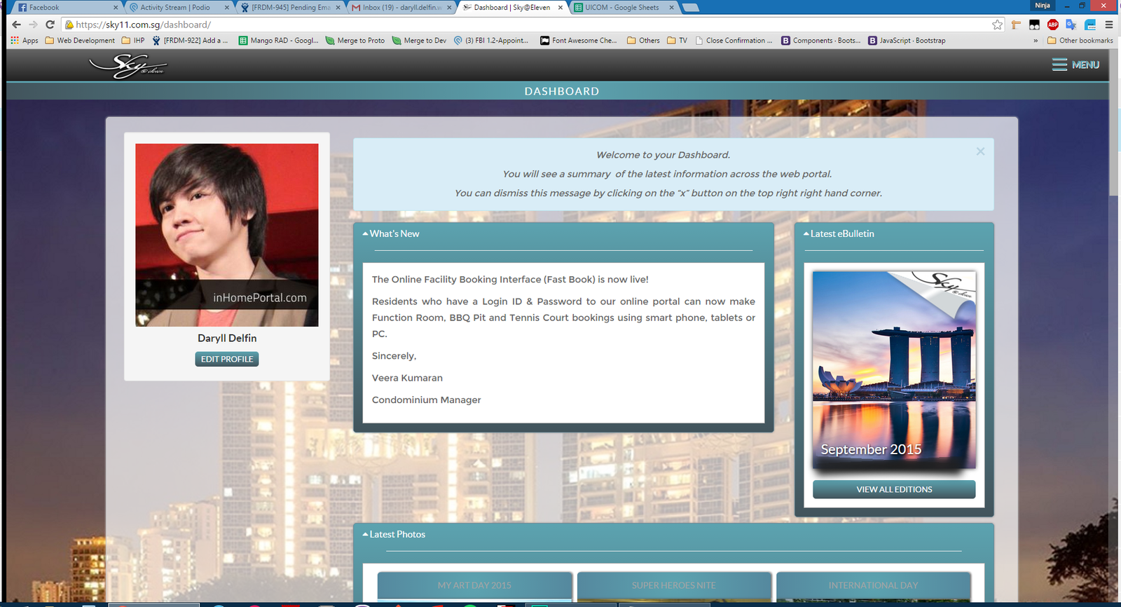
Resident dashboard - prioritize panels that are most being used.
There are some elements that we can improve on : Preloader, Ads, Performance, Menu, Booking
We should make sure on Mango, that the way we present our sponsors are not annoying and obtrusive.
No autoplaying videos.
We are somewhat applying that by allowing users to filter through all possible facility types.
Maybe we can improve this by instead of having confirmation dialogues, having undo dialogues instead… when cancelling a booking, for example. (Note that this is difficult to implement) -- example on cancelling a booking.
Airplane animation advertisement is interruptive but fun!
How about putting some Easter eggs?
Improve personality: Formal but fun and engaging
By Gian Faye Paguirigan
Communicating to People


