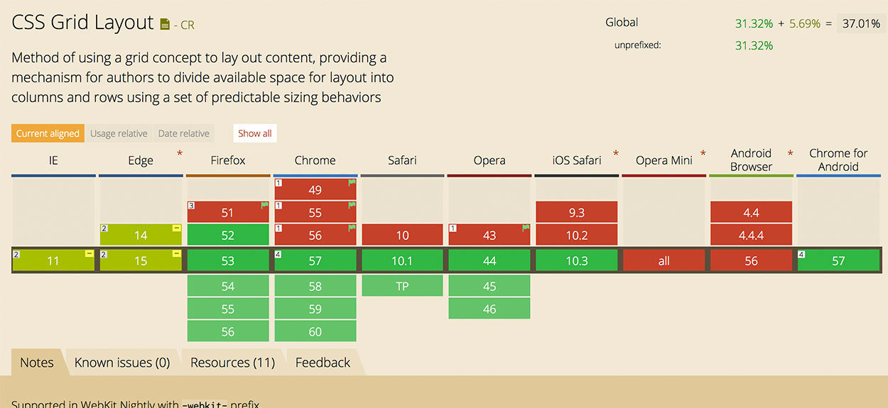
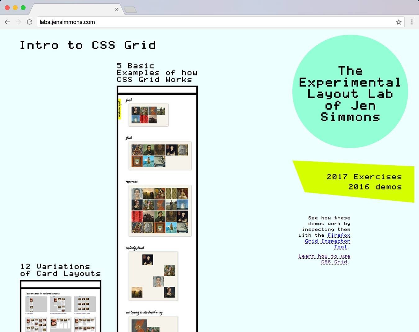
CSS Grid layout
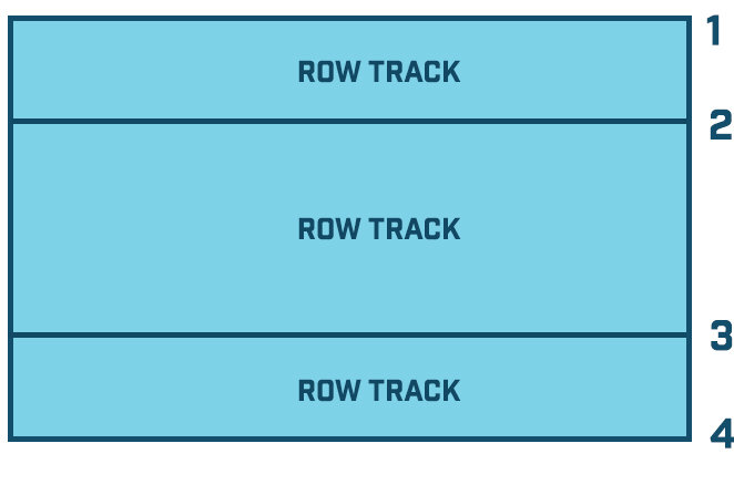
grid layout
<div class="container">
  <div class="row">
    <div class="col-12">
      <h1>My Grid Layout!</h1>
    </div>
  </div>
  <div class="row">
    <div class="col-8"></div>
    <div class="col-4"></div>
  </div>
  <div class="row">
    <div class="col-4"></div>
    <div class="col-4"></div>
    <div class="col-4"></div>
  </div>
</div>grid layout
<div class="container">
  <h1>My Grid!</h1>

  <div class="col"></div>
  <div class="col"></div>

  <div class="col"></div>
  <div class="col"></div>
  <div class="col"></div>
</div>grid layout
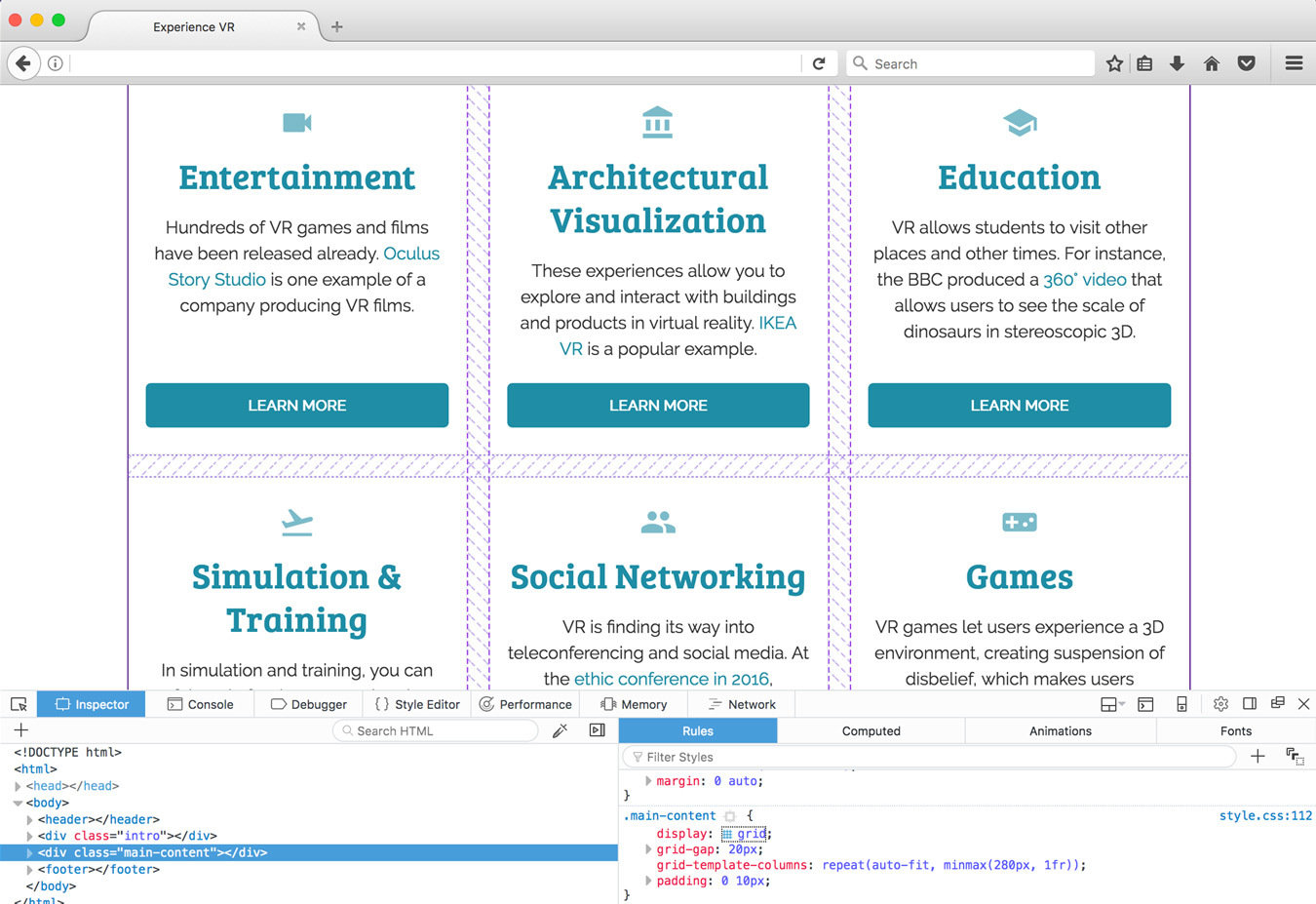
.main-content {
  display: grid;
}
<div class="main-content">
<div class="card">...</div>
<div class="card">...</div>
<div class="card">...</div>
</div>grid layout
grid layout
grid layout
grid layout
grid layout
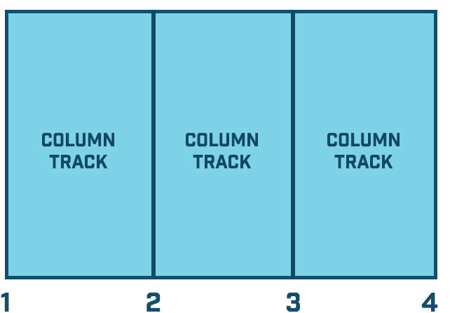
.main-content {
  display: grid;
  grid-template-columns: 200px 200px 200px;
}
<div class="main-content">
<div class="card">...</div>
<div class="card">...</div>
<div class="card">...</div>
</div>grid layout
Grid layout
Grid layout
.main-content {
  display: grid;
  grid-template-columns: 200px 1fr 200px;
}
grid layout
grid layout
.main-content {
  display: grid;
  grid-template-columns: 1fr 1fr 1fr;
}grid layout
grid layout
.main-content {
  display: grid;
  grid-template-columns: 1fr 2fr 1fr;
}grid layout
grid layout
.main-content {
  display: grid;
  grid-template-columns: 1fr 1fr 1fr;

  grid-template-rows: 100px;
}
grid layout
grid layout
.main-content {
  display: grid;
  grid-template-columns: 1fr 1fr 1fr;

  grid-template-rows: 100px 300px;
}
grid layout
grid layout
.main-content {
  display: grid;
  grid-template-columns: 1fr 1fr 1fr;

  grid-row-gap: 15px;
  grid-column-gap: 10px;
}
grid layout
.main-content {
  display: grid;
  grid-template-columns: 1fr 1fr 1fr;

  grid-gap: 15px 10px;
}
grid layout
grid layout
.main-content {
  display: grid;
  grid-template-columns: 1fr 1fr 1fr;
  grid-gap: 15px 10px;
}
grid layout
.main-content {
  display: grid;
  grid-template-columns: repeat(3, 1fr);
  grid-gap: 15px 10px;
}
grid layout
.main-content {
  display: grid;
  grid-template-columns: repeat(5, 1fr 2fr);
  grid-gap: 15px 10px;
}
grid layout
.main-content {
  display: grid;
  grid-template-columns: minmax(200px, 300px) 1fr 1fr;
}
grid layout
.main-content {
  display: grid;
  grid-template-columns: minmax(200px, 1fr) 1fr 1fr;
}
grid layout
.main-content {
  width: 95%;
  max-width: 1000px;

  display: grid;
  grid-template-columns: repeat(3, minmax(200px, 1fr));
}
grid layout

grid layout
.main-content {
  width: 95%;
  max-width: 1000px;

  display: grid;
  grid-template-columns: repeat(auto-fit, minmax(280px, 1fr));
}
grid layout

grid layout
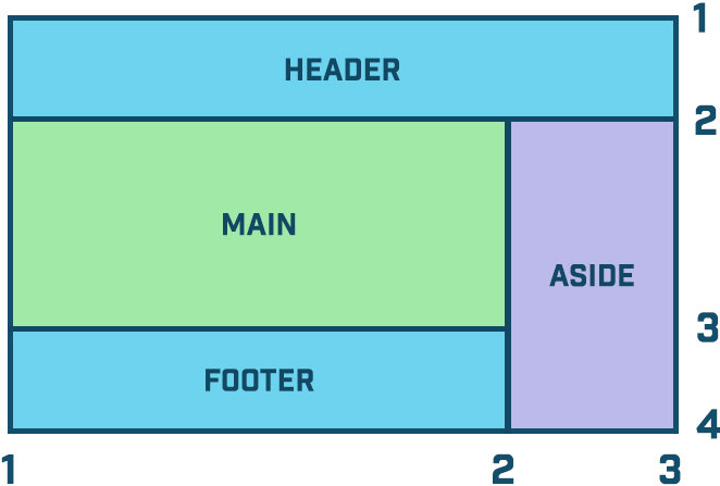
header {
  grid-area: head;
}
main {
  grid-area: main;
}
aside {
  grid-area: side;
}
footer {
  grid-area: foot;
}
<div class="wrapper">
<header>header</header>
<main>content</main>
<aside>sidebar</aside>
<footer>footer</footer>
</div>grid layout
header {
  grid-area: 🍻;
}
main {
  grid-area: 🍔;
}
aside {
  grid-area: 🍟;
}
footer {
  grid-area: 💩;
}
<div class="wrapper">
<header>header</header>
<main>content</main>
<aside>sidebar</aside>
<footer>footer</footer>
</div>grid layout
.wrapper {
  display: grid;
  grid-gap: 10px;
  grid-template-rows: auto 300px;
  grid-template-columns: 3fr 1fr;

  grid-template-areas:
    '🍻 🍻'
    '🍔 🍟'
    '💩 💩';
}grid layout
grid layout
grid layout
grid layout
.container {
  display: grid;
  grid-template-areas:
    'A  B  C  E'
    'A  D  D  E';
}
grid layout
img:nth-child(1) {
 grid-area: A;
}
img:nth-child(2) {
 grid-area: B;
}
img:nth-child(3) {
 grid-area: C;
}
img:nth-child(4) {
 grid-area: D;
}
img:nth-child(5) {
 grid-area: E;
}
Grid Layout
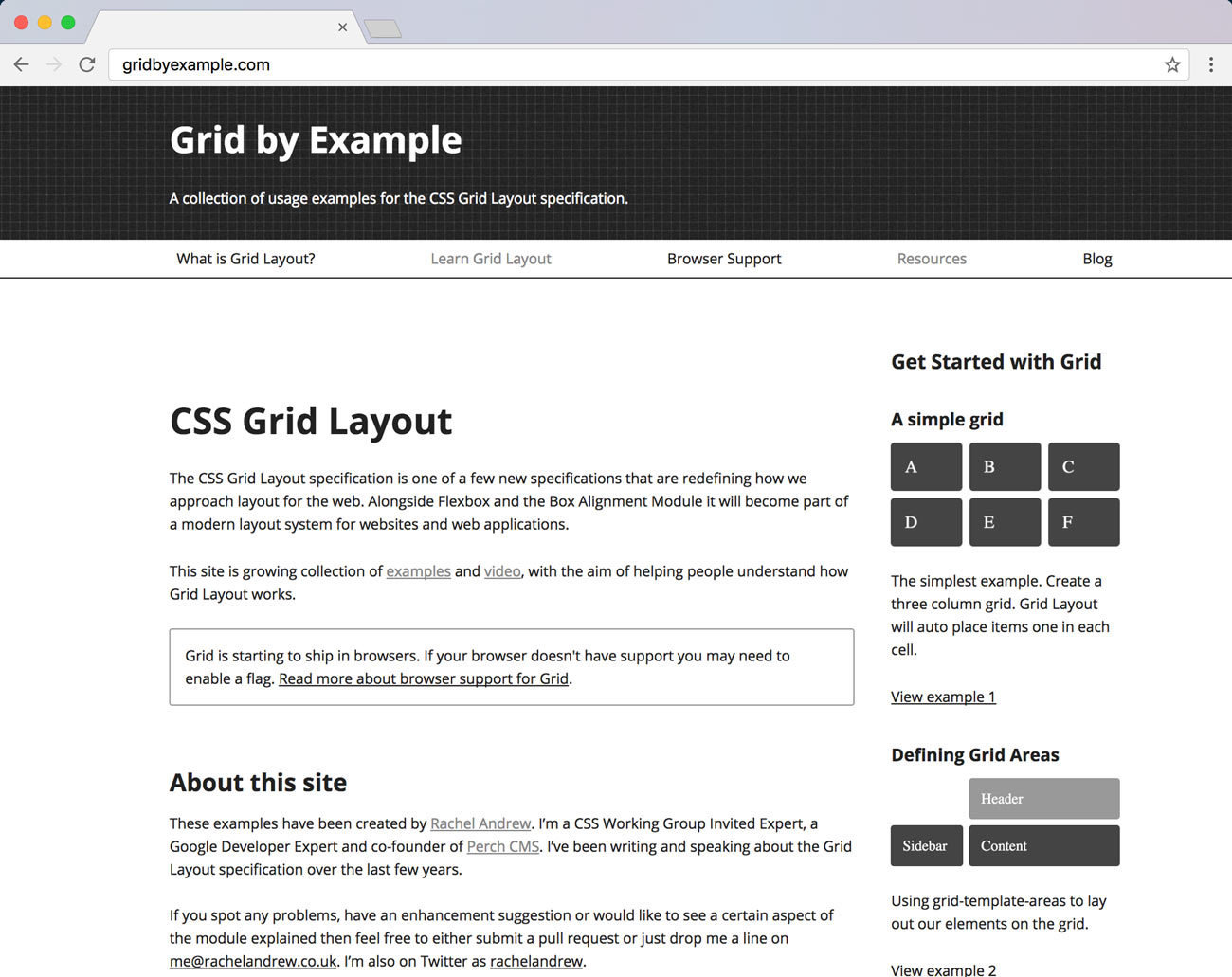
Learn All Things CSS Grid
@rachelandrew
@jensimmons
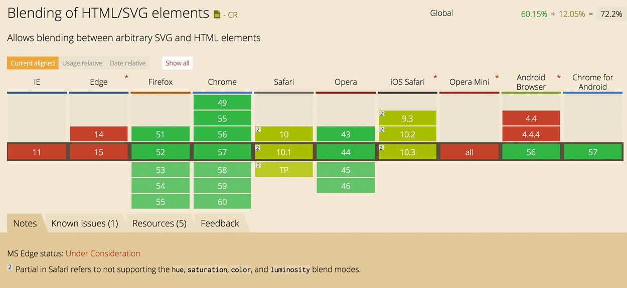
Compositing & Blending
Compositing
The combining of a graphic element with its backdrop
Blending
Calculates the mixing of colors wherever an element and a backdrop overlap
Blending
header {

  background: linear-gradient(#009fe1, #3acec2),
              url('bg.jpg') no-repeat;

  background-blend-mode: multiply;
}

mix-blend-mode


Blending
.img-mix {
  width: 650px;
  mix-blend-mode: lighten;
}


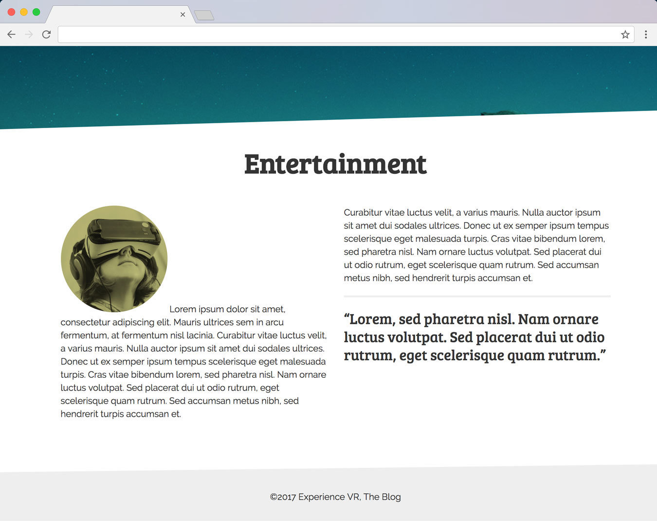
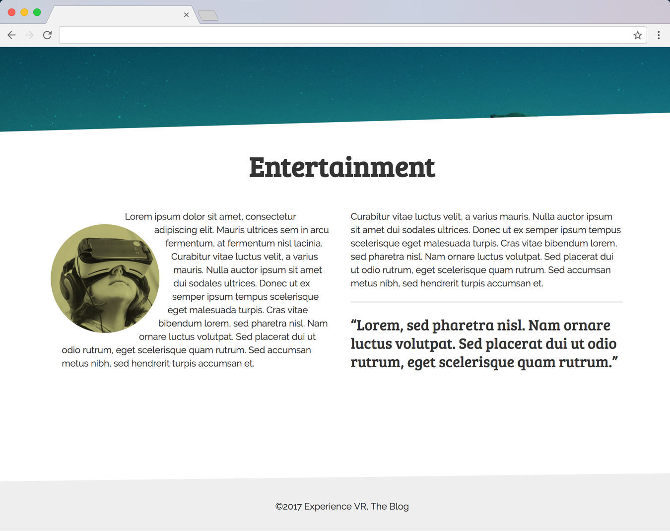
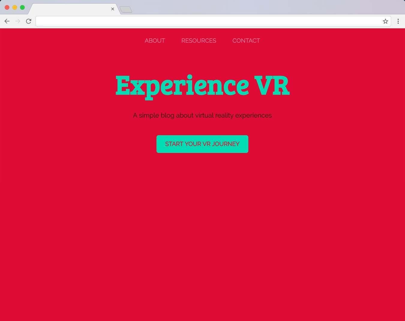
.img-featured img {
  width: 100%;
  height: 100%;
  mix-blend-mode: multiply;
}

.img-featured {
  ...
  background-color: #f8f295;
}
<div class="img-featured">
  <img src="featured.jpg" alt="VR">
</div>Blending

svg image {
  mix-blend-mode: multiply;
}

svg {
  ...
  background-color: #f8f295;
}
<svg viewBox="0 0 600 600">
  <image xlink:href="featured.jpg" width="600" height="600">
<svg>Blending
Blending
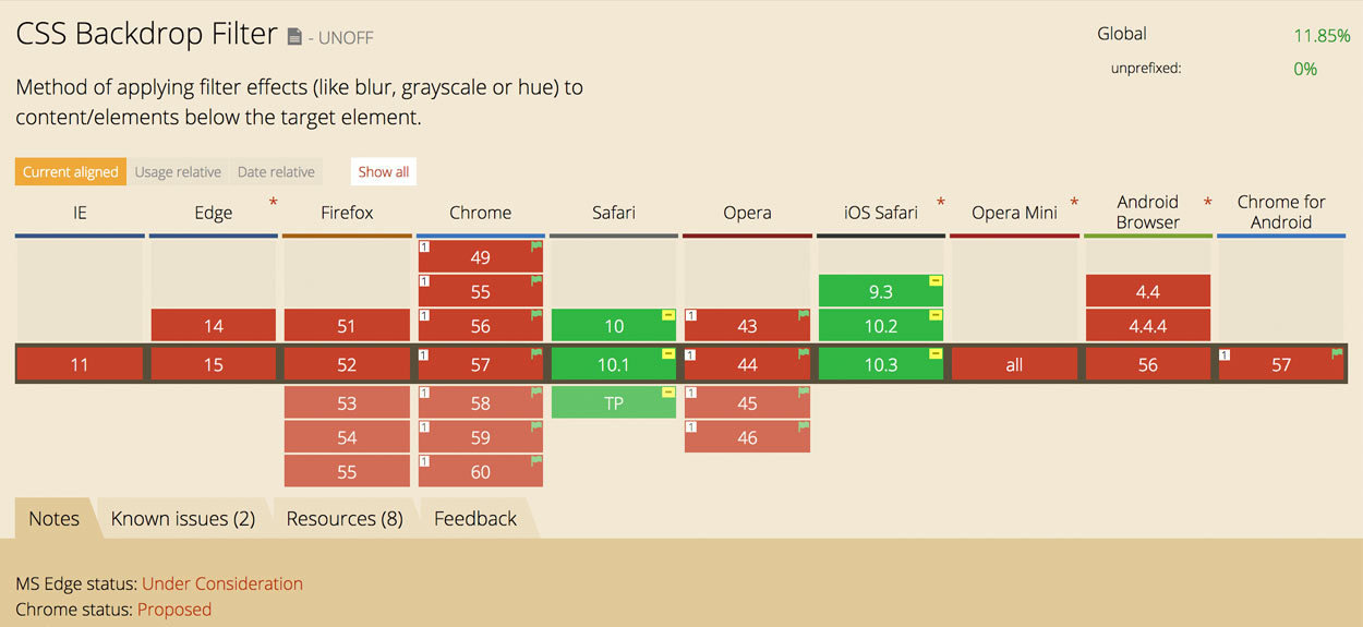
Backdrop Filter
.filter {
  ...
  backdrop-filter: invert(100%) blur(2px);
}

header {
  background-image: url(...);
}
Backdrop filter
Backdrop filter
Backdrop filter
Backdrop filter
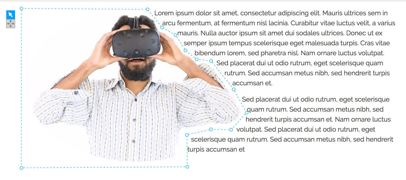
CSS shapes
CSS Shapes
.img-shape {
  width: 190px;
  border-radius: 50%;

  float: left;
  shape-outside: circle();
}
CSS Shapes
.img-shape {
  border-radius: 50%;
  float: left;

  shape-outside: circle();
}CSS Shapes
.img-shape {
  border-radius: 50%;
  float: left;

  shape-outside: border-box;
}CSS Shapes
.img-shape {
  border-radius: 50%;
  float: left;
  shape-outside: border-box;

  shape-margin: 20px;
}CSS Shapes
.triangle {
  width: 200px;
  height: 600px;
  float: left;

  shape-outside: polygon(0 0, 0 200px, 300px 600px);
}CSS Shapes
CSS Shapes
CSS Shapes Editor
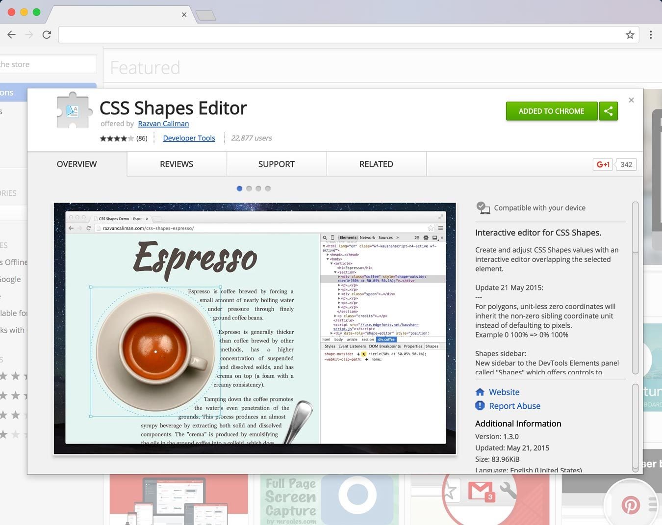
CSS SHAPES
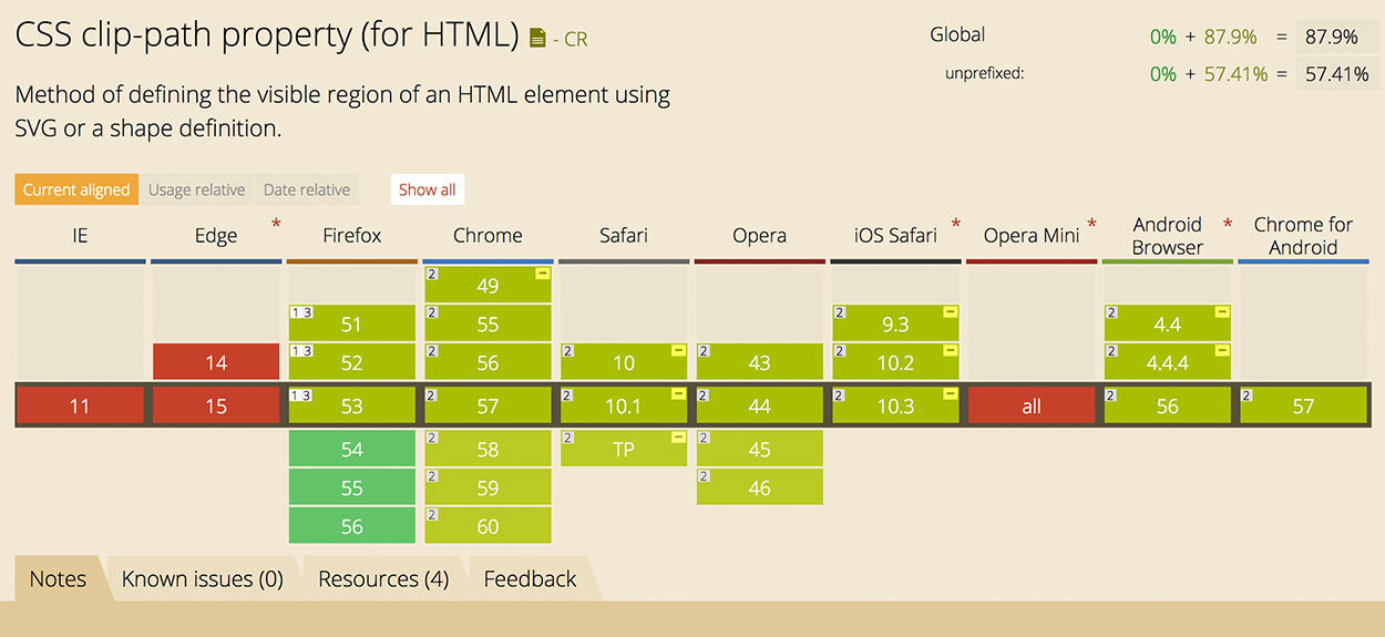
CSS Clip Paths
Clip Paths
.img-moon {
  float: left;
  clip-path: circle(115px at 50% 50.3%);
}
Clip Paths
Clip Paths
.img-moon {
  float: left;
  clip-path: circle(115px at 50% 50.3%);

  shape-outside: circle(115px at 50% 50.3%);
  shape-margin: 25px;
}
Clip Paths
Clip Paths
<svg width="0" height="0">
  <clipPath id="clipPolygon">
    <polygon points="..."></polygon>
  </clipPath>
</svg>
h1 {
...
clip-path: url('#clipPolygon');
}Clip Paths
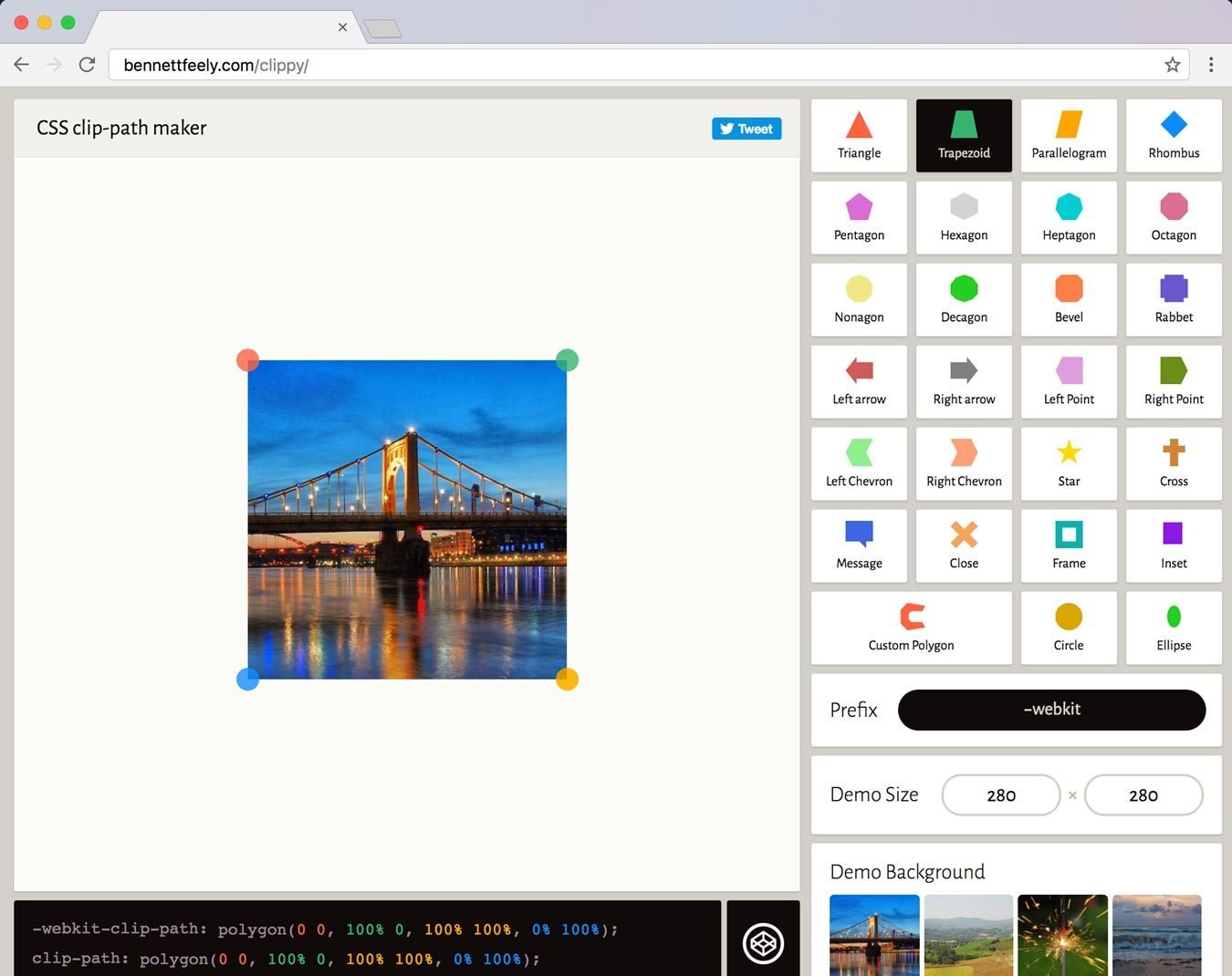

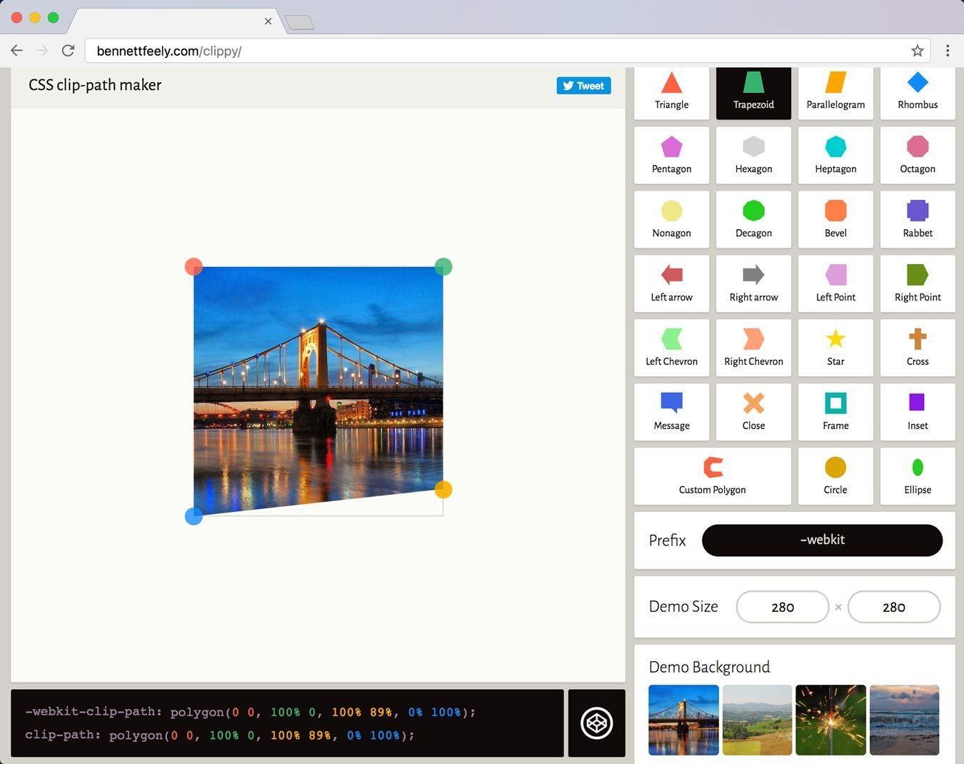
header {
  ...
  clip-path: polygon(0 0, 100% 0, 100% 89%, 0% 100%);
}
Clip Paths

Clip Paths
Color Values
Hex Notation
.icon {
  /* 50% alpha */
  color: #278DA480;
}
Hex Notation
.icon {
  /* 80% alpha */
  color: #278DA4CC;
}
Hex Notation
.icon {
  /* 20% alpha */
  color: #278DA433;
}
Hex Notation
.icon {
  color: #0022AA88;
}
Hex Notation
.icon {
  color: #02A8;
}
Hex Notation

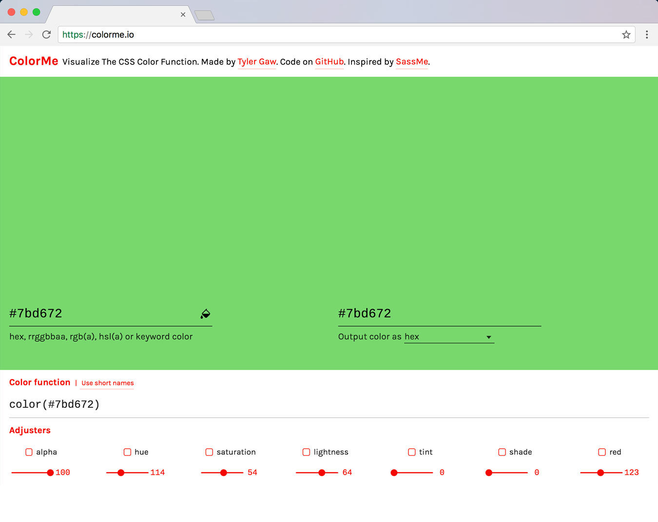
Modifying Colors
.box {
  background-color: color-mod(
                      #278da4 /* modified color */
                      hue(+ 5deg)
                      lightness(+ 15%)
                      alpha(75%)
                    );
}
a:hover {
  color: color-mod( #278da4 lightness(+ 20%) );
}
Modifying Colors
a:hover {
  color: color-mod( #278da4 lightness(- 5%) );
}
Modifying Colors
.box {
  background-color: color-mod(
                      #278da4
                      hue(+ 5deg)
                      lightness(+ 15%)
                      alpha(75%)
                    );
}
Modifying Colors
:root {
  --base: crimson;
  --base-dark: color-mod(var(--base) lightness(- 30%));
  --base-light: color-mod(var(--base) lightness(+ 25%));

  --complement: color-mod(var(--base) hue(+ 180deg));
  --complement-light: color-mod(var(--complement) lightness(+ 10%));
}
Modifying Colors

--base: cornflowerblue;

--base: hotpink;
--base: crimson;
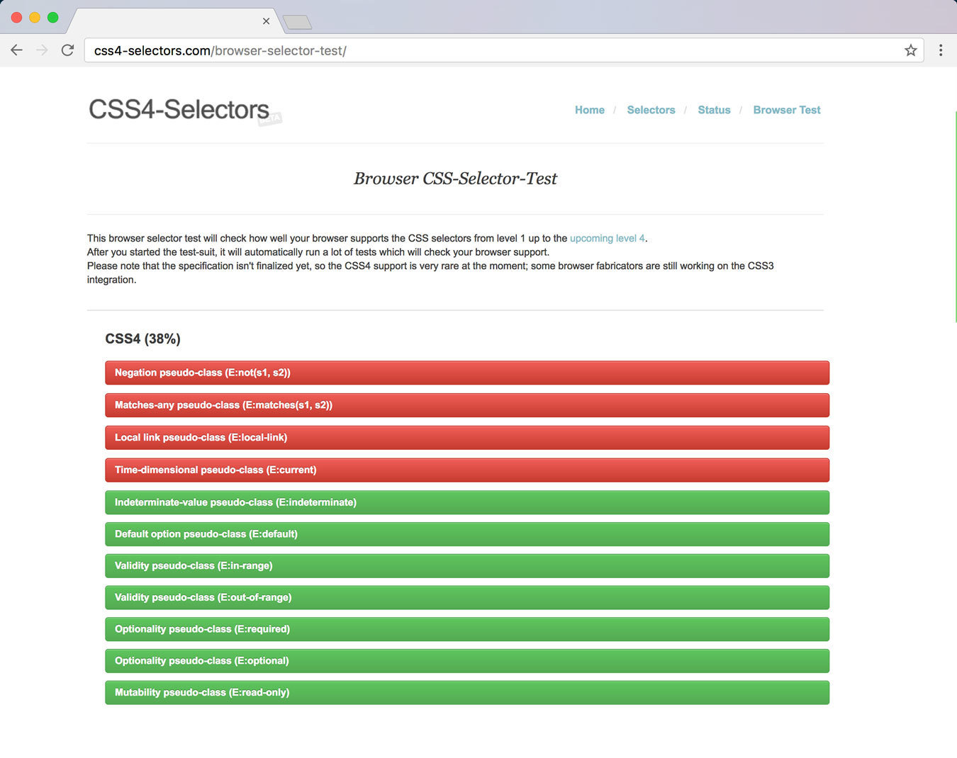
Selectors
Level 4
Selectors Level 4
:matches(.card, .modal, form) .btn {
  font-size: 1.25em;
}

/*
.card .btn,
.modal .btn,
form .btn { ... }
*/
Selectors Level 4
a:matches(:hover, :focus, :active, :visited) {
  color: tomato;
}

/*
a:hover,
a:focus,
a:active
a:visited {...}
*/
Selectors Level 4
:matches(img, p, form) + p {
  margin-top: 0;
}

/*
img + p,
p + p,
form + p {...}
*/

Selectors Level 4
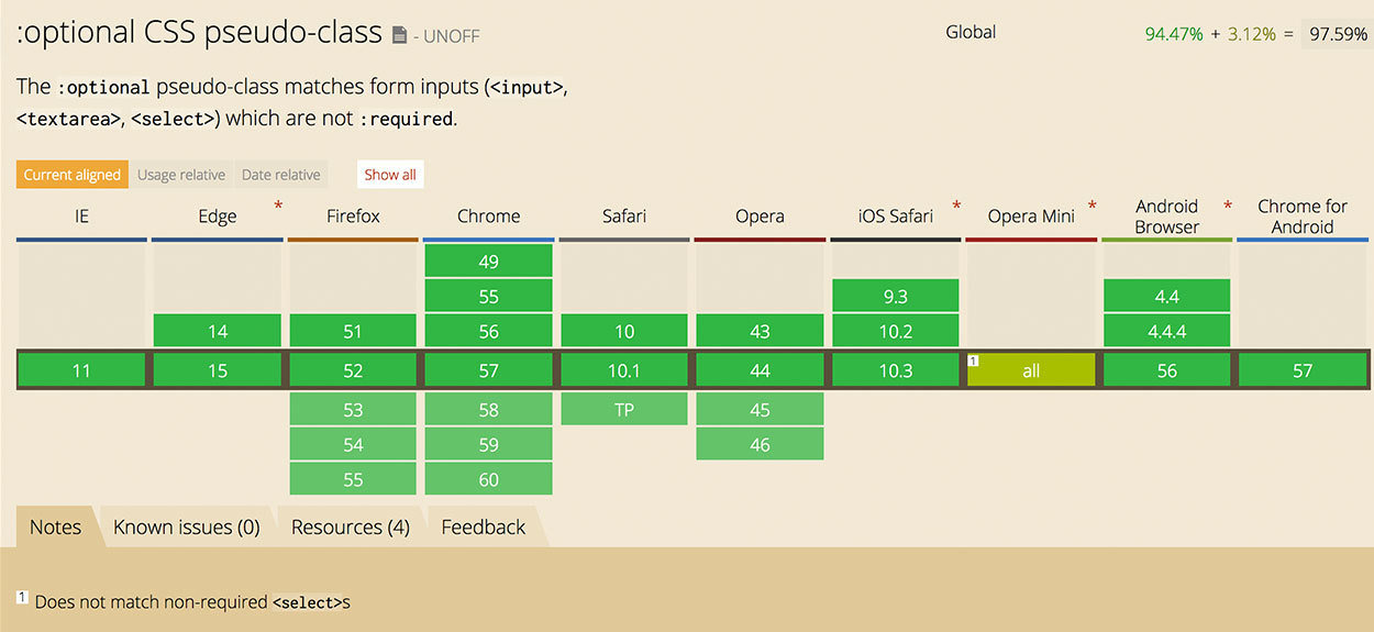
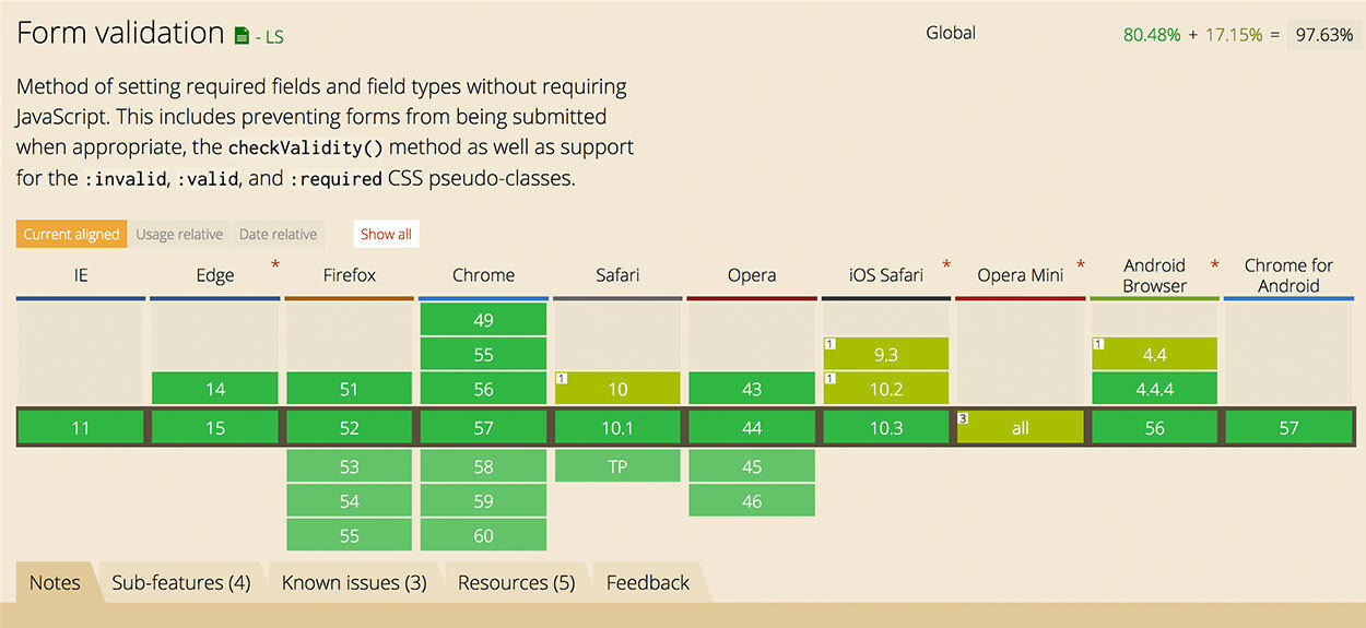
.email:valid {
  border-color: forestgreen;
}

.email:invalid {
  border-color: firebrick;
}
<input class="email" type="email" required>Selectors Level 4
.email:valid {
  border-color: forestgreen;
}

.email:valid + .icn::before {
  content: '😃';
}
<input class="email" type="email" required>
<span class="icn"></span>Selectors Level 4
Selectors Level 4
.email:focus:invalid {
  border-color: firebrick;
}
.email:focus + .icn::before {
  content: '😳';
}

.email:valid {
  border-color: forestgreen;
}
.email:valid + .icn::before {
  content: '😃';
}Selectors Level 4
Selectors Level 4
Selectors Level 4
Selectors Level 4
Feature Queries
Feature Queries
.main-content {
display: flex;
flex-wrap: wrap;
}
.card {
flex: 1 280px;
margin: 10px;
}
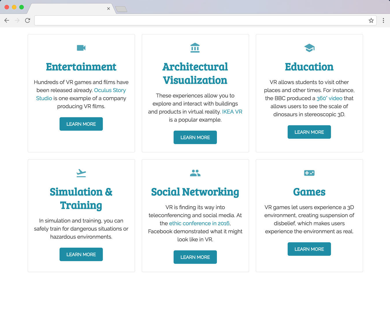
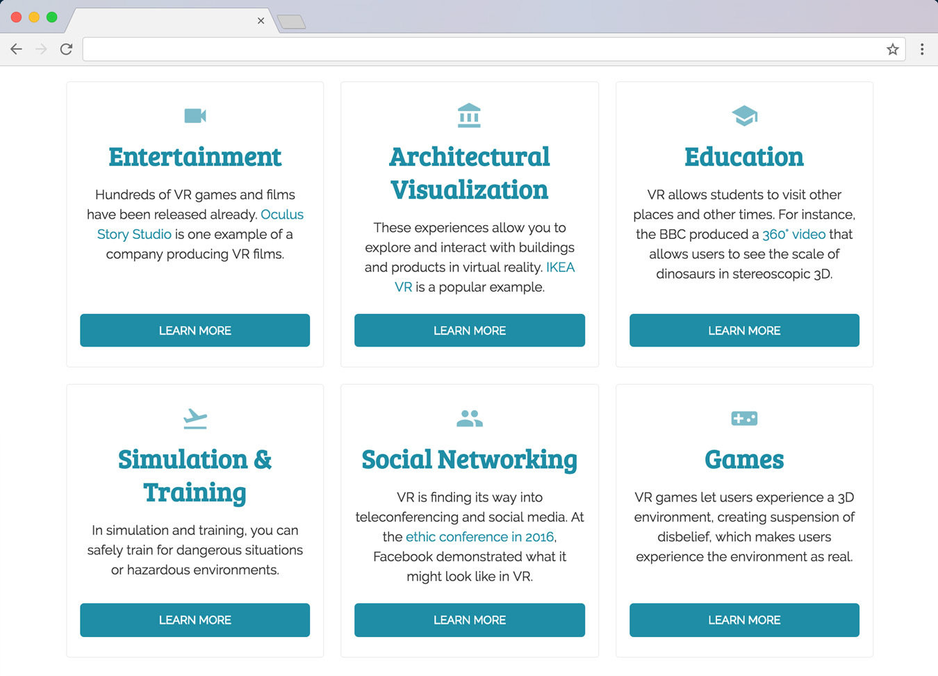
@supports (display: grid) { /* 🔥 Grid Layout 🔥 */
.main-content {
display: grid;
grid-template-columns: repeat(auto-fit, minmax(280px, 1fr));
grid-gap: 20px;
}
.card {
margin: 0;
}
}Feature Queries
@supports (writing-mode: vertical-rl) and (display:grid) {

  main {
    display: grid;
    grid-template-columns: 100px 1fr;
    grid-column-gap: 15px;
  }

  h1 {
    justify-self: start;
    writing-mode: vertical-rl;
  }
}Feature Queries

Feature Queries

Thank you!👋
@guilh
Get Ready for the Future of CSS
By guilh