TrelliscopeJS
Ryan Hafen
http://bit.ly/trelliscopejs1
Modern Approaches to Data Exploration with Trellis Display
install.packages(c("tidyverse", "gapminder", "rbokeh",
  "visNetwork", "plotly"))
devtools::install_github("hafen/trelliscopejs")

library(tidyverse)
library(gapminder)
library(rbokeh)
library(visNetwork)
library(trelliscopejs)
All examples in this talk are reproducible after installing and loading the following packages:
TrelliscopeJS is an htmlwidget
TrelliscopeJS is a layout engine for collections of plots (including htmlwidgets)
TrelliscopeJS is a framework for creating interactive displays of small multiples, suitable for visualizing large datasets in detail
Small Multiples
A series of similar plots, usually each based on a different slice of data, arranged in a grid
"For a wide range of problems in data presentation, small multiples are the best design solution."
Edward Tufte (Envisioning Information)
This idea was formalized and popularized in S/S-PLUS and subsequently R with the trellis and lattice packages

Advantages of Small Multiple Displays
- Avoid overplotting
- Work with big or high dimensional data
-
It is often critical to the discovery of a new insight to be able to see multiple things at once
- Our brains are good at perceiving simple visual features like color or shape or size and they do it amazingly fast without any conscious effort
- We can tell immediately when a part of an image is different from the rest, without really having to focus on it
Advantages of Small Multiple Displays
- Avoid overplotting
- Work with big or high dimensional data
- It is often critical to the discovery of a new insight to be able to see multiple things at once
- Our brains are good at perceiving simple visual features like color or shape or size and they do it amazingly fast without any conscious effort
- We can tell immediately when a part of an image is different from the rest, without really having to focus on it

Advantages of Small Multiple Displays
- Avoid overplotting
- Work with big or high dimensional data
-
It is often critical to the discovery of a new insight to be able to see multiple things at once
- Our brains are good at perceiving simple visual features like color or shape or size and they do it amazingly fast without any conscious effort
- We can tell immediately when a part of an image is different from the rest, without really having to focus on it
In my experience, small multiples are much more effective than more flashy things like animation, linked brushing, custom interactive vis, etc.
Trelliscope: Interactive Small Multiple Display
- Small multiple displays are useful when visualizing data in detail
- But the number of panels in a display can be potentially very large, too large to view all at once
- It can also be difficult to specify a meaningful order in which panels are displayed
Trelliscope is a general solution that allows small multiple displays to come alive by providing the ability to interactively sort and filter the panels based on summary statistics, cognostics, automatically computed for each panel
TrelliscopeJS
JavaScript Library
R Package


trelliscopejs-lib
trelliscopejs

- Built using React
- Pure JavaScript
- Interface agnostic
- htmlwidget interface to trelliscopejs-lib
- Evolved from CRAN "trelliscope" package (part of DeltaRho project)
Gapminder Example
Suppose we want to understand mortality over time for each country
Observations: 1,704
Variables: 6
$ country   <fctr> Afghanistan, Afghanistan, Afghanistan, Afghanistan, Afgh...
$ continent <fctr> Asia, Asia, Asia, Asia, Asia, Asia, Asia, Asia, Asia, As...
$ year      <int> 1952, 1957, 1962, 1967, 1972, 1977, 1982, 1987, 1992, 199...
$ lifeExp   <dbl> 28.801, 30.332, 31.997, 34.020, 36.088, 38.438, 39.854, 4...
$ pop       <int> 8425333, 9240934, 10267083, 11537966, 13079460, 14880372,...
$ gdpPercap <dbl> 779.4453, 820.8530, 853.1007, 836.1971, 739.9811, 786.113...
glimpse(gapminder)

qplot(year, lifeExp, data = gapminder, color = country, geom = "line")

Yikes! There are a lot of countries...
qplot(year, lifeExp, data = gapminder, color = continent,
  group = country, geom = "line")

I can't see what's going on...
qplot(year, lifeExp, data = gapminder, color = continent,
  group = country, geom = "line") +
    facet_wrap(~ continent, nrow = 1)

That helped a little...
p <- qplot(year, lifeExp, data = gapminder, color = continent,
  group = country, geom = "line") +
    facet_wrap(~ continent, nrow = 1)
plotly::ggplotly(p)
This helps but there is still too much overplotting...
(and hovering for additional info is too much work and we can only see more info one at a time)
qplot(year, lifeExp, data = gapminder) +
  xlim(1948, 2011) + ylim(10, 95) + theme_bw() +
  facet_wrap(~ country + continent)

From ggplot2 Faceting to Trelliscope
Turning a ggplot2 faceted display into a Trelliscope display is as easy as changing:
to:
facet_wrap()
or:
facet_grid()
facet_trelliscope()
qplot(year, lifeExp, data = gapminder) +
  xlim(1948, 2011) + ylim(10, 95) + theme_bw() +
  facet_trelliscope(~ country + continent, nrow = 2, ncol = 7, width = 300)
Note: this and future plots in this presentation are interactive - feel free to explore!
qplot(year, lifeExp, data = gapminder) +
  xlim(1948, 2011) + ylim(10, 95) + theme_bw() +
  facet_trelliscope(~ country + continent,
    nrow = 2, ncol = 7, width = 300, as_plotly = TRUE)
Plotting in the Tidyverse
country_model <- function(df)
  lm(lifeExp ~ year, data = df)

by_country <- gapminder %>%
  group_by(country, continent) %>%
  nest() %>%
  mutate(
    model = map(data, country_model),
    resid_mad = map_dbl(model, function(x) mad(resid(x))))

by_country
Example adapted from "R for Data Science"
# A tibble: 142 × 5
       country continent              data    model resid_mad
        <fctr>    <fctr>            <list>   <list>     <dbl>
1  Afghanistan      Asia <tibble [12 × 4]> <S3: lm> 1.4058780
2      Albania    Europe <tibble [12 × 4]> <S3: lm> 2.2193278
3      Algeria    Africa <tibble [12 × 4]> <S3: lm> 0.7925897
4       Angola    Africa <tibble [12 × 4]> <S3: lm> 1.4903085
5    Argentina  Americas <tibble [12 × 4]> <S3: lm> 0.2376178
6    Australia   Oceania <tibble [12 × 4]> <S3: lm> 0.7934372
7      Austria    Europe <tibble [12 × 4]> <S3: lm> 0.3928605
8      Bahrain      Asia <tibble [12 × 4]> <S3: lm> 1.8201766
9   Bangladesh      Asia <tibble [12 × 4]> <S3: lm> 1.1947475
10     Belgium    Europe <tibble [12 × 4]> <S3: lm> 0.2353342
# ... with 132 more rows
Gapminder Example from "R for Data Science"
- One row per group
- Per-group data and models as "list-columns"

Excerpt from "R for Data Science"
Plotting the Fit for Each Country
country_plot <- function(data, model) {
  figure(xlim = c(1948, 2011),
    ylim = c(10, 95), tools = NULL) %>%
    ly_points(year, lifeExp, data = data, hover = data) %>%
    ly_abline(model)
}

country_plot(by_country$data[[1]],
  by_country$model[[1]])
Plotting the Data and Model Fit for a Group
We'll use the rbokeh package to make a plot function and apply it to the first row of our data
by_country <- by_country %>%
  mutate(plot = map2_plot(data, model, country_plot))

by_country
Example adapted from "R for Data Science"
# A tibble: 142 × 6
       country continent              data    model resid_mad         plot
        <fctr>    <fctr>            <list>   <list>     <dbl>       <list>
1  Afghanistan      Asia <tibble [12 × 4]> <S3: lm> 1.4058780 <S3: rbokeh>
2      Albania    Europe <tibble [12 × 4]> <S3: lm> 2.2193278 <S3: rbokeh>
3      Algeria    Africa <tibble [12 × 4]> <S3: lm> 0.7925897 <S3: rbokeh>
4       Angola    Africa <tibble [12 × 4]> <S3: lm> 1.4903085 <S3: rbokeh>
5    Argentina  Americas <tibble [12 × 4]> <S3: lm> 0.2376178 <S3: rbokeh>
6    Australia   Oceania <tibble [12 × 4]> <S3: lm> 0.7934372 <S3: rbokeh>
7      Austria    Europe <tibble [12 × 4]> <S3: lm> 0.3928605 <S3: rbokeh>
8      Bahrain      Asia <tibble [12 × 4]> <S3: lm> 1.8201766 <S3: rbokeh>
9   Bangladesh      Asia <tibble [12 × 4]> <S3: lm> 1.1947475 <S3: rbokeh>
10     Belgium    Europe <tibble [12 × 4]> <S3: lm> 0.2353342 <S3: rbokeh>
# ... with 132 more rows
Let's Apply This Function to Every Row!
Plots as list-columns!!!
by_country %>%
  trelliscope(name = "by_country_lm", nrow = 2, ncol = 4)
Recap: TrelliscopeJS in the Tidyverse
- Create a data frame with one row per group, typically using Tidyverse group_by() and nest() operations
- Add a column of plots
- TrelliscopeJS provides purrr map functions map_plot(), map2_plot(), pmap_plot() that you can use to create these
- You can use any graphics system to create the plot objects (ggplot2, htmlwidgets, lattice)
- Optionally add more columns to the data frame that will be used as cognostics - metrics with which you can interact with the panels
- All atomic columns will be automatically used as cognostics
- Map functions map_cog(), map2_cog(), pmap_cog() can be used for convenience to create columns of cognostics
- Simply pass the data frame in to trelliscope()
With plots as columns, TrelliscopeJS provides nearly effortless detailed, flexible, interactive visualization in the Tidyverse
by_country %>%
arrange(-resid_mad) %>%
trelliscope(name = "by_country_lm", nrow = 2, ncol = 4)
Order the data frame to set initial ordering of display
by_country %>%
filter(continent == "Africa") %>%
trelliscope(name = "by_country_africa_lm", nrow = 2, ncol = 4)
Filter the data to only include plots you want in the display
Images as Panels
pokemon <- read_csv("http://bit.ly/plot_pokemon") %>%
  mutate_at(vars(matches("_id$")), as.character) %>%
  mutate(panel = img_panel(url_image))

pokemon
trelliscope(pokemon, name = "pokemon", nrow = 3, ncol = 6,
state = list(labels = c("pokemon", "pokedex")))
htmlwidgets as Panels
library(visNetwork)

nnodes <- 100
nnedges <- 1000

nodes <- data.frame(
  id = 1:nnodes,
  label = 1:nnodes, value = rep(1, nnodes))
edges <- data.frame(
  from = sample(1:nnodes, nnedges, replace = T),
  to = sample(1:nnodes, nnedges, replace = T)) %>%
    group_by(from, to) %>%
    summarise(value = n())

network_plot <- function(id, hide_select = TRUE) {
  style <- ifelse(hide_select,
    "visibility: hidden; position: absolute", "")

  visNetwork(nodes, edges) %>%
    visIgraphLayout(layout = "layout_in_circle") %>%
    visNodes(fixed = TRUE, scaling =
      list(min = 20, max = 50,
        label = list(min = 35, max = 70,
          drawThreshold = 1, maxVisible = 100))) %>%
    visEdges(scaling = list(min = 5, max = 30)) %>%
    visOptions(highlightNearest = list(enabled = TRUE, degree = 0,
      hideColor = "rgba(200,200,200,0.2)"),
      nodesIdSelection = list(selected = as.character(id), style = style))
}

network_plot(1, hide_select = FALSE)
Example: Network Vis with visNetwork htmlwidget
nodedat <- edges %>%
  group_by(from) %>%
  summarise(n_nodes = n(), tot_conns = sum(value)) %>%
  rename(id = from) %>%
  arrange(-n_nodes) %>%
  mutate(panel = map_plot(id, network_plot))

nodedat
# A tibble: 100 × 4
      id n_nodes tot_conns            panel
   <int>   <int>     <int>           <list>
1     58      17        19 <S3: visNetwork>
2     45      16        17 <S3: visNetwork>
3      9      15        18 <S3: visNetwork>
4     31      15        16 <S3: visNetwork>
5     14      14        15 <S3: visNetwork>
6     42      14        15 <S3: visNetwork>
7     90      14        14 <S3: visNetwork>
8     21      13        14 <S3: visNetwork>
9     37      13        14 <S3: visNetwork>
10    43      13        13 <S3: visNetwork>
# ... with 90 more rows
Trelliscope display with one panel per node
We create a one-row-per-node data frame with number of nodes connected to and total number of connections as cognostics and add a plot panel column
nodedat %>%
  arrange(-n_nodes) %>%
  trelliscope(name = "connections", nrow = 2, ncol = 4)
Larger Trelliscope Displays
instadf %>%
arrange(-likes_count) %>%
trelliscope(name = "posts", width = 320, height = 320, nrow = 3, ncol = 6,
state = list(labels = c("caption", "post_link", "likes_count")))
Trelliscope Displays as Apps
Trelliscope Displays as Apps
If you have an app that has multiple inputs and produces a plot output, the idea is simply to enumerate all possible inputs as rows of a data frame and add the plot that corresponds to these parameters as column and plot it
Trelliscope displays are most useful as exploratory plots to guide the data scientist (because they can be created rapidly)
However, in many cases Trelliscope displays can be used as interactive applications for end-users, domain experts, etc. with the bonus that they are much easier to create than a custom app
library(shiny)
library(ggplot2)
library(gapminder)

server <- function(input, output) {
  output$countryPlot <- renderPlot({
    qplot(year, lifeExp,
      data = subset(gapminder,
        country == input$country)) +
      xlim(1948, 2011) + ylim(10, 95) +
      theme_bw()
  })
}

choices <- sort(unique(gapminder$country))
ui <- fluidPage(
  titlePanel("Gampinder Life Expectancy"),
  sidebarLayout(
    sidebarPanel(
      selectInput("country",
        label = "Select country: ",
        choices = choices,
        selected = "Afghanistan")
    ),
    mainPanel(
      plotOutput("countryPlot",
        height = "500px")
    )
  )
)

runApp(list(ui = ui, server = server))
Scaling Trelliscope
Just because you can't look at all panels in a display doesn't mean it isn't useful or practical to make a large display - it's in fact beneficial because you get an unprecedented level of detail in your displays, and every corner of your data can be conceptually viewed
One insight is all you need for a display to serve a purpose (provided it is quick to create)
We used the previous implementation of Trelliscope to visualize millions of subsets of terabytes of data
What is needed to scale in the Tidyverse?
SparklyR is the natural solution
But we need a few things...
- SparklyR support for list-columns (nested data frames and arbitrary R objects)
- SparklyR support for remote procedure calls (run arbitrary R code on the data)
- Fast random access to rows of a SparklyR data frame
- A TrelliscopeJS deferred panel rendering scheme (render on-the-fly rather than all panels up front)
Coming Soon
Lazy Panel Rendering
- Currently all panels must be pre-rendered
- This can take some time (particularly when using ggplot2)
- Lazy panel rendering will open a display immediately and panels will render on-the-fly
- This requires the display to be run in "server mode", using the plumber package - which makes the display more difficult to share
- But since RStudio Connect can serve plumber applications, it should still be easy to share via RStudio Connect
- Once all panels have been lazily rendered the display will become self-contained
Coming Very Soon
Automatic Cognostics
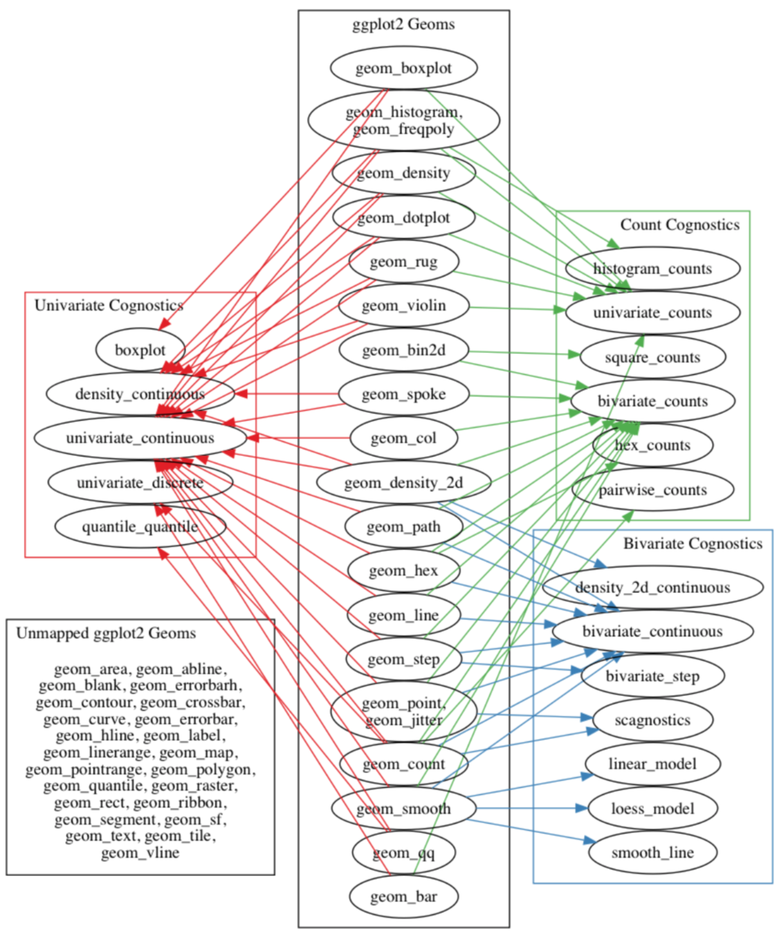
- Automatically compute cognostics based on the context of what is being plotted
- Work done by Barret Schloerke as part of his Ph.D. thesis (defense.schloerke.com)
- Already implemented for ggplot2
What's Next
-
trelliscopejs
- Automatic cognostics: automatically compute useful cognostics based on the context of what is being plotted (e.g. if a scatterplot has a model fit superposed, add model diagnostics cognostics
- Automatic handling of axis limits - "same", "sliced", "free" (underway - currently "same" limits need to be hard-coded)
- When axes are "same", only show axes on plot margins instead of every panel (underway for ggplot2)
-
trelliscopejs-lib
- More visual filters for cognostics (dates, geographic, bivariate relationships, etc.)
- Bookmarkable / sharable state
- View multiple panels side-by-side
- Support for receiving panels from other endpoints
For More Information
- Twitter: @hafenstats
- Blog: http://ryanhafen.com/blog
- Documentation: http://hafen.github.io/trelliscopejs
- Github: https://github.com/hafen/trelliscopejs
qplot(year, lifeExp, data = gapminder) +
  facet_trelliscope(~ country + continent, nrow = 2, ncol = 7, width = 300)
TrelliscopeJS
By Ryan Hafen
TrelliscopeJS
Visualization in the Tidyverse (given at rstudio::conf 2017 and a modified version given at the New York Open Statistical Programming Meetup)


