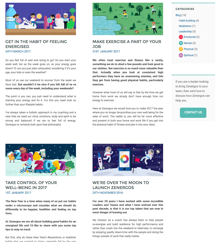
Building complex page layouts using flexbox in CSS
Hannah Smith
- multi-skilled tech freelancer in Bristol
(web development, change management, analytics)
@hanopcan
Hello, a bit about me
-
I work as a freelance web developer, change manager and analyst on projects in Bristol and remotely
- WordPress
- Sometimes (but less often) Joomla and Shopify
- Mobile app development - Ionic
-
I've held/hold a variety of management roles in:
- Software SMEs
- Large government organisations
wpbristol.co.uk
Oh and I really like dogs
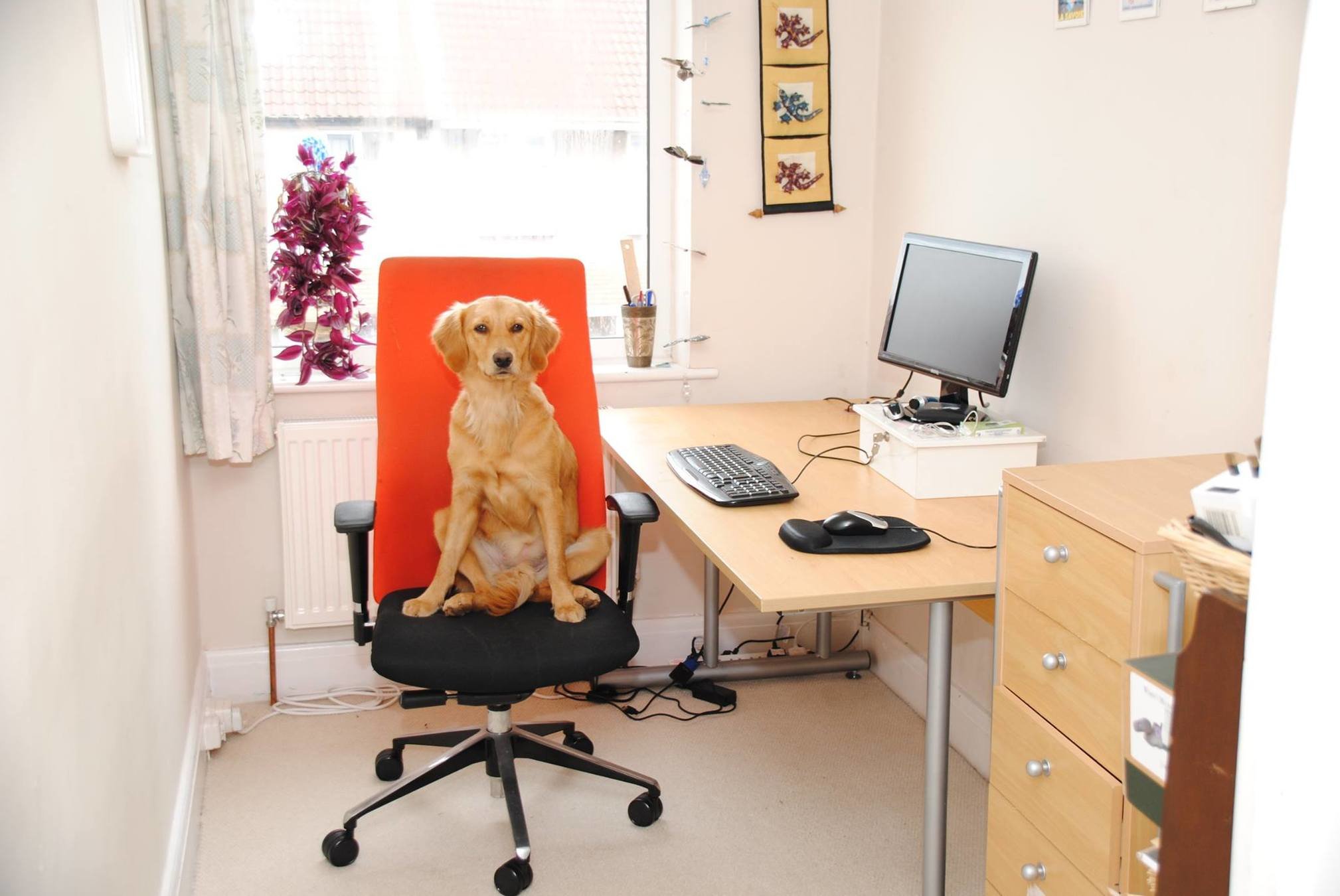
(This is my dog Lili and she is the boss!)
Plan for session
-
What is flexbox
-
What flexbox allows you to do
-
Some examples in WordPress
-
Intro to the CSS code
Please ask questions as we go – I like the audience participations and it’s more interesting for everyone.
wpbristol.co.uk
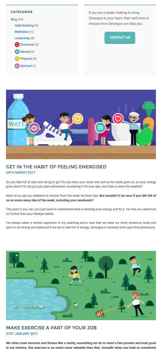
What is flexbox?
" The CSS3 Flexible Box, or flexbox, is a layout mode providing for the arrangement of elements on a page such that the elements behave predictably when the page layout must accommodate different screen sizes and different display devices. "
wpbristol.co.uk
Err... what?
wpbristol.co.uk

In english please...
wpbristol.co.uk
-
It's a bunch of CSS commands that allow you to place items in a container and jiggle their arrangement about horizontally or vertically.
Want to see some pictures to illustrate?
(Yeah I needed some too the first time I heard about this)
wpbristol.co.uk
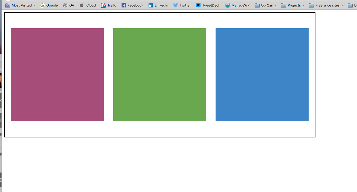
1
2
3
The container
The items
wpbristol.co.uk
We can control these items:
Horizontally
Vertically
wpbristol.co.uk
Flexbox has been told to lay these items out in a column (vertically) when the screen size gets narrower
(Flexbox was told to do this using CSS media queries)
1
2
3
wpbristol.co.uk
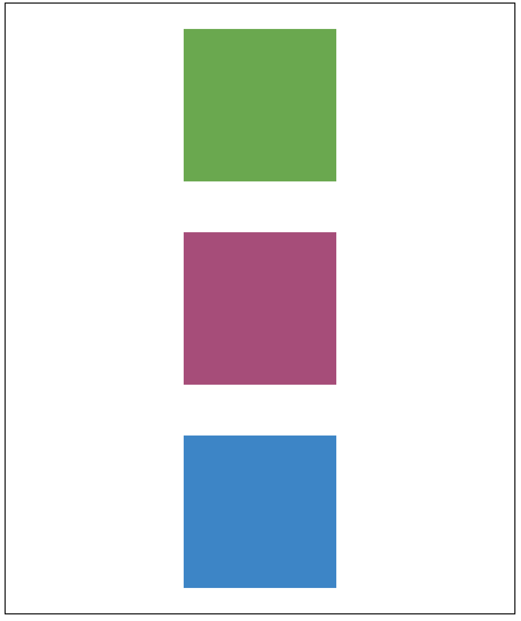
Now, flexbox has been told to change the order of these items when it's even narrower
(Again, flexbox had help from media queries to know when to do things)
1
2
3
wpbristol.co.uk

Lorem ipsum dolor sit amet, consectetur adipiscing elit.
You can put flexboxes within flexboxes, making it really powerful - now we can make some complex layouts
Becomes an item AND a container
Etc...
- You can do lots of things with flexbox
wpbristol.co.uk

Frameworks
wpbristol.co.uk
NB Flexbox isn't the only way to achieve complex layouts in websites.
There are lots of other frameworks out there that allow you to do layouts, often based on grids:
- Foundation
- BootStrap
- Skeleton
http://beebom.com/best-front-end-frameworks-for-bootstrap-alternative/
Text
But this isn't a talk about frameworks!
So let's get into looking at some flexbox CSS code
wpbristol.co.uk
Text

Basic command
wpbristol.co.uk
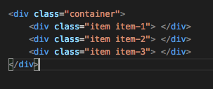
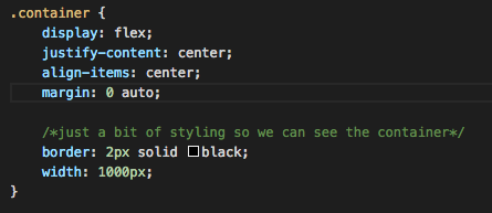
Our HTML
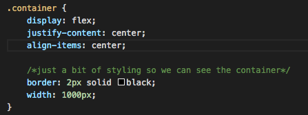
Our CSS
horizontally aligns
vertically aligns
wpbristol.co.uk
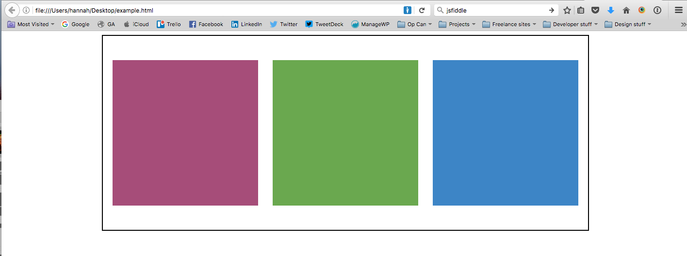
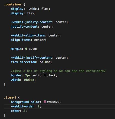
Centrally align the container
wpbristol.co.uk
Our CSS
wpbristol.co.uk
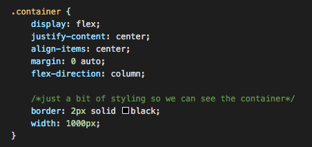
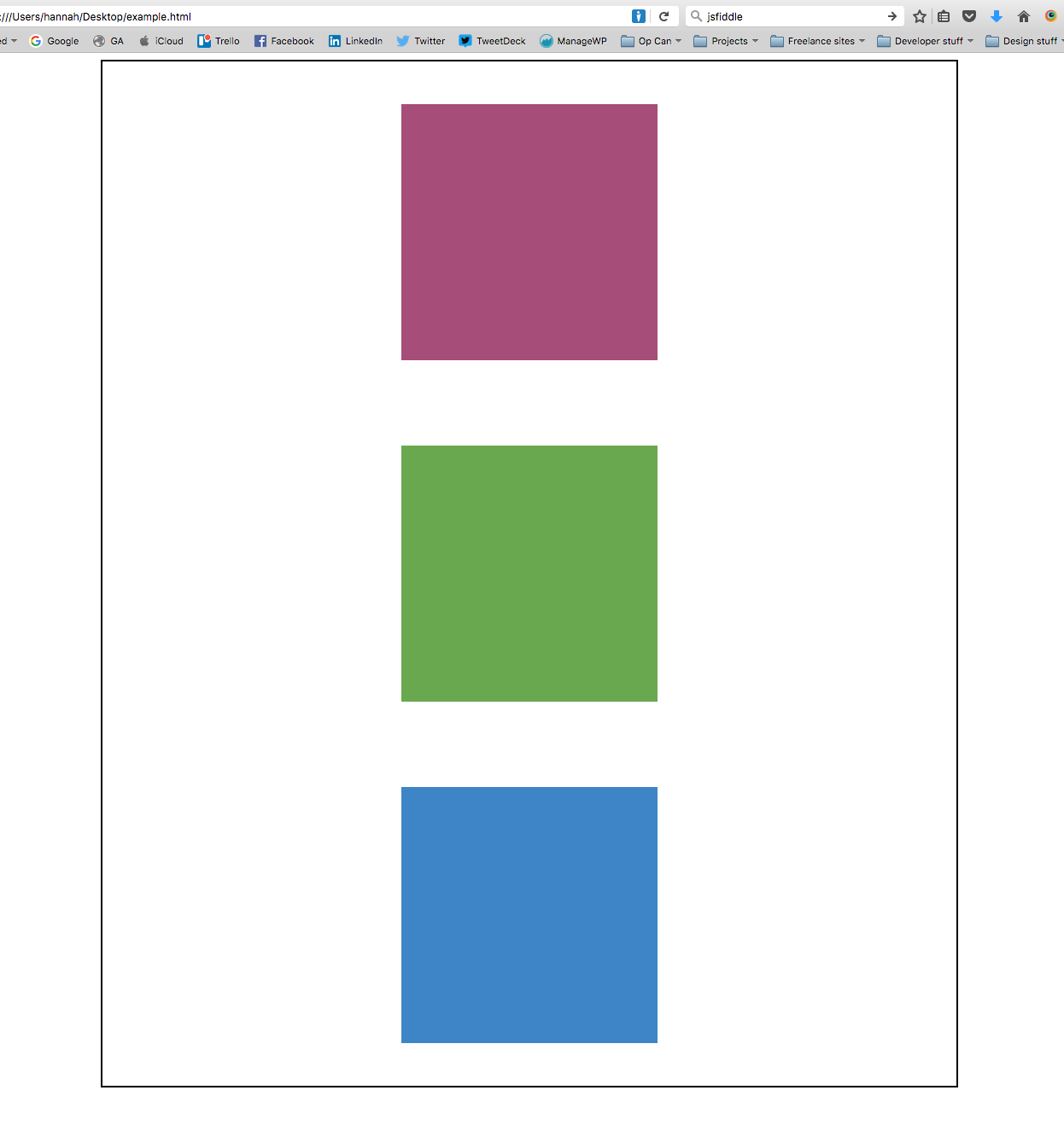
Put the items in a column
wpbristol.co.uk
Our CSS
wpbristol.co.uk
Change item order
wpbristol.co.uk
Our HTML
Our CSS
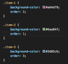
wpbristol.co.uk
References
wpbristol.co.uk
Cross-browser support
- It's pretty good on all modern browsers
- Chrome needs the -webkit-flex variant
- The order of your declarations is important!
wpbristol.co.uk
Cross-browser support
- It needs a few tweaks for some browsers:
- Edge is fine
- Internet Explorer 10 will work with special versions of the code (display: -ms-flexbox)
- With all these things do test across all modern browsers just to be sure
wpbristol.co.uk
wpbristol.co.uk
Examples of flexbox in action in a Wordpress site....
Containers
Items
Items
wpbristol.co.uk
Questions?

Thanks all!
wpbristol.co.uk

Building complex page layouts using CSS's flexbox
By hanopcan


