Brian Young
Front End Developer, University IT Communications, Stanford University
brianyoung@stanford.edu
Front End Developer
University IT Communications, Stanford University
With sidebar
Without sidebar
<section class="px-4 py-5 bg-fog">
<div class="container">
<div class="row">
<div class="col-md-4 d-flex align-items-stretch">
<div class="card mb-4 box-shadow">
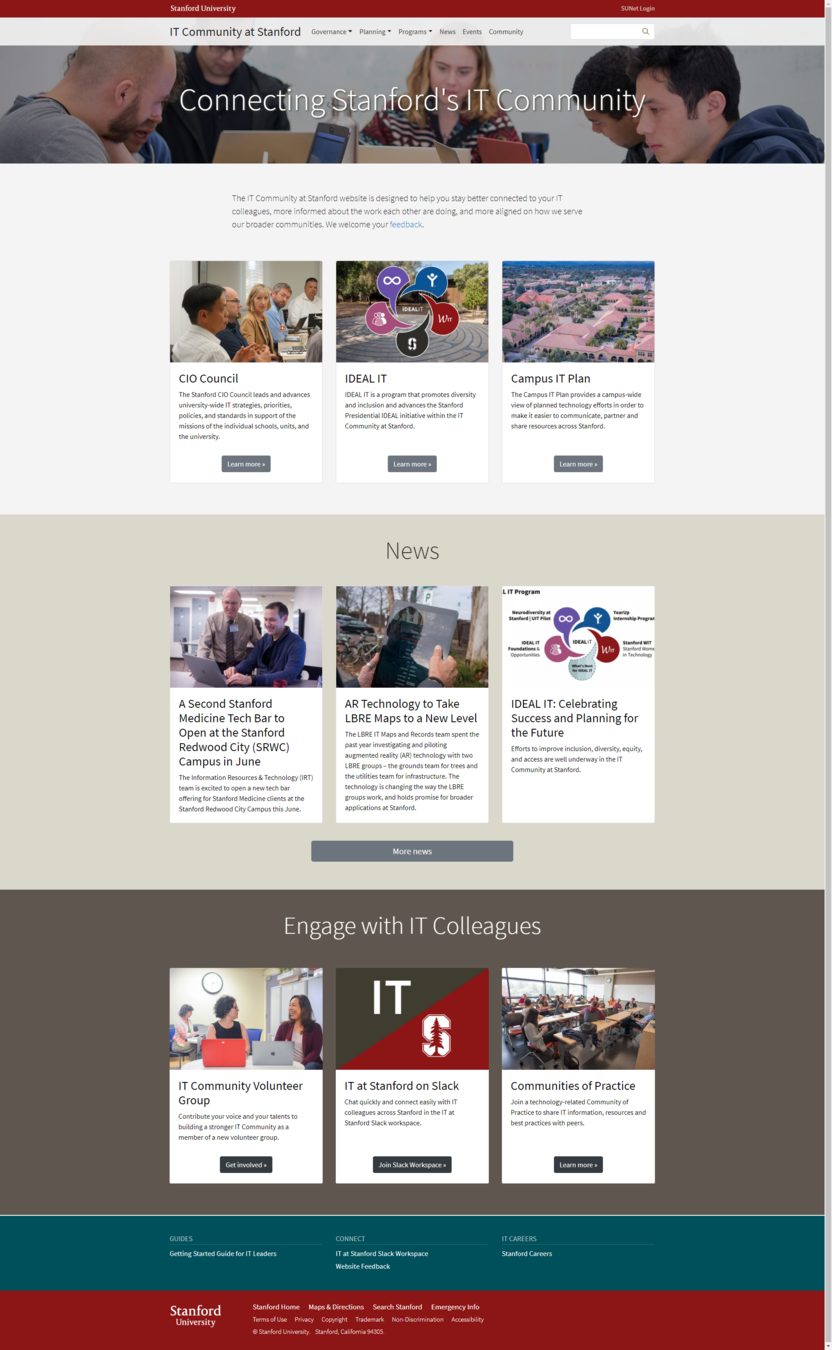
<img alt="" class="card-img-top" src="/sites/default/files/2018-09/cio-council-card-2.jpg" />
<div class="card-body">
<h2 class="h3">CIO Council</h2>
<p class="card-text">The Stanford CIO Council leads and advances university-wide IT strategies, priorities, policies, and standards in support of the missions of the individual schools, units, and the university.</p>
</div>
<div class="card-footer pb-4 border-0 bg-white text-center"><a class="btn btn-secondary" href="/cio-council">Learn more<span class="sr-only"> about the CIO Council</span> »</a></div>
</div>
</div>
<div class="col-md-4 d-flex align-items-stretch">
<div class="card mb-4 box-shadow">
<img alt="" class="card-img-top" src="/sites/default/files/2018-12/ideal-it-card-4.jpg" />
<div class="card-body">
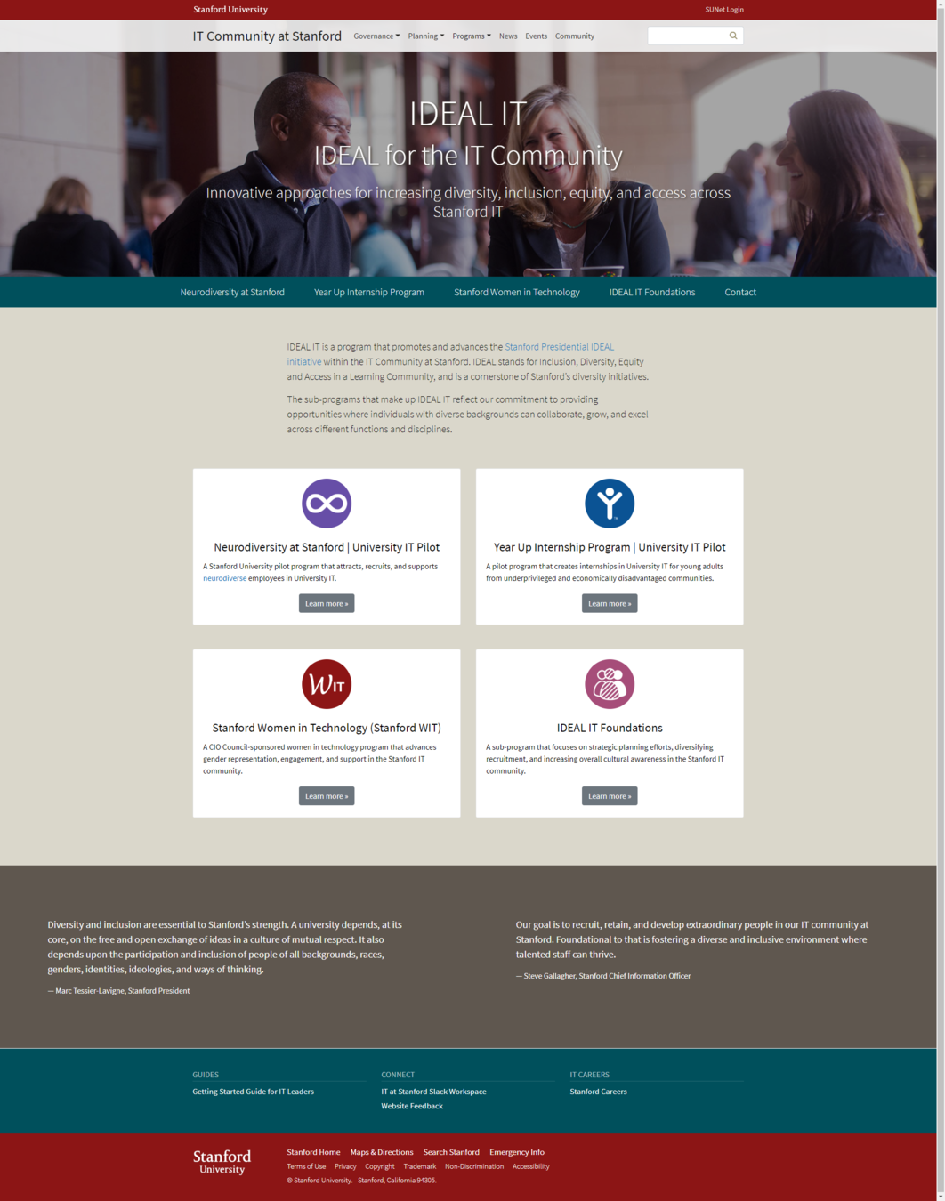
<h2 class="h3">IDEAL IT</h2>
<p class="card-text">IDEAL IT is a program that promotes diversity and inclusion and advances the Stanford Presidential IDEAL initiative within the IT Community at Stanford.</p>
</div>
<div class="card-footer pb-4 border-0 bg-white text-center"><a class="btn btn-secondary" href="/development/ideal-it">Learn more<span class="sr-only"> about IDEAL IT</span> »</a></div>
</div>
</div>
<div class="col-md-4 d-flex align-items-stretch">
<div class="card mb-4 box-shadow">
<img alt="" class="card-img-top" src="/sites/default/files/2018-08/campusitplan-card.jpg" />
<div class="card-body">
<h2 class="h3">Campus IT Plan</h2>
<p class="card-text">The Campus IT Plan provides a campus-wide view of planned technology efforts in order to make it easier to communicate, partner and share resources across Stanford.</p>
</div>
<div class="card-footer pb-4 border-0 bg-white text-center"><a class="btn btn-secondary" href="/planning/campus-it-plan">Learn more<span class="sr-only"> about Campus IT Plan</span> »</a></div>
</div>
</div>
</div>
</div>
</section>Image style
Title (can be centered)
Description
Learn more button
Background color
Text color
Title
Description (can be 2 parts)
Action button
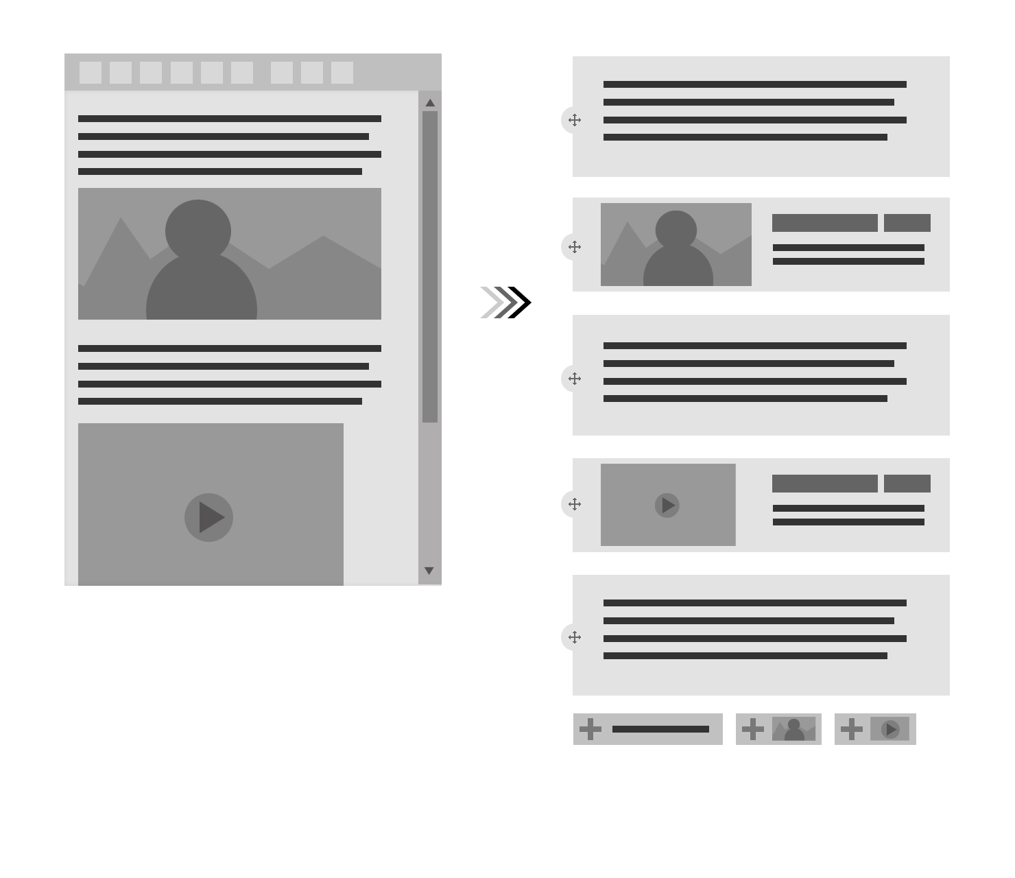
Multiple cards
The components and variations will become paragraph fields
Combine variations: Instead of having separate options for text color and background color, provide only background color. Text color should not be user controlled.
Title
Image
Image style
Body
URL
Title
Background color (Stanford Identity color palette)
Body
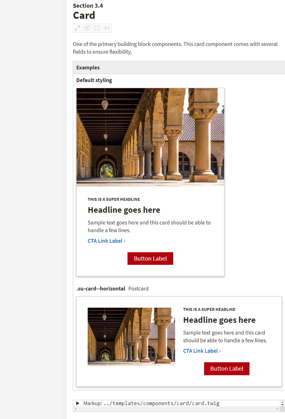
Cards (card paragraph type)
URL
<div {{ attributes.addClass(classes) }}>
    <div class="card card-teal mb-4 box-shadow">
        {% if content.field_card_image['#items'] is not empty %}<img src="{{ file_url(content.field_card_image['#items'].entity.uri.value) }}" class="card-img-top {{ paragraph.field_card_image_style.0.value|clean_class }}">{% endif %}
        <div class="card-body">
            {% if (content.field_card_image['#items'] is not empty) and (paragraph.field_card_image_style.0.value == 'card-img-photo') %}
            	<h2 class="h3 mt-0">{{ content.field_card_title }}</h2>
            {% else %}
            	<h2 class="h4 card-title text-center mt-0">{{ content.field_card_title }}</h2>
            {% endif %}
            {{ content.field_card_body }}
        </div>
        {% if content.field_card_url['#items'] is not empty %}
        	<div class="card-footer pb-4 border-0 bg-white text-center">
        		<a class="btn btn-secondary" href="{{ content.field_card_url[0]['#url'] }}">{{ content.field_card_url[0]['#title'] }} »</a>
        	</div>
        {% endif %}
    </div>
</div><section class="py-5 {{ paragraph.field_section_background_color.0.value|clean_class }}">
<div {{ attributes.addClass(classes) }}>
<div class="container">
{{ content }}
</div>
</div>
</section><div class="row section-cards">
{%- for item in items -%}
<div class="{% if loop.length == 1 %} col-md-12 mx-auto {% elseif loop.length == 2 %}col-md-6 d-flex align-items-stretch {% elseif loop.length == 3 %}col-md-6 col-lg-4 d-flex align-items-stretch {% elseif loop.length == 4 %}col-md-6 d-flex align-items-stretch {% else %}col-md-6 col-xl-4 d-flex align-items-stretch{% endif %}">
{{ item.content }}
</div>
{%- endfor -%}
</div>
The edit interface still has a bit of a mystery meat feel.
Include screenshot of resulting look and feel in edit interface
Identify elements that must be fixed in a certain location versus elements that are interchangeable.
Convert image banner and secondary menu to paragraphs as well
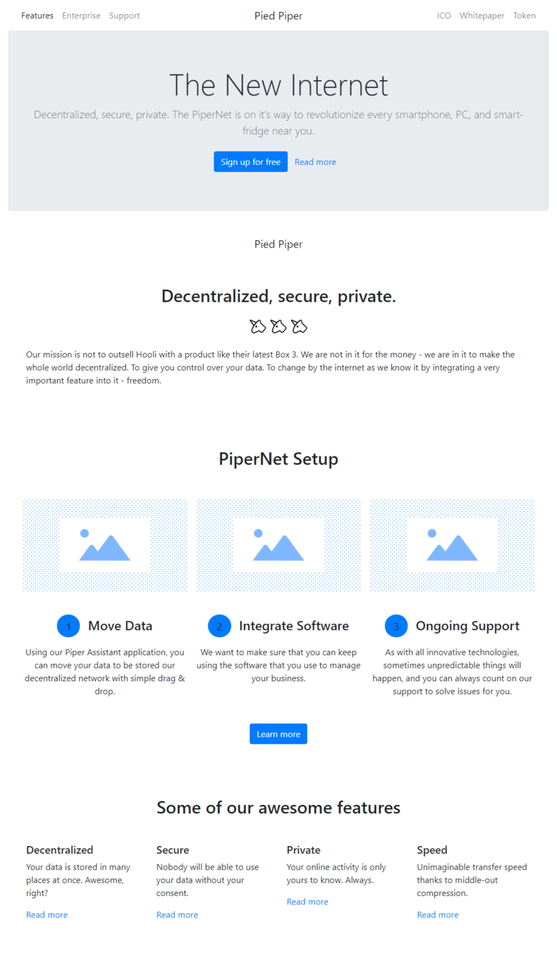
<section class="py-5">
<div class="container text-center">
<h2 class="mb-3">PiperNet Setup</h2>
<div class="row mb-3">
<div class="col-md-4 p-2 py-3"><img class="img-fluid mx-auto my-4" src="http://bootstrapshuffle.com/placeholder/pictures/bg_16-9.svg" alt="">
<h4 class="my-4"><small class="rounded-circle px-3 py-2 mr-2 bg-primary">1</small> Move Data</h4>
<p>Using our Piper Assistant application, you can move your data to be stored our decentralized network with simple drag & drop.</p>
</div>
<div class="col-md-4 p-2 py-3"><img class="img-fluid mx-auto my-4" src="http://bootstrapshuffle.com/placeholder/pictures/bg_16-9.svg" alt="">
<h4 class="my-4"><small class="rounded-circle px-3 py-2 mr-2 bg-primary">2</small> Integrate Software</h4>
<p>We want to make sure that you can keep using the software that you use to manage your business.</p>
</div>
<div class="col-md-4 p-2 py-3"><img class="img-fluid mx-auto my-4" src="http://bootstrapshuffle.com/placeholder/pictures/bg_16-9.svg" alt="">
<h4 class="my-4"><small class="rounded-circle px-3 py-2 mr-2 bg-primary">3</small> Ongoing Support</h4>
<p>As with all innovative technologies, sometimes unpredictable things will happen, and you can always count on our support to solve issues for you.</p>
</div>
</div><a class="btn btn-primary" href="">Learn more</a>
</div>
</section>By Brian Young
Learn how to use Drupal blocks for prototyping page layouts, paragraphs for enhancing the content editing experience, and features for standardizing page layouts across multiple websites.