More on
Data Visualization
Joel Ross
Winter 2020
INFO 201
Today's Objectives
By the end of class, you should be able to
- Feel comfortable using ggplot2
-
Plot geographic data on maps
- Understand the importance of good visual encodings (?)
Question Poll
Final Project
-
Objective: work as a group to analyze a pair of data sets
-
Groups: ~4 people, chosen by you (within lab section)
- Need to code collaborative via git
- Need to code collaborative via git
-
Data Sets: Up to you! Think of a topic that you think is interesting and search for data sets related to that topic.
-
Analysis: Answer data science questions about the data
- About one good question per group member
- About one good question per group member
-
Two Parts:
- Data Report (R Markdown analysis of the data)
- Data App (interactive Shiny app for exploring the data)
Data Report

The first part is a written report (using R Markdown) that presents and analyzes the data.
Report Requirements/Components:
- Created as a group: collaborate via Git
- Problem Domain Description: what is the topic of your analysis? Explain it to someone who doesn't know!
- Data Description: non-technical description of what data you'll be analyzing
- Summary Analysis: overall statistics and trends
- Specific Question Analysis: pose and answer questions with the data (wrangling required!)
- Published as web page: using GitHub Pages.
Map Visualizations in ggplot
Polygons
Use geom_polygon to draw shapes.
rect <- data.frame(x_coords = c(3, 5, 5, 3),
                   y_coords = c(4, 4, 2, 2))

ggplot(data = rect) +
  geom_polygon(aes(x = x_coords, y = y_coords))
Draw multiple polygons by grouping points.
double_rect <- data.frame(x_coords = c(1,2,2,1, 3,4,4,3),
                          y_coords = c(2,2,1,1, 2,2,1,1),
                          rect_num = c(1,1,1,1, 2,2,2,2))


ggplot(data = double_rect) +
  geom_polygon(aes(x = x_coords, y = y_coords, group = rect_num))
each row is a corner point
which rect the point goes with
Polygons


Shape Files
ggplot2 provides a set of data frames (from the included
maps library) which include polygon definitions for different geographic maps.
Access these data frames with the
map_data() function.
# access library
library("maps")

# load the data
usa_states <- map_data("state")

# plot the polygons
ggplot(data = usa_states) +
  geom_polygon(aes(x = long, y = lat, group = group)) +
  coord_quickmap()  # map coordinate system!
Map Visualizations in Leaflet
Leaflet
Leaflet is an R package (library) that provides functions for building interactive maps.
install.packages("leaflet") # once per machine
library("leaflet")          # in each relevant script
# Create a new map and add a layer of map tiles from CartoDB
leaflet() %>%
addProviderTiles("CartoDB.Positron") %>%
# center the map on Seattle
setView(lng = -122.3321, lat = 47.6062, zoom = 10) %>%
# add a marker
addMarkers(lng = -12.3110, lat = 47.6594, popup="Go Huskies!")Data Visualization
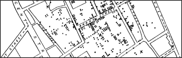
Story Time

London, 1854
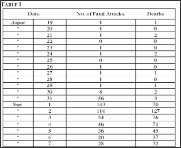
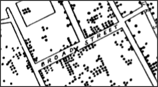
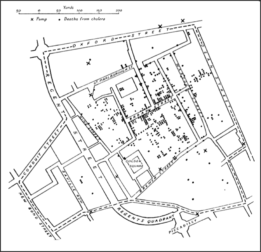
John Snow's Map
Visualizations encode data to represent it visually
Aesthetic Mappings
x-position
y-position
size
color
Features
Visual Channels
Different Encodings

What is a good
visual encoding?
Mackinlay's Effectiveness Criteria
A visualization is more effective than another visualization if the information conveyed by one visualization is more readily perceived than the information in the other visualization.
How many 3's are there?
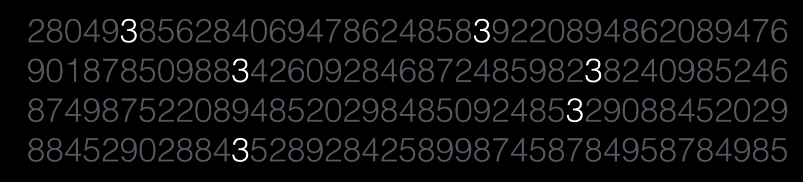
How many 3's are there?
Level of Measurement
A way of classifying the nature of data values. Applies to all data analysis, distinct from the R "data type".
Level |
Example |
Operations |
|---|---|---|
|
Nominal
|
Fruits: apples, bananas, oranges, etc. |
== !=
|
|
Ordinal
|
Hotel rating: 5-star, 4-star, etc. |
== != < >
|
|
Interval (Quantitative) |
Dates: 05/15/2012, 04/17/2015, etc. |
== != < > + – "3 units bigger" |
|
Ratio (Quantitative) ordered, fixed "zero" can find magnitude |
Lengths: 1 inch, 1.5 inches, 2 inches, etc. |
== != < >
|

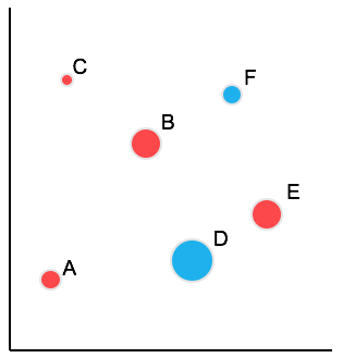
Visual Channel Effectiveness
(Mackinlay, 1986)
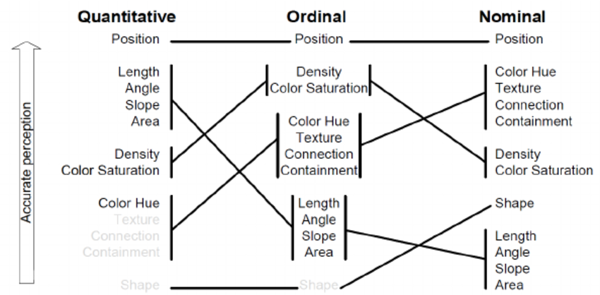
Position
The most accurate visual channel for all data types.

Resemblance (nominal)
(A != B != C)
Order (ordinal)
(B is between A and C)
Proportion (quantitative)
(BC is 2x long as AB)
Describing Color
We can describe colors in terms of:
-
Hue (red, yellow, green, etc)
-
Saturation
(vivid vs. washed out)
-
Brightness or Value
(luminance)
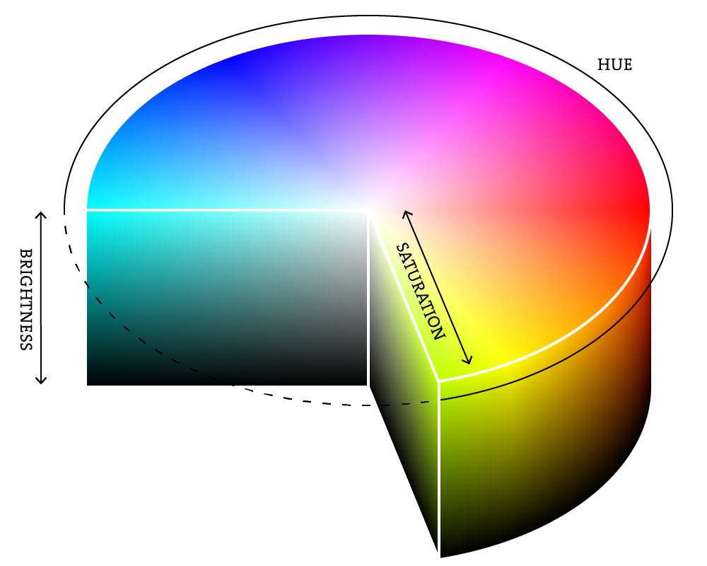
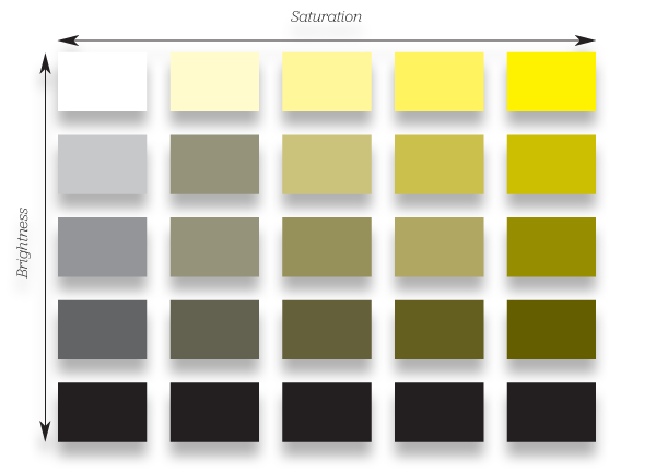
Saturation vs. Brightness
Color
Hue is good for categorical (nominal) data
Saturation and Brightness are good for continuous (ordinal or ratio) data

Hue (categorical)
Saturation (continuous)
Which is more effective?
A
B
Which is more effective?
A
B

Find the red dot
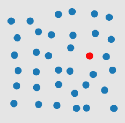
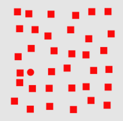
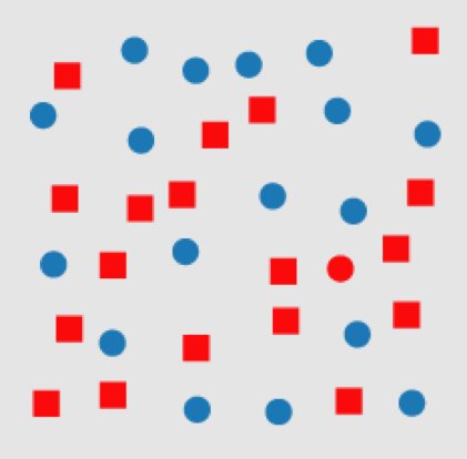
Pre-attentive Visual Perception

Labels & Glyphs
(Kabada et al. 2007)
Poor Labeling?
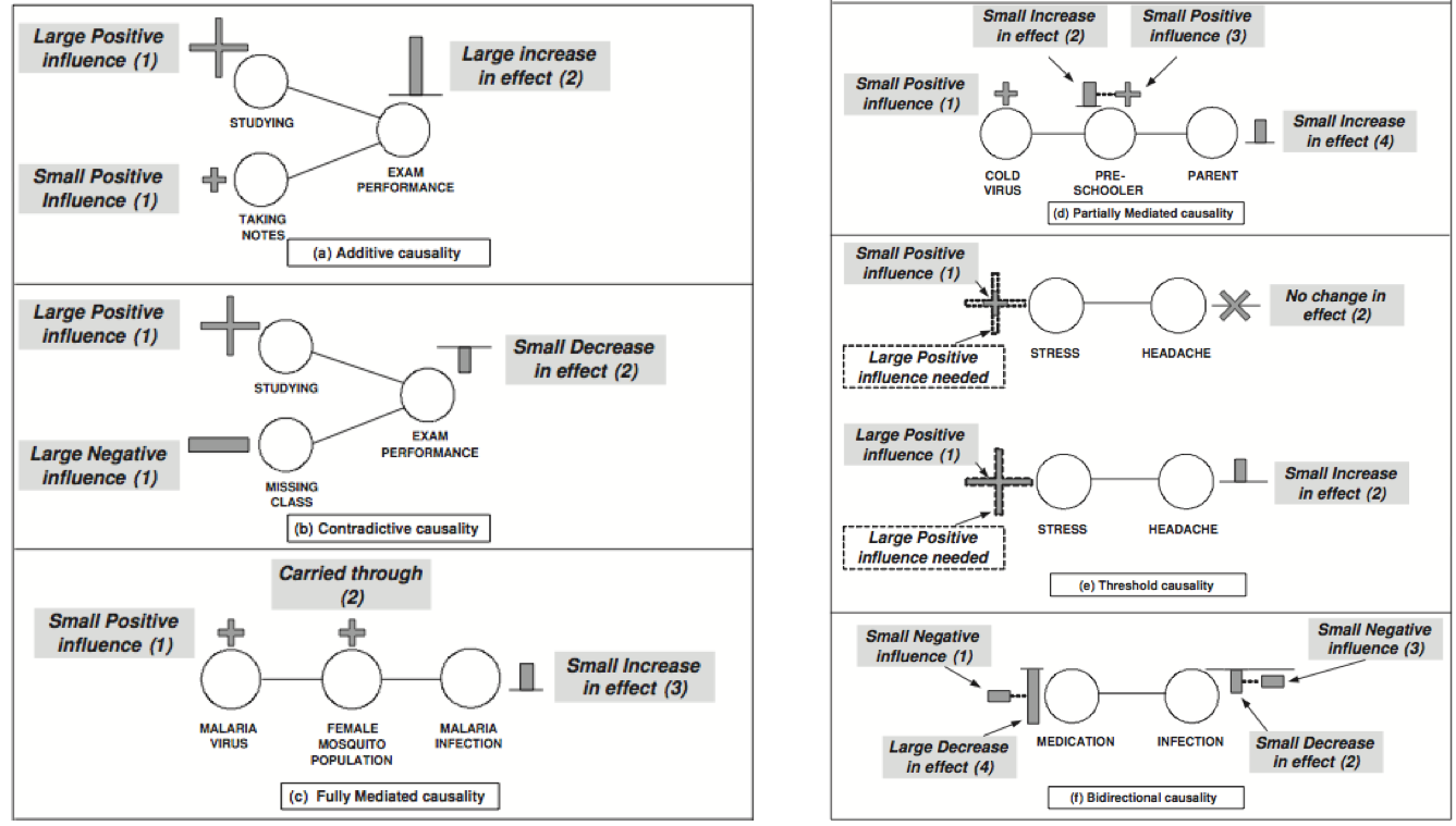
Mackinlay's Expressiveness Criteria
A set of data is expressible in a visual language if the sentences (i.e. the visualizations) in the language encode all the data in the set, and only the data in the set.
Unexpressive Visualizations

Unexpressive Visualizations
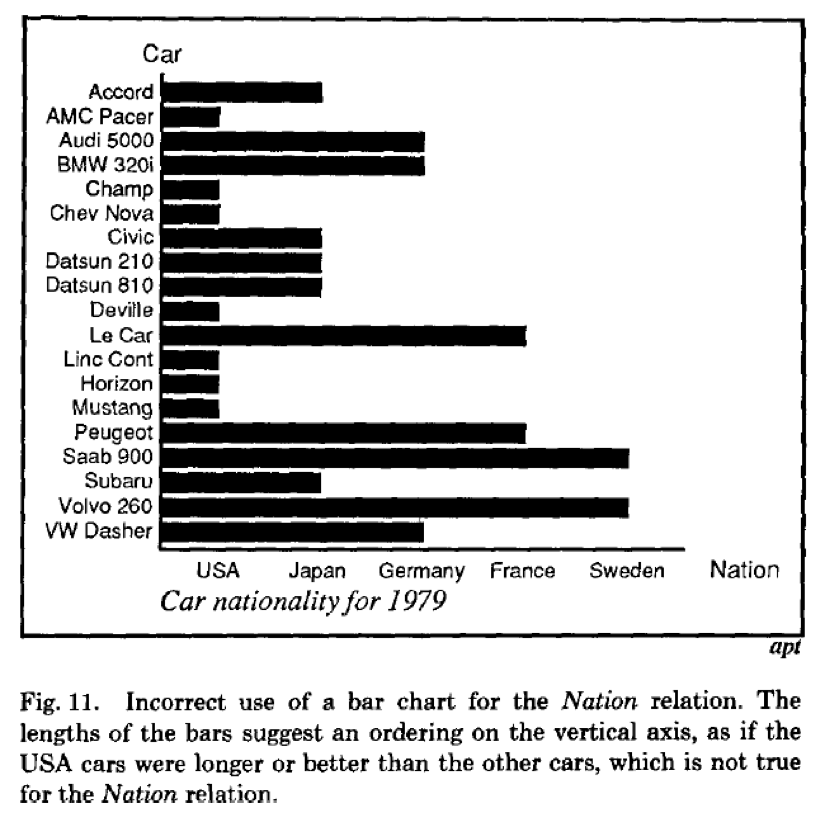
(Mackinlay, 1986)
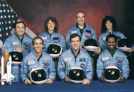
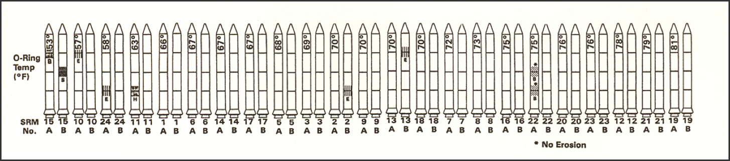
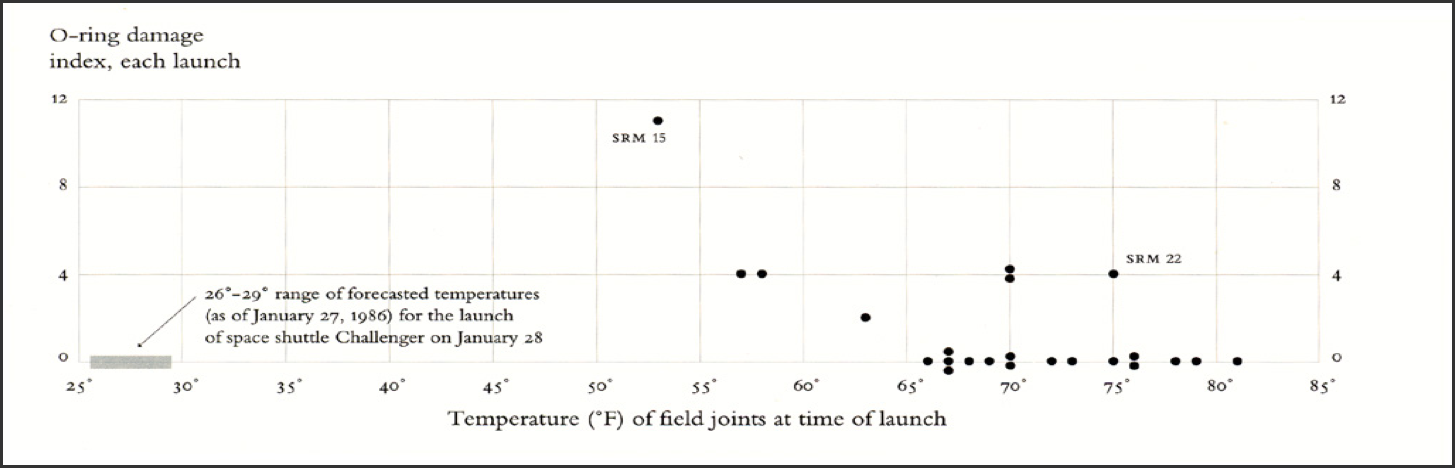
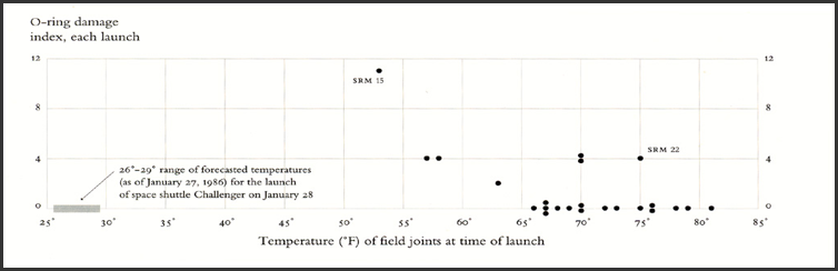
Story Time
Challenger Explosion (1986)

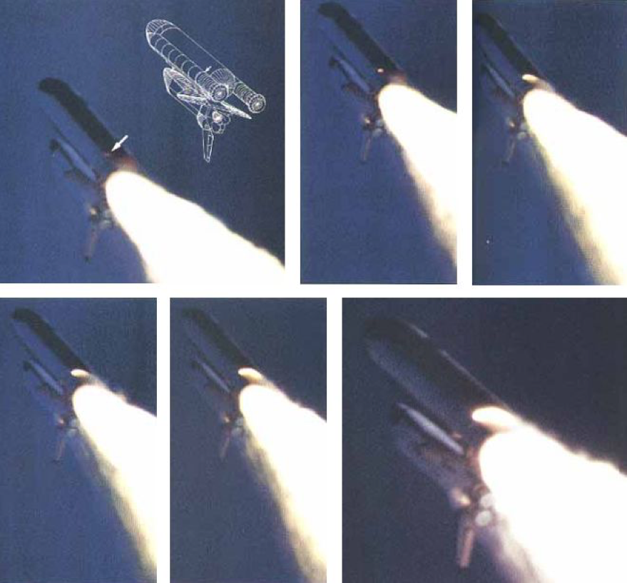
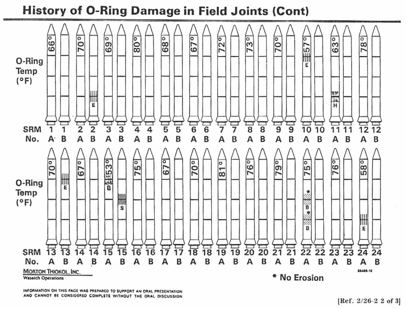
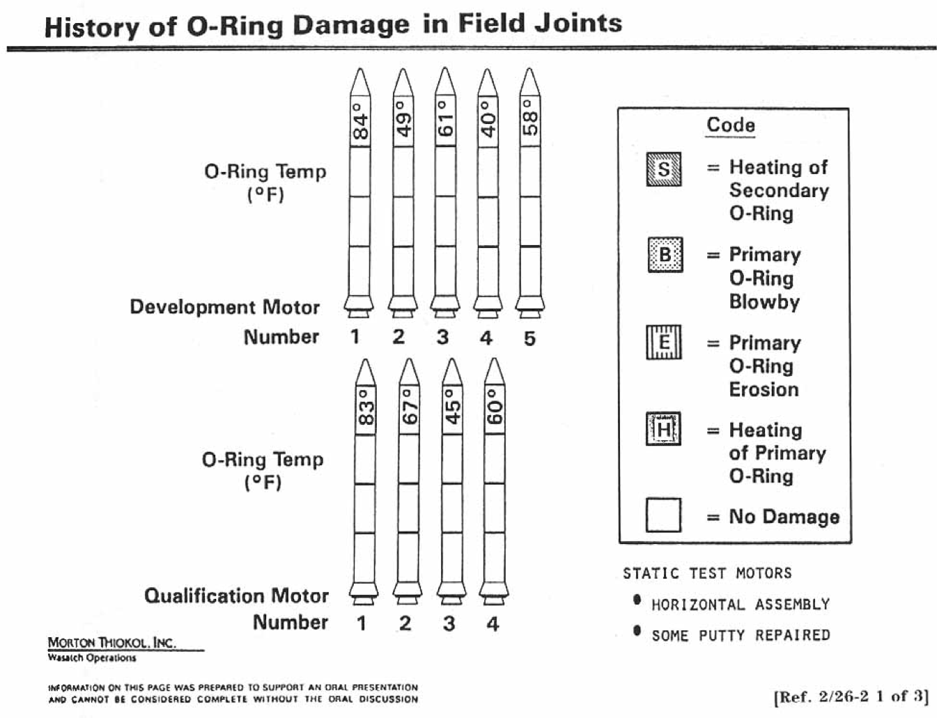
Tufte's Revision
"A good representation captures the essential elements of the event, deliberately leaving out the rest"
- Donald Norman
Reasoning (Exploration)
Communication (Explanation)
"The purpose of visualization is insight, not pictures"
- Stuart Card
Action Items!
-
Assignment 6 (visualization) due Thursday
-
Ask if there are questions!
-
-
Lab: form project groups and agree on procedures
- Begin thinking of a project domain!
- Read Chapter 20 (required)
Next: Multi-player git
info201wi20-data-vis
By Joel Ross


