Intro to CSS Animation Class with Joni Bologna
Hi again.
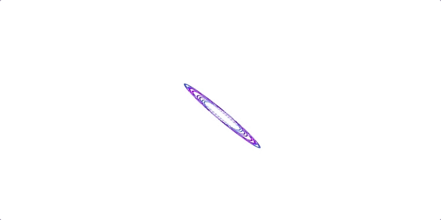
3D Dot

Demo HTML/CSS Review
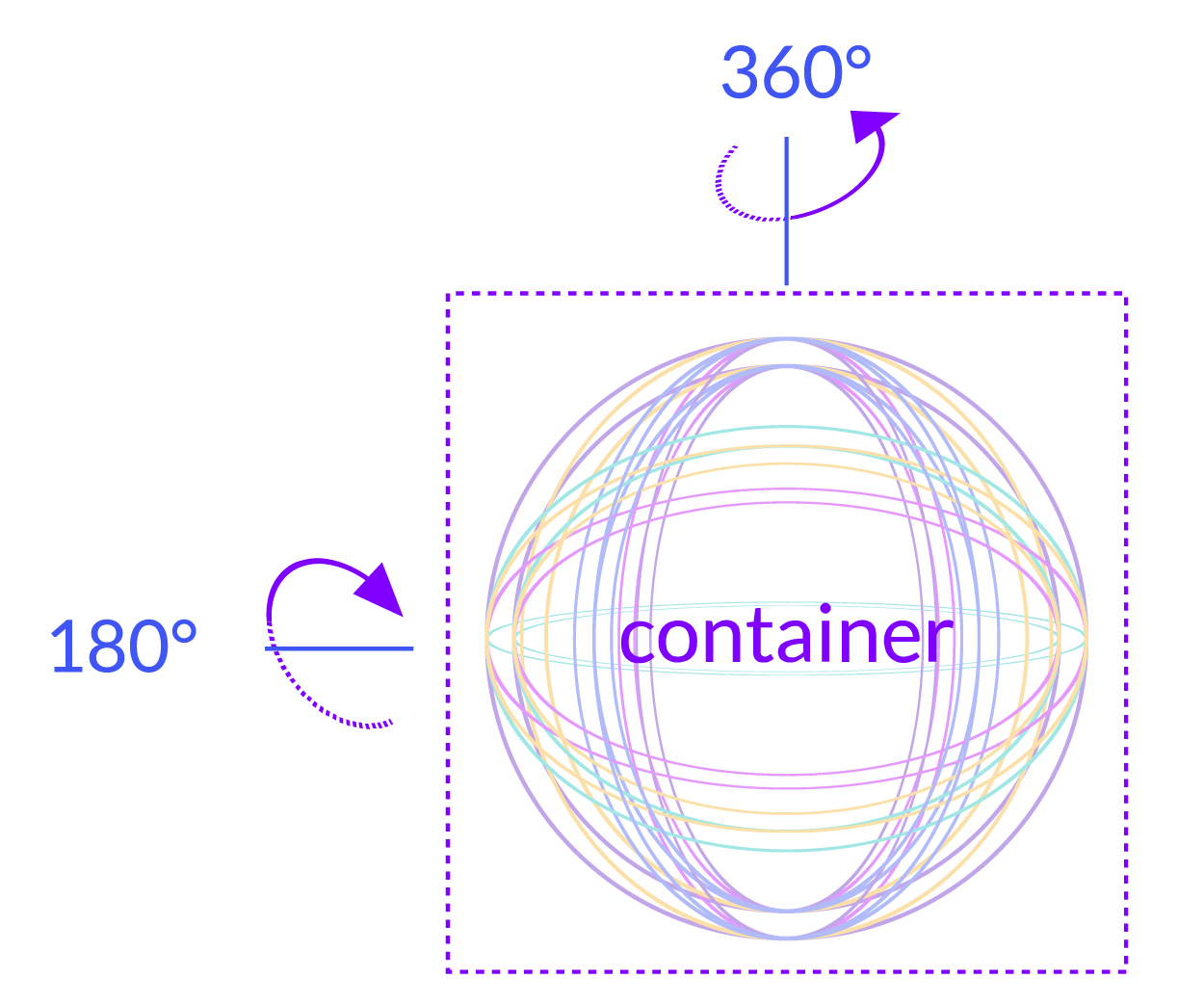
10 divs inside 1 container div
Each of 10 divs is a circle, 2 classes
Circles styled together, separately
Single animation applied to container
Circle Styling
1
Same sizing and border for all
Double border
Each circle has different color, rotations
Container 3D value impact
Rotations, x and y axis
Circle Styling
.dot {
  position: absolute;
  border: 4px double;
  border-radius: 50%;
  width: 50px;
  height: 50px;
}
Circle Styling
.dot1 {
  border-color: #6622CC;
  transform: rotateY(50deg);
}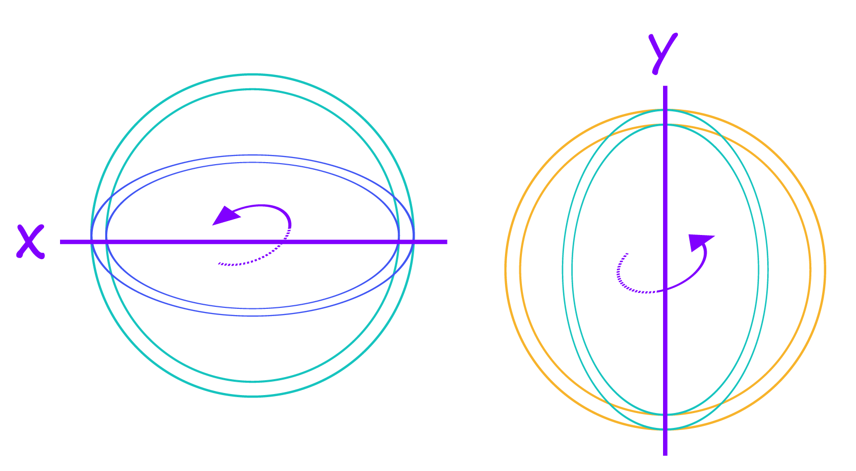
3D Impact
.contain {
  transform-style: preserve-3d;
}
vs.
2
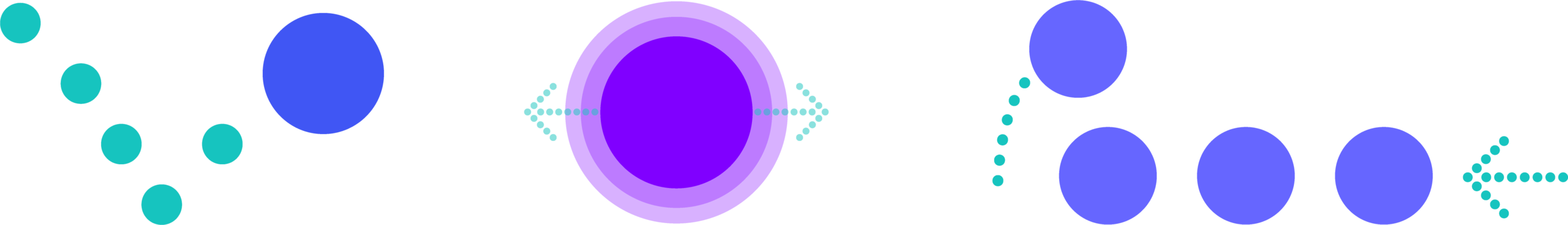
Planning Movements
3
Assigning Animation
4
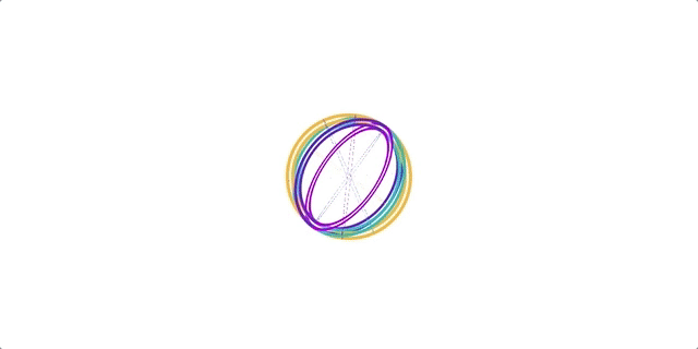
.contain {
    animation: rotate 6s infinite linear;
}
animation property
element class
animation name
duration
repeat
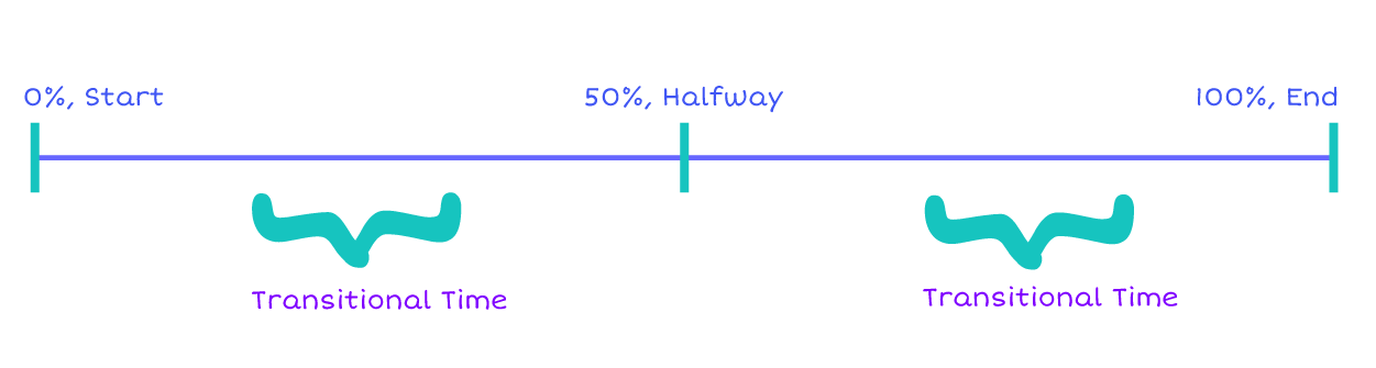
transition timing
Assigning Animation
@keyframes rotate {
  50% {
    transform: rotateY(360deg) rotateX(180deg);
  }
}
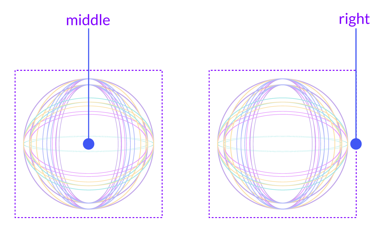
transform-origin
5
.contain {
    animation: rotate 6s infinite linear;
    transform-origin: middle;
}
Let’s change the animation values and see what happens!
What Next?
Keep practicing and experimenting
Find all materials at dotdoodl.com
Thanks again!
Intro To CSS Animation Class 3 For Kids
By Joni Trythall
Intro To CSS Animation Class 3 For Kids
Intro to CSS animation class 3: Morphing Dot, for dotdoodl.com series

