オトナの
CSS設計
入門
2017-12-06 @junsan50
こんばんは!

CSS設計とは?
目的とゴールについて
Googleエンジニア
CSS設計のポイントは以下の4点
フィリップ・ウォルトン氏
・予測しやすい
・再利用しやすい
・保守しやすい
・拡張しやすい
予測しやすい
・期待通りに振る舞うかどうか
・ほかのStyleに影響が無いか
!important 使いすぎて殺されるコード
/* Evil Container*/
.container {
    display: block !important;
    width: 970px !important;
    color: #323232 !important;
    background: #f8f8f8 !important;

    section {
        margin: 40px 0 !important;
        padding: 15px !important;
        border: 1px solid #f8f8f8 !important;
    }
}
再利用しやすい
・Styleが抽象的である
・機能ごとに分離されている
非抽象的で依存している例
/* Evil Box */
.box {
    width: 500px;  // レスポンシブ対応しなくていいの?

    // div に変更される可能性は?
    section {
        padding: 15px !important;
    }
}
保守しやすい
既存ルールの
リファクタリング発生頻度が指標
拡張しやすい
CSSのおさらい
基本を復習しましょう
詳細度とセレクタ
ユニバーサルセレクタ *
要素セレクタ・疑似要素 h1, ::after
クラス・属性セレクタ / 疑似クラス .class, input['text'], :hover
IDセレクタ #header
インライン <p style="line-height: 1.5">
!important
A.B.C = 詳細度
ユニバーサルセレクタ 0点
要素セレクタ・疑似要素 C = 1点
クラス・属性セレクタ / 疑似クラス B = 1点
IDセレクタ A = 1点
インライン 詳細度依存しない(優先)
!important 詳細度依存しない(最優先)
<div id="hoge" class="fuga">
A.B.C
1.1.0
Q1
表示される文字色は?
    #text { color: red; }

    .text { color: blue; }


    <p id="text" class="text">何色でしょうか</p>
red
    // A.B.C = 1.0.0
    #text { color: red; }

    // A.B.C = 0.1.0
    .text { color: blue; }
Q2
表示される文字色は?
    .text { color: red; }

    section:first-child { color: blue; }


    <section class="text">何色でしょうか</section>
blue
    // A.B.C = 0.1.0
    .text { color: red; }

    // A.B.C = 0.1.1
    section:first-child { color: blue; }
Q3
表示される文字色は?
    #text { color: red; }

    .t1.t2.t3.t4.t5 { color: blue; }


    <p id="text" class="t1 t2 t3 t4 t5">何色でしょうか</p>
red
    // A.B.C = 1.0.0
    #text { color: red; }

    // A.B.C = 0.5.0
    .t1.t2.t3.t4.t5 { color: blue; }
Q4
表示される文字色は?
    .parent > .child { color: red; }

    .parent  .child { color: blue; }


    <p class="parent">
        <span class="child">何色でしょうか</span>
    </p>
blue
  // A.B.C = 0.1.0
  .parent > .child { color: red; }

  // A.B.C = 0.1.0
  .parent  .child { color: blue; }

  /* 詳細度が同じ場合、後から書いたルール優先 */
詳細度を無視すると
CSSは破綻する
けっこう複雑なんですよ
アンチパターンから学ぶCSS設計
こんなCSSはイヤだ
Case 1. 要素セレクタ依存
Case 2. 上書き
Case 3. 冗長なセレクタ
Case 4. 破綻しやすい命名
CSSコンポーネント設計を知る
コンポーネントとは
構成要素、部品のこと。
スタイルを「部品」と考える
ことで再利用性を高める。
OOCSS
Object-Oriented CSS
ニコール・サリバン氏
「Webサイトはレゴの組み合わせ」
場所に依存しないCSSを書こう

Bootstrap - Alerts
    <div class="alert alert-success" role="alert">Success!</div>
    <div class="alert alert-info" role="alert">Information.</div>
    <div class="alert alert-warning" role="alert">Warning!</div>
    <div class="alert   alert-danger" role="alert">Danger...</div>
構造と見た目の分離
構造(ベース)
見た目(スキン)
OOCSSはオブジェクト指向なんかじゃない
っていう批判もある
そんな意地にならなくても…
OOCSSは
ルールではなく概念
(考え方のヒント)
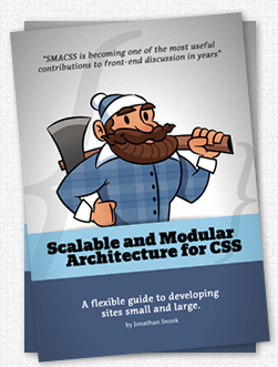
SMACSS
OOCSSを
実践するための
ガイドライン
SMACSSのカテゴライズ
Base - 要素セレクタなどのデフォルトCSS
Layout - エリアごとのCSS
Module - 再利用を想定したCSS
State - Layout, Module の状態を表すCSS
Theme - テーマCSS(WordPressのような)
Base
全体の基礎となるスタイルを定義する。
CSS Reset や Normalizeなどもここに含まれる。
原則変更禁止(書き換えるとすべてに影響する)。
    body {
      font-family: "Lato", -apple-system, BlinkMacSystemFont, "Helvetica Neue", "Yu Gothic", YuGothic, Verdana, Meiryo, sans-serif;
      font-weight: 500;
      font-size: 1rem;
      letter-spacing: -0.04rem;
      -webkit-font-smoothing: antialiased;
      word-break: break-all;
    }

    /* IE10~ */
    @media all and (-ms-high-contrast: none) {
      body {
        font-family: Verdana, Meiryo, sans-serif;
      }
    }

    p {
      margin: 1.25rem 0;
    }
Layout
ヘッダーなどのエリア別スタイルやグリッドレイアウトに代表される枠組みを定義する。
接頭語に「l-」や「layout-」を付与する。
   .l-header {
        position: fixed;
        left: 0;
        top; 0;
        z-index: 2;
        width: 100vw;
        padding: 20px;
        background: #f8f8f8;
    }

    .l-grid {
        display: flex;
        max-width: 62.5rem;
        margin-left: auto;
        margin-right: auto;
        padding-left: 0.9375rem;
        padding-right: 0.9375rem;
        box-sizing: border-box;

        .l-cell-1 {
            width: 5.2083rem;
        }

        .l-cell-2 {
            width: 10.416rem;
        }
    }

    /* 接頭辞無しで ID を使ってもいいがオススメしない */
    #footer {
        margin-top: 30px;
        padding: 15px;
    }
Module
Layoutと分離された(依存しない)再利用可能なオブジェクト。
接頭語は不要。
付けるのであれば「m-」や「mod-」など。
.mod-box {
    padding: 20px;
}

.mod-box-border {
    padding: 20px;
    border: 1px solid #f1f1f1;
}

.mod-bubble {
  position: relative;
  padding: 20px;
  background: #928b67;
  border-radius: 10px;

  &::after {
    content: '';
    position: absolute;
    left: 50%;
    bottom: -12px;
    width: 24px;
    height: 24px;
    background: #928b67;
    transform: translateX(-50%) rotate(45deg);
  }
}
State
状態を表すスタイル。
JavaScriptによる制御で状態が変化する要素やアラート表示など。
接頭語に「is-」を付与。
    .is-active {
        display: block;
    }

    .is-hidden {
        display: none;
    }

    .is-alert-success {
        color: #32b676;
        background-color: #aee4ca;
    }

    .is-alert-warning {
        color: #b5af15;
        background-color: #e4e1ae;
    }
Theme
WordPressのテーマ切替をイメージすればよい。
bodyに「theme-xxx」を付与する手法が簡単。
    /* Default theme */
    body {
        background: #f8f8f8;
    }

    .mod-head {
        color: #323232;
    }


    /* Sky theme */
    body.theme-sky {
        background: #cae6e7;

        .mod-head {
            color: #279296;
        }
    }
階層が深くなったら
どうする?
親モジュール名を付けよう
    .mod-box {
        padding: 20px;

        .mod-box-text {
            letter-spacing: -0.04rem;
            line-height: 1.5;
        }

        .mod-box-link {
            color: red;
            text-decoration: none;
        }
    }
    .mod-cage {
        padding: 8px 10px;

        .mod-cage-text {
            font-weight: bold;
        }

        .mod-cage-link {
            color: green;
            text-decoration: underline;
        }
    }
でも種類が増えると…
    .mod-box {
        padding: 20px;

        .mod-box-text {
            letter-spacing: -0.04rem;
            line-height: 1.5;
        }

        .mod-box-link {
            color: red;
            text-decoration: none;
        }

        .mod-box-link-blue {
            color: blue;
        }
    }
    .mod-cage {
        padding: 8px 10px;

        .mod-cage-text {
            font-weight: bold;
        }

        .mod-cage-link {
            color: green;
            text-decoration: underline;
        }

        .mod-cage-link-pink {
            color: pink;
        }
    }
class間のつながりを
判断するのが困難
どこまでが親子なの\(^o^)/
BEM
Block Element Modifier

コンポーネントを
Block, Element, Modifier
3要素に分類して考える

    <div class="mod-cage">
        <p class="mod-cage__text">ケージテキスト</p>
        <a class="mod-cage__link mod-cage__link--red" href="#">ケージリンク(赤)</p>
        <a class="mod-cage__link mod-cage__link--green" href="#">ケージリンク(緑)</p>
    </div>
// Block
.mod-cage {
padding: 8px 10px;
// Element
.mod-cage__text {
font-weight: bold;
}
.mod-cage__link {
text-decoration: underline;
}
// Modifier
.mod-cage__link--red {
color: red;
}
.mod-cage__link--green {
color: green;
}
}.block__element--modifier
MindBEMding
汚染リスクに強いが
class名が長くなりがち
BEMあるある早く言いたい
.wrapper__section__inner__h-slider--picture
やりすぎ(blockを分けましょう)
FLOCSS
Foundation Layout Object CSS
元サイバーエージェント
谷 拓樹 氏

FLOCSSのレイヤー
Foundation - SMACSSのBaseと同義
Layout - SMACSSのLayoutとほぼ同義
Object
- Component(再利用可能で抽象度高)
- Project(プロジェクト固有の部品)
- Utility( clearfix などの細微なスタイル)
命名規則
Layout「l-」
Component 「c-」
Project 「p-」
Utility 「u-」
Rule. 01
各レイヤーをまたいだ
カスケーディングは原則禁止
    // Utility
    .u-underline {
        border-bottom: 1px solid #000;
    }

    // Component
    .c-box {
        padding: 20px;

        // Utility がネストされているため、よろしくない
        .u-underline {
            border-bottom: 2px solid #323232;
        }
    }
Rule. 02
Projectレイヤーは他レイヤーを変更してもOK(なるべく避ける)
    // Component
    .c-box {
        padding: 20px;
    }

    // Project
    .p-article {
        margin: 0 auto;
        line-height: 1.5;

        // Projectレイヤーの下層なので変更OK
        .c-box {
            padding: 30px 25px;
        }
    }
Rule. 03
レイヤー拡張の命名規則は
MindBEMdingを用いる
    // Component
    .c-box {
        padding: 20px;
        border-radius: 10px;

        .c-box__inner {
            padding: 10px;
            border-radius: 6px;
        }

        .c-box__inner--collapse {
            padding: 0;
        }
    }
Rule. 04
レイヤー順序は変更禁止(後ろに行くほど具体的で強い)
// ==========================================================================
// Foundation
// ==========================================================================
@import "foundation/_reset";
@import "foundation/_base";

// ==========================================================================
// Layout
// ==========================================================================
@import "layout/_footer";
@import "layout/_header";

// ==========================================================================
// Object
// ==========================================================================
// -----------------------------------------------------------------
// Component
// -----------------------------------------------------------------
@import "object/component/_button";
@import "object/component/_alert";

// -----------------------------------------------------------------
// Project
// -----------------------------------------------------------------
@import "object/project/_articles";

// -----------------------------------------------------------------
// Utility
// -----------------------------------------------------------------
@import "object/utility/_align";
@import "object/utility/_position";
様々なルールが
考案されている
銀の弾は無いので
プロジェクトに応じた設計を
私がWebサイト制作で
普段使っているルール
Common - ベースとなるCSS
Block - BEMのBlock
Element - BEMのElement
Modifier - BEMのModifier
Module - 再利用を想定したCSS(SMACSS)
Utility - 細微なCSS(FLOCSS)
JavaScriptで操作する要素のみID付与
これはオススメです
CSSは良くも悪くも自由
「自由」自体は悪ではない
「ルールが無い」ことが悪
ハンズオン
そろそろ実践してみよう
Otonano-CSS-Design
By junsan50