Getting Started with D3.js
Using the Toronto
Parking Ticket Data
What is D3?
- Data-Driven Documents
- Powerful and flexible JavaScript library
- Leverages HTML, SVG and CSS
- Examples and docs at http://d3js.org/
Basically...

It's the sort of library that showcases what JavaScript can do when approached properly.
What is the Toronto
Parking Ticket Data?
- ~2.8 million parking tickets/year in Toronto
- Includes date, time, infraction, fine amount, etc.
- Available from Toronto Open Data
- This presentation uses the 2012 data
D3's flexibility
can be daunting:
- Lots and lots of methods
- Each methods does a very specific task
- Most methods are chainable
- Visualizations need to be built up piecemeal
But Don't Panic

Let's start with a basic pie chart:
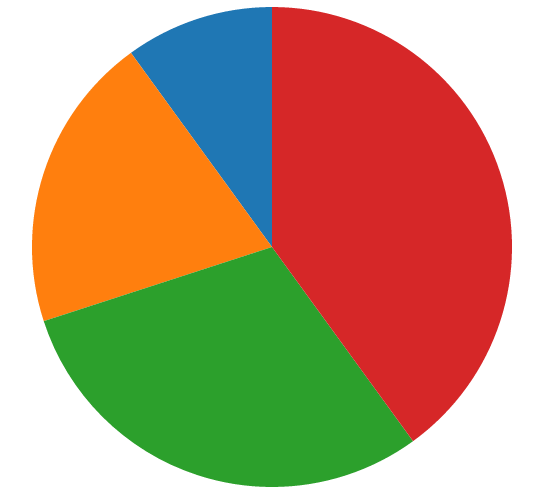
Looking at the DOM:

- An svg element with a width and height
- A g element that has been translated to center it
- 4 path elements with d and fill attributes
So how do we do that?
Let's start with some data:
var data = [10, 20, 30, 40]; var width = 960,
height = 500,
radius = Math.min(width, height) / 2;So far so good...
Next we'll define the colours using
a built-in D3 palette:
var color = d3.scale.category10();always just specify your own colours.
Now things get interesting:
Because pie charts are circular,
we'll need to define an arc:
 var arc = d3.svg.arc()
.outerRadius(radius - 10);We'll extend this later on but this is a good start.
What would a pie chart be without a pie variable?
 var pie = d3.layout.pie()
   .value(function(d) { return d; });
This calculates the angles for each section.
In other words, it determines the size of each wedge.
The value method takes an accessor function
that returns the value for each data point.
For our simple data, we can pass in an identity function.
Now for the SVG:
 var svg = d3.select('body')
   .append('svg')
   .attr('width', width)
   .attr('height', height)
   .append('g')
.attr('transform', 'translate(' + width / 2 + ',' + height / 2 + ')');- adding an svg element
- setting the width and height on it
- adding a g element
- translating it so that it's centered
Let's compare:
 var svg = d3.select('body')
   .append('svg')
   .attr('width', width)
   .attr('height', height)
   .append('g')
   .attr('transform', 'translate(' + width / 2 + ',' + height / 2 + ')');
No problem, right?

And finally:
 var path = svg.selectAll('path')
    .data(pie(data))
    .enter()
    .append('path')
    .attr('d', arc)
    .attr('fill', function(d, i) { return color(i); });
Here we see the majestic D3 pattern
selectAll(...).data(...).enter.()..append(...)
I know what you're thinking...

Keep calm and
take it line by line:
 // Select the nodes to which we'll bind the data
 var path = svg.selectAll('path')

   // Bind the pie-ified data to the selection
   .data(pie(data))

   // Create placeholder nodes for each data point
   .enter()

   // Append the path elements to the svg
   .append('path')

   // Provide the arc data for each data point
   .attr('d', arc)

   // Pick a colour from the palette by iterating over the data points
   .attr('fill', function(d, i) { return color(i); });
It's a lot of steps but D3's flexibility stems from its use of small, chainable methods.
You'll come across variations of the
selectAll(...).data(...).enter().append(...)
pattern again and again in D3.
The finished product
Great, but....
What was all that
about parking tickets?

Phase 2
Let's take this a bit further by doing two things:
- Using real data instead of our dummy data
- Switching to a donut chart
We'll end up with this:
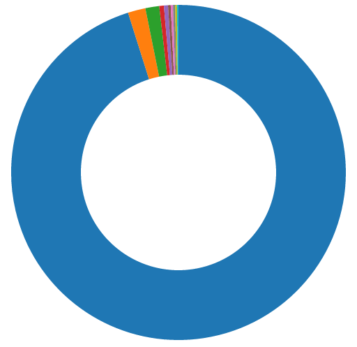
The donut part is easy

It's a one-line change:
Simply take this:
 var arc = d3.svg.arc()
   .outerRadius(radius - 10);
And add one line:
 var arc = d3.svg.arc()
   .outerRadius(radius - 10)
.innerRadius(radius - 110);while outerRadius(...) defines where it stops.
Now for some real data:
 province,count
 ON,2612317
 Other,46623
 QC,36620
 AB,12267
 NY,10919
 BC,7019
 NS,6008
 FL,5464
 MI,5008
 MB,3909
This breaks down the total number of issued tickets by
province/state. Only the top nine are listed explicitly
with all others combined in the Other category.
This was extracted from the parking ticket data using
Python and Pandas (which is awesome, by the way).
D3 can read CSVs
(as well as TSVs and arbitrary DSVs)
Our province/state data will be transformed into:
Note that the column headers have become [{ province: "ON", count: 2612317}, { province: "Other", count: 46623 }, { province: "QC", count: 36620 },...
object keys.
D3.csv(...) is asynchronous
Therefore we need to move the parts that rely
on the data into a callback. In our case, that means
our friend selectAll(...).data(...).enter().append(...)
 d3.csv('provinces.csv', function(error, data) {
   data.forEach(function(d) {
     d.count = +d.count;
   });

   var path = svg.selectAll('path')
     .data(pie(data))
     .enter()
     .append('path')
     .attr('d', arc)
     .attr('fill', function(d, i) { return color(i); });
 });
Note that the var path = ... part is unchanged.
CSVs fields are strings
Which is why we see the following on the preceding slide:
 data.forEach(function(d) {
    d.count = +d.count;
});We need the count field to be a number, so we could use parseInt(...) or parseFloat(...) but using the + to cast it to a number is generally faster. (The joys of JS.)
We now have an array of objects instead of an array of numbers
So there's one other change we need to make. This:
 var pie = d3.layout.pie()
.value(function(d) { return d; }); var pie = d3.layout.pie()
.value(function(d) { return d.count; });And just like that,
Phase 2 is complete.
Code: GitHub
Example: S3
That means it's time for...
Phase 3
Our chart is looking pretty good but
what does each colour represent?
This calls for a legend...
But not this kind:

More like this:
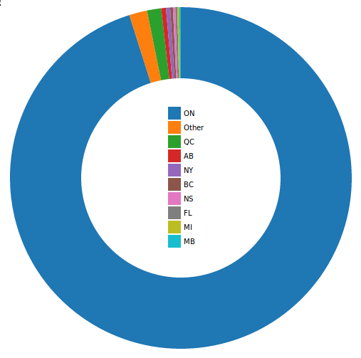
Our first CSS
So far we've gotten along without any CSS at all.
(Take a moment to consider that.)
Now we'll add just a little bit to make the font nicer:
 body {
   font: 10px sans-serif;
 }
Now what?
Up until now we've been specifying the
colours using the data indices:
 var path = svg.selectAll('path')
   ... // Other methods
.attr('fill', function(d, i) { return color(i); }); var path = svg.selectAll('path')
... // Other methods
.attr('fill', function(d, i) { return color(d.data.province); });the two that we'll use shortly.
Our legend needs three parts
- A wrapper
- The coloured boxes
- The text (province/state name)
The Wrapper
In the CSV callback, after var path = ... we'll add:
 var legend = svg.selectAll('.legend')
   .data(color.domain())
   .enter()
   .append('g')
   .attr('class', 'legend')
   .attr('transform', function(d, i) {
     return 'translate(0,' + (i * 20 - 100) + ')';
   });
pattern, after which we just add a legend class
and use a transform to position the wrapper
in the center of the donut.
The Coloured Boxes
These are straightforward:
 legend.append('rect')
   .attr('width', 18)
   .attr('height', 18)
   .attr('x', -18)
   .style('fill', color);
offsets them for centering purposes
and finally specifies the fill colour.
The Text
This is also straightforward:
 legend.append('text')
   .attr('x', 4)
   .attr('y', 9)
.text(function(d) { return d; });positions it accordingly and finally defines the text,
which will be the province/state name due to the
association we created earlier.
Easy mode, right?

Code: GitHub
Example: S3
Onwards we go...
Phase 4
What if we wanted to know
the actual numbers?
Time for some tooltips:
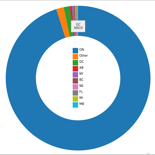
A little more CSS
Tooltips aren't built into D3 (although
there are extensions you can use), so
we need some more styles:
 .tooltip {
   background: #eee;
   box-shadow: 0 0 5px #999999;
   color: #333;
   padding: 8px;
   position: absolute;
   text-align: center;
   visibility: hidden;
   z-index: 10;
 }
.on() and mouse events
We'll use three event handlers to enable our tooltips.
They will be added to path in the callback:
 path.on('mouseover', tooltipOn)
   .on('mousemove', tooltipMove)
   .on('mouseout', tooltipOff);
Before we do anything else...
We need to add a tooltip to the document.
This doesn't need to be in the callback: it can
go after the var pie = ... part.
 var tooltip = d3.select('body')
   .append('div')
.attr('class', 'tooltip');gives it the tooltip class.
The 'mouseover' handler
Next we add our handlers, starting with tooltipOn:
 var tooltipOn = function(d, i) {
   var content = '<div>' + d.data.province + '</div><div>' +
     d.data.count + '</div>';
   tooltip.html(content)
     .style('visibility', 'visible');
 };
our tooltip will update its content to include
the province/state name and the count.
It will also make the tooltip visible
(which is kind of important).
The 'mousemove' handler
We'll have the tooltip move with the mouse, which means it needs to know where the cursor currently is:
 var tooltipMove = function(d, i) {
   tooltip.style('top', (d3.event.pageY + 10) + 'px')
     .style('left', (d3.event.pageX + 10) + 'px');
};The + 10 is there to provide some offset.
The 'mouseout' handler
This is the simplest of the three, all it needs to do is hide the tooltip when the mouse is no longer over a segment:
 var tooltipOff = function() {
   tooltip.style('visibility', 'hidden');
 };
With that, our tooltip is good to go.
Give it a try

Code: GitHub
Example: S3
Now just one last thing...
Phase 5
Let's get things moving...

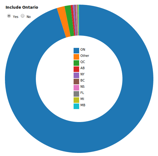
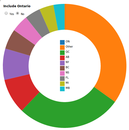
One of the most exciting aspects of D3 is its ability to enable interactivity.
Our chart is currently dominated by the parking tickets from Ontario, so it's hard to get a good feel for the breakdown of the other provinces/states.
Let's toggle between this:
And this:
First we'll add our form
We'll put this at the start of the body:
 <form>
   <h3>Include Ontario:</h3>
   <label><input type="radio" name="ontario" value="yes" checked> Yes</label>
   <label><input type="radio" name="ontario" value="no"> No</label>
 </form>
 form {
   left: 250px;
   position: absolute;
 }
 label {
   cursor: pointer;
 }
So how will we do this?
We're going to register event listener on input elements:
d3.selectAll('input').on('change', change);Now for the logic
 var change = function() {
   if (this.value === 'yes') {
     pie.value(function(d) { return d.count; });
   } else {
     pie.value(function(d) {
       return (d.province === 'ON') ? 0 : d.count;
     });
   }
   path = path.data(pie);
   path.transition().duration(750).attrTween('d', arcTween);
 };
If its value is yes, we proceed as before.
If its value is no, we'll set the Ontario count to 0.
We then need to recalculate the angles
and finally we'll animate the transition.
Before we discuss the animation, there is some housekeeping to be done.

Disable sorting:
 var pie = d3.layout.pie()
   .value(function(d) { return d.count; })
.sort(null); // NEWwill look a bit wonky otherwise.
Separate out the data
This:
 var path = svg.selectAll('path')
   .data(pie(data))
   .enter()
   .append('path')
   .attr('d', arc)
.attr('fill', function(d, i) { return color(d.data.province); }); var path = svg.datum(data) //NEW
.selectAll('path')
.data(pie) // CHANGED
.enter()
.append('path')
.attr('d', arc)
.attr('fill', function(d, i) { return color(d.data.province); })
.each(function(d) { this._current = d; }); // NEW
There are two things
going on here:
- Moving data into .datum() keeps it from
being joined with the selection, which is
what happens with .data(). - The last line attaches a _current value to
each data point. This will be used in the
animation.
Finally we have arcTween
I yanked this straight out of a D3 animation example:
 var arcTween = function(a) {
   var i = d3.interpolate(this._current, a);
   this._current = i(0);
   return function(t) {
     return arc(i(t));
   };
};Transitions are an advanced topic so don't worry about it.

Our pie chart is done.
Code: GitHub
Example: S3

![]()
On Twitter: @kentenglish
On the interwebs: http://kentenglish.ca/
(we're hiring!)
On Twitter: @CrowdRiff
On the interwebs: http://crowdriff.com/
Getting Started with D3.js Using the Toronto Parking Ticket Data
By kentenglish
Getting Started with D3.js Using the Toronto Parking Ticket Data
This presentation was given at the DVTO meetup, Keep Calm and Learn D3.js: http://www.meetup.com/Data-Visualization-Toronto/events/186352132/ The GitHub repository can be found here: https://github.com/dvto/dvto6
- 10,179
