New Innovations
Mobile App
Hypothesis
If doctors going through their residency program could use their mobile device to perform task requirements, they would be more accurate and do them more often.
Login Experience
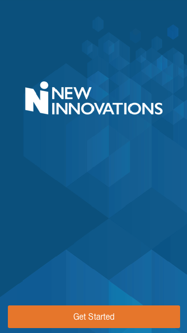
First Impression
The "Get Started" page gives the user confidence that this is the official New Innovations application. I used the marketing style guide for the background pattern and I really like how the orange contrasts with the blue.
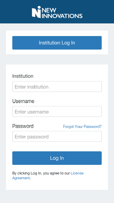
Login
Our customers have the option here to use their Institution SSO or if not available they can use their institution ID, username and password.
I put the "Institution Log In" at the top so the users who have never logged in with NI credentials would find it before stumbling through the form.
Wayfinding
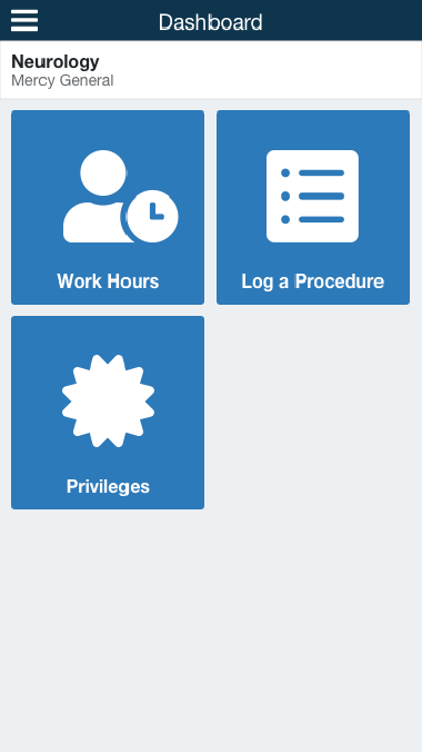
Dashboard
Under the navigation bar I added the department information as well as institution name below it. Customers can have multiple institution log ins so this gives reference.
I chose these tiles to represent modules in our suite. I wanted to do more here but for first release this was leanest.
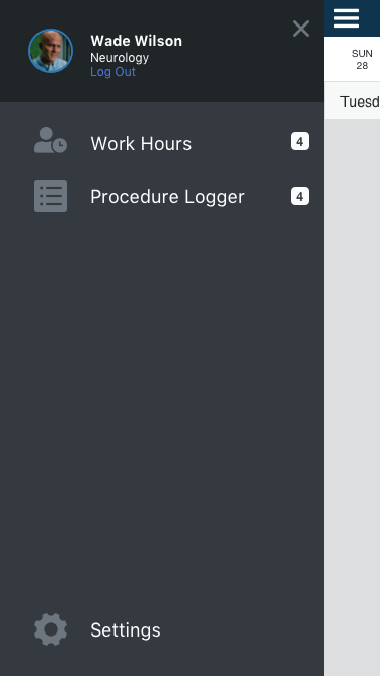
Flyout Menu
I designed this flyout menu so that users can get to other modules from anywhere in the mobile app. Settings for their account as well as log out are tucked away here because they're less common actions.
Work Hours
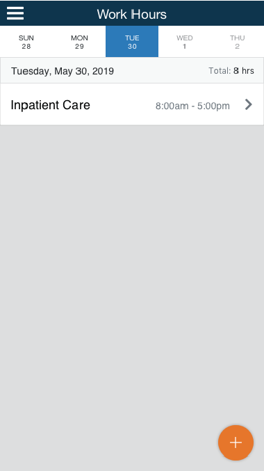
List Page
I designed this view leveraging design patterns from popular calendar apps. It was important to show
- The date
- The day was selected
- The activities logged
- A path to add an activity
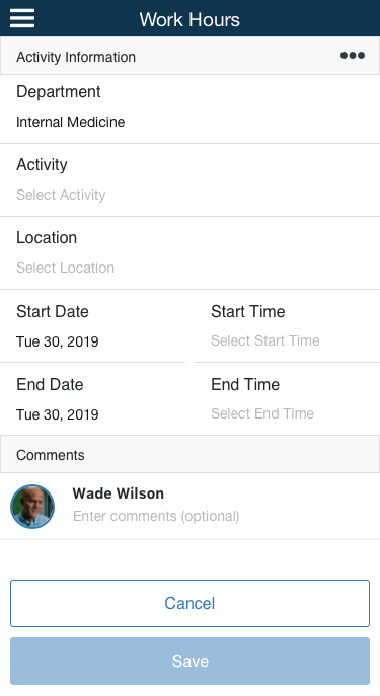
Adding (blank)
For a doctor to add their hours worked they have to satisfy these fields. It was important to me and the team to try to predict what fields we could populate for them. We persisted their "home" department and the date.
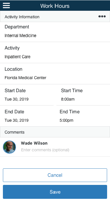
Adding (ideal)
Now that the user has satisfied the fields the save button allows them to save.
Saved
The saved entry now appears in the list view along with other meta data like the time logged for quick reference and a total hours logged in the status bar.

Conferences
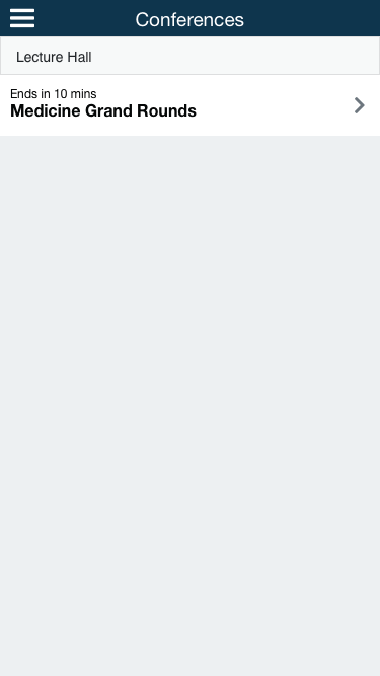
List View
Using the design pattern established in our Work Hours module, users can see what and when their conferences are scheduled.
The time meta data is important because customers can only log in for a certain duration before and after the event begins.
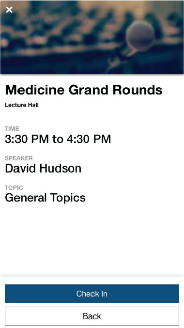
Detail View
Users can use the detail view to learn about the conferences they're scheduled for. Time and location are important so they can be sure they have enough time to get to their conference. Action buttons on the bottom let the user know what actions are available.
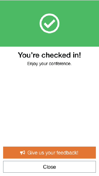
Check in success
Once a user is checked in their attendance is recorded for their program coordinator. We added a feedback button so users could tell us what the check in process was like.
Outcome
We received a large amount of feedback from our users. Positive feedback that they loved the convenience of taking their own attendance. Negative feedback that the activity type they needed in Work Hours was not in the dropdown. We received feedback that users wanted to bulk add their work hours that led to some discovery. Some users also requested a mechanism to "Start/Stop" a timer for when they were working.
New Innovations Mobile App
By Kevin Wirth


