Experiments in Storytelling
And how you can too!
By Mallory Busch | @yeamal
2015 gave us some really impressive experiments in online journalism:
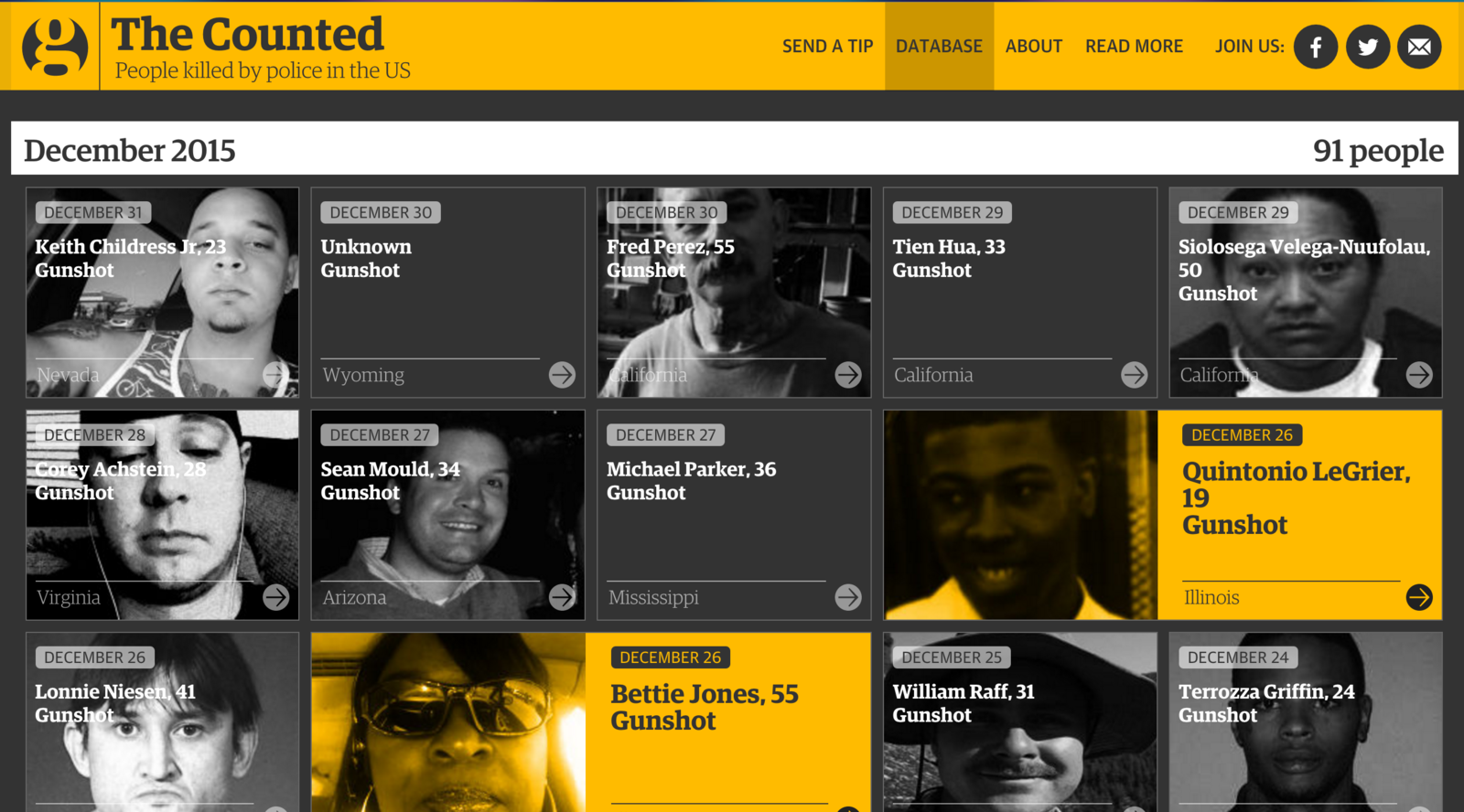
- Databases on police shootings
- Photo-audio slide stories
- Charts the user can draw on
- Virtual Reality tours of Mars
A lot of these projects are done with the support of many, skilled members
which is way cool.
But what if it's just you?
Journalism experiments are BIG and tiny.
But they can all be impactful.
What do good stories do?
They tell the facts.
They tell the whole story.
And they tell them without bias.
What do good stories have the potential to do?
-
Understand
-
Get invested
-
Share
-
Take action
They can get the audience to...
Even tiny experiments can help your story land a greater impact.

Geo-choropleth? How about tiles?
Hexagon tiles???
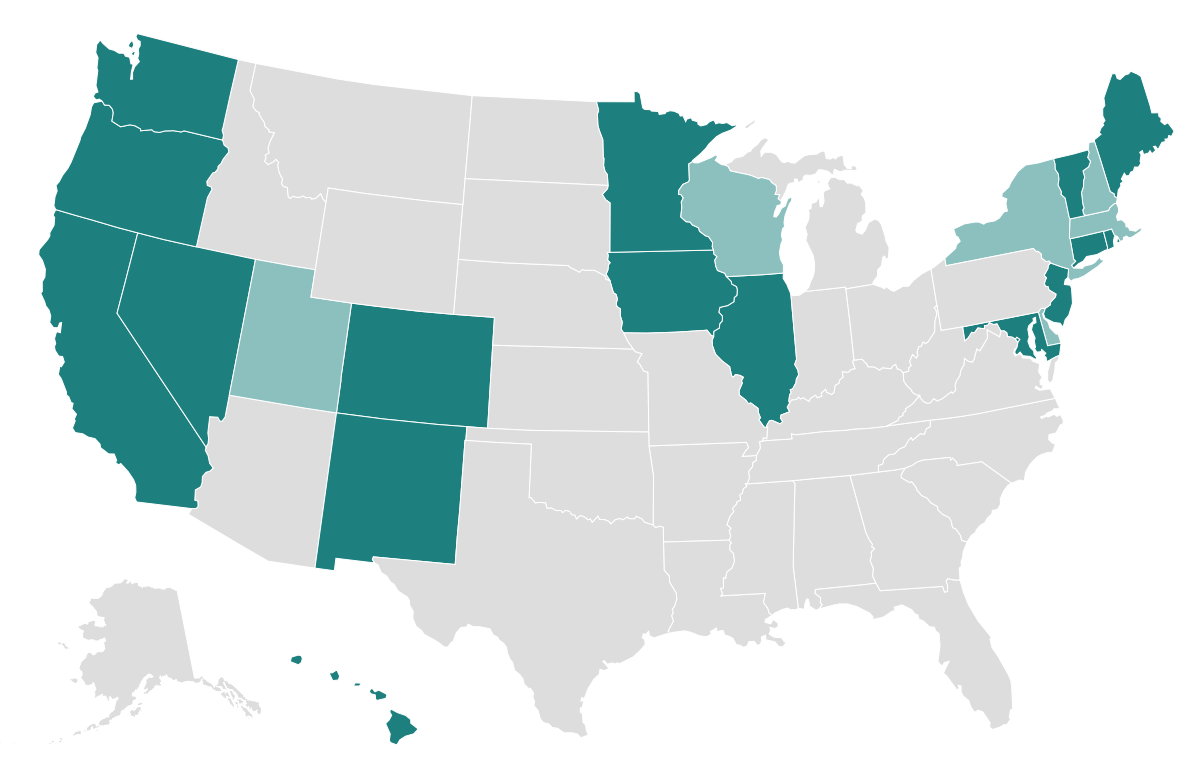
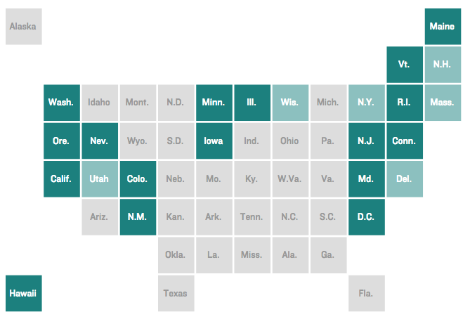
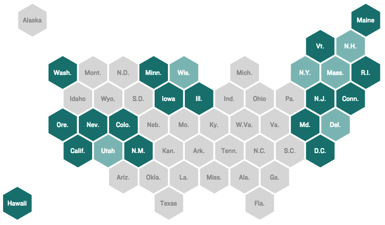
Pro Tip: You gotta read the NPRviz blog about these maps (from which these pictures were taken)
Humanizing the data
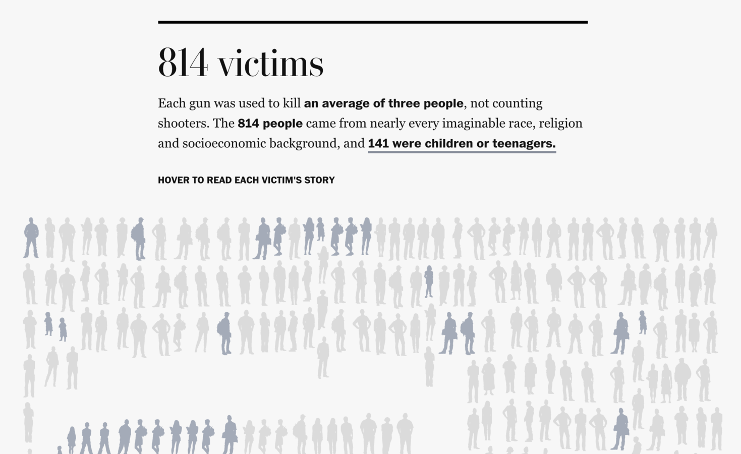
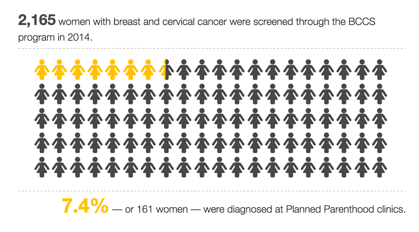
(Icons aren't always advisable for percents –– filling that last yellow icon exactly 40% required calculating the surface area in Illustrator and manually creating a unique icon)
Pro Tip:
Font Awesome has easy downloadable icons you can use for free instead of designing your own
But be careful...
When you report with data, you undertake the responsibility to use it correctly.
Sometimes going for 'simple' bar charts is best, when it means your audience won't get confused.
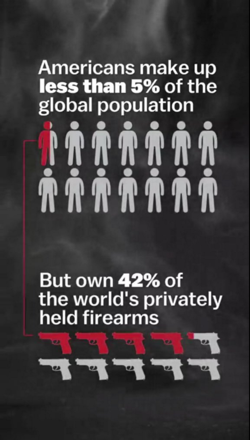
Semi-filled, dissimilar icons, comparing a group of 14 to a group of 10
Experiments with Social Media

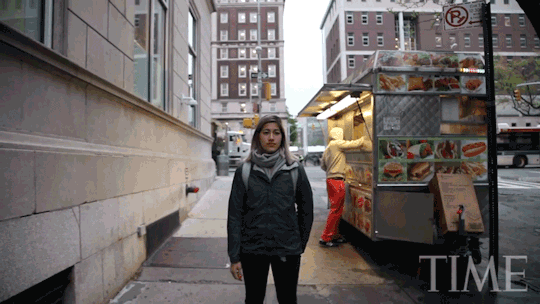
Turning part of a video into a series of gifs for Tumblr can tell the story in another facet –– while also promoting the story through social networks.

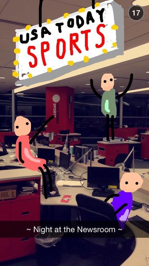
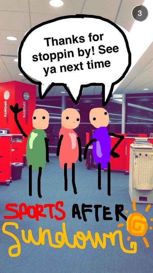
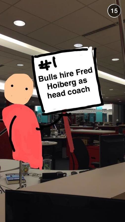
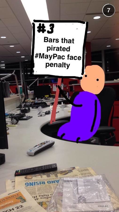
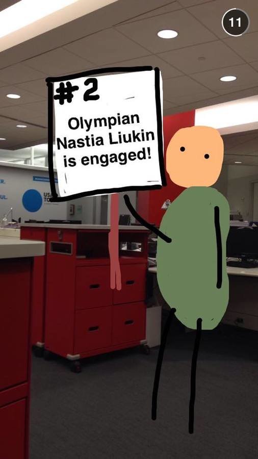
Snapchat is also great for behind-the-scenes coverage. But when possible, go for silent stories. You don't want the person scrolling on their phone in the coffee line to feel like they need headphones for the story. Same goes for Facebook video.
Pro-tip: a cheap stylus will go the distance in allowing you to draw better pictures
(USA Today Snapchat)
Deconstruct the Complicated.
The average reader spends 15 seconds on an article. Give them a reason to stay.
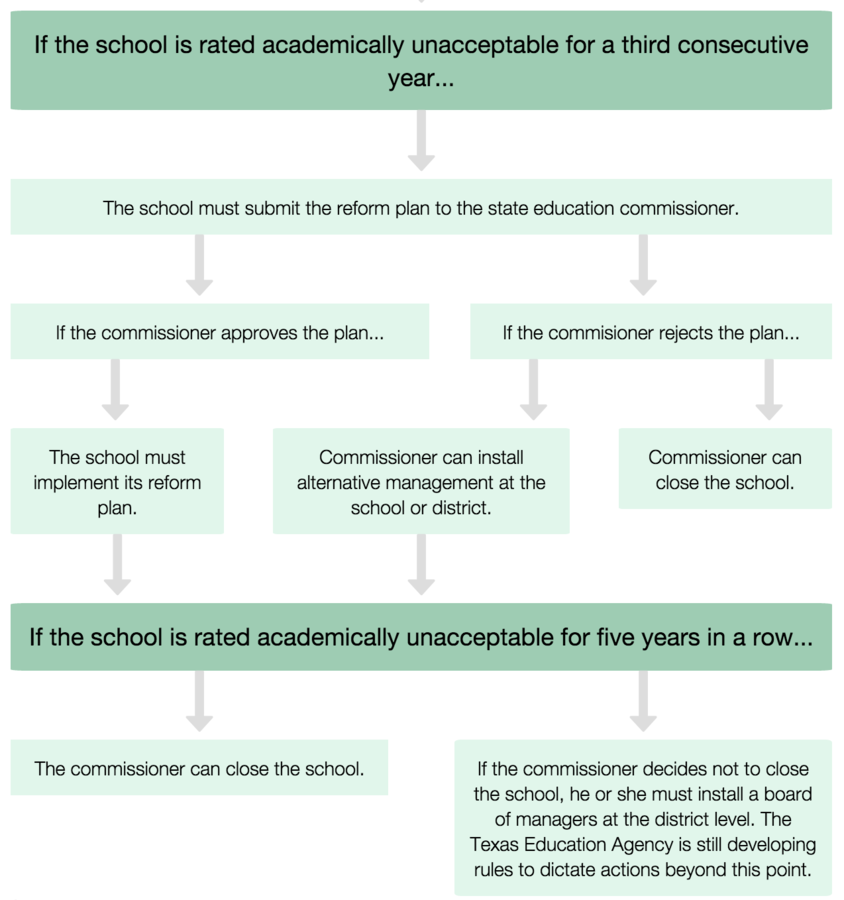
Flowcharts: Explaining Complicated Laws the Lawmakers Don't Even Understand
Pro Tip: If you think your charts will help your community audience, provide a PDF version and a download link for them. That way, they can print your chart out at home or work and refer to it as needed.
But make sure it works on mobile too. You can use JavaScript to edit which text appears on which screen size, so the mobile can present a less-complicated chart.

(That was a lot of text. gif break)
Pro Tip: No matter how you pronounce "gif," someone will always insist you are pronouncing it incorrectly.
Speaking of which, gifs are great...
Exceeeeeept that they take up large file sizes
So to achieve a similar effect, try slideshows. Or videos. Or an external hosting platform.
But. Never embed posts that can be edited.
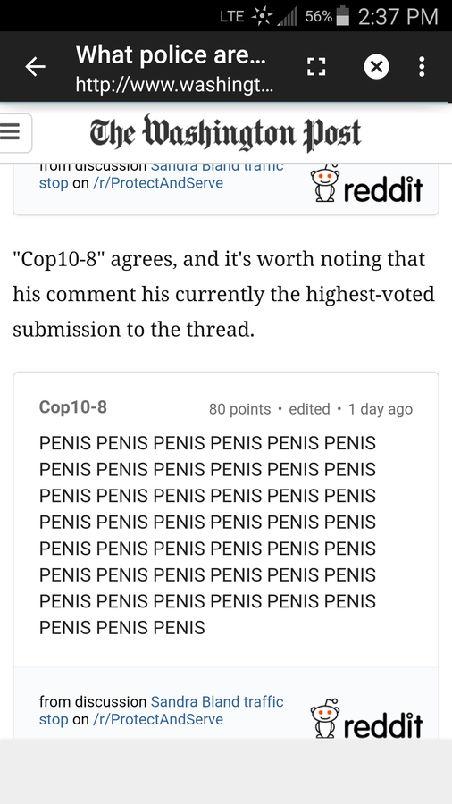
Try a screenshot instead :)
Every piece of journalism referenced in this presentation was published in 2015
Which is pretty cool. Experiments with news are aplenty, and even the smaller ones have the potential to help a story make a better impact.
So go forth, experiment!
Knowledge of social media, code, video, design and illustration strategies will give your imagination a boost.
Experiments in Storytelling
By Mallory Busch