Sass
(A high-level introduction)
Sass lets you use features that don't exist in CSS yet like variables, nesting, mixins, inheritance and other nifty goodies that make writing CSS fun again.
Basically, If this is CSS...
This is SASS

1. Variables
2. Nesting
3. Partials
4. Import
5.Mixins
6. Extend/Inheritance
TOPICS
7. Cool Tools
$font-stack:    Helvetica, sans-serif;
$primary-color: #333;

body {
  font: 100% $font-stack;
  color: $primary-color;
}
Variables
Great for: colors, fonts, padding, margins, etc.
SCSS
body {
  font: 100% Helvetica, sans-serif;
  color: #333;
}
CSS
$base-font-family: Helvetica, Arial, sans-serif;
$base-font-size:   16px;
$small-font-size:  $base-font-size * 0.875;
$base-line-height: 1.5;

$spacing-unit:     30px;

$text-color:       #222;
$background-color: #fdfdfd;
$brand-color:      #2a7ae2;

$grey-color:       #828282;
nav {
ul {
margin: 0;
padding: 0;
list-style: none;
}
li { display: inline-block; }
a {
display: block;
padding: 6px 12px;
text-decoration: none;
}
}NESTING
Helps minimize selector specificity and can help keep things DRY.
SCSS
nav ul {
  margin: 0;
  padding: 0;
  list-style: none;
}

nav li {
  display: inline-block;
}

nav a {
  display: block;
  padding: 6px 12px;
  text-decoration: none;
}
CSS
Beware the nesting rabbit hole.
.root {
  width: 400px;
  margin: 0 auto;

  .links {
    .link {
      display: inline-block;

      & ~ .link {
        margin-left: 10px;
      }

      a {
        padding: 10px 40px;
        cursor: pointer;
        background: gray;

        &:hover {
          background: blue;
          color: white;
          font-size: 700;
        }

        .icon {
          margin-right: 5px;
          @include selector-modifier(-2 ':hover', 1 suffix '.zh') {
            color: red;
            background: green;
          }
          @include selector-modifier(-2 ':hover', 1 suffix '.en') {
            color: yellow;
            background: green;
          }
        }
      }
    }
  }
}.Root.Link.link.a.iconWayyyy more qualified than it needs to be.
CSS
    -Partials
        -buttons
        -banners
        -warnings
        -social
        -nav

    -Mixins
        -media-queries
        -typography
        -more cool stuff

    -variables
        -colors
        -fonts
        -targets
Partials
Think of your CSS as a collection of styled objects an it'll become more maintainable and scalable.
SCSS
Single HTTP REQUEST!CSS
// _reset.scss

html,
body,
ul,
ol {
   margin: 0;
  padding: 0;
}

/* base.scss */

@import 'reset';

body {
  font: 100% Helvetica, sans-serif;
  background-color: #efefef;
}
Import
Sass will take the file that you want to import and combine it with the file you're importing into so you can serve a single CSS file to the web browser
SCSS
html, body, ul, ol {
  margin: 0;
  padding: 0;
}

body {
  font: 100% Helvetica, sans-serif;
  background-color: #efefef;
}
CSS
// Mixin to remove the need to add Vendor Prefixes

@mixin border-radius($radius) {
  -webkit-border-radius: $radius;
     -moz-border-radius: $radius;
      -ms-border-radius: $radius;
          border-radius: $radius;
}
Mixins
Sass Mixins are functions that allow you to complete repetitive or complex tasks quickly.
Mixin
.box { @include border-radius(10px); }Implementation
Mixin for Media Queries
$break-small: 480px;
$break-medium:768px;
$break-large: 980px;
$break-wide:1200px;


@mixin respond-to($screen) {
  @if $screen == handhelds {
    @media only screen and (max-width: $break-small) { @content; }
  }
  @else if $screen == phablets {
    @media only screen and (max-width: $break-medium - 1) { @content; }
  }
   @else if $screen == tablets {
    @media only screen and (min-width: $break-medium ) and (max-width: $break-large - 1) { @content; }
  }
  @else if $screen == defaultbs{
    @media only screen and (min-width: $break-large) and (max-width: $break-wide - 1) { @content; }
  }

  @else if $screen == wide{
    @media only screen and (min-width: $break-wide) { @content; }
  }

}
(Media Query partial currently being used on Pivot)
Use Example
.element {
  float: left;
  width: 250px;
  @include respond-to(handhelds) { width: 94%;margin-left:3%; float:none;}
  @include respond-to(phablets) { width: 80%; margin-left:10%; float:none;}
  @include respond-to(tablets) { width: 150px; }
  @include respond-to(defaultbs) { width:200px; }
 }
.message {
border: 1px solid #ccc;
padding: 10px;
color: #333;
}
.success {
@extend .message;
border-color: green;
}
.error {
@extend .message;
border-color: red;
}
.warning {
@extend .message;
border-color: yellow;
}Extend/Inheritance
Share a collection of properties from one class to another.Helps keep SASS DRY.
SCSS
.message, .success, .error, .warning {
  border: 1px solid #cccccc;
  padding: 10px;
  color: #333;
}

.success {
  border-color: green;
}

.error {
  border-color: red;
}

.warning {
  border-color: yellow;
}
CSS
Some Advanced Notes:
Extend Source Order:
Courtesy of Hugo Giraudel
.half-red {
  color: rgba(red, .5);
}

.message-error {
  color: red;
  @extend .half-red;
}
This
.half-red,
.message-error {
  color: rgba(255, 0, 0, 0.5);
}

.message-error {
  color: red;
}
Generates This
.message-error {
  color: red;
  color: rgba(255, 0, 0, 0.5);
}
Not This
@extend works by inserting the extending selector [...] anywhere in the stylesheet that the extended selector [...] appears.
Some of his best Best Practice suggestions:
- Make sure the extended selector is present only once in the stylesheet.
- Avoid extending from nested selectors.
- Avoid chaining @extend directives.
- Don’t try extending from within a media query; it doesn’t work.
.container { width: 100%; }

article[role="main"] {
  float: left;
  width: 600px / 960px * 100%;
}

aside[role="complimentary"] {
  float: right;
  width: 300px / 960px * 100%;
}
Operators
CSS spec already has Math. SASS has MATH.
SCSS
.container {
  width: 100%;
}

article[role="main"] {
  float: left;
  width: 62.5%;
}

aside[role="complimentary"] {
  float: right;
  width: 31.25%;
}
CSS
So, Yeah, It's bascially a fancier way to decorate my page... so what?

Responsive Grids:
Custom Grid
Vs.
Twitter Bootstrap
Twitter Bootstrap 2.32 (Pivot, Mosaic(?) )
76KB
61KB
5KB
3KB
Sussy
(SASS Based responsive grid generator)
Un-minified
Un-minified
minified
minified
That's 96% lighter!
Well, It can really make a difference in your existing work through refactoring.
Quick Touch on
Advanced SASS
Control Directives
@if
@for
@each
@while
@if
Takes a condition, returns style if TRUTHY
@mixin text-inset($colour, $opacity: 0.7) {

  @if lightness($colour) < 50% {
    // if the text colour is a dark colour
    // we need a white shadow, bottom, right
    text-shadow: 1px 1px 1px rgba(#fff, $opacity);
  } @else {
    // else it must be light so we need
    // a black shadow, top, left
    text-shadow: -1px -1px 1px rgba(#000, $opacity);
  }

  // set the text colour
  color: $colour;

}@for
$background-colors-list: #4BC2A5 #606F40 #6648CA #6B6022 #2F54E9;
$border-colors-list: #ff9900 #77ff66 #73C227 #C23E50 #7BAFC2;
$colors-list: #111 #222 #111 #444 #555;
@for $i from 1 through length($colors-list) {
    .stuff-#{$i} {
        color: nth($colors-list, $i);
        background-color: nth($background-colors-list, $i);
        border: 1px solid nth($border-colors-list, $i);
    }
}Iterates over contents set number of times based on variable.
Tools using SASS
http://compass.kkbox.com/
http://mhs.github.io/scout-app/
SCOUT
Koala
GUI Sass Compilers:
Sublime Text 2/3 with Sass builder
Text Editor
Atom.io with LibSass plugin
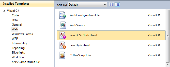
Visual Studio!
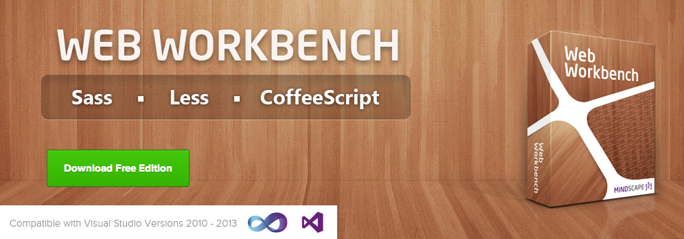
Yes, That says Free!
It's Sass...in C

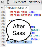
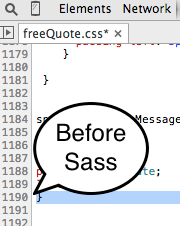
SASS Source Maps
Some Resources
Intro to Sass
By Mark Santiago
Intro to Sass
Lunch & Learn on Nov 6 and full Meetup Talk on Nov 20th.


