Tips and Tricks for reusable components


Miguel Camba
@miguelcamba
@cibernox
miguelcamba.com

Recap
What are components?
Structure that groups some piece if UI along with its behaviour in a way that is easy to share and reuse
Structure that groups some piece if UI along with its behaviour in a way that is easy to share and reuse
UI (HTML/CSS) + Behaviour (JS)
Components are to UI what functions are to code
Component(X, Y, Z) = UI (HTML + events)
<button type="button" class="btn btn-{{size}}">
  {{yield}}
</button>
{{#my-btn size="big"}}Submit{{/my-btn}}<button type="button" class="btn btn-big">
Submit
</button>Reusability === Encapsulation
Components === Functions
Attributes === Arguments
Tip 1: Explicit Contracts
Avoid implicit contracts with closure actions
export default Ember.Component.extend({
  tagName: 'button'
  click(e) {
    this.sendAction('onClick', e);
  }
});
export default Ember.Controller.extend({});{{#my-btn onClick="foobar"}}Submit{{/my-btn}}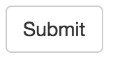

export default Ember.Controller.extend({});{{#my-btn onClick=(action "foobar")}}
Submit
{{/my-btn}}{{#my-btn onClick="foobar"}}
Submit
{{/my-btn}}{{#my-btn onClick=(action "foobar")}}
Submit
{{/my-btn}}

Tip 2:
Bidirectional communitation with closure actions
<button onclick={{save}} disabled={{disabled}}>
  {{yield}}
</button>
export default Ember.Controller.extend({
saving: true,
actions: {
save() {
this.set('saving', true);
this.get('model').save().
finally(() => this.set('saving', false));
}
}
});{{#my-btn save=(action "save") disabled=saving}}
Submit
{{/my-btn}}Closure actions have return values
export default Ember.Component.extend({
  tagName: '',
  saving: false,
  actions: {
    save() {
      this.set('saving', true);
      return this.get('save')().  // returns a promise
        finally(() => this.set('saving'));
    }
  }
});
<button onclick={{action "save"}} disabled={{saving}}>
{{yield}}
</button>export default Ember.Controller.extend({
actions: {
save() { return this.get('model').save(); }
}
});
export default Ember.Component.extend({
  tagName: '',
  save: task(function * () {
    yield this.get('save')();
  })
});
<button onclick={{perform save}} disabled={{save.isRunning}}>
{{yield}}
</button>{{my-btn save=(action "save")}}
Submit
{{/my-btn}}this.sendAction("foo", arg1, arg2);this.get('foo')(arg1, arg2);- No return value
- More complex semantics
- Less performant
- Requires your to catch and rebubble on every level
- Allows return values
- Simpler to understand, is just a function call.
- Faster
- The function can be passed several levels deep
Tip 3:
Outside-in comunication
Yield your API
Typically, components invoke actions on their parents
That's why it's called DDAU (Actions Up)
The best we can do is to answer to those actions returning values from them.
Is there a way to call actions on a children from a parent context?
{{yield}}
{{#conversations-list users=user as |conv user|}}
  {{user-avatar user=user}}
  {{chat-bubble msg=conv.lastMsg}} at {{conv.lastMsg.time}}
  {{chat-textbox conversation=conv}}
{{/conversation-list}}
|conv user|
user
conv conv
conv
{{#if open}}
  {{#ember-wormhole to="#foo"}}
    {{yield (action "close")}}
  {{/ember-wormhole}}
{{/if}}
export default Ember.Component.extend({
classNames: 'my-modal',
actions: {
close() {
this.set('open', false);
}
}
});{{#my-modal as |close|}}
<p>Lorem ipsum</p>
<button onclick={{close}}>Cancel</button>
<button onclick={{action "save"}}>Submit</button>
{{/my-modal}} |close|
onclick={{close}} |close open resize isDismisable|}}Tip 4:
DRY your {{yield}} with {{hash}}
aka "The remote controller" pattern
{{yield
  (action "close")
  (action "open")
  (action "resize")
  isDisimisable
}}
{{#my-modal as |close open changeSize canDismiss|}}
  <button onclick={{open}}>Open<button>
  {{#if canDismiss}}
    <button onclick={{close}}>Close<button>
  {{/if}}
  <button onclick={{changeSize}}>Resize<button>
{{/my-modal}}
{{yield (hash
close=(action "close")
open=(action "open")
resize=(action "resize")
isDisimisable=isDisimisable
)}}
{{#my-modal as |modal|}}
  <button onclick={{modal.open}}>Open<button>
  {{#if modal.isDismisable}}
    <button onclick={{modal.close}}>Close<button>
  {{/if}}
  <button onclick={{modal.resize}}>Resize<button>
{{/my-modal}}
|modal|
onclick={{modal.open}}
modal.isDismisable
onclick={{modal.close}}
onclick={{modal.resize}}Tip 5:
Don't mix properties and actions when you yield
{{yield (hash
  open=(action "open")
)}}
{{#my-modal as |modal|}}
{{!-- what is modal.open? A flag? An action? --}}
{{/my-modal}}{{yield (hash
isOpen=isOpen
actions=(hash
open=(action "open")
)
)}}{{#my-modal as |modal|}}
{{#unless modal.isOpen}}
<button onclick={{modal.actions.open}}>Open<button>
{{/unless}}
{{/my-modal}}export default Component.extend({
isOpen: false,
actions: {
open() { this.set('open', true); }
}
});{{yield (hash
isOpen=isOpen
actions=(hash
open=(action "open")
)
)}}Tip 6:
Pass your API on your actions
If you have a public API, tell everyone.
{{my-datepicker
  date=birthday
  onChange=(action (mut birthday))
  onKeyDown=(action "handleKeyboard")
}}
export default Ember.Controller.extend({
actions: {
handleKeyboard() {
// Open on enter? How can I do that?
}
}
});<input onkeydown={{onKeyDown}}/>If you're publishing a component, you can't foreseen how is going to be (ab)used
So, pass your public API on your actions so you don't need to
export default Ember.Controller.extend({
  actions: {
    handleKeyboard(api, e) {
      if (e.keyCode === 13) {
        api.actions.open();
      }
    }
  }
});
{{#with (hash
isOpen=isOpen
action=(hash open=(action "open")) as |api|}}
<input onkeydown={{action onKeyDown api}}>
{{/with}}Tip 7:
Keep the signature of your actions consistent
Starting from the end
{{my-component
  onChange=(action (mut birthday)) // function(value) { ... }
  onKeyDown=(action "handleKey")   // function(event) { ... }
  move=(action "moveFromTo")}}     // function(from, to) { ... }
Pass the action-specific arguments first...
{{my-component
  onChange=(action (mut birthday)) // function(value, e, api) { ... }
  onKeyDown=(action "handleKey")   // function(e, api) { ... }
  move=(action "moveFromTo")}}     // function(from, to, e, api) { ... }
... and the secondary args later, consitently
function(arg1, arg2, ... argN-2, event, api)function(arg1, arg2, ... argN-2, event, api)function(arg1, arg2, ... argN-2, event, api)function(arg1, arg2, ... argN-2, api, event)This is easier
This is more flexible
Tip 8:
Give your remote controller to your parent
He also get to play games some times
{{#my-modal as |modal|}}
  <button onclick={{modal.open}}>Open<button>
  {{!-- in here you can access the public API --}}
{{/my-modal}}

{{!-- but what about here? --}}
How can you control a component from outside?
Well, sometimes, you have to cheat a bit
{{#my-modal register=(action (mut modal)) as |modal|}}
  ...
{{/my-modal}}
export default Ember.Component.extend({
init() {
this._super();
if (this.get('register')) {
this.get('register')(this.get('publicAPI'));
}
},
publicAPI: Ember.computed(function() {
return {
isOpen: false,
actions: {
open: () => this.send('open')
}
}
})
});Yeah.
I know.
Sorry.
But still better than
openComponent() {
  let fakeClick = new MouseEvent('click');
  let button = this.$('.my-component-open-button').get(0);
  button.dispatchEvent(fakeClick);
},
highlightOption(obj) {
  let event = new MouseEvent('mouseover');
  let selector = `.my-component-item:contains("${obj.title}")`;
  let button = this.$(selector).get(0);
  button.dispatchEvent(event);
}
Tip 9:
Allow the user to tamper the default behaviour
When all fails, do it yourself.
Rule #1 of preventing default behaviour in JS
Never use e.preventDefault() to hijack your component's default behaviour.
instead.
e.preventDefault()
return false;
export default Ember.Component.extend({
  actions: {
    handleKeyboard(api, e) {
      let action = this.get('onKeyDown');
      if (action && action(e, api) === false) {
        return;
      }
      // otherwise, do the usual thing...
    }
  }
});
{{my-component onKeyDown=(action "customThing")}}Tip 10:
Allow the use to replace sub-components
{{my-datepicker value=date}}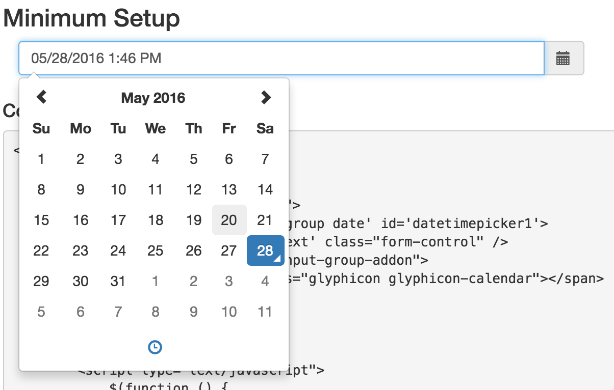
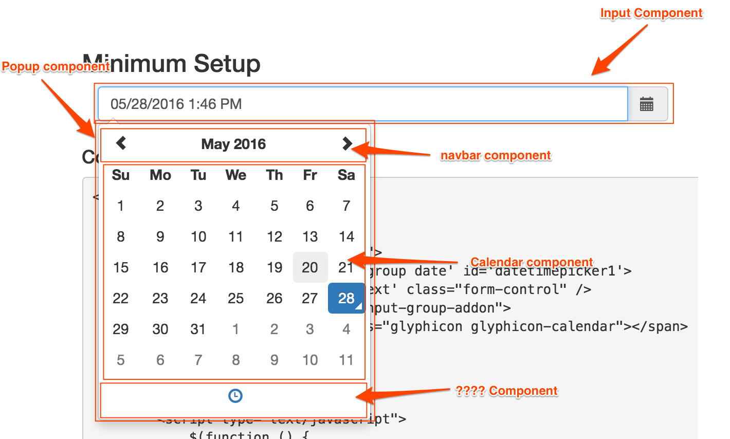
{{my-datepicker/input value=value onClick=(action "open")}}
{{#if isOpen}}
  {{#my-datepicker/popup}}
    {{my-datepicker/navbar foo=bar}}
    {{my-datepicker/calendar month=month}
    {{my-datepicker/hour-selector}}
  {{/my-datepicker/popup}}
{{/if}}
{{component inputComponent value=value onClick=(action "open")}}
{{#if isOpen}}
{{#component popupComponent}}
{{component navbarComponent foo=bar}}
{{component calendarComponent month=month}
{{component hourComponent}}
{{/component}}
{{/if}}{{component inputComponent
{{#component popupComponent
{{component navbarComponent
{{component calendarComponent
{{component hourComponent}}
{{/component}}
Use the {{component}} keyword to give the user the power to customize your component
{{my-datepicker value=date calendarComponent="custom-calendar"}} calendarComponent="custom-calendar"Tip 11:
Simplify your public API with contextual components
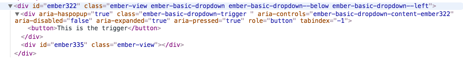
{{#basic-dropdown as |dropdown|}}
  This is the content
{{else}}
  <button>Click to open</button>
{{/basic-dropdown}}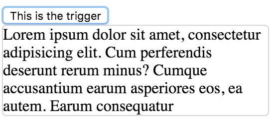
Let's criticize ember-basic-dropdown
Single components are easy to use, but have some limitations
Only two blocks
{{#basic-dropdown as |dropdown|}}
  {{!-- Content is the first block? WUT? --}}
{{else}}
  <button>Click to open</button>
  {{!-- No access to the yielded API here --}}
  {{!-- How does that button open component? Magic? --}}
{{/basic-dropdown}}
Only one has access to yielded args
No way to modify skeleton markup
The top component receives all options of all internal components
{{#basic-dropdown
  ariaLabel="foo"
  disabled=disabled
  horizontalPosition="right"
  verticalPosition="top"
  destination="#placeholder"
  renderInPlace=true
  triggerClass="my-trigger"
  dropdownClass="my-dropdown"
  ...
  as |dropdown|}}
Solution: Expose sub components
{{#basic-dropdown as |api|}}
  {{#basic-dropdown/trigger
    class="my-trigger"
    ariaLabel="foo"
    disabled=disabled}}

    {{!-- Access to yielded args --}}
    {{!-- The user gets to decide the layout --}}

  {{/basic-dropdown/trigger}}

  {{!-- I can even add extra markup here!! --}}

  {{#basic-dropdown/content
    class="my-dropdown"
    destination="#placeholder"
    renderInPlace=true
    horizontalPosition="right"
    verticalPosition="top"}}

    {{!-- Access to yielded args too --}}

  {{/basic-dropdown/content}}
{{/basic-dropdown}}
But this creates a new problem:
{{#basic-dropdown as |api isOpen onFocusIn onFocusOut onKeyDown|}}
  {{#basic-dropdown/trigger api=api
    isOpen=isOpen
    onFocusIn=onFocusIn
    onFocusOut=onFocusOut
    onKeyDown=onKeyDown}}...{{/basic-dropdown/trigger}}


  {{#basic-dropdown/content api=api
    isOpen=isOpen
    onFocusIn=onFocusIn
    onFocusOut=onFocusOut}}...{{/basic-dropdown/content}}
{{/basic-dropdown}}
The user has to intimate knowledge of the private API
Contextual components to the rescue!
{{yield (hash
  trigger=(component "basic-dropdown/trigger"
   isOpen=isOpen
   open=(action "open")
   onKeyDown=(action "onKeyDown")
   onFocusIn=(action "onFocusIn")
   onFocusOut=(action "onFocusIn")
  )
  content=(component "basic-dropdown/content"
   isOpen=isOpen
   open=(action "open")
   onFocusIn=(action "onFocusIn")
   onFocusOut=(action "onFocusIn")
  )
  isOpen=isOpen
  actions=(hash open=(action "open") ...)
)}}
Yield your components with the private info already bound
And your user only need to know the public
{{#basic-dropdown as |dropdown|}}
  {{#dropdown.trigger}}...{{/dropdown.trigger}}
  {{#dropdown.content}}...{{/dropdown.content}}
{{/basic-dropdown}}
{{#basic-dropdown as |dropdown|}}
{{#dropdown.trigger class="my-trigger"}}
...
{{/dropdown.trigger}}
{{#dropdown.content
horizontalPosition="right"
renderInPlace=true}}
...
{{/dropdown.content}}
{{/basic-dropdown}}Thanks
Components tips and tricks
By Miguel Camba


