Design for Accessibility
General Principles
- Image descriptions for low vision or screenreaders
- Color deficiency
- Low vision contrast
Image descriptions
- If you can't describe it in 1-2 sentences, it's not a good chart for anyone!
- Brief, clear, general to specific
- Describe the argument made by the data
- Assume the reader knows the basics (ie, "A bar chart shows x", not "Four rectangles of descending sizes show x"
- Further resources: Image description guidelines

In a line graph of exports between 1968 and 1980, the Exports line begins in 1968 at 3 billion dollars, rises steeply to 14 billion in 1974, then drops to 9.5 billion in 1975 and 1976. In 1977, the Exports line shoots up to 15.5 billion, then trails off to 10 billion in 1980. The Imports line begins in 1968 at 2 billion and rises steadily to 8.75 billion in 1980, except for minor dips in 1972 and 1979.
Color vision deficiency
- Multiple types - not just red vs green
- Encode meaning with something in addition to color--size, position, labeling, light vs dark
- Further resources: Viz Palette
- Further resources: Color Brewer
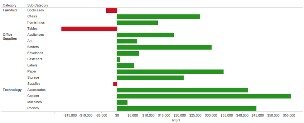
YES
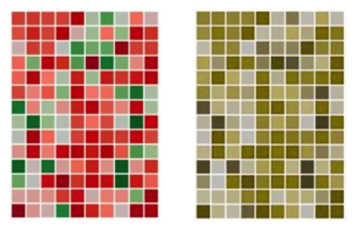
NO
Color contrast
- Web Content Accessibility Guidelines contrast ratios make things easier to read for everyone!
- High contrast is not always better - black on white can be good, but white on black can be hard
- Further resources: Color contrast checker
General guidelines
- Don't use a color scale for categorical data
- Color is social - do you really want pink for female and blue for male?
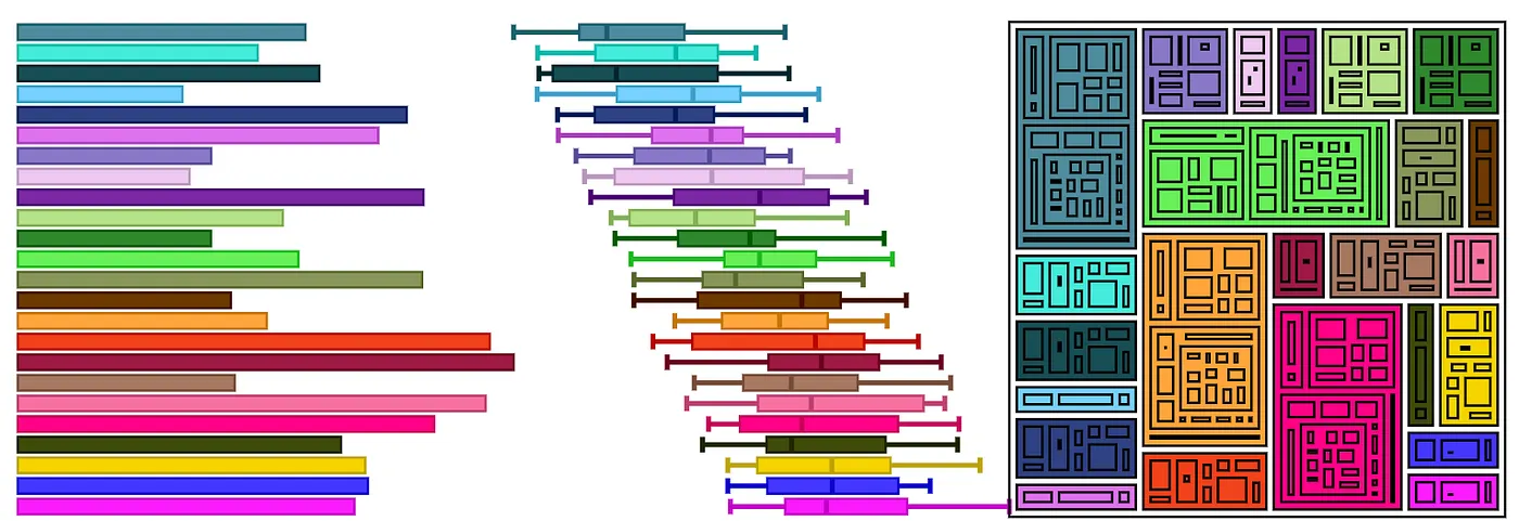
- Too much color is confusing
- Aesthetics matter - people look longer at nice things
- Tableau's defaults are fine but can be customized
- Further resources: Tableau custom colors
Design for Accessibility
By mkane


