


Moxhe
Front-End Coder
1. mobile website development
2. mobile web application
development
3. hybrid app development*
Note: Mechanism of zooming!
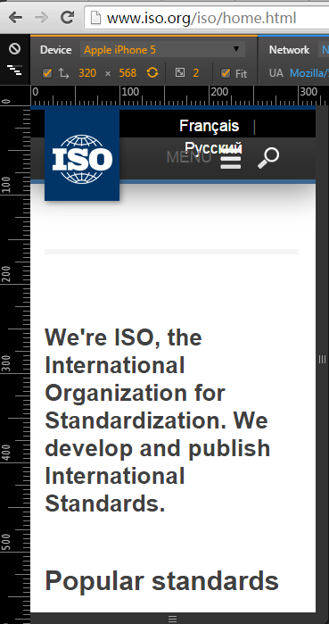
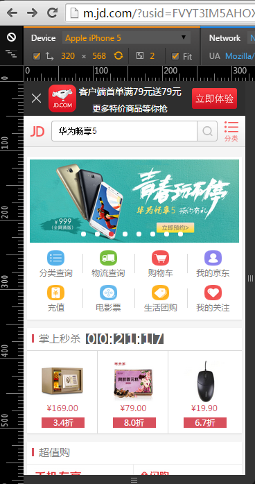
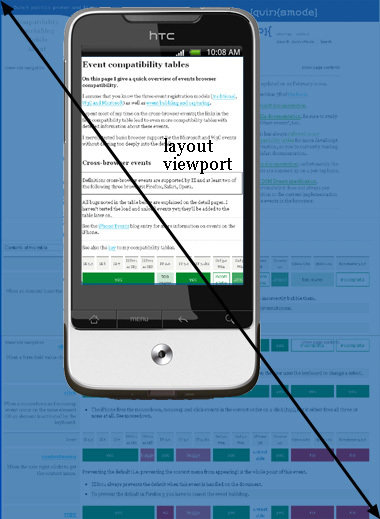
The function of the viewport is to constrain the <html> element, which is the uppermost containing block of your site.
Viewport actually is the browser window
// layout viewport's width and height.
// actually "document.documentElement"
// is the <html> element.
// but if u set <html> element's
// width/height by css,
// it also return viewport's width/height
// because it is rule
document.documentElement.clientWidth
document.documentElement.clientHeight
// Measuring the visual viewport
// what's the difference from layout viewport
window.innerWidth/Height
Measurement
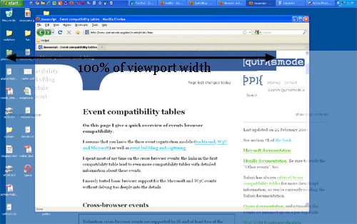
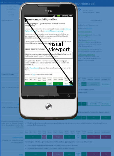
Imagine the layout viewport as being a large image which does not change size or shape. Now image you have a smaller frame through which you look at the large image. The small frame is surrounded by opaque material which obscures your view of all but a portion of the large image. The portion of the large image that you can see through the frame is the visual viewport. You can back away from the large image while holding your frame (zoom out) to see the entire image at once, or you can move closer (zoom in) to see only a portion. You can also change the orientation of the frame, but the size and shape of the large image (layout viewport) never changes.
Syntax:
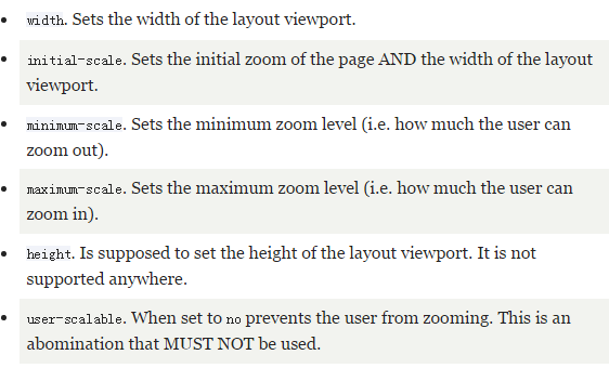
<meta name="viewport" content="name=value,name=value">Way to reset the width of layout viewport
Notes:
zoom factor = ideal viewport width / visual viewport width
<meta name="viewport" content="width=device-width, initial-scale=1">px
Flex layout
direction-agnostic
vertical centering is difficult?
effective layout
The Flexbox Layout (Flexible Box) module (currently a W3C Last Call Working Draft) aims at providing a more efficient way to lay out, align and distribute space among items in a container, even when their size is unknown and/or dynamic (thus the word "flex").
Properties for the parent:
Properties for the items:
// run in full-screen mode
<meta name="apple-mobile-web-app-capable" content="yes">


// disable telephone recognization in safari
<meta name="format-detection" content="telephone=no">

// Styling the Status Bar
// Setting a Startup Image
// apple-touch-icon
// ...// run in full-screen mode
<meta name="mobile-web-app-capable" content="yes">
// disable telephone recognization in safari
<meta name="format-detection" content="email=no">
// ...By Moxhe