CSS Grids
layout methods
"no-layout" layout
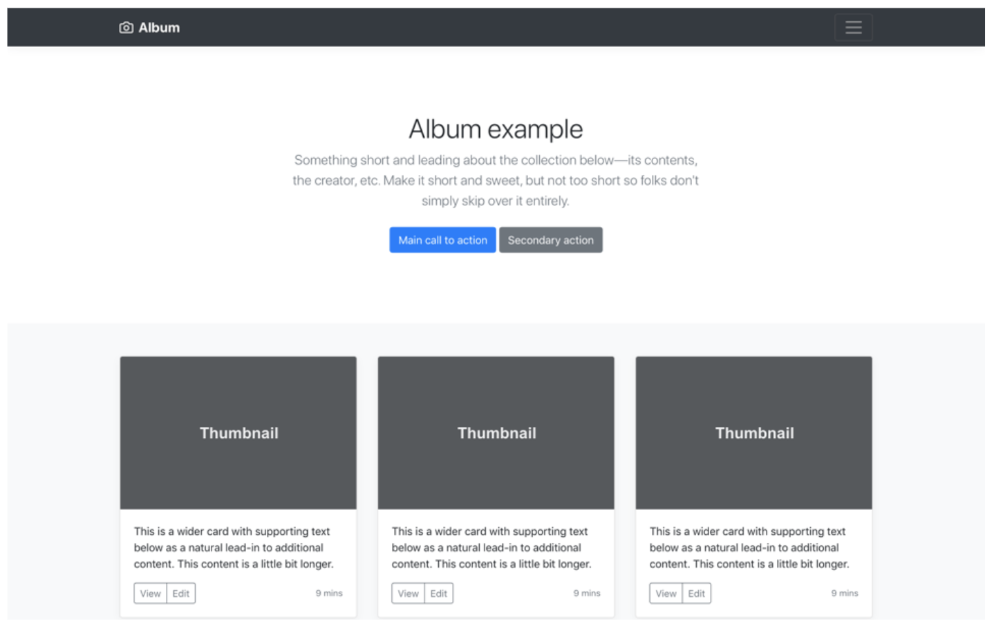
HTML TABLES FTW
FLOATS + CLEARFIXES
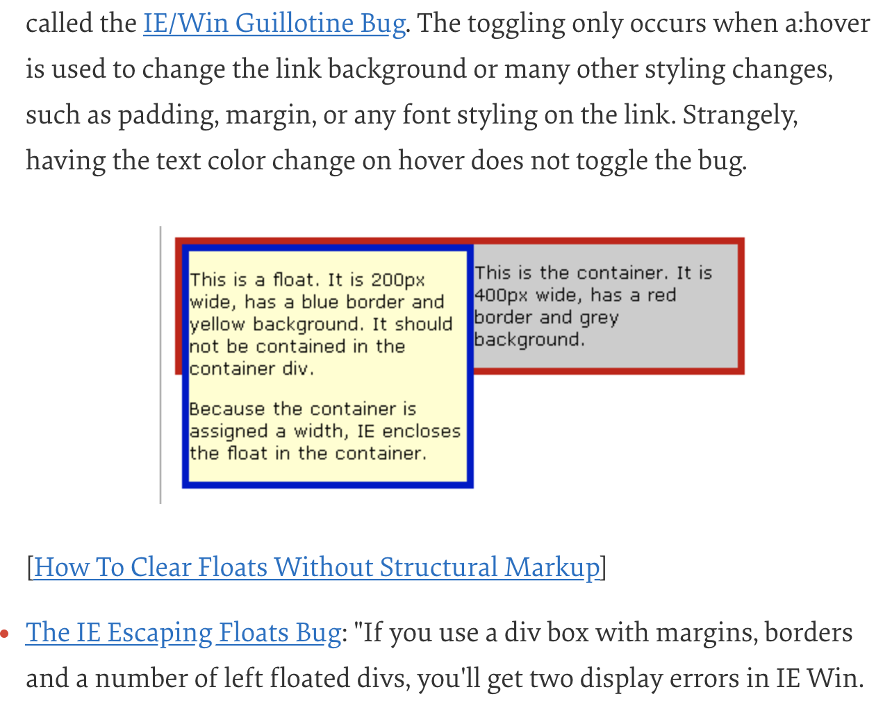
FLOATS + CLEARFIXES
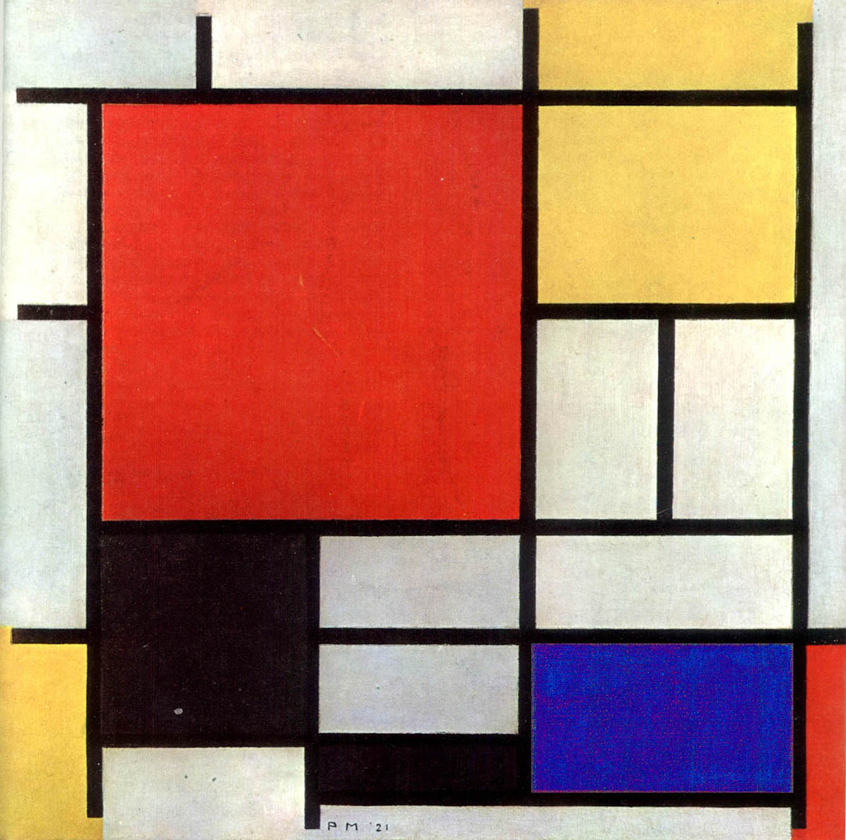
🤢
FRAMEWORK LAYOUTS
THE FUTURE!
POSSIBILITIES
DESIGN GOALS
-
POWERFUL
Enable designers to express their desires in a way that “made simple things easy and complex things possible”
-
ROBUST
Ensure there are no gaps that could cause your layout to fall apart, inhibit scrolling, or cause content to disappear accidentally
-
PERFORMANT
Layout algorithm must be fast enough to elegantly handle real-world situations like browser resize events and dynamic content loading

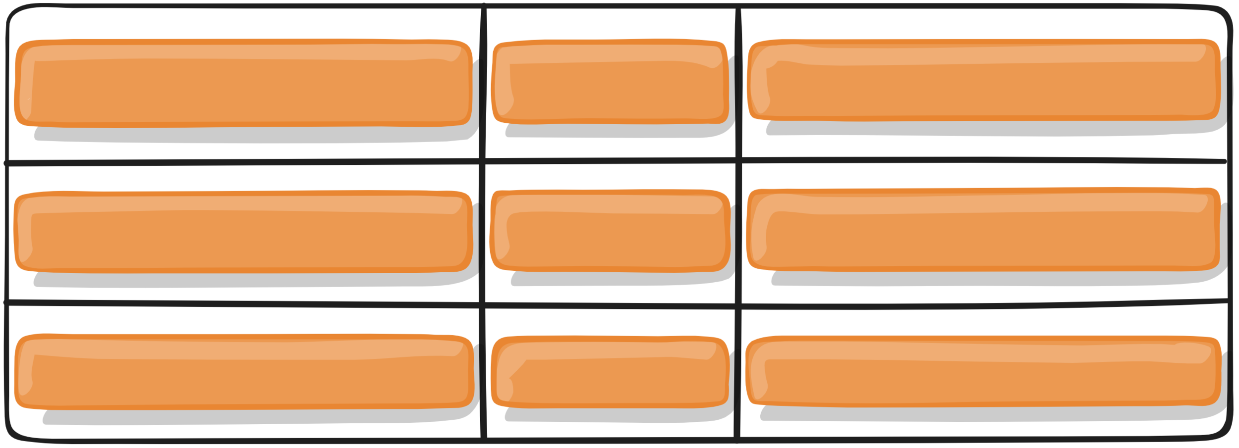
.grid-container {
height: 100vh;
display: grid;
grid-template-columns: repeat(3, auto);
grid-template-rows: repeat(3, auto);
}
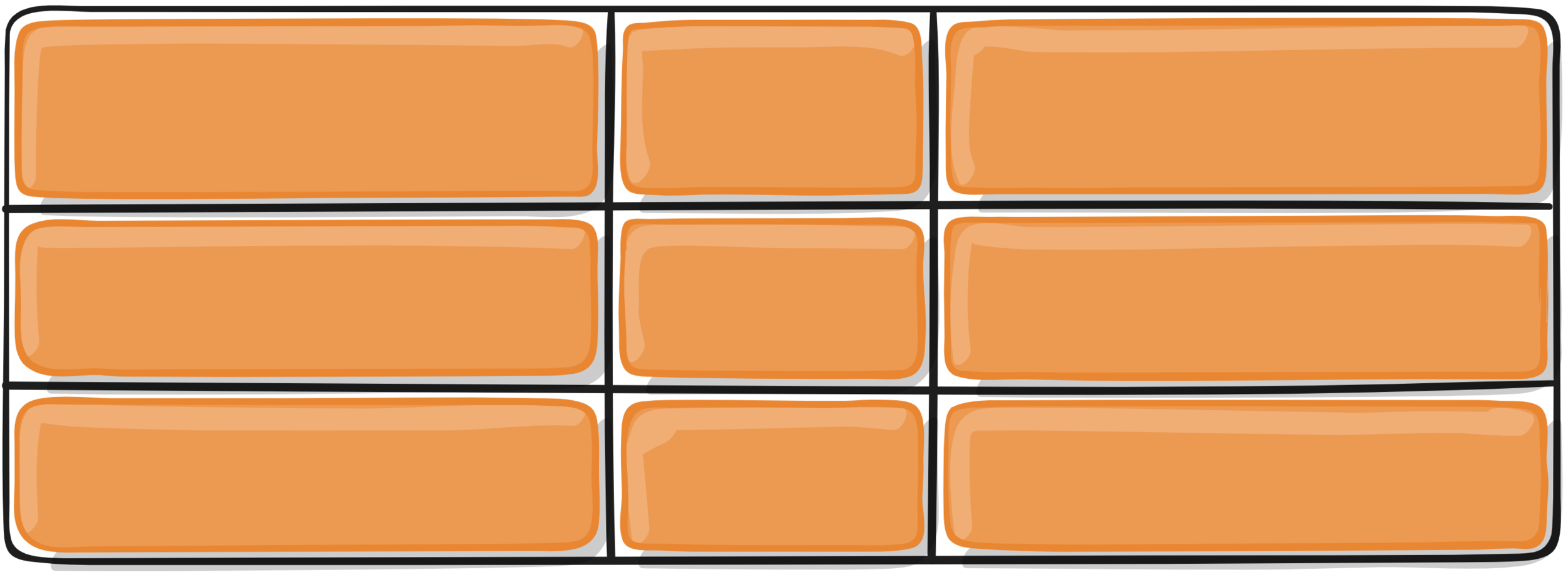
.grid {
display: flex;
align-items: center;
justify-content: center;
}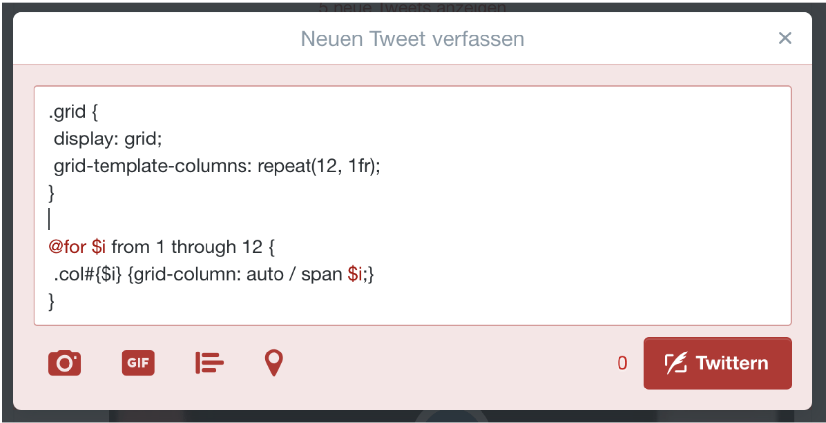
BOOTSTRAP GRID in 140 BYTES
Text
💪
WE DON’T NEED A GRID LAYOUT BASED FRAMEWORK.
IT IS A GRID FRAMEWORK.
— @rachelandrew
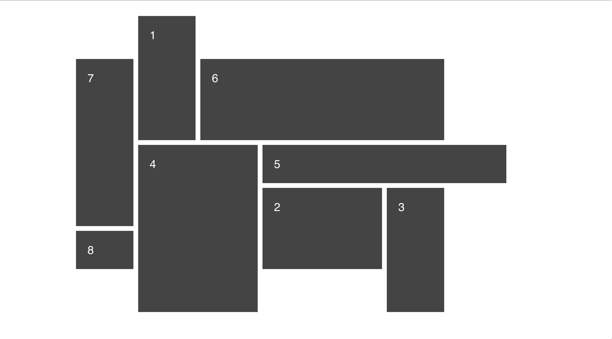
.grid-container {
    display: grid;

    grid-template-columns: repeat(7, 120px);
    grid-template-rows: repeat(7, 80px);
    grid-gap: 10px;

    grid-template-areas:
    " . x1  .  .  .  . ."
    "x7 x1 x6 x6 x6 x6 ."
    "x7 x1 x6 x6 x6 x6 ."
    "x7 x4 x4 x5 x5 x5 x5"
    "x7 x4 x4 x2 x2 x3 ."
    "x8 x4 x4 x2 x2 x3 ."
    " . x4 x4  .  . x3 .";
}
MORE FEATURES ...
OVERLAPPING
ASYMMETRIC GRIDS
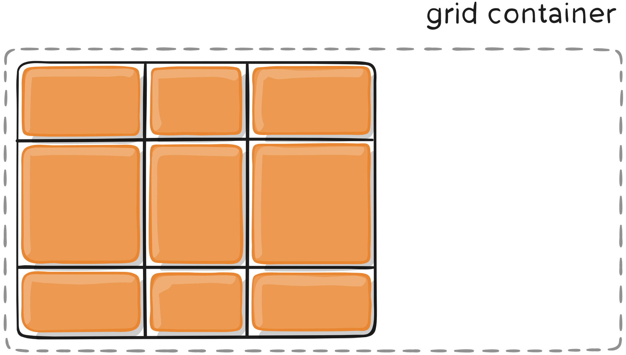
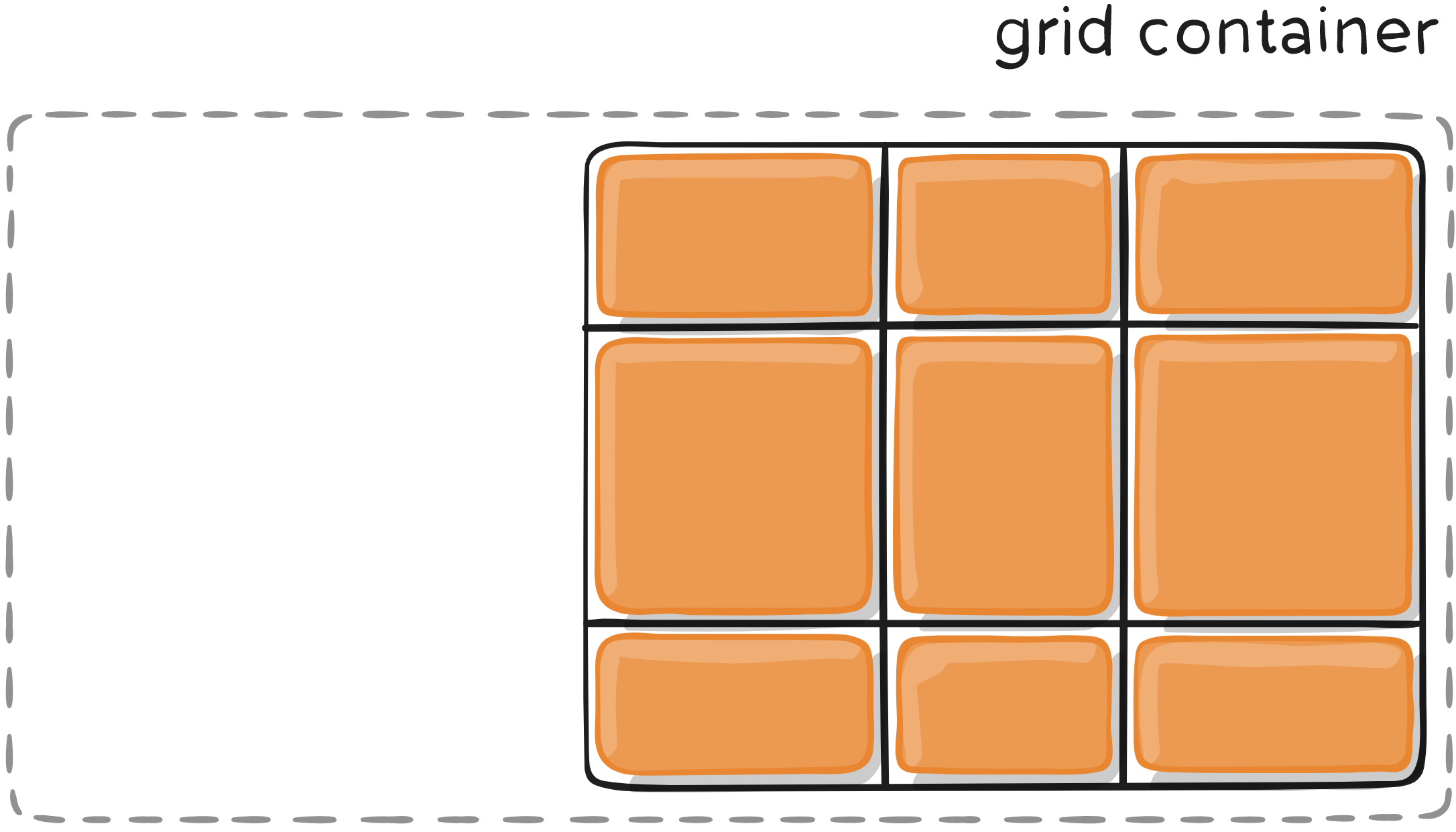
TERMINOLOGY
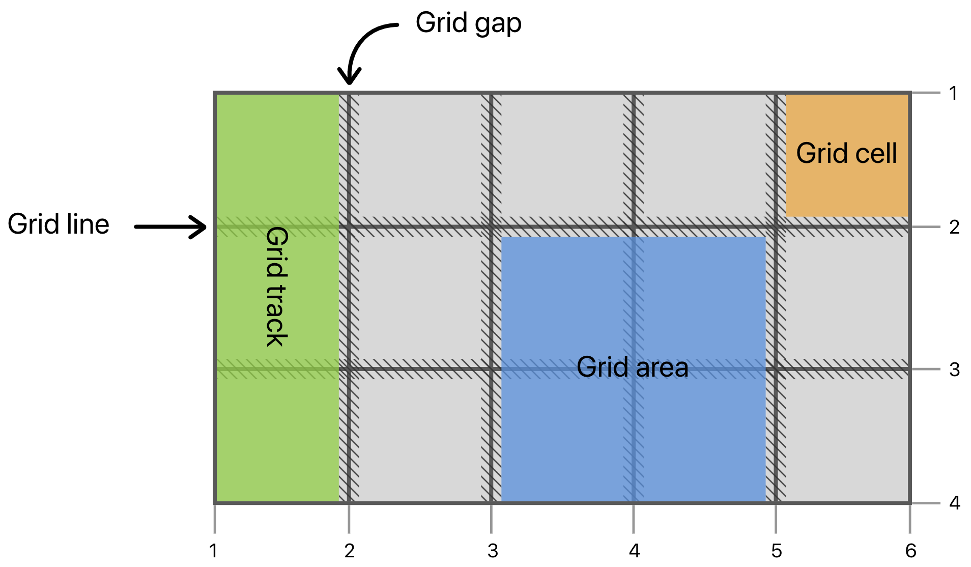
PARTS OF THE GRID
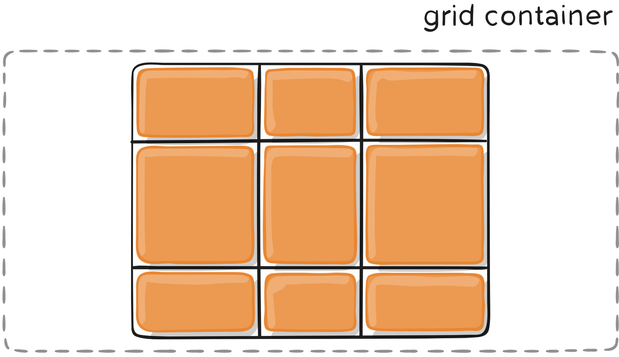
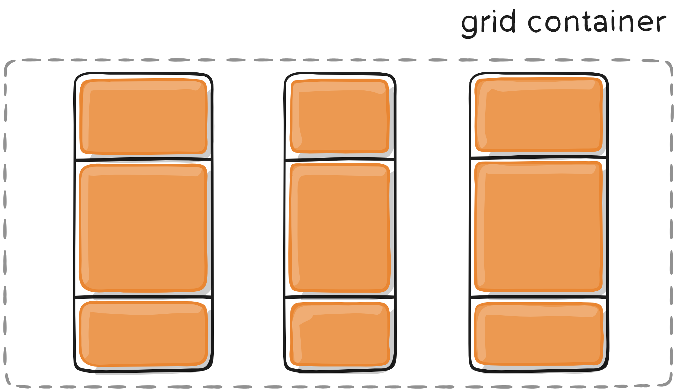
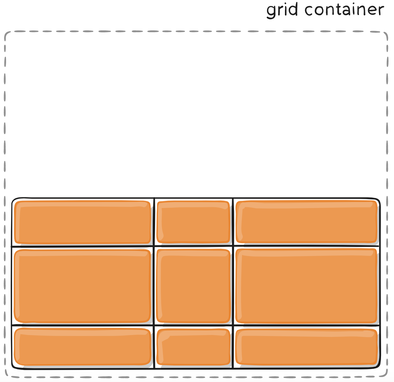
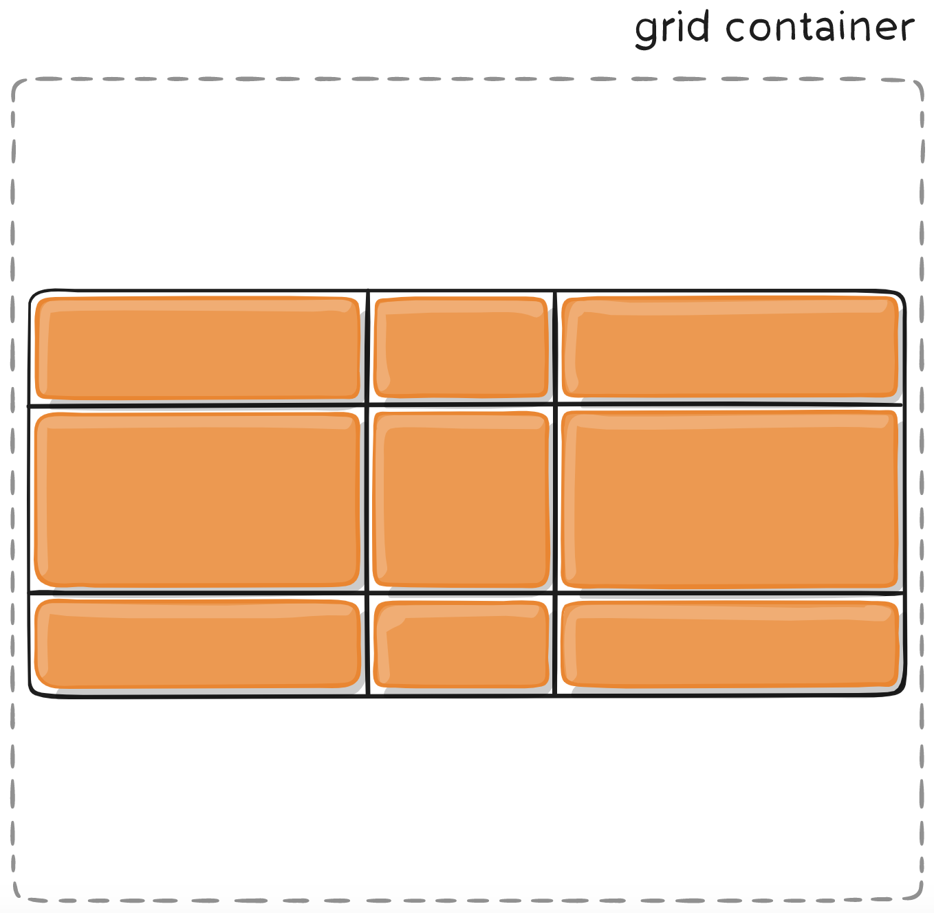
GRID-CONTAINER PROPERTIES
DISPLAY: GRID
Establishes a new grid formatting context for children.
.container {
  display: grid;
}
<div class="container">
<div class="item item-1"></div>
<div class="item item-2"></div>
<div class="item item-3"></div>
</div>GRID-CONTAINER properties
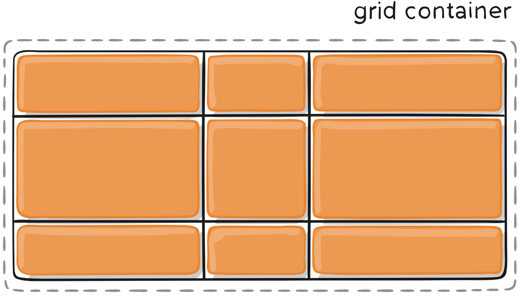
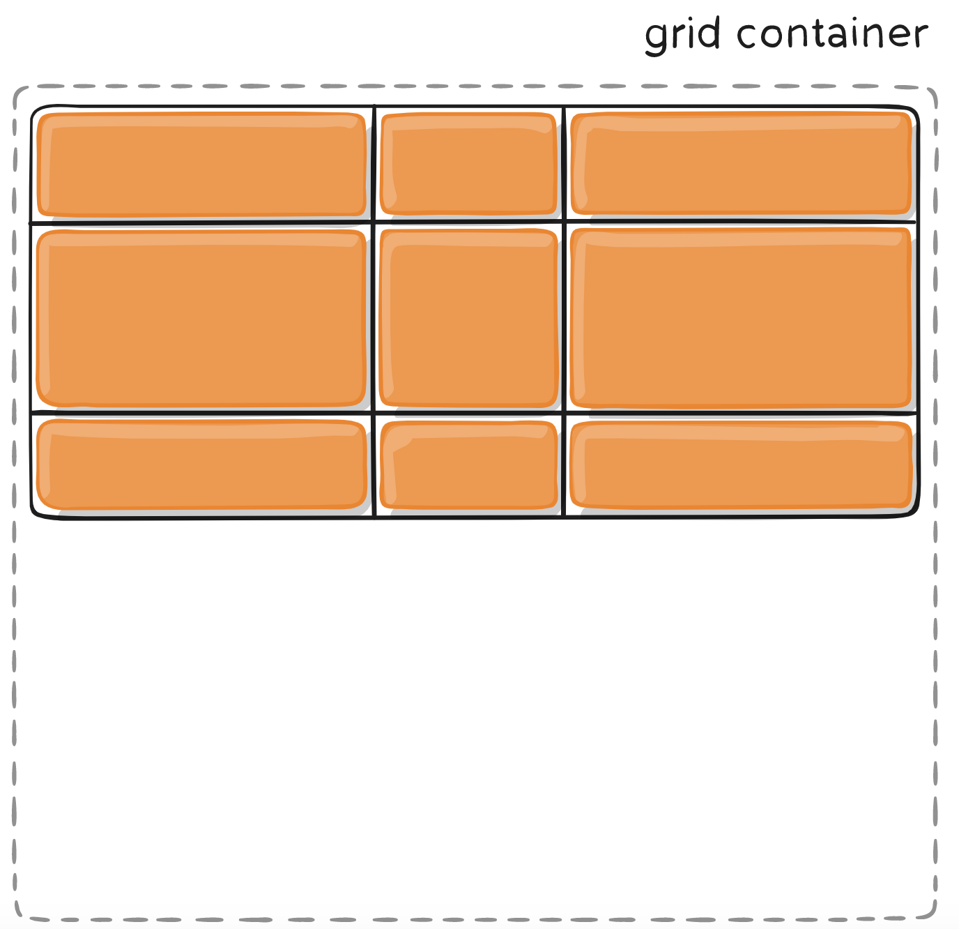
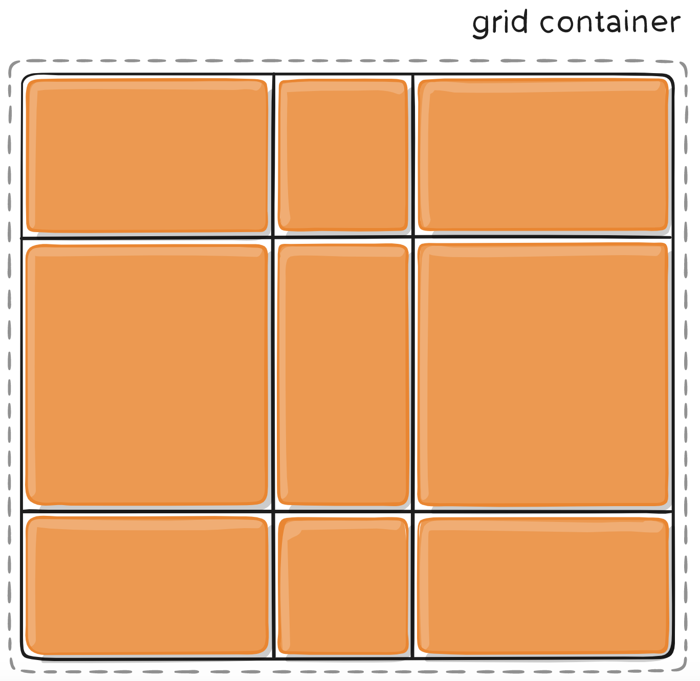
GRID-TEMPLATE-ROWS
GRID-TEMPLATE-COLUMNS
Defines the rows and columns of the grid.
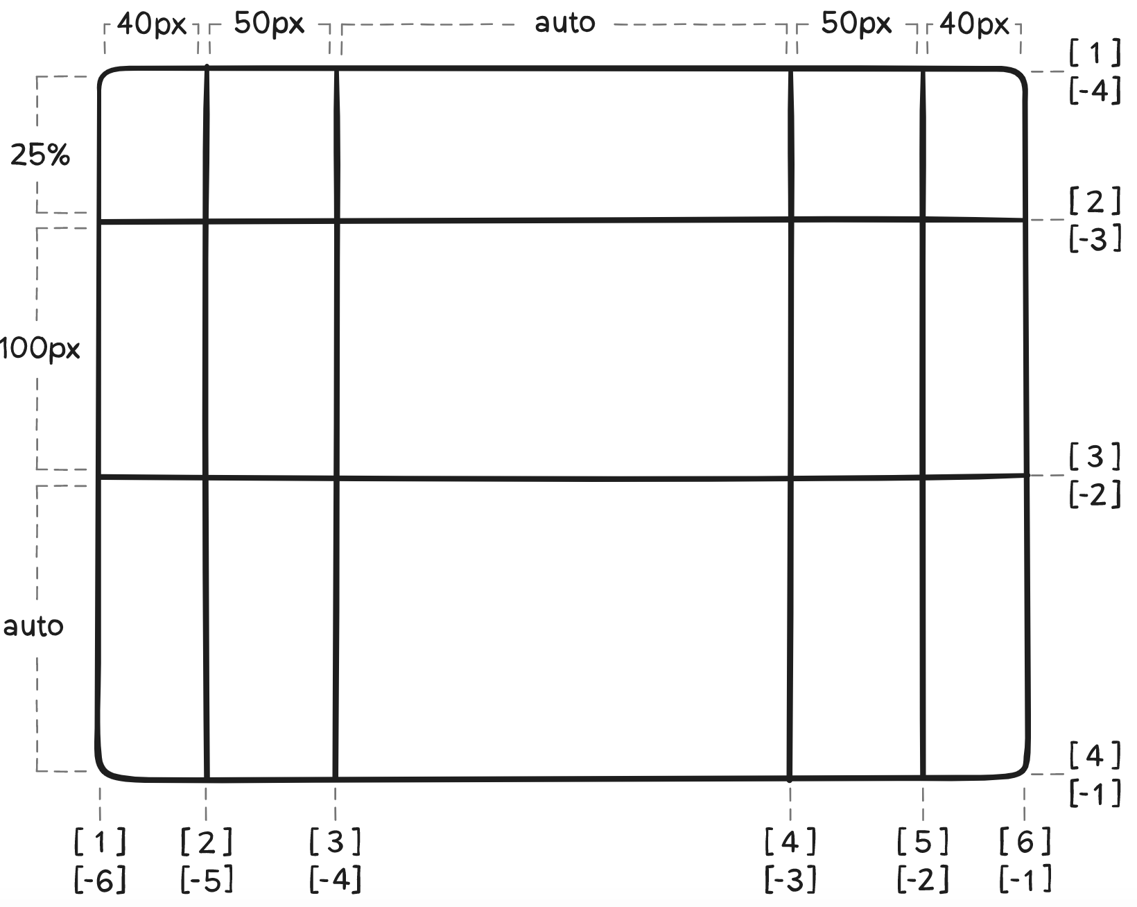
.container {
  grid-template-columns: 40px 50px auto 50px 40px;
  grid-template-rows: 25% 100px auto;
}
GRID-CONTAINER properties
GRID-TEMPLATE-AREA
Defines a grid template by referencing the names of the grid areas.
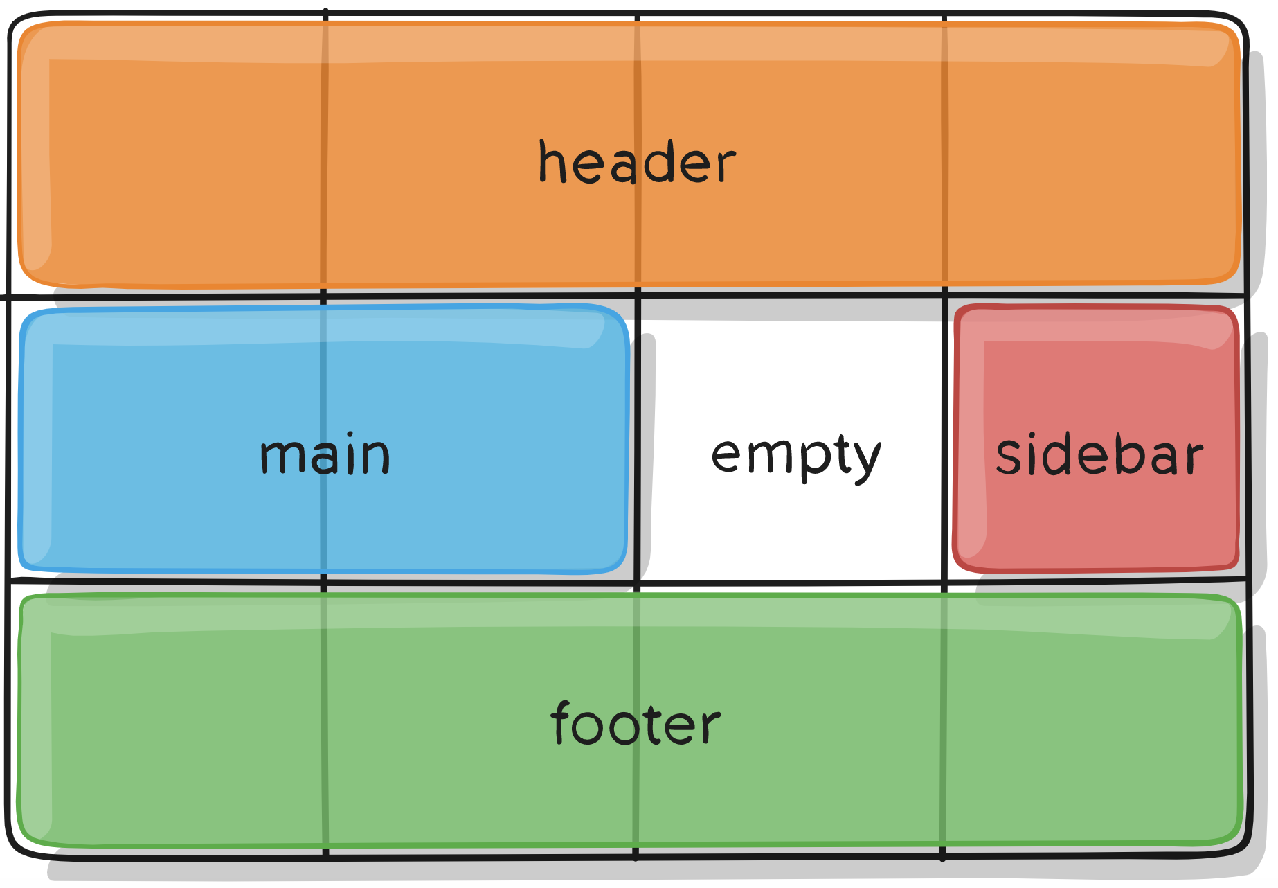
.container {
  display: grid;
  grid-template-columns: 50px 50px 50px 50px;
  grid-template-rows: auto;
  grid-template-areas:
    "header header header header"
    "main main . sidebar"
    "footer footer footer footer";
}
.item-a {
grid-area: header;
}
.item-b {
grid-area: main;
}
.item-c {
grid-area: sidebar;
}
.item-d {
grid-area: footer;
}GRID-CONTAINER properties
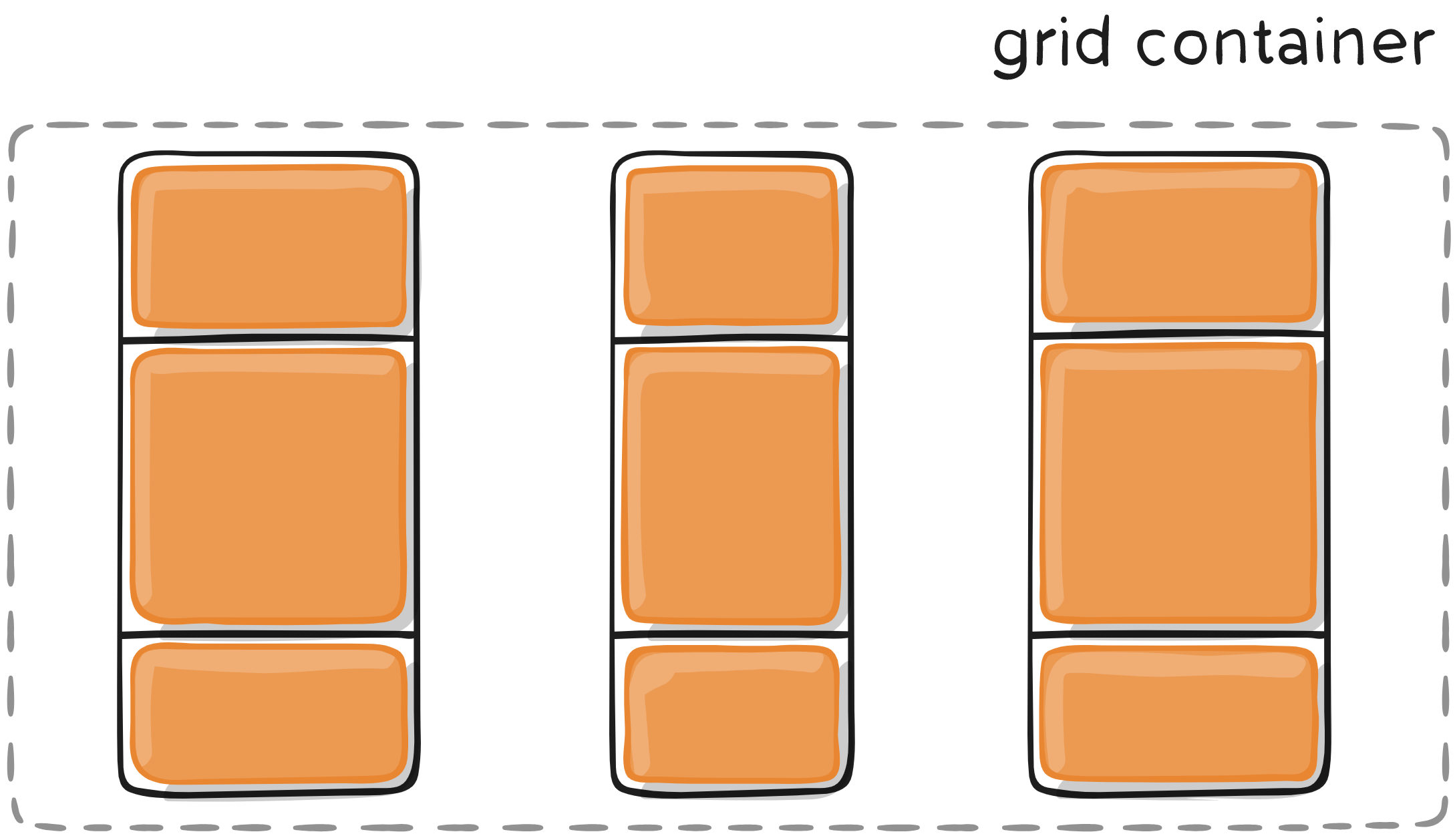
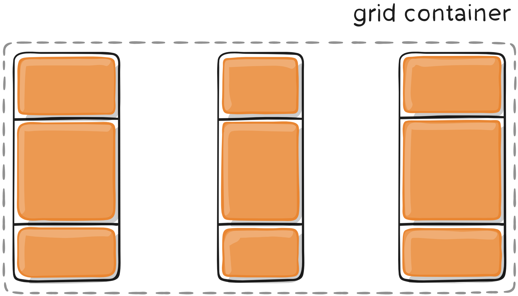
GRID-GAP
Specifies the size of column and row gutters.
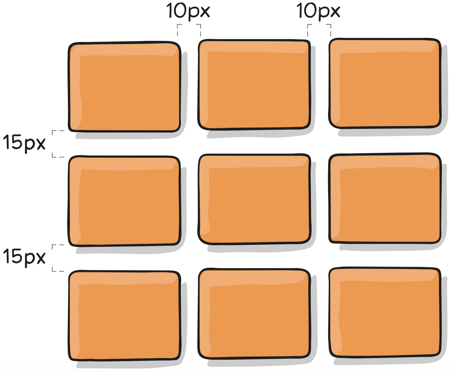
.container {
  grid-template-columns: 100px 50px 100px;
  grid-template-rows: 80px auto 80px;
  grid-column-gap: 10px;
  grid-row-gap: 15px;
}
GRID-CONTAINER properties
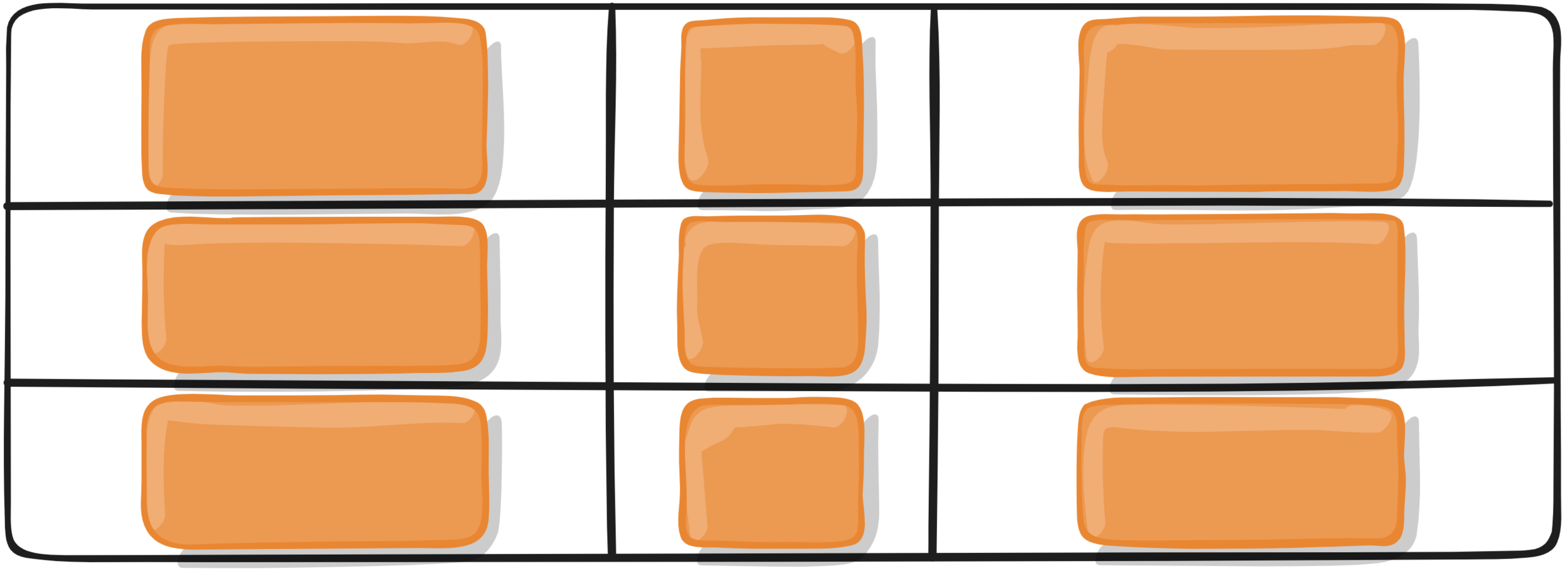
justify-items
Aligns grid items along the row axis
.container {
  justify-items: start | end | center | stretch;
}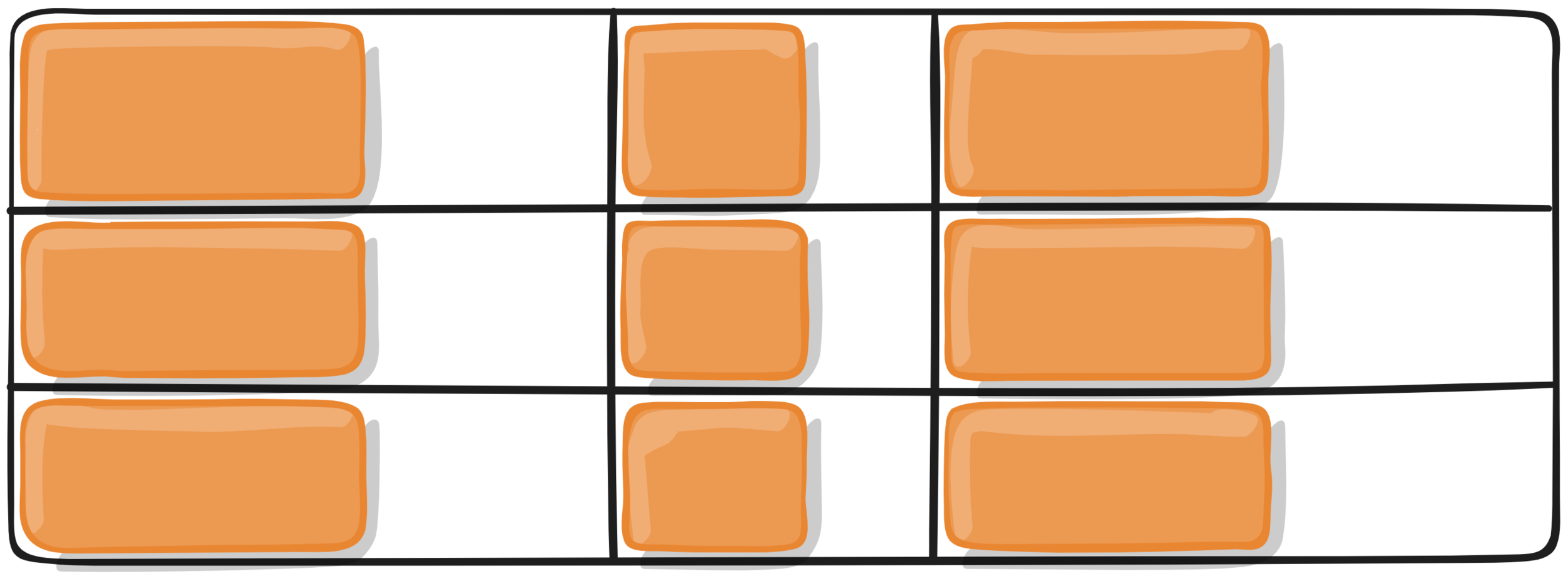
.container {
  justify-items: start | end | center | stretch;
}
.container {
  justify-items: start | end | center | stretch;
}
.container {
  justify-items: start | end | center | stretch;
}
GRID-CONTAINER properties
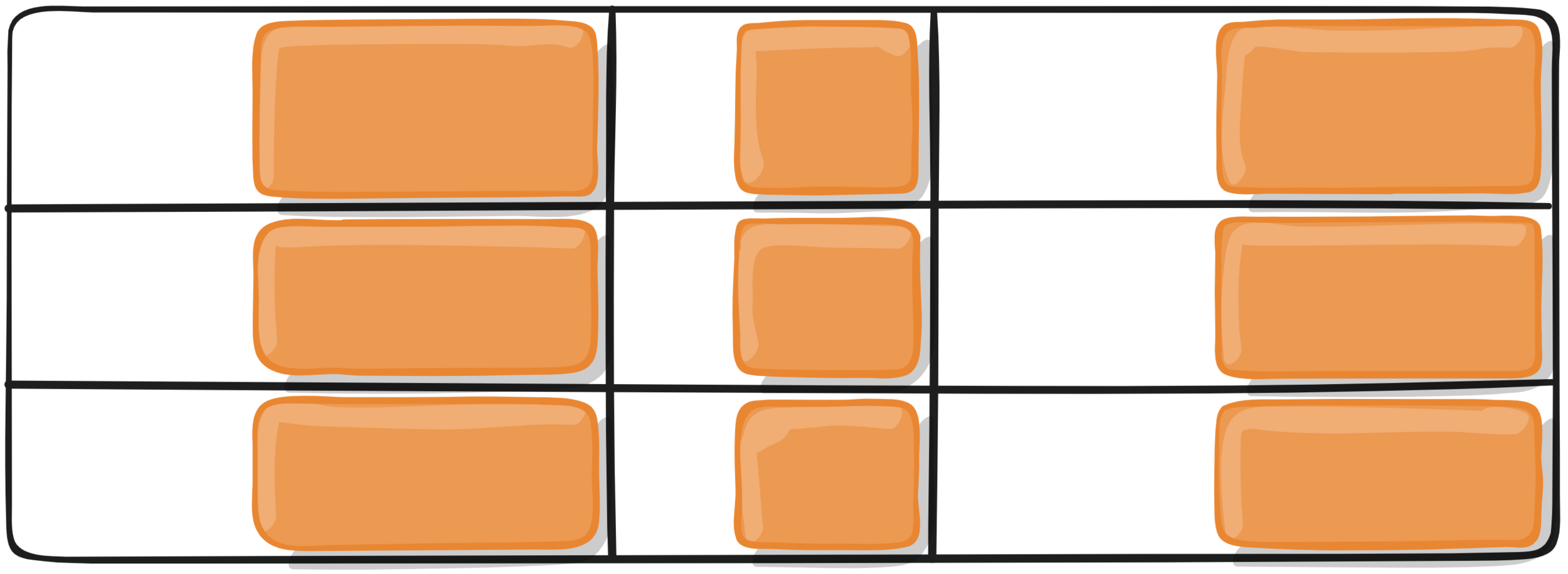
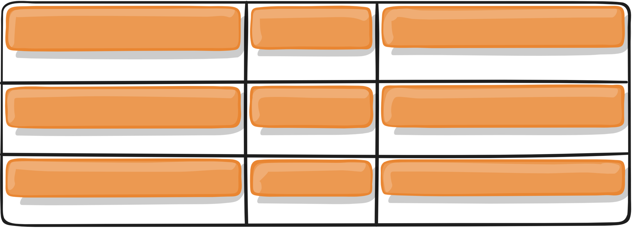
ALIGN-items
Aligns grid items along the column axis
.container {
  align-items: start | end | center | stretch;
}
.container {
  align-items: start | end | center | stretch;
}
.container {
  align-items: start | end | center | stretch;
}
.container {
  align-items: start | end | center | stretch;
}
GRID-CONTAINER properties
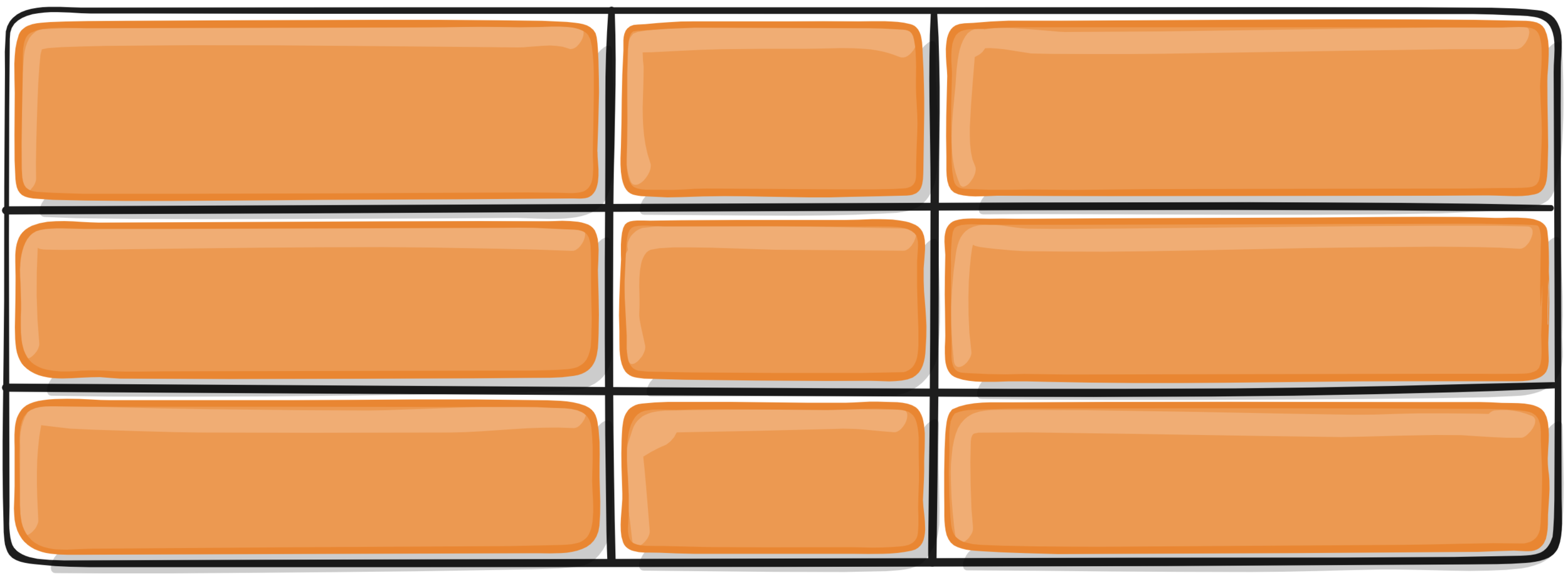
justify-content
Set the alignment of the grid within the grid container
along the row axis
.container {
  justify-content: start | end | center | stretch ...
}
.container {
  justify-content: start | end | center | stretch ...
}
.container {
  justify-content: start | end | center | stretch ...
}
.container {
  justify-content: start | end | center | stretch ...
}
.container {
  justify-content: ... | space-around | space-between | space-evenly;
}
.container {
  justify-content: ... | space-around | space-between | space-evenly;
}
.container {
  justify-content: ... | space-around | space-between | space-evenly;
}
GRID-CONTAINER properties
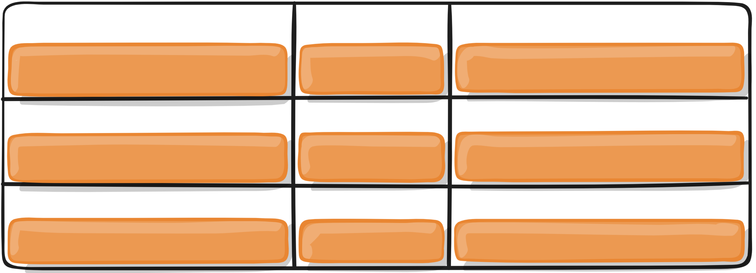
ALIGN-content
Set the alignment of the grid within the grid container
along the column axis
.container {
  align-content: start | end | center | stretch ...
}
.container {
  align-content: start | end | center | stretch ...
}
.container {
  align-content: start | end | center | stretch ...
}
.container {
  align-content: start | end | center | stretch ...
}
.container {
  align-content: ... | space-around | space-between | space-evenly;
}
.container {
  align-content: ... | space-around | space-between | space-evenly;
}
.container {
  align-content: ... | space-around | space-between | space-evenly;
}
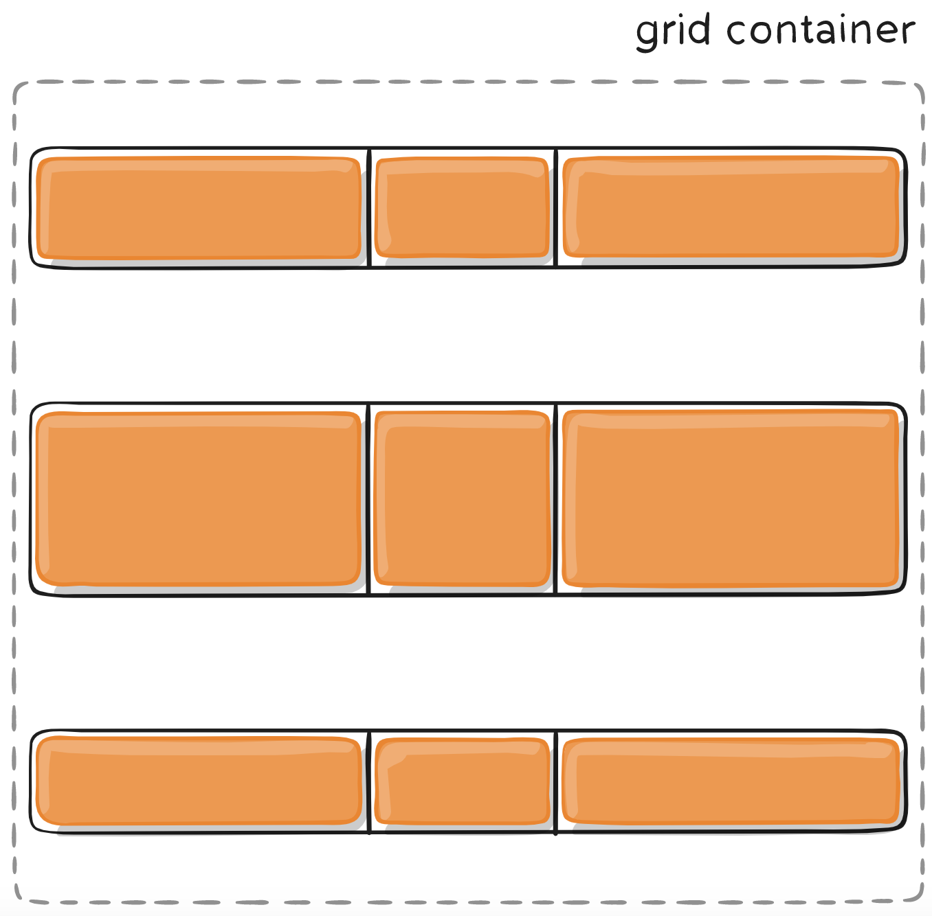
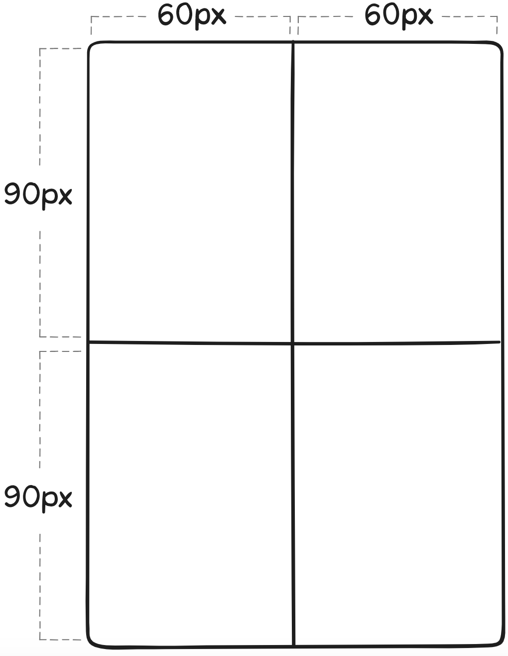
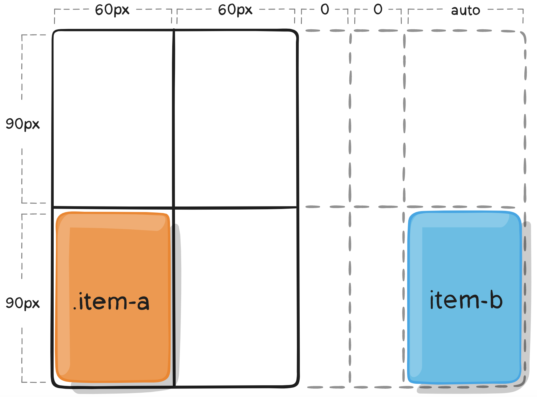
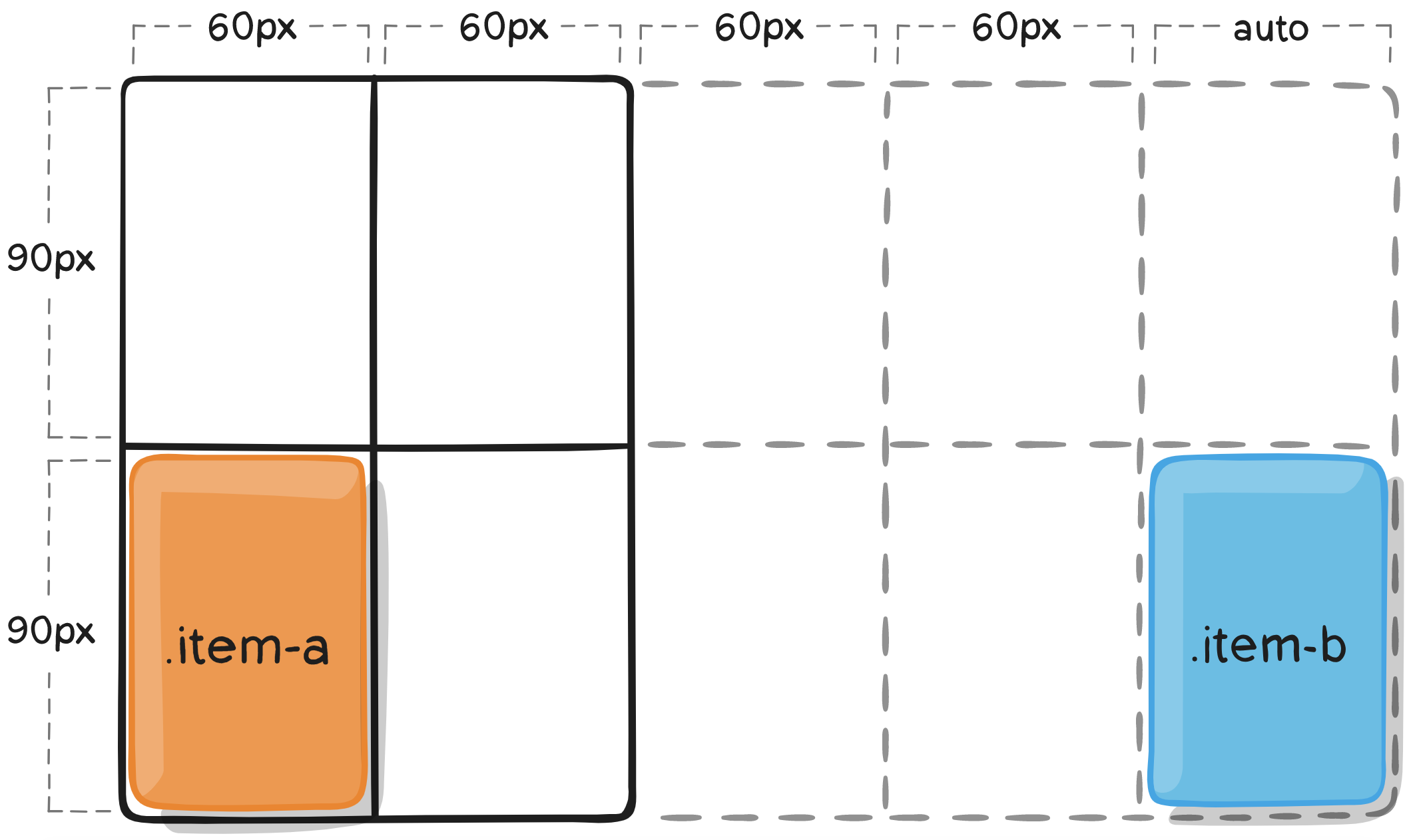
GRID-CONTAINER properties
grid-auto-columns
grid-auto-rows
Specifies the size of any auto-generated grid tracks.
.container {
  grid-template-columns: 60px 60px;
  grid-template-rows: 90px 90px;
}
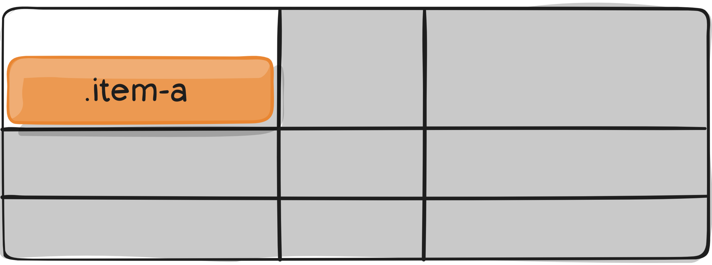
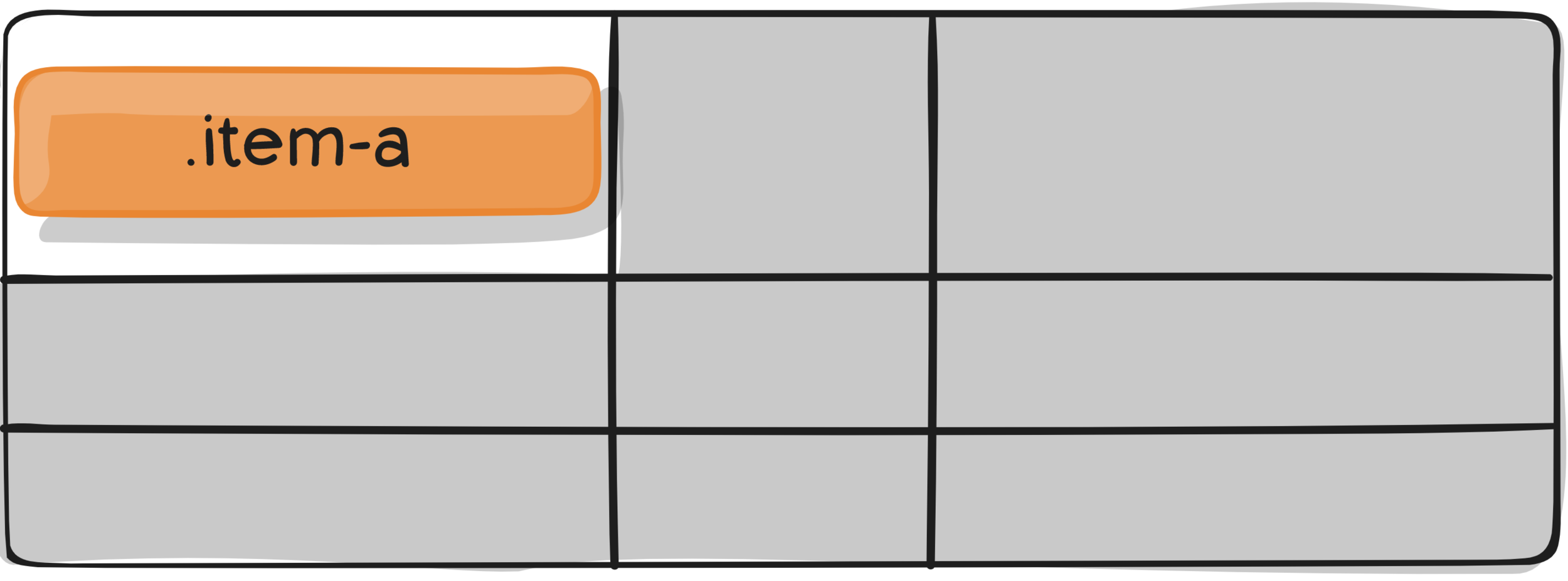
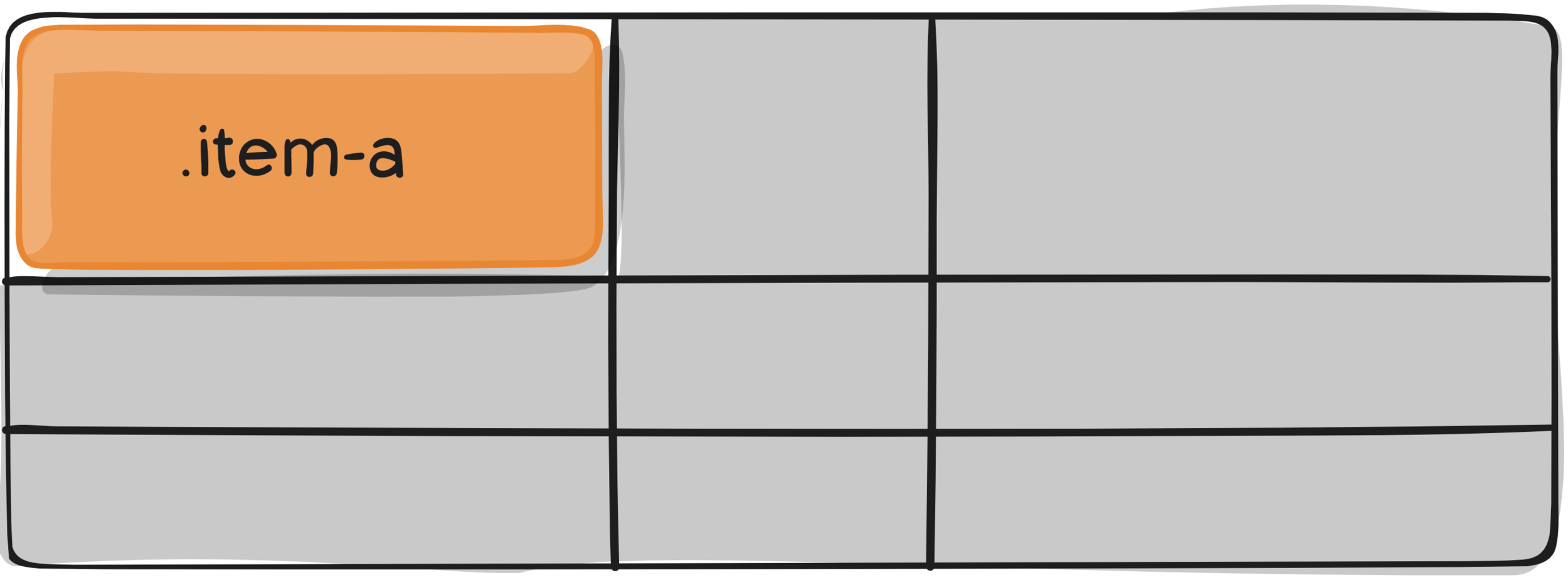
.item-a {
  grid-column: 1 / 2;
  grid-row: 2 / 3;
}
.item-b {
  grid-column: 5 / 6;
  grid-row: 2 / 3;
}
.item-a {
  grid-column: 1 / 2;
  grid-row: 2 / 3;
}
.item-b {
  grid-column: 5 / 6;
  grid-row: 2 / 3;
}
.item-a {
grid-column: 1 / 2;
grid-row: 2 / 3;
}
.item-b {
grid-column: 5 / 6;
grid-row: 2 / 3;
}.container {
grid-auto-columns: 60px;
}
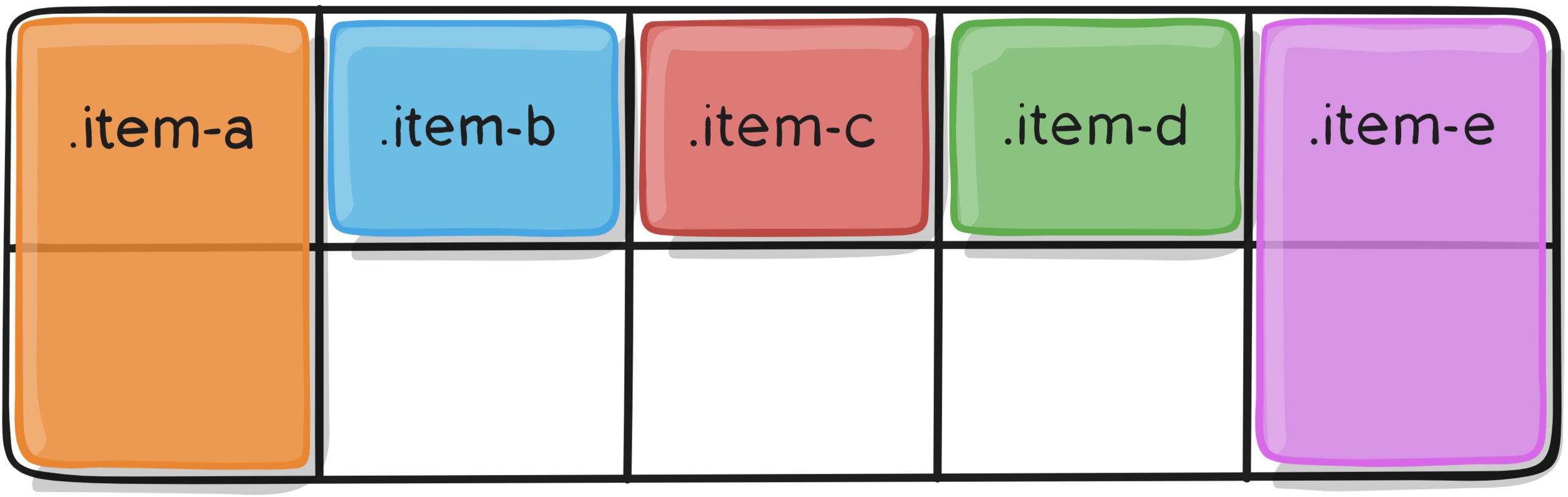
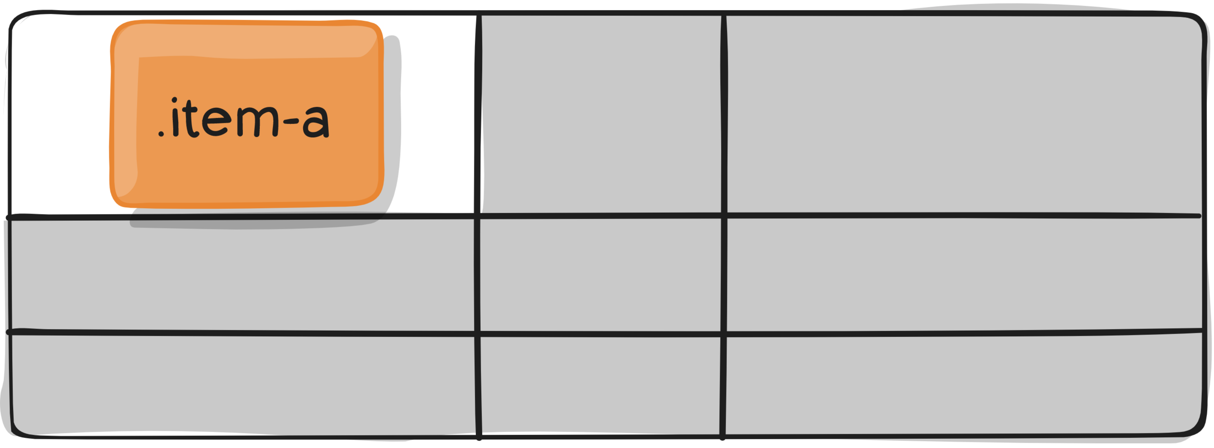
GRID-item properties
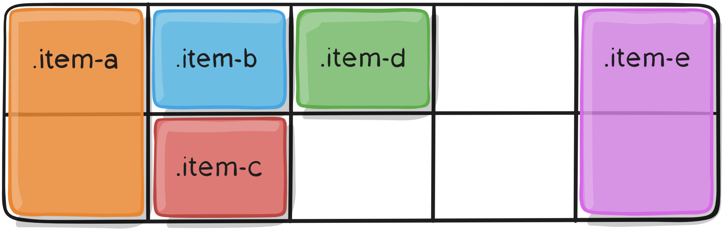
grid-auto-flow
This property controls how the auto-placement algorithm works.
.container {
  display: grid;
  grid-template-columns: 60px 60px 60px 60px 60px;
  grid-template-rows: 30px 30px;
  grid-auto-flow: row;
}
<section class="container">
<div class="item-a">item-a</div>
<div class="item-b">item-b</div>
<div class="item-c">item-c</div>
<div class="item-d">item-d</div>
<div class="item-e">item-e</div>
</section>.item-a {
grid-column: 1;
grid-row: 1 / 3;
}
.item-e {
grid-column: 5;
grid-row: 1 / 3;
}.container {
display: grid;
grid-template-columns: 60px 60px 60px 60px 60px;
grid-template-rows: 30px 30px;
grid-auto-flow: row;
}
.container {
  display: grid;
  grid-template-columns: 60px 60px 60px 60px 60px;
  grid-template-rows: 30px 30px;
  grid-auto-flow: column;
}
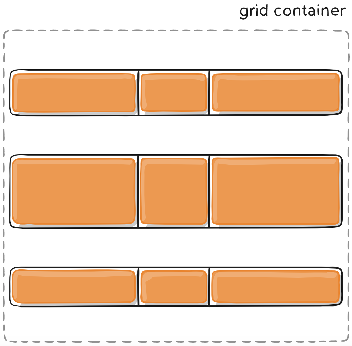
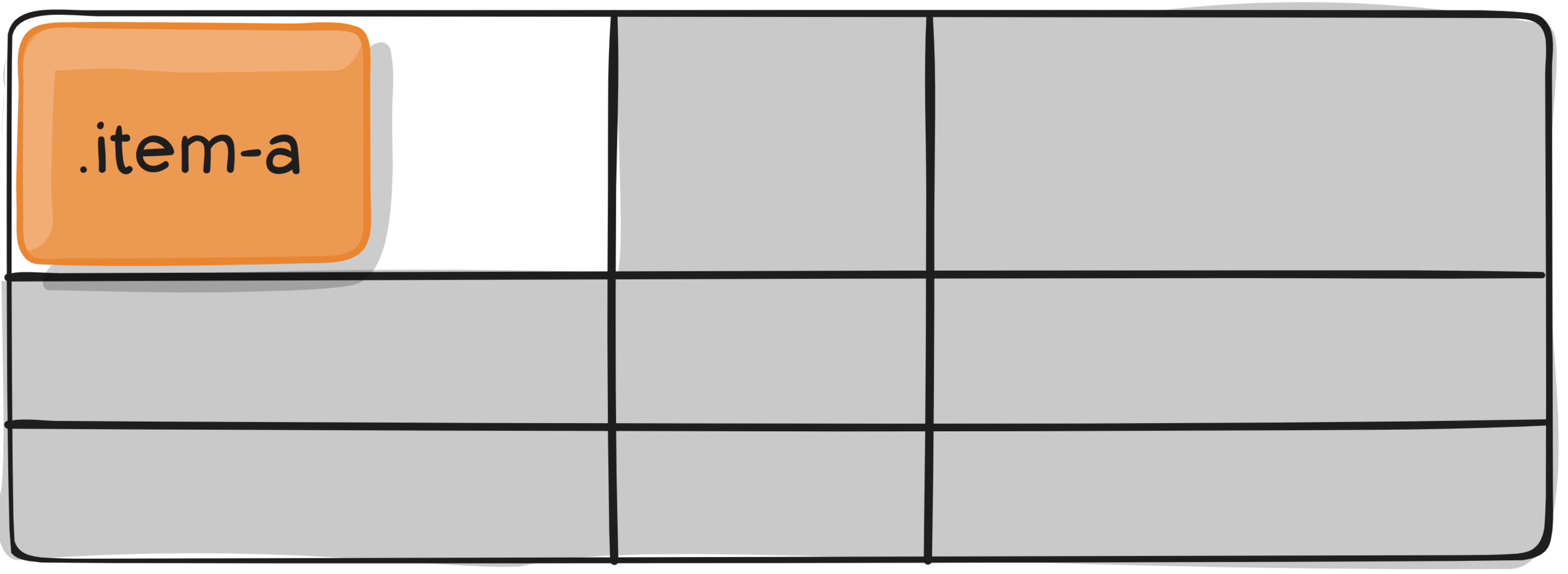
GRID-item properties
grid-row
Determines an items row-based location within the grid.
GRID-container properties
grid
Shorthand for setting all of the following properties in a single declaration:
- grid-template-rows
- grid-template-columns
- grid-template-areas
- grid-auto-rows
- grid-auto-columns
- grid-auto-flow
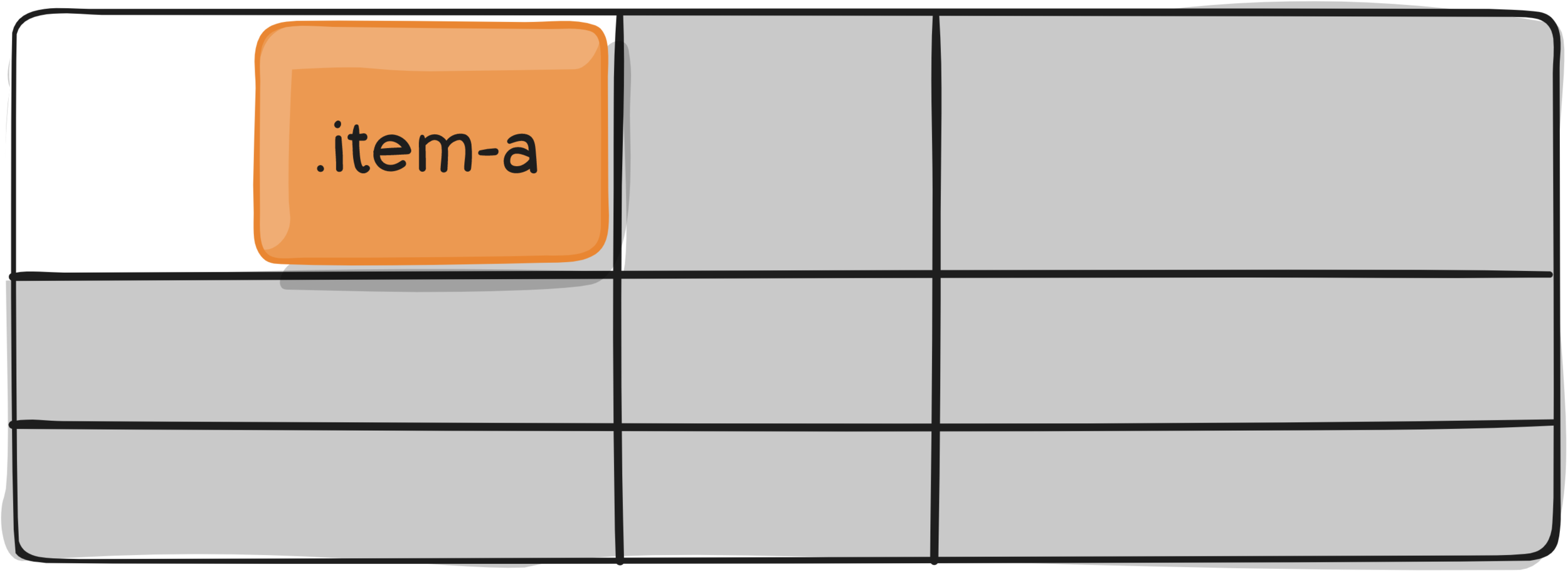
GRID-item properties
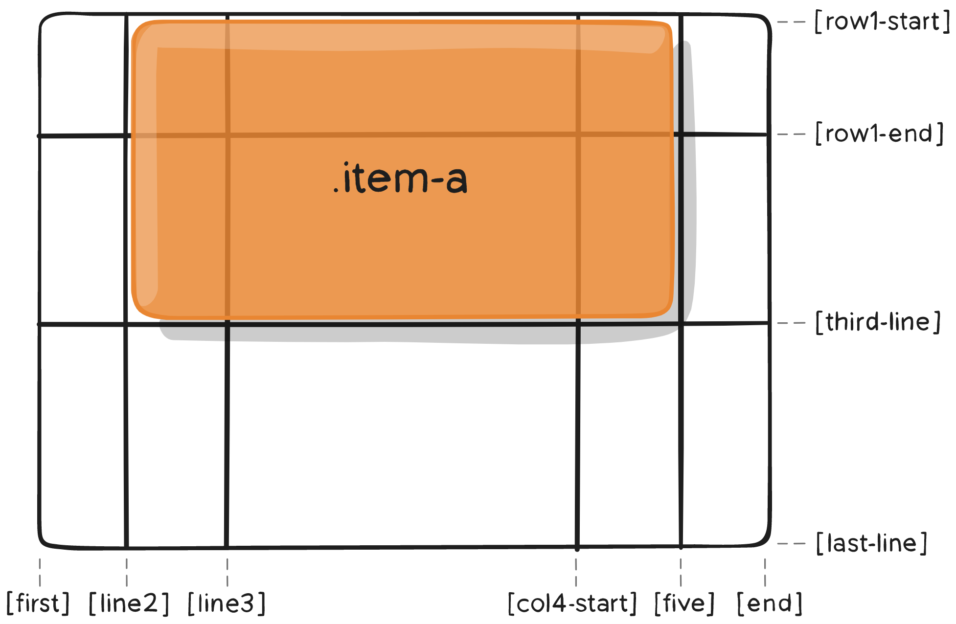
grid-row-start / -end
GRID-COLUMN-start / -END
Determines a grid item's location within the grid by
referring to specific grid lines.
.item-a {
  grid-column-start: 2;
  grid-column-end: five;
  grid-row-start: row1-start;
  grid-row-end: 3;
}
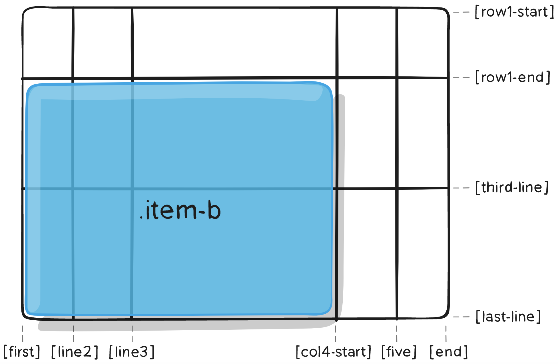
.item-b {
  grid-column-start: 1;
  grid-column-end: span col4-start;
  grid-row-start: 2;
  grid-row-end: span 2;
}
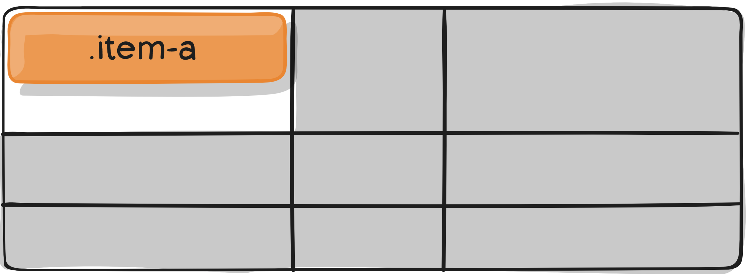
GRID-item properties
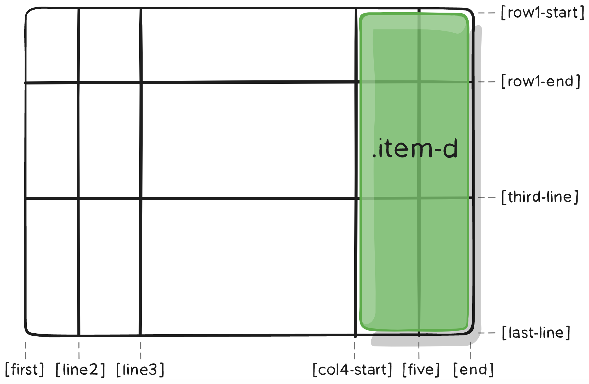
grid-area
Gives an item a name so that it can be referenced by a template
created with the grid-template-areas property.
.item {
  grid-area: <name> | <row-start> / <column-start> / <row-end> / <column-end>;
}
.item-d {
grid-area: header;
}.item-d {
grid-area: 1 / col4-start / last-line / 6;
}or
as the short-shorthand for
- grid-row-start
- grid-column-start
- grid-row-end
- grid-column-end
Assign a name:
.item-d {
  grid-area: 1 / col4-start / last-line / 6;
}
GRID-item properties
justify-self
Aligns a grid item inside a cell along the row axis.
.item {
  justify-self: start | end | center | stretch;
}
.item {
  justify-self: start | end | center | stretch;
}
.item {
  justify-self: start | end | center | stretch;
}
.item {
  justify-self: start | end | center | stretch;
}
GRID-item properties
ALIGN-self
Aligns a grid item inside a cell along the column axis.
.item {
  align-self: start | end | center | stretch;
}
.item {
  align-self: start | end | center | stretch;
}
.item {
  align-self: start | end | center | stretch;
}
.item {
  align-self: start | end | center | stretch;
}
NEXT UP @ W3C: SUB GRIDS
READ THIS :)
Thanks!
CSS Grids
By netzartist-de
