Creating fluid app-like experiences with Ember
Nick Schot

Nick Schot
Co-founder @ Webhub
CS Software Technology @ University of Twente

nickschot
@nickschot
nickschot.nl
Creating the application
An experimental approach
ember init emberconf2018 ember install ember-cli-sass ember install ember-bootstrapWhat do we need?
- Basic (interactive) UI elements
- Toolbars
- Side menu
- Panes
- Pan gesture support
- App-like transitions
- Scroll state management
What's available?
- ember-gestures
-
liquid-fireember-animated - sidebar/menu addons
- ember-burger-menu
- ember-side-menu
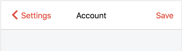
The Bar
Apps
Fixed top/bottom bars
Scrollable viewport filling rest of the height
scrollable
viewport
fixed bar
fixed bar
Bars in the context of the page for easier animation
In the browser
Use the body as the scrolling element
The bars must be
position: fixed;The bars cannot be inside an element which has a CSS transform
So it must be defined high in the route/template hierarchy
The component
- Wrapper component yielding the bars
{{#mobile-bar-wrapper as |mbw|}}
  {{outlet}}

  {{#mbw.mobile-bar type='top'}}
    ...
  {{/mbw.mobile-bar}}

  {{#mbw.mobile-bar type='bottom'}}
    ...
  {{/mbw.mobile-bar}}
{{/mobile-bar-wrapper}}- Wrapper adjusts it's padding to height of bars
scrollable
viewport
fixed bar
fixed bar
{{mobile-bar isLocked=false}}
- Follows downward touch scroll
- Comes back into view with upward scroll
- Also works for bottom bar!
- Optionally set the collapsible height
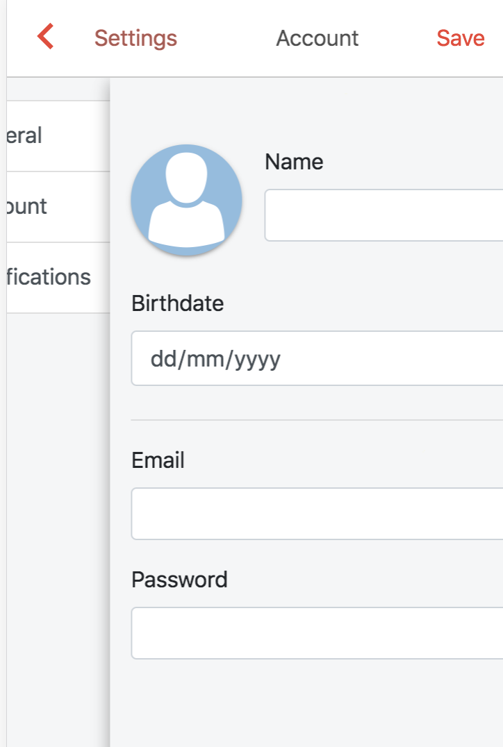
The Menu
Menu
Full height
Scrollable
Mask which closes the menu
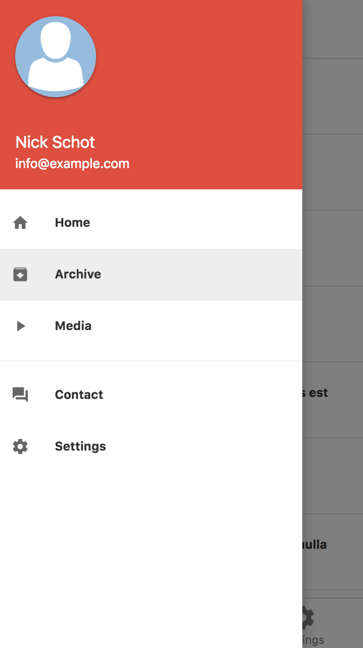
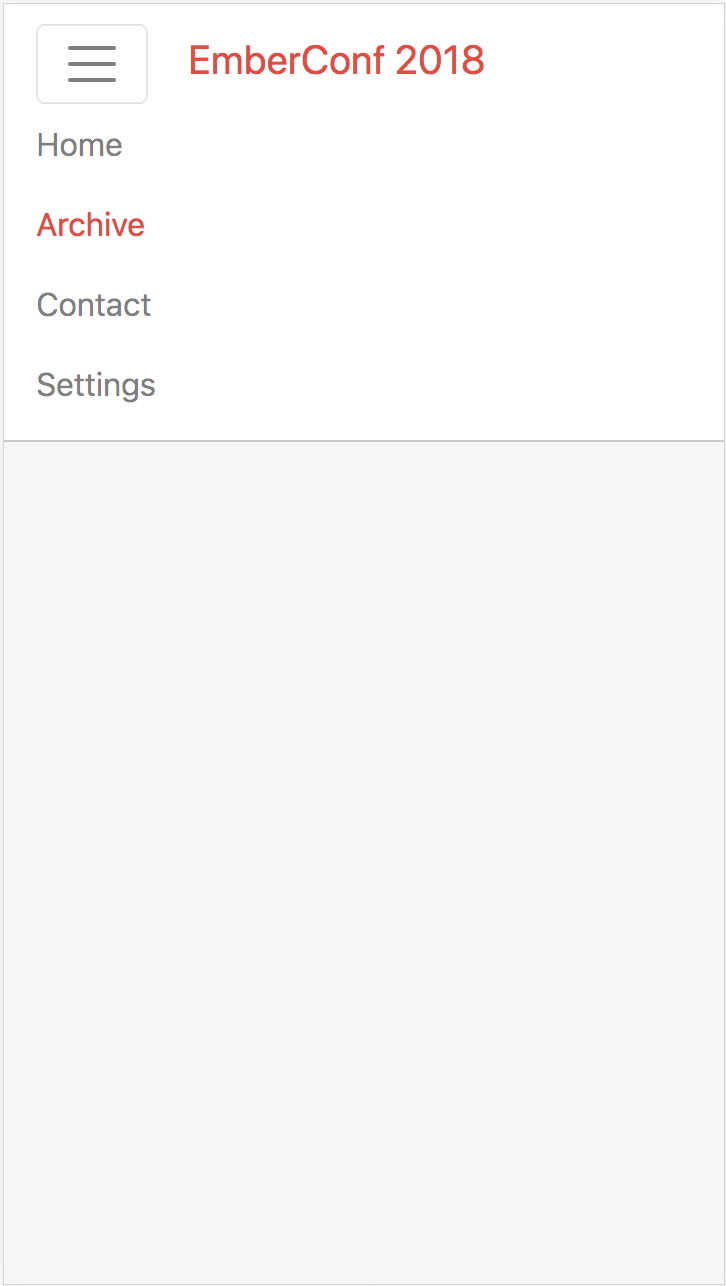
Gestures
Pan from edge to open
Pan on menu to close
Swipe
The Setup
Wrapper component yields sub-components and actions
{{!-- application.hbs --}}


{{#mobile-menu-wrapper as |mmw|}}
    {{#mmw.mobile-menu type='left' as |mm|}}
       {{#mm.link-to 'index'}}Home{{/mm.link-to}}
    {{/mmw.mobile-menu}}

    {{outlet}}
{{/mobile-menu-wrapper}}
Right and a left menus are supported
A link-to component which closes the menu on transition is provided
Edge pan recognition
const { x } = e; // pan event

if(!this.get('activeMenu')){
  if(x < 15 && leftMenu){
    this.set('activeMenu', leftMenu);
    this.set('isDraggingOpen', true);
  } else if(x > getWindowWidth() - 15 && rightMenu){
    this.set('activeMenu', rightMenu);
    this.set('isDraggingOpen', true);
  }
}
Pan start
- Wrapper defined high in the DOM
- Events trigger on the entire element
What about iOS?
We can't use edge gestures in iOS browsers :(
Conflicts with browser's "pan to go back"
  //Detect if the user is using the app
  //from a browser on iOS

  userAgent: service(),

  _isIOSBrowser(){
    return this.get('userAgent.os.isIOS')
       && !window.navigator.standalone;
  }
We can use edge gestures when the app is "added to home"!
const { x } = e; // pan event

if(!this.get('activeMenu') && !this._isIOSBrowser()){
  if(x < 15 && leftMenu){
    this.set('activeMenu', leftMenu);
    this.set('isDraggingOpen', true);
  } else if(x > getWindowWidth() - 15 && rightMenu){
    this.set('activeMenu', rightMenu);
    this.set('isDraggingOpen', true);
  }
}
window.matchMedia('(display-mode: standalone)').matchesDetect Chrome/Firefox standalone
{{mobile-menu type='left'}}
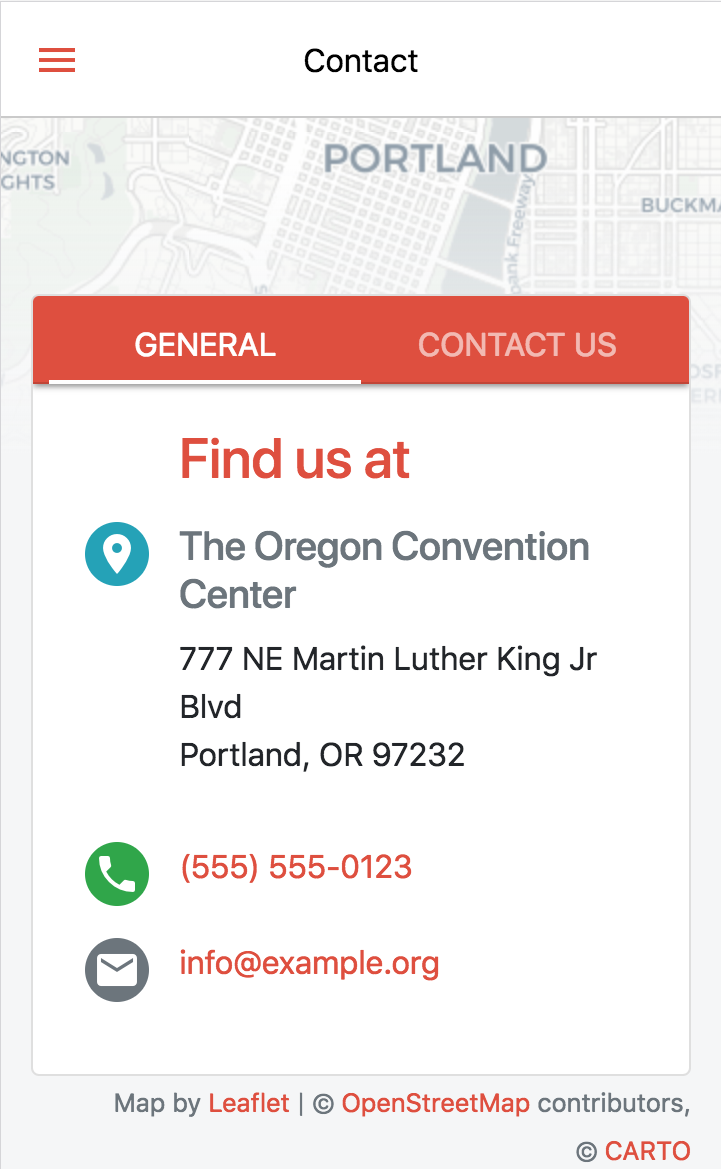
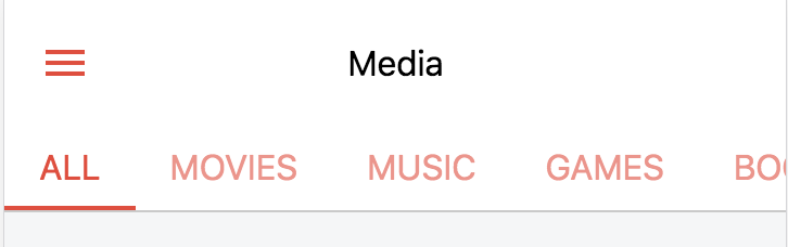
The Pane
Features
Tab component with pan support
Panning between resource routes
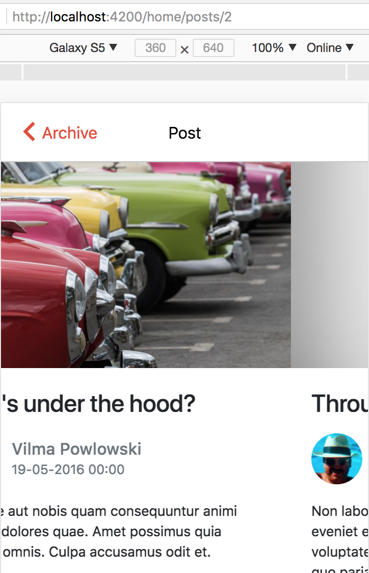
Best we can do here is query params
The components
Pannable tabs with navigation
{{#mobile-pane activeIndex=idx onChange=(action 'changeQP') as |mp|}}

  {{mp.nav}}

  {{#mp.scroller as |mps|}}

    {{#mps.pane title="General"}}
       ...
    {{/mps.pane}}

  {{/mp.scroller}}
{{/mobile-pane}}
{{#mp.infinite-scroller
  previousModel=previousModel
  currentModel=model
  nextModel=nextModel
as |mpis|}}

  Hello world! My name is {{mpis.model.name}}

{{/mp.infinite-scroller}}
Infinite panes
There is another way we can use this!
A carousel is basically a set of panes with limited interaction and timed change

Just need to add a simpler indicator
{{#mobile-pane activeIndex=pane as |mp|}}
  {{#mp.scroller as |mps|}}
      {{#mps.pane}}
        ...
      {{/mps.pane}}
  {{/mp.scroller}}

  {{mp.simple-indicator}}

{{/mobile-pane}}
And some ember-concurrency
  changePane: task(function * (){
    while(true){
      yield timeout(5000);

      const newPane = (this.get('visiblePane') + 1) % this.get('panes.length');
      this.set('visiblePane', newPane);
    }
  }).restartable()
mouseEnter(){ this.get('changePane').cancelAll(); },
mouseLeave(){ this.get('changePane').perform(); },
touchStart(){ this.get('changePane').cancelAll(); },
touchEnd(){ this.get('changePane').perform(); } didInsertElement(){
this._super(...arguments);
get(this, 'changePane').perform();
}A problem...
While opening our side menu, the pane also activates!
Browser events
<html>

  <body>

    <div>

      <button value="Click me!" />

    </div>

  </body>

</html>
Phases
- Capture
- Target
- Bubble
1. capture
3. bubble
But...
Ember works after the bubble phase...
ember-gestures doesn't support event capturing...
ember-mobile-core
Pan recognition
Touch event based pan recognition
- Coordinates
- Angle
- Distance
- Velocity
Lock support through service
Optional capture phase
Back to the side menu
1. Enable capture events
import RecognizerMixin
    from 'ember-mobile-core/mixins/pan-recognizer';

export default Component.extend(RecognizerMixin, {
  useCapture: true

  ...
}
const { x } = e; // pan event
if(!this.get('activeMenu')){
if(x < 15 && leftMenu){
this.lockPan();
this.set('activeMenu', leftMenu);
this.set('isDraggingOpen', true);
} else if(x > getWindowWidth() - 15 && rightMenu){
this.lockPan();
this.set('activeMenu', rightMenu);
this.set('isDraggingOpen', true);
}
}2. Claim the pan lock on a valid edge pan
If a lock is taken, other pan events using ember-mobile-core won't be triggered
Everything now works as you'd expect
Nested panes
Correct locking makes parent pane take over when first/last nested pane is reached
Also note the navigation keeping the active item in view
Transitions
with ember-animated
Why?
- Enhance perceived responsiveness
When used correctly transitions...
- (Un)consciously inform users of context
Example
- Title of previous page morphs into back button
- New page slides over old page
An observation
Mobile transitions follow route hierarchy/context in a predictable way
We can abstract this into components
Route hierarchy
Router.map(function() {
  this.route('posts', function(){
    this.route('post', { path: ':post_id' }, function(){
      this.route('edit');
    })
  });
});
/posts
/posts/1
/posts/1/edit{{mobile-page}}
Component which...
- Is aware of route transition direction
- Selects the matching transition effect
- Manages page/viewport style during transition
{{#mobile-page route='index' isRoot=true}}
   ...
{{/mobile-page}}- Manages scroll state
{{mobile-page}}
Currently supports
- Switching to an out of flow context
- Transitioning down (slide left)
- Transitioning up (slide right)
In the near future
- Horizontal transitions (fade)
- Switching to a "new" context
{{top-toolbar}}
Similar to mobile-page
- Transitions based on same rules as mobile-page
- Provides ember-elsewhere portals
- left button
- title
- right button
- second row
Managing scroll-state
Use the hierarchy
Mobile scroll state should...
- Get restored when going up or sideways in the hierarchy
- Get reset when going down the route hierarchy
Scroll state
We use document based scrolling
- Makes it a little harder during transitions
- The transitioning element is not the scrolling element
- Document size must be limited to prevent scrollbars
- During transition scroll is applied as a CSS transform
Normally we'd use...
- memory-scroll
- ember-router-scroll
But that won't work with the transitions we have
Manages scroll based on hierarchy and route transition
{{mobile-page}}
Manages horizontal scroll state
{{infinite-scroller}}
Responsiveness
The tools
ember-responsive
// Bootstrap 4.0.0 default breakpoints
export default {
  xs: '(max-width: 575px)',
  sm: '(min-width: 576px) and (max-width: 767px)',
  md: '(min-width: 768px) and (max-width: 991px)',
  lg: '(min-width: 992px) and (max-width: 1199px)',
  xl: '(min-width: 1200px)'
};
CSS media queries
// Bootstrap 4.0.0 media query util
@include media-breakpoint-only(xs){
    // applies only to XS
}


@include media-breakpoint-up(sm){ }
@include media-breakpoint-down(sm){ }
// hide or show element on mobile w/ classes
<div class="d-none d-sm-block"></div>
<div class="d-sm-none"></div>May cause flicker when using fastboot
{{#if media.isXs}}
  {{!-- only shown on mobile --}}
{{/if}}
Templating example
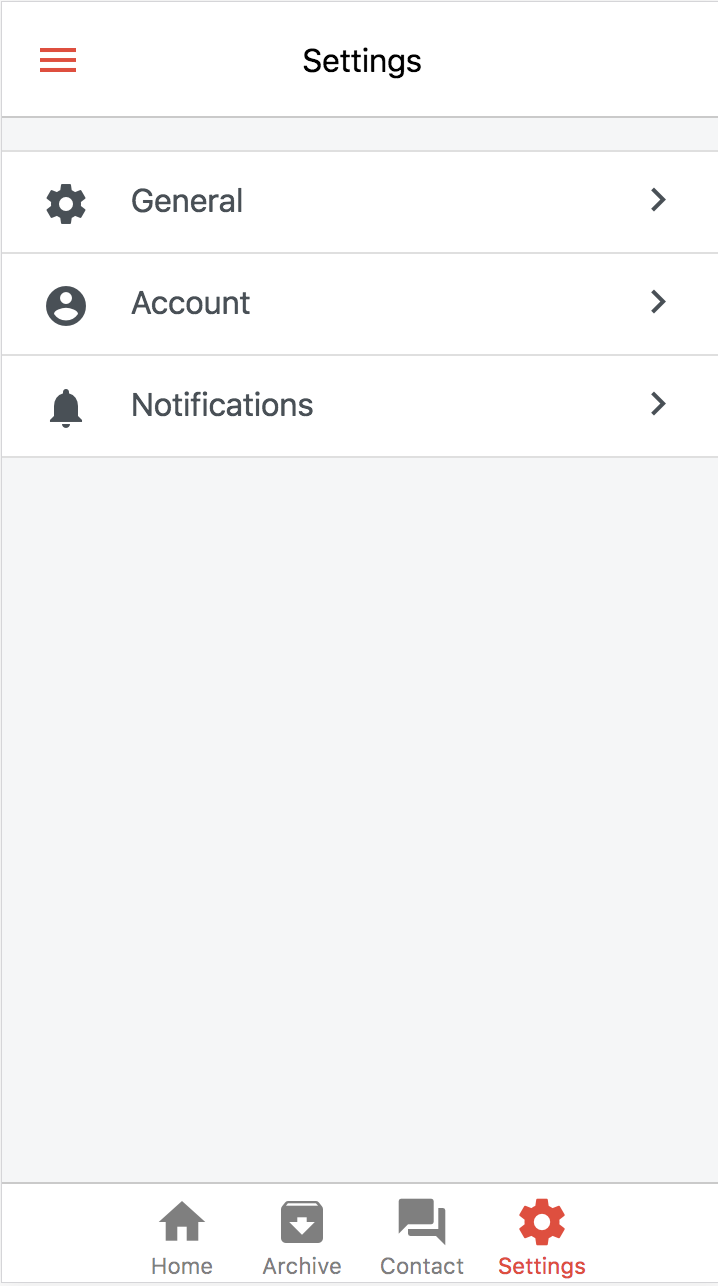
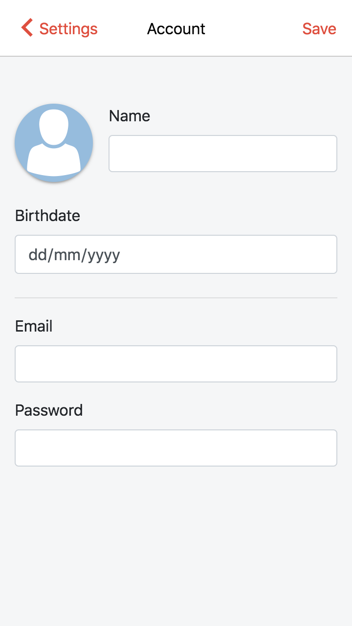
Settings menu
- Index route with menu
- Nested routes with settings pages
Not what we'd like on desktop!
A solution
- Move the settings menu into a component
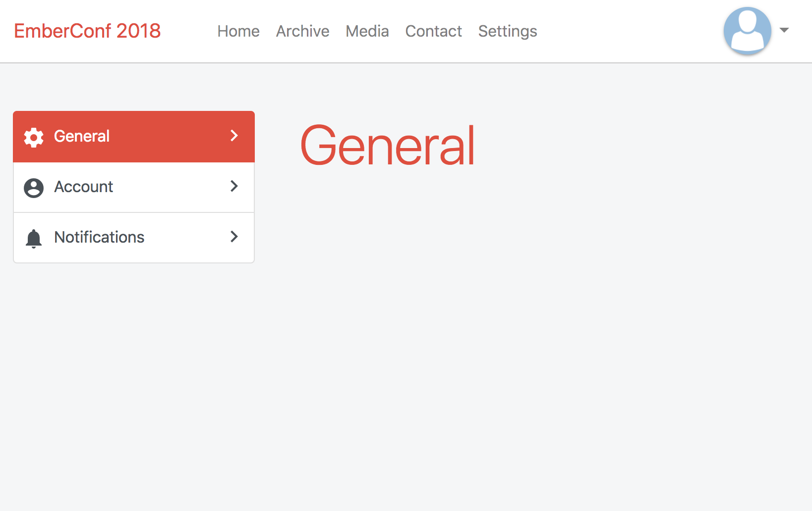
- Render it on:
- the settings.index route
- the settings route on desktop
- Redirect settings.index to the first settings menu on desktop
beforeModel(){
  if(!this.get('media.isXs')){
    this.transitionTo('settings.general');
  }
}
Transitions
Mobile transitions don't work well on desktop
Transitions
Use ember-responsive to disable or modify the transitions
transitionsEnabled: computed.reads('media.isXs') {{#if transitionsEnabled}}
{{#animated-value}}
{{yield}}
{{/animated-value}}
{{else}}
{{yield}}
{{/if}}Last remarks
- Splash screen & Icon
- Offline availability
- Native notifications
- "Add to home" notification
Progressive Web App enhancements
- Corber/Cordova
Hybrid apps
Keeping (perceived) performance up
async model hooks
- model hook blocks rendering
and as such also the visual transition
- use ember-concurrency to make model hook async
- use loader component
Keeping (perceived) performance up
svelte list rendering
vertical-collection
- rendering a lot takes time
github.com/nickschot/ember-mobile-
menu
bar
pane
core
github.com/nickschot/emberconf2018
nickschot.github.io/emberconf2018
Try it yourself!
Creating fluid app-like experiences with Ember
By Nick Schot
Creating fluid app-like experiences with Ember
Mobile apps have UI patterns and features not often found in (mobile) web applications. We will take an in-depth look at ways to enhance user interaction for responsive Ember applications without having to develop a completely separate application. Topics include application organization, templating concerns, interaction patterns, relevant addons and a display of newly built Ember addons to fill in for missing interaction features.
