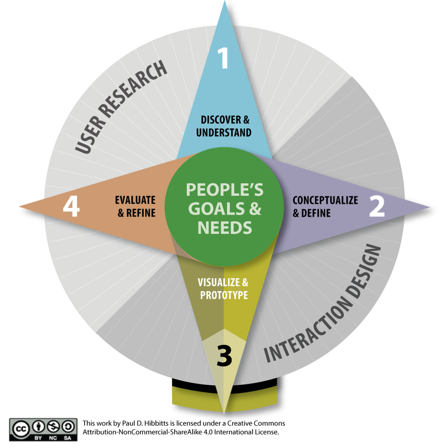


Paul Hibbitts
Educator, interaction design practitioner and software developer.
“The next generation of users is upon us. They’re context is touch, mobility and speed. Reaching them requires intuitive design. For better or worse, they are... Mobile First.”
– Jon Fox
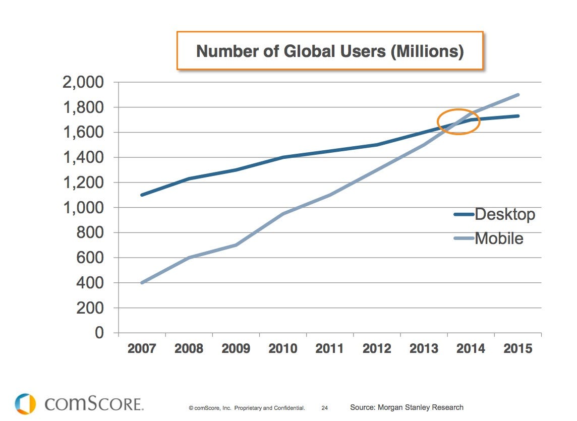
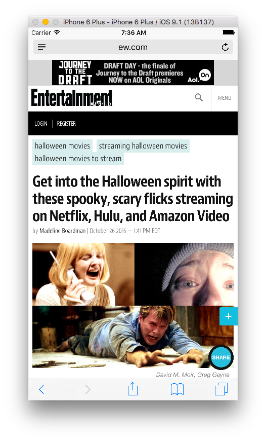
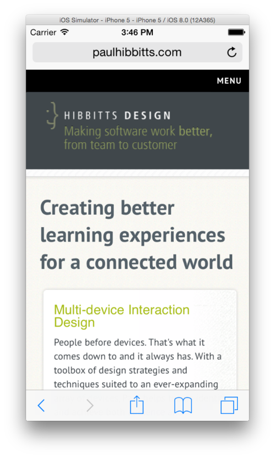
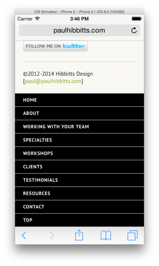
What does the term “mobile” mean in 2015?
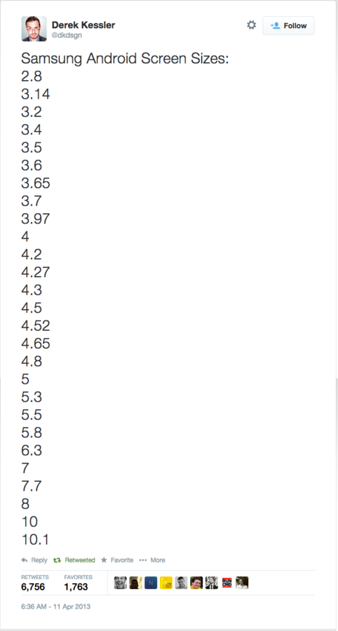
Copyright by respective copyright owners. Used without permission under the Fair Use Doctrine. Source: https://twitter.com/dkdsgn/status/322342508912852992

Copyright by respective copyright owners. Used without permission under the Fair Use Doctrine. Source: http://blogs.adobe.com/

Copyright by respective copyright owners. Used without permission under the Fair Use Doctrine. Source: ASUS
Copyright by respective copyright owners. Used without permission under the Fair Use Doctrine. Source: http://communities-dominate.blogs.com/
Copyright by respective copyright owners. Used without permission under the Fair Use Doctrine. Source: http://www.abookapart.com/products/mobile-first
Copyright by respective copyright owners. Used without permission under the Fair Use Doctrine. Source: http://scholarlykitchen.files.wordpress.com
Copyright by respective copyright owners. Used without permission under the Fair Use Doctrine. Source: http://www.magazine.org/
Copyright by respective copyright owners. Used without permission under the Fair Use Doctrine. Source: http://i-cdn.phonearena.com/
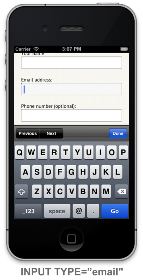
Copyright by respective copyright owners. Used without permission under the Fair Use Doctrine. Source: http://www.forbes.com/
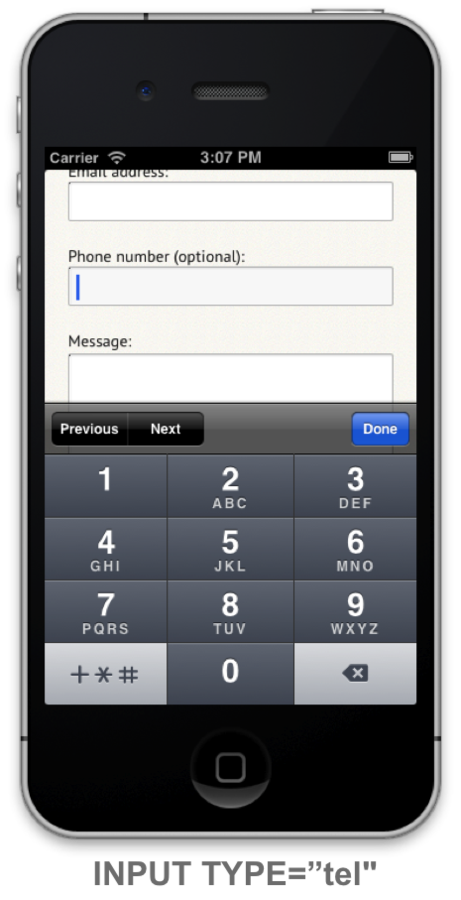
Example from Designing for Touch, by Josh Clark. http://abookapart.com/products/designing-for-touch

Copyright by respective copyright owners. Used without permission under the Fair Use Doctrine. Source: http://scotthurff.com/
Copyright by respective copyright owners. Used without permission under the Fair Use Doctrine. Source: http://scotthurff.com/
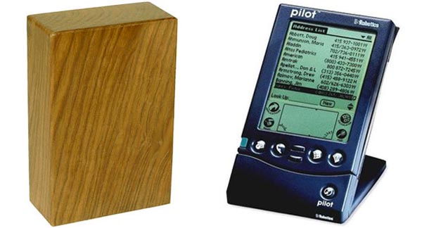
Source: Microsoft
Copyright by respective copyright owners. Used without permission under the Fair Use Doctrine. Source: http://flickr.com/photos/maestroben/390454110/
Copyright by respective copyright owners. Used without permission under the Fair Use Doctrine. Source: http://sarahlynndesign.com/blog/
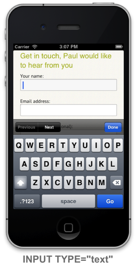
Review your assignment #3/#4 sketches in terms of supporting touch interaction
Copyright by respective copyright owners. Used without permission under the Fair Use Doctrine. Source: http://www.uselog.com/2005_10_01_archive.html
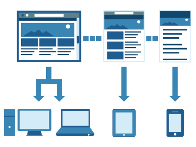
Copyright by respective copyright owners. Used without permission under the Fair Use Doctrine. Source: http://www.paulolyslager.com/responsive-design-hype-solution/
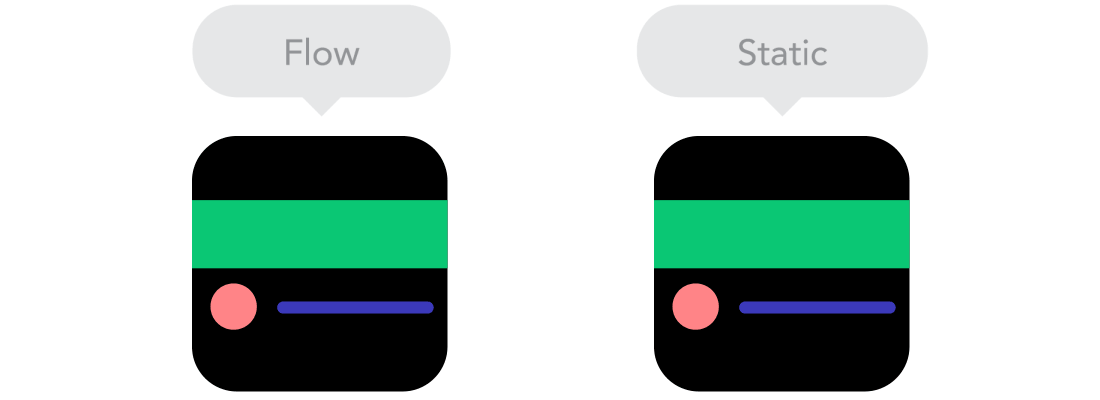
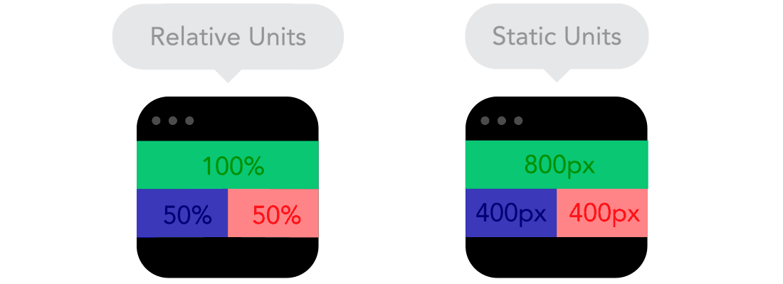
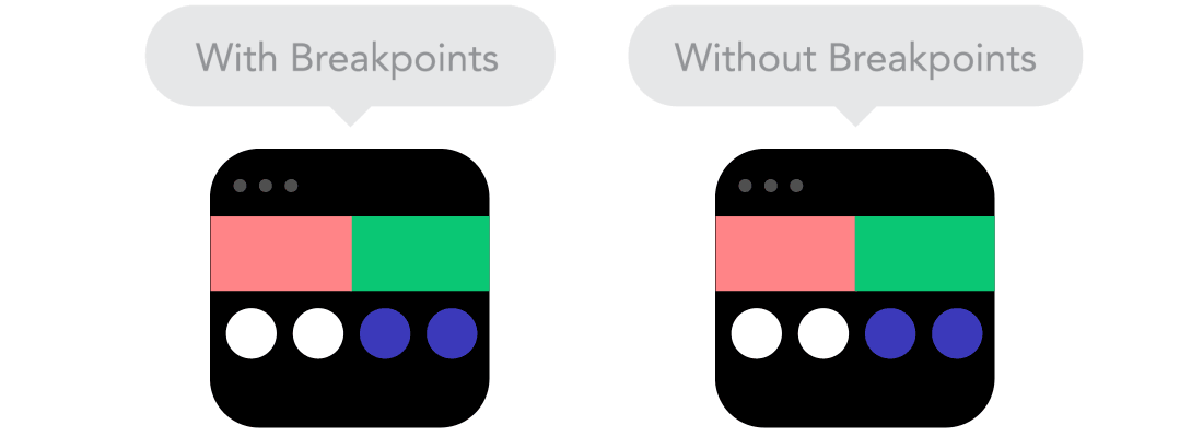
Copyright by respective copyright owners. Used without permission under the Fair Use Doctrine. Source: blog.froont.com/9-basic-principles-of-responsive-web-design/
Copyright by respective copyright owners. Used without permission under the Fair Use Doctrine. Source: blog.froont.com/9-basic-principles-of-responsive-web-design/
Copyright by respective copyright owners. Used without permission under the Fair Use Doctrine. Source: blog.froont.com/9-basic-principles-of-responsive-web-design/
Copyright by respective copyright owners. Used without permission under the Fair Use Doctrine. Source: http://viljamis.com/blog/2012/responsive-workflow/
Review your assignment #3/#4 sketches and sketch out a desktop vs. mobile device rendering of the same screen
Review your assignment #3/#4 sketches and start to create a content inventory to access placement vs. priority
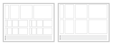
Two Column Grid

<div class="row">
    <div class="span9">...</div>
    <div class="span3">...</div>
</div>


Information Alert Box
<div class="alert alert-info"> ... </div>By Paul Hibbitts


