User Interface Inspections

CMPT 363

As soon as we started programming, we found to our surprise that it wasn't as easy to get programs right as we had thought. Debugging had to be discovered. I can remember the exact instant when I realized that a large part of my life from then on was going to be spent in finding mistakes in my own programs.
– Maurice Wilkes (1949)

Where Are We?

Types of Inspections

 
  • Cognitive walkthroughs
  • Heuristic evaluations

Cognitive Walkthroughs

 
A cognitive walkthrough is a task-based evaluation method to catch “black holes” (gaps in determining the next appropriate step)

Cognitive Walkthroughs


  • Define the user(s)
  • Select/create a collection of tasks
  • Define the correct sequence for each task
  • Proceed step-by-step through the interface (or mockups),
    asking the following questions from the user’s perspective…


Streamlined Cognitive Walkthrough Questions


  • Will the user know what to do at this step?
    • Consider the user’s goal and what they may thinking about (intent)
    • Consider the visibility of required interface elements and clarity of labels and prompts (visibility and identification)

Streamlined Cognitive Walkthrough Questions


  • If the user does the right thing, will they know that they did the right thing, and are making progress towards their goal?
    • Consider if adequate and informative feedback is supplied (progress)

Cognitive Walkthrough Answers


  • “Likely” - a credible success story should be able to be stated
  • “Unlikely” - a credible failure story should be able to be stated
  • “Not clear” - a credible reason should be able to be stated

Streamlined Cognitive Walkthrough Ground Rules 


  • All identified issues will be noted
  • No design discussions allowed!

Activity: Cognitive Walkthrough

Lynda.com Learning Matrix

Task to be demonstrated: A SFU students, fairly new to Lynda.com, wants to explore what introductory courses on design are available

  • Will the user know what to do at this step?
  • If the user does the right thing, will they know that they did the right thing, and are making progress towards their goal?

Heuristic Evaluations


The evaluation of a user interface to a checklist of design rules or heuristics

Heuristic Evaluations


A heuristic evaluation can quickly and effectively reveal key user interface issues

Heuristic Evaluations


In 1990 Jakob Nielsen (SUN Microcomputers, now Nielsen-Norman Group) and Rolf Molich developed the first list of usability heuristics

Heuristic Evaluations


This list was later revised (1994) by Nielsen into somewhat more abstract items based on analysis of 249 usability problems

Nielsen’s Heuristics (1994)


  • Visibility of system status
  • Match between system and the real world
  • User control and freedom
  • Consistency and standards graphics, layout
  • Error prevention
  • Recognition rather than recall
  • Flexibility and efficiency of use
  • Aesthetic and minimalist design
  • Help users recognize, diagnose and recover from errors
  • Help and documentation

Heuristic Evaluations


  • Subsequent heuristic lists include
    • Gary Perlman’s Practical Usability Heuristics (1997)
    • Jill Gerhardt-Powals’ Cognitive Engineering Principles for Enhancing Human-Computer Performance (1996)
    • ISO 9241 “dialogue principles” (2006)

ISO 9241 Dialog Principles


  • Suitability for the task
  • Self-descriptiveness
  • Conformity with user expectations
  • Suitability for learning
  • Controllability
  • Error tolerance
  • Suitability for individualization

Heuristic Evaluation Overview

 
  • Select heuristics list
  • Have evaluators go through UI (twice is recommended)
  • Combine findings on one list
  • Have evaluators independently rate severity
  • Present findings to design team, first highlighting positive aspects of the user interface

Heuristic Evaluation


  • Most effective when multiple evaluators are involved - optimal number 3 to 5
  • Possible evaluators include
    • User interface designers
    • Project team members
    • Representative/actual end-users

Number of Evaluators


Copyright by respective copyright owners. Used without permission under the Fair Use Doctrine. Source: http://www.nngroup.com/articles/how-to-conduct-a-heuristic-evaluation/
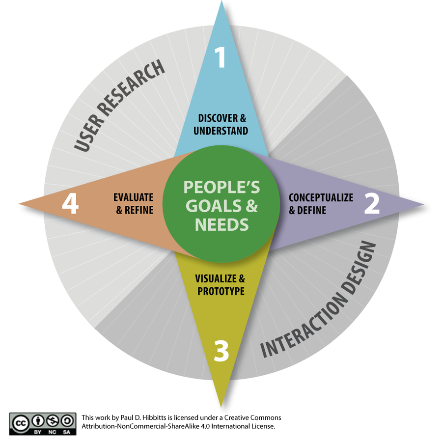
Task-based Heuristic Evaluation


An viable alternative to a standard heuristic evaluation, which is also more supportive for a single expert evaluator, is a task-based inspection

Assessing Usability Problem Severity


  • Frequency
  • Impact
  • Persistence

Frequency


The frequency with which the problem occurs: Is it common or rare?

Impact


The impact of the problem if it occurs: Will it be easy or difficult for the users to overcome?

Persistence


The persistence of the problem: Is it a one-time problem that users can overcome once they know about it or will users repeatedly be bothered by the problem?

Example Severity Rating


[0] Disagree about usability problem
    • Don’t agree that this is a usability problem at all 
[1] Cosmetic Only
    • Need not be fixed unless extra time is available on project
[2] Minor usability problem
    • Fixing this is a low priority
[3] Major usability problem
    • Important to fix, so should be given high priority
[4] Usability catastrophe (“Critical usability issue”)
    • Imperative to fix this before product can be released

Heuristic Evaluation


(+) Reasonably cheap and fast

(+) Can be used at any time in design process

(+) Identifies many usability problems

    Heuristic Evaluation


    (–) More effective with fully defined designs

    (–) Can over-emphasize minor problems

    (–) Does not identify task-based problems (using standard approach)

    (–) Does not identify domain-related problems

      Time for Questions & Discussion

       
      • What we’ve covered so far
        • What is a cognitive walkthrough
        • Cognitive walkthrough questions
        • What is a heuristic evaluation
        • Usability heuristic lists
        • Heuristic evaluation overview
        • Severity ratings
        • Advantages and disadvantages
      • Coming up
        • Applying Nielsen’s heuristics
       

      Visibility of System Status


      The system should always keep users informed about what is going on, through appropriate feedback within reasonable time


      What about “Reasonable Time” in Action/Response Situations ?

      Defining
      “Within  Reasonable Time”

       
      • Specific guidelines for response times are (important to know):
        • 0.1 second for perceived instantaneous response
        • 1.0 second for task flow not to be interrupted (user will notice delay however)
        • 10 seconds is about the maximum for a user to be able to keep focus on current task

      Match Between
      System and the Real World

       
      The system should speak the user's language, with words, phrases and concepts familiar to the user, rather than system-oriented terms

      Match Between
      System and the Real World

       
      Follow real-world conventions, making information appear in a natural and logical order


      User Control and Freedom


      Users often choose system functions by mistake and will need a clearly marked “emergency exit” to leave the unwanted state without having to go through an extended dialogue

      User Control and Freedom


      Support undo and redo


      Consistency and Standards


      Users should not have to wonder whether different words, situations, or actions mean the same thing

      Consistency and Standards


      Follow platform conventions


      Error Prevention


      Even better than good error messages is a careful design which prevents a problem from occurring in the first place


      Time for More
      Questions and Discussions

       
      • What we’ve covered in this section
        • Visibility of system status
        • Match between system and the real world
        • User control and freedom
        • Consistency and standards
        • Error prevention
      • Coming up
        • Recognition rather than recall

      Recognition Rather than Recall


      Make objects, actions, and options visible. The user should not have to remember information from one part of the dialogue to another

      Recognition Rather than Recall


      Instructions for use of the system should be visible or easily retrievable whenever appropriate


      Flexibility and Efficiency of Use


      Accelerators - unseen by the novice user - may often speed up the interaction for the expert user such that the system can cater to both inexperienced and experienced users

      Flexibility and Efficiency of Use


      Allow users to tailor frequent actions


      Aesthetic and Minimalist Design


      Dialogues should not contain information
      which is irrelevant or rarely needed

      Aesthetic and Minimalist Design


      Every extra unit of information in a dialogue competes with the relevant units of information and diminishes their relative visibility


      Help Users Recognize, Diagnose and Recover From Errors


      Error messages should be expressed in plain language (no codes), precisely indicate the problem, and constructively suggest a solution


      Help and Documentation


      Even though it is better if the system can be used without documentation, it may be necessary to provide help and documentation

      Help and Documentation


      Any such information should be easy to search, focused to the user's task, list concrete steps to be carried out, and not be too large


      Nielsen’s Heuristics (1994)


      • Visibility of system status
      • Match between system and the real world
      • User control and freedom
      • Consistency and standards graphics, layout
      • Error prevention
      • Recognition rather than recall
      • Flexibility and efficiency of use
      • Aesthetic and minimalist design
      • Help users recognize, diagnose and recover from errors
      • Help and documentation


      Bonus Activity


      Compare the identified heuristic violations shown in these slides with the most recent version of Costco.com

      Summary

       
      • What is a cognitive walkthrough
      • Cognitive walkthrough questions
      • What is a heuristic evaluation
      • Usability heuristic lists
      • Heuristic evaluation overview
      • Severity ratings
      • Advantages and disadvantages
      • Nielsen’s heuristics with examples
       

      References and Suggested Books


      • The Streamlined Cognitive Walkthrough Method, CHI 2000 Proceedings by Rick Spencer
      • Usability Engineering, by Jacob Nielsen
      • Usability Inspection Methods, by Jacob Nielsen and Robert Mack

      CMPT-363-153 User Interface Inspections

      By Paul Hibbitts

      CMPT-363-153 User Interface Inspections

      • 3,521