Where I tell you why I did what I did
Just in case you were wondering.
If not, feel free to close your browser window now.
Project goals
- Design a trustworthy, professional brand identity that appeals directly to people who feel unsettled by the money they have or have control of
- Use language, color and typography to convey the proper sense of honesty, care, and willingness to teach
- Make it apparent that you recognize the state of mind clients are coming to you in, and the state of mind they can look forward to.
What I did
- I pulled content from each document and email you sent me, re-arranged it several times, grouped it differently, and ultimately organized it in a highly approachable format
- I designed a logo and brand for your business that visually represents the content you provided and the tone conveyed throughout
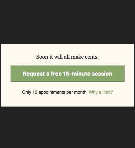
- I built a website that makes it simple to: get valuable information, hear from you, then take quick action. If it doesn't work the first time, they can keep scrolling until the form at the bottom of the page, where they are sure to request an appointment.
You probably still have questions, like...
Why those colors?
-
Dark grey
- Sophisticated
- Classy
- Neutral
- Green
- Money (duh.)
- Not HRBlock green
- Shade of green that's not vibrant, but not boring
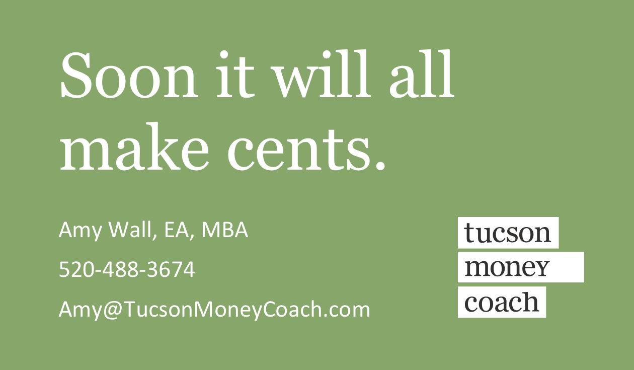
Why that for a logo?
- Considerations
- Your name says it all
- So no need for a 'mark' or 'symbol'
- Smart to avoid sports metaphors, agreed
- Must convey trust and professionalism
- Your name says it all
Why that for a logo?
- Upon first glance
- Company name is instantly readable
- White boxes behind words make it look like the words are being highlighted. That's cool.
- Colors convey the right feelings of financial trust
Why that for a logo?
- Subtle graphic nod
- White boxes are intended to suggest a bar chart
- Longest bar is one that contains 'money'
Just like with Tucson Tax Team logo, if people miss this, no worries. If they see it, it feels highly rewarding.
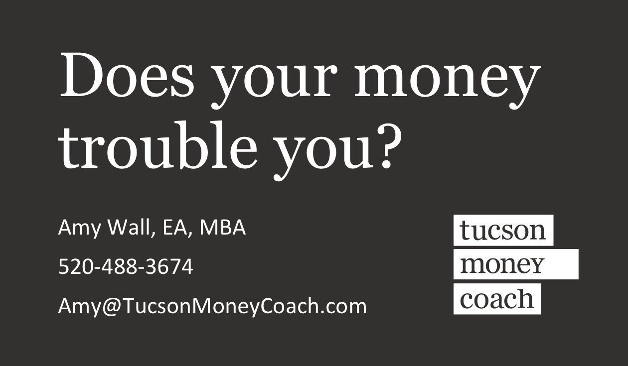
Why a dark background?
- It may feel odd
- True, it's uncommon not to have dark text on light background
- That just helps make this website stand out, right?
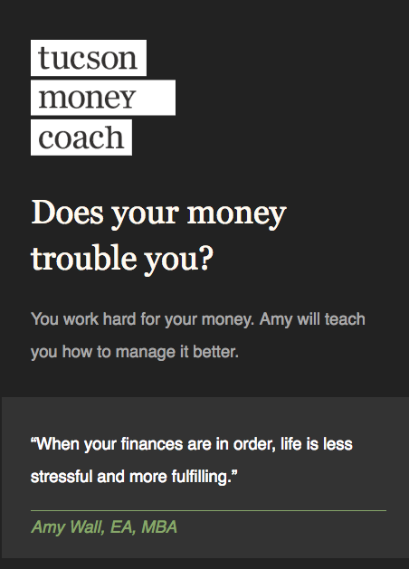
Why a dark background?
- How is it helping?
- The important content jumps off the page
(logo, headlines, quotes) - It makes the green brand color look great
- And...
- The important content jumps off the page
Why a dark background?
- It makes perfect sense
- The dark background makes the 'call to action' pop from the page
Just like with Tucson Tax Team...
Look it all over
Look it over again
Fall in love with it
Then let me know what, if any, copy edits need to be made
Have a Merry Christmas!
money-coach
By rmion