Flexbox
Minimum Effort, Maximum Result
Life before Flexbox
- Avoid writing my own layout / CSS
- Rely on Bootstrap etc.
- 200KB extra download (mostly bloat)
- Overwriting rules with more CSS
- Doesn't work well with component based setup
- Responsive?
Let's build
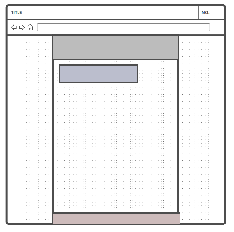
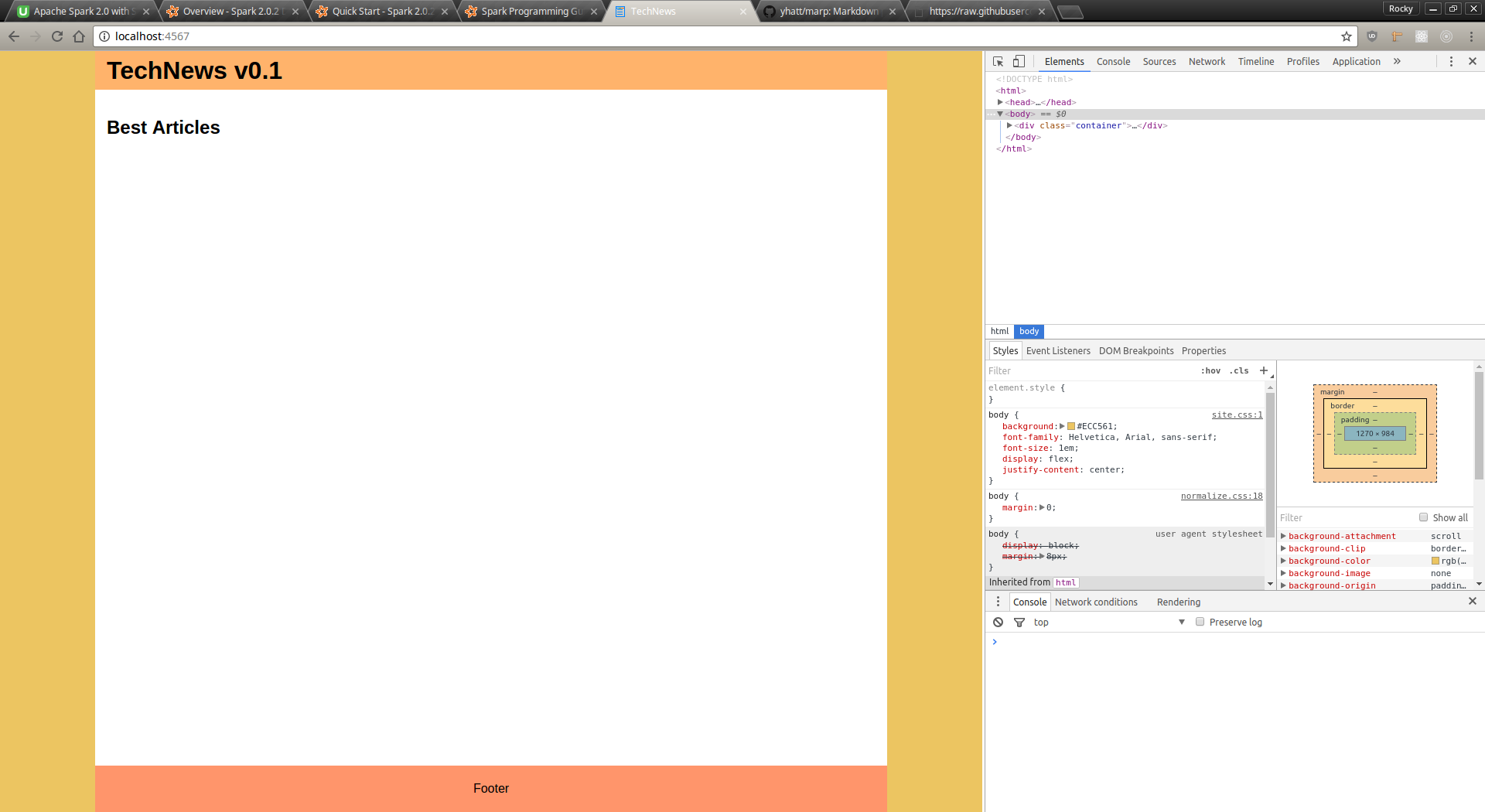
v0.1
<div class="container">

</div>
body {
background: #ECC561;
font-family: Helvetica, Arial, sans-serif;
font-size: 1em;
}Result
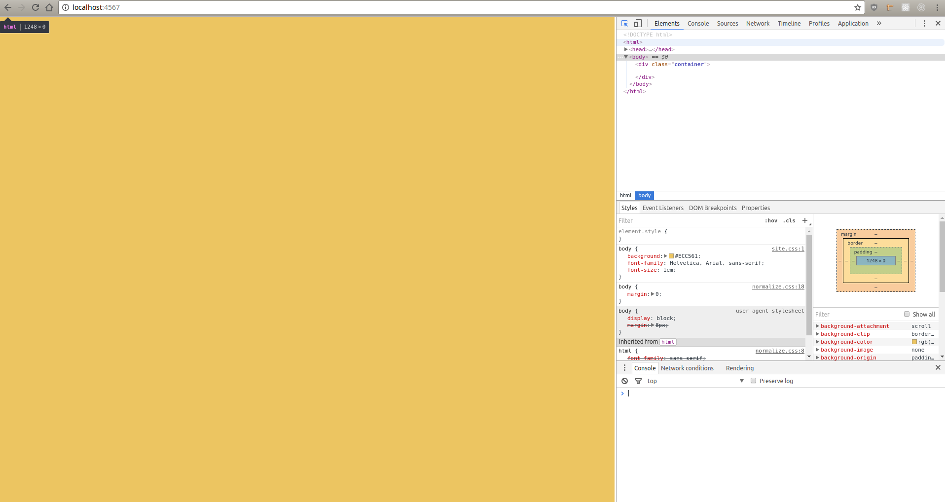
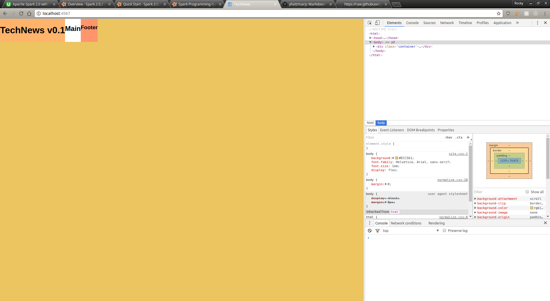
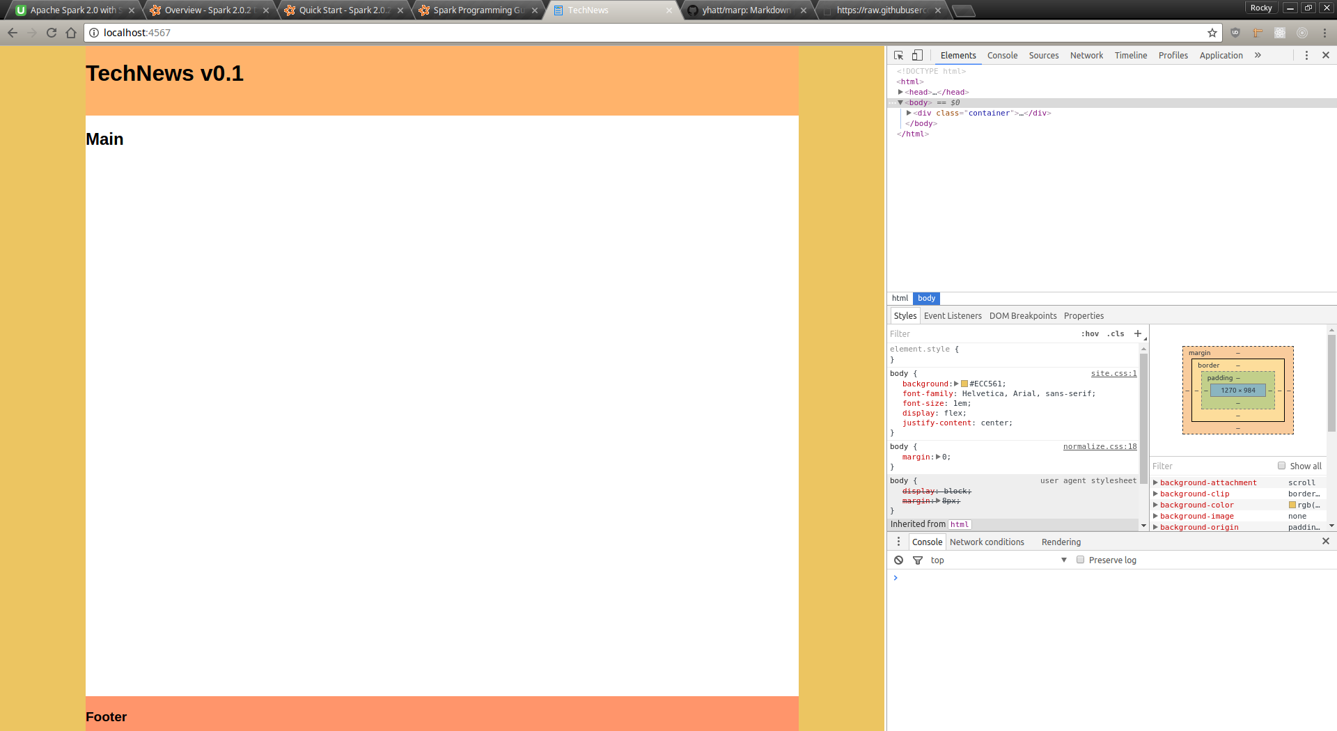
v0.2 - Add basic elements
<div class="container">
  <header>
    <h1>TechNews v0.1</h1>
  </header>
  <main>
    <h2>Main</h2>
  </main>
  <footer>
    <h3>Footer</h3>
  </footer>
</div>
body {
background: #ECC561;
font-family: Helvetica, Arial, sans-serif;
font-size: 1em;
display: flex;
}
.container {
display: flex;
}
header {
display: flex;
background-color: #FFB36B;
}
main {
display: flex;
background-color: #FFF;
}
footer {
display: flex;
background-color: #FF956B;
}Result
Apply Magic!
body {
  background: #ECC561;
  font-family: Helvetica, Arial, sans-serif;
  font-size: 1em;
  display: flex;
+ justify-content: center;
}

.container {
  display: flex;
+ flex-direction: column;
+ justify-content: space-between;
+ width: 1024px;
+ min-height: 100vh;
}

header {
  display: flex;
  background-color: #FFB36B;
+ flex-basis: 100px;
}

main {
  display: flex;
  background-color: #FFF;
+ flex-grow: 1;
}

footer {
  display: flex;
  background-color: #FF956B;
+ flex-basis: 50px;
}
v0.3 - Result
Wait .. what?
-
flex-direction
- How flex items are placed
-
justify-content
- How space is distributed between/around items
-
flex-basis
- Initial main size of item
-
flex-grow
- Grow factor of flex item
v0.4 - More formatting
header {
   display: flex;
   flex-direction: column;
   justify-content: center;
   flex-basis: 20px;
+  padding: 15px;
   background-color: #FFB36B;
-  flex-basis: 100px;
}

main {
   display: flex;
   flex-grow: 1;
+  padding: 15px;
   background-color: #FFF;
}

footer {
   display: flex;
+  flex-direction: row;
+  justify-content: center;
   flex-basis: 30px;
+  padding: 15px;
   background-color: #FF956B;
}
v0.4 - Result
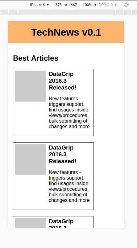
v0.5 - Get content in
<div class="container">
  <header>
    <h1>TechNews v0.1</h1>
  </header>
  <main>
    <h2>Best Articles</h2>
    <div class="articlesWrapper">
      <% 10.times do %>
        <article>
          <div class="imgPlaceholder"></div>
          <div class="articleContent">
            <h3>DataGrip 2016.3 Released!</h3>
            <p>New features - triggers support, find usages inside views/procedures, bulk submitting of changes and more</p>
          </div>
        </article>
      <% end %>
    </div>
  </main>
  <footer>
    <p>Footer</p>
  </footer>
</div>
v0.5 - Format content
main {
   display: flex;
+  flex-direction: column;
   flex-grow: 1;
   padding: 15px;
   background-color: #FFF;
}

+.articlesWrapper {
+  display: flex;
+}
+
+.imgPlaceholder {
+  height: 100px;
+  width: 100px;
+  background-color: #CCC;
+}
v0.5 - Result
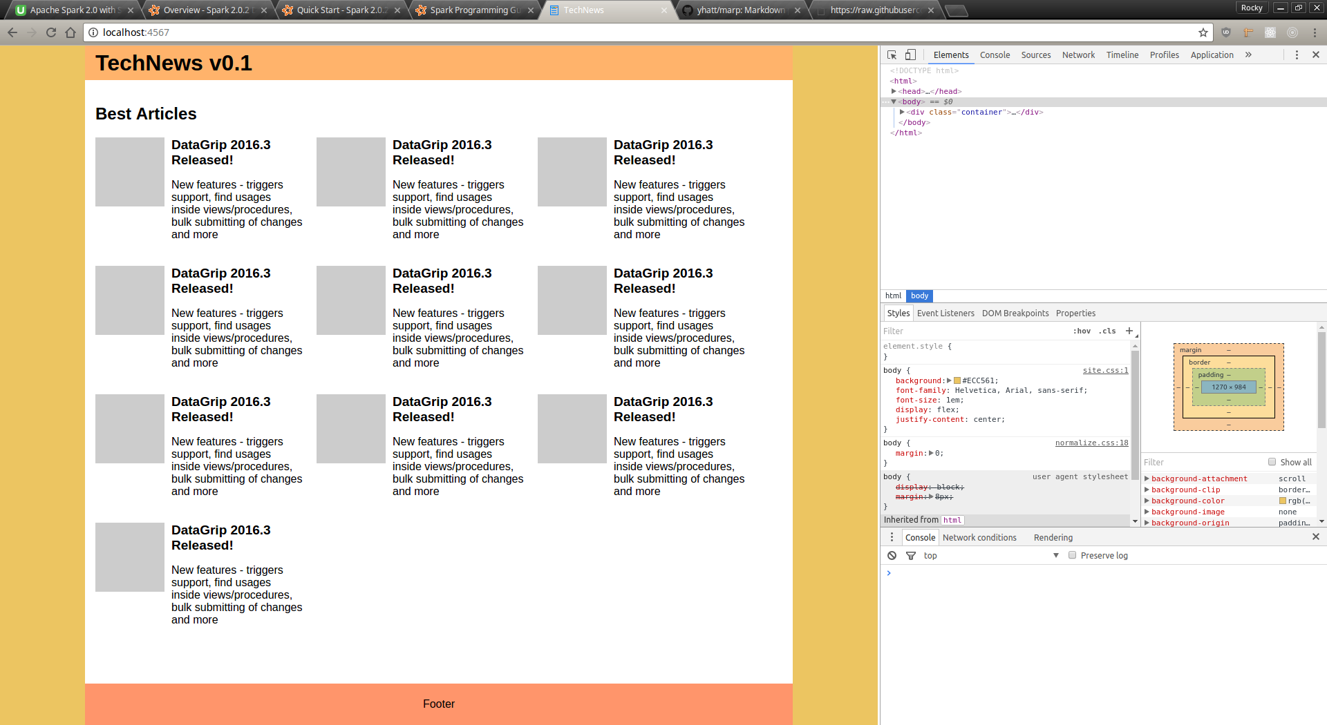
v0.6 - Fix content
.articlesWrapper {
   display: flex;
+  flex-direction: row;
+  flex-wrap: wrap;
}

.imgPlaceholder {
   height: 100px;
   width: 100px;
+  flex-shrink: 0;
   background-color: #CCC;
}

+article {
+  width: 300px;
+  display: flex;
+  margin: 0 20px 20px 0;
+}
+
+.articleContent {
+  padding-left: 10px;
+}
+
+.articleContent h3 {
+  margin: 0;
+}
v0.6 - Result
v0.6 - Only 2 new props
-
flex-wrap
- Flex items can be wrapped to multiple lines
-
flex-shrink
- Shrink factor of flex items
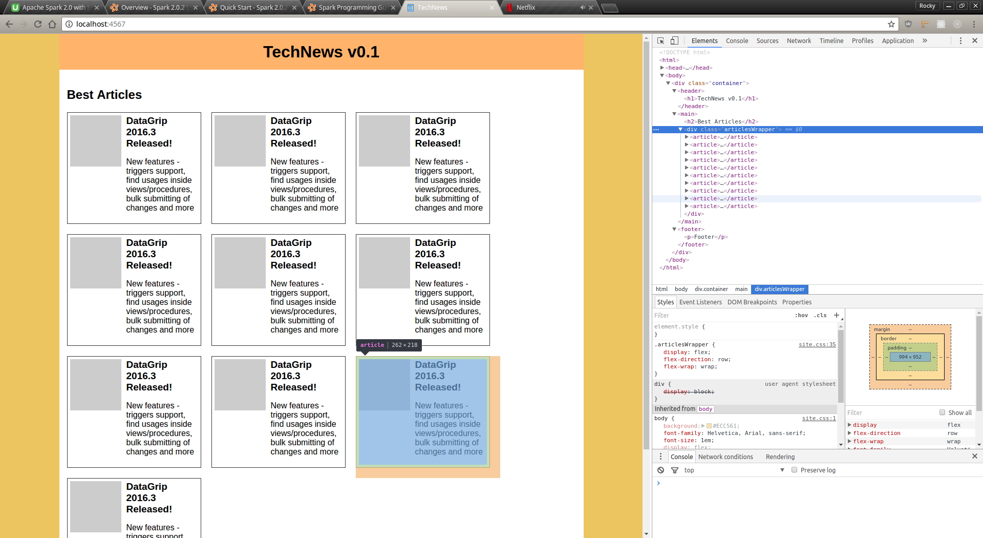
v0.7 - Centering
header {
  display: flex;
  flex-direction: column;
  justify-content: center;
+ align-items: center;
}
v0.7 - Result
Responsive
Summary
-
Total CSS lines written - 72!
-
Minified build - less than 100B!!
-
Responsive by nature
-
Only 6 new CSS properties -
-
flex-direction
-
justify-content
-
align-items
-
flex-basis
-
flex-grow
-
flex-wrap
-
flex-shrink
-
-
As promised - Minimum effort, maximum result!
Thanks!
Flexbox
By rockyj