


Sara Soueidan PRO
Lebanese Inclusive web UI engineer, author, speaker, and educator.
From The Front, Bologna, September 19, 2014
Scalable Vector Graphics (SVG) is an XML-based vector image format for two-dimensional graphics with support for interactivity and animation.
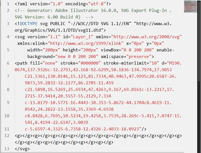
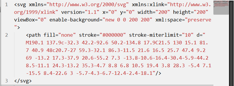
Creating SVGs: Vector Graphics Editors
Adobe Illustrator Inkscape Sketch
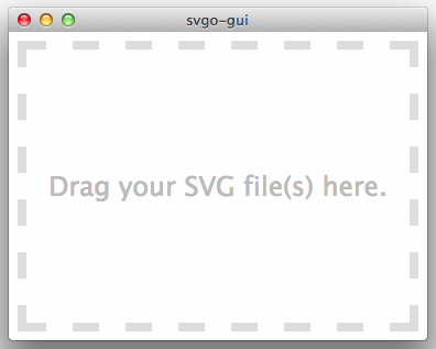
Optimizing SVGs: Standalone Tools (Peter Collingridge's SVG Editor)
Example
<svg xmlns="http://www.w3.org/2000/svg" version="1.1" width="300px" height="300px" viewBox="0 0 300 300">
<polygon
fill = "#FF931E"
stroke = "#ED1C24"
stroke-width = "5"
points = "279.1,160.8 195.2,193.3 174.4,280.8 117.6,211.1 27.9,218.3 76.7,142.7 42.1,59.6 129.1,82.7 197.4,24.1 202.3,114 "/>
</svg>
star.svg
Shared with CSS |
SVG-Only |
|---|---|
|
|
clip-rule, flood-color, flood-opacity, stop-opacity, kerning, tech-anchor, color-profile, color-rendering, fill, fill-opacity, fill-rule, marker, marker-end, marker-mid, marker-start, stroke, stroke-width, stop-color, lighting-color, enable-background, dominant-baseline, color-interpolation-filters, color-interpolation, glyph-orientation-horizontal, glyph-orientation-vertical, shape-rendering, baseline-shift, alignment-baseline, stroke-miterlimit, stroke-linejoin, stroke-linecap, stroke-dashoffset, stroke-dasharray, stroke-opacity |
In SVG2, more presentation attributes will be added.
<svg xmlns="http://www.w3.org/2000/svg" version="1.1" style="width: 300px; height: 300px;" viewBox="0 0 300 300">
<polygon
style="fill: #FF931E; stroke: #ED1C24; stroke-width: 5;"
points = "279.1,160.8 195.2,193.3 174.4,280.8 117.6,211.1 27.9,218.3 76.7,142.7 42.1,59.6 129.1,82.7 197.4,24.1 202.3,114 "/>
</svg>
star.svg
<svg xmlns="http://www.w3.org/2000/svg" version="1.1" width="300px" height="300px" viewBox="0 0 300 300">
<style type="text/css">
polygon { fill: ... ;}
</style>
<polygon points = "279.1,160.8 195.2,193.3 174.4,280.8 117.6,211.1 27.9,218.3 76.7,142.7 42.1,59.6 129.1,82.7 197.4,24.1 202.3,114 "/>
</svg>
star.svg
<!DOCTYPE html> <html><head>...</head>
<body>
<style type="text/css">
svg { width: ...; }
polygon { fill: ... ; }
</style>
<svg version="1.1" viewBox="0 0 300 300">
<!--SVG content-->
</svg>
</body>
</html>
star.svg
<?xml version="1.0" standalone="no"?>

<?xml-stylesheet type="text/css" href="styles.css"?>

<svg xmlns="http://www.w3.org/2000/svg" version="1.1" width="300px" height="300px" viewBox="0 0 300 300">

    <!-- SVG Content -->

</svg>
star.svg
<style>
circle {fill: orange;}
</style>
<svg version="1.1" viewBox="0 0 400 400">
<g fill="yellow">
<circle cx="100" cy="100" r="100" fill="blue" style="fill: deepPink;" />
<!-- ... -->
</g>
</svg>
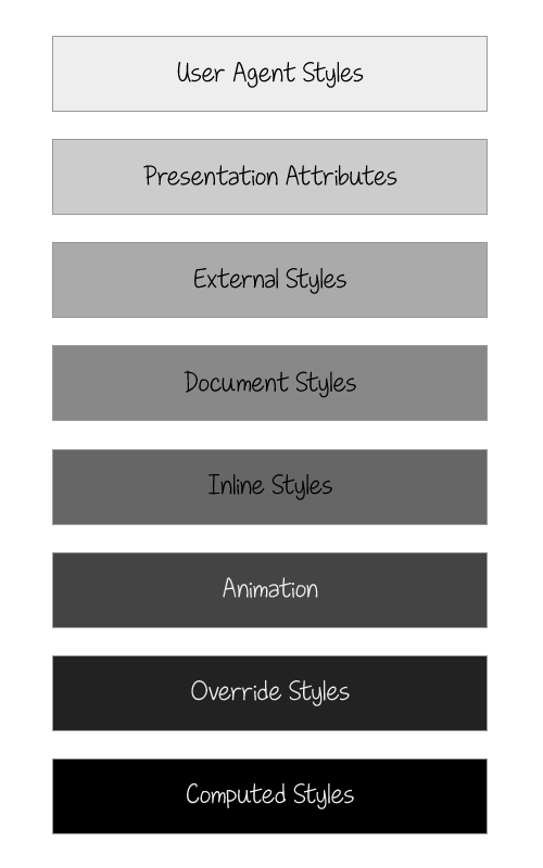
Styles lower in the diagram override those above them
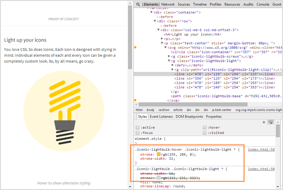
Example: CSS Transitions Demo: Iconic
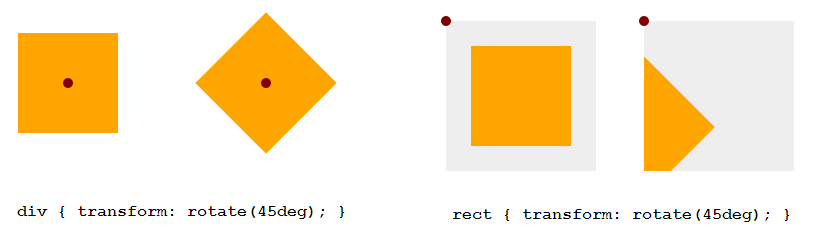
transform-origin (default value)
HTML Elements (div, ::before, etc.)
SVG Elements (circle, rect, etc.)
50% 50%
(the center of the element itself, calculated relative to its box model)
0 0
(top left corner of the SVG canvas, not of the element itself)
Example: 45deg Rotation
<!DOCTYPE html>
<div style="width: 100px; height: 100px; background-color: orange"> </div>
<svg style="width: 150px; height: 150px; background-color: #eee">
<rect width="100" height="100" x="25" y="25" fill="orange" />
</svg>
Example
<!DOCTYPE html><style>
div, rect { transform-origin: 50% 50%; }
</style>
Setting transform-origin in percentages does not work as expected. Use absolute values instead.
Example Animations Demo
.wheel {

        -webkit-transform-origin: 50% 50%;

        transform-origin: 193px 164px;

        animation:  spin 4s cubic-bezier(.49,.05,.32,1.04) infinite alternate;

}

@keyframes spin {

   50% {

      transform: rotate(360deg);

   }

}
Bugs!
CSS Transitions & Animations can be used to animate any of the properties shared with CSS, but not the others.
Example: Morphing Paths
Example: Morphing Paths
Example: Motion Along a Path
Motion Along a Path in CSS
Embedding Technique
CSS Animations
<img src="mySVG.svg" alt=".." />
CSS Interactions
Yes, only if inside <svg>
No
.el {background: url(mySVG.svg);}
No
Yes, only if inside <svg>
<object type="image/svg+xml" data="mySVG.svg"><!--fallback--></object>
Yes, only if inside <svg>
Yes, only if inside <svg>
<embed type="image/svg+xml" src="mySVG.svg" />
Yes, only if inside <svg>
Yes, only if inside <svg>
<iframe src="mySVG.svg"><!--fallback--></iframe>
Yes, only if inside <svg>
Yes, only if inside <svg>
<svg><!--SVG content--></svg>
Yes
Yes
Remove 'width' and 'height' attributes from the root <svg>.
<svg version="1.1" xmlns="http://www.w3.org/2000/svg"
viewBox=".."width=".." height=".."> <!-- SVG content --> </svg>
logo.svg
Add 'viewBox' attribute if not already present.
<svg version="1.1" xmlns="http://www.w3.org/2000/svg"         viewBox="..">

    <!-- SVG content -->

</svg>
logo.svg
Set 'preserveAspectratio' to 'xMidYMid meet'.
logo.svg
Note that preserveAspectRatio has no effect if no viewBox is set.
<svg version="1.1" xmlns="http://www.w3.org/2000/svg"       viewBox=".." preserveAspectRatio="xMidYMid meet">

    <!-- SVG content -->

</svg>
..and apply fixes where/when needed..
background: url(logo.svg);
No fixes or hacks needed.
<img src="logo.svg" alt=".." />
img {
    width: 100%;
}
Required for Internet Explorer.
<object type="image/svg+xml" data="logo.svg"></object>
object {
    width: 100%;
}
Required for Internet Explorer.
<embed type="image/svg+xml" src="logo.svg" />
embed {
    width: 100%;
}
Required for Internet Explorer.
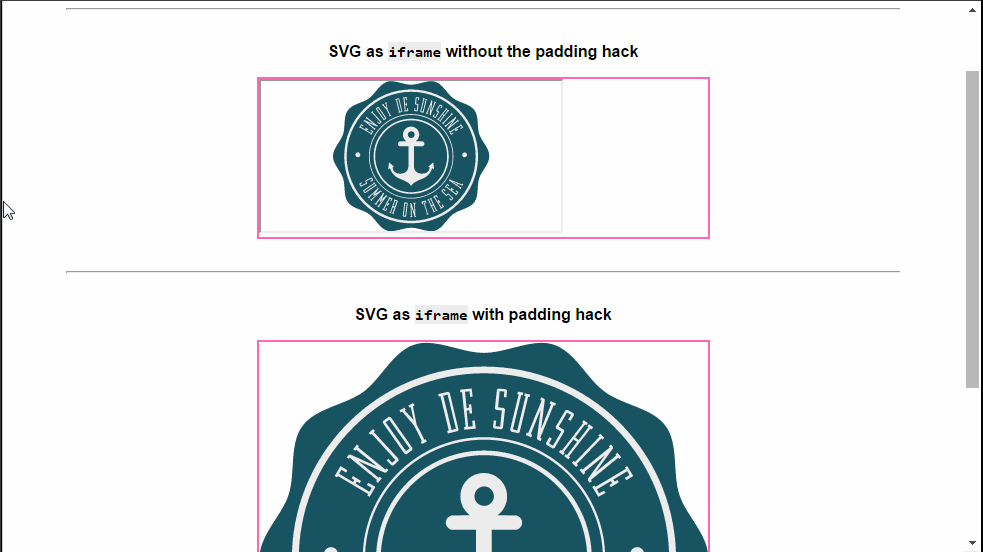
<iframe src="logo.svg"></iframe>
Required for all browsers.
SVG embedded as <iframe> with and without Padding Hack
<!doctype html>
<html>
    <head><!-- ... -->
        <link rel="stylesheet" href="styles.css" />
    </head>
    <body>
        <div class="container">
            <iframe src="logo.svg" alt="Company Logo"><!-- fallback --> </iframe>
        </div>
        </!-- ... -->
    </body>
</html>
page.html
styles.css
.container {
height: 0;
width: width-value;
padding-top: (svg 'height' / svg 'width') * width-value;
position: relative;
}
iframe {
position: absolute;
top: 0;
left: 0;
width: 100%;
height: 100%;
}
1
2
3
4
5
6
<!DOCTYPE html>
<svg version="1.1" viewBox=".."></svg>
Required for Internet Explorer.
(with Media Queries)
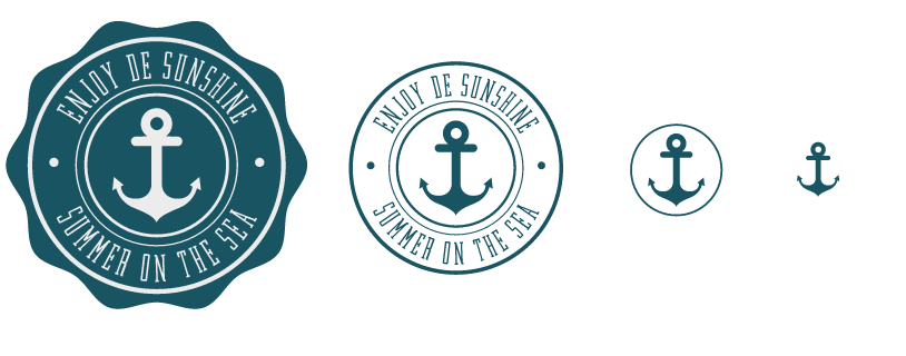
Example: Adaptive Logo
Example: Adaptive Logo
<svg xmlns="http://www.w3.org/2000/svg" version="1.1" viewBox="...">
<style>
svg * { transition: fill .1s ease-out, opacity .1s easeout; }
@media all and (max-width: 250px) {
#curved_bg { opacity: 0; }
#secondary_content, #primary_content { fill: #195463; }
}
@media all and (max-width: 200px) { /* ... */ }
@media all and (max-width: 150px) { /* ... */ }
</style>
<path id="#curved_bg" d="..." /><!-- ....... -->
</svg>
logo.svg
Example: Adaptive Logo
<div class="container">

        <img id="logo" src="logo.svg" alt="Company Logo." />

</div>
.container {
width: 25%; /* or whatever */
/* ... */
}
#logo {
width: 100%; /* IE fix */
}
styles.css
The sizes specified in the media queries refer to the size of the SVG viewport, not to the size of the page viewport.
And the SVG viewport depends on the embedding technique you use—it can be either the size of the root <svg> (for an SVG embedded inline), or the size of the element referencing the SVG.
#MustRead
#MustRead
By Sara Soueidan
From The Front, September 2014, Bologna.


