SVG SPRITES FOR ANIMATION
CSS Summit, Environments for Humans 2015
Sarah Drasner, Senior UX Engineer at Trulia
@sarah_edo : twitter || @sdras : codepen
SVG!
- Crisp on any display
- Less HTTP requests to handle
- Easily scalable for responsive
- Small filesize if you design for performance
- Easy to animate
- Easy to make accessible
- Fun!
This pen.
Before we get started:
Animation Performance!
- JankFree.org
- Perf Audit, Reddit Mobile by Paul Irish
- People expect mobile to be faster than web
- CSS-Tricks Article: Weighing SVG Animation Techniques with Benchmarks
- Above all else: test things yourself!

SVG Sprites
Start with this technique from Joe Harrison

Technique #1:
Splash with Step()
Step Animation
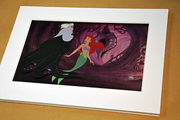
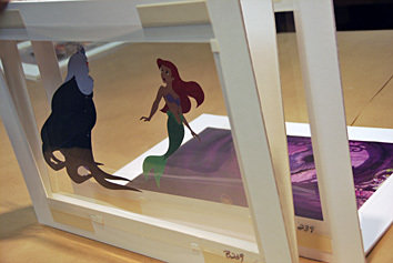
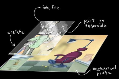
Of all web-based animation techniques, step animation most closely resembles old hand-drawn cel animation.
Let's use this to our advantage.


3 of 21 frames.
Shooting on twos.
This pen.
Large Sprite and animate the background position.
Keep it simple.
@keyframes splashit {
        100% { background-position: 0 -3046px; }
}

.splash {
  background: url(‘splash-sprite2.svg’);
  animation: splashit 1.8s steps(21) infinite;
}

/* fallback */
.no-svg .splash {
  background: url(‘splash-sprite2.png’);
}
Fallbacks
2 ways to make this.
Illustrator, with a template:
- Object → Path → Split Into Grid
- View → Guides → Make Guides
- Draw and then copy paste and align, change drawing slightly
- Can also easily export png fallback
Works with Sketch, too.
2 ways to make this.
In an SVG editor with Grunticon
- Draw drawing in SVG editor, save off one by one
- Can also draw on paper and scan
- Use grunticon
- It makes the fallback for you

After export, before implementation:
Optimize!
Technique #2:
Rolling Sprite Background
without Step()
Take the steps() out
The background rolls through...
Let's use this to our advantage.


/*--extend--*/
.area {
  width: 600px;
  height: 348px;
}

.fore, .mid, .bk, .container { @extend .area; }
Extend to keep it DRY
.fore {
  background: url(‘fore.svg’);
  animation: bk 7s -5s linear infinite;
}

.mid {
  background: url(‘mid.svg’);
  animation: bk 15s -5s linear infinite;
}

.bk {
  background: url(‘bkwalk2.svg’);
  animation: bk 20s -5s linear infinite;
}

@keyframes bk {
  100% { background-position: 200% 0; }
}
Z-index for parallax, consistent bk position,
different length of animation in seconds.
Technique #3:
Modern Day Book of Kels
Illustration with SVG Sprite
Make it a responsive svg animation sprite


This pen.
That whole SVG and animation was
8KB Gzipped.
Compare to using text with photos to illustrate an article.
CSS Animation
[class^="star"] {
  animation: blink 2s ease-in-out infinite both;
}

[class^="dot"] {
  animation: blink 5s -3s ease-in-out infinite both;
}

@keyframes blink {
  50% { opacity: 0; }
}
No width and height for the SVG itself, instead define it in css
.initial {
  width: 50%;
  float: left;
  margin: 0 7% 0 0;
}
We're using percentage here, but we could also use flexbox.
viewBox="0 0 490 474" preserveAspectRatio="xMidYMid meet"Define smaller viewbox, put in preserveAspectRatio (though this is also the default)
Animation MEDIA QUERIES
+ Adjust initial object, affects animation
[class^="mountain"], [class^="grass"] {
  transform: skew(2deg);
}

@media screen and ( max-width: 500px ) {
  [class^="mountain"], [class^="grass"] {
    transform: skew(1.5deg);
  }
}
!important part
Animation MEDIA QUERIES
You can do this, you know this already, it applies to all animation, even javascript
!important part
Viewbox shift with JavaScript
var shape = document.getElementById("svg");

// media query event handler
if (matchMedia) {
        var mq = window.matchMedia("(min-width: 500px)");
        mq.addListener(WidthChange);
        WidthChange(mq);
}
// media query change
function WidthChange(mq) {
        if (mq.matches) {
            shape.setAttribute("viewBox", "0 0 490 474");
        }
        else {
            shape.setAttribute("viewBox", "0 490 500 500");
        }
};
Acts like a window to show and hide the requisite parts of the sprite
Technique #4:
One Scalable SVG with
Hidden Information
Sometimes for complex animations, we need to use JavaScript. GSAP, to be exact.
here's why...
(I don't work for them and they don't pay me.)
Solves cross-browser inconsistencies


Bad transform origin bug on rotation.
More in this CSS-Tricks article.
Chrome
IE
Firefox
Safari (zoomed)
Timeline
- stack tweens
- set them a little before and after one another
- change their placement in time
- group them into scenes
- add relative labels
- animate the scenes!
- make the whole thing faster, move the placement of the whole scene, nesting
All without recalculation!

The issue with longer CSS animations:
This pen.
Other cool things
for complex animation
- Motion along a path (widest support)
- Draggable
- CSS Properties
- Draw SVG- make an SVG look like it draws itself.
Percentage based transforms on SVG!
get excited.
This pen courtesy of GreenSock.
So we can do stuff like this, All fully responsive in every direction
Animation As Information
- Animation must be designed
- Helps with context-shifting
- Invisible animation- check out Val Head's awesome "All the Right Moves"
- Comply with branding
- Animation for a company means having a motion design language, like Google Material Design
- Consistent on mobile, or a fallback to a light version
This pen.
This pen.
Motion on the web:
Fun! But also, USEFUL!
Technique #5:
Responsive Design for an
Animated Infographic
Pretty close to Technique #3,
Kels Illustration
Revisiting old approaches
Responsive Animated Infographic

Three sources with detailed analysis showing lead improvements
Conversion
(one source example, The Whole Brain Group)
- increased traffic to their website by over 400%
- lead increase by almost 4500%
- the number of new visitors to their site to almost 78%
Problems
- Not responsive- tipping point: Tim Kadlec
- Not updated to current context
- ^ Especially design
All posts older than 2 years.
What Happened?
This pen.
Responsive:
Change the viewbox in JavaScript like we did before:

Responsive:
Media queries for layout, and fallback with Modernizr:
/* media query example element, mobile first */
@media (max-width: 825px) {
  .container {
    width: 100%;
  }
}
@media (min-width: 826px) {
  .container {
    width: 825px;
  }
}

/* fallback */
.inlinesvg .fallback {
  display: none;
}

.no-inlinesvg .fallback {
  width: 500px;
  height: 500px;
  display: block;
}
Accessibility
Title and associative aria tags: (WIP)
<svg aria-labelledby="title" id="svg" xmlns="http://www.w3.org/2000/svg" viewBox="0 0 765 587">
<title id="title" lang="en">Circle of icons that illustrate Global Warming Solutions</title>
You can also add a title for elements in the SVG DOM
This resource, with support charts.
Also, this article by Dudley Storey.
Social Coding sites help you learn
Fun. Remember fun?
(I don't work for them and they don't pay me)
- Codepen
- JS Fiddle
- Dabblet
People you should know about
- Val Head
- Sara Soueidan
- Rachel Nabors
- Tiffany Rayside
- Chris Gannon
- CJ Gammon
- LegoMushroom
- Ana Tudor
- David Walsh Blog
- CSS-Tricks
- Amelia Bellamy-Royds
- Taylor Hunt
- Dudley Storey
- CSS Animation Rocks
- GreenSock
- Dennis Gaebel
- I Hate Tomatoes (Petr Tichy)
- Lucas Bebber
- Joni Trythall
- Jake Albaugh
More!
Thank you!
These Slides:
slides.com/sdrasner/css-summit
SVG Sprites for Animation
By sdrasner
SVG Sprites for Animation
- 15,539


