data visualization for react developers
Shirley Wu
Workshop goal
Use D3 to calculate data
React to render visualizations
why?
D3's learning curve:
enter-update-exit
==
React's virtual DOM
(let React do the hard work!)
My Fem workshops
Data Visualization
for React Developers
↓
Intro to D3
↓
Building Custom
Data Visualizations
Basic chart types
and when to use them
↓
The making of
a chart with SVG
↓
Going from data
to SVG shapes
↓
Using React to
render SVG and Canvas
↓
Exceptions and
finishing touches
data types
- Categorical (genres)
- Ordinal (t-shirt sizes)
- Quantitative (temperatures)
- Temporal (dates)
- Spatial (cities)
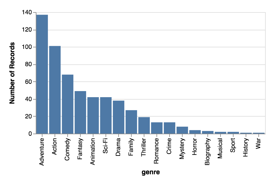
Bar chart
For categorical comparisons
Domain: categorical
Range: quantitative
basic charts
and when to use them
basic charts
and when to use them
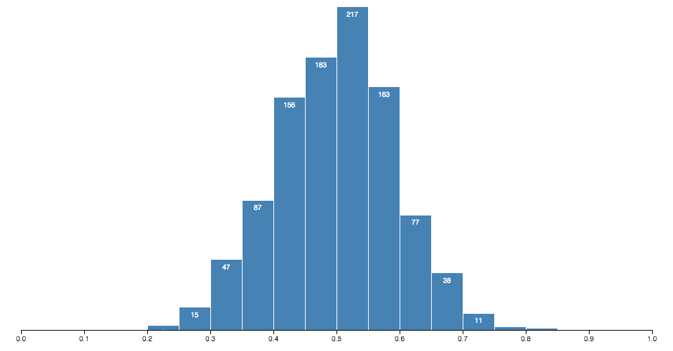
Histogram
For categorical distributions
Domain: quantitative bins
Range: frequency of quantitative bin
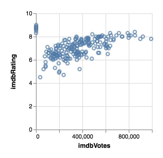
Scatterplot
For correlation
2 attributes and the relationship between their quantitative values
basic charts
and when to use them
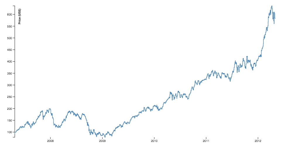
Line chart
For temporal trends
Domain: temporal
Range: quantitative
basic charts
and when to use them
Tree
For hierarchy
Parent-child relations
Multiple tiers of category
basic charts
and when to use them
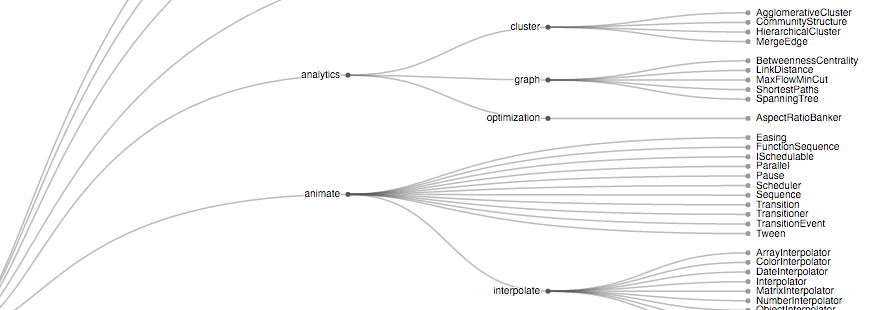
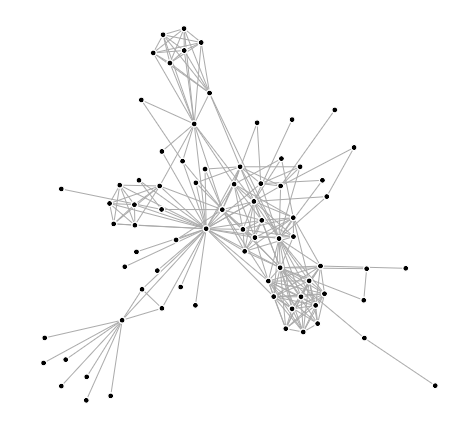
Node-link diagram
For connection
Relationship between entities
basic charts
and when to use them
Chloropleth
For spatial trends
Domain: spatial regions
Range: quantitative
basic charts
and when to use them
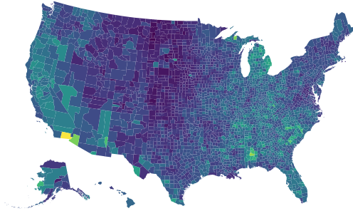
Best for:
- Regional patterns
- Only one variable
- Relative data (normalize for population)
Not good for:
- Subtle differences in data
(Source: Datawrapper)
Pie chart
For hierarchical part-to-whole
Best for:
- When values are around 25%, 30%, or 75%
- 3 or 4 values
Not good for:
- Comparing fine differences
- Multiple totals
basic charts
and when to use them
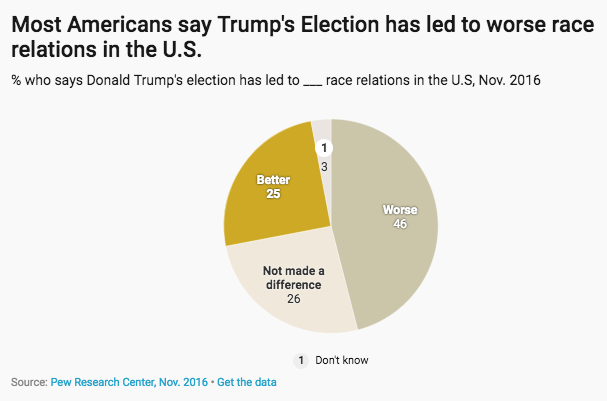
(Source: Datawrapper)
What we'll be
building today
SVG Elements
rect
x: x-coordinate of top-left
y: y-coordinate of top-left
width
height
circle
cx: x-coordinate of center
cy: y-coordinate of center
r: radius
text
x: x-coordinate
y: y-coordinate
dx: x-coordinate offset
dy: y-coordinate offset
text-anchor: horizontal text alignment
Hi!
path
d: path to follow
Moveto, Lineto, Curveto, Arcto
SVG coordinate system
0,0
x
y
25,50
125,100
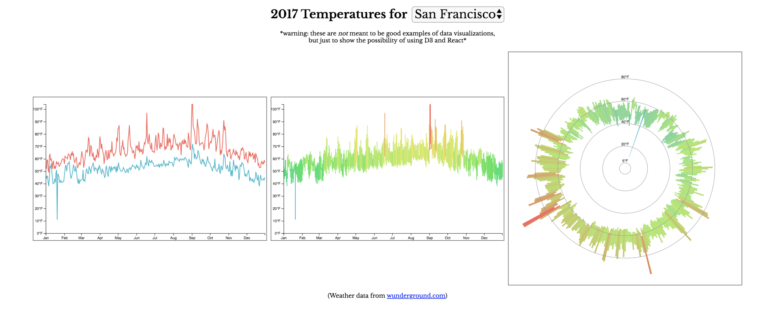
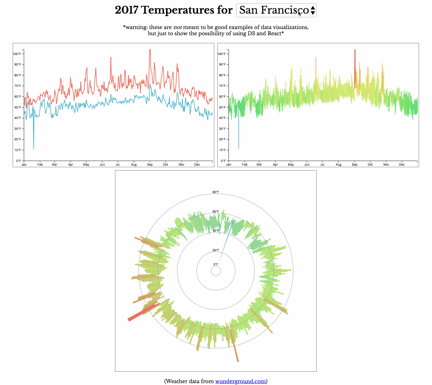
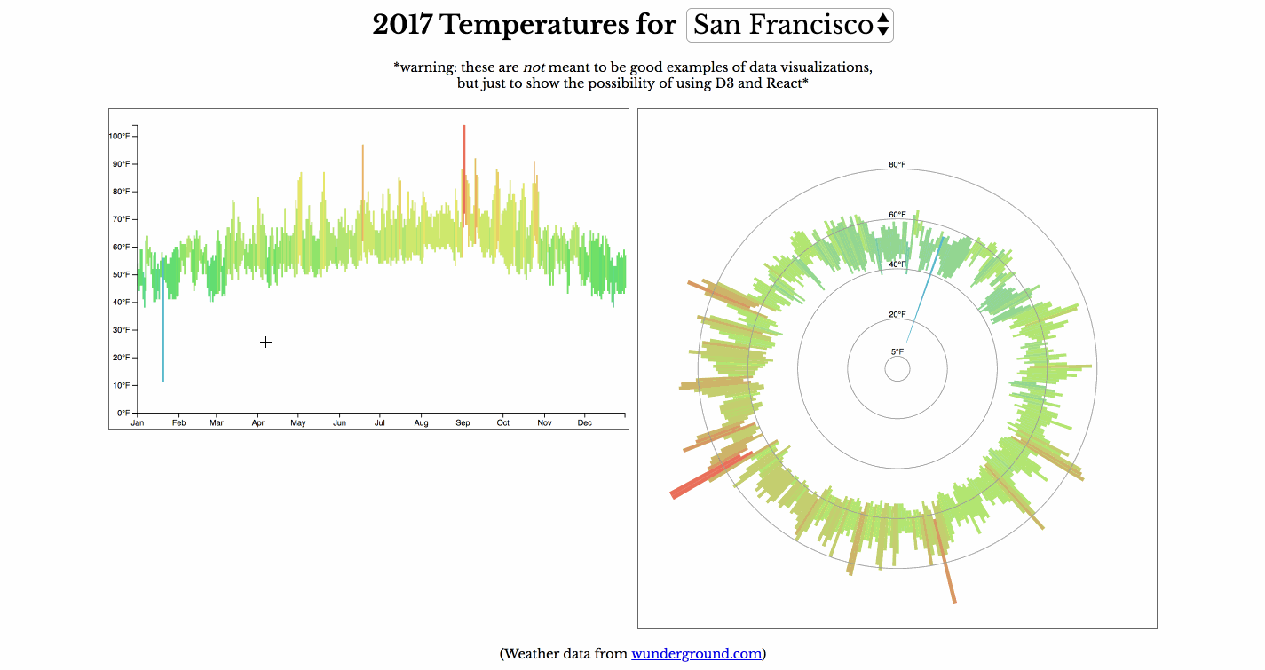
making of a
bar chart
365 <rect />'s
- x: date
- y: high temp
- height: low - high temp
- fill: average temp
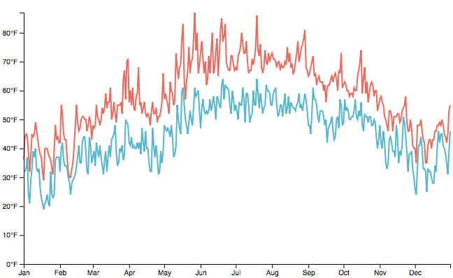
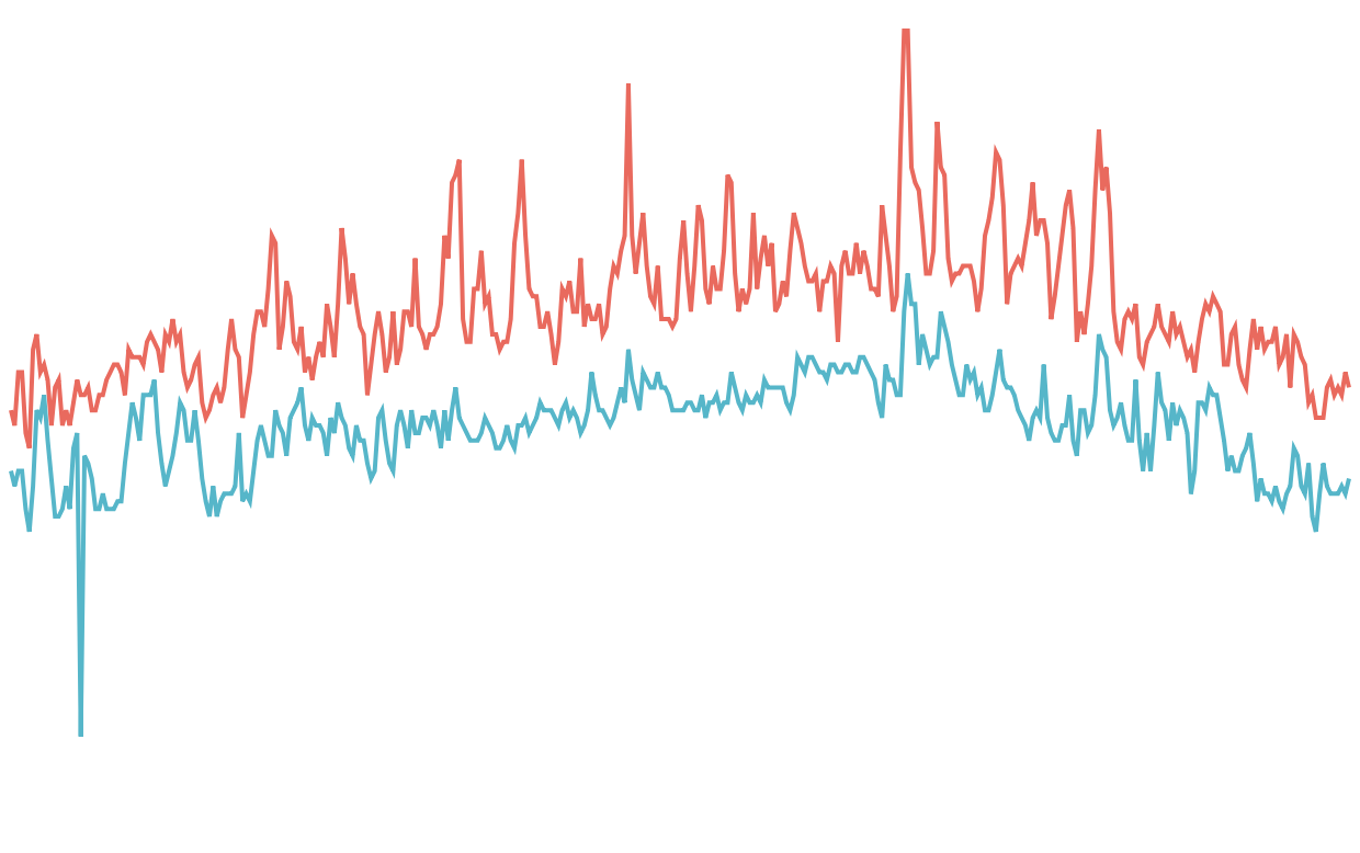
making of a
line chart
2 <path />'s
- d: line commands that connect points
- for each point
x: date
y: temperature - fill: red for high temp
blue for low temp
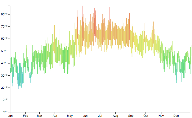
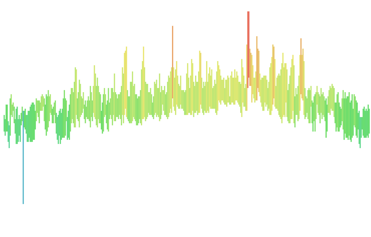
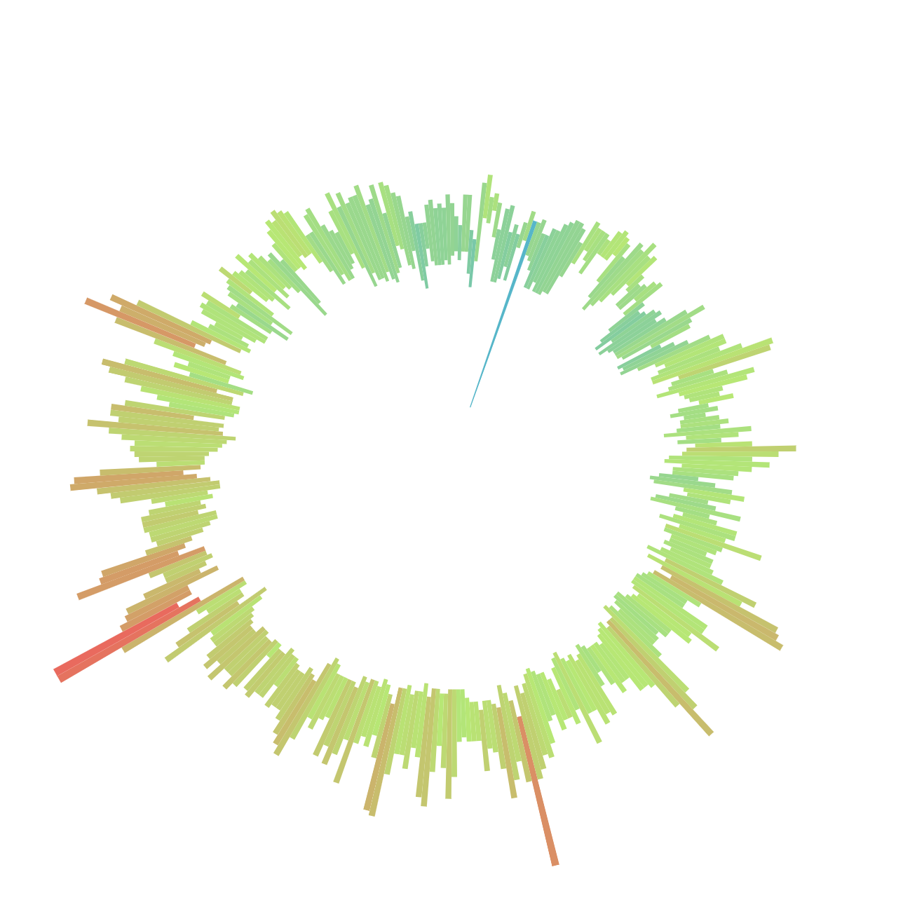
making of a
radial chart
365 <path />'s
- d: line + curve commands to make slices
- for each slice
angle: day
inner radius: low temp
outer radius: high temp - fill: average temp
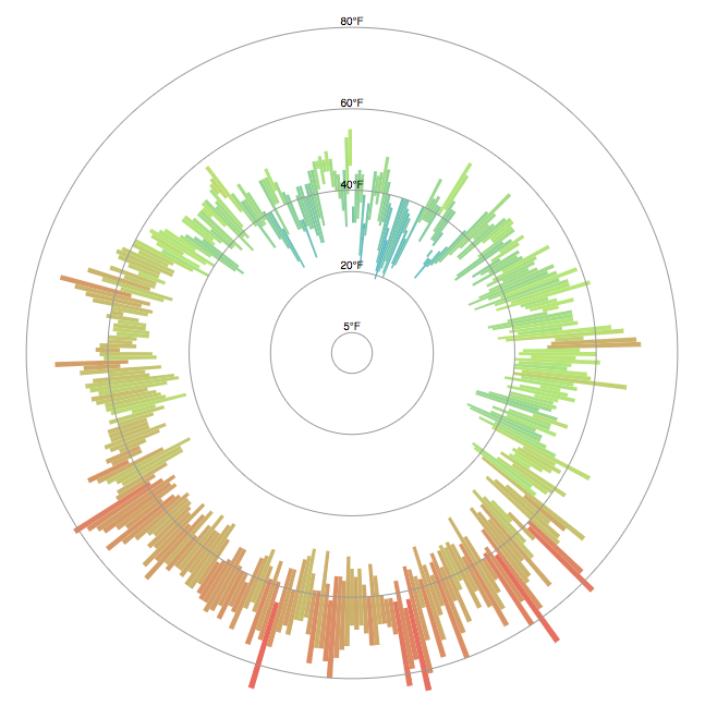
making of a chart

Play with the SVG elements!
(Observable notebook)
going from data
to svg shapes

One of the (many) things
D3 is good for!
rect
x: x-coordinate of top-left
y: y-coordinate of top-left
width
height
data to Svg:
bar chart
data to svg:
Scales
  d3.scaleLinear()
    .domain([min, max]) // input
    .range([min, max]); // output
scale: mapping from
data attributes (domain)
to display (range)
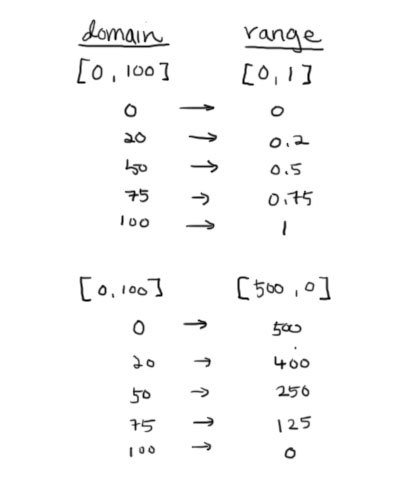
date → x-value
value → y-value
value → opacity
etc.
// get min/max
var width = 800;
var height = 600;
var data = [
    {date: new Date('01-01-2015'), temp: 0},
    {date: new Date('01-01-2017'), temp: 3}
];

var min = d3.min(data, d => d.date);
var max = d3.max(data, d => d.date);

// or use extent, which gives back [min, max]
var extent = d3.extent(data, d => d.temp);

var xScale = d3.scaleTime()
  .domain([min, max])
  .range([0, width]);
var yScale = d3.scaleLinear()
  .domain(extent)
  .range([height, 0]);
data to svg:
Scales
data to svg:
Scales i use often
| Quantitative | Continuous domain Continuous range |
scaleLinear scaleLog scaleTime |
| Continuous domain Discrete range |
scaleQuantize | |
| Categorical | Discrete domain Discrete range |
scaleOrdinal |
| Discrete domain Continuous range |
scaleBand |
data to svg:
exercise

data to Svg:
line chart
path
d: path to follow
Moveto, Lineto, Curveto, Arcto
var data = [
  {date: '2007-3-24', value: 93.24},
  {date: '2007-3-24', value: 95.35},
  {date: '2007-3-24', value: 98.84},
  {date: '2007-3-24', value: 99.92},
  {date: '2007-3-24', value: 99.80},
  {date: '2007-3-24', value: 99.47},
  …
];

var line = d3.line()
  .x((d) => { return xScale(new Date(d.date)); })
  .y((d) => { return yScale(d.value); });

line(data)
Input: array of objects
Output: string that can be used in path's d attribute
M5,19.0625L13,21.875L21,12.03125
L29,12.03125L37,23.28125L45,26.09375
L53,7.8125L61,5L69,12.03125L77,10.625
L85,13.4375L93,21.875L101,14.84375
L109,13.4375L117,21.875L125,19.0625
L133,21.875L141,17.65625L149,13.4375L157,16.25
L165,16.25L173,14.84375L181,19.0625L189,19.0625
L197,16.25L205,16.25L213,13.4375
L221,12.03125L229,10.625L237,10.625L245,12.03125
data to Svg:
d3.line()
data to svg:
exercise
data to Svg:
radial chart
path
d: path to follow
Moveto, Lineto, Curveto, Arcto
  var pie = {
    "data":  1, "value":  1,
    "startAngle": 6.050474740247008,
    "endAngle": 6.166830023713296,
  };

  var arc = d3.arc()
    .innerRadius(0)
    .outerRadius(100)
    .startAngle(d => d.startAngle)
    .endAngle(d => d.endAngle);

  arc(pie);

  // M-23.061587074244123,-97.30448705798236A100,100,0,0,1,-11.609291412523175,-99.32383577419428L0,0Z
data to Svg:
d3.arc()
data to svg:
exercise
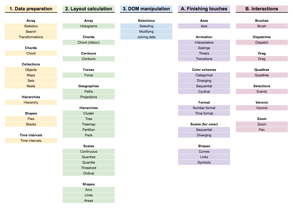
Let's break down the D3 API to just what we care about ✌️
I usually end up using native array functions or lodash for these
(it depends on what you feel comfortable with!)
But some functions are really helpful for getting data ready for D3's scale/shape/layout functions
I use this a lot for getting data into what SVG needs to draw
These are really great dataviz-specific interactions that I use frequently
What we'll use React for
REACT RENDERS:
architecture
Division of responsibilities:
-
Chart component
-
Gets passed in raw data as prop
-
Translates raw data to screen space
-
Renders the calculated data
-
Manages state for interactions that don’t require redrawing of the chart (hover, click)
-
-
Root component
-
Manages updates to raw data
-
Manages state for interactions that require redrawing of charts (filter, aggregate, sort, etc.)
-
REACT RENDERS:
architecture
Where to calculate data:
-
getDerivedStateFromProps
-
Pro: simple and straightforward
-
Con: asynchronous, race conditions if not careful
-
-
Render
-
Pro: very straightforward
-
Con: will recalculate on every lifecycle
-
-
componentDidMount & componentDidUpdate
-
Pro: no race condition
-
Con: less straightforward
-
REACT RENDERS:
architecture
Assumes:
- React manages state (no redux or similar)
- Multiple charts that all share some part of the data or state
Main takeaway:
- D3 calculations can go anywhere (that makes sense for your project) as long as React can access it in its render function
REACT RENDERS:
exercise
Draw a bar chart!
react renders:
exercise
Draw a radial chart!
react renders:
architecture
componentDidUpdate(nextProps, nextState) {
  // prevents infinite loop
  if (this.props.someId !== nextProps.someId) {
    this.calculateData();
  }
}

componentDidMount() {
  // Make sure component is rendered first
  if (this.SVG.current) {
    this.calculateData();
  }
}

calculateData() {
  ...
  this.setState({data})
}
(Adapted from code by Jhon Paredes)
Functions where D3 needs access to the DOM
D3 renders
- Instantiate D3 function in componentDidMount
- Create <g /> container in render
- Place D3 code in componentDidMount and/or componentDidUpdate
**Never ever let D3 and React manage same parts of the DOM!
OR BUGS!!
D3 renders:
axes
Axes are very important in making the data readable, and D3 makes it easy.
D3 renders:
axes
- Create axisLeft or axisBottom at beginning of React lifecycle and set corresponding scale
- Create an SVG group element in render
- Call axis on the group element in componentDidUpdate
  const yAxis = d3.axisLeft()
    .scale(yScale);

  <g ref='group' />

  d3.select(this.refs.group)
    .call(yAxis);
d3 renders:
exercise
Create axes for the bar chart!
d3 renders:
transitions
d3 renders:
transitions*
*It works, it's performant, but the code is ugly. I don't highly recommend it.
// in componentDidUpdate
d3.select(this.refs.bars)
  .selectAll('rect')
  .data(this.state.bars)
  .transition()
  .attr('y', d => d.y)
  .attr('height', d => d.height)
  .attr('fill', d => d.fill);

// in render
<g ref='bars'>
  {this.state.bars.map((d, i) =>
    (<rect key={i} x={d.x} width='2' />))}
</g>
In componentDidUpdate:
- Select elements to transition
- Bind data
- Call transition
- Set the attributes to transition
Make sure React doesn't manage the attributes D3 is transitioning!
d3 renders:
brush
d3 renders:
brush
// in componentDidMount
this.brush = d3.brush()
  .extent([[0, 0], [width ,height]])
  .on('end', () => ...);

d3.select(this.refs.brush)
  .call(this.brush);

// in render
<g ref='brush' />
In componentDidMount:
- Create brush instance
- Define brushable area (extent)
- Pass in a function to execute on every brush, or brush end
d3 renders:
exercise (together)
readability:
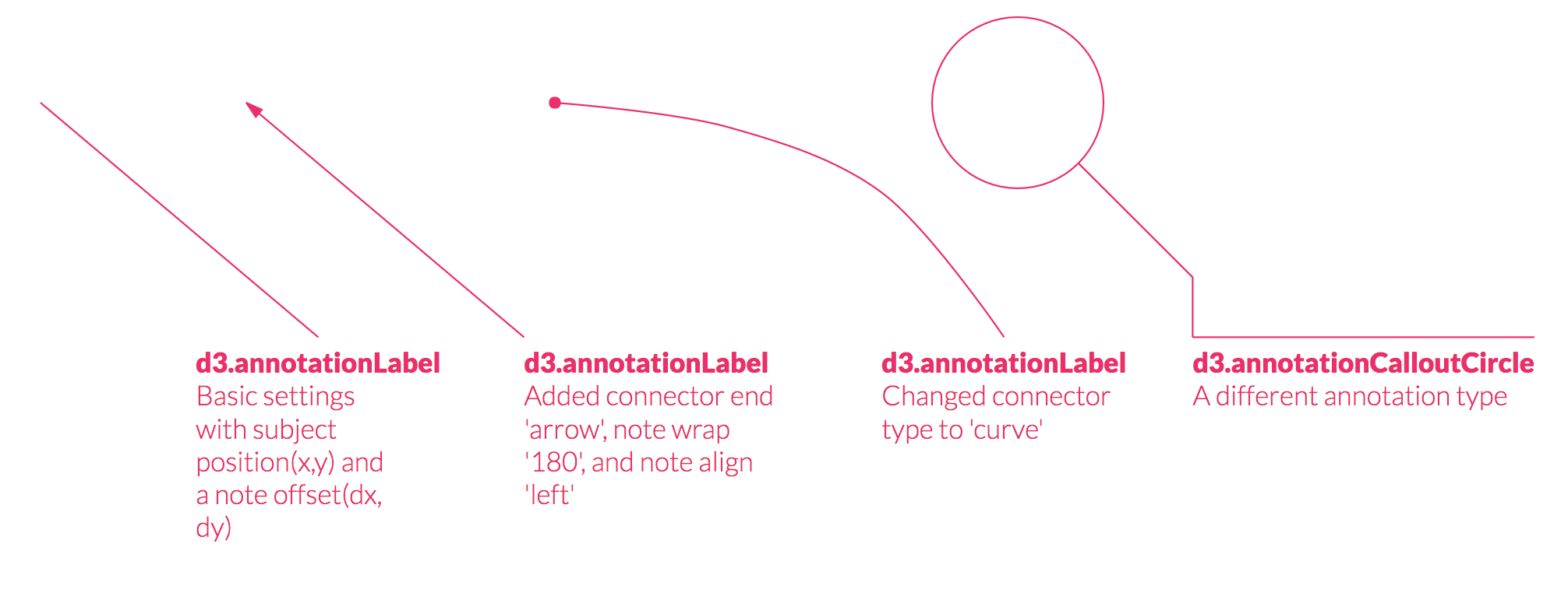
legends
readability:
annotations
large datasets:
canvas
// in render
<canvas ref=’canvas’
  style={{width: `${width}px`, height: `${ height}px`}}
  // retina screen friendly
  width={2 * width} height={2 * height} />

// in componentDidMount
ctx = this.refs.canvas.getContext('2d')
Performant because only one DOM element that we're "drawing" shapes on
large datasets:
canvas
ctx.fillRect(x, y, width, height)
// or ctx.strokeRect(x, y, width, height)
ctx.beginPath()
ctx.arc(x, y, radius, startAngle, endAngle, anticlockwise)
ctx.fill() // or ctx.stroke()
ctx.beginPath()
// moveTo, lineTo, bezierCurveTo
ctx.fill() // or ctx.stroke()
canvas:
exercise (together)
Render the bar chart with canvas!
canvas:
exercise (together)
Render the radial chart with canvas!

Thank you to
my beta-testers 💕
Carol
Juan
Jhon
Sam
Hector
Alexander

Front-end Masters: Data Visualization for React Developers
By Shirley Wu