Hello Flexbox.
The future of layout in CSS
olex@thinkful.com
@tholex
The Status Quo
Putting things side-by-side in CSS requires using one of three hacks.
float
+ clear
display: inline-block + html spaces
2.
1.
3.
position: absolute
+ padding?...
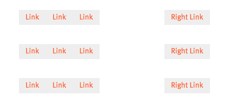
Example: Nav Links
<nav class="nav">
  <ul class="nav-list">
    <li><a href="">Link</a></li>
    <li><a href="">Link</a></li>
    <li><a href="">Link</a></li>
    <li><a href="">Right Link</a></li>
  </ul>
</nav>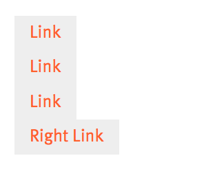
.nav {
  margin-top: 40px;
  margin-bottom: 40px;
  a {
    display: inline-block;
    text-decoration: none;
    color: #ff612f;
    padding: 8px 14px;
    background-color: #eee;
  }
}
style css
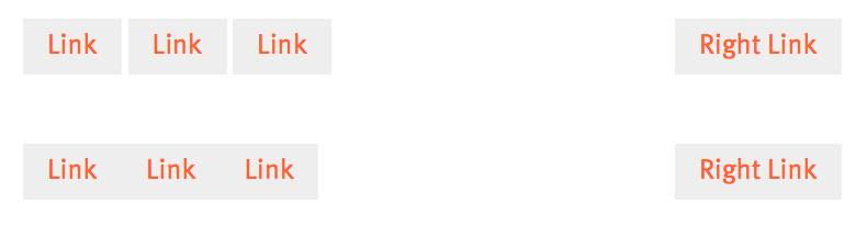
Using Floats (ugh!!!)
.nav.float li {
  float: left;
}
.nav.float li:last-child {
  float: right;
}

.clearfix {
  clear: both;
}
<nav class="nav float">
  <ul class="nav-list">
    <li><a href="">Link</a></li>
    <li><a href="">Link</a></li>
    <li><a href="">Link</a></li>
    <li><a href="">Right Link</a></li>
  </ul>

  <div class="clearfix"></div>
</nav>
You need an extra HTML element, correctly placed to "clear" the float.
Using i-block and absolute (sigh)
<nav class="nav iblock-abs">
  <ul class="nav-list">
    <li><a href="">Link</a></li>
    <li><a href="">Link</a></li>
    <li><a href="">Link</a></li>
    <li><a href="">Right Link</a></li>
  </ul>
</nav>
You need to remove the text spacing between inline-block elements (font-size: 0; on parent)
.nav.iblock-abs ul {
  position: relative;
  font-size: 0;
}
.nav.iblock-abs li {
  display: inline-block;
  font-size: 1rem;
}
.nav.iblock-abs li:last-child {
  position: absolute;
  right: 0;
}
Forget it, Flex it!
<nav class="nav flex">
  <ul class="nav-list">
    <li><a href="">Link</a></li>
    <li><a href="">Link</a></li>
    <li><a href="">Link</a></li>
    <li><a href="">Right Link</a></li>
  </ul>
</nav>
.nav.flex ul {
display: flex;
}
.nav.flex li:last-child {
margin-left: auto;
}
display: flex; on the container
The Future
- Flexbox will be the de-facto way
of arranging containers
- Floats only used for the thing
newspaper people call "floats"
- Inline-block only used for small
side-by-side cases, e.g. buttons
- Absolute positioning only used
for one-off elements and
visual design / pseudo-el's
Flexbox is great for filling a container regardless of contents.
- Children with flex-grow property expand their internal size to fill container - you can mix static width, flex-grow, and %!
- Elements with margin-{dir}: auto can create space between elements to fill container if there are no flex-grow siblings.
- Container with justify-content determines how remaining space is filled otherwise. (similar to text-align but way more awesome!)
Axes / flex-direction
Everything about flexbox can be flipped 90º or 180º
row (default)
row-reverse
1
2
3
2
1
3
column
1
2
3
3
2
1
column-reverse
Spacing / justify-content
flex-start
flex-end
center
space-between
space-around
"Vertical" Spacing
align-items
flex-start
flex-end
stretch (default)
center
+ baseline (lowest snippet of text inside is aligned)Wrapping and Row Spacing
flex-wrap & align-content
nowrap (default)
wrap
+ wrap-reverse
stretch (default)
flex-start, flex-end,
center, space-between,  and space-around
Child Properties
Elements with flex-grow automatically gobble up their parents' space in proportion to their flex-grow value.
1
1
1
1
2.7
1
1
2.7
flex-shrink: 0, flex-basis can prevent shrinking
1
2.7
order can override HTML position
align-self can override align-items for one element
Flex is Complex, but keeps Simple Things Easy
"Centering in the Unkown", a classic CSS problem
.container {
  display: flex;
  align-items: center;
  justify-content: center;
}
Demo
Flexbox is a HUGE step for CSS
Finally, there is now a functional multitool for CSS Layout
If you need the details, flipping directions in media queries, reordering, anything, it's there!

We are 69.3% in the Future!
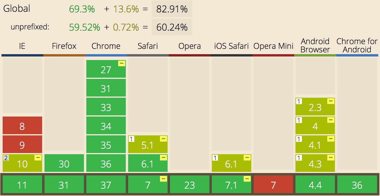
IE < 11, iOS < 7, and Android < 4.4 don't support the spec.
As Microsoft kills XP, flex might reach 90-95% by mid-2015
Thanks!
Nav links, "status quo" demo:
http://codepen.io/tholex/pen/GordK
Chris Coyer's "A Complete Guide to Flexbox" (inspired this):
http://css-tricks.com/snippets/css/a-guide-to-flexbox/
Can I Use Page / Browser Support:
http://caniuse.com/#search=flexbox
Note: CanIUse numbers (e.g. "82%") also mention an "Old" Flexbox spec which almost reached candidate status in 2009-2011. However, old flexbox works differently and is dead! Newer browsers don't support it.
Hello Flexbox
By Olex Ponomarenko
Hello Flexbox
The future of layout in CSS is here.


