Lesson 2
Designing Graphics to Enlighten

Version 1.12.0
Last updated: 28/08/2019
Lesson 2: Designing Graphics to Enlighten
What will you learn from this lesson?
- Human perception and information processing
- Rules for encoding values in graph
- JunkCharts
- Practical guides for using colour in charts
- Data-ink
- Principles of graphical design
Lesson 2: Designing Graphics to Enlighten
Human perception and information processing

Lesson 2: Designing Graphics to Enlighten
Human perception and information processing
Fact 1: We do not attend to everything we see

Lesson 2: Designing Graphics to Enlighten
Human perception and information processing
Fact 2: We see what we know and expect

Lesson 2: Designing Graphics to Enlighten
Human perception and information processing
Fact 3: We don't remember everything we see

Lesson 2: Designing Graphics to Enlighten
Human perception and information processing
Fact 3: We don't remember everything we see

Lesson 2: Designing Graphics to Enlighten
Human perception and information processing
How many 3's can you find?

Lesson 2: Designing Graphics to Enlighten
Human perception and information processing
How many 3's can you find?

Lesson 2: Designing Graphics to Enlighten
Human perception and information processing
Pre-attentive Processing
- A limited set of visual properties are processed preattentively (without need for focusing attention)
-
This is important for design of visualizations
-
What can be perceived immediately?
-
Which properties are good discriminators?
-
What can mislead viewers?
-
Lesson 2: Designing Graphics to Enlighten
Human perception and information processing
Preattentive Attributes

Lesson 2: Designing Graphics to Enlighten
Human perception and information processing
Preattentive Attributes: Popup effects

Lesson 2: Designing Graphics to Enlighten
Human perception and information processing
Visual conjunctive search

Lesson 2: Designing to Enlighten
The Devil is in the Data
Numbers worth Knowing
- Categorical data: numbers that summarise (i.e. sex, property type, planning region)
- nominal, ordinal, hierarchical
- Continuous data (i.e. unit price, age, monthly salary)
- interval, ratio
- time
Lesson 2: Designing Graphics to Enlighten
The Devil is in the Data
Data understanding
- GIGO = Garbage In, Garbage Out

Lesson 2: Designing to Enlighten
The Devil is in the Data
Graphical Integrity: Show me the truth
- Snapshot data can be misleading

Lesson 2: Designing Graphics to Enlighten
The Devil is in the Data
Graphical Integrity
- Do not miss out what had happened in between

Lesson 2: Designing Graphics to Enlighten
The Devil is in the Data
Graphical Integrity
- Sometime data need to be transformed

Lesson 2: Designing Graphics to Enlighten
Rules for Encoding Values in Graph
Components of a Graph

Lesson 2: Designing Graphics to Enlighten
Rules for Encoding Values in Graph
Bertin's Semiology of Graphics


Lesson 2: Designing Graphics to Enlighten
Rules for Encoding Values in Graph
Rule 1: Avoid using point alone to display time-series data

Lesson 2: Designing Graphics to Enlighten
Rules for Encoding Values in Graph
Rule 2: Avoid using points to represent discrete values

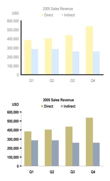
Lesson 2: Designing Graphics to Enlighten
Rules for Encoding Values in Graph
Rule 3: Bars don't work unless the quantative scale begins at zero

Lesson 2: Designing Graphics to Enlighten
Rules for Encoding Values in Graph
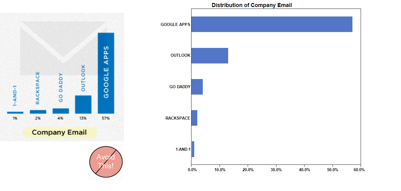
Rule 4: Avoid pie chart if possible because our eyes are not good in reading areas

Lesson 2: Designing Graphics to Enlighten
Rules for Encoding Values in Graph
Rule 4: Avoid pie chart if you want to compare over time

Lesson 2: Designing Graphics to Enlighten
Rules for Encoding Values in Graph
Rule 5: Maintain a balance ratio between the x- and y-axis

Lesson 2: Designing Graphics to Enlighten
ChartJunk
What is ChartJunk?
-
Chartjunk refers to all visual elements in charts and graphs that are not necessary to comprehend the information represented on the graph, or that distract the viewer from this information.
-
It was first introduced by Edward Tufte in his 1983 book The Visual Display of Quantitative Information.
-
There is an interesting blog called Junk Charts (http://junkcharts.typepad.com/junk_charts/) by Kaiser Fung, examines chartjunk
Lesson 2: Designing Graphics to Enlighten
ChartJunk
Avoid using unnecessary colour shading for the bar

Lesson 2: Designing Graphics to Enlighten
ChartJunk
Avoid colourful or wallpaper background

Lesson 2: Designing Graphics to Enlighten
ChartJunk
Avoid using 3D effects in graphics

Lesson 2: Designing Graphics to Enlighten
ChartJunk
Avoid using misleading graphical representation

Lesson 2: Designing Graphics to Enlighten
ChartJunk
Avoid using artistic design which is difficult to visualise

Lesson 2: Designing Graphics to Enlighten
Practical Guides for Using Colour in Charts
Rule1:
If you want different objects of the same colour in a graph to look the same, make sure that the background- the colour that surrounds them is consistent

Lesson 2: Designing Graphics to Enlighten
Practical Guides for Using Colour in Charts
Rule 2:
If you want objects in a graph to be easily seen, use a background colour that constract sufficiently with the object

Lesson 2: Designing Graphics to Enlighten
Practical Guides for Using Colour in Charts
Rule 3:
Use color only when needed to serve a particular communication goal

Lesson 2: Designing Graphics to Enlighten
Practical Guides for Using Colour in Charts
Rule 4:
Use different colours when they corresponding to differences of meaning in the data

Lesson 2: Designing Graphics to Enlighten
Practical Guides for Using Colour in Charts
Rule 5:
Use soft, natural colours to display most information and bright and/or dark colours to highlight information that requires greater attention

Lesson 2: Designing Graphics to Enlighten
Practical Guides for Using Colour in Charts
Rule 6:
When using colour to encode a sequential range of quantitative values, stick with a single hue (or a small set of closely related hues) and vary intensity from pale colours for low values to increasingly darker and brighter colours for high values

Lesson 2: Designing Graphics to Enlighten
Practical Guides for Using Colour in Charts
Rule 7:
Non-data components of a graphs should be displayed just visibly enough to perform their role, but not more so, for excessive salience could cause them to distract attention from the data

Lesson 2: Designing Graphics to Enlighten
Practical Guides for Using Colour in Charts
Rule 8:
To guarantee that most people who are colourblind can distinguish groups of data that are colour codeded, avoid using a combination of red and green in the same display

Lesson 2: Designing Graphics to Enlighten
Data-ink
What is Data-ink?
- The non-erasable ink used for the presentation of data. If data-ink would be removed from the image, the graphic would lose the content.
- Non-Data-Ink is accordingly the ink that does not transport the information but it is used for scales, labels and edges.
Lesson 2: Designing Graphics to Enlighten
Data-ink
-
Reduce the non data-ink
-
Removed unnecessary non data-ink
-
Deemphasise or regularise the remaining non data-ink
-
-
Enhance the data-ink
-
Remove unnecessary data-ink
-
Emphasise the remaining data-ink
-
Lesson 2: Designing Graphics to Enlighten
Data-ink
Tick marks are superfluous on categorical scale

Lesson 2: Designing Graphics to Enlighten
Data-ink
- Tick marks are superfluous on categorical scale

Lesson 2: Designing Graphics to Enlighten
Data-ink
- Tick marks are necessary on continuous scale

Lesson 2: Designing Graphics to Enlighten
Data-ink
- How many tick marks should you use?

Lesson 2: Designing Graphics to Enlighten
Data-ink
- When can you eliminate legends?

Lesson 2: Designing Graphics to Enlighten
Typography & Labels
-
Avoid using artistic fonts

Lesson 2: Designing Graphics to Enlighten
Typography & Labels
-
Orientation of label should be reader friendly
Lesson 2: Designing Graphics to Enlighten
Typography & Labels
-
When should you use other text?

Lesson 2: Designing Graphics to Enlighten
Principles of Graphic Design
-
Clarity vs Aesthetics

Lesson 2: Designing Graphics to Enlighten
Principles of Graphic Design
-
A Tale of Four Quadrants

Lesson 2: Designing Graphics to Enlighten
Principles of Graphic Design
-
Quadrant IV: Confusing yet Beautiful

Why is it beautiful?
- Well placed & aligned title & lead-in
- Attention to detail with font selection
- Inclusion of image
Why is it confusing?
- Y-axis starts at 10K (column height misleading)
- 3D effect makes it difficult to gage heights
- Title & lead-in aren't helpful
Lesson 2: Designing Graphics to Enlighten
Principles of Graphic Design
-
Quadrant III: Confusing and Ugly
Why is it ugly?
- Horrible font & color choice
- Grid lines are too dark & distracting
- Format of axes (vertical x-axis labels, number format of y-axis)
Why is it confusing?
- Y-axis starts at 10K (column height misleading)
- 3D effect makes it difficult to gage heights
- No lead-in or call-outs to provide context

Lesson 2: Designing Graphics to Enlighten
Principles of Graphic Design
-
Quadrant II: Clear but Ugly
Why is it ugly?
- Poor color (puke yellow?) and font (Comic Sans?) choices
- Slightly pixelated poor attention to image quality detail
- Chart details axis orientation, grid lines, outline
Why is it clear?
- The y-axis starts at 0 and the 2D columns are easy to gage
- For the first time, we see call-outs of relevant events on the timeline
- This time the lead-in paragraph is actually informative

Lesson 2: Designing Graphics to Enlighten
Principles of Graphic Design
-
Quadrant I: Clear and Beautiful
Why is it beautiful?
- Good font & color choices throughout
- Soft gridlines don't distract
- All elements well aligned and spaced
- High res images are useful chartjunk
Why is it clear?
- The y-axis starts at 0 and the 2D columns are easy to gage
- Call-outs with images aid cognition
- Improved title & lead-in verbiage provide further elucidation
- For the first time, a photo credit and data source are included

Lesson 2: Designing Graphics to Enlighten
Principles of Graphic Design
-
Analytical data visualization criticism

Lesson 2: Designing Graphics to Enlighten
Reference
Graphical Methods
- Few, Stephen (2012) (2nd edition) Show Me the Numbers: Designing Tables and Graphs to Enlighten, Analytics Press, Oakland, USA
- Robbins, Naomi B. (2005) Creating More Effective Graphs, John Wiley & Sons, New Jersey, USA
- Wong, Dona M. (2010) The Wall Street Journal Guide to Information Graphics, W. W. Norton & Company, Inc. New York.
- Tufte, Edward (2nd Edition) The Visual Display of Quantitative Information, Graphics Press LLC, Connecticut, USA
Lesson 2: Designing Graphics to Enlighten
Reference
Data Visualisation
- Kirk, A (2012) Data Visualization: A successful design process. PACKT Publishing, Birmingham.
- Few, S (2009) Now You See It. Analytics Press, Oakland, CA.
- Yau, Nathan (2013) Data Points: Visualization that means something, John Wiley & Sons, Inc.
Lesson 2: Designing Graphics to Enlighten
Reference
Information Graphics and Data Visualisation blogs
- Junk Charts (http://junkcharts.typepad.com/junk_charts/)
- Perceptual Edge (http://www.perceptualedge.com/blog/)
- Statistical Graphics and more (http://www.theusrus.de/blog/)
- EagerEyes (http://eagereyes.org/)
- The Functional Art (http://www.thefunctionalart.com/)
- Visualizing data (http://www.visualisingdata.com/)
- DataViz (http://www.improving-visualisation.org/)
- Visualizing Economics (http://visualizingeconomics.com/)
- The Global Sociology Blog (http://globalsociology.com/)
- The Cranky Sociologists (http://thecrankysociologists.com/)
IS428-Lesson02
By Kam Tin Seong


