Visualisation for Digital Humanities
Thomas Wielfaert
KU Leuven - Quantitative Lexicology and Variational Linguistics

Digital Humanities Spring Event
29 April 2015
Why?
Increasingly bigger data sets: 3 V's
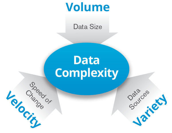
source: gtcorp.com
The fourth research paradigm (Jim Gray)
Rather than finding data to test a hypothesis, find a hypothesis that can be tested on the existing data.
- Empirical: describing natural phenomena
- Theoretical: laws i.e. Newton, Kepler, ...
- Computational: modelling, simulation
- Data exploration: data processing a.k.a. Big Data
Black box algorithms
Visual Analytics can reveal properties of algorithms that were not detected before.
source: visual-analytics.eu
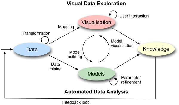
What is a good visualisation?
What is not?
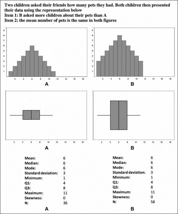
Caveats of visual perception
Hermann grid
Checker shadow illusion
Properties of good visualisations
- Visual perception theory: research field proper
- Even 'simple' standard visualisations such as boxplots and histograms can easily mislead. (see Lem et al. 2013)
Semiology of graphics (Bertin)
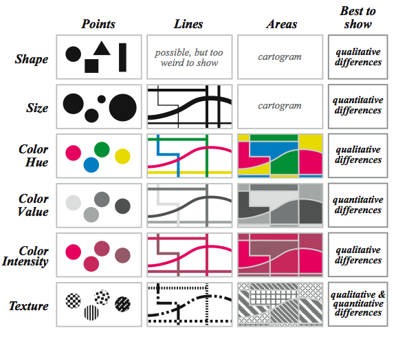
Reminder: types of variables
- Numerical (quantitative): 23.4; 0.2; 5e-1
- Categorical (nominal): man/woman/X
- Ordinal (ordered): low/medium/high
Ranking of perceptual tasks
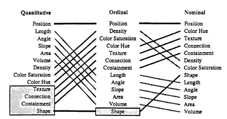
Mackinlay (1986)
colorbrewer2.org
Never ever pick colors yourself!
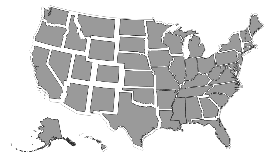
Different kinds of data
- Geo(spatial) data: maps
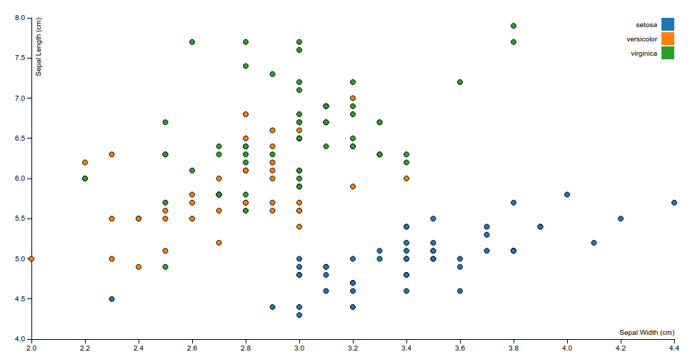
- Multivariate/high-dimensional data: line, point, region-based
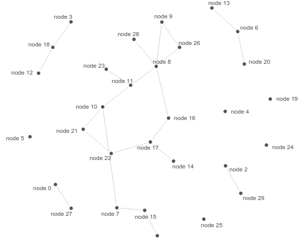
- Graphs/networks
source: D3.js gallery
Get inspired
Don't try to reinvent the wheel...
Good starting point: D3.js Gallery
So what is a good visualisation?
Interplay between several factors:
- Type and quality of the data
- Human cognition (visual perception theory)
- Usability (interactions fast enough?)
Evaluation:
- Interaction between programmer/designer and user/domain expert
- Discussions during visualisation work shops
Is this for me?
Empirical DH fields
- Computational linguistics
- Corpus linguistics
- Also literature
- Social sciences
- Philosophy
- Musicology
- ....
How?
Use commercial software
i.e. Tableau (also free version available)
Use commercial software
Pro:
- You can get started immediately; no need to program yourself.
Cons:
- Step into a closed ecosystem
- For technical support you will have to pay
- Depend on a company rather than a community for new features
Reuse what is freely available
- Tools written by others
- Specialised, only one type of visualisation
- Reusability not always optimal (i.e. convert your own data)
- Adding extra features difficult or impossible
- R libraries (i.e. ggplot, lattice)
- +: Statistical analysis output can be directly fed to a visualisation library
- -: Not the most suitable tool for textual data
- -: Limited interactivity
Google's Magic Table (load unsafe scripts to see this)
Program it yourself
Programming languages designed for the job:
- Processing: based on Java, runs as a stand-alone program on your computer.
- D3.js (Data Driven Documents): Javascript, works in any modern browser; easy to publish online; the future.
Bottom line: extremely flexible and versatile, but comes with a steep learning curve.
Middle ground
R data frame
D3.js
Google Charts
...
R libraries:
- rCharts
- networkD3
- googleVis
- ...
Some DH visualisations
DoubleTreeJS (Chris Culy)
Slash/A (Todorova and Chinkina)
Very basic introduction to D3.js
Today 14:45-15:45, MSI 02.18
Hands on: bring your own laptop or befriend someone with a laptop with Chrome or Firefox installed (pretty please).
Topics:
- The very basics of D3
- Import a dataset (!)
- Make a basic visualisation of the data set
Comments? Questions?
thomas.wielfaert@kuleuven.be
References
Bertin, J., (1967). Sémiologie graphique, Mouton/Gauthier-Villars, Paris.
Collins, J.P., (2009). The Fourth Paradigm: Data-Intensive Scientific Discovery. Microsoft Research, Redmond, Washington.
Lem, S., Onghena, P., Verschaffel, L., Van Dooren, W. (2013). On the misinterpretation of histograms and box plots. Educational Psychology: An International Journal of Experimental Educational Psychology, 33 (2), 155-174.
Mackinlay, J.D., (1986). Automating the Design of Graphical Presentations of Relational Information, ACM Transactions on Graphics, 5, 110-141.
DH Visualisation
By Thomas Wielfaert
DH Visualisation
29-04-2015 KU Leuven Digital Humanities Spring Event
