Styling react with styled components
Freitag, 24. März 2017, #ReactStuttgart
Oliver Schmidt - @webkreation

work
Web+Freelancer since 1999
FE architect and developer
React since 2014
Offline/Mobile Webapps
Travel Tech
E-Learning
L'TUR, TUI, SWISS, HLX, Thieme, Greenpeace, fr.de
private
married, 3 kids
wintersport, MTB
travel
food, wine
VR
in this talk
Styling React in the "past"
CSS in JS, Inline Styles,
CSS Modules, JSS
not in this talk
Styling React Native
Linting
Testing
Styled Components
CSS to Styled Components
Tagged Template Literals
Composing, overriding, theming
Helpers
v2
HTML // CSS // Javascript
BEM

„past”
SUIT
inuitCSS
CSS is designed primarily to enable the separation of document content from document presentation, including aspects such as the layout, colors, and fonts.
WWWC December 2010
React components
JSX(HTML)
logic
state
inline styles
WTF???
React 2014
Inline Styles
<button style="
  background-color: rgb(0, 216, 255);
  color: white;
  border: none;
  border-radius: 0.25em;
  font-size: 2em;
  padding: 0.5em 1em;"
>
  Styled Button
</button>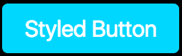
// button,js

const styles = {
  backgroundColor: "#00D8FF",
  color: "white",
  border: "none",
  borderRadius: "0.25em",
  fontSize: "2em",
  padding: "0.5em 1em"

  // hover???
};
return (
<div>
<button style={styles}>
Styled Button
</button>
</div>
)all of CSS
global CSS
write CSS
no build requirements
isolated
colocated
Theming
Inline Styles
❌
❌
❌
✅
✅
✅
❌
Inline Styles + Radium
import Radium from 'radium';
const styles = {
backgroundColor: "#00D8FF",
color: "white",
border: "none",
borderRadius: "0.25em",
fontSize: "2em",
padding: "0.5em 1em"
':hover': {
background-color: white;
color: #00D8FF;
}
};const Button = () => {
return (
  <div>
    <button style={styles}>
     Styled Button
    </button>
  </div>
)
}
export default Radium(Button)✅ all of CSS
✅ global CSS
❌ write CSS
✅ no build requirements
✅ isolated
✅ colocated
✅ Theming
Inline Styles Radium
React components
JSX(HTML)
logic
state
React 2016
CSS
build
CSS-in-JS
more Infos: React: CSS in JS by vjeux
CSS-in-JS
// btn.css

.btn {
  background-color: #00D8FF;
  color: white;
  border: none;
  border-radius: 0.25em;
  font-size: 2em;
  padding: 0.5em 1em;
}

.btn:hover {
  background-color: white;
  color: #00D8FF;
}

.btn--ctaction {
  background-color: green;
  color: white;
}
import classNames from 'classnames';
const btnClass = classNames({
'btn': true,
'btn--ctaction': this.state.buyit,
});
return (
<div>
<button className={btnClass}>
Styled Button
</button>
</div>
)<button class="btn btn--ctaction">
Buy it
</button>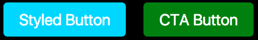
CSS-in-JS
✅ all of CSS
✅ global CSS
✅ write CSS
✅ no build requirements
❌ isolated
❌ colocated
✅ (Theming)
If you’re writing React, you have access to a more powerful styling construct than CSS class names.
You have components.
@chantastic June 2016 *
* https://medium.learnreact.com/scale-fud-and-style-components-c0ce87ec9772
CSS Modules
/* Btn.css */
.base {
  background-color: #00D8FF;
  color: white;
  border: none;
  border-radius: 0.25em;
  font-size: 2em;
  padding: 0.5em 1em;
}

.base:hover {
  background-color: white;
  color: #00D8FF;
}

.ctaction {
  composes: base;
  background-color: green;
  color: white;
}
/* Button.js */
import styles from './styles'
return {
<button
className={
cta ? styles.ctaction : styles.base
}/>
}styles: {
base: "Btn__base__abc23423",
ctaction: "Btn__ctaction__dfe6546"
}<button class="Button__ctaction__dfe6546">
CTA Button
</button>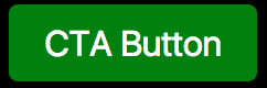
CSS Modules
✅ all of CSS
✅ global CSS
✅ write CSS
❌ no build requirements
✅ isolated
❌ colocated
❌ Theming
JSS
import classnames from 'classnames';
import useSheet from 'react-jss';

const styles = {
  button: { padding: '1em' },
  'media (max-width: 200px)': {
    button: {
      width: '100%'
    }
  }
};

@useSheet(styles)
export default class ConfirmButton extends React.Component {
  render() {
    const {classes} = this.props.sheet;

    return
      <button className={classnames(classes.button, classes.primary)}>
        Confirm
      </button>;
  }
}
JSS
✅ supports all of CSS
✅ supports global CSS
❌ write CSS
✅ no build requirements
✅ isolated
✅ colocated
❌ (Theming)
CSS vs. JS/React
Styled Components
supports all of CSS
supports global CSS
write CSS
no build requirements
isolated
colocated
Theming
✅
✅
✅
✅
✅
✅
✅
const AppWrapper = styled.div`
  display: flex;
  flex-direction: column;
`;
$ npm install -g create-react-app
$ create-react-app styled-components-demo
$ cd styled-components-demo
$ yarn add styled-components
$ yarn startCSS to Styled Components
Project setup in 1 minute
create-react-apps
styled-components
console.log`hello
React
Stuttgart`

['hello↵React↵Stuttgart']
const name = 'ReactStuttgart'
console.log`hello ${name} members`
['hello ', 'members'] 'ReactStuttgart'const food = veryHungry ? 'Pizza' : 'Soup'
const drink = 'Beer'
console.log`I like ${foot} and ${drink}.`
['I like ', 'and', '.'] 'Pizza' 'Beer'
Tagged Template Literals
Multi line strings
${Interpolations}
many Interpolations
styled components
Adapting based on props
Full CSS Support
Overriding Component Styles
Styling third-party components
Theming
Demos:
https://github.com/webkreation/styling-react-with-styled-components/tree/03-styled-components-demos
$ yarn
$ yarn start
Passed Props
import React, { Component } from 'react';
import styled from 'styled-components';
import H2 from '../components/H2'
import Next from '../components/Next'
const Input = styled.input`
font-size: 1.25em;
padding: 0.5em;
color: palevioletred;
background: gray;
border: none;
border-radius: 3px;
`;
class PassedProps extends Component {
render() {
return (
<div>
<H2>Passed Props</H2>
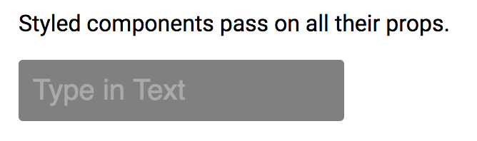
<p>Styled components pass on all their props.</p>
<p>
<Input
placeholder="Type in Text" size="20" type="text" />
</p>
</div>
);
}
}
export default PassedProps;
Adapting based on props
import React from 'react'
import styled from 'styled-components'
import H2 from '../components/H2'

const Button = styled.button`
  display: block;
  background: ${props => props.action ? 'green' : '#00D8FF'};
  color: ${props => props.action ? 'white' : 'black'};
  border: none;
  border-radius: 0.25em;
  font-size: ${props => props.bigger ? '2em' : '1em'};
  padding: 0.5em 1em;
  margin: 1em 0;
`;

const PassedProps = () => {
    return (
      <div>
        <H2>Adapting based on props</H2>
        <p>
          <Button>Normal</Button>
          <Button action>Buy now</Button>
          <Button action bigger>Buy now bigger</Button>
        </p>
      </div>
    );
}

export default PassedProps;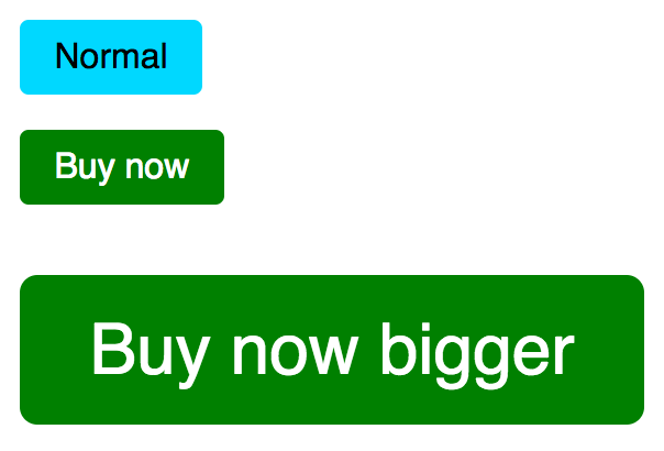
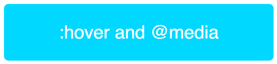
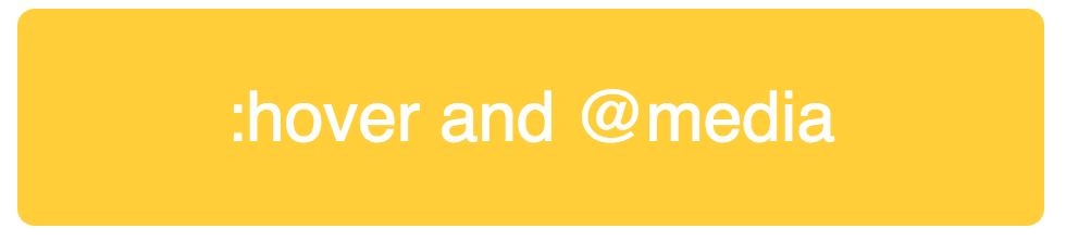
Full CSS Support
const Button = styled.button`
  display: block;
  background: ${props => props.action ? 'green' : '#00D8FF'};
  color: ${props => props.action ? 'white' : 'black'};
  color: white;
  border-radius: 0.25em;
  font-size: ${props => props.bigger ? '2em' : '1em'};
  padding: 0.5em 1em;
  margin: 1em 0;
  cursor: pointer;

  &:hover {
    background-color: #FFCE38;
  }

  @media (min-width: 1024px) {
    padding: 1em 3em;
  }
`;

const PassedProps = () => {
    return (
      <div>
        <H2>Full CSS Support</H2>
        <p>
          <Button bigger>:hover and @media</Button>
        </p>
        <Next nextPage="/04"/>
      </div>
    );
}
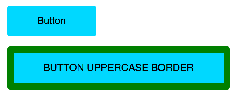
Overriding Component Styles
import React, { Component } from 'react'
import styled from 'styled-components'
import H2 from '../components/H2'
import Next from '../components/Next'
import Button from '../components/Button'


const UppercaseButton = styled(Button)`
  text-transform: uppercase;
  border: 10px solid green;
`

const Overriding = () => {
  return (
    <div>
      <H2>Overriding Component Styles</H2>
      <p>
        <Button>Button</Button>
        <UppercaseButton>Button Uppercase Border</UppercaseButton>
      </p>
      <Next nextPage="/05"/>
    </div>
  );
}

export default Overriding;
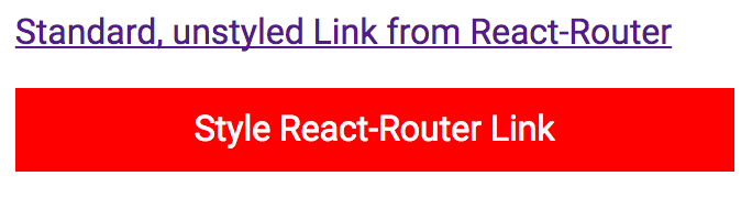
Styling third-party components
import React from 'react'
import styled from 'styled-components'
import H2 from '../components/H2'
import { Link } from 'react-router-dom'

const StyledLink = styled(Link)`
  display: block;
  background-color: red;
  color: white;
  padding: 10px;
  text-align: center;
  margin: 1em 0;
  text-decoration: none;
`;

const ThirdPartyComponents = () => {
  return (
    <div>
      <H2>Styling third-party components</H2>
      <p>
        <Link to="/">Standard, unstyled Link from React-Router</Link>
      </p>
      <p>
        <StyledLink to="/02">Style React-Router Link</StyledLink>
      </p>
    </div>
  );
}

export default ThirdPartyComponents;
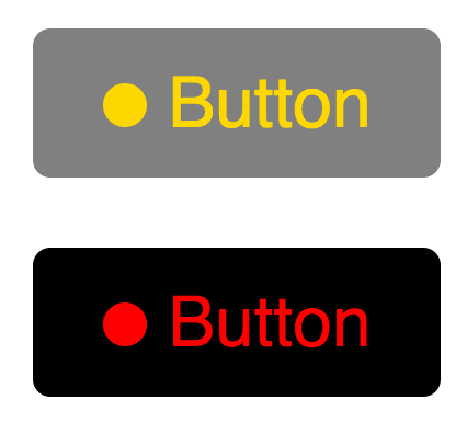
Theming
import React from 'react'
import styled, {ThemeProvider} from
       'styled-components'
import H2 from '../components/H2'

const theme = {
  theme1: {
    mainColor: 'gold',
    background: 'gray'
  },
  theme2: {
    mainColor: 'red',
    background: 'black'
  }
}

const Button = styled.button`
  display: block;
  background: ${props => props.theme.background};
  color: ${props => props.theme.mainColor};
  border: none;
  border-radius: 0.25em;
  font-size: 2em;
  padding: 0.5em 1em;
  margin: 1em 0;
  cursor: pointer;
`
Theming
const Circle = styled.div`
  display: inline-block;
  background: ${props => props.theme.mainColor};
  border-radius: 50%;
	width: 20px;
	height: 20px;
  margin-right: 10px;
`

const Theming = () => {
  return (
    <div>
      <H2>Theming</H2>
      <ThemeProvider theme={theme.theme1}>
        <Button>
          <Circle/>
          Button
        </Button>
      </ThemeProvider>
      <ThemeProvider theme={theme.theme2}>
        <Button className="test">
          <Circle/>
          Button
        </Button>
      </ThemeProvider>
    </div>
  );
}

export default Theming;
Theming
class Theming extends Component {
  constructor(props) {
    super(props);
    this.state = {
      theme: "theme1"
    };
    this.handleThemeClick = this.handleThemeClick.bind(this);
  }

  handleThemeClick() {
    this.setState({theme: "theme2"});
  }

  render() {
    const { state } = this.props;

    return (
      <div>
        <H2>Theming</H2>
        <ThemeProvider theme={theme[this.state.theme]}>
          <div>
            <Button><Circle />Button</Button>
            <Button onClick={this.handleThemeClick}>
              Toggle Theme
            </Button>
          </div>
        </ThemeProvider>
      </div>
    );
  }
}

export default Theming;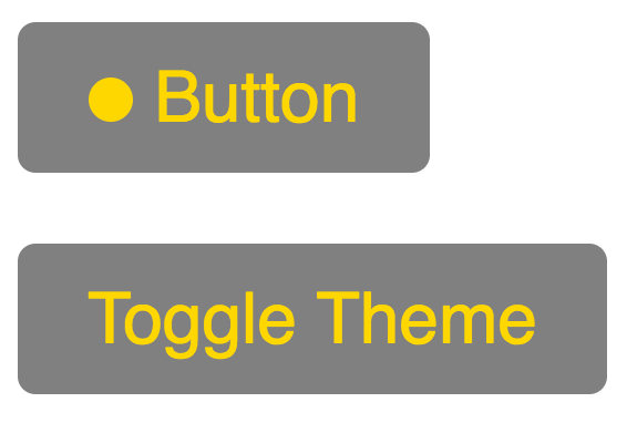
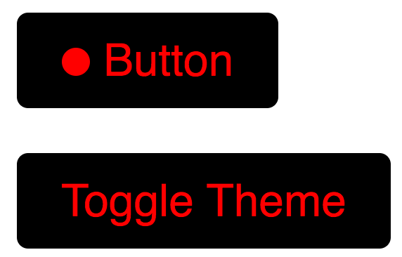
onClick
change theme
use existing css packages
const IconStyled = styled.i`
  width: ${props => props.size + 'px'};
  ....
  color: ${props => props.currentDay ? 'white' : colors.thieme.blue};
`;
<DonutStyled size={size} title={percentage + '%'}>
<IconStyled
size={size}
currentDay={currentDay}
className={dayDone ? 'mdi mdi-check' : null}/>
<svg width={size} height={size} viewBox={viewBox}>...</svg>
</DonutStyled><link
href="...materialdesignicons.min.css"
rel="stylesheet"
><div size="36" title="12%" class="bpKDSq">
<i size="36" class="mdi mdi-check haomqU"></i>
<svg/>
</div>
Styled Componets-App inside Angular App
=> completely isolated styles via styled-components
Syntax highlight
auto-complete
lint support
for Atom, Visual Code and Sublime Text.
IDE support
v2.0 main differences
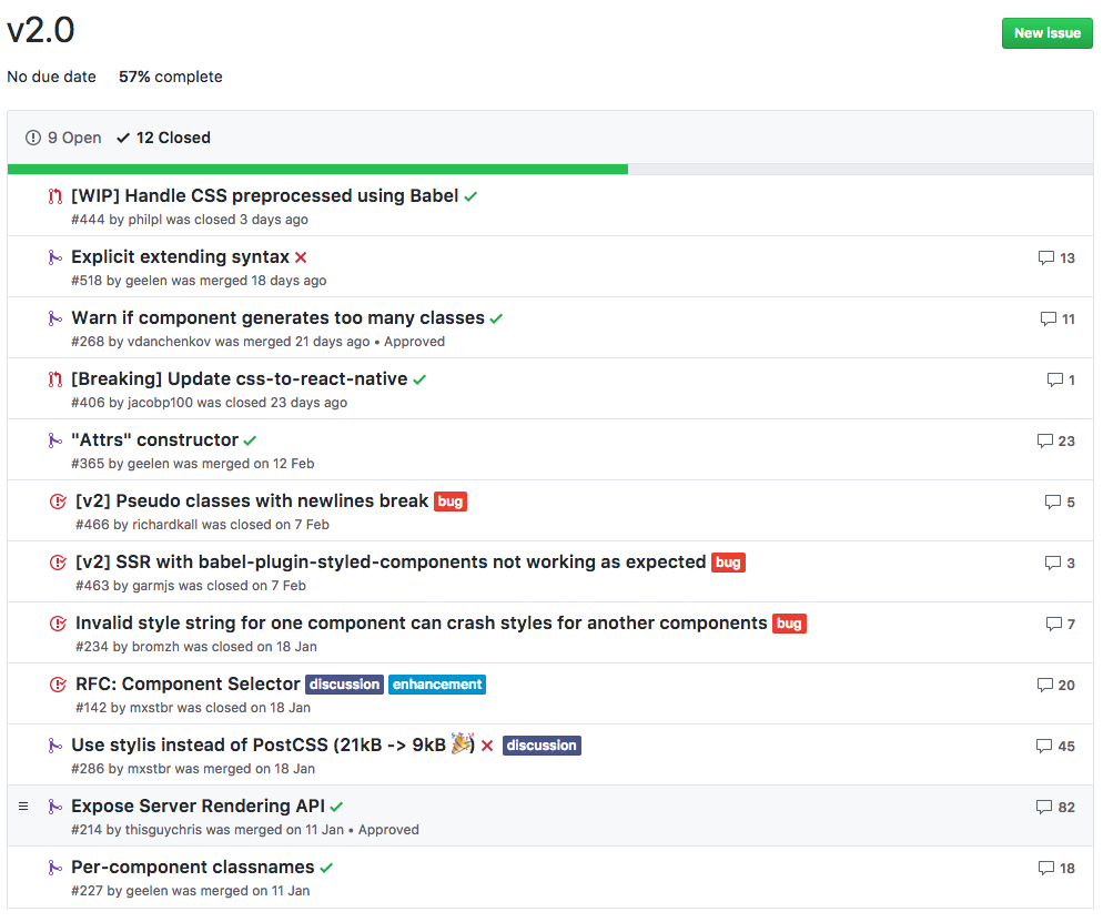
v2.0 closed issues
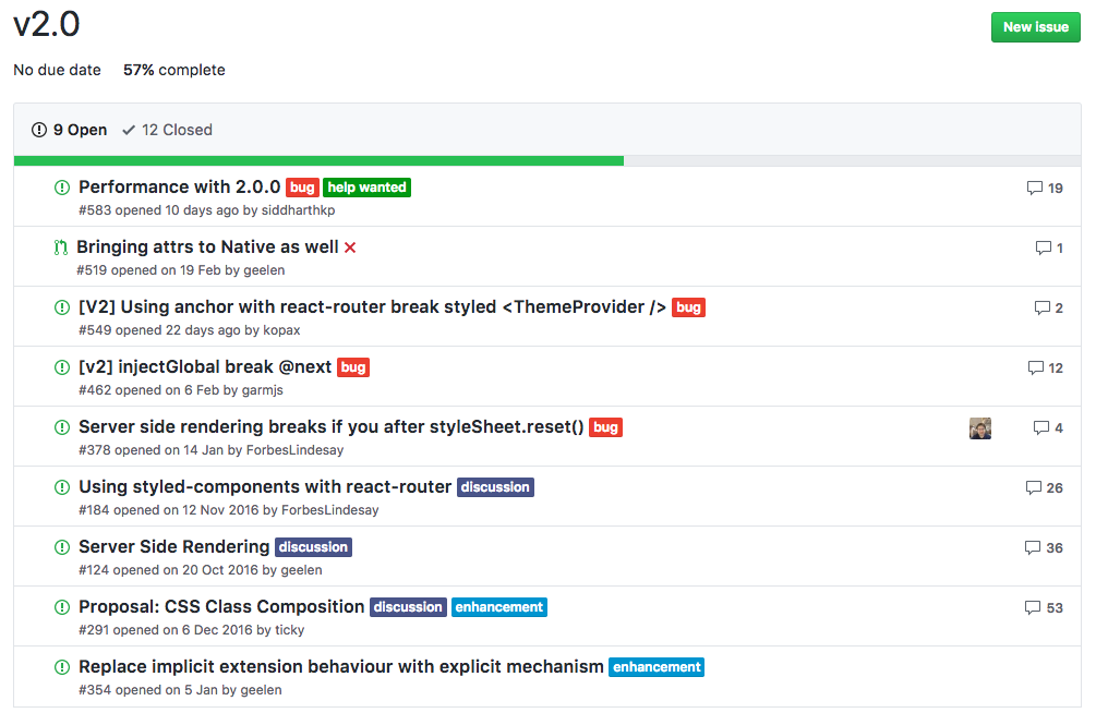
v2.0 open issues
more infos
Oliver Schmidt
Oberer Bohl 16
78601 Mahlstetten
E-mail: kontakt@webkreation.de
Skype: webkreation
Twitter: @webkreation
XING: https://www.xing.com/profile/Oliver_Schmidt59
about me
Styling react with styled components
By webkreation