Angular
Flex
Layout
Sophisticated component layout engine for
Angular
Flexbox CSS
+
mediaQuery
Browser support

Pure TypeScript layout engine
Independent of Angular Material
Angular CLI Integration
npm install --save @angular/flex-layout@latestimport { FlexLayoutModule }
from '@angular/flex-layout';
...
@NgModule({
imports: [FlexLayoutModule],
...
})
export class AppModule { }Import Angular Flex-Layout NgModule
Install Angular Flex-Layout components
v2.0.0-beta.8
Static Layout API
CSS Flexbox Model
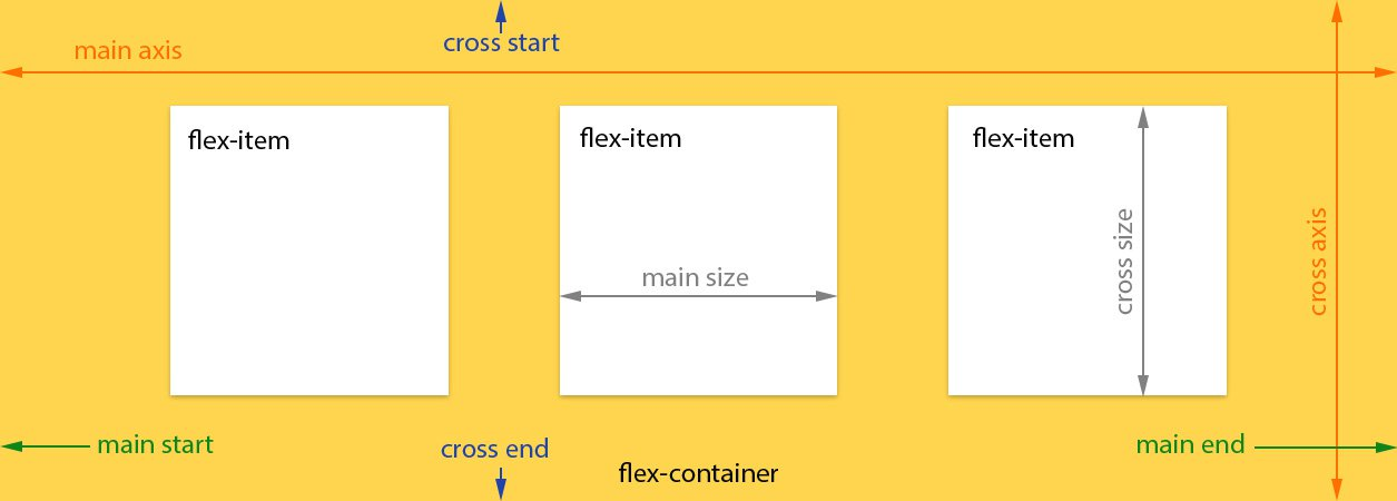
API for DOM containers
| fxLayout |
|
|---|---|
|
fxLayoutWrap |
|
|
fxLayoutGap |
|
|
fxLayoutAlign |
<div fxLayout="row"
    fxLayout.xs="column"> </div>
<div fxLayoutWrap> </div>
<div fxLayoutGap="10px"> </div>
<div fxLayoutAlign="start stretch">
</div>
API for flex elements
| fxFlex |
|
|---|---|
|
fxFlexOrder |
|
|
fxFlexOffset |
|
|
fxFlexAlign |
|
|
fxFlexFill |
<div fxFlex="1 2
calc(15em + 20px)"></div>
<div fxFlexOrder="2"></div>
<div fxFlexOffset="20px"></div>
<div fxFlexAlign="center"></div>
<div fxFlexFill></div>
Responsive API
Material Design Breakpoints
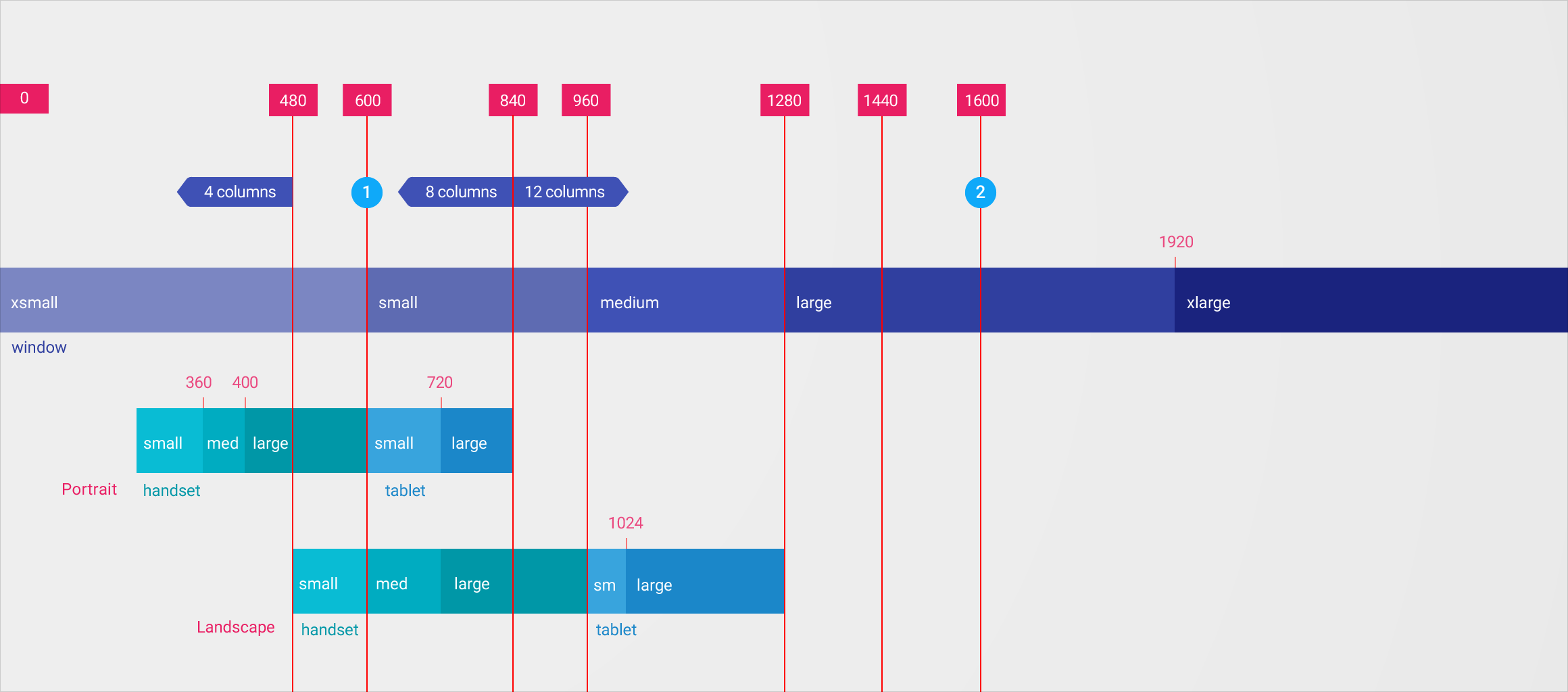
Media Queries and Aliases
| breakpoint | mediaQuery |
|---|---|
| xs | 'screen and (max-width: 599px)' |
| sm | 'screen and (min-width: 600px) and (max-width: 959px)' |
| md | 'screen and (min-width: 960px) and (max-width: 1279px)' |
| lg | 'screen and (min-width: 1280px) and (max-width: 1919px)' |
| xl | 'screen and (min-width: 1920px) and (max-width: 5000px)' |
| lt-sm | 'screen and (max-width: 599px)' |
| lt-md | 'screen and (max-width: 959px)' |
| lt-lg | 'screen and (max-width: 1279px)' |
| lt-xl | 'screen and (max-width: 1919px)' |
| gt-xs | 'screen and (min-width: 600px)' |
| gt-sm | 'screen and (min-width: 960px)' |
| gt-md | 'screen and (min-width: 1280px)' |
| gt-lg | 'screen and (min-width: 1920px)' |
Breakpoint Activation Fallback Algorithm
-
Flex-Layout responsive engine uses a fallback, descending-scan algorithm
-
For non-overlapping breakpoints: the search scans from largest-to-small breakpoint
-
For overlapping breakpoints: the search scans from smallest-to-largest breakpoint range
Visibility example
<div fxShow fxHide.xs="false" fxHide.lg="true"></div>- xl, then fallback to the default fxShow; so the div is shown
- lg, then the div is hidden (since the value === 'true')
- md, then fallback to the default fxShow; so the div is shown
- sm, then fallback to the default fxShow; so the div is shown
- xs, then the div is shown (since the value === 'false')
Sizing example
<div fxFlex="50%" fxFlex.gt-sm="100%"></div>- xl, then fallback to 'gt-sm' so the div sizing is 100%
- lg, then fallback to 'gt-sm' so the div sizing is 100%
- md, then fallback to 'gt-sm' so the div sizing is 100%
- sm, then fallback to the default fxFlex="50%"; so the div is 50%
- xs, then fallback to the default fxFlex="50%"; so the div is 50%
Special Responsive Features
| fxShow |
|
|---|---|
|
fxHide |
|
|
ngClass |
|
|
ngStyle |
<div fxShow
    [fxShow.xs]="isVisibleOnMobile()"></div>
<div fxHide
    [fxHide.gt-sm]="isVisibleOnDesktop()"></div>
<div
    [ngClass.sm]="{'fxClass-sm': hasStyle}"></div>
<div
    [ngStyle.xs]="{color: 'blue'}"></div>
JavaScript API (Imperative)
Programmatic features
| ObservableMedia |
|
|---|---|
|
BREAKPOINTS |
|
|
BaseFxDirectiveAdapter |
constructor(public
    media:ObservableMedia ) {}
providers: [{provide: BREAKPOINTS,
    useValue: MY_CUSTOM_BREAKPOINTS }]
export class ClassDirective
    extends NgClass {}
Subscribe to mediaQuery activations
import {Subscription} from "rxjs/Subscription";
import {MediaChange, ObservableMedia}
  from "@angular/flex-layout";

constructor(media: ObservableMedia) {
  this.watcher = media.subscribe(
    (change: MediaChange) => {

      if ( change.mqAlias == 'xs') {
        this.loadMobileContent();
      }

    });
}
"Holy Grail" of layouts
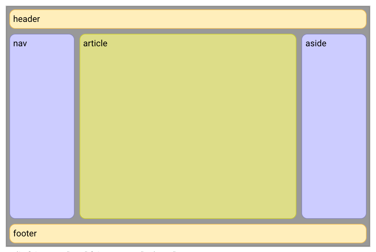
<div>
  <header>header</header>
  <div>

    <nav>nav</nav>

    <article>article</article>

    <aside>aside</aside>

  </div>
  <footer>footer</footer>
</div>
<div fxLayout="column">
<header>header</header>
<div fxLayout="row" fxFlex>
<nav fxFlex="1 6 20%">nav</nav>
<article fxFlex="3 1 60%">article</article>
<aside fxFlex="1 6 20%">aside</aside>
</div>
<footer>footer</footer>
</div>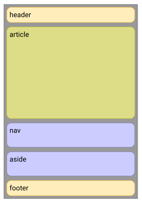
<div fxLayout="column">
  <header>header</header>
  <div fxLayout="row" fxLayout.xs="column" fxFlex>

    <nav fxFlex="1 6 20%" fxFlexOrder
        fxFlexOrder.xs="2">nav</nav>

    <article fxFlex="3 1 60%" fxFlexOrder
        fxFlexOrder.xs="1">article</article>

    <aside fxFlex="1 6 20%" fxFlexOrder
        fxFlexOrder.xs="3">aside</aside>

  </div>
  <footer>footer</footer>
</div>
Resources
Angular Flex-Layout
https://github.com/angular/flex-layout
Visual guide to Flex
http://cssreference.io/flexbox/
Thank you!
Katrine Orlova
@cheerypick
github.com/
twitter.com/
Copy of deck
By Maxim Salnikov