CSS Grid Layout
Why do we need it?
Where should we use it?
When could we use it?
Revolutionary
@webmaxru
UI engineer at ForgeRock
GDE in Angular
Meetups organizer / mobileera.rocks
Maxim Salnikov


WHY?
1

<table>
float: left

display: inline-block
display: table
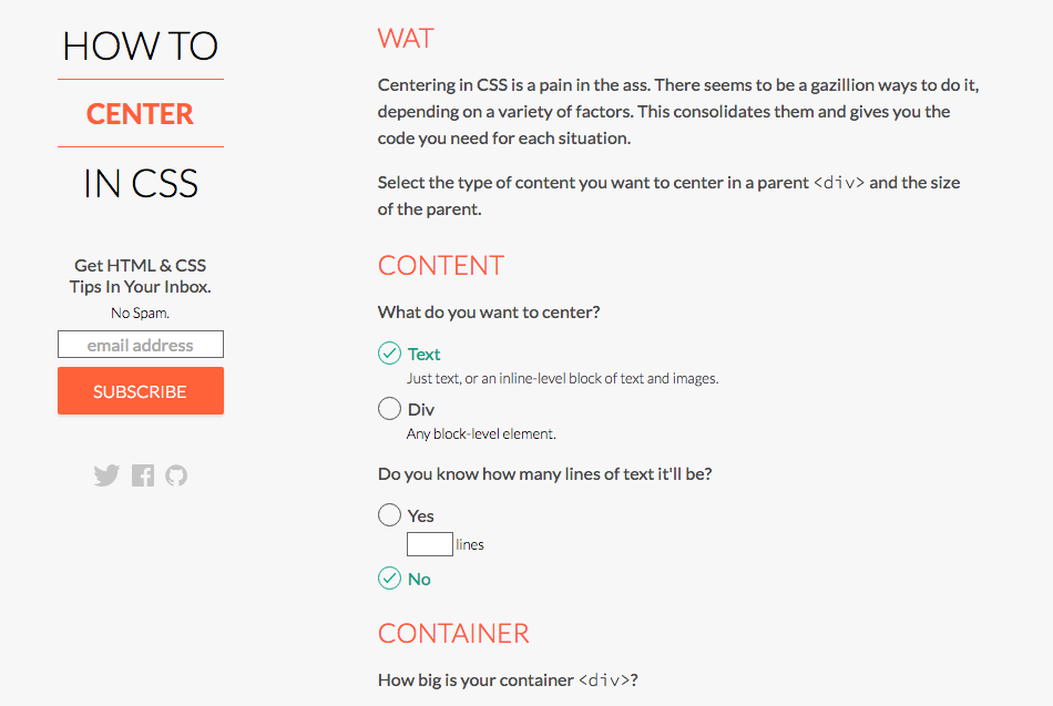
http://howtocenterincss.com
Centering in CSS is a pain in the ass
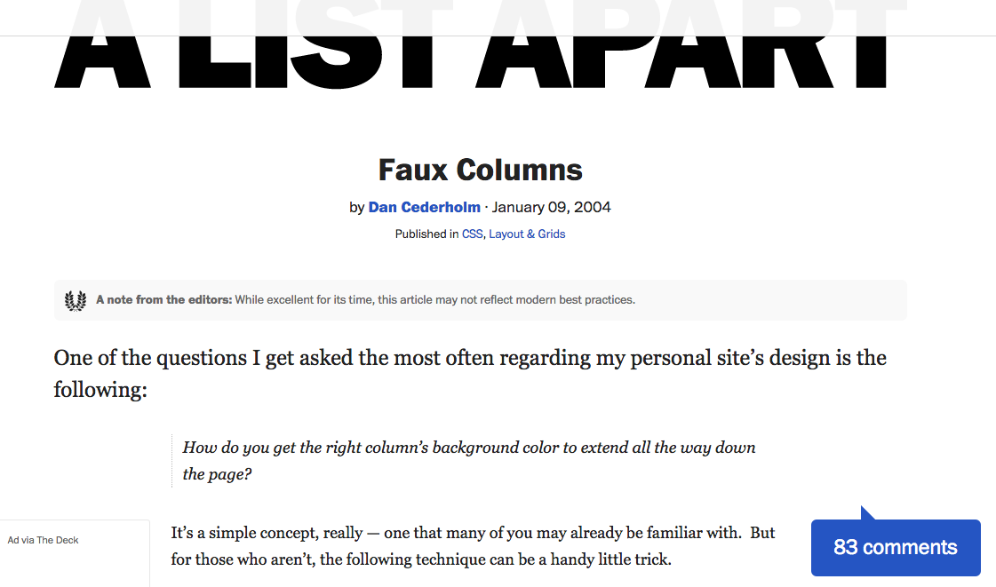
http://alistapart.com/article/fauxcolumns
One of the questions I get asked the most often regarding my personal site’s design is the following: How do you get the right column’s background color to extend all the way down the page?
CSS frameworks
CSS processors
<div class="row">
  <div class="col-xs-12 col-sm-6 col-md-8">This</div>
  <div class="col-xs-6 col-md-4">is</div>
</div>
<div class="row">
  <div class="col-xs-6 col-sm-4">not</div>
  <div class="col-xs-6 col-sm-4">what</div>
  <div class="clearfix visible-xs-block">we</div>
  <div class="col-xs-6 col-sm-4">want :(</div>
</div>
http://getbootstrap.com/css/#grid
Good enough?
flexbox
What's wrong?
3 (three) different specifications [SOLVED]
Content-shift during loading
One-dimensional by design
Flexbox is for one-dimensional layouts - anything that needs to be laid out in a straight line (or in a broken line, which would be a single straight line if they were joined back together).
Tab Atkins
http://lists.w3.org/Archives/Public/www-style/2013May/0114.html
1
2
3
4
5
6
CSS Grid Layout
Some facts
Hidden behind the browser flags
17 (seventeen) new properties + 1 new unit
Two-dimensional by design [PSEUDO-3D]
WHERE?
2
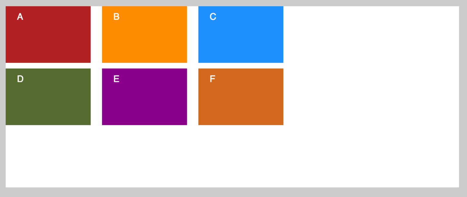
.alphabet {
  display: grid;

  max-width: 800px;
}
Turn me on
<div class="alphabet">
  <div class="a">A</div>
  <div class="b">B</div>
  <div class="c">C</div>
  <div class="d">D</div>
  <div class="e">E</div>
  <div class="f">F</div>
</div>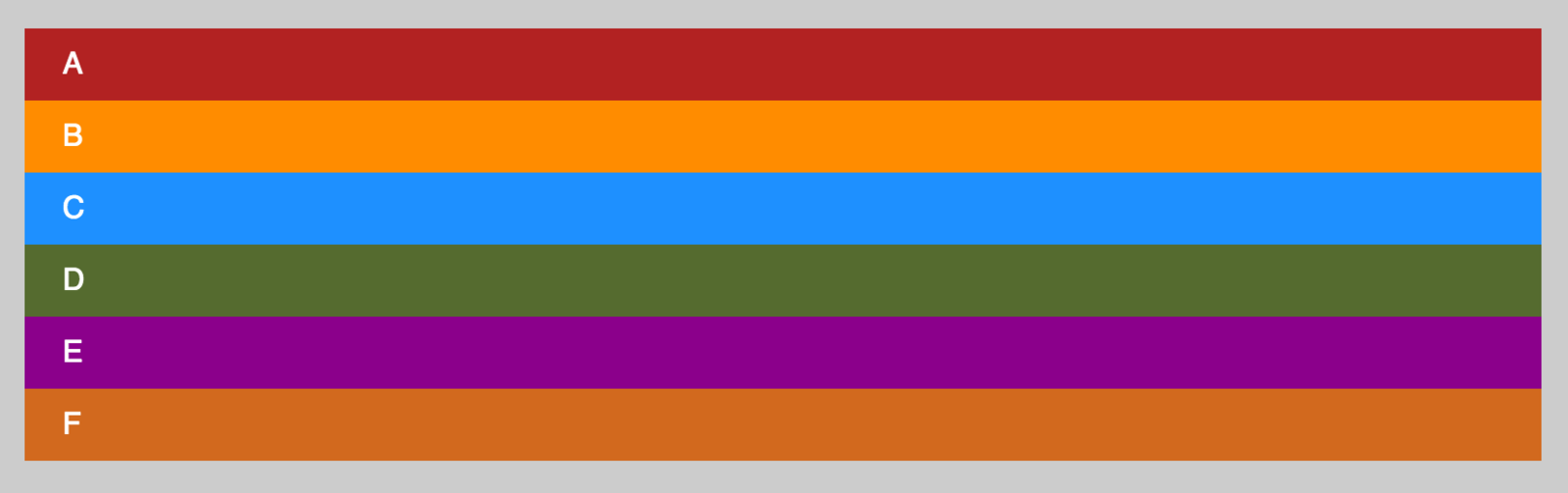
http://codepen.io/collection/nwWWqr/
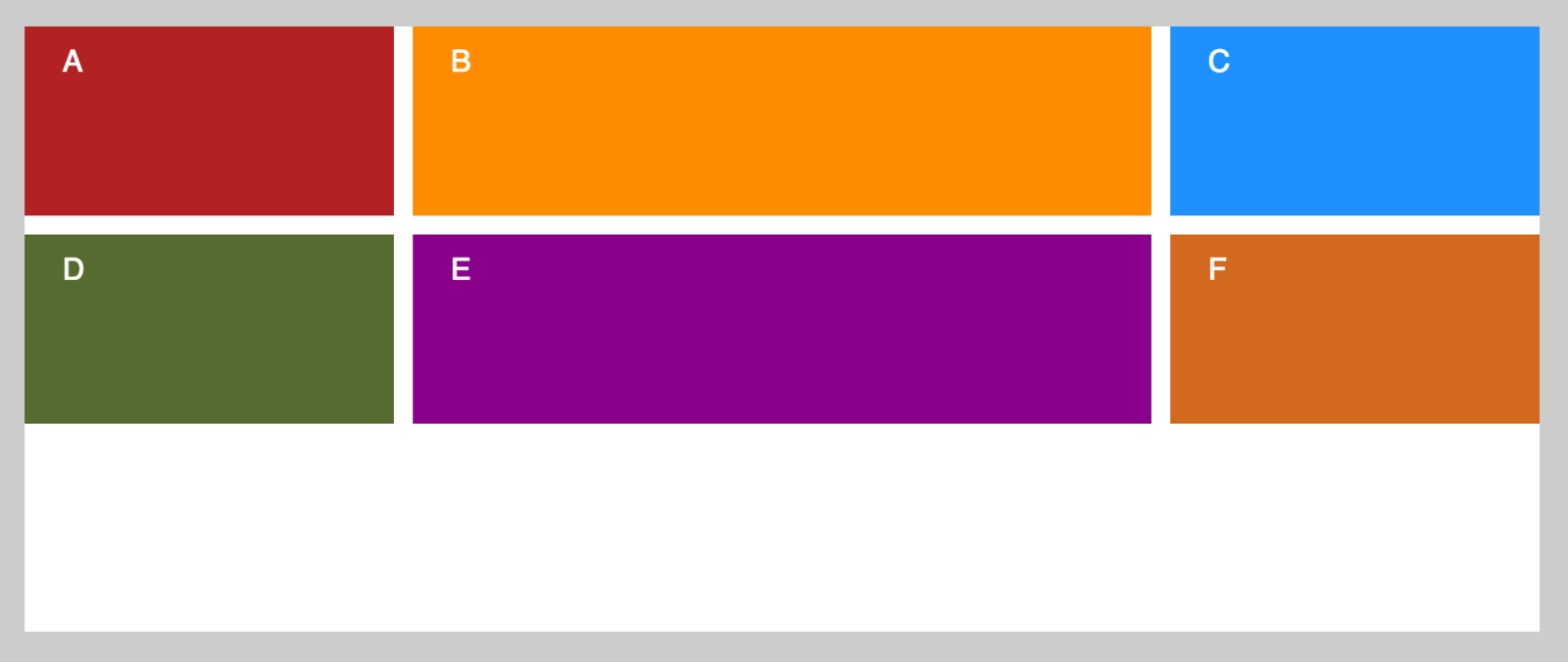
.alphabet {
  display: grid;
  grid-template-columns: 150px 150px 150px;
  grid-template-rows: 100px 100px 100px;
}
Explicit grid
grid-template-columns
grid-template-rows

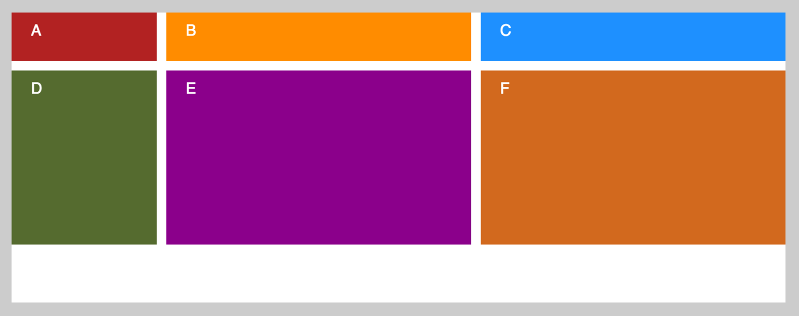
.alphabet {
display: grid;
grid-template-columns: 150px 150px 150px;
grid-template-rows: 100px 100px 100px;
grid-column-gap: 20px;
grid-row-gap: 10px;
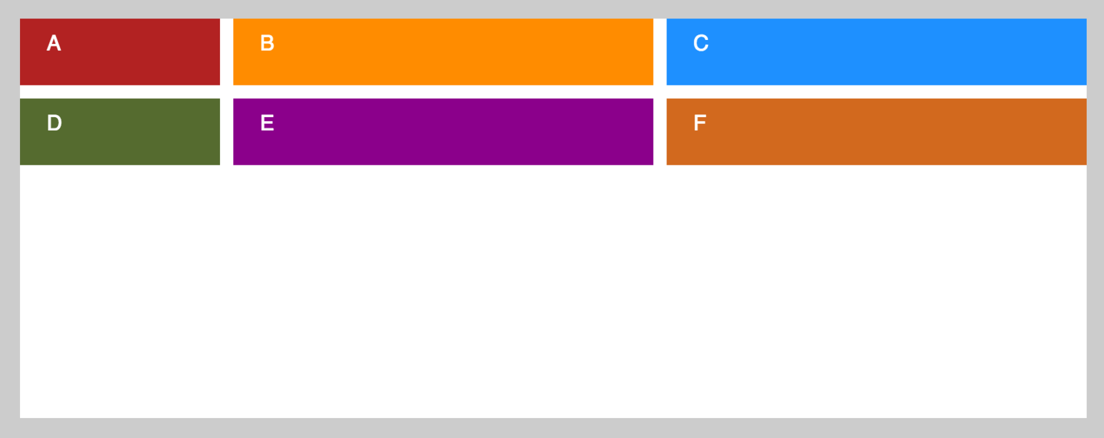
}Some air, please!
grid-column-gap grid-row-gap grid-gap
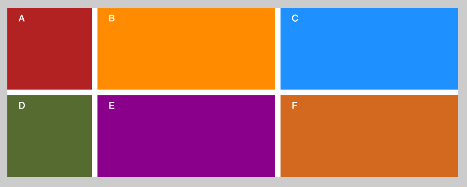
.alphabet {
  display: grid;
  grid-template-columns: 1fr 2fr 1fr;
  grid-template-rows: 100px 100px 100px;
  grid-gap: 10px;
}
Fractions
fr
A fraction of the available space in the container
.alphabet {
  display: grid;
  grid-template-columns: 150px 1fr 1fr;
  grid-template-rows: 50px 1fr 50px;
  grid-gap: 10px;
}
In the mix
Fraction tracks share the space left after fixed size tracks and the gaps
.alphabet {
  display: grid;
  grid-template-columns: 150px repeat(2, 1fr);
  grid-template-rows: 50px 1fr 50px;
  grid-gap: 10px;
}
DRY
Defines a repeating pattern of tracks
repeat
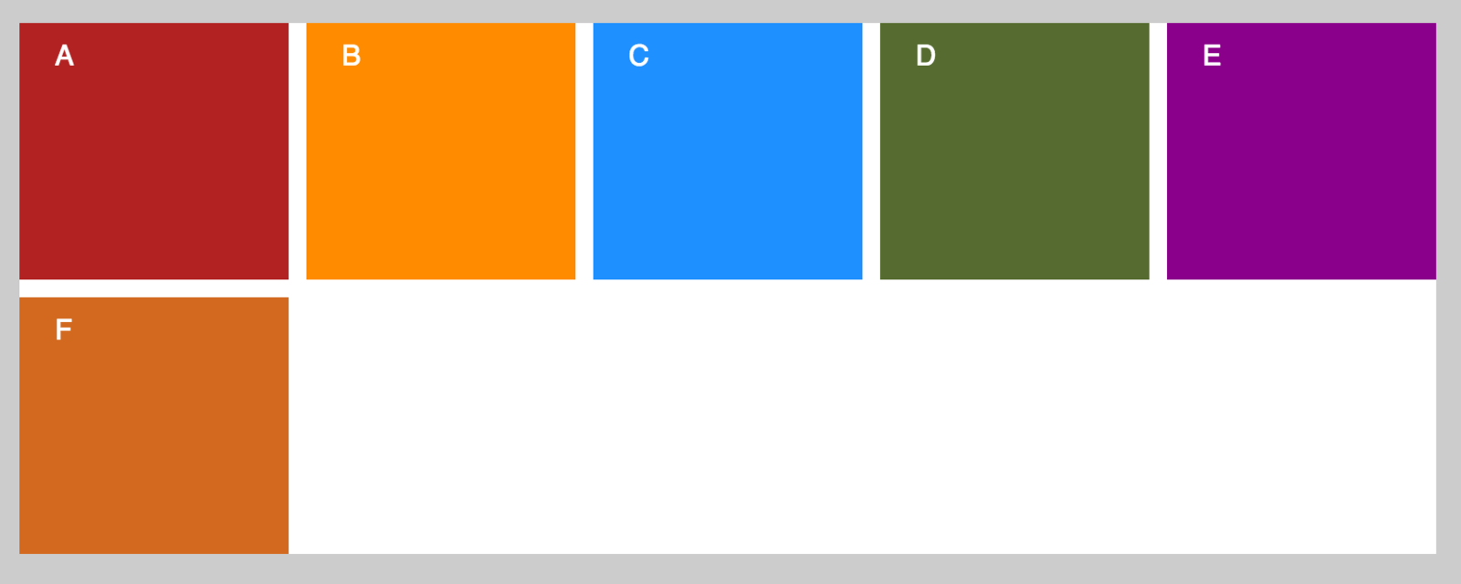
.alphabet {
  display: grid;
  grid-template-columns: 150px repeat(2, 1fr);
  grid-gap: 10px;
}
Implicit grid
Grid will create implicit rows for us
.alphabet {
  display: grid;
  grid-template-columns: 150px repeat(2, 1fr);
  grid-auto-rows: 50px;
  grid-gap: 10px;
}
Custom sized implicit grid
Define the size of implicit tracks
grid-auto-rows
grid-auto-columns
.alphabet {
  display: grid;
  grid-template-columns: repeat(auto-fill, minmax(150px,1fr));
  grid-gap: 10px;
}
More magic
Creates as many items that will fit into the container
auto-fill
Enables the creation of flexible grids
minmax()
Some base concepts
cell
area
1
2
3
...
1
2
3
...
line
track
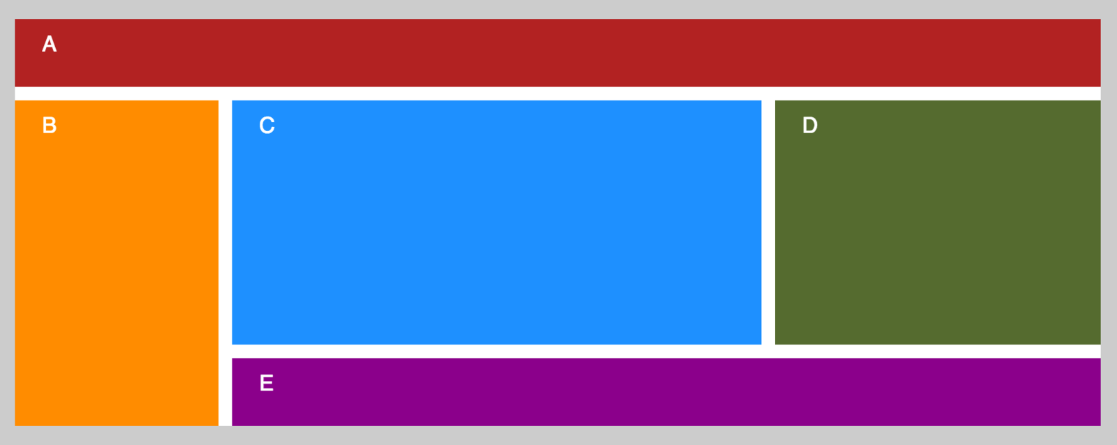
.alphabet {
  display: grid;
  grid-template-columns: 150px 1fr 240px;
  grid-template-rows: 50px 1fr 50px;
  grid-gap: 10px;
}

.a {
  grid-column: 1 / 4;
  grid-row: 1;
}

.b { grid-column: 1; grid-row: 2 / 4 ; }

.c { grid-column: 2; grid-row: 2; }

.d { grid-column: 3; grid-row: 2; }

.e { grid-area: 3 / 2 / 4 / 4; }
Cells positioning and sizing
grid-column-start
grid-column-end
grid-column
grid-row-start
grid-row-end
grid-row
grid-area
.wrapper {
display: grid;
grid-template-columns: 150px 1fr 240px;
grid-template-rows: 50px 1fr 50px;
grid-gap: 10px;
}
header {
grid-column: 1 / 4;
grid-row: 1;
}
nav { grid-column: 1; grid-row: 2 / 4 ; }
section { grid-column: 2; grid-row: 2; }
aside { grid-column: 3; grid-row: 2; }
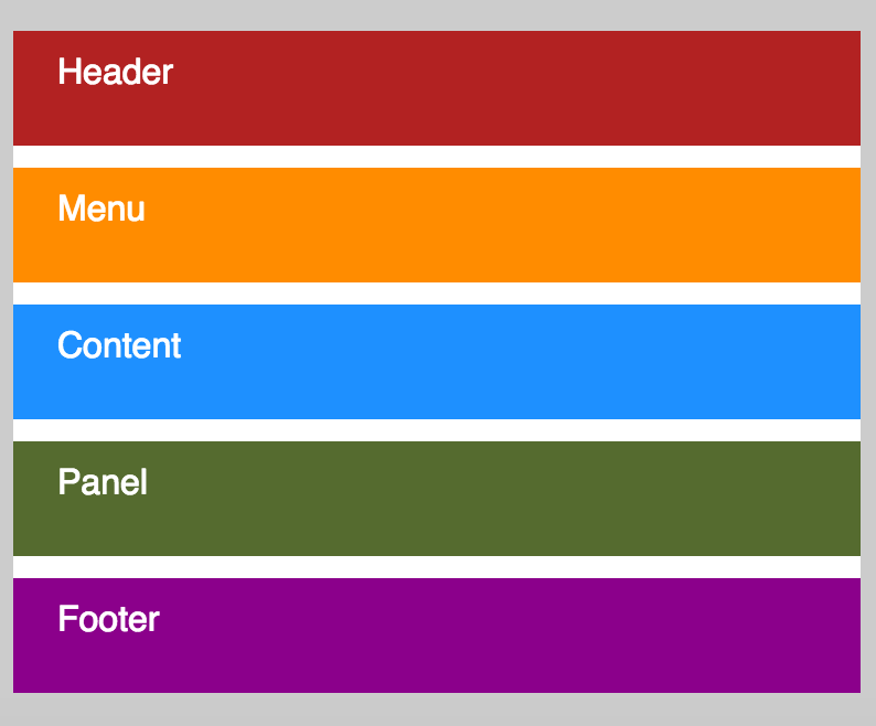
footer { grid-area: 3 / 2 / 4 / 4; }Holy Grail
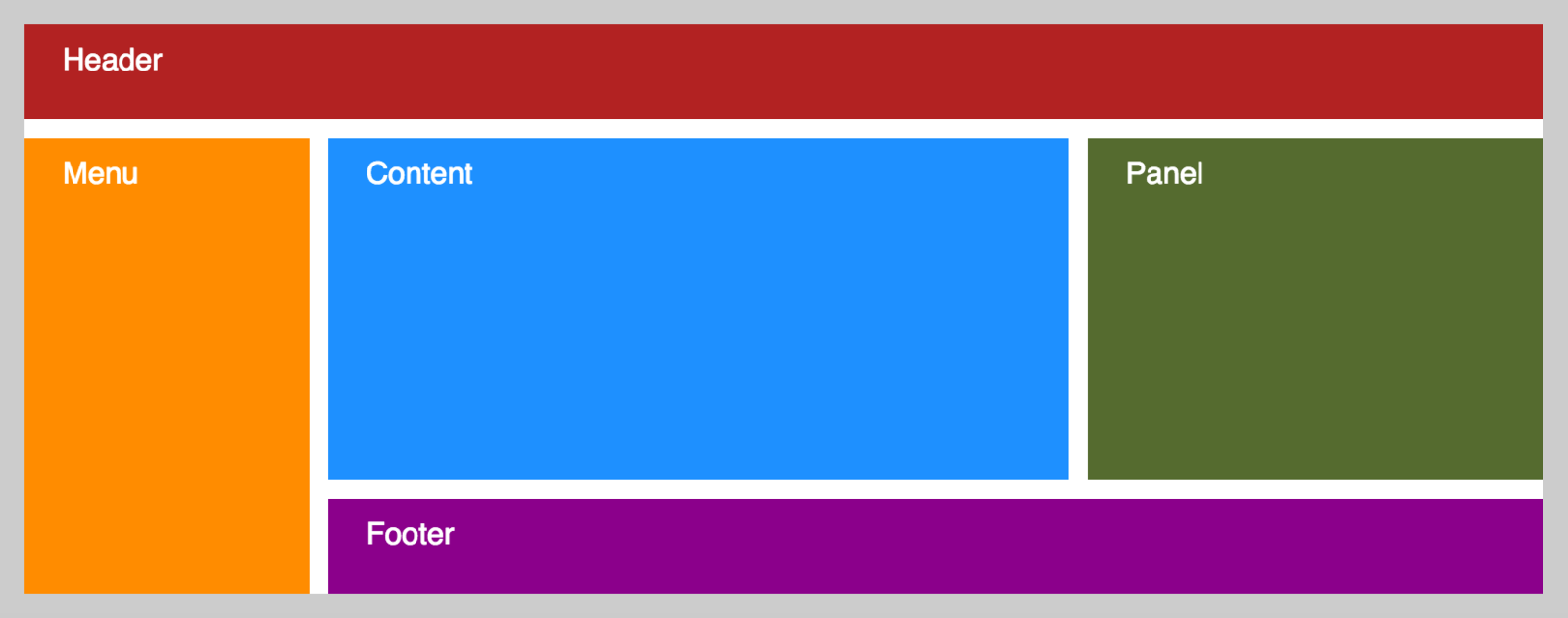
<div class="wrapper">
  <header>Header</header>
  <nav>Menu</nav>
  <section>Content</section>
  <aside>Panel</aside>
  <footer>Footer</footer>
</div>
Great responsibility
Correct source order is important for speech, for sequential navigation (such as keyboard navigation), and non-CSS UAs such as search engines, tactile browsers, etc.
Grid placement only affects the visual presentation!
https://drafts.csswg.org/css-grid/#placement-a11y
.wrapper {
  display: grid;
  grid-gap: 10px;
}

header { grid-row: 1 ; }

nav { grid-row: 2; }

section { grid-row: 3; }

aside { grid-row: 4; }

footer { grid-row: 5; }
Responsiveness
@media (min-width: 550px) {

  .wrapper {
    display: grid;
    grid-template-columns: 150px 1fr 240px;
    grid-template-rows: 50px 1fr 50px;
    grid-gap: 10px;
  }

  header { grid-column: 1 / 4; grid-row: 1; }

  nav { grid-column: 1; grid-row: 2 / 4 ; }

  section { grid-column: 2; grid-row: 2; }

  aside { grid-column: 3; grid-row: 2; }

  footer { grid-area: 3 / 2 / 4 / 4; }

}
Lay elements out in a single column for the narrow screens and enhance progressively using Media Queries
Named lines
@media (min-width: 550px) {

  .wrapper {
    display: grid;
    grid-template-columns:
      [col-menu-start] 150px
      [col-content-start] 1fr
      [col-panel-start] 240px [col-panel-end];
    grid-template-rows:
      [row-header-start] 50px
      [row-content-start] 1fr
      [row-footer-start] 50px [row-footer-end];
    grid-gap: 10px;
  }

  header {
    grid-column: col-menu-start / col-panel-end;
    grid-row: row-header-start;
  }

  nav { grid-column: col-menu-start; grid-row: row-content-start / row-footer-end ; }

  section { grid-column: col-content-start; grid-row: row-content-start; }

  aside { grid-column: col-panel-start; grid-row: row-content-start; }

  footer { grid-area: row-footer-start / col-content-start / row-footer-end / col-panel-end; }

}
Names of lines (not tracks!) are in [square brackets]
Named areas
.wrapper {
  display: grid;
  grid-gap: 10px;
  grid-template-areas:
    "header"
    "menu"
    "content"
    "panel"
    "footer"
}

header {
  grid-area: header ;
}

nav { grid-area: menu; }

section { grid-area: content; }

aside { grid-area: panel; }

footer { grid-area: footer; }

@media (min-width: 550px) {

  .wrapper {
    display: grid;
    grid-template-columns: 150px 1fr 240px;
    grid-template-rows: 50px 1fr 50px ;
    grid-gap: 10px;
    grid-template-areas:
      "header header header"
      "menu content panel"
      "menu footer footer"
  }

}
We repeat the name of the area to span it across the cells
grid-template-areas
grid-area
Summary
We define and describe a grid in CSS
We place our grid items in a different ways
Visual order is independent from content order
We can change the layout by Media Queries
Content can overlap
Grid can adapt to the available space
Another cool stuff
Grid item placement algorithm
grid-auto-flow
Resolves automatic positions of grid items into definite positions, ensuring that every grid item has a well-defined grid area to lay out into.
Subgrids
display: subgrid
Ability to position the children of this element on the same grid their parent is placed on
CSS Box Alignment Module Level 3
This module contains the features of CSS relating to the alignment of boxes within their containers in the various CSS box layout models: block layout, table layout, flex layout, and grid layout.
https://drafts.csswg.org/css-align/
align-self
justify-self
align-items
justify-items
align-content
justify-content
WHEN?
3
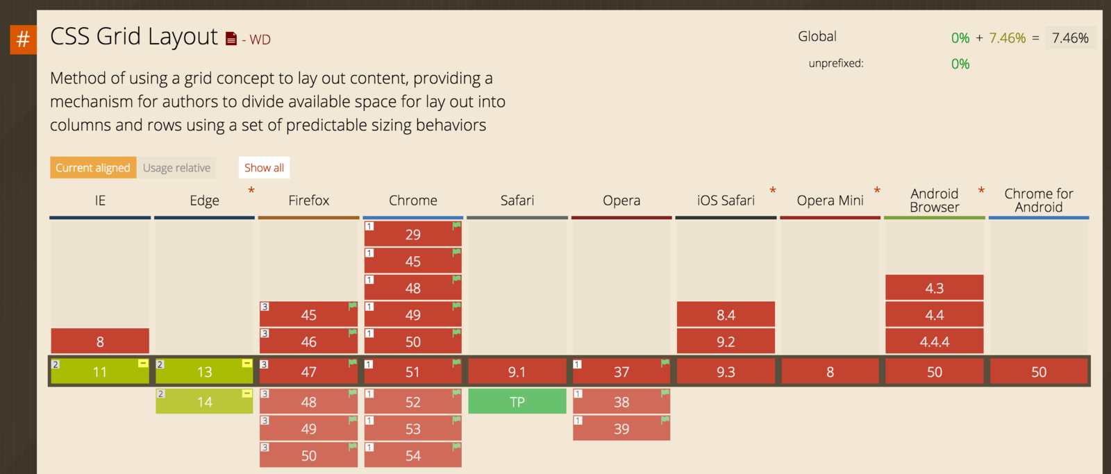
Can I use?
http://caniuse.com/#feat=css-grid
Status
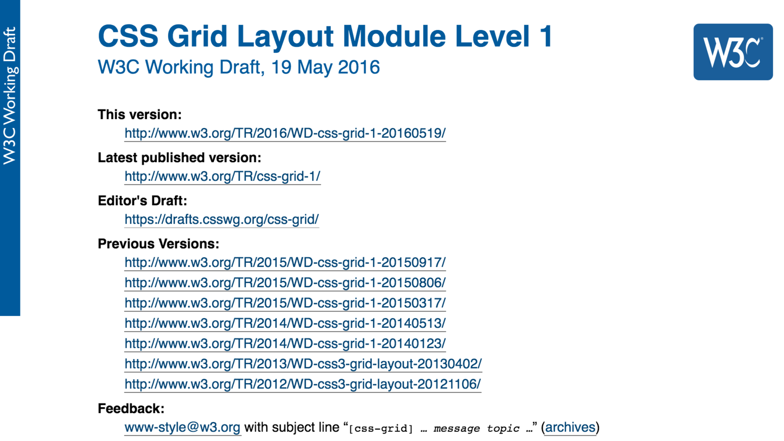
https://www.w3.org/TR/css-grid-1/
Enabling
http://igalia.github.io/css-grid-layout/enable.html

Enable Experimental Web Platform features flag

Enable Experimental Web Platform features flag
Use Safari Technology Preview and WebKit Nightly Builds. Prefixed ;(

Enabling
https://github.com/FremyCompany/css-grid-polyfill

Enable layout.css.grid.enabled flag

Old syntax since IE10
Updates to CSS Grid to match the latest spec are currently on our backlog with a priority of high.
Polyfill
Resources & Credits
https://blogs.igalia.com/mrego/tag/css-grid-layout
Manuel Rego Casasnovas | Web Engines Hacker (Chromium/Blink & WebKit)
https://rachelandrew.co.uk/archives/tag/grid-layout
http://gridbyexample.com
Rachel Andrew | Grid Layout Enthusiast, Speaker, Writer, Blogger
TH
A
@webmaxru
NK
YOU
Revolutionary CSS Grid Layout: why do we need it, where should we use it, when could we use it?
By Maxim Salnikov
Revolutionary CSS Grid Layout: why do we need it, where should we use it, when could we use it?
Horizontal lines, vertical lines. Front-end developers create grid-based layouts from the early days of web. Tables, floating DIVs, flexbox - it's the... well.. evolution. The time has come to fix the issues with older techniques, which weren't really designed for grid page layout. Revolution time! Let's dive into the wonderful world of the CSS Grid Layout, review its syntax and main features, experiment with some practical examples and check can we use it right now. Be well prepared - CSS Grid Layout is being implemented in every major web engine.