


Woongjae Lee
Daangn - Frontend Core Team ex) NHN Dooray - Frontend Team Leader ex) ProtoPie - Studio Team
컴포넌트 스타일링
CSS Module
Sass
Styled-components
React Shadow
Ant Design 활용하기
[Homework] 개발 서적 평가 서비스 로그인 디자인
Software Engineer | Studio XID, Inc.
Microsoft MVP
TypeScript Korea User Group Organizer
Electron Korea User Group Organizer
Marktube (Youtube)
파일 확장자에 맞는 loader 에게 위임
babel-loader
.js
.jsx
.css
style-loader
css-loader
최종 배포용 파일
babel config
어떤 문법을 번역할건지 설정
npx create-react-app style-loaders-example

cd style-loaders-example

npm run eject
// "postcss" loader applies autoprefixer to our CSS.
// "css" loader resolves paths in CSS and adds assets as dependencies.
// "style" loader turns CSS into JS modules that inject <style> tags.
// In production, we use MiniCSSExtractPlugin to extract that CSS
// to a file, but in development "style" loader enables hot editing
// of CSS.
// By default we support CSS Modules with the extension .module.css
{
test: cssRegex, // /\.css$/
exclude: cssModuleRegex, // /\.module\.css$/
use: getStyleLoaders({
importLoaders: 1,
sourceMap: isEnvProduction && shouldUseSourceMap,
}),
// Don't consider CSS imports dead code even if the
// containing package claims to have no side effects.
// Remove this when webpack adds a warning or an error for this.
// See https://github.com/webpack/webpack/issues/6571
sideEffects: true,
},import './App.css'; // Adds support for CSS Modules (https://github.com/css-modules/css-modules)
// using the extension .module.css
{
test: cssModuleRegex, // /\.module\.css$/
use: getStyleLoaders({
importLoaders: 1,
sourceMap: isEnvProduction && shouldUseSourceMap,
modules: true,
getLocalIdent: getCSSModuleLocalIdent,
}),
},import styles from './App.module.css'; // Opt-in support for SASS (using .scss or .sass extensions).
// By default we support SASS Modules with the
// extensions .module.scss or .module.sass
{
test: sassRegex, // /\.(scss|sass)$/
exclude: sassModuleRegex, // /\.module\.(scss|sass)$/
use: getStyleLoaders(
{
importLoaders: 2,
sourceMap: isEnvProduction && shouldUseSourceMap,
},
'sass-loader'
),
// Don't consider CSS imports dead code even if the
// containing package claims to have no side effects.
// Remove this when webpack adds a warning or an error for this.
// See https://github.com/webpack/webpack/issues/6571
sideEffects: true,
},import './App.scss';
import './App.sass'; // Adds support for CSS Modules, but using SASS
// using the extension .module.scss or .module.sass
{
test: sassModuleRegex, // /\.module\.(scss|sass)$/
use: getStyleLoaders(
{
importLoaders: 2,
sourceMap: isEnvProduction && shouldUseSourceMap,
modules: true,
getLocalIdent: getCSSModuleLocalIdent,
},
'sass-loader'
),
},import styles from './App.module.scss';
import styles from './App.module.sass';// App.js
import './App.css';<div className="App">
<header className="App-header">
<img src={logo} className="App-logo" alt="logo" />
<p>
Edit <code>src/App.js</code> and save to reload.
</p>
<a
className="App-link"
href="https://reactjs.org"
target="_blank"
rel="noopener noreferrer"
>
Learn React
</a>
</header>
</div>.App {
text-align: center;
}
.App-logo {
height: 40vmin;
}
.App-header {
background-color: #282c34;
min-height: 100vh;
display: flex;
flex-direction: column;
align-items: center;
justify-content: center;
font-size: calc(10px + 2vmin);
color: white;
}
.App-link {
color: #09d3ac;
}.App
.App-header
.App-logo
.App-link
.App {
text-align: center;
}
.App .logo {
height: 40vmin;
}
.App .header {
background-color: #282c34;
min-height: 100vh;
display: flex;
flex-direction: column;
align-items: center;
justify-content: center;
font-size: calc(10px + 2vmin);
color: white;
}
.App .link {
color: #09d3ac;
}
.App
.App .header
.App .logo
.App .link
<div className="App">
<header className="header">
<img src={logo} className="logo" alt="logo" />
<p>
Edit <code>src/App.js</code> and save to reload.
</p>
<a
className="link"
href="https://reactjs.org"
target="_blank"
rel="noopener noreferrer"
>
Learn React
</a>
</header>
</div>.App {
text-align: center;
.logo {
height: 40vmin;
}
.header {
background-color: #282c34;
min-height: 100vh;
display: flex;
flex-direction: column;
align-items: center;
justify-content: center;
font-size: calc(10px + 2vmin);
color: white;
}
.link {
color: #09d3ac;
}
}
.App
.App .header
.App .logo
.App .link
<div className="App">
<header className="header">
<img src={logo} className="logo" alt="logo" />
<p>
Edit <code>src/App.js</code> and save to reload.
</p>
<a
className="link"
href="https://reactjs.org"
target="_blank"
rel="noopener noreferrer"
>
Learn React
</a>
</header>
</div>npm i node-sassimport styles from './App.module.css';
console.log(styles);.App {
text-align: center;
}
.App-logo {
height: 40vmin;
}
.App-header {
background-color: #282c34;
min-height: 100vh;
display: flex;
flex-direction: column;
align-items: center;
justify-content: center;
font-size: calc(10px + 2vmin);
color: white;
}
.App-link {
color: #09d3ac;
}
import styles from './App.module.scss';
console.log(styles);.App {
text-align: center;
.logo {
animation: App-logo-spin infinite 20s linear;
height: 40vmin;
pointer-events: none;
}
.header {
background-color: #282c34;
min-height: 100vh;
display: flex;
flex-direction: column;
align-items: center;
justify-content: center;
font-size: calc(10px + 2vmin);
color: white;
}
.link {
color: #61dafb;
}
}
@keyframes App-logo-spin {
from {
transform: rotate(0deg);
}
to {
transform: rotate(360deg);
}
}import React from "react";
import logo from "./logo.svg";
import styles from "./App.module.css";
const App = () => {
console.log(styles);
return (
<div className={styles["App"]}>
<header className={styles["App-header"]}>
<img src={logo} className={styles["App-logo"]} alt="logo" />
<p>
Edit <code>src/App.js</code> and save to reload.
</p>
<a
className={styles["App-link"]}
href="https://reactjs.org"
target="_blank"
rel="noopener noreferrer"
>
Learn React
</a>
</header>
</div>
);
};
export default App;
- Button.module.css
- Button.jsx
import React from 'react';
import styles from './Button.module.css';
const Button = props => <button className={styles.button} {...props} />;
export default Button;.button {
background: transparent;
border-radius: 3px;
border: 2px solid palevioletred;
color: palevioletred;
margin: 0 1em;
padding: 0.25em 1em;
font-size: 20px;
}
import React from 'react';
import styles from './Button.module.css';
export default class Button extends React.Component {
state = {
loading: false,
};
startLoading = () => {
console.log('start');
this.setState({ loading: true });
setTimeout(() => {
this.setState({ loading: false });
}, 1000);
};
render() {
const { loading } = this.state;
return (
<button
className={
loading ? `${styles.button} ${styles.loading}` : styles.button
}
{...this.props}
onClick={this.startLoading}
/>
);
}
}.button {
background: transparent;
border-radius: 3px;
border: 2px solid palevioletred;
color: palevioletred;
margin: 0 1em;
padding: 0.25em 1em;
font-size: 20px;
}
.loading {
border: 2px solid grey;
color: grey;
}
npm i classnamesimport classNames from 'classnames';
console.log(classNames('foo', 'bar')); // "foo bar"
console.log(classNames('foo', 'bar', 'baz')); // "foo bar baz"
console.log(classNames({ foo: true }, { bar: true })); // "foo bar"
console.log(classNames({ foo: true }, { bar: false })); // "foo"
console.log(classNames(null, false, 'bar', undefined, 0, 1, { baz: null }, '')); // "bar 1"
console.log(classNames(styles.button, styles.loading)); // Button_button__2Ce79 Button_loading__XEngF
import React from 'react';
import styles from './Button.module.css';
import classNames from 'classnames';
export default class Button extends React.Component {
state = {
loading: false,
};
startLoading = () => {
console.log('start');
this.setState({ loading: true });
setTimeout(() => {
this.setState({ loading: false });
}, 1000);
};
render() {
const { loading } = this.state;
return (
<button
className={
loading ? classNames(styles.button, styles.loading) : styles.button
}
{...this.props}
onClick={this.startLoading}
/>
);
}
}import classNames from 'classnames/bind';
const cx = classNames.bind(styles);
console.log(cx('button', 'loading')); // Button_button__2Ce79 Button_loading__XEngF
console.log(cx('button', { loading: false })); // Button_button__2Ce79import React from 'react';
import styles from './Button.module.css';
import classNames from 'classnames/bind';
const cx = classNames.bind(styles);
export default class Button extends React.Component {
state = {
loading: false,
};
startLoading = () => {
console.log('start');
this.setState({ loading: true });
setTimeout(() => {
this.setState({ loading: false });
}, 1000);
};
render() {
const { loading } = this.state;
return (
<button
className={cx('button', { loading })}
{...this.props}
onClick={this.startLoading}
/>
);
}
}npx create-react-app styled-components-example
cd styled-components-example
npm i styled-components
code .
npm startimport React from 'react';
import logo from './logo.svg';
import './App.css';
import StyledButton from './components/StyledButton';
function App() {
return (
<div className="App">
<header className="App-header">
<img src={logo} className="App-logo" alt="logo" />
<p>
<StyledButton>버튼</StyledButton>
</p>
</header>
</div>
);
}
export default App;import styled from 'styled-components';
const StyledButton = styled.button``;
export default StyledButton;
import styled from 'styled-components';
const StyledButton = styled.button`
background: transparent;
border-radius: 3px;
border: 2px solid palevioletred;
color: palevioletred;
margin: 0 1em;
padding: 0.25em 1em;
`;
export default StyledButton;import React from 'react';
import StyledButton from './components/StyledButton';
function App() {
return (
<div className="App">
<p>
<StyledButton>버튼</StyledButton>
</p>
</div>
);
}
export default App;import styled, { css } from 'styled-components';
const StyledButton = styled.button`
background: transparent;
border-radius: 3px;
border: 2px solid palevioletred;
color: palevioletred;
margin: 0 1em;
padding: 0.25em 1em;
${props =>
props.primary &&
css`
background: palevioletred;
color: white;
`};
`;
export default StyledButton;import React from 'react';
import StyledButton from './components/StyledButton';
function App() {
return (
<div className="App">
<p>
<StyledButton>버튼</StyledButton>
<StyledButton primary>Primary 버튼</StyledButton>
</p>
</div>
);
}
export default App;import styled, { css } from 'styled-components';
const StyledButton = styled.button`
background: transparent;
border-radius: 3px;
border: 2px solid palevioletred;
color: palevioletred;
margin: 0 1em;
padding: 0.25em 1em;
`;
const PrimaryStyledButton = styled(StyledButton)`
background: palevioletred;
color: white;
`;
export default PrimaryStyledButton;import styled from 'styled-components';
const StyledButton = styled.button`
background: transparent;
border-radius: 3px;
border: 2px solid palevioletred;
color: palevioletred;
margin: 0 1em;
padding: 0.25em 1em;
font-size: 1em;
display: inline-block;
text-decoration: none;
`;
export default StyledButton;
import React from 'react';
import StyledButton from './components/StyledButton';
function App() {
return (
<div className="App">
<p>
<StyledButton as="a" href="/">
a 태그 버튼
</StyledButton>
<StyledButton>버튼</StyledButton>
</p>
</div>
);
}
export default App;
import styled from 'styled-components';
const StyledButton = styled.button`
background: transparent;
border-radius: 3px;
border: 2px solid palevioletred;
color: palevioletred;
margin: 0 1em;
padding: 0.25em 1em;
font-size: 1em;
display: inline-block;
`;
export default StyledButton;import React from 'react';
import StyledButton from './components/StyledButton';
const UppercaseButton = props => (
<button {...props} children={props.children.toUpperCase()} />
);
function App() {
return (
<div className="App">
<p>
<StyledButton as={UppercaseButton}>button</StyledButton>
<StyledButton>button</StyledButton>
</p>
</div>
);
}
export default App;
import React from 'react';
import styled from 'styled-components';
function MyButton({ className, children }) {
return <button className={className}>MyButton {children}</button>;
}
const StyledButton = styled(MyButton)`
background: transparent;
border-radius: 3px;
border: 2px solid palevioletred;
color: palevioletred;
margin: 0 1em;
padding: 0.25em 1em;
font-size: 1em;
`;
export default StyledButton;
import React from 'react';
import StyledButton from './components/StyledButton';
function App() {
return (
<div className="App">
<p>
<StyledButton>button</StyledButton>
</p>
</div>
);
}
export default App;
import styled from 'styled-components';
const StyledButton = styled('button')`
background: transparent;
border-radius: 3px;
border: 2px solid palevioletred;
color: palevioletred;
margin: 0 1em;
padding: 0.25em 1em;
font-size: 1em;
`;
export default StyledButton;import React from 'react';
import StyledButton from './components/StyledButton';
function App() {
return (
<div className="App">
<p>
<StyledButton>button</StyledButton>
</p>
</div>
);
}
export default App;
import styled from 'styled-components';
const StyledButton = styled.button`
background: transparent;
border-radius: 3px;
border: 2px solid ${props => props.color || 'palevioletred'};
color: ${props => props.color || 'palevioletred'};
margin: 0 1em;
padding: 0.25em 1em;
font-size: 1em;
`;
export default StyledButton;import React from 'react';
import StyledButton from './components/StyledButton';
function App() {
return (
<div className="App">
<p>
<StyledButton>button</StyledButton>
<StyledButton color="red">red button</StyledButton>
<StyledButton color="green">green button</StyledButton>
</p>
</div>
);
}
export default App;import styled from 'styled-components';
const StyledButton = styled.button`
background: transparent;
border-radius: 3px;
border: 2px solid palevioletred;
color: palevioletred;
margin: 0 1em;
padding: 0.25em 1em;
:hover {
border: 2px solid red;
}
`;
export default StyledButton;import React from 'react';
import StyledButton from './components/StyledButton';
function App() {
return (
<div className="App">
<p>
<StyledButton>버튼</StyledButton>
</p>
</div>
);
}
export default App;import styled from 'styled-components';
const StyledButton = styled.button`
background: transparent;
border-radius: 3px;
border: 2px solid palevioletred;
color: palevioletred;
margin: 0 1em;
padding: 0.25em 1em;
::before {
content: '@';
}
`;
export default StyledButton;import React from 'react';
import StyledButton from './components/StyledButton';
function App() {
return (
<div className="App">
<p>
<StyledButton>버튼</StyledButton>
</p>
</div>
);
}
export default App;import styled from 'styled-components';
const StyledButton = styled.button`
background: transparent;
border-radius: 3px;
border: 2px solid palevioletred;
color: palevioletred;
margin: 0 1em;
padding: 0.25em 1em;
&:hover {
border: 2px solid red;
}
`;
export default StyledButton;import React from 'react';
import StyledButton from './components/StyledButton';
function App() {
return (
<div className="App">
<p>
<StyledButton>버튼</StyledButton>
</p>
</div>
);
}
export default App;import styled from 'styled-components';
const StyledButton = styled.button`
background: transparent;
border-radius: 3px;
border: 2px solid palevioletred;
color: palevioletred;
margin: 0 1em;
padding: 0.25em 1em;
& ~ & {
border: 2px solid red;
}
& + & {
border: 2px solid green;
}
`;
export default StyledButton;import React from 'react';
import StyledButton from './components/StyledButton';
function App() {
return (
<div className="App">
<p>
<StyledButton>버튼</StyledButton>
<StyledButton>버튼</StyledButton>
<StyledButton>버튼</StyledButton>
<button>버튼</button>
<StyledButton>버튼</StyledButton>
</p>
</div>
);
}
export default App;import styled from 'styled-components';
const StyledButton = styled.button`
background: transparent;
border-radius: 3px;
border: 2px solid palevioletred;
color: palevioletred;
margin: 0 1em;
padding: 0.25em 1em;
&.orange {
border: 2px solid orange;
}
`;
export default StyledButton;import React from 'react';
import StyledButton from './components/StyledButton';
function App() {
return (
<div className="App">
<p>
<StyledButton className="orange">버튼</StyledButton>
</p>
<p className="orange">
<StyledButton>버튼</StyledButton>
</p>
</div>
);
}
export default App;import styled from 'styled-components';
const StyledButton = styled.button`
background: transparent;
border-radius: 3px;
border: 2px solid palevioletred;
color: palevioletred;
margin: 0 1em;
padding: 0.25em 1em;
.orange {
color: orange;
}
`;
export default StyledButton;import React from 'react';
import StyledButton from './components/StyledButton';
function App() {
return (
<div className="App">
<p>
<StyledButton>
<a className="orange">버튼</a>
</StyledButton>
</p>
</div>
);
}
export default App;import styled from 'styled-components';
const StyledButton = styled.button`
border: 1px solid palevioletred;
`;
export default StyledButton;import React from 'react';
import StyledButton from './components/StyledButton';
import { createGlobalStyle } from 'styled-components';
const GlobalStyle = createGlobalStyle`
button {
color: palevioletred;
}
`;
function App() {
return (
<div className="App">
<p>
<GlobalStyle />
<StyledButton>버튼</StyledButton>
<button>버튼</button>
</p>
</div>
);
}
export default App;import styled from 'styled-components';
const StyledButton = styled.button`
border: 1px solid palevioletred;
`;
export default StyledButton;import React from 'react';
import StyledButton from './components/StyledButton';
import { createGlobalStyle } from 'styled-components';
const GlobalStyle = createGlobalStyle`
button${StyledButton} {
color: palevioletred;
}
`;
function App() {
return (
<div className="App">
<p>
<GlobalStyle />
<StyledButton>버튼</StyledButton>
<button>버튼</button>
</p>
</div>
);
}
export default App;import styled from 'styled-components';
const StyledA = styled.a.attrs(props => ({
href: props.href || 'https://www.fastcampus.co.kr',
color: props.color || 'palevioletred',
target: '_BLANK',
}))`
color: ${props => props.color};
`;
export default StyledA;import React from 'react';
import StyledA from './components/StyledA';
function App() {
return (
<div className="App">
<p>
<StyledA>링크</StyledA>
<StyledA color="red">링크</StyledA>
</p>
</div>
);
}
export default App;import styled, { keyframes } from 'styled-components';
const slide = keyframes`
from {
margin-top: 0em;
}
to {
margin-top: 1em;
}
`;
const StyledButton = styled.button`
display: inline-block;
color: palevioletred;
font-size: 1em;
margin: 1em;
padding: 0.25em 1em;
border: 2px solid palevioletred;
border-radius: 3px;
animation: ${slide} 0.3s ease-in;
`;
export default StyledButton;import React from 'react';
import StyledButton from './components/StyledButton';
function App() {
return (
<div className="App">
<p>
<StyledButton>Slide Button</StyledButton>
</p>
</div>
);
}
export default App;npx create-react-app react-shadow-example
cd react-shadow-example
npm i react-shadow
code .
npm start/* index.css */
body {
margin: 0;
font-family: -apple-system, BlinkMacSystemFont, "Segoe UI", "Roboto", "Oxygen",
"Ubuntu", "Cantarell", "Fira Sans", "Droid Sans", "Helvetica Neue",
sans-serif;
-webkit-font-smoothing: antialiased;
-moz-osx-font-smoothing: grayscale;
}
code {
font-family: source-code-pro, Menlo, Monaco, Consolas, "Courier New",
monospace;
}
p {
color: red;
}
.App {
text-align: center;
}
.App-logo {
height: 40vmin;
pointer-events: none;
}
@media (prefers-reduced-motion: no-preference) {
.App-logo {
animation: App-logo-spin infinite 20s linear;
}
}
.App-header {
background-color: #282c34;
min-height: 100vh;
display: flex;
flex-direction: column;
align-items: center;
justify-content: center;
font-size: calc(10px + 2vmin);
color: white;
}
.App-link {
color: #61dafb;
}
@keyframes App-logo-spin {
from {
transform: rotate(0deg);
}
to {
transform: rotate(360deg);
}
}import React from "react";
import logo from "./logo.svg";
import root from "react-shadow";
const styles = `...`;
function App() {
return (
<root.div>
<div className="App">
  <header className="App-header">
    <img src={logo} className="App-logo" alt="logo" />
    <p>
      Edit <code>src/App.js</code> and save to reload.
    </p>
    <a
      className="App-link"
      href="https://reactjs.org"
      target="_blank"
      rel="noopener noreferrer"
    >
      Learn React
    </a>
  </header>
</div>
<style type="text/css">{styles}</style>
</root.div>
);
}
export default App;
npx create-react-app antd-example

cd antd-example

npm i antd
import React from "react";
import "./App.css";
import { DatePicker } from "antd";
function App() {
return (
<div className="App">
<DatePicker />
</div>
);
}
export default App;
import React from "react";
import ReactDOM from "react-dom";
import "antd/dist/antd.css";
import "./index.css";
import App from "./App";
import * as serviceWorker from "./serviceWorker";

ReactDOM.render(
  <React.StrictMode>
    <App />
  </React.StrictMode>,
  document.getElementById("root")
);

serviceWorker.unregister();
import 'antd/dist/antd.css'; // <= 전역 스타일 추가 in index.js
import { DatePicker } from 'antd'; // <= 리액트 컴포넌트 in App.js
import React from "react";
import "./App.css";
import { DatePicker } from "antd";
import "antd/es/date-picker/style/css";

function App() {
  return (
    <div className="App">
      <DatePicker />
    </div>
  );
}

export default App;
import React from "react";
import ReactDOM from "react-dom";
// import "antd/dist/antd.css";
import "./index.css";
import App from "./App";
import * as serviceWorker from "./serviceWorker";

ReactDOM.render(
  <React.StrictMode>
    <App />
  </React.StrictMode>,
  document.getElementById("root")
);

// If you want your app to work offline and load faster, you can change
// unregister() to register() below. Note this comes with some pitfalls.
// Learn more about service workers: https://bit.ly/CRA-PWA
serviceWorker.unregister();
import DatePicker from 'antd/es/date-picker';
import 'antd/es/date-picker/style/css';{
...
"babel": {
"presets": [
"react-app"
],
"plugins": [
[
"import",
{
"libraryName": "antd",
"libraryDirectory": "es",
"style": "css"
}
]
]
},
...
}npm run eject
npm install babel-plugin-import --save-devimport React from "react";
import "./App.css";
import { DatePicker } from "antd";
// import "antd/es/date-picker/style/css";
function App() {
return (
<div className="App">
<DatePicker />
</div>
);
}
export default App;
npm install @ant-design/iconsimport React from 'react';
import { Button } from 'antd';
import { HeartOutlined } from "@ant-design/icons";
export default class LoadingButton extends React.Component {
state = {
loading: false,
};
startLoading = () => {
console.log('start');
this.setState({ loading: true });
setTimeout(() => {
this.setState({ loading: false });
}, 1000);
};
render() {
const { loading } = this.state;
return (
<Button
type="primary"
size="large"
icon={<HeartOutlined />}
loading={loading}
onClick={this.startLoading}
style={{
width: 50,
}}
/>
);
}
}
import React from 'react';
import LoadingButton from './components/LoadingButton';
import { TwitterOutlined } from "@ant-design/icons";

function App() {
  return (
    <div className="App">
      <p>
        <LoadingButton />
      </p>
      <p>
        저는 <TwitterOutlined /> 를 잘 안해요!
      </p>
    </div>
  );
}

export default App;
import React from 'react';
import { Row, Col } from 'antd';
const colStyle = () => ({
height: 50,
backgroundColor: 'red',
opacity: Math.round(Math.random() * 10) / 10,
});
function App() {
return (
<div className="App">
<Row>
<Col span={12} style={colStyle()} />
<Col span={12} style={colStyle()} />
</Row>
<Row>
<Col span={8} style={colStyle()} />
<Col span={8} style={colStyle()} />
<Col span={8} style={colStyle()} />
</Row>
<Row>
<Col span={6} style={colStyle()} />
<Col span={6} style={colStyle()} />
<Col span={6} style={colStyle()} />
<Col span={6} style={colStyle()} />
</Row>
</div>
);
}
export default App;
import React from 'react';
import { Row, Col } from 'antd';

function MyCol({ span }) {
  return (
    <Col span={span}>
      <div style={{ height: 50, backgroundColor: 'red', opacity: 0.7 }} />
    </Col>
  );
}

export default function App() {
  return (
    <div className="App">
      <Row gutter={16}>
        <MyCol span={12} />
        <MyCol span={12} />
      </Row>
      <Row gutter={16}>
        <MyCol span={8} />
        <MyCol span={8} />
        <MyCol span={8} />
      </Row>
      <Row gutter={16}>
        <MyCol span={6} />
        <MyCol span={6} />
        <MyCol span={6} />
        <MyCol span={6} />
      </Row>
    </div>
  );
}
import React from 'react';
import { Row, Col } from 'antd';
function MyCol({ span, offset }) {
return (
<Col span={span} offset={offset}>
<div style={{ height: 50, backgroundColor: 'red', opacity: 0.7 }} />
</Col>
);
}
export default function App() {
return (
<div className="App">
<Row gutter={16}>
<MyCol span={12} offset={12} />
</Row>
<Row gutter={16}>
<MyCol span={8} />
<MyCol span={8} offset={8} />
</Row>
<Row gutter={16}>
<MyCol span={6} />
<MyCol span={6} offset={3} />
<MyCol span={6} offset={3} />
</Row>
</div>
);
}import React from 'react';
import { Row, Col } from 'antd';
function MyCol({ span, offset }) {
const opacity = Math.round(Math.random() * 10) / 10;
return (
<Col span={span} offset={offset}>
<div style={{ height: 50, backgroundColor: 'red', opacity }} />
</Col>
);
}
export default function App() {
return (
<div className="App">
<Row
style={{
height: 300,
}}
justify="start"
align="top"
>
<MyCol span={4} />
<MyCol span={4} />
<MyCol span={4} />
<MyCol span={4} />
</Row>
</div>
);
}"start" | "center" | "end" | "space-between" | "space-around"
"top" | "middle" | "bottom"
import React from 'react';
import { Layout } from 'antd';

const { Header, Sider, Content, Footer } = Layout;

export default function App() {
  return (
    <div className="App">
      <Layout>
        <Header>Header</Header>
        <Layout>
          <Sider>Sider</Sider>
          <Content>Content</Content>
        </Layout>
        <Footer>Footer</Footer>
      </Layout>
    </div>
  );
}npx create-react-app my-books
cd my-books
(optional) nvm use
npm i react-router-dom react-error-boundary antd12.16.2{
"singleQuote": true,
"trailingComma": "all"
}
<!DOCTYPE html>
<html lang="en">
  <head>
    ...
    <title>My Books</title>
    <link
      href="https://fonts.googleapis.com/css?family=Roboto&display=swap"
      rel="stylesheet"
    />
    ...
  </head>
  <body>...</body>
</html>
import React from 'react';
import ReactDOM from 'react-dom';
import 'antd/dist/antd.css';
import './index.css';
import App from './App';
import * as serviceWorker from './serviceWorker';

ReactDOM.render(
  <React.StrictMode>
    <App />
  </React.StrictMode>,
  document.getElementById('root'),
);

// If you want your app to work offline and load faster, you can change
// unregister() to register() below. Note this comes with some pitfalls.
// Learn more about service workers: https://bit.ly/CRA-PWA
serviceWorker.unregister();
body {
  margin: 0;
  font-family: 'Roboto', sans-serif;
  -webkit-font-smoothing: antialiased;
  -moz-osx-font-smoothing: grayscale;
}
import React from "react";
import { BrowserRouter, Switch, Route } from "react-router-dom";
import Home from "./pages/Home";
import Signin from "./pages/Signin";
import NotFound from "./pages/NotFound";
import Error from "./pages/Error";
import { ErrorBoundary } from "react-error-boundary";

const App = () => (
  <ErrorBoundary FallbackComponent={Error}>
    <BrowserRouter>
      <Switch>
        <Route exact path="/signin" component={Signin} />
        <Route exact path="/" component={Home} />
        <Route component={NotFound} />
      </Switch>
    </BrowserRouter>
  </ErrorBoundary>
);

export default App;
import React from "react";

const HomePage = () => (
  <div>
    <h1>Home</h1>
  </div>
);

export default HomePage;
import React from "react";

const NotFoundPage = () => (
  <div>
    <h1>NotFound</h1>
  </div>
);

export default NotFoundPage;
import React from "react";

const ErrorPage = () => (
  <div>
    <h1>Error</h1>
  </div>
);

export default ErrorPage;
import React from "react";
import Signin from "../components/Signin";

const SigninPage = () => <Signin />;

export default SigninPage;
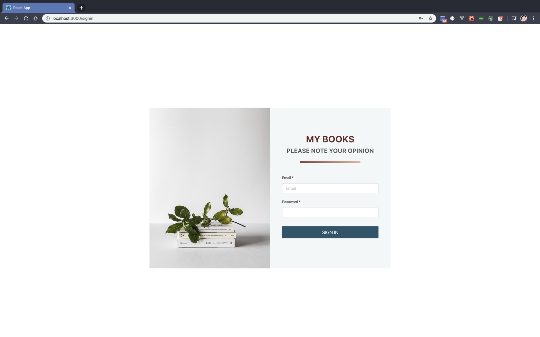
import React from 'react';
import { Row, Col, Button, Input } from 'antd';
import styles from './Signin.module.css';

const Signin = () => {
  return (
    <form>
      <Row align="middle" className={styles.signin_row}>
        <Col span={24}>
          <Row className={styles.signin_contents}>
            <Col span={12}>
              <img
                src="/bg_signin.png"
                alt="Signin"
                className={styles.signin_bg}
              />
            </Col>
            <Col span={12}>
              <div className={styles.signin_title}>My Books</div>
              <div className={styles.signin_subtitle}>
                Please Note Your Opinion
              </div>
              <div className={styles.signin_underline} />
              <div className={styles.email_title}>
                Email
                <span className={styles.required}> *</span>
              </div>
              <div className={styles.input_area}>
                <Input
                  placeholder="Email"
                  autoComplete="email"
                  name="email"
                  className={styles.input}
                />
              </div>
              <div className={styles.password_title}>
                Password
                <span className={styles.required}> *</span>
              </div>
              <div className={styles.input_area}>
                <Input
                  type="password"
                  autoComplete="current-password"
                  className={styles.input}
                />
              </div>
              <div className={styles.button_area}>
                <Button
                  size="large"
                  loading={false}
                  onClick={click}
                  className={styles.button}
                >
                  Sign In
                </Button>
              </div>
            </Col>
          </Row>
        </Col>
      </Row>
    </form>
  );

  function click() {}
};

export default Signin;
.signin_row {
  height: 100vh;
}

.signin_title {
  text-align: center;
  font-size: 30px;
  font-weight: bold;
  color: #642828;
  text-transform: uppercase;
  margin-top: 80px;
}

.signin_subtitle {
  text-align: center;
  font-size: 20px;
  font-weight: bold;
  text-transform: uppercase;
}

.signin_underline {
  width: 200px;
  height: 6px;
  margin-right: auto;
  margin-left: auto;
  margin-top: 20px;
  background: linear-gradient(to right, #803b32, #ddb49b);
}

.signin_contents {
  margin-top: 50px;
  background-color: #f3f7f8;
  margin-left: auto;
  margin-right: auto;
  width: 800px;
}

.signin_bg {
  width: 100%;
}

.email_title {
  font-family: Roboto;
  font-size: 12px;
  font-weight: bold;
  margin-top: 40px;
  text-align: left;
  padding-left: 40px;
}

.password_title {
  font-family: Roboto;
  font-size: 12px;
  font-weight: bold;
  margin-top: 10px;
  text-align: left;
  padding-left: 40px;
}

.required {
  color: #971931;
}

.input_area {
  padding-top: 10px;
  padding-bottom: 10px;
  padding-left: 40px;
  padding-right: 40px;
}

.input {
  width: 100%;
  border-radius: 1px;
  border-width: 1px;
  font-family: Roboto;
}

.button_area {
  text-align: center;
  padding-left: 40px;
  padding-right: 40px;
  margin-top: 20px;
}

.button {
  border-color: #28546a;
  background-color: #28546a;
  text-transform: uppercase;
  border-radius: 1px;
  border-width: 2px;
  color: white;
  width: 100%;
}

.button:hover {
  background-color: #28546a;
  color: white;
}
By Woongjae Lee
Fast Campus Frontend Developer School 17th


