today's agenda
Introduce myself (5 min)
Your turn: Analyze 5 visualizations that have to do with who lives where (15 min work + 5 min discussion)
Q&A based on your prepared questions (20-25 min)
Look at and critique one set of data in several visual forms
Add color and annotations to one of those visualizations
data visualization designer and engineer
What do I do?

work at Google
Where do I work?

I write code
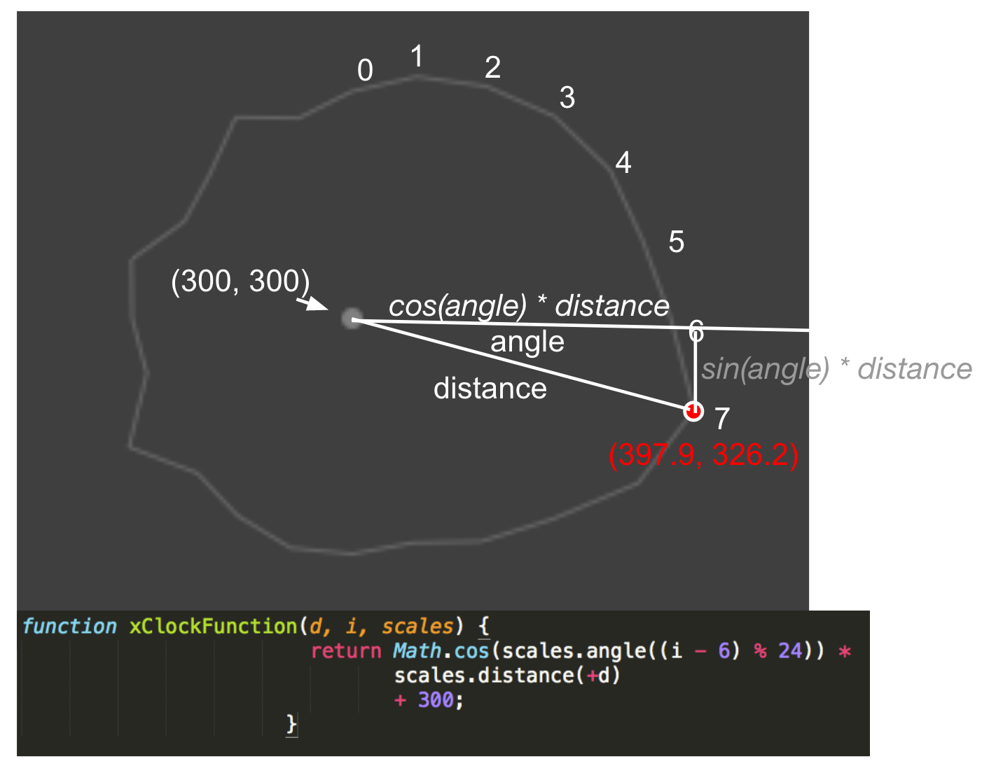
Data Visualization Skills


I use math To create
Data Visualization Skills


I Analyze data
Data Visualization Skills

I design
Data Visualization Skills


And apply principles of human visual perception
Data Visualization Skills


I write stories (& lots of emails)
Data Visualization Skills

I Do research
Data Visualization Skills

i think creatively, figuring out what the core need is and how to solve for it
Data Visualization Skills

Communication & understanding: I figure out what my clients need
Data Visualization Skills

I think a lot about color
Data Visualization Skills

I ask questions like...
What affects what time of day babies are born?
...
How can we figure out if our images of cells under a microscope are in focus, when there are too many to look at one-by-one?
...
What's Google's revenue going to be in December?
....
What do Machine Learning Neural Nets See?
...
Is it warmer in SF in January or July?
...
How do I convey a sense of "disgust" or "calm"?
Data Visualization Skills
You don't have to choose between "STEM" subjects, Art, humanities, doing meaningful work, and being creative...
Data Visualization Skills
analyze/critique visualizations
(15 minutes)
5 ways of looking at where we live, who lives nears us, and why
(15 minutes analysis + 5 minute discussion)
5 visualizations about where we live. And who lives near us.
2. America is More Diverse than Ever, but Still Segregated
3. Visualizing the Racial Divide
5. Mapping Inequality: Redlining in America
For 3 of these...
* What is the data being shown?
* What do you think the creator's goal was?
* What is one choice they made about the visual form (color, shape, size, position, animation, etc) that works well for their goal?
* What do you think makes this visualization effective or ineffective?
* Does anything surprise you about the data?
question time!
(20 minutes)
Data Viz for Burton High School
By Zan Armstrong


