MOCK UPS
Front cover mock ups:
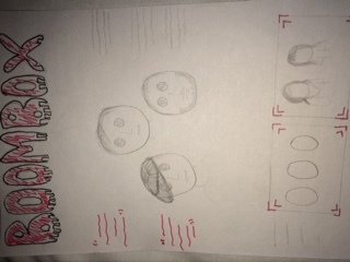
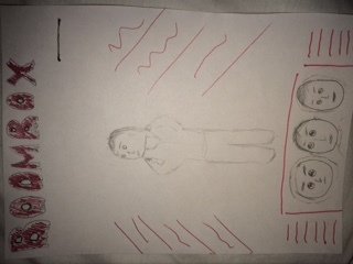
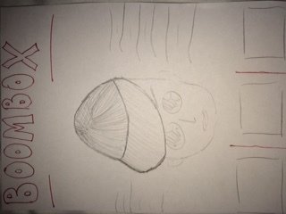
Conventions found on these mock ups:
- Masthead
- Plugs
- Buzz Words
- Slogan
- Central Image
Pros of this design:
Cons of this design:
Why is this appropriate for my genre/audience:
- The use of red is suitable for my genre as a lot people associate the colour red with the genre of hip hop
- The use of images is appropriate for audience as it looks more appealing to a younger audience
- The central image is in the centre and quite large which make it look more interesting.
- It will contain a few plugs which would make it eye catching.
- It may be too simple
Pros of this design:
Pros of this design:
Cons of this design:
Cons of this design:
- As there are two images it may make the front cover look more appealing as there is more to look at.
- It has a consistent colour theme which makes it look more neat.
- It looks a bit bare not enough features are on it
- Central Image may be a bit too small
- A lot of images used which makes the front cover more eye catching
- More colours could be used or features
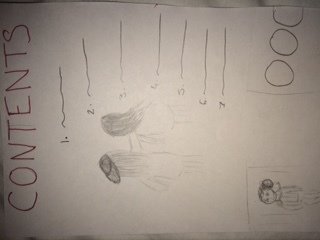
Contents Mock Ups:
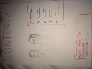
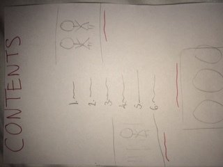
Pros of this design:
- It has a clear layout which makes it easier to understand
- images are used to make it look more interesting
Cons of this design:
- It may be too simple as not a lot of features have been added
- The layout is spread out therefore it can look too sparse
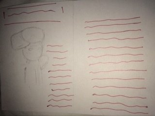
Pros of this design:
Pros of this design:
Cons of this design:
Cons of this design:
- May look a bit empty
- More images could be added
- Interesting layout with the writing curved around the image which can make it look more eye catching to an audience.
- More features could be added
- Layout is very different as the images are on the outside with the text in the middle
Double Page Spread Mock Ups:
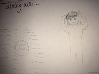
Pros of this design:
- Clearly shows an central image of an artist with the interview beside it
- The layout shows nothing overlapping which gives the double page spread an overall look which is neat
Cons of this design:
- It may not appeal to my audience as much due to the large amounts of text.
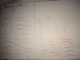
Pros of this design:
Pros of this design:
Cons of this design:
Cons of this design:
- The images link with text therefore it gives the audience an idea on what the article is going to be about.
- The use of multiple images make it look more appealing.
- It may look empty as only one side has text on
- It has a balance between images and text
- "Talking with" gives an idea of what the article is about
- It may look over crowded as there is a lot of text
- Also it may not appeal to my audience as there is a lot of text and in my survey the results showed they prefer images to text.
Mock Ups
By aquella