1. In what ways does your media product use, develop or challenge forms and conventions of real media products?
DIGIPAK
FRONT COVER
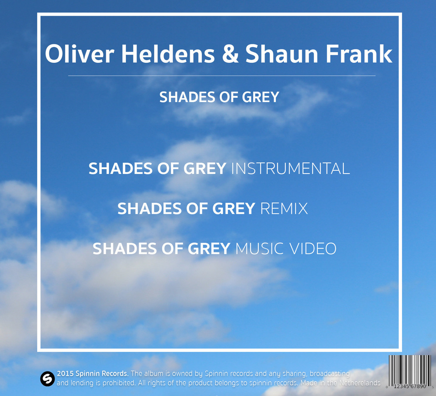
INSIDE
BACK COVER
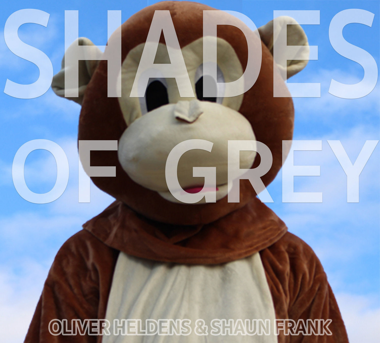
For the front cover of digipak we decided to put the face of our main character "The monkey" on the front using a close mid shot. This was to show a clear link between the music video and the digipak which would make it more recognizable to the audience. This is a similar convention to actual dance digipaks. This is because a lot of dance videos are quite wacky and random by using random characters and costumes in the video. Therefore including the monkey onto the front page would draw more attention to it. In addition the use of a mid close up shows a clear image of the monkey which makes the digipak stand out and more original. This is due to the monkey not being a typical character in a music video making the music vide more concept based which is stereotypical for a dance video.
We also challenged the fact that normally most dance videos use bright colours for their text and background to reflect that dance music videos represent partying and being in a scene where there are loads of flashing lights. Such as pink, orange and green colours.We challenged this by using a dull grey colour for the text of the masthead to portray the name of the song "Shades of Grey". Furthermore the background of the front cover is the sky to represent elements of the video like when the monkey spends time outside and in the tree. This feature is portrayed throughout the whole of the digipak including the back cover and inside to show a recurring and consistent theme.
FRONT COVER
Also we also developed the idea of having the title of the song displayed on the front cover as a masthead. This is because deciding to have the name of the song on the front cover meant that the audience would clearly be able to recognise what the digipak is for and what it holds. We developed this convention from other dance digipak as we saw that had a clear effect. Similarly we did the same with the name of the artist. This is because we felt that it was important to have the specific details about the song on the front cover.
Examples of dance genre digipaks:

Here is an example of a real dance themed digipak. As you can see we have a similar convention of having one main image/ person on the front using a close-mid shot- just like our digipak.
Another similarity between our front cover and this one is that they both feature the artist name. Which are both placed in the centre of the cover to show that it is important and should be some of what the centre of attention.
One convention that we challenged from this front cover is that they use a more complex background featuring different shapes which relate to Calvin Harris such as they are displayed on his sets when he performs. This is different to our front cover as we have just used a simple sky image so we didn't make our front cover look too over crowded.
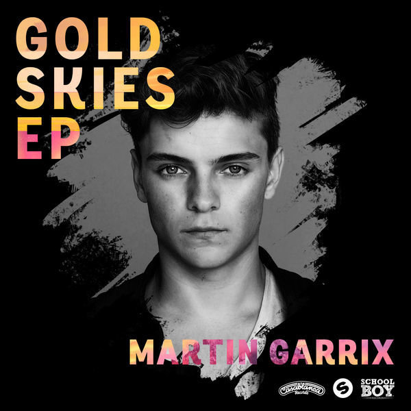
Our digipak challenges this example as it uses a darker colour theme compared to ours which is much more light. However is has a contracts with the gold text which link in with the dance genre.
Here is an example of a real dance themed digipak. As you can see we have a similar convention of having one main image/ person on the front using a close-mid shot- just like our digipak.

Inside
When researching digipaks of the dance genre we noticed a lot of them were kept it simple with either just a plain image featuring no images of the artist. However we decided to challenge this convention and feature the monkey on this cover. We decided this because we wanted to consistently create the digipak linking to the video therefore putting the monkey on different pages allows the audience to be constantly reminded about the Shades of grey music video with reference to the monkey. Also like real inside covers we also decided to put no text on the cover. This was to keep the cover simple and minimalistic as you will not see the majority of the image as the cd will cover it, this why we had to flip the actual image as the monkey would not have been seen.
Back cover

On the back cover we used the sky image again for the background image to link in with the rest of the digipak. This links in with real dance digipaks as they have the same background on all covers. This is because it shows consistency within the digipak and makes it more recognisable if everything is the same. Also having the sky as a background relates to the music video as in the beginning of the video there is low angle shot rotating facing up to the sky.
One convention we developed from real digipak back covers was adding copyright information at the bottom of the cover. We decided to add this because we wanted our back cover to look as realistic as possible therefore we knew adding this important information and text would make it look more realistic and professional.
Furthermore we also used the convention of putting the record labels logo on the bottom of the page. This is because we felt that this was an important feature for the back cover as usually the most important information about the track or album is on the back cover.
However we challenged the positioning of the barcode. This is by placing the barcode in the bottom right corner when usually on real digipkas the barcode is placed on in the centre. We decided to challenge this because we did not want it to take attention away from the main and important information; the track list.
deck
By aquella